Discussion points: Influences

_7R2_DSC2651 copy
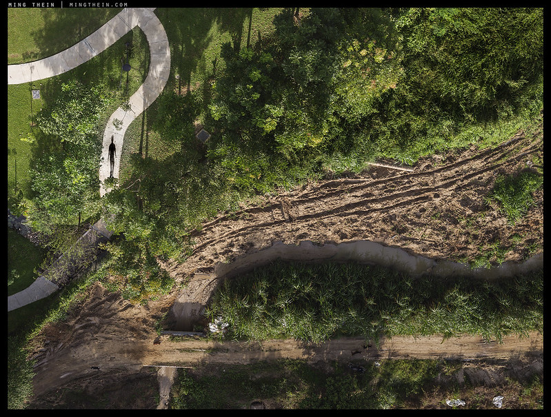
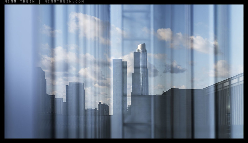
From the series ‘Only The Clouds are Truly Free’, inspired by the work of Magritte

Following on from the previous article on finding inspiration – it makes sense to throw another question out to the audience – who are your inspirations? Hopefully, you might find something you’ve not seen before. The more I’ve been asked this question, the more I’ve found myself allowing increased weight to non-photographic themes: creativity is a fluid, difficult-to-define thing, and sources can be pretty much anything: other photographers; artists in different media; music; a season; muses; objects; locations; even (ahem) hardware.

I’ll go first, after the jump. MT
[Read more…]

Photoessay: John Rylands, Manchester

X1D3-B0002128 copy

I had a very small amount of time between meetings during a recent visit to Manchester; one of the buildings on my to-shoot list is (was, I guess) the John Rylands Library. It’s an interesting mix of new and old, much in the same kind of style as the British Museum, and to a lesser extent, the Louvre. The new part is very new; stark, minimalist and somewhat Escheresque in places; the old part is very much Gothic (though built in the late 19th Century, and opened in 1900). The detailing and finesse of the stonework is both delicate and extremely detailed; it’s an absolutely beautiful building to photograph. It’s also sensitively lit inside, too. Whilst photography is permitted, tripods aren’t, so one has to be either very steady – or find something to brace against*. The oculus/ring/gallery in the last shot is a personal favourite feature: you almost expect a portal to another dimension to open from time to time (but only during visiting hours, 10am-5pm Monday-Friday, closes 2pm Saturday). MT

*I can’t help but think an E-M1.2 and 12-100 with its incredible stabiliser combination would have been perfect here.

This series was shot with a preproduction Hasselblad X1D, 45 and 90mm lenses, and post processed with Photoshop and Lightroom Workflow III. Roam vicariously with T1: Travel Photography. and the How to See series.

[Read more…]

The design process

_8B40789 copy
Not a camera, but a watch is as good an example as any – perhaps more so, especially when you’re producing just one and it has to satisfy the most demanding client: the designer.

Whenever a photographer ‘has some ideas about camera design’, they often forget they’re only seeing one small portion of the puzzle. Inevitably, there are significant other considerations beyond the obvious – sometimes to the point of being physically impossible or functionally incompatible with their own intended result. At this point, having significantly more involvement in the design process will allow me to clarify why some things are the way they are, why some things should or don’t change, and where manufacturers shouldn’t have any excuses. Think of it as a candid ‘message from the other side of the fence’.

[Read more…]

Photoessay: Doha to London

IMG_4062b copy
Doha

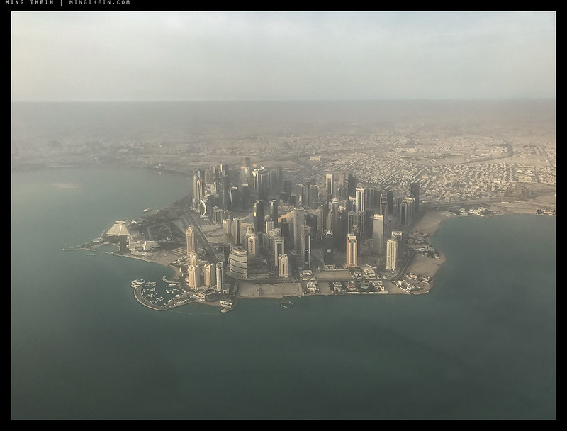
I always try to get a window seat if I’m flying, and if there might be the slightest chance of anything to see (night photography from an airplane has so far proven highly challenging, with few exceptions – either your ISO is cranked so high that any subtle tonality in the widespread blue palette completely disappears, or you have motion problems). In those cases, it’s probably advisable to take an aisle seat if you’re the insomniac type, or stick to the window if you prefer not to be climbed over by your neighbour. Usually, the Middle East to European routes have something worth seeing; you overfly desert, mountains, and cities, and there’s at least eight hours of boredom to kill. I can’t imagine what else the answer might be if not photographic, to the point that I’ll try to sit on the ‘correct’ side of the plane for light and likely opportunities – beats 20 reruns of Friends at any rate. Whilst perhaps airline travel doesn’t quite have the same immediate connection with the changing landscape as driving or taking the train, it simply happens at a much faster pace and larger scale – which sadly is all too often overlooked by most travellers.

The opening image proves again that the adage ‘the best camera is the one you have with you’ is true: whilst the H5D was on my lap as usual for takeoff, I had completely the wrong lens on (100mm) – iPhone to the rescue. MT

This series was shot with a Hasselblad H5D-50C, various lenses and post processed with Photoshop and Lightroom Workflow III. Roam vicariously with T1: Travel Photography. and the How to See series.

[Read more…]

More images may not always be a good thing…

IMG_3118
@mingthein; I’ve been there for about a year or so. Benefits? None that I can see…

Social media = instant updates = easy consumption of new content = necessarily easy production of aforementioned new content. With the proliferation of cameraphones, this is course the era of the snapshot – more so than in the tourist film compact days, because not only does pretty much everybody in the developed world (and much of the developing world*) carry a smartphone; they’ve also been conditioned to use it. When your parents and parents in law -= people previously uninterested in photography beyond normal family documentary – now take more photos than you do with their phones, you know a switch has flipped. But what does this mean for the image-making business and image appreciation as a whole? I have a theory, and I suspect you’re not going to like it.

*In Malaysia, it’s not uncommon to see people earning $700-800 a month before tax but owning the latest iPhone. The mind boggles, since this is easily a purchase that’s two months’ net pay.

[Read more…]

Photoessay: Continuity

X1D3-B0001790 copy

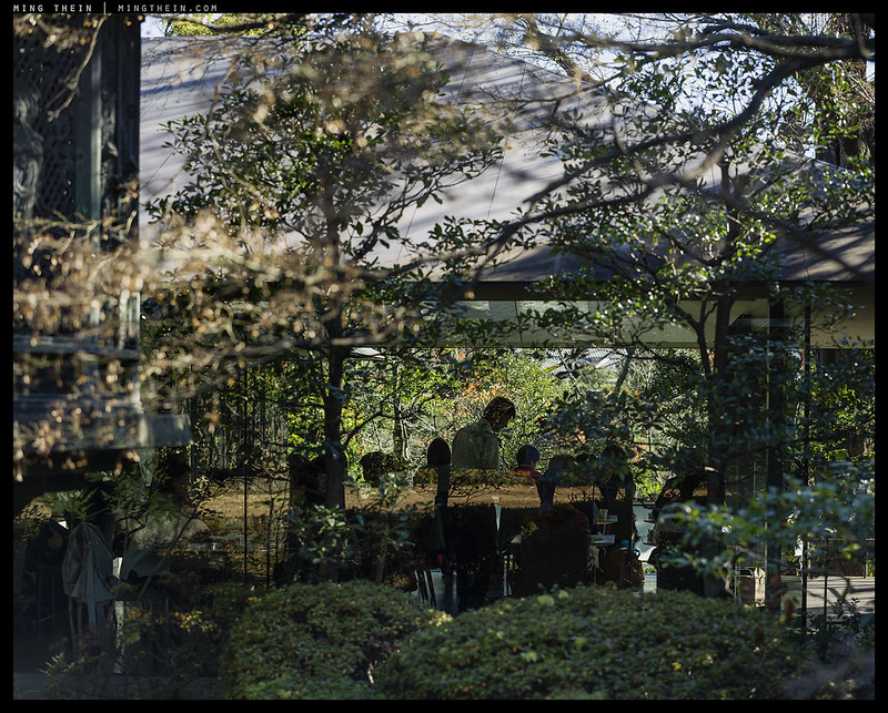
I find it curious that a lot of modern structures try to hide their bulk buy the use of mirrors and glass; classical architects have proven that it’s very possible to make a beautiful and adequately light structure without massive glass curtain walls, and the brutal/industrial cast-concrete era of the 60s, 70s and 80s proved further that it’s even more possible to make such structures vomitoriously ugly and utilitarian. The modern stuff seems to try to blend by hiding – reflecting the surroundings and making it tricky to sometimes determine where the structure begins and ends. If a city were to only be furnished with such structures, there’d be a lot of light and the illusion of openness, but zero character and probably a lot of avian accidents. Fortunately, real life is a bit more chaotic and ‘dirtier’ which avoids that kind of thing. Yet there is still this strange blended continuity… MT

This series was shot in Tokyo with a Canon 100D, 24STM; an X1D-50c and 90mm; a H6D-100 and 100mm. Post processing was completed using the techniques in the weekly workflow and PS Workflow III. Learn more about capturing the essence of a location with T1: Travel Photography; or visit Japan vicariously in How To See Ep.2: Tokyo.

[Read more…]

Subconscious associations – or titling, redux

[Image removed – Société des Auteurs dans les arts graphiques et plastiques does not permit Magritte’s work to be used for editorial or educational purposes, but you can still google it]. 
The Empire of Light

The repost of the titling article a couple of days back was a deliberate choice to set you up for today’s somewhat more abstract and surrealist discussion. I was recently re-looking at the way Rene Magritte handled day-night transitions or zones in the same painting to see if there were any ideas there which could be translated to photography in a beyond-literal way, specifically inspired by the above painting. It’s one of my favourites for several reasons. There are physical elements which I personally find appealing, such as the fluffy clouds and the heavy, tonally-rich shadow areas; it’s non-literal in that the image shown is actually impossible to see in reality given the physical constraints of the world; and finally, the use of colour to split the mood of the painting so decisively in two (relaxing, safe, pleasant above, slightly sinister and potentially dangerous below) – yet maintain a complimentary color palette and aesthetic that still tricks the audience into believing it’s physically plausible. I think the implied continuation of the scene outside the edges of the painting (especially at the right  – no neat cut points here!) contributes very strongly to this. Actually, all of the above is true and not true: there are several paintings in the series, which Magritte gave the same titles: The Empire of Light. All of them have the same elements, however: fluffy white clouds against a blue sky; a dark, slightly foreboding urban element with a high ambiguity factor at the bottom of the frame, and a single street light. After viewing this and many others of Magritte’s paintings, the real question I’m left asking is usually around the titles: how do they clearly manage to relate to what’s visually present whilst simultaneously neither being literal but giving you the feeling that there’s something philosophically deeper going on? And moreover, how does one learn to title like that?

[Image removed – Société des Auteurs dans les arts graphiques et plastiques does not permit Magritte’s work to be used for editorial or educational purposes, but you can still google it].
The Treachery of Images

The more I look at Magritte’s work (who was also a somewhat less art notorious photographer in his day), the more I believe the titles and the image are inseparable; however, some historical research suggests that he worked in two ways with paintings: either starting from a philosophical idea – which often later got condensed into the title – or he worked completely in reverse, with elements of themes that dominated at certain portions of his life* and then played a sort of parlour game with friends in the same surrealist philosophical circle to try to give the work a name. I personally think is much easier to understand The Treachery of Images than The Empire of Light; in some ways, even though the former is not anywhere as literal, it’s conceptually more straightforward because it was intended to represent the distillation of an idea into a simple visual form, which goes along the lines of:

  1. Every painting or picture, no matter how realistic or good or easily recognisable, is not the original object.
  2. The image presented is a stand in for the original object and merely represents or conjures by association the qualities and physical properties and of that object – an effigy, in effect.
  3. The initial visual impression of the above image is a very literal one, because the image is unambiguous: we see a representation of a pipe, and our brains make the associative leap to assume that it represents the pipe and its physical qualities.
  4. The text then serves to break this association by forcing us to read, notice and comprehend it because it is unusual and out of place (breaking pattern, thus drawing attention to it) in the painting: “This is not a pipe”.
  5. The title of the image could be something literal, like “The pipe”, or something conceptual, like “Illusions”; in this case, the idea behind the image came first, and was refined down to “The Treachery of Images”: in that we can make potentially dangerous mistakes assuming something is, as opposed to something represents.

*Clouds, birds, spherical bells, chess pieces, men in suits, pipes, trees, picture frames, food items etc. – it actually seemed like he was mostly staying within a fairly universally recognisable vocabulary for the time period; this is interesting because use of anything obscure would have greatly increased difficulty of interpretation of the paintings, which were already not exactly literal or straightforward to begin with. We don’t have quite as big a problem with this in photography because we can only represent real objects, which greatly increases recognisability and reduces the potential for misinterpretation/ confusion.

In many ways, The Treachery of Images is a very solid distillation of the conceptual side of Magritte’s images: they aren’t literal, and the elements used represent something – sometimes ideas in  themselves, or historical/personal associations, or something else. But whatever the case is, an apple is never just an apple. The titles exist to both help us through the interpretation (avoiding ‘the treachery’) by giving us a window into Magritte’s thought process, but also to force us to stop, really think about subconscious, almost reflex assumptions about the world – and subsequently look harder.

[Image removed – Société des Auteurs dans les arts graphiques et plastiques does not permit Magritte’s work to be used for editorial or educational purposes, but you can still google it]. 
The Son of Man

Perhaps the most famous of Magritte’s paintings, The Son of Man has a title that feels like it almost carries all of the information necessary to decipher the idea, but not quite; you can feel it tugging at the edges of your brain, but the viewer is still forced to make that final logical leap themselves. My interpretation is a biblical one: the apple represents knowledge and original sin; Eve is no longer in the picture, but her descendant is once again clothed and hiding their shame – the face can represent individualism, identity; a visible face, honesty and openness. (The garb is also typical of what Magritte wore; is he referring to himself?) A hidden face becomes shame or ambiguity or simple untrustworthiness; the obscuring apple is presumably hiding behind knowledge. What throws us out a little here are the visual qualities of the picture: it’s far too ‘clean’ and ‘happy’ with traditionally flattering and ‘good’ light to imply the sort of malice we’d expect from a businessman hiding his face (and implied activities). That lends a sense of hope, I think, which is confirmed by the title: ‘son’ implies this a subsequent (and possibly better) generation.

There is of course no way to know if was thinking all that when he was painting it, or simply set out to make a self-portrait without his face, and saw some apples on the counter – and then presented the painting to his surrealist philosophical circle and they named it after what they saw; it could be that the strong resonance of title with image was the result of the audience, not the creator**.

**Interesting idea: allowing your audience to title an image based on what they see, which may be very different from what you saw or intended at the time of capture.

[Image removed – Société des Auteurs dans les arts graphiques et plastiques does not permit Magritte’s work to be used for editorial or educational purposes, but you can still google it]. 
The Banquet

In a lot of cases, the process must have been quite a lot more iterative than that – the result of a discussion, rather than a straw poll or a single person thinking. I suppose we can think of this as the evolution of a title: the above image is a good example. If I had to guess, it was more like a stream of consciousness and series of associations, which probably went something like this (individual lines representing steps in logical progression):

  • Sun dominates sunset / egg / country estate
  • Evening / power / food / formal – stuffy – official
  • Official event in the evening at formal location…
  • voila: The Banquet!

Having already created singles and series around an idea or theme – I’m going to have to try this second method for a future set of images, with the ultimate goal of combining the two…MT

__________________

Visit the Teaching Store to up your photographic game – including workshop videos, and the individual Email School of Photography. You can also support the site by purchasing from B&H and Amazon – thanks!

We are also on Facebook and there is a curated reader Flickr pool.

Images and content copyright Ming Thein | mingthein.com 2012 onwards. All rights reserved

Photoessay: Postcards from a wintery Gothenburg

X1D4_B9994894 copy

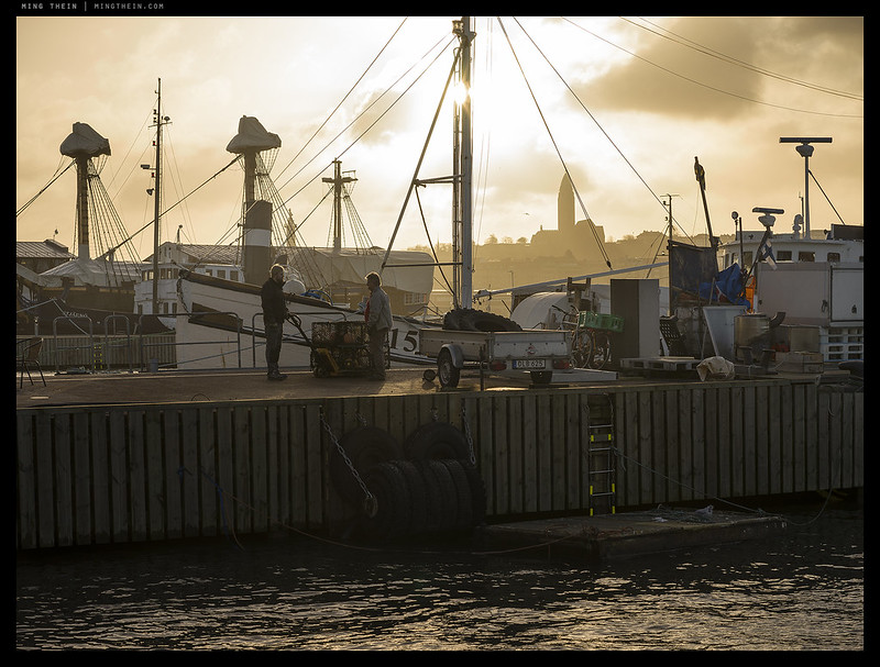
This set has had a little sitting time – shot in March, just about on the cusp of spring. I was in Gothenburg for Hasselblad-related things. The usual hotel near the office was booked out, which I initially resented, but it did give me the pleasure of a nice walk of a couple of kilometres down the waterfront from the hotel to the office and back. Living in the tropics, you really miss the seasons – the whole year passes pretty much the same, with some variations in precipitation as about the only clues as to which month you’re in. It’s strange, but there’s definitely pleasure in getting such a strong feeling from your environment that change is about to happen – you can see the brilliant sunshine and warmth trying to break through slightly more each day and chase the vestiges of winter misery away, though there are still moments during the day where you’re not quite sure what season it is (especially towards dusk, if there are clouds). What was that old saying again – we always want what we can’t have…MT

This series was shot with a Hasselblad X1D and 90mm lens, and post processed with Photoshop and Lightroom Workflow III. Roam vicariously with T1: Travel Photography. and the How to See series.

[Read more…]

Repost: Titling and Storytelling

AB0001018 copy

I’ve always believed a strong image should be able to stand on its own without a title – after all, sometimes images and titles get separated (quite often, actually) – and if it isn’t self-explanatory to some degree without it, then the image itself isn’t clear. However, a good title certainly enhances impact of an image; it can explain, direct, add another layer of meaning, put into context, force the thoughts of the audience in a certain direction, create contrast or tension between perceptual reality and actual reality (visual content vs asserted content or vice versa) or merely serve as an easy method of reference to an image. I’ve frequently been asked how I pick a title for my images; today’s essay explores that in a bit more detail. There really isn’t a lot of science in it, though a large vocabulary probably helps, as does a ready store of cultural references. Firstly, I don’t think choosing – or perhaps more appropriately, creating a title can be entirely spontaneous and retrospective. In fact, it really all boils down to the fourth important thing.

[Read more…]

Photoessay: Singapore snippets

H51-B0012542 copy
Trapped in an order only an outsider can see

Like the Prague Singles, there are those few images at the end of the post-trip or post-shoot curation that really don’t fit into any common category or curation – yet for some reason or other, an emotional attachment has developed and you’re loath to throw them away. They become your albatrosses; probably of no significance to anybody else other than the imaginator. Why? Because there’s a story there that’s triggered a memory, your imagination, or some flight of whimsical fancy; it’s incongruous, unexpected and fleeting. Titles are necessary. MT

This series was shot with a Hasselblad H5D-50C and H6D-50C, various lenses and post processed with Photoshop and Lightroom Workflow III.

[Read more…]