Popular reactions to art

_3503916 copy

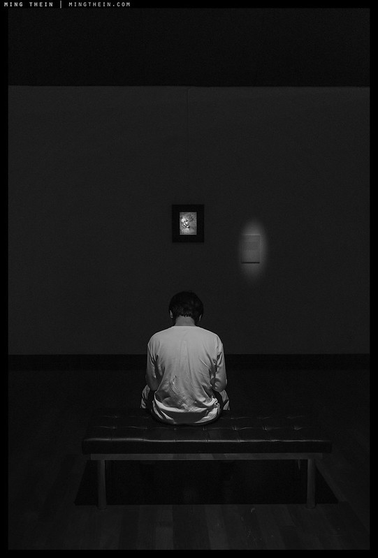
A few months back, the touring Leonardo Da Vinci reproduction exhibition “Opera Omnia” made a stop in Kuala Lumpur. Whilst obviously not the originals, 17 decent reproductions were made on transparent canvas and backlit to simulate the experience of viewing a well-lit painting as closely as possible. I say ‘decent’ because the method was quite clever, but close up some of the the reproductions clearly lacked the print resolution required to really capture the subtlety of the originals – both Da Vinci’s own extremely fine brushstrokes on areas such as hair, but also the ageing and craquelure that’s a large part of the experience. Obviously, the “3D-ness” of real paint were not reproduced, though I suspect with a little less diffusion on the light used for the initial reproduction, some shadows of surface texture might have been captured. Interestingly, even behind barriers, glass, and at a greater distance – the originals somehow feel much more textural than the reproductions. But I digress – this is not so much about the reproduction method as more general commentary on the public and the way art is seen/appreciated/interpreted in general.

[Read more…]

Repost: Derivative works and photography

IMG_4128b copy
Influenced by the architect? Surely. Created by him? About as much as it was created by Apple, because it was shot on an iPhone.

I originally wanted to call this article ‘is anything truly original?’ – however, I think that’s the concluding question I’d like to leave the reader with rather than the opening one. There has been a lot of debate recently – both in the comments here, offline amongst my usual correspondents and in various places on the internet about why a) photography is perhaps not perceived as ‘highly valued’ as other art forms; b) obviously derivative works and the creative value – or lack of – contained therein; and the greater question of whether c) the medium as a legitimate creative art form rather than merely a recording/ documentary one. Perhaps the biggest question is in the title: ‘but is it art?’

[Read more…]

Creative integrity – or, the Struggling Artist Myth explained

H51-B0006603 copy

For the past six years, I’ve shot for pay full time, and occasionally for the better part of the preceding ten years before that. During the last six, the proportion of images of any sort shot with my own creative vision as primary motivation vs those shot with somebody else’s – i.e. for a client or as part of a commercial assignment – has swung from 100-0 to perhaps 5-95. This is expected, and both good and bad. It’s what actually had me stumped in my early pro days: every time I met a successful or established photographer, they almost never had a camera with them – or if they saw something spontaneous, they’d use their phone to shoot it. I wondered why, especially given their access to ‘better’. I think I know the answer to this, and to be honest: I’m not sure I or anybody else is going to like it. Read on if you dare.

[Read more…]

Subconscious associations – or titling, redux

[Image removed – Société des Auteurs dans les arts graphiques et plastiques does not permit Magritte’s work to be used for editorial or educational purposes, but you can still google it]. 
The Empire of Light

The repost of the titling article a couple of days back was a deliberate choice to set you up for today’s somewhat more abstract and surrealist discussion. I was recently re-looking at the way Rene Magritte handled day-night transitions or zones in the same painting to see if there were any ideas there which could be translated to photography in a beyond-literal way, specifically inspired by the above painting. It’s one of my favourites for several reasons. There are physical elements which I personally find appealing, such as the fluffy clouds and the heavy, tonally-rich shadow areas; it’s non-literal in that the image shown is actually impossible to see in reality given the physical constraints of the world; and finally, the use of colour to split the mood of the painting so decisively in two (relaxing, safe, pleasant above, slightly sinister and potentially dangerous below) – yet maintain a complimentary color palette and aesthetic that still tricks the audience into believing it’s physically plausible. I think the implied continuation of the scene outside the edges of the painting (especially at the right  – no neat cut points here!) contributes very strongly to this. Actually, all of the above is true and not true: there are several paintings in the series, which Magritte gave the same titles: The Empire of Light. All of them have the same elements, however: fluffy white clouds against a blue sky; a dark, slightly foreboding urban element with a high ambiguity factor at the bottom of the frame, and a single street light. After viewing this and many others of Magritte’s paintings, the real question I’m left asking is usually around the titles: how do they clearly manage to relate to what’s visually present whilst simultaneously neither being literal but giving you the feeling that there’s something philosophically deeper going on? And moreover, how does one learn to title like that?

[Image removed – Société des Auteurs dans les arts graphiques et plastiques does not permit Magritte’s work to be used for editorial or educational purposes, but you can still google it].
The Treachery of Images

The more I look at Magritte’s work (who was also a somewhat less art notorious photographer in his day), the more I believe the titles and the image are inseparable; however, some historical research suggests that he worked in two ways with paintings: either starting from a philosophical idea – which often later got condensed into the title – or he worked completely in reverse, with elements of themes that dominated at certain portions of his life* and then played a sort of parlour game with friends in the same surrealist philosophical circle to try to give the work a name. I personally think is much easier to understand The Treachery of Images than The Empire of Light; in some ways, even though the former is not anywhere as literal, it’s conceptually more straightforward because it was intended to represent the distillation of an idea into a simple visual form, which goes along the lines of:

  1. Every painting or picture, no matter how realistic or good or easily recognisable, is not the original object.
  2. The image presented is a stand in for the original object and merely represents or conjures by association the qualities and physical properties and of that object – an effigy, in effect.
  3. The initial visual impression of the above image is a very literal one, because the image is unambiguous: we see a representation of a pipe, and our brains make the associative leap to assume that it represents the pipe and its physical qualities.
  4. The text then serves to break this association by forcing us to read, notice and comprehend it because it is unusual and out of place (breaking pattern, thus drawing attention to it) in the painting: “This is not a pipe”.
  5. The title of the image could be something literal, like “The pipe”, or something conceptual, like “Illusions”; in this case, the idea behind the image came first, and was refined down to “The Treachery of Images”: in that we can make potentially dangerous mistakes assuming something is, as opposed to something represents.

*Clouds, birds, spherical bells, chess pieces, men in suits, pipes, trees, picture frames, food items etc. – it actually seemed like he was mostly staying within a fairly universally recognisable vocabulary for the time period; this is interesting because use of anything obscure would have greatly increased difficulty of interpretation of the paintings, which were already not exactly literal or straightforward to begin with. We don’t have quite as big a problem with this in photography because we can only represent real objects, which greatly increases recognisability and reduces the potential for misinterpretation/ confusion.

In many ways, The Treachery of Images is a very solid distillation of the conceptual side of Magritte’s images: they aren’t literal, and the elements used represent something – sometimes ideas in  themselves, or historical/personal associations, or something else. But whatever the case is, an apple is never just an apple. The titles exist to both help us through the interpretation (avoiding ‘the treachery’) by giving us a window into Magritte’s thought process, but also to force us to stop, really think about subconscious, almost reflex assumptions about the world – and subsequently look harder.

[Image removed – Société des Auteurs dans les arts graphiques et plastiques does not permit Magritte’s work to be used for editorial or educational purposes, but you can still google it]. 
The Son of Man

Perhaps the most famous of Magritte’s paintings, The Son of Man has a title that feels like it almost carries all of the information necessary to decipher the idea, but not quite; you can feel it tugging at the edges of your brain, but the viewer is still forced to make that final logical leap themselves. My interpretation is a biblical one: the apple represents knowledge and original sin; Eve is no longer in the picture, but her descendant is once again clothed and hiding their shame – the face can represent individualism, identity; a visible face, honesty and openness. (The garb is also typical of what Magritte wore; is he referring to himself?) A hidden face becomes shame or ambiguity or simple untrustworthiness; the obscuring apple is presumably hiding behind knowledge. What throws us out a little here are the visual qualities of the picture: it’s far too ‘clean’ and ‘happy’ with traditionally flattering and ‘good’ light to imply the sort of malice we’d expect from a businessman hiding his face (and implied activities). That lends a sense of hope, I think, which is confirmed by the title: ‘son’ implies this a subsequent (and possibly better) generation.

There is of course no way to know if was thinking all that when he was painting it, or simply set out to make a self-portrait without his face, and saw some apples on the counter – and then presented the painting to his surrealist philosophical circle and they named it after what they saw; it could be that the strong resonance of title with image was the result of the audience, not the creator**.

**Interesting idea: allowing your audience to title an image based on what they see, which may be very different from what you saw or intended at the time of capture.

[Image removed – Société des Auteurs dans les arts graphiques et plastiques does not permit Magritte’s work to be used for editorial or educational purposes, but you can still google it]. 
The Banquet

In a lot of cases, the process must have been quite a lot more iterative than that – the result of a discussion, rather than a straw poll or a single person thinking. I suppose we can think of this as the evolution of a title: the above image is a good example. If I had to guess, it was more like a stream of consciousness and series of associations, which probably went something like this (individual lines representing steps in logical progression):

  • Sun dominates sunset / egg / country estate
  • Evening / power / food / formal – stuffy – official
  • Official event in the evening at formal location…
  • voila: The Banquet!

Having already created singles and series around an idea or theme – I’m going to have to try this second method for a future set of images, with the ultimate goal of combining the two…MT

__________________

Visit the Teaching Store to up your photographic game – including workshop videos, and the individual Email School of Photography. You can also support the site by purchasing from B&H and Amazon – thanks!

We are also on Facebook and there is a curated reader Flickr pool.

Images and content copyright Ming Thein | mingthein.com 2012 onwards. All rights reserved

Photoessay: Shadows and details

H51-B0018442 copy

Texture is shadows, and shadows are texture: at the micro level, surface irregularities are thrown into relief and colors are intensified. This latter effect is an interesting property of raked lighting: since the pits in the surface structure of an object are in shadow, the overall reflected luminosity is lower. However, there are also small portions that appear brighter because some light may reflect off surfaces at precisely the right angle. End result: microcontrast is higher, colors are deeper/richer and textures are made to appear more real (if such a thing is possible). I love old buildings like these because they are perfect subjects for this kind of light: some surfaces are rendered smooth by centuries of paint; others by centuries of wear; and still others show the marks of etching of pollution etc. It’s an interesting study in color, form and texture…MT

This series was shot with a Hasselblad H5D-50C, and H6D-50c, various lenses and post processed with Photoshop and Lightroom Workflow III.

[Read more…]

Artists, creatives and critics

IMG_0243b copy
Positive/creative

Almost everybody falls into one of two categories: creator or consumer. Do you spend more time making content or material, derivative or otherwise, than consuming it? Do you prefer to make or view images? Of the creators, there are positive, derivative and negative. The positives try to advance art, science and and knowledge by providing a point of view or product or device or service that hasn’t existed previously, whilst maybe or maybe not benefitting personally from the provision of said novelty. The line between positive and derivative is a blurry one, and perhaps doesn’t cleanly exist – in my mind, it’s down to whether the creator tries to add some element of originality or not; there’s no such thing as 100% uniqueness or 100% invention from nothing. We cannot create without some base of precedent or inspiration, no matter how remote or seemingly unrelated. But the more remote the connections that are made in the creation of something, the more the creator contributes by joining the dots, making the logical conclusions and helping the rest of us see what we might have missed.

[Read more…]

Photoessay: Motion in Tokyo/ The Idea of Man II

_7R2_DSC3754 copy

I view The Idea of Man project as mostly complete; the story is tight and stylistically consistent. But I’ve been thinking a lot about its sequel in the time since the exhibition; to begin with – is there one at all? Where does one go from the story of the individual finding their place in the world? The answer came to me after some long exposure urban landscape: it’s in community, in groups, in the flow and interaction of individuals. And that idea will be at the core of The Idea of Man II.

[Read more…]

Photoessay: Paradise Lost, part III

B0000193 copy

Today’s images are I think a little darker and sadder than the previous two (part I, part II) – but not quite over the edge into full-blown depression. I see it as being analogous to one of those portraits where we want to enhance the lines on the subject’s face. I can see the final presentation of this series going in waves, with grouping and pacing a mirror image to the way we have different moods depending on the day – though I feel the impact of this particular set is lost in color, and mixing the two is somewhat odd unless the presentation medium is conducive (e.g. separate gallery areas, or sections in a book – but not as a continuous scroll or all at once. The ‘break’ is required to prevent a jarring visual discontinuity. What do you think? MT

This series was shot mostly with a Hasselblad 501CM, CFV-50C digital back, 4/50 C T* and 4/150 CF T* lenses. Postprocessing follows the Monochrome Masterclass workflow.

[Read more…]

Photoessay: Paradise Lost, part II

_8B34724 copy

I’ve been continuing to work on the Paradise Lost project for some time now; at some point I will have to curate a consistent body of work to a theme and declare the thing ‘finished’, but in the meantime I’m still experimenting with the presentation. As mentioned previously, I’m treating this project as an ‘open book’ so you can see what goes into the creation of something like this. My current dilemma is a question of mood: is it a happy retirement, or a sad one, or a melancholic one? Or perhaps somewhere in between the three?

[Read more…]

Photoessay-project WIP: Anatomy of the quotidian

_Q116_L1060002-18 bw bathtime redux copy

Today’s photoessay is something a little different – a work in progress, if you will. An idea occurred to me several months ago: we see the same objects every day, in slightly different light and from slightly different angles. This is what contributes to our overall impressions and memories of the object: it isn’t a single encounter but a series of experiences. I wanted to figure out the best way of translating this visually. There was no question it would have to be a composite of some sort; however, it would also have to be done in a way that would leave the identity of the object clear, but simultaneously indistinct. I played around a bit further with that idea and the concepts of definition and then anatomy arose; taking that one step further, I thought it might be interesting to present these as virtual x rays. It’s a very different approach to my normal photography since I almost never work with composites, and even less with this degree of postprocessing (which I’m happy to cover in a future episode of Weekly PS Workflow if anybody’s interested). I’d be curious to hear your thoughts…MT

This series was with a Leica Q, heavily composited and the final leg done with the Monochrome Masterclass workflow.

[Read more…]