
Primary colors. Nikon D700, 28-300VR.
Here’s a good example of an image that wouldn’t work at all in black and white…to be the subject of an upcoming article! MT
reframing the world one picture at a time
Primary colors. Nikon D700, 28-300VR.
Here’s a good example of an image that wouldn’t work at all in black and white…to be the subject of an upcoming article! MT

What makes this photo identifiable as dawn instead of sunset? Hint: it’s the color. We expect sunsets to be warm, but mornings to be cool and clear.
A series of experiments was done many years ago that showed humans have been conditioned to expect certain things in the way of color: blue ketchup just doesn’t fly, for instance. The theory is that it’s a primeval subconscious response to warn us of danger. Think of it this way: rancid meat looks a certain way, and has a certain color. Even if we can’t smell it – looking at a photograph of vomit or something decomposing makes us go ewwww. Such examples are to be found in nature all the time – think of those brightly colored poisonous beetles, for instance. In fact, the link between color and range (and thus emotion) is so strong that many species mimic the coloring of more dangerous species to warn away predators, but at the same time rely solely on that as protection because they pack no venom or toxicity. (Toxicity is energy-consuming to produce, and in food-scarce environments, you want to waste as little of your nutritional intake as possible producing something that’s only going to help you if you’re eaten – and thus probably going to die anyway.)


A tale of two cities. Shot minutes apart, though. How does the first image make you feel? The second?
How does this relate to photography? Quite simply, when you look at a photograph, how does it make you feel? Ignore the subject for a moment. The remaining emotional response is mostly down to your reaction to the processing: specifically, color. Why do black and white images have that ‘timeless’ or ‘ageless’ quality? Why do they make you feel slightly detached, as you’re an observer but not really part of the scene? It’s all due to color, or in this case, the lack of it. It’s difficult to relate to something if your information or perception on it is limited to tonal information only.

Why does this shot imply richness and juiciness? How would you feel about pale gray steak with red tomatoes, even if it tasted the same?
In fact, if you look through historical photographs and video – you’ll see that each recent era or block of ~10 years in modern history actually has quite distinct color and tonal styles. And looking at this often makes one feel something – nostalgia, hatred, wondering what one was doing with their youth. Early color photos from the 1930s and 40s have that vintage look, for instance.

To me, this screams classical photojournalism – because of the contrast, the tonality, and the lack of color. Early photographers didn’t purposely go for that look – they learned to work with it because of the limitations of darkroom chemistry.
A lot of modern photography software capitalizes on this. Instagram and all of those software filter packages are a good example – hell, even Lomography to some extent – they let you instantly create a feeling through a combination of color fiddling and contrast manipulation. There’s a reason why a photo from a Lomo or Instagram looks like a vintage hippy polaroid: it’s because the white balance was shifted warmer by several notches, the saturation decreased slightly, the contrast decreased a lot, and the relative luminance and hue of the red and yellow channels shifted. And there’s probably some grain and gaussian blur in the mix, too. Try it yourself in Photoshop, if you don’t believe me.

Cool mountain. Nikon D700, Zeiss ZF.2 2/100 Makro-Planar
The point is, polaroids looked that way because of the chemical process of the day: not because they wanted them to look that way. I’m pretty sure the engineers there were chasing perfect color, too. The upshot of all of this is that a modern photograph processed that way invokes memories of the polaroid era, because that’s how most social images looked then.

Mmm, natural green freshness.
Most humans respond in similar ways to color, namely:
Red – danger, warning, attention;
Blue – cool, calming, relaxing;
Yellow – warm, friendly, open;
Green – natural, fresh;
Black – mysterious, sinister, classic, premium, heavy;
White – pure, open, light, honest, clean
Gray – apathy

Multiple light sources can be confusing as hell, but almost always signal ‘party!’
Simply put, there’s a reason why most Ferraris are red, and most hospitals are white.
How does this help you as a photographer?
Actually, it’s fairly simple. Color enters your image everywhere, but makes an impact in at least two major ways. The first is if you’ve got one dominant color in the scene that registers on the subconscious of the viewer even before they figure out what the subject is; it can be the color of the backdrop, for instance. A more subtle way is the ambient light temperature – for instance, a warmer white balance setting will result in a shift towards the red and yellow channels; this in turn imparts the ambient light with a particular quality and tone.

Warmth. The ambient WB was shifted further away from the primary light source (the flame) to preserve the warm color.
The second major way is through contrast: if you’ve got a subject of one color against a backdrop of another completely opposite color (red and green or blue and yellow, for instance) then it’ll stand out because it’s the only thing in the scene that is visually discordant. It’s a good thing, in this case, because it draws your eye to the subject and lets the background serve as a stage – which is the way it should be.

Why does my subject stand out? It’s a different color to the background, of course.
But what if your scene has no dominant color, or is very washed out or low in saturation? Do what the cinematographers have been doing for years, and either impart a global tint as described above – you can easily do this if you shoot raw by shifting the white balance; lower color temperatures that what is accurate are cooler and bluer, and vice versa for higher color temperatures. The other alternative is to use a filter over your lens, or color the light – the latter obviously assumes you’ve got some control over your lighting, though. By far the easiest way to shift color and not land up with odd hues due to the nature of color addition and subtraction is to adjust your white balance.

KLCC dawn, color slightly shifted. Nikon D700, 28-300VR
One final comment: you need to start with an accurate white balance before you shift the color temperature. This is so you don’t land up with strange colors due to shifts along the green to magenta axis (white balance and color temperature affects only blue to orange/red). Also, remember not to overdo the saturation: shifting the white balance can cause other channels to blow, even if the original appeared to be correctly exposed. And over saturated images just look crude, frankly.
And on that note, I’m going to break until the next topic: chasing perfect color, and white balance myths. MT

Funky diner colors. Sometimes, your ambient light is close to exactly what you want – and all you have to worry about is color accuracy. Nikon D700, 85/1.4 G
____________
Visit our Teaching Store to up your photographic game – including Photoshop Workflow DVDs and customized Email School of Photography; or go mobile with the Photography Compendium for iPad. You can also get your gear from B&H and Amazon. Prices are the same as normal, however a small portion of your purchase value is referred back to me. Thanks!
Don’t forget to like us on Facebook and join the reader Flickr group!

Images and content copyright Ming Thein | mingthein.com 2012 onwards. All rights reserved

Pisco sour sorbet, poached melon and a jelly I don’t remember decorated with local nuts and flowers. By chef Pedro Miguel Schiaffino of Ristorante Malabar, Lima, Peru. Leica D-Lux 5 and two LED panels.*
*One of the reasons I switched to LED panels for food photography is the matter of dessert: there’s no way you can photograph ice cream with halogens or flashes without getting more than say three or four frames before visible melting sets in. And this obviously isn’t good, though a hint of melting actually helps the viewer know that it is in fact ice cream, and not say, mashed potatoes masquerading as ice cream.** One of the most refreshing, palate-cleansing deserts I’ve eaten – a perk of running a food photography workshop in conjunction with his culinary class…
**Food photography in-joke: mashed potato is actually quite frequently used to substitute for ice cream, for this very reason. MT
Some experiments into how the same subject can be simultaneously not the same. A bit of contemplative photography while on vacation. Or perhaps I just like water and waves for the same reasons I like clouds. Sometimes, we don’t need to think too much about it – just shoot. I need to go on holiday more often; but then again, don’t we all? MT
This series shot with an Olympus E-PM1 Pen Mini at Tanjung Jara, on the east coast of peninsular Malaysia.


Taxi drivers checking out a new ride, new arrival or old friend passing by a rank. Leica M9-P, 50/2.5 Summarit-M

Prague sunset by the river. Olympus E-PM1 Pen Mini, ZD 45/1.8

Last year’s lens surprise of the year was the Olympus M.Zuiko Digital ZD 45mm f1.8 MSC – it’s a lens that was announced with the E-P3, E-PL3 and E-PM1, seems fairly ordinary and innocuous on spec, but yet delivers in boatloads. It’s both cheap and expensive at the same time; let me explain why. Most conventional SLR mount 50/1.8 lenses go for $100-150 or thereabouts. This lens is closer to $300, and it’s all silver-painted plastic except for the mount – to be honest, it feels kinda cheap. That’s expensive. But, it doesn’t use a conventional double-Gauss optical design:

Image from Olympus. Purple bits are E-HR lenses, whatever that means. I suspect it’s ED glass or something similar. I certainly don’t see any purple elements inside my lens 😛
Whoa, what’s this? 9 elements in 8 groups? Not so simple. I suspect the reason Olympus chose this optical design was primarily due to the very short back flange distance of Micro Four Thirds; double Gauss designs work well if the back focus distance is close to the focal length, which it is for most SLRs. Changing the optical design to keep the lens compact introduces all sorts of other issues on its own, including corrections for the various complex optical aberrations that occur once a lens design becomes asymmetric.
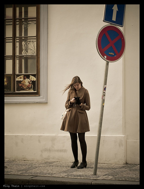
Waiting for that text. Olympus E-PM1 Pen Mini, ZD 45/1.8
Secondly, it has a very fast coreless focusing motor – Olympus brands these lenses as ‘MSC’, which means you won’t hear the focusing motor working while recording videos – a nice touch. It’s also blazingly fast, at least with the current generation of Olympus M4/3 bodies. Sadly, like all of the other M4/3 lenses (except the 12/2), there’s no full time focus override; it’s fly-by-wire only and you have to put the camera into MF mode on the body before the ring does anything. Still, it’s nicely damped if a little dead-feeling.

Night in the Malastranska, Prague. Olympus E-PM1 Pen Mini, ZD 45/1.8
But never mind all that, how does it perform? In a word, brilliantly. It’s one of my favorite lenses for Micro Four Thirds. If I had to describe it in a word, it would be ‘transparent’. That’s probably a good thing for an optical device; however, what I mean is that the lens itself doesn’t impose any of its own optical quirks or peccadilloes on the image; it does its job moving light from the subject to the sensor, and then gets out of the way. It delivers sharpness across the entire frame wide open at f1.8; there is some slight improvement at 2.8, but it isn’t really necessary to stop down – perhaps this may be different on the higher density 16MP sensor of the OM-D, however.

All about the hair. Olympus E-PM1 Pen Mini, ZD 45/1.8
Fringing is almost entirely absent, as is longitudinal chromatic aberration; a sign that the optical designers have done their job very well indeed, and the lens is working well with the sensor. (In case you’re wondering about in-camera CA removal, I’m not shooting JPEG and the RAW files are run through ACR like the rest of my workflow – there’s no special treatment unless Olympus is doing something with the RAW files.)

Echoes of red. Olympus E-PM1 Pen Mini, ZD 45/1.8
The lens is contrasty, but not that contrasty; it strikes a nice balance between sufficient global contrast and maintaining the microcontrast that is so important to preserving fine detail structures. In fact, I prefer lenses with lower macro contrast for digital use as they help to maximize preservation of dynamic range; this is especially important with smaller sensors that have lower dynamic range, like those used in M4/3 cameras.

Ninja demolition. Olympus E-PM1 Pen Mini, ZD 45/1.8
Color reproduction is on the warmish side of neutral. No yellow casts like I see with Sigma and Tamron lenses, but a pleasing warm hue shift. Bokeh is also neutral to good; there are times when separation between subject and background is a little harsh – typically when the subject is fairly close to the background – but it’s also pretty darn good under ideal conditions.

Mirrors. Olympus E-PM1 Pen Mini, ZD 45/1.8
Although it ‘only’ focuses down to 0.5m, it’s worth remembering that on Micro Four Thirds, 45mm is really a 90mm FOV, and there no non-macro lenses for full frame cameras that focus this close – it’s 0.8m if you’re lucky, or 1m if you’re using a rangefinder. The lens can be used handheld at arms’ length – i.e. live view style – and that’s how I’ve been using it so far; however, you’ll need to keep your shutter speeds up, because frankly the in-body stabilization isn’t that effective. I suppose if you were using this on the OM-D it’d be a different story as the built in EVF would let you get a bit more stability by bracing the camera against your eye.

Dusk and the sign. Olympus E-PM1 Pen Mini, ZD 45/1.8
The 45/1.8 makes up part of my M4/3 ‘trinity’ – the 12/2 and 20/1.7 being the other two, though I might replace both with the new Voigtlander 17.5/0.95 (35mm equivalent, fast and versatile – though I prefer 28, and sadly there are very few fast 28mms). It forms a great lightweight travel kit which is still capable of delivering outstanding optical quality. It also works very well as a secondary camera in conjunction with something else; at the end of last year, I shot in Europe with a Leica M9-P, 28 and 50mm lenses as my primary body, with the Pen Mini and 45/1.8 in a coat pocket for those times I needed a little extra reach – made a great compliment to the rangefinder.

Graffiti. Olympus E-PM1 Pen Mini, ZD 45/1.8
Even on the slightly higher density OM-D sensor, this lens is a gem; sharpness doesn’t seem to be compromised anywhere, but there is a very slight veiling flare that goes away about half a stop in. It has a lightness and transparency (lower macro contrast, but higher micro contrast perhaps?) that I don’t see with the 12/2 or 20/1.7, and it’s something that makes the way it renders very natural and appealing.

A classical portrait, second version. OM-D, 45/1.8. The first version is here
Are there any negatives? Well, yes. At the price, you can’t expect fantastic build quality. Frankly, it feels about on par with the kit lens; Olympus chose to put all of the production money into optics rather than cosmetics, which is a decision I can agree with. However, the leaves the lens feeling just a tiny bit fragile; the plastics don’t feel that thick or robust, and that little blanking ring on the front (ostensibly to cover the hood mount threads) doesn’t really stay in place securely, and isn’t that well made, either.
Still, all that aside, this is a highly recommended lens for Micro Four Thirds users. It isn’t good enough that I’d go out and buy a Micro Four Thirds camera just for this lens alone, but then again the thought of having a fast portrait 90mm equivalent in a pocket is quite appealing, and the cost of a Pen Mini plus this lens is much cheaper than many full frame lens options on their own. Of course, you do get the DOF profile of a 45mm lens, not an 85 or 90mm lens, so don’t expect crazy thin DOF. There’s adequate separation, but true bokeh enthusiasts will probably have to wait for the upcoming ZD 75/1.8 – a lens which I’m pretty excited about, actually. MT

Sunset in the city. Olympus E-PM1 Pen Mini, ZD 45/1.8
Get the Olympus ZD 45/1.8 here from B&H or Amazon.
____________
Visit our Teaching Store to up your photographic game – including Photoshop Workflow DVDs and customized Email School of Photography; or go mobile with the Photography Compendium for iPad. You can also get your gear from B&H and Amazon. Prices are the same as normal, however a small portion of your purchase value is referred back to me. Thanks!
Don’t forget to like us on Facebook and join the reader Flickr group!
Images and content copyright Ming Thein | mingthein.com 2012 onwards. All rights reserved

Outtake from a recent architectural assignment. Look out for a future On Assignment post about shooting buildings. Leica D-Lux 5.
Although most architectural images are shown with nothing but the building, in a vaguely abstracted product-shot-kind-of-way, I personally find the images I like best are the ones which have some human scale or context included; it’s otherwise tough to gauge scale of the building, how it fits into its environment, and more importantly, how does the end user perceive it? Do they use the intended main entrances and traffic routes, or like water, do people find a path of lower resistance? Are there flow routes that the designers didn’t envision, i.e. connections between two back streets? Does the vehicular circulation work? How does the facade look from a human perspective? Once again, it comes back down to understanding something about your subject before you shoot it. MT
One of the more unusual watches I’ve photographed, the Immortal Dragon is both immaculately finished on the dial and the movement – the watch has both serious horological pedigree (being from the atelier of highly respected independent watchmaker Peter Speake-Marin and some pretty unique aesthetics. The dial was hand-engraved in relief by master engraver Kees Engelberts, and the watch is a piece unique destined for the Asian market in honor of the current lunar year of the dragon. MT
This series shot with a Nikon D700, AFS 60/2.8 G Micro, and Zeiss ZM 2.8/28 Biogon with Leica M-F adaptor and multiple speedlights.


Fear of straying off the beaten path. Nikon D3, 24-70/2.8
I’m in the early planning stages of a small (3-5 participant) private workshop in Tokyo this October (2012). Dates aren’t fixed yet, that’ll depend on the participants’ schedules. Details as follows:
– 3 days, based in Tokyo (but I’m not ruling out quick side trips to appreciate the autumn foliage)
– Two days of shooting – covering whatever specific topics the participants would like to learn, but I have some ideas (travel, landscape, photojournalism and making sequences of images into stories, learning composition fundamentals with compacts, night photography etc.)
– One day of editing/ selecting images and photoshop post-processing
Depending on the number of participants, costs will range from US$1,300 to US$2,200; this is for tuition only and assumes you live in Tokyo, or can easily get there. Would be ideal for Asian residents, as it’s just a short commute.
Please drop me an email or leave a comment below if you’re interested.
Thanks! MT

Base jumping off the KL Tower. There are no do-overs for either the shot or the participants. Nikon D200, AI-P 500/4
Suppose you had one opportunity to get the shot: what do you do? The obvious answer is go for broke; who cares if it’s slightly overexposed, out of focus or the framing is a little off. Maradona is probably only going to use the ‘hand of god’ once; the millennium is only going to roll around once in your lifetime. Bigfoot will probably only appear once, and only in out of focus or foggy areas*.
That’s one end of the spectrum: it’s all about the content rather than the execution.

Benzinger Skeleton. Full control of everything, full repeatability. The second, third, fourth and fifth shots would look exactly the same.
The opposite end would be fine art still life: any one of the aforementioned photographic sloppinesses would probably get you thrown out of the gallery, unless perhaps you were very, very good at explaining why out of focus images represent the current zeitgeist of society, how rushing around and achieving complete form and ‘just getting it done’ rather than doing it well – quantity over quality – are also paradigms of modern corporate living.

What’s this? A situation in the middle: you can anticipate what’s going to happen and be prepared, but you don’t get a do-over. You should be able to get a perfect result with practice.
Enough sarcasm. Basically, if you’re going to create a still life, you’d better damn well be in control of the elements, or it just makes you look sloppy and incompetent as a photographer. There’s no way you can excuse compositional errors, slanted horizons, overexposure or things intruding into the edges of the frame. Studio commercial photography also falls into this category; it’s 100% controlled, and if you can’t get your image right when there isn’t anything left to chance – and the shot is repeatable – then you should probably hang up your camera.

It wouldn’t have worked without the man. Schonbrunn Palace, Vienna. Leica M9-P, 28/2.8 ASPH
And that’s where the dilemma comes in: for photography that isn’t clearly at one end of the spectrum or the other, where do you draw the line of acceptability? If there is no expectation to create perfection, is there any necessity? In fact, if the expectation is of something slightly imperfect – to capture the chaos of reality – then perhaps perfection would actually weaken the impact of the overall image.

I like the lyricism and movement in this image; in fact, nothing is perfect. It was underexposed because the meter gets fooled by backlit situations so I went manual and got the exposure slightly wrong; then the limitations of my equipment meant motion blur in the subject was a certainty, so I decided to work with it; finally, none of the verticals are straight – it bothers the perfectionist in me, but I bet you it wasn’t the first thing you noticed about the image. Malastranska, Prague. Leica M9-P, 28/2.8 ASPH
That last point isn’t immediately obvious. In fact, it’s quite counterintuitive; I was only made aware of it because I personally tend to drift towards the technical perfection end of the spectrum, and various clients have commented that my images look a little too perfect in some ways, especially for photojournalistic work. For studio photography, on the other hand, my clients love the attention to detail.

If This Looks Too Perfect, That’s Because It Was Staged. Artfully constructed scene for a promotional video. Nikon D700, Zeiss ZF 1.4/85 Planar
A year or two ago, I would have thought that the ideal combination would be to nail content, composition and the technical aspects of the exposure to produce a perfect image; however, this is not only nearly impossible to do, but somehow also results in slightly lifeless images. The soul is missing – or perhaps it’s not so much soul per se as humanity represented by the slight imperfections which impart the character of the photographer onto his or her image.

More lyricism. Malastranska, Prague. Leica M9-P, 28/2.8 ASPH
Perhaps I’m just confusing myself with the philosophy now, because this is my current photographic worldview:
1. We strive for perfect images.
2. Technical perfection isn’t perfection per se, because that slight bit of imperfection humanizes an image and gives it personality.
3. This means that we must have skill and ability to achieve technical and compositional perfection, even under spontaneous circumstances.
4. However, we need to have even more control than that, because we need to have the ability to add imperfection at will.
5. Go out and create, with this brief of perfect imperfection in mind.

Just your average slice of life. Olympus E-PM1 Pen Mini, Panasonic 20/1.7 G
I hear questions from the back of the room. Does this apply to every situation? More importantly, how much imperfection should we apply?
The answer to the first is obviously not; if you can do this in a situation where you have little or no control over the subject – think war zone photojournalism, for instance – that probably makes you one step removed from God, and a clear notch above the great PJs like Capa, HC-B et. al. Remember from the Magnum Contact Sheets book, even they had to work the scene a bit to get the final composition they wanted.

The foot. The one aberration in this abstract urbanscape is actually to me what makes the image. Nikon D800, AFS 24/1.4 G
The answer to the second is nowhere near as clear cut. And frankly, I have no idea how much is too little, how much is enough, and how much is too much. The only way to determine the answer to this conclusively is to experiment, and get your work out there and opined-upon. Modern Japanese photographers tend to be at the very haphazard end of the spectrum – some of their work seems almost random, albeit very carefully constructed random – and the other end I suppose are the environmental portraitists who bring lights and modifiers and everything else with them even into the middle of conflict areas.
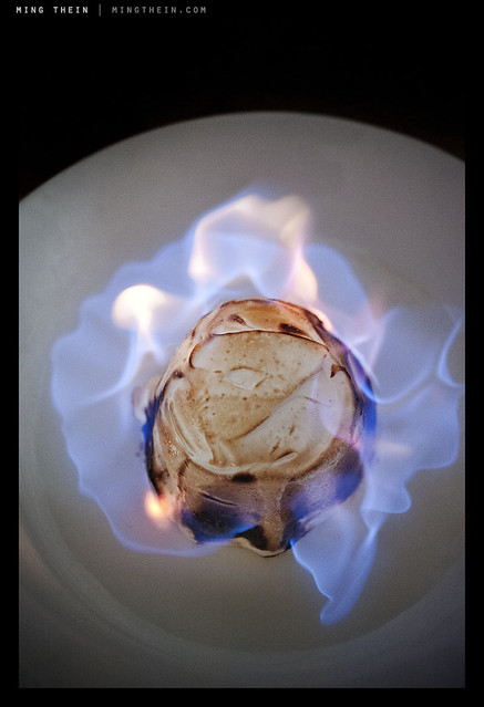
Flambe. Repeatable, but not controllable. You can set up the shot and do it again, but you can’t control what the flames are going to do. And this is the interesting thing that gives a little variation and makes each shot different. Seascapes are another good example. Nikon D700, AFS 60/2.8 G Micro
Personally, I’m going for something in the middle; but before I even get there, I need to shoot more – to have full intuitive control over my camera so that whatever adjustments I make come to me as second nature. And at this point something has to be said about good cameras, bad cameras, and too many cameras; good cameras are intuitive to use and require little training or practice to master. They do what you want them to, nothing more and nothing less. Bad cameras are ones that you never feel fully in control of, no matter how much practice you have. And too many cameras is just that: if you have too many cameras, you’re bound to eventually forget which button does what. And that could cost you at the most critical moment. This is why I’ll continue to use my D700 for reportage assignments until I’m fully comfortable with the D800; I know exactly habit will do under every situation, born of seventy thousand frames of experimentation – not counting the fifty thousand I shot with the D3, which is pretty much the same camera. MT
*Did anybody get the Futurama reference?

Would the burger be as appetizing without that juicy pickled onion marmalade peeking out? Probably not. Nikon D700, AFS 60/2.8 G Micro
____________
Visit our Teaching Store to up your photographic game – including Photoshop Workflow DVDs and customized Email School of Photography; or go mobile with the Photography Compendium for iPad. You can also get your gear from B&H and Amazon. Prices are the same as normal, however a small portion of your purchase value is referred back to me. Thanks!
Don’t forget to like us on Facebook and join the reader Flickr group!
Images and content copyright Ming Thein | mingthein.com 2012 onwards. All rights reserved
Behind the scenes videos




If you enjoyed the content, please consider  -ing or subscribing - thanks for your support!

