Photoessay: This little piggy

At Chinese weddings all over the world, the groom traditionally has to bring an offering of a roast suckling pig to the house of his bride-to-be on the morning of the tea ceremony, after which the couple is considered officially married by the community. I recently attended the wedding of one of my cousins – how could one not bring a camera (or two)?

This series shot with a Nikon D700, D3x, 24/1.4 G and 85/1.4 G lenses. You’re probably wondering why I didn’t use the D800; I didn’t have an AF solution at this point, and it isn’t really suited to being a photojournalism camera. The D3x had the 24/1.4 on it and the 85 was on the D700. MT

_048_7062350 copy

_047_3X00414 copy

_049_7062359 copy

_050_3X00426 copy

_051_3X00437 copy

_053_7062367 copy

_052_3X00441 copy

The inexact science of color and emotion

_7037890 copy
What makes this photo identifiable as dawn instead of sunset? Hint: it’s the color. We expect sunsets to be warm, but mornings to be cool and clear.

A series of experiments was done many years ago that showed humans have been conditioned to expect certain things in the way of color: blue ketchup just doesn’t fly, for instance. The theory is that it’s a primeval subconscious response to warn us of danger. Think of it this way: rancid meat looks a certain way, and has a certain color. Even if we can’t smell it – looking at a photograph of vomit or something decomposing makes us go ewwww. Such examples are to be found in nature all the time – think of those brightly colored poisonous beetles, for instance. In fact, the link between color and range (and thus emotion) is so strong that many species mimic the coloring of more dangerous species to warn away predators, but at the same time rely solely on that as protection because they pack no venom or toxicity. (Toxicity is energy-consuming to produce, and in food-scarce environments, you want to waste as little of your nutritional intake as possible producing something that’s only going to help you if you’re eaten – and thus probably going to die anyway.)

_7049521 copy

_7049526 copy

A tale of two cities. Shot minutes apart, though. How does the first image make you feel? The second?

How does this relate to photography? Quite simply, when you look at a photograph, how does it make you feel? Ignore the subject for a moment. The remaining emotional response is mostly down to your reaction to the processing: specifically, color. Why do black and white images have that ‘timeless’ or ‘ageless’ quality? Why do they make you feel slightly detached, as you’re an observer but not really part of the scene? It’s all due to color, or in this case, the lack of it. It’s difficult to relate to something if your information or perception on it is limited to tonal information only.

_7060545 copy
Why does this shot imply richness and juiciness? How would you feel about pale gray steak with red tomatoes, even if it tasted the same?

In fact, if you look through historical photographs and video – you’ll see that each recent era or block of ~10 years in modern history actually has quite distinct color and tonal styles. And looking at this often makes one feel something – nostalgia, hatred, wondering what one was doing with their youth. Early color photos from the 1930s and 40s have that vintage look, for instance.

_7036896bw copy
To me, this screams classical photojournalism – because of the contrast, the tonality, and the lack of color. Early photographers didn’t purposely go for that look – they learned to work with it because of the limitations of darkroom chemistry.

A lot of modern photography software capitalizes on this. Instagram and all of those software filter packages are a good example – hell, even Lomography to some extent – they let you instantly create a feeling through a combination of color fiddling and contrast manipulation. There’s a reason why a photo from a Lomo or Instagram looks like a vintage hippy polaroid: it’s because the white balance was shifted warmer by several notches, the saturation decreased slightly, the contrast decreased a lot, and the relative luminance and hue of the red and yellow channels shifted. And there’s probably some grain and gaussian blur in the mix, too. Try it yourself in Photoshop, if you don’t believe me.

_7014252 copy
Cool mountain. Nikon D700, Zeiss ZF.2 2/100 Makro-Planar

The point is, polaroids looked that way because of the chemical process of the day: not because they wanted them to look that way. I’m pretty sure the engineers there were chasing perfect color, too. The upshot of all of this is that a modern photograph processed that way invokes memories of the polaroid era, because that’s how most social images looked then.

_7013736 copy
Mmm, natural green freshness.

Most humans respond in similar ways to color, namely:
Red – danger, warning, attention;
Blue – cool, calming, relaxing;
Yellow – warm, friendly, open;
Green – natural, fresh;
Black – mysterious, sinister, classic, premium, heavy;
White – pure, open, light, honest, clean
Gray – apathy

_7035572 copy
Multiple light sources can be confusing as hell, but almost always signal ‘party!’

Simply put, there’s a reason why most Ferraris are red, and most hospitals are white.

How does this help you as a photographer?

Actually, it’s fairly simple. Color enters your image everywhere, but makes an impact in at least two major ways. The first is if you’ve got one dominant color in the scene that registers on the subconscious of the viewer even before they figure out what the subject is; it can be the color of the backdrop, for instance. A more subtle way is the ambient light temperature – for instance, a warmer white balance setting will result in a shift towards the red and yellow channels; this in turn imparts the ambient light with a particular quality and tone.

_5100_DSC1276 copy
Warmth. The ambient WB was shifted further away from the primary light source (the flame) to preserve the warm color.

The second major way is through contrast: if you’ve got a subject of one color against a backdrop of another completely opposite color (red and green or blue and yellow, for instance) then it’ll stand out because it’s the only thing in the scene that is visually discordant. It’s a good thing, in this case, because it draws your eye to the subject and lets the background serve as a stage – which is the way it should be.

_7037150 copy
Why does my subject stand out? It’s a different color to the background, of course.

But what if your scene has no dominant color, or is very washed out or low in saturation? Do what the cinematographers have been doing for years, and either impart a global tint as described above – you can easily do this if you shoot raw by shifting the white balance; lower color temperatures that what is accurate are cooler and bluer, and vice versa for higher color temperatures. The other alternative is to use a filter over your lens, or color the light – the latter obviously assumes you’ve got some control over your lighting, though. By far the easiest way to shift color and not land up with odd hues due to the nature of color addition and subtraction is to adjust your white balance.

_7049662 copy
KLCC dawn, color slightly shifted. Nikon D700, 28-300VR

One final comment: you need to start with an accurate white balance before you shift the color temperature. This is so you don’t land up with strange colors due to shifts along the green to magenta axis (white balance and color temperature affects only blue to orange/red). Also, remember not to overdo the saturation: shifting the white balance can cause other channels to blow, even if the original appeared to be correctly exposed. And over saturated images just look crude, frankly.

And on that note, I’m going to break until the next topic: chasing perfect color, and white balance myths. MT

_7029367 copy
Funky diner colors. Sometimes, your ambient light is close to exactly what you want – and all you have to worry about is color accuracy. Nikon D700, 85/1.4 G

____________

Visit our Teaching Store to up your photographic game – including Photoshop Workflow DVDs and customized Email School of Photography; or go mobile with the Photography Compendium for iPad. You can also get your gear from B&H and Amazon. Prices are the same as normal, however a small portion of your purchase value is referred back to me. Thanks!

Don’t forget to like us on Facebook and join the reader Flickr group!

appstorebadge

Images and content copyright Ming Thein | mingthein.com 2012 onwards. All rights reserved

Photoessay: A study of wave action

Some experiments into how the same subject can be simultaneously not the same. A bit of contemplative photography while on vacation. Or perhaps I just like water and waves for the same reasons I like clouds. Sometimes, we don’t need to think too much about it – just shoot. I need to go on holiday more often; but then again, don’t we all? MT

This series shot with an Olympus E-PM1 Pen Mini at Tanjung Jara, on the east coast of peninsular Malaysia.

_PM08131 copy

_PM08126 copy

_PM08124 copy

_PM08116bw copy

_PM08094 copy

_PM08088 copy

_PM08128bw copy

Photoessay: The Speake-Marin Immortal Dragon

One of the more unusual watches I’ve photographed, the Immortal Dragon is both immaculately finished on the dial and the movement – the watch has both serious horological pedigree (being from the atelier of highly respected independent watchmaker Peter Speake-Marin and some pretty unique aesthetics. The dial was hand-engraved in relief by master engraver Kees Engelberts, and the watch is a piece unique destined for the Asian market in honor of the current lunar year of the dragon. MT

This series shot with a Nikon D700, AFS 60/2.8 G Micro, and Zeiss ZM 2.8/28 Biogon with Leica M-F adaptor and multiple speedlights.

_7055995 copy

_7055968 copy

_7055992 copy

_7055950 copy

_7055834 copy

_7055766 copy

_7055925 copy

Balancing content and technical perfection

_M224835 copy.jpg
Base jumping off the KL Tower. There are no do-overs for either the shot or the participants. Nikon D200, AI-P 500/4

Suppose you had one opportunity to get the shot: what do you do? The obvious answer is go for broke; who cares if it’s slightly overexposed, out of focus or the framing is a little off. Maradona is probably only going to use the ‘hand of god’ once; the millennium is only going to roll around once in your lifetime. Bigfoot will probably only appear once, and only in out of focus or foggy areas*.

That’s one end of the spectrum: it’s all about the content rather than the execution.

_7045452 copy
Benzinger Skeleton. Full control of everything, full repeatability. The second, third, fourth and fifth shots would look exactly the same.

The opposite end would be fine art still life: any one of the aforementioned photographic sloppinesses would probably get you thrown out of the gallery, unless perhaps you were very, very good at explaining why out of focus images represent the current zeitgeist of society, how rushing around and achieving complete form and ‘just getting it done’ rather than doing it well – quantity over quality – are also paradigms of modern corporate living.

_MT98674bw copy.jpg
What’s this? A situation in the middle: you can anticipate what’s going to happen and be prepared, but you don’t get a do-over. You should be able to get a perfect result with practice.

Enough sarcasm. Basically, if you’re going to create a still life, you’d better damn well be in control of the elements, or it just makes you look sloppy and incompetent as a photographer. There’s no way you can excuse compositional errors, slanted horizons, overexposure or things intruding into the edges of the frame. Studio commercial photography also falls into this category; it’s 100% controlled, and if you can’t get your image right when there isn’t anything left to chance – and the shot is repeatable – then you should probably hang up your camera.

_M9P1_L1003919bw copy
It wouldn’t have worked without the man. Schonbrunn Palace, Vienna. Leica M9-P, 28/2.8 ASPH

And that’s where the dilemma comes in: for photography that isn’t clearly at one end of the spectrum or the other, where do you draw the line of acceptability? If there is no expectation to create perfection, is there any necessity? In fact, if the expectation is of something slightly imperfect – to capture the chaos of reality – then perhaps perfection would actually weaken the impact of the overall image.

_M9P1_L1005830bw copy
I like the lyricism and movement in this image; in fact, nothing is perfect. It was underexposed because the meter gets fooled by backlit situations so I went manual and got the exposure slightly wrong; then the limitations of my equipment meant motion blur in the subject was a certainty, so I decided to work with it; finally, none of the verticals are straight – it bothers the perfectionist in me, but I bet you it wasn’t the first thing you noticed about the image. Malastranska, Prague. Leica M9-P, 28/2.8 ASPH

That last point isn’t immediately obvious. In fact, it’s quite counterintuitive; I was only made aware of it because I personally tend to drift towards the technical perfection end of the spectrum, and various clients have commented that my images look a little too perfect in some ways, especially for photojournalistic work. For studio photography, on the other hand, my clients love the attention to detail.

_7008086 copy
If This Looks Too Perfect, That’s Because It Was Staged. Artfully constructed scene for a promotional video. Nikon D700, Zeiss ZF 1.4/85 Planar

A year or two ago, I would have thought that the ideal combination would be to nail content, composition and the technical aspects of the exposure to produce a perfect image; however, this is not only nearly impossible to do, but somehow also results in slightly lifeless images. The soul is missing – or perhaps it’s not so much soul per se as humanity represented by the slight imperfections which impart the character of the photographer onto his or her image.

_M9P1_L1005824bw copy
More lyricism. Malastranska, Prague. Leica M9-P, 28/2.8 ASPH

Perhaps I’m just confusing myself with the philosophy now, because this is my current photographic worldview:
1. We strive for perfect images.
2. Technical perfection isn’t perfection per se, because that slight bit of imperfection humanizes an image and gives it personality.
3. This means that we must have skill and ability to achieve technical and compositional perfection, even under spontaneous circumstances.
4. However, we need to have even more control than that, because we need to have the ability to add imperfection at will.
5. Go out and create, with this brief of perfect imperfection in mind.

_PM04193 copy
Just your average slice of life. Olympus E-PM1 Pen Mini, Panasonic 20/1.7 G

I hear questions from the back of the room. Does this apply to every situation? More importantly, how much imperfection should we apply?

The answer to the first is obviously not; if you can do this in a situation where you have little or no control over the subject – think war zone photojournalism, for instance – that probably makes you one step removed from God, and a clear notch above the great PJs like Capa, HC-B et. al. Remember from the Magnum Contact Sheets book, even they had to work the scene a bit to get the final composition they wanted.

_8001696bw copy
The foot. The one aberration in this abstract urbanscape is actually to me what makes the image. Nikon D800, AFS 24/1.4 G

The answer to the second is nowhere near as clear cut. And frankly, I have no idea how much is too little, how much is enough, and how much is too much. The only way to determine the answer to this conclusively is to experiment, and get your work out there and opined-upon. Modern Japanese photographers tend to be at the very haphazard end of the spectrum – some of their work seems almost random, albeit very carefully constructed random – and the other end I suppose are the environmental portraitists who bring lights and modifiers and everything else with them even into the middle of conflict areas.

_7060984 copy
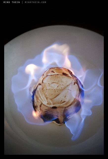
Flambe. Repeatable, but not controllable. You can set up the shot and do it again, but you can’t control what the flames are going to do. And this is the interesting thing that gives a little variation and makes each shot different. Seascapes are another good example. Nikon D700, AFS 60/2.8 G Micro

Personally, I’m going for something in the middle; but before I even get there, I need to shoot more – to have full intuitive control over my camera so that whatever adjustments I make come to me as second nature. And at this point something has to be said about good cameras, bad cameras, and too many cameras; good cameras are intuitive to use and require little training or practice to master. They do what you want them to, nothing more and nothing less. Bad cameras are ones that you never feel fully in control of, no matter how much practice you have. And too many cameras is just that: if you have too many cameras, you’re bound to eventually forget which button does what. And that could cost you at the most critical moment. This is why I’ll continue to use my D700 for reportage assignments until I’m fully comfortable with the D800; I know exactly habit will do under every situation, born of seventy thousand frames of experimentation – not counting the fifty thousand I shot with the D3, which is pretty much the same camera. MT

*Did anybody get the Futurama reference?

_7058402 copy
Would the burger be as appetizing without that juicy pickled onion marmalade peeking out? Probably not. Nikon D700, AFS 60/2.8 G Micro

____________

Visit our Teaching Store to up your photographic game – including Photoshop Workflow DVDs and customized Email School of Photography; or go mobile with the Photography Compendium for iPad. You can also get your gear from B&H and Amazon. Prices are the same as normal, however a small portion of your purchase value is referred back to me. Thanks!

Don’t forget to like us on Facebook and join the reader Flickr group!

appstorebadge

Images and content copyright Ming Thein | mingthein.com 2012 onwards. All rights reserved

Defining style, and finding your own

Introduction: This has been one of, if perhaps not the most difficult essay to write so far: it concerns a topic that’s fundamentally important for all serious photographers, yet is extremely difficult to define in a strict technical sense due to its very nature. It’s the only essay I’ve had to stop and start writing several times because I penned myself into a corner. What you read is the culmination of many sessions and days of work. I hope you find it useful.

What is style? Dictionary.com gives a lot of options – 16 to be exact – but I think perhaps the most appropriate definition of style from a photography perspective is best described as:

A particular, distinctive characteristic mode or form of execution, construction, appearance of a visual work which can be associate with a particular person or group of people.

Let’s think about this for a moment. It probably isn’t an exhaustive definition, however, it captures the essence: style is distinctive. It’s individual, or belonging to a group of individuals, associated with them because they created it or they promote and propagate its use. What are the distinctive visual elements or combinations of visual elements that define a style, specific to photography?

1. Color (or lack of it)
2. Tonality
3. Perspective
4. Lighting
5. Focal point/ depth of field
6. Fidelity
7. Quirks, the personality of the photographer, or perhaps the X factor

Let’s examine each one individually.

Color
This one is fairly simple: is there color or not? Is it black and white? Is the color saturated, bright and punchy (think happy commercial product shot) or is it monochrome and gritty (think classical photojournalism and war photography)? Consistent use of color is one of the fundamental things that defines a style – but it isn’t exhaustive on its own. Similarly, consistent use of filters or digital gradients to apply a consistent hue shift to a set of images can also define a style; for example, I personally associate that warm, golden light with California; I have no idea why, perhaps it’s the pollution of LA or a fetish of the Hollywood directors.

Tonality
This splits out into a few options: neutral, high key, low key, low contrast and high contrast. The former three options can be combined with the latter two options; you can have something that’s neutrally biased but high contrast, or neutrally biased but low contrast. In digital terms, think of the former as where the majority of the histogram is bunched: neutral would be evenly spread, high key would be towards the highlight end, and low key towards the shadows. Contrast then becomes the bunching: if you’ve got strong gradients in the histogram at any particular point, that’s high contrast. Low contrast images don’t show this. A good example of distinctive tonality would be the works of Sebastiao Salgado: you always know it’s a Salgado because of the tonality of the image, before you even see the subject. It’s a distinctive signature that’s there in his corporate work covering the Channel Tunnel and his humanitarian work in Africa.

Perspective
This one is a highly technical characteristic, and linked to the focal length of the lens used – only. If a set is shot predominantly with a wide angle lens – modern photojournalism tends to do this a lot, with the subject placed center or near-center foreground and the environment in the background around it to give context – then that’s gives a distinct exaggerated perspective. Similarly, sport and wildlife almost always employ compressed (telephoto) perspectives due to inability to get close to the subject.

Ligthing
Lighting is linked to tonality and contrast: direct lighting produces harsh shadows and flat images for subjects in the frame that are perpendicular to the camera; diffuse lighting produces nice textures and gentle gradients. If you’re not shooting with studio lights, you might not always be able to control this; but you do have control over when and where you shoot, which of course affects the quality of the lighting. Some photographers are nocturnal, for instance. Others choose to always use direct flash in daylight – Bruce Gilden, for example.

Focal point/ depth of field
How much of the image is in focus? Granted, sometimes this is linked to the perspective because of optical limitations, but there are ways around that – fast ultrawides for DSLRs give a telephoto-like separation of subject from background, but with exaggerated perspective; similarly, small sensor super zoom cameras will let you achieve compression but also short hyperfocal distances.

Fidelity
This is a tricky one to define: how close is the image to reality? Is it a feasible scene, which you could happen upon with your naked eyes, or is it something that’s been so heavily photoshopped that you can’t tell between what was shot with a camera or created with a Wacom tablet? I’d put HDR imaging somewhere on this spectrum, too. It isn’t reality, but HDR can be used properly to actually create more natural looking results (to be the subject of a future article).

Quirks
We end with the broadest possibility of all: anything open to the creativity of the photographer. Some photographers leave a little in-joke in frame; others have a particularly distinctive way of retouching; others may only shoot one particular subject. I deliberately haven’t put subject in as a component of style, because it’s possible to shoot the same subject in many different styles – and this wouldn’t be consistent.

Now that we have some idea of how to define style, how do you define your own? Firstly, it must be consistent: you need to be shooting and finishing images in this style consistently, without having to think about it. There may be more than one style you do routinely; I have three which I’m aware of. Using my work as an example, I do three things:

_7037081bw copy
Classical Photojournalist.

1. Classical photojournalist. High contrast black and white, with almost everything in focus, finessed tonal transitions in the subject – I expose and process for the the subject and let everything else fall wherever on the tonal scale it may – and mostly wide angle, mostly 28mm but with some ventures as wide as 24mm or as long as 50mm, but no longer. I’d describe it as as mix of Salgado and HC-B.

_7034062 copy
Cinematic.

2. Cinematic. This is perhaps the style that defines me the most: shallow depth of field, mostly long perspectives (85mm) with some wide, dramatic shots; strongly dynamic lighting, with heavy manipulation of color and tonality to affect atmosphere. (Color will be the subject of several future article). Heavy focus on the subject and just enough background to give context, but no more.

_7050700 copy
Commercial.

3. Commercial. Although there are elements of the previous two styles in here, I prefer to think of this as the clean, perfectly-lit product shot: it’s what I do with the majority of my watch photography.

At this point, I should take a step back: how do you even find your style, before you define it? Simple: look at what’s out there, and experiment. For the first few years – hell, it might be a lot of years – you will probably be following other people’s work. You might not even be able to consistently reproduce a style that isn’t your own. Don’t worry – that’s not the point. Your own style should evolve naturally after sufficient experimentation. I know that I didn’t really have a distinct style until 2009 – though I dabbled in many up to that point – which was the classical photojournalist. Cinematic developed at the end of 2010. Commercial has been continuously in refinement as I improve my lighting skills. Other than proving I’m nothing if not a schizophrenic photographer, it shows that even if you can define your style, you may not necessarily have found the one that works best for you: I can shoot in any one of these three, and often have trouble deciding which one would look best.

_0012575 copy
Natural.

And you know what? I’d be very disappointed if I stopped developing here. I think there’s a midpoint between all of these three styles – something I’ll tentatively call ‘natural’ – which seems to be the direction in which my work is going now, be it available light or studio. The characteristic of this style seems to be perfect color, with a little cinematic hue shift where required; a mix between dynamic and natural lighting, with an emphasis on the subject; and an overall natural perspective to the images – as though you could have seen them with your own eyes, without much artificial intervention (think monochrome, or long exposure, etc.). I’m looking forward to seeing where this goes in the future. MT

____________

Visit our Teaching Store to up your photographic game – including Photoshop Workflow DVDs and customized Email School of Photography; or go mobile with the Photography Compendium for iPad. You can also get your gear from B&H and Amazon. Prices are the same as normal, however a small portion of your purchase value is referred back to me. Thanks!

Don’t forget to like us on Facebook and join the reader Flickr group!

appstorebadge

Images and content copyright Ming Thein | mingthein.com 2012 onwards. All rights reserved

Photoessay: The Charles Bridge, Prague

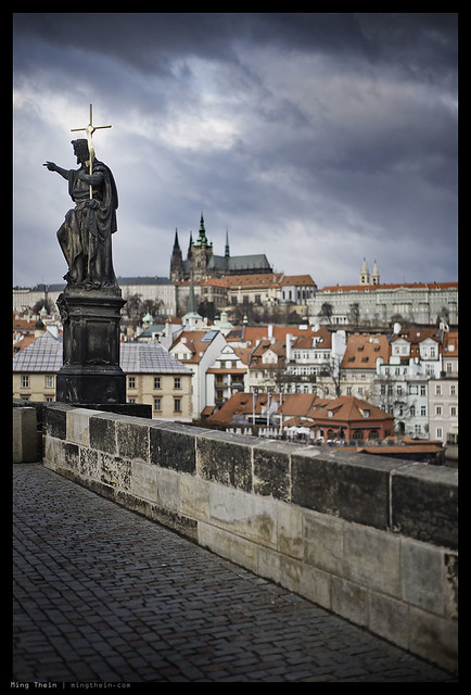
The Charles Bridge – or Karlov Most in Czech – is one of Prague’s great landmarks. Spanning the River Vltava, it was constructed in the 14th century to connect Prague Castle with the old town. Until 1841, it was the only way to get from one side of the city to the other. It is a majestic 510m long, supported by sixteen stone arches and guarded by two towers on either side. The bridge has borne witness to both countless historical events and natural disasters; being severely damaged during several of these and most recently repaired following major floods in 2002. The span itself is decorated by numerous statues, under whose auspices various tradespeople ply their wares during the day.

From a photographic point of view, it’s an interesting place to observe life – both locals and tourists – and a picturesque backdrop to practice street photography or photojournalism, or even a little architecture if the fancy takes you. MT

This series shot with a Leica M9-P, 28/2.8 ASPH, 50/1.4 ASPH and Olympus E-PM1 Pen Mini and 45/1.8 ZD lenses.

_M9P1_L1005751 copy

_M9P1_L1007318 copy

_M9P1_L1005986 copy

_M9P1_L1005109 copy

_PM05215 copy
Not technically of the bridge, but you can see its lookout towers in the background.

_M9P1_L1005101 copy

_M9P1_L1005072 copy

Photoessay: Seascapes

Inspired by Hiroshi Sugimoto. The South China Sea, off the east coast of Malaysia at Tanjung Jara.

This series shot with an Olympus E-PM1 Pen Mini and the 14-42 kit lens.

_PM08047bw copy

_PM08345 copy

_PM08014 copy

_PM08365bw copy

_PM08344 copy

_PM08348 copy

_PM08196bw copy

_PM08331 copy

The relationship between talent, creativity and experience

Let’s start with some semantics:

Talent: is your innate ability to do something – it’s inborn, and for the purposes of this essay, you can’t change it. It’s fixed. Think of it as your starting point; you also can’t lose it.

Creativity: in the photographic context centers around your ability to construct a unique composition from a given scene. It’s a continuum; the more different your composition to anything that’s come before, the more creative you are. This applies for both the elements you can control (e.g. studio lighting, flashes, focal length/ perspective etc) and the ones you can’t – the subject, for instance. The amount of creativity a person has is generally fixed; however, unlike talent, you can train yourself to be more creative.

Experience: is the knowledge you gain from having done something (or something related and relevant) before – for instance, if you’ve used a fire before, you know it’s hot and you won’t put your hand into it because it hurts. In a photographic context, it could be something as simple as knowing that telephoto lenses work better for wildlife photography than wide angles, or it could be as subtle as choosing a thick carbon-fiber monopod over a thinner steel one for its rigidity and vibration damping properties to enable as low a shutter speed as possible. This is the biggest area of opportunity for all photographers.

It’s easier to understand where I’m going next if you have a baseline: I’ll use myself as a guinea pig, and score out of 10; 10 being the best and 0 being poke-your-eyes-out-with-a-stick bad.

Ming, in 2003 (Brand-new, wet-behind-the-ears hobby photographer. Doesn’t know the first thing about shutter speeds, finds aperture numbering confusing, and can’t figure out the whole perspective thing.) Here’s an early shot:

_DSC0633 copy
Random abstract.

At the time, I thought this was actually one of my better ones. Shocking, huh? I think nobody would question an assessment of Talent = 0. Creativity – hmm, harder to judge; it obviously isn’t really a standard shot, but at the same time…execution is lacking. I’ll be generous and say this merits a 5 on the creativity scale. It does tell us something about the experience rating, though: had I known better, I wouldn’t have overexposed, and I’d have used a tripod. I’d probably also have selected a more suitable exposure combination commensurate to the effect I was trying to achieve. Let’s give experience another zero.

Fast forward a bit to today.

Ming, in 2012 (Getty Images member, Nikon Professional Services UK member, Leica Camera-sponsored, veteran of countless pro shoots, etc…I’ll stop blowing my own horn now 😉

_7053570bw copy
Jaeger Le-Coultre Gyrotourbillon 2 escapement

I don’t think anybody would argue that this is an easy shot to produce. It requires advance knowledge and mastery of a) lighting; b) composition and visual balance; c) being able to see the unique in something not immediately visible or obvious (the frame covers approximately 12x8mm); d) post processing; e) familiarity with the subject itself; f) the ability to get one’s equipment to deliver exactly what is required.

So what’s changed in the last nine years? My talent remains the same: it can’t change, and it’s approximately still zero. My creativity has definitely improved; I’m both trying different things and executing them so that they manage to communicate my initial vision – that shot was supposed to give the impression of an x-ray view into the heart of a complex machine, which this particular watch absolutely is.

But the biggest improvement is experience: in the last nine years, I’ve shot more than half a million frames – some in the course of getting the shot for a particular assignment or location; some out of pure experimentation; and some just in the course of capturing and recording life as I see it. But each one of those frames has given me the benefit of being able to refine my skills incrementally more. Although the laws of diminishing returns definitely kicked in a long time ago, I’m told there’s still some progress going on. The way I shoot now is not the same as the way I shot even a year or two ago.

Shooting lots is one thing – but remembering what you’ve learned is even more important, otherwise you’ll hit diminishing returns pretty early on in the process. There are many times where I’ll do experiments concentrating on one particular aim only – for instance, refining my x-ray processing technique – and ignoring the other elements. Or perhaps it might be to master the use of lighting very small reflective objects at close distances. I probably won’t keep any of these experiments because compositionally they don’t work (and that wasn’t the point) – but it’s the experience and knowledge that’s important. And then when I *do* need to put it all together – the above shot, for instance – then I have confidence that my techniques and experience will let me pull it off.

There is no substitute for experience. There’s plenty of evidence to support that it takes 10,000 hours of dedicated practice to master something – give or take a little depending on whether you do it continuously (benefit of not forgetting between sessions and having to backtrack or repeat) and your intellect. This means one task, continuously, for three years or more. And that’s why there were a) so few master photographers in the film days (practice cost a lot of time and money, and there was a delay between taking the shot and getting feedback, during which it was easy to forget what you tried) – and b) lots of ‘new talent’ emerging today.

Which brings us to the conclusion of this article: I’m often asked what is the one best tip I can give to an aspiring photographer: practice, practice, practice. I still do it, and I’m still learning. MT

____________

Visit our Teaching Store to up your photographic game – including Photoshop Workflow DVDs and customized Email School of Photography; or go mobile with the Photography Compendium for iPad. You can also get your gear from B&H and Amazon. Prices are the same as normal, however a small portion of your purchase value is referred back to me. Thanks!

Don’t forget to like us on Facebook and join the reader Flickr group!

appstorebadge

Images and content copyright Ming Thein | mingthein.com 2012 onwards. All rights reserved

The complete set of images from my exhibition with Jaeger Le-Coultre and Leica

For those of you who can’t make the exhibition in person, here’s the next best thing.

For the making of, see this post. MT

_M9P1_L1014229 copy

Amvox 5 chronograph detail

_M9P1_L1014172 copy

Amvox 5 Chronograph

_M9P1_L1013962 copy

The Deep Sea in a dial

_M9P1_L1013790 copy

Trilobed chaton, Master Minute Repeater

_M9P1_L1013739 copy

Master Minute Repeater

_M9P1_L1013662 copy

Duometre a Spherotourbillon

_M9P1_L1013608 copy

If only we could wear it upside down…

_M9P1_L1013556 copy

The Spherotourbillon cage

_M9P1_L1013484 copy

Balance

_M9P1_L1013449 copy

Duometre a Sphertourbillon in recline

_M9P1_L1013340 copy

Duometre a Sphertourbillon movement detail

_M9P1_L1013250 copy

Duometre 40.5

_M9P1_L1010108 copy

For the ladies

_7056884 copy

Escapement – Gyrotourbillon II

_7056862 copy

Caged – Gyrotourbillon I

_M9P1_L1009941 copy

Follow the sun – equation of time indicator on the Gyrotourbillon I

_7054011 copy

Swan Lake in a dial

_7053570bw copy

X-ray vision

_7053324 copy

Gyrotourbillon II

_7053295-LARGE copy

Gyrotourbillon II

_M9P1_L1014615 copy

Three is the magic number

_M9P1_L1014513+28 copy

Ultrathin

_M9P1_L1014454 copy

Waiting to be wound

_M9P1_L1014371 copy

Moon and stars a Rendez-Vous

_M9P1_L1014260 copy

The world on your wrist

____________

Visit our Teaching Store to up your photographic game – including Photoshop Workflow DVDs and customized Email School of Photography; or go mobile with the Photography Compendium for iPad. You can also get your gear from B&H and Amazon. Prices are the same as normal, however a small portion of your purchase value is referred back to me. Thanks!

Don’t forget to like us on Facebook and join the reader Flickr group!

appstorebadge

Images and content copyright Ming Thein | mingthein.com 2012 onwards. All rights reserved