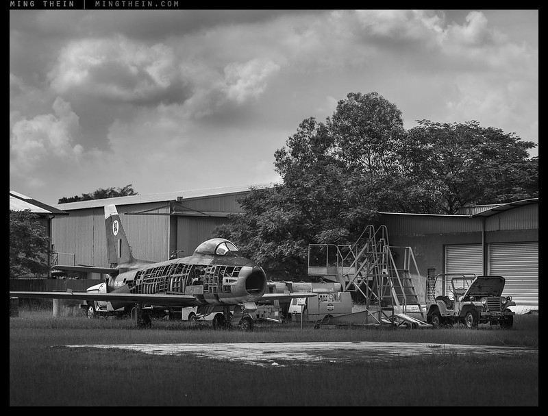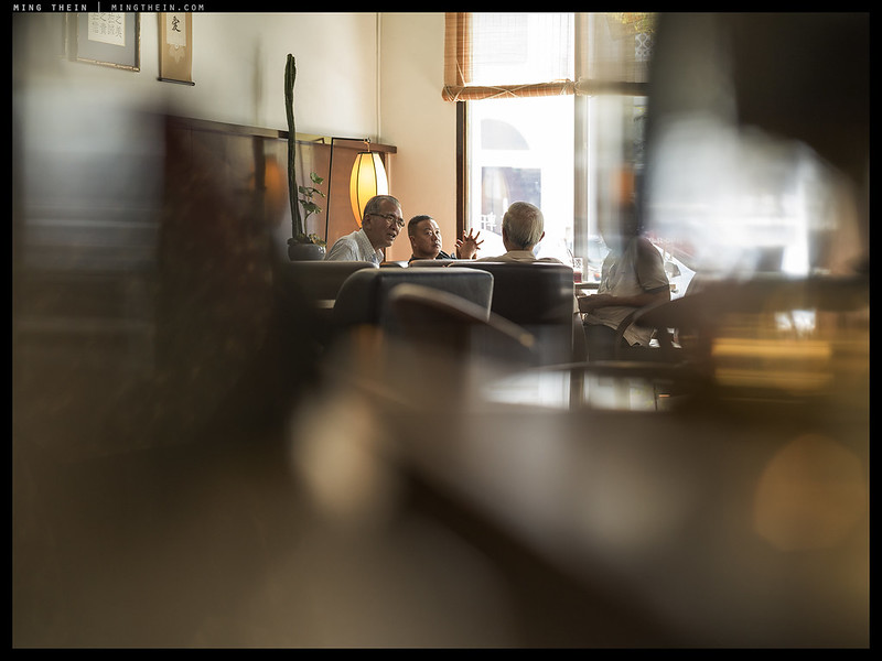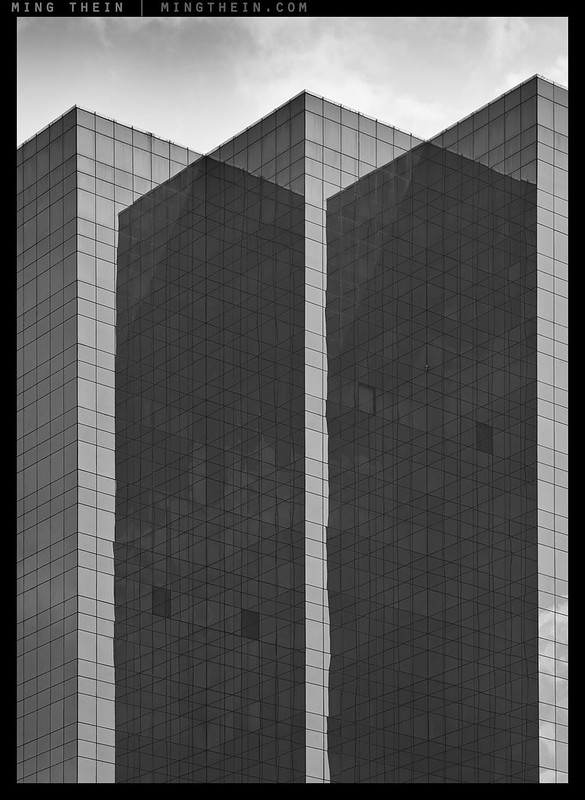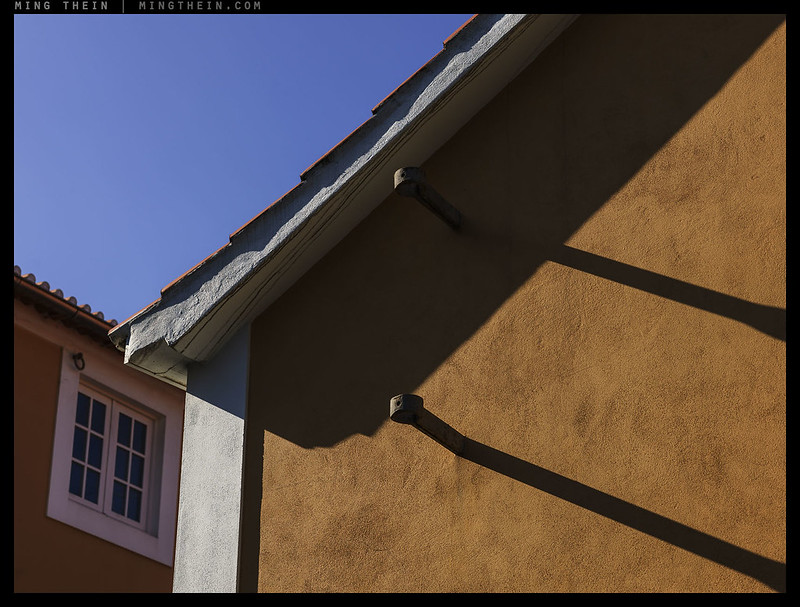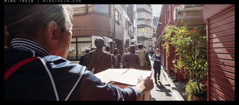

Spot the difference.
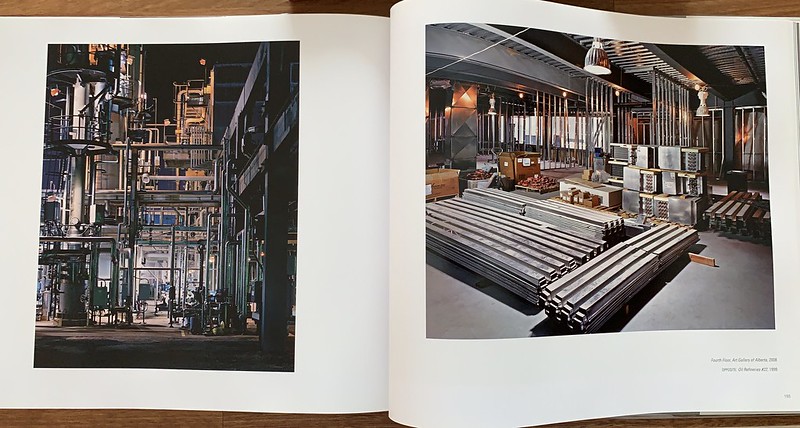
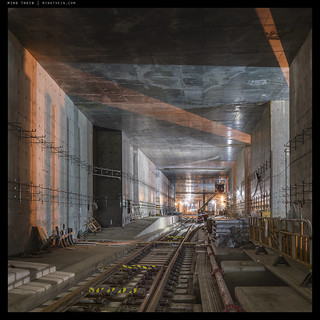
I had a rather strange experience at a local specialist photographic bookstore the other day – not just because the books were surprisingly affordable and heavily discounted*, but because I felt like I was looking at my own work – but shot by somebody else. It was almost as though there there was a lost assignment whose contact sheets I’d just discovered. Some color themes and specific subject matter may have been transposed, but for the most part, even those were the same: earthy tones playing off against greys-blues in skies or manmade elements, and a lot of heavy engineering. But those are the most minor of the similarities: it’s as though the underlying structure of subject elements and camera angles/ perspectives were very, very similar, too. There’s the same use of parallel orientation of cameras relative to subject ‘planes’; the use of contextual elements to concentrate framing; leading lines and repeated elements, and above all: a very strong emphasis on emphasis of texture both spatially and through lighting choices. Even the interpretation of color was pretty similar: a mostly faithful but ever so slightly cinematic bias (read: just enough hint of a WB shift to give the image some life).
*Books are heavily taxed in Malaysia; a phonebook with an European MSRP of say EUR39.95 will land up being easily RM400-500 – or 2-2.5x. This is a huge amount compared to relative average monthly income; 20-25% to be precise. Such taxes only discourage erudition; form whatever cynical conclusions you will – they’re probably correct.