Ming Thein’s Email School of Photography

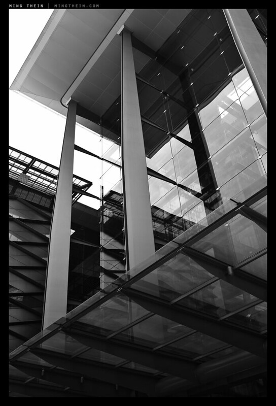
_M9P1_L1007399 copy

Following on from the reader critiques, email conversations and meet ups – I realize that there’s a big hole out there for people who want to learn how to do specific things photographically – how to achieve the end objectives *you* want to achieve, not  what’s dictated by an enormous group workshop. And by a big hole, I mean nonexistent other than trial and error or finding a friend who happens to be good at whatever it is you want to shoot, and as a bonus has the time to teach you.

This is where Ming Thein’s Email School of Photography comes into play.

1. Learn what you want to learn. You decide what you your final objective is: it can be as specific or general as you like. Anything from ‘how do I make a good photograph?’ to ‘I want to be able to make gigapixel images’.

2. Receive in depth critiques. Send me a related portfolio of your ten best images, which I’ll review and critique briefly. This lets me get a baseline for where you are and where the opportunities lie. I’ll be brutal, but objective and honest: you’re not going to gain anything from sugar coated comments.

3. It’s assignment based. I’ll set you ten assignments. Each assignment is aimed at teaching you one thing; the submission is in the form or a photo, or series of photos. There will be a detailed explanation of the hows, whys and technical/ historical context before the assignment, and a thorough review and postmortem dissection afterwards. This is the key learning portion.

4. It’s flexible. You’re the only student in your particular tailored program, so along the way, feel free to change the end goal as you learn more, or ask any relevant questions you might need answered.

5. Take as long as you need. The assignments can fit around your schedule and level of commitment. In fact, I’d be disappointed if you submitted the first image you shot, because it means you haven’t spent any time thinking about the learnings and experimenting.

The Full Course – US$900/ $800/ $500
The price for this is a one-off fee of US$900, which includes two videos – The Fundamentals and Making Outstanding Images Ep. 1, or whichever two videos are most appropriate for your level. Alternatively, it’s US$800 if you already have all of the videos you need, or $500 for post-workshop students excluding videos.

Compared to the thousands of dollars one spends on a decent camera and a couple of lenses, the equivalent of $75 per lesson is very little money to spend on acquiring the knowledge to use it properly and be able to capture your vision. And unlike equipment, the value of knowledge does not depreciate over time. The Email School was designed specifically to help you learn the fundamentals of photography that apply across any system to let you take the kind of photographs you want to take. It’s the distillation of 12 years and millions of images worth of experimentation, experience and expertise into one-on-one, personalized tuition with an experienced instructor and photographer. The reason I’m offering this is because I didn’t have anybody to go to to learn about the things I wanted to shoot when I was starting out, but I’d gladly have paid or enrolled in a school to learn – except there weren’t any. You don’t have to be in Kuala Lumpur to take part (but it would help) – everything can be done over email.

It’s a tailored, personal way of learning – you get as much out of it as you put in, and there’s no time limit to what you can learn.

Portfolio Review – US$500
Alternatively, I do a comprehensive portfolio review either in person, via email, or recorded to video (depending on your preference); from a submission of 50-100 images, I’ll perform a detailed critique of 20 of them, deconstructing them down to elements that work, elements that don’t, and most importantly, identifying recurring opportunities for improvement – and how to go about fixing them. I’ll also give you useful tips on straightforward things you can do with the equipment you’ve got to get closer to the results you want. This is similar to the Full Course, but without the assignment-based ongoing feedback process afterwards,

Places are limited by the amount of time I have – each student gets individual and personal attention. If you would like to sign up or get more information, please send me an email.

Thanks! MT

A couple of testimonials (over 150 students to date):

Jo B Grasmo (Image critique): Wow! Precisely what I was looking for! Thank you very much! I guess I’m “too afraid” of breaking rule of thirds and having anything in the middle of the image. Balance is indeed something I need to think more about when composing my images, which fits with another goal of less cluttered images – making them simpler and more peaceful. Again, thanks!

Eugene Palomado (Email School) – I find Ming’s Email School a great way of learning and improving your photography skills. What I love the most about it is that you get to do it on your own time. I guess the disadvantage is that feedback is not instant because everything is done through email but Ming’s response time is awesome! I have no complaint whatsoever in our communication all through out the course of the program and he is very professional. He answers all questions and he even sends you a note if he is going to be delayed in providing feedback. I struggled a bit with email communication at first but it’s something you have to be patient with and understand that there’s no facial queues. Everything is in words so if there’s something that is unclear regardless of what it is, simply clarify or ask. I think the keys to making it successful are to be honest and to communicate well. I highly recommend this program. You’re awesome Ming!

Gary Greenberg (Email school, Intro to PS): As a current student of Ming’s, and owner of one of these videos, and of many from his MT Compendium iPad app, I can’t more highly recommend his training products. I have grown so much from both his products, and freely available blog. I can say that if personal satisfaction is an acceptable metric, I am more satisfied in my own work. His approach is systematic, his ability to communicate top notch, and end product- images- so pure. To many professionals depend upon heavy post-processing (IMHO) these days. I follow and recommend Ming because he pushes me (us) to create amazing images that do not look like they’ve been digitally altered. Thanks Ming for your guidance, expertise, and honesty!

Stefan Decker (Email school): Hi Ming, I just completed your E-Mail school and want to thank you very much for mentoring. Before starting the program, I was in doubt: Either your E-Mail school or a new lens/camera. It was definitely the right decision. It took 8 months full of individual mentoring. For this, the price is a real bargain and the learning effect is much higher than any other “weekend workshop” at a photo studio. The school improved not only my photographic skills, but also the understanding of what makes a good picture. You answered also all of my additional questions. (always super fast and competent). In conclusion: – Highly recommended – 9.5/10

John Chang (Email school): Thank you for a great course, perhaps the best money I’ve spent on photography, i’ve picked up more in the past 10 assignments than the last 10 years. Confident of your career trajectory, I’m going to keep all those images and advice and make money off your fame in the near future! : )

Pete Saunders (Email School): I certainly have benefited greatly from Ming’s mentorship. Don’t expect his critques to be sugar-coated. He will be honest (brutally so at times) but fair. If you want to be on the path to developing useful and creative photographic skills, this is the person to go to. I have been fortunate enough to have had the ear (and eyes) of Ming these past few years in guiding me to the satisfying levels I’m at today. Ocassionally, he even likes one or two of my photographs.

Roger Wojahn (Portfolio review): Thank you so much for your patient, thoughtful, encouraging and brutally frank comments on my portfolio as well as my strengths and weaknesses. I have taken them all to heart and feel like the goals are tangible and understandable. Edges, exploring the vertical, eliminating random extra space and many of the finer (and larger subject) points all taken. A few of the comments about, for example, a boat on one side and needing a bit more of the mountain line descent on the other were merely a shortcoming of having one lens on the camera and little room to move closer or further from the scene. Still those points are instructive. (Follow up:) I first wanted to say that you have completely changed my perspective having been so forthright in your review of my portfolio. It may not seem like much has changed from your end, but I am practicing every day. Instead of making one casual shot and moving on, I am trying to improve, strengthen my subjects, watch the edges, shoot in vertical format, and a host of other things you mentioned. Part of the reason that I shot landscapes was my love for individual travel and discomfort with shooting in a crowd. It’s still quite a transition toward street photography but I am trying. For example, both shots that you chose of mine today were shot without looking through the viewfinder. The Mimosa, shot from well overhead (very clunky) with an M9 and the other, hanging around my neck, sitting on a subway. I’m trying to learn zone focusing, etc. Anyway, too much info I’m sure, but I’m doing my best to improve and practice is helping given your commentary.

There are even more testimonials here.

____________

Visit our Teaching Store to up your photographic game – including Photoshop Workflow DVDs and customized Email School of Photography; or go mobile with the Photography Compendium for iPad. You can also get your gear from B&H and Amazon. Prices are the same as normal, however a small portion of your purchase value is referred back to me. Thanks!

Don’t forget to like us on Facebook and join the reader Flickr group!

appstorebadge

Images and content copyright Ming Thein | mingthein.com 2012 onwards. All rights reserved

May 10, Part 1: The Leica M-Monochrom review

_5001729 copy

The focus of Leica’s May 10 announcement landed in my hands a few days ago (not counting the X2, which was reviewed here); I suppose that Facebook post might have done the trick.

_5001707 copy

This will be a three part review. Part one will deal with the M-Monochrom; part two, the new APO-Summicron-M 50/2 ASPH (which I’ll refer to from here on as the 50APO); and finally, part three will be a bit of a surprise. The latter I’ll also be testing on my M9-P, because there’s obviously no way of testing the APO specification on a monochrome only body.

Note: I’ve been informed by Leica that both camera and lens are prototypes, and there may be changes between now and the final release product.

_5001708 copy

A short note on the context of this review: I am a commercial photographer, and measure the quality of the camera by the ultimate output I can get from it – this is my litmus test, because ultimately my clients don’t care what equipment I use so long they get what they paid for. The images you will see in this review have been processed with my normal workflow (minus the B&W conversion step, of course) – there is no way I’d deliver an out of camera JPEG, and I suspect the target audience won’t be happy with the unprocessed images either; that’s like eating uncooked food and wondering why it tastes odd. Before the cynics cry ‘unfair’, remember that I do this with every camera I review. I try to get the best possible output from the camera, and if the raw data isn’t there, no amount of Photoshop will save it. I’m brand agnostic; I run four systems, will pick the most suitable tool for the job, and (sadly) none of the camera companies pay me.  If the camera doesn’t work, I won’t waste my time with it. I won’t be posting any full size images due to bandwidth – I live in the third world, internet is slow – and intellectual property issues, however, there are 100% crops sprinkled throughout the review. Clicking on the images will bring you to larger versions hosted on Flickr. Please go by what I say as I’ve pored over hundreds of full size uncompressed DNGs on a calibrated monitor; images here are for illustration purposes only.

_MM1_L9995360bw copy
Stairs. Sasana Kijang, Bank Negara Malaysia. Leica MM and 50/2 APO

The M-Monochrom (MM from here onwards) is essentially the same camera as the M9-P, but with the bayer filter covering the sensor removed, and a rejigged processing algorithm. Leica have not disclosed whether they have left UV and IR filtration elements in place over the sensor, but it would definitely be nice if they’d removed them – from what I’ve seen so far, I believe these filters have been left in place; I’m not seeing much of a telltale glow off hot black objects which would indicate the absence of an infrared filter. Aside from the new guts, the rest of the camera is almost identical to a standard M9-P, in black chrome (if it existed) with leather textured grips and a small MONOCHROM engraving on the hotshoe, which is now black. I can see detail aficionados knocking themselves out in the distant future over the various different variants of M9. Unfortunately, the same low-res from the M8 and M9 remains.

_MM1_L9995532bw copy
Phone call. Leica MM and 35/1.4 ASPH FLE

There’s also one other important detail: the ISO setting now goes all the way to 10(000) – which as far as I know, is a first for any sort of commercial digital camera CCD of any sort. (CMOS doesn’t count). Base ISO is 320, so if you plan on using your fast glass wide open during the daytime, you should probably invest in some ND filters. Finally, it appears that Leica have followed Nikon’s D800/D800E example on pricing: the camera without the Bayer filter costs more than the one with. Niche markets and all.

_MM1_L9995597bw copy
Counting pennies. Leica MM and 35/1.4 ASPH FLE

In use, there is really not a lot to say about the MM that I haven’t already said about the M9-P in my long term review of that camera. It shoots the same as any other Leica M, and existing M9 or M9-P users will feel right at home. I must admit, the color combination feels a bit nostalgic for me – I shot with nothing but a pair of M8s in black chrome for most of 2009/10. The camera also comes with a leather strap and rubber-bottomed shoulder pad, rather than the grippy synthetic of the M9/ M9-P. It looks and feels nice, but I personally don’t like it because the strap rings still dig into my fingers, and the ends have a habit of slipping through the rings and interfering with your grip – especially if you have to grab the camera and raise it to your eye in a hurry. I find the stippled standard strap more grippy, too. Care is required when slinging this one over a shoulder to ensure that it doesn’t subsequently make an expensive crashing noise on the floor.

_MM1_L9995429bw copy
The hat. Leica MM and 35/1.4 ASPH FLE

The only other notable differences are lack of white balance (duh) and a disappearance of the DNG compression options – it could be because my camera was prototype 007 (makes me feel like James Bond!) and running beta firmware. Compression would be nice as the files weigh in at an enormous 34.75MB; however I suspect this is also partially because of the amount of detail contained therein.

_MM1_L9995352bw copy
Lines of the Hoffmeister kink. Leica MM, 50/2 APO

There is no question that the MM out resolves the M9 – by exactly how much it’s hard to say (hint: come back and see the post I have planned for Sunday) – but the difference is similar to the difference between a sensor with a strong AA filter and one without; it’s almost as though there’s a layer of something between you and the image that’s been removed. The MM has a level of clarity and acuity at the pixel level that so far has only been seen on Foveon sensors; however, even those start to become a weak at ISO 800 and above. The MM maintains its acuity all the way through the maximum ISO, though above ISO 5000 noise dominates the microcontrast structure of the image.

_MM1_L9995464bw copy
Spiral, 2. Sasana Kijang, Bank Negara Malaysia. Leica MM and 35/1.4 ASPH FLE

The files require almost zero sharpening out of the camera; if you missed focus you might want to mask off and sharpen, but then you have to be careful of other areas in the image that will subsequently look over sharpened. Actually, the MM’s high ISO capabilities encourage you to stop down a little more to get the most out of the lens; there’s little noise penalty associated with shooting a stop or two down from your normal aperture. In fact, the camera encourages you to see and think about your images in a very different way: aside from the increased depth of field available, there’s also more dynamic range on tap. The overall look of the images is redolent of medium format – from the tonality to the microcontrast structure.

_MM1_L9995612bw copy
The obligatory cat shot. Leica MM, 35/1.4 ASPH FLE

I tested the MM with the new Leica 50/2 APO-Aspherical-Summicron-M (50 AA, review coming on Friday), the Leica 35/1.4 ASPH FLE, the Zeiss ZM 2.8/28 Biogon and the Zeiss ZM 2/50 Planar. The ISO comparisons and tests were performed with the 50 AA. Let’s just say that combined lack of Bayer filter and AA filter makes for an incredibly demanding sensor – focus calibration is absolutely critical* when shooting at maximum aperture or close to it; the sensor captures the falloff in depth of field with warts and all. Similarly, all lens flaws are revealed; whilst you of course don’t get CA on a monochrome sensor, this flaw is seen as a sort of blooming (which makes sense, as the light that makes up colored fringes instead contributes to the luminance values of the neighboring pixels instead).

_MM1_L9995393bw copy
Cityscape. Leica MM, 35/1.4 ASPH FLE

*My MM was perfectly calibrated for the 50 AA it arrived with, but not for any of my other lenses; after a couple of narrow misses with my 35/1.4 ASPH FLE wide open, I decided to shoot everything stopped down a little thereafter. Even though the 50 AA is an f2 lens, it demands the same focusing precision as a Noctilux on the MM body precisely because of the unforgiving nature of the sensor. I would highly recommending any potential MM owner sending back all of their lenses and any other M9/ M8 bodies to ensure consistent calibration between all lenses and bodies to avoid any nasty surprises. There isn’t much point in buying a Noctilux over a Summarit if you can’t use the extra stops due to focusing concerns.

_MM1_L9995393bw crop copy
100% crop of the previous.

The decision to release the 50 AA with the MM left me scratching my head – but having seen the resolving power of this sensor, it makes complete sense. None of the lenses were capable of delivering the same cross-frame performance on the MM as the 50 AA, though the Zeiss 2/50 ran very close especially at smaller apertures. Unfortunately the price will make your eyes water – it’s about 70% of a Noctilux – and the relative subsequent performance of your other lenses will, too.

MM vs M9P ISO comparison copy
ISO comparison vs. M9. Click here for the full size image, which contains 100% crops.

All ISO comparisons between the MM and conventional Bayer cameras are a little bit of a fudge, because there is some interpolation that will take place in the color to monochrome conversion; I’ve attempted to avoid this as much as possible by just doing a straight desaturation via ACR in all such A-B tests. The first thing you notice when comparing them M9 and MM is the huge difference in pixel level acuity – I’d normally just sharpen and be done with it. I actually re-ran this test several times with focus bracketing just to make sure it wasn’t a rangefinder calibration issue – it wasn’t. (The 50 AA was used on both cameras, shot from the same tripod position and stopped down to avoid plane of focus issues.) More importantly, this is a good illustration of the difference in resolving power between the new cameras – the M9 is no slouch for pixel-level acuity. The difference is so huge it’s almost as though you’ve removed a sheet of low-quality plastic or similar material in between shooting the two cameras.

_MM1_L9995375bw copy
Tripod. Leica MM and 35/1.4 ASPH FLE

The next obvious difference is a 1-1.5 stop noise advantage in favor of the MM; however, the difference isn’t quite as clear cut as that, because the MM retains detail much better than the M9; look at the fine text in the sample as an example. Needless to say, the noise pattern of the MM is extremely fine grained, and pleasingly random – very much evocative of film grain. The reason this skews things is because you’ll have to sharpen the high ISO M9 files to get some edge definition back; this in turn increases the amount of visible luminance noise, and certainly introduces at least another stop of disadvantage to the M9. Furthermore, due to the lack of color filters, the MM is actually about half a stop more sensitive natively – which is to say, you get need 1/15s on the MM to get the same histogram as 1/10s on the M9 would get you. In practical terms, this means the MM is probably more like 2-2.5 stops more useable than the M9.

_MM1_L9995526bw copy
Waiting. Leica MM and 35/1.4 ASPH FLE

There’s also more dynamic range, too; it’s hard to say exactly how much, but I think it’s similar to the noise gain – 1-1.5 stops, which makes sense. What’s very nice about the native tonal rendition of the MM is that it seems quite shadow-biased – which suits my B&W style just fine, but may not work for everybody. I definitely feel it’s got better highlight rolloff than the CMOS based DSLRs, too – the transition from light gray to highlights is far more gentle and pleasing to the eye. Watch the extreme highlights though, because as with the M9 sensor, once you get a huge blowout around a point highlight source, there will be blooming to adjacent areas on the sensor – and you can’t recover this information.

_MM1_L9995572bw copy
It works for Japanese-style street photography too. Leica MM, 35/1.4 ASPH FLE

One small detail on image review is worth noting – the MM is possibly the only camera that displays a true RAW histogram; normally this information is color-channel based, and thus subject to interpretation by white balance adjustments during the RAW file conversion. All other cameras that are displaying RAW histograms are in fact using a small embedded jpeg to generate this data. The lack of an embedded preview jpeg may also explain why sharpening of the RAW files seems to be very low – it’s actually very hard to determine critical focus using the monitor, more so than the M9. I learned to mostly trust it, then make up the balance of insurance through focus bracketing and depth of field. Would I be confident using this camera with a Noctilux? In time, yes, but not without more frames under my belt for a better feel of how the LCD represents images.

_MM1_L9995557bw copy
Cockblock. Leica MM, 35/1.4 ASPH FLE

Something I’m sure every reader is wondering about is the MM’s usefulness as an available light and night camera; after all, the film Ms were legendary for their usefulness in the dark because of a combination of the very low vibration horizontal-plane cloth shutter, and the ease of focusing a rangefinder. The latter hasn’t changed; the Ms are definitely easier to focus manually than an SLR (providing of course your RF is calibrated properly). However, in the film era, the ‘sensor’ was normalized across all equipment; this isn’t the case with digital. I’d long wished for the D3s’ sensor in an M9 body; that would make one incredible available light camera, especially with the f1.4 M lenses.

_MM1_L9995881bw copy
Waiting room and garage. Leica MM, 50/2 APO

My normal workflow for shooting in the dark with an M9 sees me setting ISO 1250, 1/30s and f2 as a starting point; I judge the changing light conditions by eye and adjust accordingly – shutter speed or aperture as required – but never increase the ISO any further because of the ensuing noise and loss of dynamic range. Frankly, even ISO 1250 is a bit borderline on the M9.

_MM1_L9995911bw copy
Crossing. Leica MM, 50/2 APO

The MM, on the other hand, can be set to ISO 2500 with little noise penalty – at 100% magnification it appears as very, very fine grain; perhaps comparable to an ISO 400 B&W film. Better yet, there doesn’t appear to be much loss of dynamic range, either. This is probably because the base ISO of the sensor is now 320. Having a base of ISO 2500 to start from (and 5000 for emergencies) means much higher available shutter speeds, or a bit more DOF (if desired). During my night shooting sessions, I didn’t run into the usual camera shake issues that come with borderline shutter speeds on the M9.

_MM1_L9995938bw copy
Family moment. Leica MM, 50/2 APO

Over the course of several thousand frames in the last two days, and controlled A-B testing between the MM and M9-P, I’ve come to the conclusion that the biggest difference between the two cameras isn’t the sensor. Yes, the monochrome-only version is definitely much sharper and delivers images with lower noise and higher dynamic range, but if you’re shooting the MM for an extended period of time, the change seen in your images won’t be because of these properties.

_MM1_L9995346bw copy
Traffic again. Leica MM, 50/2 APO

Rather, the camera forces you to recalibrate the way you see the world. To understand why, we need to think a bit about human vision: the eye sees mostly in color; more intensely when there’s more light, which is why the tropics are generally perceived as colorful, but London in winter is dark and gray. When it gets dark, the eye defaults to a larger patch of cells around the periphery of the retina that only perceives luminance information. This is why almost all photographers inherently compose better in black and white when the light is low – it’s much closer to how our eye natively sees, and there’s less imagination required to visualize the end shot.

_MM1_L9995346bw-crop copy
100% crop of above shot – 50/2 APO shot wide open at f2 with zero sharpening.

So how is all of this relevant? Well, because the MM forces you to ‘see’ luminance information even in bright daylight. To use this camera effectively, you have to learn to ignore contrasting colors; these frequently result in very flat monochrome images because the luminance values across the scene have to be similar for us to perceive the different colors equally strongly (and thus appear contrasting). Unlike conventional Bayer cameras, you can’t put this perceptual difference back into the final image in the RAW conversion – there’s no channel mixer. It’s easy to say, but very difficult to put into practice, even when you do consciously understand what’s going on*. During the course of shooting the MM, I started off looking for monochrome images in the same way I would with the M9-P – which is to say, colored contrasts that I might adjust later on to preserve the contrast. This produced lousy, mostly forgettable images. Looking at luminance only – oddly, sunglasses helped achieve this – and consciously remembering to do so, greatly improved the impact of my output. I definitely also noticed that when switching back to the M9-P to test the 50 AA, a lot of the frames had very strong luminance differences that worked OK in color, but were much stronger when converted to black and white.

*I was concerned about some of the early samples from the MM I saw; most of them looked incredibly flat and lifeless – until I thought about it a bit more and realized the above. It’s also worth noting that all of the tonal information is there, it’s just up to you how you want to allocate it through dodge, burn, curves etc in the processing of the raw file.

_MM1_L9995551bw copy
Meaningless graffiti. Leica MM, 35/1.4 ASPH FLE

I’m going to conclude by saying that the MM is not the camera for everybody. It’s not easy to see luminance only; if you can’t, you’re honestly going to get better results by shooting a color camera and then mastering the conversion process afterwards (to be the subject of a future article). However, with practice, some amazing things are possible with the MM – the image quality potential of this camera is incredibly high indeed. I’ve never seen pixel acuity at this level before – even Foveon cameras tend to have some degradation due to the multi-layer design of the sensor. You’ll notice I haven’t dealt with the exact resolution numbers in this review; I’ll be doing that in part three, to be published on Sunday. MT

Come back in two days for the next installment: a review of the APO-Summicron 50/2 ASPH-M (I think I got that in the right order.) A shameless plug: If you enjoyed this or my articles, please consider donating support via PayPal ([email protected]) – it takes a huge amount of time and energy to keep this site running. It’s ad-free at the moment, which means that it’s entirely supported out of my own pocket and time spent writing and testing is time I can’t spend shooting commercially. Thanks! If you’ve got any questions or thoughts, feel free to leave a comment below.

September 5: My Photoshop Workflow DVD for the Leica M-Monochrom is now available. For more details, please click here.

The Leica M-Monochrom is available here from B&H.

____________

Visit our Teaching Store to up your photographic game – including Photoshop Workflow DVDs and customized Email School of Photography; or go mobile with the Photography Compendium for iPad. You can also get your gear from B&H and Amazon. Prices are the same as normal, however a small portion of your purchase value is referred back to me. Thanks!

Don’t forget to like us on Facebook and join the reader Flickr group!

appstorebadge

Images and content copyright Ming Thein | mingthein.com 2012 onwards. All rights reserved

Nikon D700 firmware update…

…v1.03 is now online for download here. It’s supposed to solve an extreme underexposure problem (which I’ve never, ever seen in >100,000 frames with three cameras) – but I suspect there may be some additional minor tweaks in there somewhere. Nice to see that Nikon’s still supporting it despite the age of the camera and it’s recent replacement by the D800…MT

Color or black and white?

In advance of tomorrow’s review of the Leica M-Monochrom, it seems that this is a an appropriate question to tackle (if a completely academic one if your camera doesn’t shoot color in the first place.) It’s actually one of the tougher problems I face on a regular basis. Does a shot work better in color or black and white? What if it’s both? There are generally a few things that I look for which help, either to define the obvious or if I’m on the fence. This article is a short distillation of that process.

1. Is it commercial? If so, then 99% of the time, the required output will be color. Especially if it’s food or product; architecture can be either.

_7059099 copy
Commercial architecture. Nikon D700, AFS 24/1.4 G

2. Are there strong dominant colors in the image? If so, then color. Generally, if the image is about strong color, monochrome almost always never works because for a color to be perceived as strong, you need to have fairly constant luminance values across the scene. And luminance variation is what you need for a good B&W. If the strong dominant color as a good range of luminance values, then either can work.

_M9P1_L1011009 copy
Offerings of strong color. Leica M9-P, 35/1.4 ASPH FLE

3. Is the image naturally washed out or low saturation because of the subject or lighting? Generally, black and white works better here; however, you’d be surprised at how different an image with subtle color and very low saturation looks vs one that is completely colorless.

_M9P1_L1006123 copy
Subtle color works well, sometimes. Prague castle. Leica M9-P, 28/2.8 ASPH

_M9P1_L1003919bw copy
But sometimes there is just no color to be had – the scene in reality was almost monochrome already due to the flat lighting and fog. Schonbrunn Palace, Vienna. Leica M9-P, 28/2.8 ASPH

4. Is the subject isolated or highlighted by the lighting of the scene? Either can work, but my personal preference is for black and white because you’ve got enough luminance isolation already without having to overdo it.

_M8_L1025558bw copy
Isolation by lighting. Note how the backlight rings the subject. Paris. Leica M8, Voigtlander 50/1.1

5. Is the subject isolated by color? Stupid question, easy answer. Go with color. If not, you risk running into the problem of small differences in luminance values again. Sometimes, color IS the subject.

_M8_L1017941 copy
Isolation by color. Goa, India. Leica M8, Voigtlander 15/4.5

6. What emotion or feeling are you trying to achieve with the image? Classical timelessness always requires B&W, otherwise, go with color and shift the white balance a little.

_M8_L1023455bw copy
Film Noir. This could have been 8 days or 80 years ago. It was neither, actually. London, Leica M8, 35/2 ASPH

7. Is the image part of a series, group or set? Whatever the answer is, be consistent. You could produce two different sets, but make sure the style (including color or lack thereof) is consistent between images in the set. If you’re only delivering or using one set, then don’t change styles halfway through. See what best fits the images and overall goal of the series.

_7007311 copy
The man behind the scenes, literally. If the backdrop was monochrome, would the blue screen effect metaphor have been as obvious? I think not. Nikon D700, Zeiss ZF 1.4/85 Planar

Of course, the easiest way to avoid all of these problems and questions it to pre visualize your shot and start with the end already in mind, so you know what you’re going to do with it. And that will be the subject of a future article 🙂 MT

This post was brought to you by Ming Thein’s Email School of Photography. Don’t forget to like us on Facebook!

POTD: After lunch

_MM1_L9995602bw%20copy
Stall owner washing and packing up utensils after the lunch rush, Kuala Lumpur. Down some grimy, dirty, little back alley whose name has been long forgotten by all except those whose lives revolve around there. Beautiful light from the holes in the roof and gaps between the buildings, though.

Leica M-Monochrom, 35/1.4 ASPH FLE. Look out for my full review (in three parts) starting from tomorrow.

Chasing perfect color, and common myths about white balance

The previous article on the inexact science of color and emotion dealt with why color was important, and how we can use it as a tool to alter the mood and emotional response of the viewer of our photographs. This article explains how we get there.

_7061647 copy
Sandwiches. Did you know greens are heavily affected by the yellow channel? Nikon D700, AFS 60/2.8 G Micro

Although highly saturated color is visually striking, and B&W images are timelessly classic and elegant, there are a lot of times when neither is appropriate or an accurate representation of the scene. I’ve recently realized that I like accurate color above everything else – saturation control then becomes a matter of seasoning to taste. Color accuracy is actually quite critical when it comes to things like food – if the color of cheese or lettuce is off, it just looks moldy or unfresh. This is definitely NOT good for commercial work! My recent work is what I’d call in a ‘natural’ style – the color, saturation and hues are as close to my perception and remembrance of the scene as possible. I’ll do some shifting of white balance to make things warmer or cooler as required, but not a huge amount because it can do some very strange things to tonal accuracy.

_VL31_L1000539 copy
Scarlet Ibis. The red in is plumage is due to pigments in the shellfish that forms the majority of its diet. Leica V-Lux 3

Skin tones are perhaps the most difficult to replicate accurately; this is because skin is both reflective of ambient light (easy for the camera to capture) and emissive – we’re warm, and there’s some passive IR radiated by warm objects. Although modern cameras have very effective UV/IR blocking filter packs, they also produce (in my opinion) slightly dead-looking skin tones. I actually liked the skin tones from the Leica M8 for this reason, which was notorious for having perhaps the weakest UVIR filtration of any camera on the market – to the point that to get accurate blacks you’d have to use a UVIR filter on your lens.

_M9P1_L1002674 copy
Black fabrics in the sun are notorious IR-emitters. Leica M9-P, 28/2.8 ASPH

Other objects that are notoriously difficult to reproduce accurately are flowers, some animals, and some fabrics. Again – this is because of the way they interact with the near-UV and near-IR spectra, which affects the way our eyes perceive color (though we can’t see UV or IR directly unlike some animals). To date, there is no camera that accurately reflects the spectral response of the human eye – and I suspect it might be very difficult to make one, because the filter pack would have to be calibrated to transmit or cut out a certain amount of each wavelength. It’s much easier to make a filter that cuts out everything above and/or below a certain wavelength. Throw in the added complication of mixed light sources, and you’ve got a minor nightmare.

_PM02066 copy
Colors. All of them. Which one do you balance for without shifting the others? Answer: focus on your subject – in this case, skin tones and blacks. Olympus E-PM1 Pen Mini, 45/1.8

So what can we do to achieve perfect color?

First clarification: we are not trying to achieve perfect spectral reproduction; we’re trying to achieve perfect perceptual reproduction. It’s not quite the same thing. Basically, you want to get to the starting point of being as close to what you remember seeing as possible, then work from there. That way, you know that all of your tweaking isn’t going to create some strange shifts in certain parts of the tonal spectrum.

_7047057 copy
Chilis. Nikon D700, AFS 60/2.8 G Micro

White balance is inextricably linked to color. And there are some important things one has to bear in mind:

1. You have to get it right first time if you’re shooting JPEG. There just isn’t the tonal headroom in 8 bits to be able to make anything other than minor channel adjustments and not encounter posterization or weird hue shifts.

2. Manual white balance and a piece of paper are your best friends.

3. If you’re shooting RAW, white balance is less critical, but if you blow a channel, you’re not getting it back. Usually reds and yellows are the first to go. With earlier cameras, you might have to underexpose by as much as two stops to maintain tonal detail in the reds. I think it’s something to do with IR-sensitivity, the effectiveness of the filter pack over the top of the sensor, and how the red pixels respond very strongly to IR pollution.

_5100_DSC2749 copy
Cigars are one of the most difficult colors to get right. I don’t know what it is about the tobacco leaf, but that rich, deep brown hue requires a lot of work to perfect. Nikon D700, AFS 60/2.8 G Micro

4. White balance does affect exposure. This isn’t immediately intuitive; the reason is because if you get it very, very wrong, you’ll find that after correction, the dominant colors in the shot will shift, and the sensor may not have gained up enough at the extreme ends (red or blue) resulting in underexposure – most likely. You can to some extent recover this in post, but the bigger problem is that you’re going to land up with a very noisy image – the blue channel is generally holds the most noise for most cameras as it is the least sensitive due to the laws of optics, photon energy and filtration…but I won’t go into that here; complex quantum mechanical formulae are beyond the ability of my blogging software to input and display. 🙂

_7035823 copy
Prayer wheels, Nepal. Nikon D700, 24/1.4 G

Bottom line: shoot raw, and get in the right ballpark. Small adjustment are fine, and you can never get it 100% right all the time with a manual balance because ambient light is always changing. AWB works reasonably well on most cameras these days, but you have to watch out for the very warm light sources. I was told by several people in the camera industry that it was a conscious choice to leave the yellow/red components in the tungsten AWB because people expect the light to be warm (back to perception) – and having pure whites just looked odd to most consumers. I can attest to that as a lot of my students have asked me why the color is so blue when shooting indoors! Although I can’t say whether it’s a visual expectation on the part off the photographer, or whether inaccurate white balance is something they’ve come to expect because it was inadvertently dictated by the industry.

I’ve been playing with a handy little tool recently called a WhiBal. Basically, it’s a very, very accurate neutral gray card. I’ve found there are two ways to use it – one, take a shot under AWB with the card in the frame, and use that as your reference frame; eyedropper tool WB from the card in ACR, then sync white balance between the remainder of your files. Note that these two methods only work when your lighting is consistent from frame to frame, i.e. under studio conditions. The other option is shoot the card under the lighting conditions you’re going to use to set the preset in camera; I find this works better because all of your frames are automatically synced from the shoot. And if you’re using the same setup – as I do for watches – I can basically do it once and just leave one of my manual presets to match my flash and diffuser combo.

_7035796 copy
If any of you have shot purple flowers, you’ll know they’re notorious for shifting towards blue: that’s because of the UV reflectance. Flowers have UV and IR reflective pigments to signal to other animals – in this case pollinating insects and birds – that can see UV and IR.
Nepal. Nikon D700, 24/1.4 G

Next, make the tweaks – in your RAW converter, (I use ACR 6) perfect your white balance. Use the eyedropper tool on various gray areas in the scene until, it looks close to what you remember. (This is another reason why I like to process as close to immediately as possible: you might forget what the originals scene looked like, or any processing ideas you might have had at the time). Don’t worry if the eyedropper tool doesn’t get it right; you can shift the color temperature and hue sliders a little until you do.

_7025478 copy
This blue is one of the most difficult colors to get right. What makes it so appealing as a car color – the fact that it changes a lot under different lighting conditions – also makes it a royal pain to photograph and represent accurately. The honest truth is that I have no idea what RGB value this actually is, because it’s both reflective and in many spectra. Nikon D700, 28-300VR.

Open your file, make whatever contrast adjustments you need to – curves/ levels – then only use the Hue/Saturation tool to adjust the individual channels. Using curves inevitably shifts the saturation and hue slightly – there’s no way out of that – so you’ll need to bring back the individual channels. For instance, if it’s predominantly red and you used a curve that darkened the image, you’ll have to compensate for that by reducing saturation and increasing lightness slightly in the Hue/Saturation tool. There is no exact science to this – it’s all about experience, perception, and having the most accurate monitor you can find.

_7021997 copy
Remember what I was saying before about shellfish and birds? Nikon D700, AFS 60/2.8 G Micro

Each camera has a different filter pack and spectral response. Even though manufacturers try to keep the color output consistent from model to model, there will be differences. The D3100, for instance, has a crappy color gamut that I was never happy with – much like the NEX-5 – however, the D700, D5100 and D7000 are all pretty similar. The D800 is close, but even more accurate and with a wider supported tonal range out of the box. The M8 with UVIR filter, M9 without and S2 are almost identical. Since I use a whole bunch of cameras – at the last check, Leica, Nikon, Olympus and Ricoh – I’ve created individual color profiles for each camera in ACR and saved them as camera defaults. The look I like is somewhere between the tonal richness of Leica and the warmth of Olympus – perhaps Olympus + Zeiss glass describes it best. Oh, and different lenses have different spectral transmission characteristics too, just to make life more interesting. Your personal preferences will almost certainly be different because each individual perceives color differently. But I suggest that if you have the time, this is a worthwhile exercise.

_7022462 copy
The challenging pale but saturated lightness of macaroons. Nikon D700, Carl Zeiss ZF.2 2/2.8 Distagon

One important final note: all of this is in vain if your final output use is extremely limited gamut or highly compressed (*cough*FACEBOOK*cough*) – all of the additional tonal information you tried to save is going to be lost and compressed to hell. Some browsers (Safari) and photo sharing sites (Flickr) are better than others because they are color profile aware and don’t compress images, but the issue then becomes monitor accuracy. So unless you know the final output method and have some control over it, it’s very tricky to ensure that everybody is seeing the same thing. And printing is a whole separate blog on its own…MT

____________

Visit our Teaching Store to up your photographic game – including Photoshop Workflow DVDs and customized Email School of Photography; or go mobile with the Photography Compendium for iPad. You can also get your gear from B&H and Amazon. Prices are the same as normal, however a small portion of your purchase value is referred back to me. Thanks!

Don’t forget to like us on Facebook and join the reader Flickr group!

appstorebadge

Images and content copyright Ming Thein | mingthein.com 2012 onwards. All rights reserved

POTD: Contingent relationships

_M9P1_L1007047bw copy
The legend goes that if you place a lock here with your partner and keep one key each, then you’ll be together for as long as the lock is in place. Taking this at face value, there are a) contingent relationships, because there are locks on locks since the bridge railings are out of space (or maybe mistresses); b) polygamous/ polyandrous relationships, because I’m sure some locks come with multiple sets of keys, or foreigners misunderstood the instructions; c) relationships that ended quickly because of poor foundations, like those who bought cut price locks and had them rust away; and d) those which were forgotten because of misplaced keys. Malostranska, Prague, Leica M9-P and 28/2.8 ASPH.

Photoessay: This little piggy

At Chinese weddings all over the world, the groom traditionally has to bring an offering of a roast suckling pig to the house of his bride-to-be on the morning of the tea ceremony, after which the couple is considered officially married by the community. I recently attended the wedding of one of my cousins – how could one not bring a camera (or two)?

This series shot with a Nikon D700, D3x, 24/1.4 G and 85/1.4 G lenses. You’re probably wondering why I didn’t use the D800; I didn’t have an AF solution at this point, and it isn’t really suited to being a photojournalism camera. The D3x had the 24/1.4 on it and the 85 was on the D700. MT

_048_7062350 copy

_047_3X00414 copy

_049_7062359 copy

_050_3X00426 copy

_051_3X00437 copy

_053_7062367 copy

_052_3X00441 copy

POTD: Primary colors

_7028505 copy
Primary colors. Nikon D700, 28-300VR.

Here’s a good example of an image that wouldn’t work at all in black and white…to be the subject of an upcoming article! MT

The inexact science of color and emotion

_7037890 copy
What makes this photo identifiable as dawn instead of sunset? Hint: it’s the color. We expect sunsets to be warm, but mornings to be cool and clear.

A series of experiments was done many years ago that showed humans have been conditioned to expect certain things in the way of color: blue ketchup just doesn’t fly, for instance. The theory is that it’s a primeval subconscious response to warn us of danger. Think of it this way: rancid meat looks a certain way, and has a certain color. Even if we can’t smell it – looking at a photograph of vomit or something decomposing makes us go ewwww. Such examples are to be found in nature all the time – think of those brightly colored poisonous beetles, for instance. In fact, the link between color and range (and thus emotion) is so strong that many species mimic the coloring of more dangerous species to warn away predators, but at the same time rely solely on that as protection because they pack no venom or toxicity. (Toxicity is energy-consuming to produce, and in food-scarce environments, you want to waste as little of your nutritional intake as possible producing something that’s only going to help you if you’re eaten – and thus probably going to die anyway.)

_7049521 copy

_7049526 copy

A tale of two cities. Shot minutes apart, though. How does the first image make you feel? The second?

How does this relate to photography? Quite simply, when you look at a photograph, how does it make you feel? Ignore the subject for a moment. The remaining emotional response is mostly down to your reaction to the processing: specifically, color. Why do black and white images have that ‘timeless’ or ‘ageless’ quality? Why do they make you feel slightly detached, as you’re an observer but not really part of the scene? It’s all due to color, or in this case, the lack of it. It’s difficult to relate to something if your information or perception on it is limited to tonal information only.

_7060545 copy
Why does this shot imply richness and juiciness? How would you feel about pale gray steak with red tomatoes, even if it tasted the same?

In fact, if you look through historical photographs and video – you’ll see that each recent era or block of ~10 years in modern history actually has quite distinct color and tonal styles. And looking at this often makes one feel something – nostalgia, hatred, wondering what one was doing with their youth. Early color photos from the 1930s and 40s have that vintage look, for instance.

_7036896bw copy
To me, this screams classical photojournalism – because of the contrast, the tonality, and the lack of color. Early photographers didn’t purposely go for that look – they learned to work with it because of the limitations of darkroom chemistry.

A lot of modern photography software capitalizes on this. Instagram and all of those software filter packages are a good example – hell, even Lomography to some extent – they let you instantly create a feeling through a combination of color fiddling and contrast manipulation. There’s a reason why a photo from a Lomo or Instagram looks like a vintage hippy polaroid: it’s because the white balance was shifted warmer by several notches, the saturation decreased slightly, the contrast decreased a lot, and the relative luminance and hue of the red and yellow channels shifted. And there’s probably some grain and gaussian blur in the mix, too. Try it yourself in Photoshop, if you don’t believe me.

_7014252 copy
Cool mountain. Nikon D700, Zeiss ZF.2 2/100 Makro-Planar

The point is, polaroids looked that way because of the chemical process of the day: not because they wanted them to look that way. I’m pretty sure the engineers there were chasing perfect color, too. The upshot of all of this is that a modern photograph processed that way invokes memories of the polaroid era, because that’s how most social images looked then.

_7013736 copy
Mmm, natural green freshness.

Most humans respond in similar ways to color, namely:
Red – danger, warning, attention;
Blue – cool, calming, relaxing;
Yellow – warm, friendly, open;
Green – natural, fresh;
Black – mysterious, sinister, classic, premium, heavy;
White – pure, open, light, honest, clean
Gray – apathy

_7035572 copy
Multiple light sources can be confusing as hell, but almost always signal ‘party!’

Simply put, there’s a reason why most Ferraris are red, and most hospitals are white.

How does this help you as a photographer?

Actually, it’s fairly simple. Color enters your image everywhere, but makes an impact in at least two major ways. The first is if you’ve got one dominant color in the scene that registers on the subconscious of the viewer even before they figure out what the subject is; it can be the color of the backdrop, for instance. A more subtle way is the ambient light temperature – for instance, a warmer white balance setting will result in a shift towards the red and yellow channels; this in turn imparts the ambient light with a particular quality and tone.

_5100_DSC1276 copy
Warmth. The ambient WB was shifted further away from the primary light source (the flame) to preserve the warm color.

The second major way is through contrast: if you’ve got a subject of one color against a backdrop of another completely opposite color (red and green or blue and yellow, for instance) then it’ll stand out because it’s the only thing in the scene that is visually discordant. It’s a good thing, in this case, because it draws your eye to the subject and lets the background serve as a stage – which is the way it should be.

_7037150 copy
Why does my subject stand out? It’s a different color to the background, of course.

But what if your scene has no dominant color, or is very washed out or low in saturation? Do what the cinematographers have been doing for years, and either impart a global tint as described above – you can easily do this if you shoot raw by shifting the white balance; lower color temperatures that what is accurate are cooler and bluer, and vice versa for higher color temperatures. The other alternative is to use a filter over your lens, or color the light – the latter obviously assumes you’ve got some control over your lighting, though. By far the easiest way to shift color and not land up with odd hues due to the nature of color addition and subtraction is to adjust your white balance.

_7049662 copy
KLCC dawn, color slightly shifted. Nikon D700, 28-300VR

One final comment: you need to start with an accurate white balance before you shift the color temperature. This is so you don’t land up with strange colors due to shifts along the green to magenta axis (white balance and color temperature affects only blue to orange/red). Also, remember not to overdo the saturation: shifting the white balance can cause other channels to blow, even if the original appeared to be correctly exposed. And over saturated images just look crude, frankly.

And on that note, I’m going to break until the next topic: chasing perfect color, and white balance myths. MT

_7029367 copy
Funky diner colors. Sometimes, your ambient light is close to exactly what you want – and all you have to worry about is color accuracy. Nikon D700, 85/1.4 G

____________

Visit our Teaching Store to up your photographic game – including Photoshop Workflow DVDs and customized Email School of Photography; or go mobile with the Photography Compendium for iPad. You can also get your gear from B&H and Amazon. Prices are the same as normal, however a small portion of your purchase value is referred back to me. Thanks!

Don’t forget to like us on Facebook and join the reader Flickr group!

appstorebadge

Images and content copyright Ming Thein | mingthein.com 2012 onwards. All rights reserved