Photoessay: Those magnificent men in their flying machines

There’s a magical whimsy about hot air ballooning. It’s always appealed to me because of the silence, grace and intimate connection with your environment that you can’t get from other forms of flying; unfortunately there’s also the issue of complete lack of control over navigation, and the fact that your sole protection from the elements is a wicker basket, and the only thing keeping you from crashing is a thin bag full of gas. But still, I do enjoy watching them fly and very occasionally going up in one myself. MT

Images from a variety of events.

_7013522 copy
Fire. Nikon D700, Zeiss ZF.2 2/28 Distagon

_M8_L1000112 copy
Unhappy at being left behind. Leica M8, 35/2 ASPH

_M8_L1140590 copy
Rising. Leica M8, 35/2 ASPH

_7027148 copy
Watching the show. Nikon D700, 24/1.4

_3100_DSC2009 copy
Evening glow. Nikon D3100, 85/1.4 G

_7027432 copy
High priest saluting the power of fire. Nikon D700, 24/1.4

Photoessay: Dawn over Kuala Lumpur

Although not technically aerial shots, the 421-m tall platform (plus hill) afforded by Menara Kuala Lumpur (KL tower) is a great place to get some interesting images of the city downtown at dawn or dusk – though it usually rains in the evening, so morning is a better bet. MT

Series shot with a Nikon D700 and 28-300VR.

_7049662 copy

_7049646 copy

_7049526 copy

_7049524 copy

_7049521 copy

Sushi, and the philosophy of photography

_PM07501 copy
Seared Wagyu beef with momeji oroshii.

Sushi is a universe in itself – there are so few components that if you get any one of them slightly wrong, the taste will be horrible. But if you get every one of them right, the experience can be magical. Specifically, your fish must be fresh and in season; precisely the right amount of soy sauce should be brushed on to the top, with a little dab of wasabi hiding between the rice and the fish. The fish itself is cut slightly concave so it drapes perfectly over the rice, itself measured to precisely the right quantity to make a mouthful and shaped by hand, not too tightly packed and not too loose, either.

_PM07411 copy
Katsuo (bonito) with ginger.

And then there’s the seasoning that accompanies the rice – a mix of mirin and rice vinegar – which must offer the right degree of tartness and sweetness to provide a counterpoint to the fish and soy sauce, but not so much that it overpowers or tastes sour. And this is before we even talk about more complicated creations that involve multiple types of fish, or searing, or additional condiments and seasoning.

_PM07492 copy
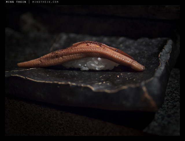
Broiled anago (freshwater conger eel).

There’s a parallel between sushi and photography (and sushi and many other things, actually) – aside from the obvious that it’s art, sushi making requires both technical skill and creativity. There are constraints, but you can work around them. It can be learned, it can be honed by experience, but there’s definitely an element of talent and intuition involved which all great sushi chefs possess. Photographs and sushi both come in small, bite-sized increments – they require little time to create if all the elements come together, and can be enjoyed in moments or contemplated for hours – I’ve eaten sushi dinners with 20+ different varieties served over many hours; I suppose that would be like going through the Magnum annual. Neither photography nor sushi is cheap, either; and mastery can take years.

_PM07485 copy
Torigai clam.

There’s even an anticipative element to it – the feeling of curiosity before you go to eat (wondering what is in season and came from Tsukiji today) is much like the feeling I get before a shoot; you’re all excited and ready to go. It’s also entirely possible that it’s just me.

_PM07471 copy
Seared katsuo

The best sushi I’ve ever eaten – so far – comes from a local chef in Kuala Lumpur at a restaurant called Hanare; Kenny Yew is an absolute genius when it comes to creating new things – for instance, seared wagyu with momeji oroshii chili – as a sushi. I need to go at least once a month or I get withdrawal symptoms and the DTs, because I just can’t eat sushi anywhere else now. The few lucky friends I’ve taken there feel the same way. It really is art – some of the pieces make me tingly and others nearly bring me to tears. I’ve eaten things there I never would have though edible, let alone ordered – and loved them. That’s much like how certain exhibitions, art or equipment inspire me to try photographic experiments that work out a lot better than expected.

_PM07446 copy
Seared hama-tai (sea bream)

And best of all, you can mix the two. The lighting conditions at that restaurant are pretty horrible, but they save me a seat at the counter which happens to have a halogen spot over it; I position my sushi carefully to be well-lit. This set might appear the same, but that’s because I wanted a consistent point of view; (and comparison)
they were also shot during the same meal. I discovered one other thing that night: the best color I’ve yet managed to achieve is delivered by a combination of Zeiss glass and Olympus cameras.

_PM07395 copy
Oo-toro. (Fatty yellowfin tuna belly)

I had the ZF.2 2/28 Distagon on the Pen Mini via an adaptor, and was utterly floored by the color when I opened up the raw files on my computer – the sushi literally looked like it had in real life. Every bit of the color, texture, iridescence and freshness was captured. I’m guessing it’s a combination of the fortuitous lighting, the great color and micro contrast of Zeiss lenses in general, and the pleasing color palette of Olympus cameras. Whatever it is, I think I’ve found my perfect sushi-camera.

_PM07426 copy
Red snapper.

My parting advice is that if you do get a chance to eat sushi made by a master, do as you would do at an exhibition of photographs by a great photographer: put away your preconceptions, go in with an open mind, and enjoy. You’ll probably be surprised. MT

_PM07424 copy
Kamburi (giant yellowtail).

The confusion between T-stops and f-stops

f-stop – we all know what that is, right? The size of the hole in the lens that lets light through. The faster the better, and the faster the more expensive. The faster it is, the easier it is to shoot in low light. An f0.95 Leica Noctilux is easily ten times more expensive than an f2.5 Leica Summarit, yet it’s only three stops faster.

That’s all. Right?

Not quite.

_5100_DSC1518 copy
Zeiss ZF.2 2/28 Distagon. Notice how the front few elements almost disappear – that’s because they’re not reflecting anything. This despite a huge diffuse light source – it’s the mark of excellent coatings, and promises a T-stop close to the f-stop.

f-stop is the relationship between the physical aperture of the lens – the effective optical diameter, usually limited by the diaphragm – and the focal length. Specifically, focal length over physical aperture equals f-stop. So a 50mm f2.0 will have an effective physical aperture of 25mm. This affects one property, and one property only of the lens: the minimum depth of field. All f1.4 lenses of a given focal length will have the same depth of field. However, they may appear to have different depths of field because the speed of transition between in focus and out of focus differs depending on the optical formula of the lens. As does the quality of the bokeh. (See my other article ‘A word (or ten) on bokeh’ for more information).

_7052666 copy
The legendary Leica Noctilux.

T-stop (curiously, always written with a capital T) is a number measuring the effective transmission aperture of the lens – in other words, the physical aperture might be f2.0, but how well does the light actually transfer light to the image plane? Why would it even differ from the f-stop in the first place? Lenses are actually black holes: they absorb or reflect or refract light in directions other than the imaging plane. It could be due to poor coatings, or internal polished elements, or simply having many elements – at every air/glass or glass/glass interface, 100% transmission is impossible. There will always be some reflections which decrease the effective transmission factor of a lens.

_5100_DSC1488 copy
The famous Zeiss T* coating.

Modern coatings go a very long way towards ensuring that all light entering the lens makes it to the image plane, with flare reduction and increased contrast as a bonus. However, as lens design gets more complex – take those 18-270mm super zooms for instance – the number of elements required to correct aberrations across all focal lengths covered increases, and so does the complexity of the lens design. Remember, more surfaces means less light transmission.

_D90_DSC7216 copy
Leica 21/1.4 Summilux-M ASPH. Again, note how the front few elements disappear thanks to the coating. Interestingly, this is a very complex design for a Leica lens – 10 elements in 8 groups.

Practically, this means that prime lenses will generally give you a higher shutter speed for a set aperture; it might be a small difference, or a noticeable one. Your f5.6 super zooms probably have a T-stop closer to f8 or f10. Conversely, a good prime lens with few elements and excellent coatings will give a T-stop very close to the actual f-stop.

Example 1: the older Nikon 85/1.4 D has a T stop closer to T-2; the Zeiss ZF 85/1.4 Planar yields almost double the shutter speed for the same exposure, with all other variables constant. The T-stop is around T1.47.

_1KD_MG_0064 copy
Old Nikon 85/1.4 D – note visible reflections off every single element. That’s light that isn’t going to reach the sensor anymore.

Example 2: ignoring the minor difference in focal length, consider the Nikon 105/2.8 VR macro and the Leica 90/4 Elmarit-M macro. The Leica has only four elements. The Nikon, 14 elements in 12 groups. What do you think their T stops are? Unsurprisingly, not very different.

Not all lenses are made equal. And don’t think because there are fewer elements, the lens design isn’t as good. It’s very difficult to design a well-corrected lens with few elements – designs such as the Cooke Triplet and Double Gauss are pretty much as simple as they get. MT

____________

Visit our Teaching Store to up your photographic game – including Photoshop Workflow DVDs and customized Email School of Photography; or go mobile with the Photography Compendium for iPad. You can also get your gear from B&H and Amazon. Prices are the same as normal, however a small portion of your purchase value is referred back to me. Thanks!

Don’t forget to like us on Facebook and join the reader Flickr group!

appstorebadge

Images and content copyright Ming Thein | mingthein.com 2012 onwards. All rights reserved

Passion and frustration

I’ll begin by saying that this is a difficult post for me to write for many reasons. Over the course of the last month or so, you – my valued readers – have hopefully seen some of my work and passion, and even more hopefully learned something from the articles and how-to’s.

I started this site for several reasons. Firstly, I wanted to share my knowledge; secondly, I want my work to reach a greater audience – although every true artist would (and often does) work without pay or acknowledgement, sometimes the egotistical part of us does value recognition. Thirdly, there are sites aimed at amateurs, at professionals, at particular user groups…but I find the level of content not really that advanced, or too equipment-focused, or not balanced between pure image sharing, learning and techniques/ equipment. Photography is all of these things. Finally, I want to figure out a way to spend more time doing photography-related things, and less time in the corporate world.

The reality of commercial photography these days is that there are plenty of talented people out there; more so now that people have discovered skills thanks to the ever-lowering barriers to accessibility. This is further compounded by the effects of social media (yes, I know I’m benefitting too). Curiously though, although the overall standard for images has raised thanks to the proliferation of photographers, the business community attaches less and less value to it – meaning to say bluntly that there really isn’t any money in the business (with a few very rare exceptions) because corporate buyers are both spoiled for choice and frankly can’t tell the difference most of the time. Those that can are served by long-standing relationships with existing photographers.

What does this mean? ‘Professionals’ are usually scratching a living and unable to have the freedom to develop and improve because that requires time and money; they’re short of the former because they need to do more jobs to get enough of the latter. ‘Amateurs’ have all of the equipment, for the most part act outwardly like professionals, but when the crunch hits, usually can’t quite deliver. The people who are truly pushing are either those aforementioned professionals with long-standing commercial relationships – think Annie Leibowitz and the like – or serious amateurs whose living costs are supported by a day job. I know for a fact that almost all of my professional photography friends do not make a living from selling pictures or photo work. Think about this for a minute: if professional photographers aren’t valued, who’s going to drive the image creation of the future? How are companies going to find the ever-better visual content demanded but not support the people they rely on to create it? I don’t think they’ve given any thought to that; bottom lines are all that matters.

I’m not complaining; far from it. The shift in photography market dynamics has opened up other opportunities that would have been previously unsustainable or commercially unworkable. But the reality for me is that I have to choose between my passion and my day job – which is both mutually exclusive, and nowhere near a fair contest.

Maintaining this blog – creating articles, photographing and keeping myself up to date and pushing the envelope to deliver content that you’d want to read – takes time. A lot of it. Somewhere in the region of 20-30 hours per week, actually – that’s almost a full time job in itself. Actually, it is a full time job if you think about how much more productive you are when you both don’t have to take breaks and can produce everything by yourself – and the topic is something you’re an expert on.

At some point, I’m going to have to decide which path I take going forward – I no longer have the time or ability to maintain both. It’s a tough choice, though – because one path is nothing but uncertainty (except perhaps certain poverty) and the other is the diametric opposite of anything creative. I suppose everybody who is intensely passionate about something, and that something is not their day job, faces this dilemma eventually. What I wonder is how many people regret not trying – and how many people try, but never manage to make it work and just give up eventually. Society likes to talk about determination leading to success – but we also call people fools who try repeatedly but never succeed.

So I’m going to do three things now:

1. Ask for your opinions and thoughts – please leave a comment on this post

2. Ask you to share – use the social media buttons; email links to articles you like; link my blog. (It’s still ad free, and in order to keep it that way I need to traffic to try out some of the other exciting ideas I have planned – which can only work if I have a big enough readership).

3. Shamelessly, if you’ve enjoyed reading or viewing or have learned something, please consider a donation via PayPal ([email protected]) – however large or small, it does help me to continue providing content and art for you all to enjoy. It’s not just the time cost; there are hosting costs, equipment costs, travel costs…the list goes on. The more resources I have, the better content I can create.

Finally – thank you all for your continued support! MT

Photoessay: Cigars

One of my other passions is to have a good cigar now and again. Although I mostly prefer Cubans, there are also some very good things coming out of the Dominican Republic such as the Fuente Opus X and Padron brands. Needless to say, a camera usually accompanies me to these outings; partially because it’s attached to me like an extra limb, and partially because I write the occasional review and video for My Cigar Blog. MT

This series shot with a whole load of different equipment.

_M9P1_L1001196 copy

_7050217 copy

_7050126 copy

_7048354 copy

_7041334 copy

_7041315 copy

_220_IMG_0162bw copy

Observing vs. participating: behind the camera

Today’s post is a follow-on spurred by the discussion following yesterday’s article on hiding behind the subject. Apologies to anybody if I lose you in the second paragraph, but I promise it will be worth it.

A camera can be many things.

A tool, to produce an image.

A bridge, to start a conversation.

An observer, to record an event, or bear witness to something.

A shield, to distance and separate the photographer from the scene he or she is attempting to capture.

There’s a big difference between being part of the action, and just being a witness to the action. Which do you think makes for stronger images? Unquestionably, the former. However, it’s not that simple: photojournalism is like quantum mechanics.

Let’s take a little detour. Quantum mechanics 101: under the quantum mechanical realm – i.e. the very small – an observable event has no distinct state, but rather a continuum of probability. This means that there’s the potential for any possible outcome to our observable event; however, until we observe it, we don’t know what the outcome will be. However, the very act of observing the event changes the outcome – because once the outcome has been observed, it can no longer be any of the other possible outcomes. This changes the probability continuum for the event, thus changing the event itself.

The best example of this is Erwin Schrodinger’s (the famous physicist) cat experiment. A box contains a live cat, whose lid triggers a mechanism that <em>might</em> kill the cat. So until you open the lid of the box, you don’t know if the cat is dead or alive; by observing the cat, you interfere with its state of being: namely, you might kill it by checking if it’s really alive or not.

_PM05775 copy
A demonstration of the link between quantum mechanics and photography. Behaviour of the person in the middle didn’t change until he saw me bring the camera up.
New year’s eve 2011-12, Kuala Lumpur. Olympus Pen Mini E-PM1, 12/2

Back to photography. As a photojournalist, if you are an observer, you do not generally interfere with the course of events – other than any secondary impact arising from people viewing your images, and possibly taking action or interfering with the course of history. However, if you are a participant rather than an observer – then by taking photographs, you are directly interfering with the event. From a photographic point of view, it means that the images you get may be more powerful, but not necessarily as genuine because the subjects are aware of the camera and will almost certainly change their behavior accordingly, which again changes the image and changes the course of events because the subjects change the way they act around the camera. As a stealth operative, you will capture the natural reactions of your subjects – but at the expense of involvement for the viewing audience.

_PM04759 copy
Active participation at a family event. Olympus Pen Mini E-PM1, 12/2

They’re very different types of images, and both have their advantages and disadvantages – to say nothing of the ethical dilemmas posed for a photojournalist when covering certain events, for instance wars and natural disasters. I can’t say whether one is better than the other, but I do know that it’s much more difficult to get powerful images if you are not a participant – simply because the focus of the subject is not the camera.

_7048120 copy
Passive observer. Epicure 2011. Nikon D700, 85/1.4G

I’ve always felt the best compromise is to be an observer, but an active one: anticipate and seek out your targets; study behavior and be ready for what comes next, so when that one fleeting moment of critical action – what HC-B memorably termed ‘the decisive moment’ – you are ready, and manage to capture it.

_N8_L1000374bw copy
The kiss, hommage a HC-B. London. Leica M8, Zeiss ZM2.8/21.

Required a lot of anticipation because a) the M8 is manual focus; b) you have to shoot wide open in the low light conditions of the Underground; c) here’s the kicker: they were on an escalator moving in the opposite direction to me, so there was really only one chance to get the shot.

There are times when you should not be a passive observer. In intimate social situations, for example – hiding behind your camera would just come across as awkward, antisocial and downright rude. Portraiture is another example. People naturally connect and express emotion more easily when there’s another human on the receiving end, rather than an enormous and intimidating piece of glass attached to a big black camera.

Perhaps this is why smaller cameras such as the compact system cameras and rangefinders are seeing a modern resurgence (aside from the obvious size and weight benefits) – they remove a layer between you and your subject in a couple of ways. Firstly, if you’re interacting with your subject, they can see your face; body language is the vast majority of communication, and your subject will take visual cues from you. If you’re not interacting with your subject, smaller cameras attract a lot less attention, and let you shoot without the subject being conscious of your presence. I have no problem shooting in very close quarters with a good point and shoot or mirrorless camera – the Ricoh GR-Digital III and Olympus Pen Mini are my favorites because of size and responsiveness – and to a lesser extent, the Leica M9-P. The full-sized Nikons are a no-no (especially anything with a battery grip or large aperture lens) unless you’re in a public situation where the expectation is a lot of people will have cameras and be taking photos.

_M8_L1022749bw copy
Never a problem finding a protest if you’re shooting a Leica. Just look like you’re a world-weary photojournalist and you’d be surprised how many ‘official’ lines you can get past. Leica M8, Voigtlander 50/1.1 Nokton

Speaking of expectations, this should be a good guide to what equipment and technique is best suited to get the best images: if you’re expected to look and play the part of a photographer – a fashion shoot, for instance – using a small camera so the model can see your face probably isn’t going to get you the results you desire. If you’re trying to be stealthy and cover an insurgent protest, then a point and shoot probably is a good idea to help you keep a low profile. Street photography is something else that’s best done with compacts, too. Bottom line: take your cue from your subjects.

One final word: if you are not comfortable, then it will show in your body language. Remember, most communication is nonverbal: this means you’re also going to make your subjects aware of your discomfort (and probably also make them feel uncomfortable with the situation). Most important tip: be confident, regardless of whatever your equipment choice, and however you chose to shoot. Photographers create images: appearing the part is a very important piece of the puzzle. MT

Hiding behind the subject

Photographers normally hide behind the camera (though we shouldn’t, because it distances us from what we’re shooting and makes us observers rather than participant-observers, but that’s another story for another time) right? So what’s with hiding behind the subject?

A friend once said this to me about a watch: I’m expecting exceptional photos because it’s an extraordinary subject. I didn’t quite understand what he meant at first, but I do now. How many images are famous because of the content – maybe the rarity of the subject, the famousness of the person, the momentousness of the situation – rather than because the photograph itself is exceptional? Look carefully. For instance, imagine the photo wasn’t of say Obama, but instead an ordinary man. Would it still be a special photograph? Probably not. The examples go on. Some of these images are truly special for their composition etc – but a lot are also well known solely because the photographer happened to be in the right place at the right time.

I’m not saying that news photographers can’t shoot, but there is a continuum. I often wonder whether I’d be able to produce images as good or better than other people if I was in one of those once-in-a-lifetime situations. The honest answer is, I don’t know.

But I digress; back to the watch.

Supposing you make what is perceived as an ordinary photo of an ordinary subject; that is probably par for the course. If you can make an exceptional photo of an ordinary subject, then the talent lies with you as the photographer rather than the subject for being special. However, if you fail to make a ‘wow’ photo with a very special subject – I dunno, say a Bugatti Veryron for instance – then you’ve both failed to capture the essence of the subject in the photograph, and failed to apply your nascent talent as a photographer.

I bore this in mind as I photographed the watch – a Lange & Sohne Datograph.

The image on the manufacturer’s site looks like this (slightly different to the actual watch shot because this is an updated model):

It’s technically competent, but a very flat, very boring shot that fails to capture any of the magic of the piece. I can’t say I was happy with my first, second or even third try; I too made an ordinary photo out of an exceptional subject (you’ll see why, shortly) or at best, a good photo. Which still didn’t do the subject justice, in my mind.

_7051575 copy
Early attempt. Nikon D700, 60/2.8 G

_7051614 copy
Later attempt, which you’ve probably seen in another article; I use this for illustration purposes. Yes, it’s compositionally and technically much stronger, but also fails in many ways to capture the essence of the subject. Nikon D700, 60/2.8 G

_PM03763 copy
Here’s an interesting attempt to capture the idea of cool precision. I think by throwing out conventional notions of how I’d shoot a watch, I was definitely making progress. I didn’t even use my usual D700 and 60 macro combination with flashes; this was shot with the Olympus Pen Mini, Panasonic 20/1.7 and continuous LED lights.

_7052948 copy
Final attempt. I like this idea because it subtly represents the ‘best of Germany’-teutonic-aesthetic, yet it’s still a little bit imperfect (like anything handmade, especially the subjects) and a bit surreal. The watch was actually resting on the same surface as the lens, but the laws of optics reverse the projection (and in turn required mirror-imaging in photoshop to make the orientation look correct). Nikon D700, 60/2.8 G and a Leica Noctilux 0.95 ASPH.

This philosophy is something I now keep in the back of my mind when I shoot: don’t hide behind your subject. At very least, do it justice. If you can, then make an extraordinary photo. If you can’t, then try, or at least know when it doesn’t come up to scratch. It isn’t easy to do, but I think just one more way to raise your game. MT

Reader photo critique: Temples


Leica M9

Today is the second in the series of my reader’s image critiques. This images comes from Hilmar.

Once again, I’ll break down the assessment into three categories – composition, technique and other; the other category deals with things such as lighting, timing, subject opportunity, etc. Photography is subjective, so I won’t give points or scores.

Composition
The body of the composition follows classical rule of thirds division – 2/3 sky, 1/3 subject/ foreground. However, the intrusion into the sky of the tree at left both breaks up the monotony of the solid block of color, but also creates a bit of an imbalance, despite sitting neatly in the notch between the left hand temple and foliage. Lateral balance is good, with the architectural detailing mirrored somewhat in the plants and trees, as well as being roughly symmetric about the middle (again, except for the tree at left). It is a pleasing composition, but not a particularly strong or dynamic one.

However, the biggest question I’m left wondering is: what is the subject? The temple? Which temple? The tree? The sky? The scene in general?

Technique
The last point bridges into technique: clearly this image was shot with a wide angle lens; remember one of the golden rules of photography: select your perspective, THEN only select your focal length. I suspect that this shot was composed in reverse: get in whatever you wanted to get into the frame with the lens you’ve got. Although there is clearly perspective distortion and keystoning present caused by the perspective, there’s no clear foreground-background separation – which means the dynamic potential of the lens could have further been maximized. Yes, it would have resulted in a significant change in composition (as is the norm when moving the camera slightly with all wide angle lenses). However, it’s important to remember that the end goal isn’t to ‘get the scene in’ but to create a representative image which contains the key elements you wish to capture – in effect, the essence of the scene – not necessarily the entire scene.

I want to talk a bit about post processing. In a scene with challenging dynamic range, you’ve got three options: expose for highlights and lose shadows; expose for shadows and lose highlights; finally, HDR and retain all or nearly all tonal information. In my mind, only the former approach works well here; exposing for shadows would have resulted in a very washed-out image, with white sky (and lots of seemingly blank space). HDR looks unnatural, and should be avoided unless there’s no other way of retaining the desired tonal information – and even then, used with great care. In a nutshell: the exposure here is bang on, and the photographer deserves commendation for that. However, I feel a little more shadow detail could have been extracted through judicious use of ACR or the shadow/ highlight tool.

Other
How would I have framed this shot with the same equipment? Assuming the key elements of the scene are sky, temple and tree (i.e. natural context/ setting), I’d have gone closer to the temple at left to place it in the foreground and lower half of the image; shot in portrait orientation and placed the tree silhouetted against the sky in the upper half.

In conclusion
One important takeaway here: choose your perspective then only compose, not the other way around.

MT

Photoessay: Mount Yotei

Mt. Yotei overlooks the Niseko area in Hokkaido, northern Japan, and is itself a popular skiing destination. In many ways, it’s the archetypical ‘perfect’ mountain, being symmetrically conical – much like the iconic Mt. Fuji. It also happens to provide a perfect backdrop to a golf course. Shot during the summer off season, when everything is green and not covered in snow. MT

Series shot with the Nikon D700, Zeiss 2/28, 2/35 and 2/100 lenses.

_7013841 copy

_7013875 copy

_7013195 copy

_7013429 copy

_7014255 copy

_7014399bw copy It’s everywhere, even in town!