Photoessay: Tokyo architecture

Tokyo must be one of the best places in the world to shoot modern architecture – between the crazy ideas, traditional influences and availability of money to spend on buildings beyond the merely functional. I suppose the incredibly small plot sizes also force architects to make the best use of available space, but at the same time also stand out from their neighbours. One interesting thing I’ve noticed is that all buildings are separated by a small – about 6″ – gap; presumably this has something to do with allowing slip in the event of an earthquake. Still, it does look a little odd at times.

Being personally and professionally interested in architecture, I had a field day walking around the city; a couple were shot with the Olympus OM-D and 12/2 is surprisingly good for this combination, though at times I did wish I had something a little wider – perhaps an equivalent for the Zeiss 2.8/21 Distagon which is my current mainstay for architectural work. The Sony RX100 covered everything else. Enjoy! MT

_RX100_DSC2173b copy
Slices

_RX100_DSC1991b copy
Tower

_RX100_DSC1931b copy
Chaos

_RX100_DSC2546bw copy
Order

_RX100_DSC2182bw copy
Tradition

_RX100_DSC2198b copy
I always think of this building as a bean in a hurry.

_RX100_DSC2042b copy
Ginza lamppost

_RX100_DSC2587b copy
Continuation of sky

_RX100_DSC2029b copy
Curvature is not an illusion

_RX100_DSC1932b copy
Facades I

_RX100_DSC2053bw copy
Facades II

_RX100_DSC1973b copy
Who says windows have to follow floors?

_5010912 copy
Mirrored shard

____________

If you enjoyed this post, please consider supporting the site via Paypal ([email protected]); Ming Thein’s Email School of Photography – learn exactly what you want to learn, when you want to learn it or learn how to achieve a similar look with our Photoshop workflow DVDs.  You can also get your gear from Amazon.com via this referral link.  Prices are the same as normal, however a small portion of your purchase value is referred back to me. Thanks!

Don’t forget to like us on Facebook and join the Flickr group!

Images and content copyright Ming Thein | mingthein.com 2012 onwards. All rights reserved

Photographic integrity and the use of Photoshop

Even amongst photographers, I think it is very important to demystify something which has plagued the photography community and the craft in general, especially since the early days of digital capture. I’m talking about Photoshop; yes, that dirty word which has now come to be associated with over-airbrushed models, extra crowds, and general media hoaxes and fakes of all possible descriptions. I think never has a creative tool been so universally reviled and misunderstood by the general population. The word ‘Photoshop’ in itself has almost come to be synonymous with making alterations or changes to something to the point that it is no longer representative of the original object or subject.

Whilst it is, of course, possible to turn a Oprah into Britney Spears and vice versa; to do it well exceeds photography and solidly enters the realm of digital illustration. I am not going to discuss that in this article*; suffice to say that it is a completely different challenge and requires the hand and eye of a painter combined with the logical, structured thinking of a programmer.

*In the interests of full disclosure, I was taught the vast majority of my Photoshop knowledge by one of the best illustrators in the UK. He also happened to be a photography enthusiast, my neighbor in London, and also the reason why I now shoot with a Nikon instead of Canon. I also use Photoshop for illustration, layout and design purposes, but in my experience, that requires an almost completely different set of tools to what a photographer would use – another story for another time.

That is not to say the retouchers couldn’t learn a thing or two from the digital illustrators; too often a much-too heavy-handed approach is applied to any corrections that are performed on an image. It is very important to have an eye for the original subject, a sensitivity to the natural pre-existing lighting in the frame, and the touch of a feather to seamlessly and imperceptibly blend any changes made with the original image. This applies not just to airbrushing and heavy commercial grade retouching, (such as smoothing skin and removing dust or unwanted reflections) but also to normal photographic corrections during postprocessing – I’m thinking specifically of dodging and burning or saturation adjustments.

This is one of the reasons why I’m a huge fan of using an editing tablet and pen; the pressure sensitive and tilt sensitive nature capabilities of the setup allow you to have very fine control over precisely how strong the effect applied is. Both size and density can change depending on the pressure on or angle of the pen; it’s very much like drawing or painting. I suppose if one were to substitute the brush tool for the dodge and burn brush and start a new layer, the resulting image – representing the corrections applied – would almost like a sketch of the original image. (I like to use the Wacom Intuos series because of their high precision and natural feel.)

There are a few worthwhile rules that I think all photographers should keep in mind as they are retouching and postprocessing:

It is possible to overdo it. precisely how much is enough is actually not a very easy thing to determine. However, this is where it is useful to see plenty of other images; look at enough photographs and you will eventually develop a sense of those that work and those that don’t, and more importantly, an eye for just how much processing is required to achieve the desired look.

If you can see where an image was retouched/ edited/ processed, you’ve gone too far. if the corrections also obvious, then the resulting image is no longer photograph but a very poor illustration. This of course is not the intention of photography.

Do things in small, gentle increments. this permits finer control as well as better blending and integration of the changes with the structure of the original image. It is also much easier to undo things and not have to repeat signification amounts of work if you happen to make a mistake.

Any sort of documentary or reportage photography which is intended for editorial news or recording purposes should not have the contents of the image altered at all.

The final point brings me to the second half of my article. In a situation where a photograph is meant to serve as witness to an event, object or place, integrity is paramount. This includes news, reportage, documentary legal documentation, or any sort of archive or historical reference. Although it is perfectly acceptable for the color, contrast and general tone of an image to be altered in such a way as to best present the subject to the viewer; it is definitely not acceptable to change what constitutes the contents of the image. Overenthusiastic use of the clone stamp, healing brush, and most notoriously, mask, copy and paste have cemented Photoshop in the popular consciousness as the tool of choice when deliberate deception or obfuscation is the intention.

That said, I think it is equally important to define what is acceptable in the context of not altering the contents of the image; this list includes exposure, shadow and highlight recovery, curves, levels, dodging and burning, desaturation/ black and white conversion, and minor hue and saturation adjustments. Frankly, the final item – hue and saturation – is also a little bit borderline. This is because a decisive change in the color of a photograph or subject can result in very different interpretations, for example, naturally occuring blue carrots would be an event of note, but postprocessed ones would not. It is therefore the responsibility of the photographer to ensure that color is as accurate and faithful to the original subject as possible. The alternative is to shoot in black and white; this has the effect of removing the psychological aspects of color from the image.

Determining what is naturally occurring and what is the product of Photoshop skill has become more and more difficult since the increasing popularity of shooting in RAW. It is actually nearly impossible to spot well executed retouching; in fact, I actually make it a point to look for flaws in retouching in order to avoid these mistakes in my own commercial work. Even in very good work, there are two giveaways. The first is that everything simply looks too perfect; reality is dirty, rough and full of flaws; an image that is meant to serve as documentary witness should also reflect that. It is possible (but highly unlikely) that a subject will be perfect and flawless at the full resolution level; and this is where such inspection should begin. The second clue is a lot more subtle, hidden in the noise characteristics of the camera. Even by eyeball, if this texture microtexture is not properly replicated in a retouched area of an image it will be fairly obvious. Although it is possible to have images with zero noise even in the shadow zones, or alternatively add it back, it is almost impossible to perfectly replicate the native noise pattern of the sensor, or have zero noise in the shadows. It is also possible to reveal these inconsistencies either through extreme total manipulation – which amplifies the differences between the retouched and surrounding areas – or through the use of forensic statistical analysis software.

There is a big gray area between documentary photography and conceptual or artistic photography. This twilight zone is home to the commercial photographer. Understandably, it is highly desirable to make your product or service or people look as appealing, flawless and perfect as possible; however there is also the question of integrity. This is where too much Photoshop can get you into trouble. Once a photograph no longer reasonably represents the actual product or service you are going to receive; in some countries it is quite reasonable to take legal action on the grounds of misrepresentation. One very good example of this is fast food; in the hundreds of times I’ve at McDonalds, I can’t recall ever having received a burger which actually resembles anything on the menu. Natural lettuce is simply not that green most of the time, nor are the burgers that big! (I also remember an oldish article circulating on the Internet which shows just how much effort and preplanning is used in the preparation of a burger for one of these shoots; there were spare parts for everything and a huge pile of discarded ingredients that would be perfectly edible, but due to a slight blemish were rendered unsuitable for photography. This was obviously in the days of film, before Photoshop retouching.)

I personally deal with this issue on a fairly regular basis. As you know know, I’m a commercial photographer whose work covers subjects that are meant to be desirable – expensive watches, gourmet food and avant-garde buildings. There is therefore some degree of retouching required to ensure that the subjects look as perfect as possible; you can reasonably expect there to be no loose drips of sauce around your entree, or dust and scratches on your new watch. But just where do you stop making the tomatoes redder, and the meat more golden brown? To complicate things, it’s also a tough balance between finding a unique and aesthetically pleasing angle (a commercial photography requirement) against representing a perspective that a normal person might reasonably expect to experience. I honestly don’t have an answer for this question; the personal guidelines I generally work to are that the images I produce must look natural, even if they are conceptual in nature and require compositing multiple images (which frequently happens to manage reflections, deal with large dynamic range while maintaining shadow image quality, or photographing prototypes that might not be representative of final finishing). A dedicated and careful viewer should not be able to tell which part of the images has been retouched or composited, oh where the break points used were.

For my limited documentary work, I do absolutely zero retouching or airbrushing on any portions of the image and seek to deliver as faithful color to the original scene as possible. Adjustments are limited to curves, dodging and burning and sharpening; hue and saturation adjustments are made solely in the quest to deliver more accurate color. Personal or artistic work is basically open season; however, if I want to do illustration, I’ll do illustration; since I’m focusing on the photography, and my style these days is predominantly natural, I try to do as little retouching as possible. (It also helps me to speed up my workflow and throughput.)

By no means am I saying these guidelines are a hard and fast set of rules for every photographer to follow, however they are worth keeping in mind depending on the intended usage and purpose of your photographs. In the interests of maintaining the reputation and integrity of both the profession and the individual; working photographers should be open to fully disclose if an image has been edited or retouched, if it is ever called into question. The editing and retouching of images has been around for many years before Photoshop – there were even services for adding color to black and white images – but during the film days, retouching was never perceived as a threat to integrity, perhaps because the tools available were rudimentary, and it was nearly impossible to achieve a perfectly natural looking result. Today, it is very much our responsibility as photographers to do our best to restore public trust in the integrity of documentary images, as well as faith that what you pay for is actually going to be what you receive. MT

____________

If you enjoyed this post, please consider supporting the site via Paypal ([email protected]); Ming Thein’s Email School of Photography – learn exactly what you want to learn, when you want to learn it or learn how to achieve a similar look with our Photoshop workflow DVDs.  You can also get your gear from Amazon.com via this referral link.  Prices are the same as normal, however a small portion of your purchase value is referred back to me. Thanks!

Don’t forget to like us on Facebook and join the Flickr group!

Images and content copyright Ming Thein | mingthein.com 2012 onwards. All rights reserved

Workshop report: Melaka, November 2012

_M9P2_L1001305 copy
Turning a cliche on its head. Leica M9-P, Zeiss ZM 2/50

Last weekend, a group of keen photographers braved the afternoon rains to join me for a workshop aimed at a bit of travel and street photography, but more importantly covering the fundamentals of composition and understanding what works in an image, and what doesn’t. One day of shooting on location in Melaka was followed by Introduction to Photoshop back at the studio in Kuala Lumpur. Aside from leaving with a newfound appreciation for quality of light, perspectives, natural frames, leading lines and cinematicness, perhaps the most important thing was opening eyes and creating awareness of a whole new bunch of photographic possibilities – there is always something to photograph.

And yes, I did shoot some film. But the results will have to wait a little until I get around to developing it.

Finally, a big thank you to all of the participants!

Side note: the M9-P held up very well in the rain despite not being weather sealed; it’s the second time I’ve shot it in adverse weather conditions (The Hong Kong and Macau workshop being the first) and other than water on the viewfinder windows, it didn’t miss a beat. Odd, considering the number of lockups I tend to get when the skies are fair…MT

_M9P2_L1001158 copy

_M9P2_L1001283 copy

_RX100_DSC2848 copy

_RX100_DSC2883 copy

_M9P2_L1001406 copy

_RX100_DSC3014bw copy

Here are a few teaser images from my set; I’ll be posting more in a future photoessay.

_RX100_DSC2958 copy

_M9P2_L1001256bw copy

_RX100_DSC2925 copy

_M9P2_L1001281 copy

_M9P2_L1001355 copy

_RX100_DSC2841 copy

_RX100_DSC3004 copy
The kind of weather that distinguishes between true weather sealing and mere bits of foam lining.

____________

If you enjoyed this post, please consider supporting the site via Paypal ([email protected]); Ming Thein’s Email School of Photography – learn exactly what you want to learn, when you want to learn it or learn how to achieve a similar look with our Photoshop workflow DVDs.  You can also get your gear from Amazon.com via this referral link.  Prices are the same as normal, however a small portion of your purchase value is referred back to me. Thanks!

Don’t forget to like us on Facebook and join the Flickr group!

Images and content copyright Ming Thein | mingthein.com 2012 onwards. All rights reserved

Experiments with street photography and motion

_5013173 copy

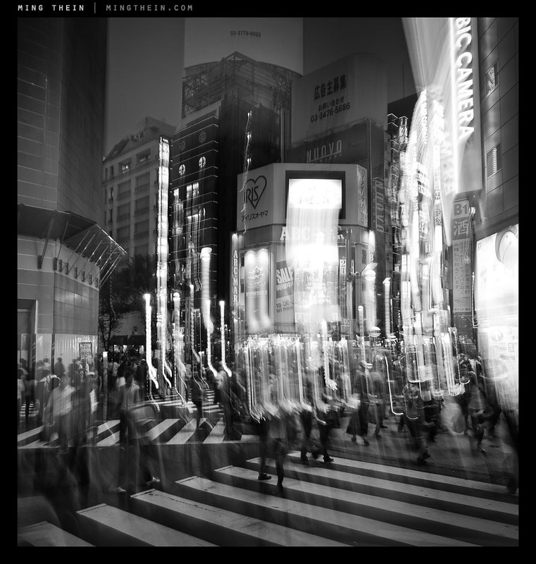
This series of images was captured around dusk in Shinjuku, Tokyo during my last workshop. While my students were off completing their final assignment, I decided to challenge myself to capture the feel and essence of the place in a different way to what I would have normally done. (After all, it wouldn’t be fair for me to put my students outside their comfort zone by insisting on the importance of having a central idea or theme in their images for their assignment if I couldn’t delivery myself, would it?)

_5012881 copy

At the same time, I’d felt as though I’d been reaching a little creative stagnation of late, and wanted to force myself to do something different anyway. Having your own style is good, but at the same time, that style has to evolve and grow in order not to get stale or boring. One of the things I’d been doing a lot of lately is jacking my shutter speeds up very high to ensure I was getting every last pixel of resolution out of the new cameras; whilst this made for great definition under the majority of circumstances, this crispness of capture doesn’t always suit the theme you’re trying to shoot to.

_5013351 copy

The idea I decided to follow for this series was flow – people as water, life as transient, a moment being more than a moment and altogether insufficient to capture the sheer volume of activity of what was going on around me. It’s a very strong impression I got simply by standing in place and watching life moving around me – people simply didn’t stop, torpedoing from location to location with some objective in mind, dispatching that objective, then moving on to the next one. (I’m guilty of this at times too; it’s a consequence of running your own business. Perhaps this experiment was as close to my subconscious was going to get to forcing me to slow down and smell the roses.)

_5013736bw copy

The only two ways I could see of communicating this idea were either to have a huge number of people lining streets and thoroughfares to appear as a continuous mass (there were a lot of people, but not that many, and moreover there was no way or achieving that vantage point) or through the use of motion blur – not a little bit, of the kind that appears at 1/30s and with people walking, but something altogether a bit more abstract. In hindsight, this would have been very easy to accomplish with a tripod, but without it, I didn’t have the foresight to pack one in – much less bring one on the day. Even a mini-pod or a Gorillapod would have been useful.

_5013181bw copy

Instead, I was forced to test the stabilizer of the OM-D to its limits – even with something to brace against (And sometimes not), I’d be needing shutter speeds in the 1/2s-1/5s range to achieve the effects I was looking for. Needless to say, you can only do this when the sun is going down. To give me a higher chance of success, I used the 12/2 for most of these shots, and shot in continuous high burst mode – not for the frame rate, but because I’d be able to keep my finger on the shutter button to minimize camera shake, and have only short intervals between frames. When I had to shoot using the LCD instead of the EVF, I would pull the neck strap tight to tension the camera somewhat against my neck and hopefully reduce shake – this technique is actually surprisingly effective. In hindsight, I should have used the self timer + burst function to completely eliminate finger-induced shake.

_5013468 copy

One of the things with this kind of photography is that you really don’t know exactly what you’re going to get until you get it; there may not be enough motion, or too much, or you might have streaks in the wrong part of the frame; all you can do is do a lot of takes until you get the right one.

Compositionally, the most important thing to remember when involving motion in your shot is that there must always be some clearly static and sharp object in the frame to serve as a visual anchor for your composition; if this is missing, the photograph just appears to be blurred or out of focus without the same directionality and focus that is implied by motion blur. In fact, having a large number of people moving through the frame is somewhat reminiscent of the energy of strong, dynamic brush strokes in a painting. I like the idea of abstracting out the people from the scene, and the contrast between the animate and inanimate. For these images, I chose the visual anchor first, then followed it by imagining where I’d want my flows of people to go; needless to say, there were a lot that didn’t work out because I didn’t have enough people moving close to the camera – a foreground is of course a necessity of using a wide-angle lens.

_5013253 copy

I did use the 45/1.8 for some of the images, but this proved to be extremely challenging as the lower practical limit for handholding a 90mm equivalent was somewhere in the 1/10s range on the OM-D, which is fractionally higher than what I needed for the desired effect. Still, I did manage to get lucky a couple of times with both very stable shots and convenient things to lean against. I also tried some more and less conventional techniques – panning blur, and combining staticness with abrupt motion of the entire camera to impose an impression of chaos whilst maintaining some semblance of a visual anchor. Overall, I’m pretty happy with the results though. Notes for a future experiment: I’d love to try this with a tripod and a longer lens. MT

____________

Visit our Teaching Store to up your photographic game – including Photoshop Workflow DVDs and customized Email School of Photography; or go mobile with the Photography Compendium for iPad. You can also get your gear from B&H and Amazon. Prices are the same as normal, however a small portion of your purchase value is referred back to me. Thanks!

Don’t forget to like us on Facebook and join the reader Flickr group!

appstorebadge

Images and content copyright Ming Thein | mingthein.com 2012 onwards. All rights reserved

_5013236 copy

_5013681 copy

_5013109 copy

_5013834 copy

ACR 7.3 is now available

You can download the final release candidate here. Notable changes are support for the Olympus E-PL5, E-PM2, Panasonic GH3, some of the new Canon compacts, a whole slew of lenses, and final support for the Nikon D600. Fuji owners are still out of luck, unfortunately. MT

Just got interviewed on the Leica blog…

…For those of you who might be a little curious about the person behind the site, the interview by Eric Kim can be found here. MT

Photoessay: Street photography with the OM-D and ZD 60/2.8 macro

_5010194 copy
From outside looking in

All images in this series shot with the Olympus OM-D and ZD 60/2.8 macro.

There’s nothing that says you can’t use macro lenses for non-macro purposes; the old myth of the optics being poorer at longer distances is just that: a myth. In fact, macro lenses tend to perform better than most standard lenses even at long distances because they are so well corrected in the first place. There are two drawbacks: firstly, the apertures tend to be slower, which isn’t so good for achieving subject separation and is solely a physical property of the focal length and aperture combination of the lens; secondly, the focus throw tends to be shorter.

_5010332bw copy
Not wanting to be part of the crowd

This is a both good and bad – good because if an autofocus lens, the focusing elements don’t have to move as far since the lens must also be able to provide sufficient effective extension to focus at macro distances, bad because it means that if you have a manual focus lens – like the ZF.2 2/50 Makro-Planar I use – you have very, very little travel between mid distances – say 2-3m or so – and infinity, which can make precise focusing very difficult. For manual focus lenses, using the camera’s built-in rangefinder/ focus confirmation dot simply isn’t precise enough as the dot stays lit for some not inconsiderable displacement of the focusing barrel*. For autofocus lenses, the camera/ lens combination may not have the ability to consistently move the elements by the precise displacements required for very small changes in focusing distance – this is especially apparent with older screwdriver-focused lenses like the Nikon 60/2.8 D. Newer coreless motor lenses (AFS, EFS, M4/3 lenses etc) generally don’t have problems as there is very little backlash in the focusing system.

_5010144 copy
The writing’s on the wall

*Do this simple test to see what I mean: shoot the same subject, at the same distance, with the cameras on a tripod and your desired test lens attached. Using the viewdfinder or EVF, try to focus the lens/ camera manually from both infinity and near limit, stopping just once the focus confirm indicator lights. Do this with the aperture wide open, otherwise other focus errors like backfocusing or mirror misalignment can’t be identified and compensated for. Shoot the same frame again, focusing with live view to use as a comparison image. What you’ll probably see – is that neither image using focus confirm is as sharp as the live view image. This effect is even worse for telephotos, because of the depth of field characteristics of the focal length. The shorter the focus throw, the worse this problem becomes.

_5010527 copy
Untitled.

Potential focusing issues notwithstanding, so long as you have enough light for a sufficiently high shutter speed to avoid camera shake, the results are generally excellent. Specifically in the case of the ZD60, (my full review at macro distances is here) I’m pleased to report that the lens’ already excellent optical properties do not change at all at longer distances. In fact, the one niggling flaw I saw at close range is mostly gone – I’m not seeing any bright edges to out of focus highlights. Both foreground and background bokeh is smooth and non-distracting. Subjects fall nicely in planes and are separated in a manner that has plenty of 3D pop; this is characteristic of a lens with excellent microcontrast.

_5010353 copy
Arches

Focusing is not an issue at all, and is just as fast as the ZD 45/1.8 providing you have the 4-way limiter switch in the right position. The one minor issue I did find was that the lens with hood is not exactly inconspicuous (and nowhere as compact as the 45), being nearly 15cm long with everything in place. Relatively small by DSLR standards, but probably not exactly what M4/3 users have in mind.. Personally, I find this combination of interest not because I’d take it out on dedicated street photography/ travel expeditions, but because I frequently carry the OM-D system either as a backup camera (or as a primary for assignments that don’t require the D800E’s resolution) – and the ability for a lens to do double-duty means one less thing to carry, break, fail or potentially lose. It’s always nice to have options. MT

The Olympus OM-D, 60/2.8 Macro and 45/1.8 are available through Amazon by clicking on their respective links.

____________

Visit our Teaching Store to up your photographic game – including Photoshop Workflow DVDs and customized Email School of Photography; or go mobile with the Photography Compendium for iPad. You can also get your gear from B&H and Amazon. Prices are the same as normal, however a small portion of your purchase value is referred back to me. Thanks!

Don’t forget to like us on Facebook and join the reader Flickr group!

appstorebadge

Images and content copyright Ming Thein | mingthein.com 2012 onwards. All rights reserved

_5010264 copy
A pick-me-up before the pick up

_5010106 copy
Hiding from the dishes

_5010217 copy
Guardedly relaxed

_5010340 copy
I’m on the way

_5010076 copy
Hop to rainbow row

_5010091 copy
A surprisingly good soup

The four stages of creative evolution of a photographer

_7037765 copy
As close as I got to Everest. Nikon D700, 85/1.4 G

On careful reflection, there are a number of stages which every photographer (hopefully) goes through as their creative vision develops. In fact, it’s more like a pyramid or mountain that requires climbing: the higher you go, the more difficult it gets, and the more commitment is required. The lower slopes are gentle, easy and well-charted; the higher slopes are rocky, icy, treacherous and the preserve of the supremely brave or foolhardy. At the same time, far more people visit base camp than the summit; and few do it without supplemental oxygen.

Perhaps that metaphor has gone a bit too far. Like every pursuit, photography is one of severely diminishing returns: it isn’t difficult or expensive to become reasonably good, but if you’re trying to push the boundaries, be prepared for frequent dead ends, wrong turns, and never-ending criticism: the simple reality is that if you are always experimenting, not all experiments turn out better than the previous one, let alone tried and true methods.

I was at a dinner with a number of fellow commercial photographers recently where this point was discussed in some detail: we work in an environment of shrinking budgets and drying up jobs, yet there will always be some clients who perhaps are more like patrons than business as usual: they don’t mind you trying to push the boundaries. The comparison to the art world was drawn: a piece that may not make any sense to a casual, external observer makes no sense precisely because of the casualness of the observation: the viewer does not have the benefit of having experienced and seen the evolution of the artist from the starting point into their current form of expression. I think the same thing is true with photography, though to a lesser extent; we were discussing another recent batch of image submission which had to be graded/ sorted/ reviewed etc. and how to judge whether something had extremely deep and complex metaphors, or whether it was simply a bad image – the conclusion was that the caption was the giveaway. (It stands to reason that a casual-looking image with a deep meaning and careful execution would have an equally-carefully crafted caption that supports the message of the photograph. None of these particular images did.)

Pre stage
The vast majority of the population falls into this group. These are the people who own cameras and perhaps use them at social occasions, or for recording/ documentary purposes, or when they are expected to – like when on vacation – but do not actively seek to go out and take photographs. They may be creative in other areas, but just not photography. Composition is not something that they actively think about and technical skill is limited to turning the dial to the green mode. For the purposes of this discussion, I will classify them but not discuss their traits in any greater detail; I’m almost certain that none of my readers fall into this category anyway.

First stage
To progress to the first stage, you need to have the intention; you have to make a conscious choice in wanting to make a image. You may or may not know what is good, what works and what doesn’t, or the technical aspects of photography; the bottom line is that a person in this category has the desire to photograph. I suppose this is what separates newbie photographers from the rest of the population who might merely own a camera. Intention is what gives people the motivation to actually get out and do something – in this case, learning, experimenting, and trying out things. It is impossible to learn photography solely by reading or looking at other people’s images, though this can be very useful – you really don’t get a feel for things without experience, and this experimentation is something which is a common factor to all forms of creativity.

The other characterizing traits of a person in the first stage of creativity is that the way they shoot and the work they produce is reactive; they may make a conscious choice to embark on an outing whose sole purpose is to take photographs, however, it is very much a case ‘of shoot what you see’, and only photographing a subject if it’s obvious and front and centre. There is no element of anticipation, preconception, or previsualization involved; this means that the images are frequently lacking in a story – ‘the idea’ – because the photograph frequently contains only the subject and no related elements (the context) – or worse still, a bunch of distracting and misleading elements.

Second stage
The next phase of development involves some awareness of ‘the idea’. It is usually also accompanied by a heightened consciousness of one’s surroundings; this is caused by the development of one’s sense of observation and anticipation. The photographer in the second stage will visit a particular place and feel that it is photographically ‘rich’, with a lot of opportunities or stories; or perhaps that there are certain elements that must be included in a shot in order to the essence of the location.

However, the idea may not be fully formed, or the photographer may lack the technical ability to execute what they are envisioning in their minds. Images produced by the photographers in the second stage tend to feel a little bit chaotic; this is because not all of the elements in the scene are under control, or were included or excluded as a conscious choice on the part of the photographer. It is very possible for a second stage photographer to occasionally produce a brilliant piece image; the problem is that although the outcome may match the intended story perfectly, it was more due to luck than planning and would not be consistently repeatable. Most dedicated amateurs will reach this stage.

Third stage
The first part of this stage – let’s call it 3A – is when a photographer firstly has a vision in their mind of what the end product should look like, can consistently execute this, and have the image communicate its meaning or intention to a viewer on its own merits, without the help of a caption, or intervention from the photographer. These photographers tend to have nearly every element of the image under conscious control; and have a level of technical skill that enables them to consistently repeat the execution if required. There is practically nothing left to chance, and no detail is too small. A good commercial photographer would fall into this category, and it’s probably beneficial for them not to push too much farther, especially in Asia and other conservative markets – there are far more clients that prefer the ‘safe’ route rather than the experimental one.

At the same time, there’s something missing from the images – they’re too safe, too perfect; stage 3B is where the creative realizes this and is trying to produce something different, but can’t quite make it work; it isn’t a bad image, but the full idea or story isn’t getting through. On the way to the pinnacle, one has to expect to fail at least some, if not most of the time. And by fail, I mean produce images that are not quite satisfactory for some reason or another – usually because they fall short of fully and clearly communicating the photographer’s idea at the time of capture. If this isn’t happening, then chances are you’re playing it overly safe and stagnating.

Fourth stage
Defining what makes a photographer qualify for this level is tough, simply because it’s impossible to pin a concrete set of limits on creativity. Perhaps it’s best to say they have to be gifted in some way and give examples; we start with Louis Daguerre, include Oskar Barnack, H-CB, Capa, Kubrick, Salgado, Majoli and perhaps also Avedon and Leibowitz; I think some of the Japanese photographers like Araki would also qualify, though I don’t claim to fully understand their work – but it is clearly a very developed, evolved style. I’m sure there are plenty more out there whose work I haven’t yet had the chance to see, or whose work is either kept private (Vivian Maier, for example – though I don’t think she’s a stage four) or not well publicised. There are but a small handful of people who ever reach this point; they have the common trait of pushing the boundaries in one or more aspects of the image making process simply because they can imagine and envision things which the majority of the population are unable to. I suppose in some ways, this aberration of the mind or difference in thinking is a bit like having a disability, but in a way that’s more beneficial than debilitating.

Although these people have the benefit of being able to see in a way that the rest of us cannot; a lot of them are also handicapped by it because this way of seeing is so ingrained into their thought processes and consciousness that it is very difficult, if not impossible, to break away from. This is in a way analogous to a form of savantism in which the subject has a narrow, obsessive focus on one particular topic that leads them to consider every possibility and outcome; including the ones that are normally discarded through a more balanced rational thought process. This focus results and creativity or games in one very specific niche; a slightly less intense variant of this is the development of personal style. Discovery and adoption of a personal style, in a way, is the development of and obsession with a particular look or mood to an image.

One little thing I notice about photographers who are at the fourth stage is that none of them will ever admit it: their work is never excellent, it is merely good enough (and rarely, if that). They are proud of what they do, but they know that things can still be taken further with another push; ideas fleshed out and illustrated more fully. Their work is always technically very well executed, and frequently polarising; their creativity is so far ahead of the interpretative capacities of most people that there are two camps of viewers: the concept or message is so fundamental that either you understand it, or you don’t. They have a deep passion in what they do, bordering on the obsessive; and are frequently difficult people to interact with in social settings, simply because their thought processes are so different to the majority of people that there is no common ground or reference basis on which for them to interact, leading to frequent miscommunication and awkward gaps in conversation. This in turn contributes to such artists being misunderstood or developing a reputation for genius – it’s not that they don’t want to explain the rationale behind their thought processes, it’s because they simply cannot – what seems perfectly ordinary to them and not requiring a second thought is something that requires a huge number of mental leaps for somebody else.

The conclusion of this article has deviated somewhat into an examination of the mind of how an extremely talented and gifted person would think; this was not intentional however in the interest of full disclosure it is a topic that is very personal to me because of things I have faced in my own life. I graduated young, and have always been – by a large margin – the youngest person at my level in any organization I’ve worked at; in my last corporate job, my peers were in their 50s (I was 25). I had no problems doing the job – the huge delta in thought processes and social experience is what made me feel highly uncomfortable with my day to day situation.

One of the reasons I’m so passionate about photography is because it is one of the last few truly meritocratic fields; it doesn’t matter how old you are or who you’re related to (there are of course exceptions); in an anonymous viewing, a crap image will always be a crap image; there is far less discrimination based on age than in other fields. Perhaps it’s because a perception thing: you can instantly judge the merits of a photograph visually, but it’s impossible to know if somebody is a good investment manager or consultant or operations director simply by looking at them. (And even several years down the line, it’s still difficult to tell; it’s impossible to separate out the person from the other environmental factors affecting their work.)

This is of course not to claim that I fall into stage four or even 3B; I think it takes recognition by a large body of people for a person to be recognized as gifted. But I do know that I plan and think about my images to the point of being neurotically obsessive; there is always something that can be better, there is always something else to try, another article to write or another thought to elucidate and share. And in a weird way, I think I rather enjoy it. MT

____________

Visit our Teaching Store to up your photographic game – including Photoshop Workflow DVDs and customized Email School of Photography; or go mobile with the Photography Compendium for iPad. You can also get your gear from B&H and Amazon. Prices are the same as normal, however a small portion of your purchase value is referred back to me. Thanks!

Don’t forget to like us on Facebook and join the reader Flickr group!

appstorebadge

Images and content copyright Ming Thein | mingthein.com 2012 onwards. All rights reserved

Last workshop for November 2012: Introduction to Wildlife Photography, Kuala Lumpur

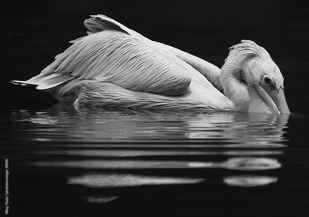
_VL31_L1000526 copy

By popular demand, I’m going to be conducting one more workshop this month in Kuala Lumpur: an introduction to wildlife photography techniques. Due to our current weather and afternoon rains, the session will be split into two mornings – Friday 23 November, 9-1pm and Saturday 24 November, 9-1pm. The sessions run continuously, and the break in between allows for critiques and literal and figurative recharging of batteries between the two sessions.

_7190026 copy.jpg

Since wildlife photography can be very hit and miss – in the past, I’ve spent entire weekends in swamps with only five minutes of action – we will be conducting the workshop in a ‘safe’ environment where there definitely will be animals to shoot: the Kuala Lumpur Bird Park at Lake Gardens.

_VL31_L1000804 copy

The topics covered will include:
– Long lens technique and shot discipline
– Approaching your subjects
– Understanding animal behaviour and what constitutes an interesting wildlife image
– Use of context and environment
– Metering techniques under difficult lighting
– Understanding and managing AF

There will also of course be feedback and critique sessions at the end of each half-day.

_D3T1396 copy.jpg

Finally, it’s worth remembering that wildlife photography isn’t just applicable to wildlife: the skills of anticipation and shot discipline are valuable for every type of photography. The workshop will be jointly supported by the local distributor of Gitzo tripods and monopods, Shriro. They will be bringing along a range of tripods and monopods to experience.

A quick note on equipment requirements: Although you can bring along your big guns and DSLRs – 300mm would be a minimum, and 400mm+ preferable – you can also produce compelling work with smaller formats such as a M4/3 camera and 100-300 zoom, or even a bridge camera – a lot of the images in this post were shot with a Leica V-Lux 3. 

The price for both days with an experienced wildlife photographer – I shot mainly wildlife for five years, and my some of my work can be seen here – is just RM1,250 inclusive of park admission. Please send an email to [email protected] for bookings or more information. Thanks! MT

_M106893bw copy.jpg

____________

If you enjoyed this post, please consider supporting the site via Paypal ([email protected]); Ming Thein’s Email School of Photography – learn exactly what you want to learn, when you want to learn it or learn how to achieve a similar look with our Photoshop workflow DVDs.  You can also get your gear from Amazon.com via this referral link.  Prices are the same as normal, however a small portion of your purchase value is referred back to me. Thanks!

Don’t forget to like us on Facebook and join the Flickr group!

Images and content copyright Ming Thein | mingthein.com 2012 onwards. All rights reserved

Clearing up the myth of higher resolution, shot discipline and image quality once and for all

Empirical observation #1: Cameras with higher resolutions, for a given sensor size, are harder to hand-hold and get a good result than those with a lower resolution.

And I define a good result as one which the image is critically sharp at 100% actual-pixels view, with no motion blurring or other artefacts such as slightly missed focus (we’ll get to this later). Motion blur is when the camera moves by a greater amount than a pixel during the time when the shutter is open; if it’s less than this, then you see either hard edges on your subject as a perfect sharp edge, or with slightly lower contrast than expected due to the image projected by the lens on the sensor plane ‘spilling over’ into the next adjacent pixel slightly when the camera moves.

The simple reason why higher resolution cameras are less forgiving is that for a given angle of view, the camera with the high resolution will put the greater number of pixels per degree of field of view on the subject. This means, that less angular movement is needed before it becomes visible as blur on the image – i.e. you need to be more static than with a lower resolution camera to avoid seeing the effects of motion blur at the pixel level.

But what about the image when viewed as a whole at the same reproduction size? If we started out with a huge number of pixels with both – say 24MP and 36MP and resized both them down to say, 4MP or so – we would not see any difference between two cameras assuming one assuming both were equally downsized. This is because the downsampling process has enough information for each pixel to accurately determine its color and luminance value and therefore appears as true detail. If we downsize 36MP to 24MP, it might or might not look better: a lot of the outcome depends on the interpolation process. It isn’t a ‘clean’ situation where each new, downsized pixel has multiple pieces of information (the original pixels) to form an average that would be the same whether you used 8 or 12 pixels originally. Since 36 doesn’t divide cleanly into 24 – you get 1.5 old pixels per new one – there’s always going to be some guesswork as to precisely how that half pixel is allocated. And depending on the algorithm, any one of the following might happen – blur edges; stairstep artefacts; haloes or abrupt transitions; odd discontinuities in diagonal lines.

Let’s take an example: if you have a scene shot with 12 (8.45um pixel pitch) and 36 MP (4.88um pixel pitch) cameras, and both are equally motion-blurred. The degree of camera shake may be less than a pixel on the 12MP camera – let’s say 5um for argument’s sake, which will still produce a critically sharp image. However, the 36MP camera is now blurred by more than one pixel, which definitely will not look critically sharp at 100%. Yes, we can downsize – but you are downsizing not to 1/2 of the original linear dimension (which would yield 8MP, and bin the two blurred pixels into one sharp one that looks perceptually okay), but to 1.7x of it – and once again, we run into potential issues in trying to fit discrete, nonlinear data into a linear continuum.

This is one of the reasons why less pixels might actually produce a perceptually sharper/ crisper image for a given reproduction size, providing that this size is reasonable for the amount of resolution you’ve got in the smaller image.

The upshot of all of this in practical shooting is that you’ll need to use a higher shutter speed than you expect, which lowers your shooting envelope by a corresponding number of stops as noise increases as you ramp up the sensitivity to keep shutter speeds high. Perceptually, if you’re going to be shooting under already borderline conditions to get a critically sharp image with a 12MP camera, you’re not going to get one with a 36MP one – even if you print them at the same size.

Empirical observation #2: Cameras with higher resolution require more precise autofocus.

Comparatively, this one is very simple to explain: if the camera misses focus, the resolving power of the lens is diminished. You need to have the ability to resolve slightly smaller structures than the pixel pitch of the camera in order to create a perfectly sharp image at the sensor plane. If you miss focus by an arbitrary amount – let’s say 1% of your subject to camera distance – this may result in a loss of resolution corresponding to the inability to resolve structures below 5um in size. For our 36MP, 4.88um pitch camera, this will appear to be a blurry shot. For our 12MP, 8.45um one, things still look critically sharp.

A lot of what we’re seeing isn’t necessarily worse autofocus; what’s happening is that we are now visibly reaching the limits of tolerances and precision since sensor quality is now high enough to resolve at or close to the previously acceptable tolerances.

A lot of the reasons why an image appears sharp or not has to do with the reproduction medium, as well as how our eyes interpret information: an image with hard edge is seen to be ‘sharper’ than an image without one, even if there is less fine detail or edge definition. The fact that digital capture splits out our images into distinct zones – the pixels – doesn’t help this at all, either. It’s important to remember that a slightly blurred image (depending on the degree of blur, of course) from a higher resolution camera may technically still have more detail, our eyes don’t necessarily pick up on this; it’s a perceptual thing. Bottom line: don’t use more pixels than you are capable of handling properly for a given situation. It’s one of the reasons why I don’t shoot the D800E for casual work…but it’s also the reason it’s my camera of choice when I have full control of the execution. MT

____________

Visit our Teaching Store to up your photographic game – including Photoshop Workflow DVDs and customized Email School of Photography; or go mobile with the Photography Compendium for iPad. You can also get your gear from B&H and Amazon. Prices are the same as normal, however a small portion of your purchase value is referred back to me. Thanks!

Don’t forget to like us on Facebook and join the reader Flickr group!

appstorebadge

Images and content copyright Ming Thein | mingthein.com 2012 onwards. All rights reserved