The concept of ‘visual weight’

H51-B0007349 copy
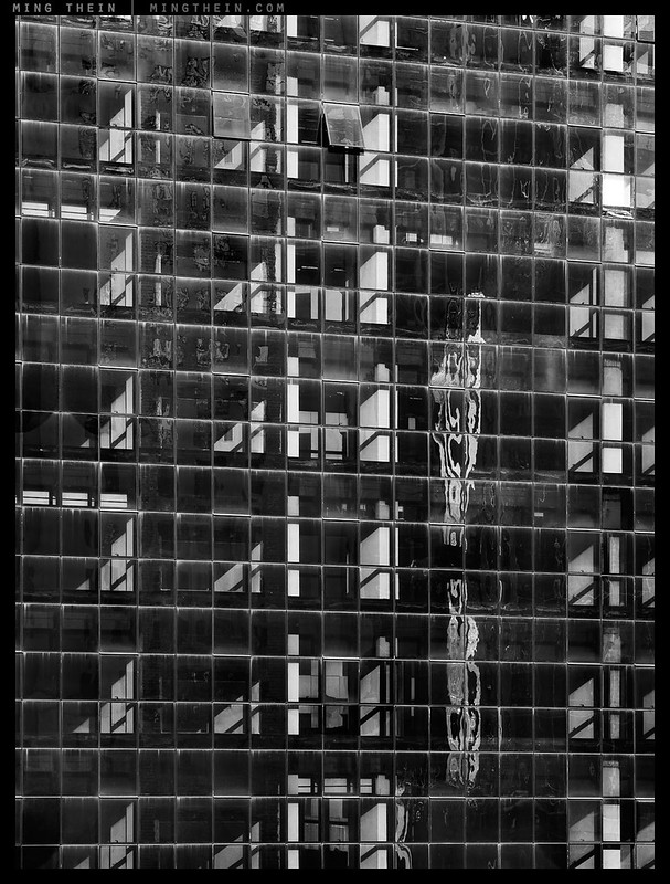
Heavy, but with light inside bits. Translation: transparency

We acknowledge that every medium of expression has its strengths and limitations relative to others. Yet our basis for discussion and understanding of concepts and ideas is very much a written/spoken language-based one, this remains our benchmark – more so when the concepts become more complex and less intuitive – or the opposite, so simple and basic they’re entirely intuitive and not at all logical. There are of course severe limitations of language when it comes to describing the visual properties of expression and composition, yet it’s usually easy for us to see when something isn’t quite right. Why, how, and what do proportions, weight, balance, composition and aesthetics have to do with each other? Is there a somewhat more objective way to handle these concepts? I’m not certain, but today were going to try.
[Read more…]

Review: The Olympus E-M1 Mark II

100D_MG_1685 copy

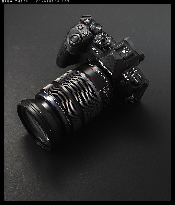
I’ve had the chance to use a final preproduction (i.e. should be no difference to shipping units) Olympus E-M1 Mark II for the last couple of weeks, thanks to Olympus Malaysia*. The camera was supplied with the new 12-100/4 IS PRO and the 25/1.2 PRO lenses. What follows will be not so much the traditional ‘review’ as series of thoughts on the camera (hereby abbreviated to EM1.2); I’ve previously made my current position on hardware and reviews clear and will again state upfront that this evaluation is performed in the context of the images I usually make, not every possible photographic situation. There are some subjects I just don’t shoot, and it would not be very useful for me to comment on the camera’s performance in these areas anyway. With that aside, let’s proceed.

Important note (and you’ll see why, later): all accompanying images were shot handheld, and edited from camera JPEGs – there is no ACR support for the E-M1.2 yet. This of course means tonality and color will likely deviate from my ideal output intention. Images are clickable for larger versions. I’ll also be adding more images to the flickr gallery here.

*Though some people were apparently paid by the mothership to go to Iceland…

[Read more…]

Repost: Differences between eye and camera: practical implications

_G008000 copy
Why is it so difficult to get sunsets to appear ‘right’? Read on for the answer.

Following the last two articles on rules of vision, it seemed very appropriate to finish the mini-series with this little reminder from 18 months ago…

Many photographs do not work. Subsequently, we find out they do not work because there is a difference between what you saw and what your audience sees in the image. Sometimes this comes down to lack of skill in translating an idea, but often it’s more subtle than that: the camera doesn’t see what we see, and we need to be both highly aware of that and how to compensate for it. Yesterday’s photoessay is a good example: it’s no big deal to make a monochrome image, but our eyes only perceive a lack of color under very exceptional circumstances. Yet it’s these differences that make some images stand out, and others not really ‘work’.

[Read more…]

Last day left to order the ultimate photographers’ daybag

100D_MG_1083 copy

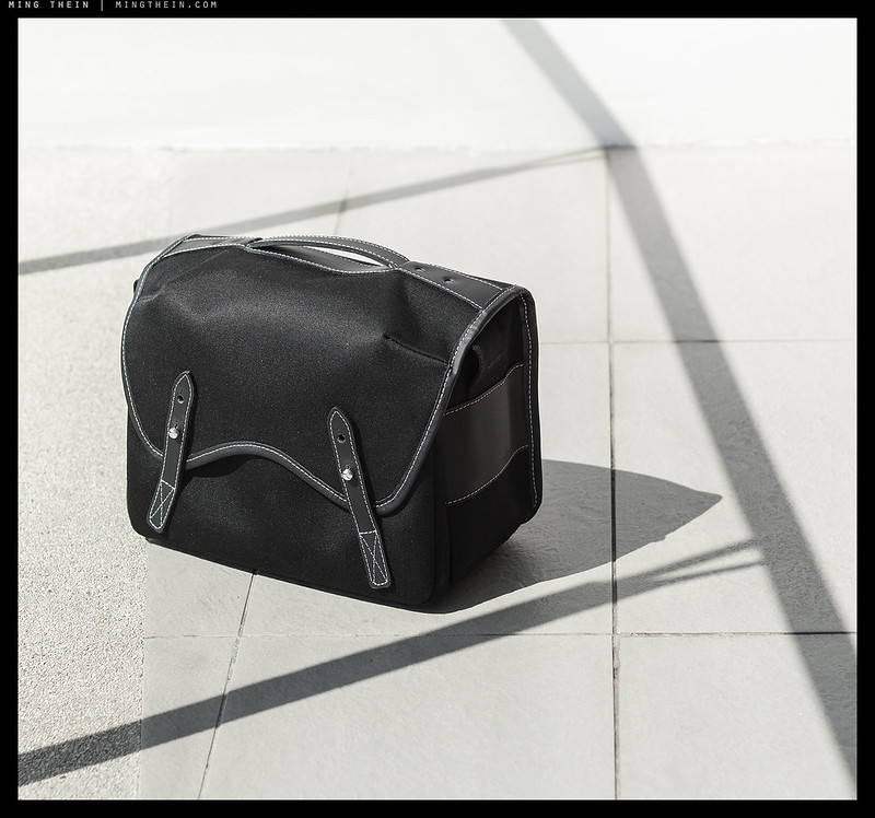
Quick update: the first batch of orders went out last late last week. Thank you to all for the strong support so far; there were far more orders than planned for, though we do expect to still ship everything by the end of November.

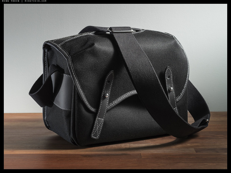
Please note that we’ll be closing the order book for the ultimate photographers’ daybag – designed by me, handmade in England by Frankie Falcon – tomorrow night. So, this is your final chance – please get your orders in here if you’d like one. 🙂 Thanks! MT

Some images of the first and second batches coming together at the workshop care of FF after the break.

[Read more…]

Photoessay: Urban detail, Lisbon

H51-B0002637 copy

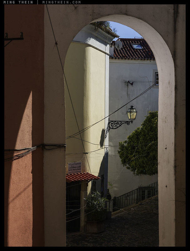
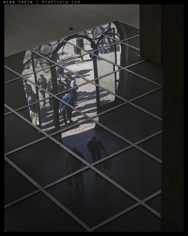
Today’s photoessay is a series of detail images from Lisbon – small vignettes and scenes which I feel give a reasonably representative flavour of the older parts of the city. Yes, there’s a modern surprise in there about halfway in, but in many ways, this is also typical: there’ll often be an unexpected bit of architecture or facade tucked away in amongst the antiques, too. I’m sure more than a week here would have yielded a tighter distillation, and there are almost certainly interesting local pockets I’ve missed out on, but I also felt I had the benefit some pretty exceptional light; interesting how those light coloured buildings tend to bounce, reflect and fill each other so there are actually very few really deep shadows – even in narrow alleyways. Lots of textures, too, ranging from what I think of as ‘cheery Mediterranean tile’ to ‘Eastern European patina’. Enjoy! MT

This series was shot with a Hasselblad H5D-50C, HC 24, 50 and 100mm lenses and post processed with Photoshop and Lightroom Workflow III.

[Read more…]

Rules of vision – part II

H51-B0003481 copy
Upside down, or?

Continued from part I – hopefully the first part has had time to settle and digest; let us press on…

We draw temporal inferences from direction of shadows
The length and direction of shadows also suggests time of day: this is one of the indelible subconscious rules dating back to the very beginning. It is a consequence of observing sunrises and sunsets and being able to judge approaching darkness accordingly, by both overall luminance of a scene and the shadows cast by the sun. Sadly, for a lot of us, this is somewhat academic as there are far too many offices with hours that extend beyond daylight and further have no natural light whatsoever…

[Read more…]

Rules of vision (or, things we can’t help seeing) – part I

H51-B0003019 copy
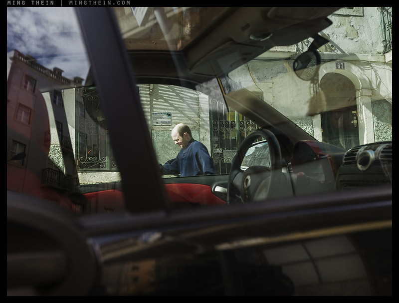
Did you notice the sign above the man’s head? What about the house number? Or what appears to be a Cuban flag in the doorway? Or was the moving man the first ‘anchor’?

Regular readers will know that I hate arbitrary maxims labelled as ‘photographic’ rules simply because there is no such thing as a ‘universal scene’ or universal set of parameters for every image. Every composition is different, and every creative intention is different, which means the whole premise of there being a fixed set of laws that make a ‘good’ image or ‘image that works’ can only be nonsense. However, I do think there are some fundamental principles of human vision – and consequently psychological response to elements in an image – that we cannot ignore since they directly influence the response of our audience to the ideas we are trying to present. That is what I wish to address today: what are the autonomous/ subconscious/ reflex/ automatic – pick your preferred term – visual responses that we should be aware of and seek to utilise when we compose an image? Think of this post as the predecessor to The Four Things: it’s the underlying reason why some of the Things have to be the way they are.

[Read more…]

One week left to order the MT x FF ultimate daybag…

100D_MG_0979 copy

One week left to order the ultimate photographers’ daybag – designed by me, handmade in England by Frankie Falcon. The order book closes 31/10, and it won’t be sold again in this configuration (and even possibly not at all). So, this is your final chance – please get your orders in here if you’d like one. 🙂 Thanks! MT

Photoessay: Two buildings and a break

H51-B0012124 copy

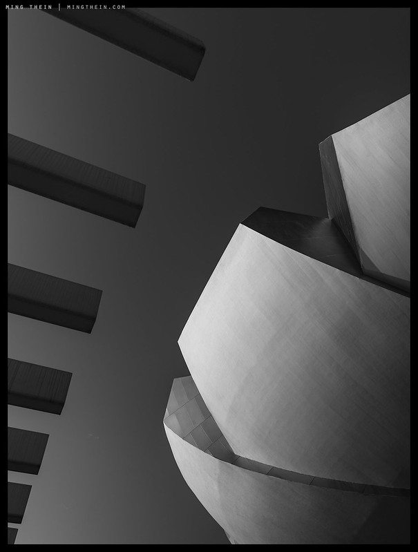
For some odd reason, I’ve always thought these two buildings* to be amongst the most difficult to photograph in Singapore – partially because they’re such iconic landmarks that there’s almost no angle or light or weather condition that hasn’t already been exploited; you’re almost afraid to take a photograph because there’s a high chance you’ll just be doing something unoriginal. On top of that, the structures themselves are oddly shaped and the perspectives available at ground level are somewhat limited so that they look very similar from a wide range of vantage points. In the end, I landed up going back to basics: what is the essence of the form and feel of the structure? The result was a series of abstracts of each building. I’ve left what appears to be an unconnected ‘conventional’ image to divide between them, for the simple reason that under the skin: the hardware and M&E doesn’t change. MT

*If you aren’t familiar with Singapore architecture, the two buildings are of Art Science Museum and the Parkroyal on Pickering.

This series was shot with a Hasselblad H5D-50c, 35-90mm and 150mm lenses and post processed with The Monochrome Masterclass workflow.

[Read more…]

Psychologist, philosopher, tinker, spy

16_8A15558 virtual banking copy

Borrowing the title reference from the John le Carre novel and (later) movie Tinker Tailor Soldier Spy – I think nicely encapsulates the multitude of hats the modern photographer must be comfortable wearing in order to be a producer of compelling images. I’ve said before that photography is both a dialog between photographer and audience and that the process of photographing is really an exercise in curating and excluding elements of the world according to one’s own personal biases, then sharing the results with an audience such that they might be interpreted in the desired way. The technical process of capture, and the creative one of composition, are no more than enablers to that translation: the capture allows recording and sharing; composition is arrangement with the intention of direction and influence over the audience. The whole photographic process – vision, composition, capture, presentation, viewing – is really simultaneously as much and as little as the sharing of an idea inspired by already extant objects.

[Read more…]