After six months in the making…I’ve got a big announcement coming at noon tomorrow. Stay tuned 🙂 MT
On Assignment: back to the hospital
November 19, 2012 by

This hospital has turned into one of my regular clients – I went back for another couple of shoots. Incrementally, we’re working our way through the departments and refreshing their image banks. I’m also hoping to shoot live surgery at some point in the future, but no idea if that’s going to be cleared by their board or not – there are so many things that might be unacceptable both from a hygiene point of view – you can’t autoclave a camera – as well as privacy etc. Still, it’ll be an interesting experience. At least light shouldn’t be a problem, given those fantastically bright operating theatre fixtures. (Side fact: one of the reasons why I didn’t go to med school was because I couldn’t stand the sight of blood. But oddly enough, operating a camera makes me focus on shooting and completely ignore everything else – the resultant being that I’m happy to shoot in places which I’d never even think about visiting ordinarily.)

But, I digress. With this post, I wanted to talk a bit about lighting on location. Hospital lighting in the wards tends to be uniform, flat and uninteresting: fluorescent tubes, more fluorescent tubes, and yet more…you get the picture. If you’re lucky, they might even be color matched. Fortunately, to keep patients feeling comfortable with the ambience, most of the time they’re at least daylight-balanced tubes (this is important, because it means you don’t have to gel your flashes to balance out ambient).

A typical scene involves some equipment, a doctor/ technician, and a patient. And the interaction is what we’re trying to capture, along with some sense of context, along with a bit of ‘ooh, look at the fancy machine’. This means that lighting is a bit of a challenge because you’ve got to have a nice diffuse source to make the humans look good, as well as something a bit punchier and more directional to give the machines some depth and dimensionality. On top of all of this, there often isn’t that much room in which to set things up, and ceilings aren’t that high. Oh, and it’s also a working hospital, so time is very much of the essence.

Composite shot – the glass was far too reflective and dark (it was a sleep lab, after all) so I had to shoot one of the monitoring post, another one of the computer screen, and a third inside the sleep lab itself from approximately the same angle of view of the operator and line of sight.
The setup I go with is a pair of speedlights on stands with umbrellas; either shoot-through (for the primary light on the humans) or bounced reflector (for the machines). Sometimes I’ll add a third speedlight as a catchlight or to brighten up the background a bit. For the most part, Nikon’s CLS/ iTTL system works pretty well, though the background speedlights sometimes don’t trigger due to being out of the line of sight. But a little tweak to position and usually all is well again. I was considering radio triggers, but then I was told that they weren’t allowed in the hospital as they might interfere with critical equipment such as pacemakers and life support machines (!) – probably best not tried, then. MT

Setup. This room was luxuriously huge.

This one, not so much.
I don’t quite remember what I shot what with, but a typical loadout for this kind of job goes:
Bodies: Nikon D800E (primary), Nikon D700 (secondary; now D600); Sony RX100 (B-roll)
Lenses: Zeiss ZF.2 2.8/21 Distagon, Nikon AFS 28/1.8 G, Zeiss ZF.2 2/50 Makro-Planar, Nikon AFS 85/1.8 G, Zeiss ZF.2 2/100 Makro-Planar (sometimes).
Lighting: 4x Nikon SB900s and plenty of batteries; shoot-through and reflective umbrellas; stands.
Support: Manfrotto 1052BACs for the lights, and a Gitzo GT5562 GTS Systematic with Manfrotto Hydrostat head for the camera.
____________
If you enjoyed this post, please consider supporting the site via Paypal (mingthein2@gmail.com); Ming Thein’s Email School of Photography – learn exactly what you want to learn, when you want to learn it or learn how to achieve a similar look with our Photoshop workflow DVDs. You can also get your gear from Amazon.com via this referral link. Prices are the same as normal, however a small portion of your purchase value is referred back to me. Thanks!
Don’t forget to like us on Facebook and join the Flickr group!
Images and content copyright Ming Thein | mingthein.com 2012 onwards. All rights reserved
Comparative lens review: The Olympus M. Zuiko Digital 17/1.8
November 17, 2012 by

Advance note: Images in this review were shot with an Olympus OM-D and the ZD 17/1.8 unless marked otherwise. Please go by the commentary rather than the reduced crops; I am looking at uncompressed RAW files on a calibrated monitor, not a websize JPEG. The review was completed with a final pre-production prototype lens. I’m told that image quality and build are representative of the finished product.
 With (once again) poorly designed and optional lens hood. At this price…shame on you, Olympus.
One of the first lenses released for the fledgling Micro Four Thirds system was the 17/2.8 – equivalent to 34mm in full-frame talk, and the staple walk-around lens for most photographers. I’ve personally never been a fan of this focal length – it simply doesn’t fit with the way I see – so I tried it once on the first E-P1, and never paid it much attention since. That lens was a simple 6/4 design with a single aspherical element at the rear, and notorious for managing to pack many undesirable qualities into a single lens at once – it was slow to focus, suffered from serious lateral chromatic aberration at the edges at pretty much all apertures, and was extremely noisy while hunting to boot.

Tuna.
Its sole redeeming graces were that it was sharp in the center of the frame, and very small. Most photographers ditched that lens for the Panasonic 20/1.7, which was a little longer, not much bigger, but over a stop faster and optically comparable. That lens made its way into my bag while I was shooting with the E-PM1 Pen Mini, turning the camera into a small and pocketable companion.

Silhouette of a man
Olympus has been on a bit of a roll lately with its Micro Four Thirds lenses – first the 12/2, followed by the 45/1.8, then the 75/1.8 and 60/2.8 – the latter two of which are amongst the best lenses I’ve used for any system, period; the new M.Zuiko Digital 17mm f1.8 (hereafter known as the 17/1.8) is the latest to follow in this vein.

What lurks beneath
The lens’ construction is closer to the 75 and 12mm lenses than the 45 and 60, which is to say it follows the High Grade requirements of being all-metal in construction (champagne-colored anodized aluminum) and having the ZERO optical coating. It has the same pleasant tactility and solidity as the 75 and 12mm lenses; there’s no plastic to be seen anywhere here. Unfortunately the lens is not weather sealed and has no visible gaskets, and once again, has an optional (and expensive) lens hood that makes it very difficult to remove the lens cap. Like the 12/2, the full-time manual focus ring override clutch activated by pulling the focusing ring backwards towards the camera. In this position, the ring exposes the distance scale which works in conjunction with the depth of field scale engraved on the static outer flange, and has fixed end stops at minimum focus distance and infinity. Unlike the 12/2, the possible distances are no longer fixed to several discrete ranges – pulling back on the ring and turning it slowly through its range of travel, you can see via the LCD image that the focus distance changes continuously. If there are discrete steps, they’re very small ones. This is great news – whilst the idea was a good one for reactive documentary photography, its implementation on the 12mm made it fairly useless in practice.

Hop to rainbow row
Needless to say, autofocus speed is on par with all of the current generation of Olympus lenses – very, very fast indeed. It’s much faster than the 17/2.8 and Panasonic 20/1.7 – about the same as the 12/2, and slightly faster than the 45/1.8 (which is to be expected because that lens has a longer focus travel as required by its focal length). I did experience one or two issues with precision at longer distances wide open though – admittedly an unlikely usage scenario – the lens tended to lock at about 6-10m distance instead of infinity; as a consequence, images were borderline sharp but nowhere near what the lens can produce if focused properly. The 17/1.8 focuses down to a minimum of 25cm, which in practice means covering a 15x20cm object or thereabouts. It’s slightly less than the 20cm minimum of the 17/2.8, but curiously the real focal length of the 17/1.8 seems to be a bit longer, which lands up evening things out in the end. Close up performance wide open is not its strength; there’s a distinct loss of microcontrast that robs resolving power, that only starts to come back at f2.8 and smaller – this isn’t entirely surprising as the lens lacks any floating elements. In this area, I’d say it’s on par with the 20/1.7, and slightly worse than the 17/2.8.


Optical formulae. 17/1.8 at left, 17/2.8 at right.
The 17/1.8 is a much more complex lens than the 17/2.8 that preceded it. Firstly, focusing takes place entirely within the lens, in order to keep things fast and silent; the entire optical assembly no longer moves. It’s a complex 9/6 design that appears to have been done entirely by computer; I don’t recognize the optical formula at all. Olympus have spared no expense here – two aspherical elements, one HR element, and one DSA (double super aspherical) element go into the mix. Both front and back surfaces are flat, which presumably has a positive effect on flare; I certainly didn’t see any during my test images, which included several deliberately backlit shots and point sources within the frame. No doubt the ZERO coating helps, too.


MTF charts. 17/1.8 top, 17/2.8 bottom. Image from Olympus Malaysia
On the basis of the MTF charts alone, both lenses should perform similarly in the center, with excellent overall sharpness and contrast, and middling to good microcontrast. Towards the outer portions of the frame, the 17/2.8 drops in fine resolving power, and loses it in the corners. This is not because the lens isn’t sharp: huge amounts of chromatic aberration mixed in with field curvature rob resolving power. The 17/1.8, on the other hand, maintains its overall resolving power out much further towards the edges – remember this is at f1.8, against the 17/2.8 at f2.8 – with a dropoff only in the extreme corners. The complex wave form of the 60 lp/mm lines suggests that it’s probably due to some very odd field curvature, probably as a result of the complex optical design. The 17/2.8, on the other hand, has a simpler, less corrected, design, with resulting first- and second- order uncorrected field curvature. Geometric distortion is very low, however, and requires almost no correction in Photoshop.

In a very quiet back alley somewhere, waiting for the person to complete the shot that never arrived.
In practice, what this means for sharpness is that the 17/2.8 was good in the center, but terrible in the corners and lacking punch and transparency. From what I’ve seen, the 17/1.8 markedly improves on this in practical situations; the sweet spot extends much farther out from the centre even wide open at f1.8, and by f4 performance is uniformly excellent across the entire frame – in some ways, reminiscent of the behaviour of the 12/2. Note that this is a lens which performs best if you place the focus point over the intended subject; focus-with-the-center-point-and-recompose is not going to yield optimum results due to the nature of the 17/1.8’s field curvature profile.

Whole test scene.

3-way comparison of center resolution. 100% version here. The 20/1.7 has the highest overall scene contrast, but the 17/1.8 wins out in microcontrast and reproduction of fine detail structures – personally, I prefer this as it gives me more latitude for processing before the shadows and highlights block up. The 17/2.8 is in the middle for macro contrast and on par with the 20/1.7 for microcontrast.

Top right. 100% version here. Note purple fringing on the 20/1.7 shots, even at 5.6. That portion of the building is not overexposed according to the histogram. The two Olympus lenses exhibit notable CA, with the 17/2.8 being the worst offender.
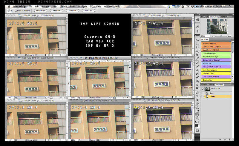
Top left. 100% version here. The 20/1.7 is oddly free of both CA and purple fringing in this corner; in fact, the performance here doesn’t really match the other corners – chalk it down to sample variation. This is the 17/1.8’s worst corner.

Bottom right. 100% version here. We’re now seeing CA from all three lenses, with the 17/2.8 once again faring the worst. The 17/1.8 is slightly better than the 20/1.7. Interestingly, not much changes even when you stop down.
What will affect resolution (and perceived acuity) far more is lateral chromatic aberration. The 17/2.8 was notorious for this, and to be honest, the 17/1.8 shows a notable improvement over its predecessor, but CA is still present to f4. Both lenses have visible longitudinal chromatic aberration and spherochromatism that show up as fringes in the bokeh; the new lens is slightly better but still not perfect. This does not affect microcontrast as much as you would expect as the longitudinal CA occurs only in out of focus areas, which are devoid of microcontrast and fine detail structures anyway. In the in-focus areas, microcontrast delivered by the 17/1.8 is already good wide open, improving slightly to peak at f4. The 17/1.8 has about the same global contrast as the 17/2.8 at comparable apertures, but slightly better microcontrast and the ability to render more subtle tonal gradations.

Whole test scene. Yes, that’s a Lego chess set. A custom one: goons vs. the village people.

Bokeh, LoCA and spherochromatism, #1. 100% version here. I’d say the 20/1.7 looks best here, but it’s very nearly a tie with the 17/1.8.
Both lenses have surprisingly consistent color rendition despite their vastly different construction and coatings; that is to say, neutral to slightly warm, with decent (but still plausibly natural) saturation. Where they differ is in transmission: (see this article for the difference between T stops and f stops) it’s clear that the coatings used in the new lens endow it with significantly better lower internal reflection properties than the older lens. Despite having more elements and air-glass surfaces, the 17/1.8 meters with a shutter speed that’s about 1/3-1/2 stop faster than the old lens for a given fixed aperture and histogram (luminance) output. This is a useful gain in practical situations; it’s not quite see-in-the-dark territory, but good transmission characteristics combined with its relatively short focal length and the excellent stabilization system on the OM-D mean that its useability envelope is very wide indeed. Vignetting is also fairly negligible too, even wide open.

Bokeh, LoCA and shperochromatism, #2. 100% version here. No prizes for guessing the 20/1.7 has the best rendition since it also has the longest focal length; this portion is a bit of a lopsided comparison.
The 17/1.8 renders out-of-focus areas with a rounded softness and lack of hard/ bright edges or double images, even against complex background textures. Whist you’re never going to get a large amount of defocus to your backgrounds with a real focal length of 17mm (that’s a property of the focal length) unless you get very close to your subject with a simultaneously distant background, what you do get with the 17/1.8 is very pleasant. I actually think the 17/1.8 delivers close to the right amount of bokeh for most situations at relatively near distance; enough to separate the subject but not so much as to completely abstract out backgrounds.

Fear of the supervisor
Throughout this review, I’ve talked a lot about its predecessor, the 17/2.8; the other dark horse sitting in the corner is the Panasonic Lumix 20/1.7 G. It was my mainstay lens on the E-PM1 Pen Mini, though I’ve used it less since acquiring the 12/2 and 45/1.8 lenses. Though it has a slightly longer real focal length at 40mm equivalent, in practice the difference is minimal and no more than a step or two backwards or forwards. The 20/1.7 is a popular lens amongst enthusiasts because it was both fast and compact; value for money, too, if purchased with the original GF1 kit. It still retains its popularity today, because the only other fast 35-ish equivalent so far has been the Voigtlander 17.5/0.95, which is not only hideously expensive, bulky and manual focus only – all of which somewhat defeat the point of Micro Four Thirds.

Caged laundry
What I find curious is that the 20/1.7 images render as though they are a slightly cropped version of the 17/1.8 – this is a good thing, as the optics on the 20/1.7 are excellent. Sharpness/ resolution, microcontrast, color transmission and even quality of bokeh are very similar; however they have completely different optical design philosophies. Where the 17/1.8 makes significant gains over the 20/1.7 is in autofocus speed; it’s simply night and day; not to mention the usefulness of the manual focus clutch.

Hipster at sunset
For the 35mm (or therabouts) EFOV enthusiast, we now have four choices in the Micro Four Thirds mount – the Olympus 17/1.8 and 2.8; the Panasonic 20/1.7, and the Voigtlander 17.5/0.95. There are also myriad other options you could adapt from other mounts, such as the excellent Zeiss ZM 18/4. I’d consider the adapted options not viable simply because none of them were designed with telecentricity in mind, yielding poor results on M4/3 cameras – severe vignetting, color shifts in the corners and purple fringing are all common problems. The Voigtlander is an intriguing lens and a surprisingly excellent performer at f1.4 (it’s decent at f0.95) that also happens to have a very short minimum focus distance of just 15mm from the sensor, but it’s very much a special-purpose lens: you don’t buy this and shoot it at f2.8. There’s simply no point. And if you need one, I think you’ll already know it.

Waiting for the bus
That leaves us with the three native AF options. I would not buy the 17/2.8 unless size is a critical priority, or you know that you’re going to be shooting only static objects stopped down; otherwise the slow AF speed will drive you crazy. The Panasonic 20/1.7 is in a similar boat; it’s faster to focus than the 17/2.8 and optically better, but nowhere near as fast as the 17/1.8. The 20/1.7 and 17/1.8 deliver similar resolution in the center, but they render quite differently – the 20/1.7 is punchier but has slightly lower microcontrast; the 17/1.8 has lower macrocontrast but better reproduction of fine detail structures – i.e. better microcontrast. In the corners, the 20/1.7 is the highest-resolving of the three, but shows strong purple fringing on top of CA which is absent from the other lenses. Interestingly, one thing I noticed with all three lenses was that corner performance was not really consistent – i.e. there were some minor tolerance-related astigmatism effects in play. All three lenses still suffer from longitudinal CA and spherochromatism, though. Ultimately, I think your choice will boil down to three things: price (the lens is to be around US$500 when it becomes available in December), whether you prefer the 40mm FOV, or 35mm; and how critical is focusing speed? If you shoot a lot of street or documentary work, then the ability to stop down and scale focus can be an extremely valuable asset. Overall verdict: recommended. MT
Thank you to Olympus Malaysia for supplying the lens review sample.
The Olympus 17/1.8 is available here from B&H
____________
Visit our Teaching Store to up your photographic game – including Photoshop Workflow DVDs and customized Email School of Photography; or go mobile with the Photography Compendium for iPad. You can also get your gear from B&H and Amazon. Prices are the same as normal, however a small portion of your purchase value is referred back to me. Thanks!
Don’t forget to like us on Facebook and join the reader Flickr group!

Images and content copyright Ming Thein | mingthein.com 2012 onwards. All rights reserved
Gentle reminder: two places left for the Intro to Wildlife Photography workshop…
November 15, 2012 by

…to be held in Kuala Lumpur on Fri 23rd and Sat 24th of November, next week. More details here – send me an email if you’re interested. Thanks! MT
What to look for when evaluating used and new equipment
November 15, 2012 by

Sample variation abounds in both cameras and lenses, and that’s before we even talk about the second hand markets and all of the possible complications that use can introduce. With the increasingly complex nature of cameras and optics, it’s important to know what you’re buying is going to perform the way you expect it to. It doesn’t help either that the megapixel race is pushing ever higher demands on optics, too; these levels of performance can only be reached if the manufacturing and assembly tolerances are sufficiently tight. And frankly, the more handmade a camera is, the more difficult it is to achieve these tolerances; machines are both more consistent and more precise than a human, providing of course they were set up correctly in the first place.
First note: I’ve received so many emails asking “is this a good copy of x or y” that I have to make an upfront disclaimer: there is no way for me to assess the results of a test without knowing how that test was conducted in the first place – if you didn’t focus it properly, or the camera wasn’t locked down on a tripod, etc – how am I going to know if it’s lens softness or user error? I don’t always do this myself when evaluating equipment, but knowing then precise limitations involved in the test make it easier for me to derive some form of meaning to the results.
Second note: When testing and forming an opinion on lenses, I will frequently test many copies to make sure the results I’m seeing are consistent; if the performance deviates significantly from the expected level, then I’ll make sure I test more than one. If I didn’t, I might be drawing (incorrect and unfair) conclusions based on an exception. This of course means that when I state something delivers good quality or quality at a certain level, you can be fairly sure that if you go out and buy a good sample, it will perform at the level I report.

Okay, that aside, there are a number of things we need to check for both lenses and bodies; some apply to both new and used gear, some apply to used gear only. Let’s begin.
Lenses
Important: don’t overlook a lens just because the external cosmetics are poor; if you only intend to shoot with it, use it and not collect it, then there are some great bargains to be had – and you’ll worry less about denting/ scratching the barrel when you do take it out. Plus it’s unlikely you’ll lose very much on it when you get bored of it. Note: this is not a guide to how to assess if a given lens is good or not optically; that’s a much more complicated topic for another day.
Both new and used (and fixed-lens cameras)
- Zoom/ focus rings should be smooth and not gritty or sticky
- Hold the lens up to the light; there should be no fungus (spidery tendrils, or splotches) inside the elements
- Coatings should appear intact (it will look like a peeling film if it isn’t)
- No scratches on the glass
- Optically, it should at least be sharp in the center; test with a camera that has live view AF, locked down on a tripod at base ISO. Look at the four corners and center for every major focal length, start with wide open; they should all be reasonably sharp (especially the center). Note that you must use live view AF (or magnified MF) to rule out any possible issues with the camera. And it’s also important to move the focus point to the intended corner, because the lens may not be flat-field – this means that the subject distance in the corner will have to change in order to reach optimum performance. It’s best to check this on the largest format the lens was designed to cover, i.e. if full frame, use a full frame camera and not an APS-C one.
- The left/ right sides of the lens should be symmetrically sharp or soft (if it has field curvature, or is just a soft lens)
- Focusing motors should not squeak or make grinding noises, this is a sign of imminent failure.
- For CPU lenses, check the contacts – they should be clean and not corroded; and of course the lens should work properly with the intended camera!
- A warranty of some sort. This means that the seller is confident in their product – but don’t expect it from individual private sellers.
New
- Warranty cards, papers, manuals etc.
- Check the mount for signs of use – there shouldn’t be any if it’s a new lens.
- Internal dust – yes, it does happen.
- Dry/ loose rubber parts – that means it’s been sitting on the shelf for too long.
- Aperture rings should have clean, crisp detents
- The point about optics applies too: there is a lot of sample variation, even in new lenses built to modern tolerances.
Used
- Although barrel cosmetics seldom affect optics, they can sometimes serves as an indicator of more serious damage; if the barrel is dented or stiff, avoid this lens because there’s a good chance the helicoids are damaged, and the internal elements could be misaligned.
- Oil on aperture blades – there shouldn’t be any. It could spray inside the lens as they open and close, especially at high speed with an SLR.
- Marks on aperture blades from use are a non-issue.
- Coatings: are they intact? Are they scratched?
- Aperture rings should have clean, crisp detents.
- There should be no missing screws.
- Caps, hood, case? Especially for period lenses where these items can be difficult to find.
- Some brassing on the mount is normal. None is a bonus.
- Dented filter rings are a giveaway that a lens has been dropped.
Bodies
These are the opposite of lenses: hard use on the outside almost certainly means hard use on the inside. Avoid anything that looks like it spent some time in the ring with Mike Tyson.
Both new and used
- Accessories: batteries (especially for older cameras), finders, port covers, eyepiece covers
- Autofocus and shooting functions work properly
- No sticky or unresponsive buttons
- No dead pixels on the LCD
- Scratches on optics – finder, focusing screen, mirror, eyepiece, LCD etc
- Camera writes to card properly
New
- Everything that should be in the box is actually in the box. Some shady dealers will try to sell you the original charger as an ‘optional accessory’ or replace it with a non-original one. Beware.
- Since the D800/ D800E fiasco, I’ve had to check the edge AF points on all new bodies. Yes, poor focusing can be fixed, but you’d rather not have to send in a brand new camera to correct something that should have been right in the first place…
Used
- Accurate shutter speeds – especially for film; expose a roll if they’ll let you, if not, time the slow shutter speeds with your watch.
- Check the shutter count if you can. A JPEG file plus a program like iExif will show you the count, or alternatively, it’s often embedded as a ‘unique image ID’ hex code, which can easily be viewed with Bridge and converted.
- Film advance is smooth
- Dust inside the prism or finder – some can be cleaned, some can’t
- Desilvering of the mirror (dark spots) or prism; separation of the rangefinder patch (flare, poor contrast)
- Bent pins in the CF or SD slots
- Peeling grips – they can frequently be replaced for little money, but it’s just annoying to have to send in the camera.
- A warranty of some sort. This means that the seller is confident in their product – but don’t expect it from individual private sellers.
- Mirror alignment. This is much tougher to check with film, but basically if you focus on something with manual focus through the finder, it should be in focus – this isn’t always the case as the mirror alignment or zero return position might be off.
- Rangefinder alignment – same deal as the previous item, but for rangefinder cameras. Bottom line: with a rangefinder, if you can’t consistently focus on your intended subject, chances are the alignment is off. Watch also for vertical alignment – the RF patch should overlap perfectly vertically, and only move left to right. There should not be a vertical double image.
- This seems obvious, but with the lens off and the mirror lifted (if applicable) the shutter curtain should appear pristine. Even on an older camera.
Accessories
- Flashes can be very high mileage but look new. Check recycle time and power with new batteries; if it’s slow or underpowered, chances are the tube is on the way out – avoid.
- Tripods should have smoothly operating legs and heads/ ball action; the head should not move at all once it’s locked down. Check for excessive grease; metal filings dirt etc. can easily get trapped, causing things to bind, or worse, damaging internals.
____________
Visit our Teaching Store to up your photographic game – including Photoshop Workflow DVDs and customized Email School of Photography; or go mobile with the Photography Compendium for iPad. You can also get your gear from B&H and Amazon. Prices are the same as normal, however a small portion of your purchase value is referred back to me. Thanks!
Don’t forget to like us on Facebook and join the reader Flickr group!
Images and content copyright Ming Thein | mingthein.com 2012 onwards. All rights reserved
Review: The Fuji FinePix XF1
November 13, 2012 by

One of the more interesting compacts in recent memory is the Fuji Finepix XF1. Announced at Photokina 2012, it’s a pocketable metal-bodied camera with a moderately sized sensor – not the 1″ of the Sony RX100, but not the usual 1/1.7″ type either. It shares a sensor with the Fuji X10 – the 12MP 2.3″ EXR-CMOS, presumably it’s the updated version without the white orb issue; I certainly didn’t see any during my testing. The camera is definitely retro-styled, with a faux-leather skin covering the middle portion of the body, with warm silver metal covers top and bottom – presumably anodized aluminum. It’s certainly a pleasingly tactile object to handle. For the style conscious, the camera is available with black, tan or red pleather; I opted for red since the camera was ostensibly a present for my wife.

The camera’s biggest party trick is its lens: a 25-100/1.8-4.9 equivalent that both sports a mechanical zoom ring – slowly becoming a rarity even for M4/3 cameras – and a collapsing mechanism that lets it drop back into the camera body to keep things pocketable. Presumably it’s an evolution of the design used on the X10, though obviously not as fast due to size constraints. Again, like the X10, it also powers on the camera. One twist into standby mode puts the camera either into ‘ready’ position (if enabled, eats battery); another twist to the wide end of the zoom turns the camera on. I would love to have a separate power switch, too – this would make it a fantastically responsive camera as you could have the desired focal length preset before powering on; something I wish the otherwise very fast Sony RX100 could do.

Lens in a range of positions from fully retracted to fully extended.
Needless to say, zooming is quick and easy. The mechanism itself is reasonably smooth, but it could use a bit more damping to give a higher quality feel; you have the impression of a lot of light pieces of plastic or thin metal moving around inside the lens barrel as you turn it. In fact, the camera is quite light – generally a desirable quality – personally, I’d prefer a bit more heft. Finally, stiffer detents between the 25mm position, STANDBY and OFF would help avoid accidental power ups/ shut downs. The only other notable mechanical gubbin is the release lever for the dinky pop-up flash hidden in the top plate.

It would seem that the feature race hasn’t ended for the enthusiast-level compacts; the XF1 is packed with all sorts of modes and customisability; the only three that are of any real note are the dynamic range optimiser, built in level and customizable buttons. The former does some strange things with the sensor and ISO range to extend highlight and shadow dynamic range in JPEG files only; it seems to work. I’ll say more on this in the image quality section. The built in level is an unobtrusive horizon line through the middle of the frame that works for roll only, but shows a single green line when the camera is level. It’s actually quite handy on a camera of this size, because it isn’t always easy to hold it stable with one hand – not that you’re going to be shooting the XF1 singlehanded with the mechanical zoom.

Traffic. Fuji XF1
Finally, there are effectively no less than seven programmable buttons: pressing E-Fn brings up a virtual overlay where the user’s choice of shortcuts are assigned to the four directions of the D-pad, playback and record buttons on the back; there’s also another function button on the top plate behind the shutter. Annoyingly – perhaps out of muscle memory – it’s in exactly the same place as the power button on just about every other compact, and I find myself repeatedly hitting it and wondering why the camera won’t turn on or off, but instead bring up a menu. The only function which I’d want to assign to this direct-access key (you don’t have to press E-Fn first) would be AF area – and guess what, this also happens to be the only one of the customizable functions that’s missing from the list of possibles for this button. Grr.

Yard abstract. Fuji XF1
It’s worth noting that there is no way to separate AE lock and AF lock from the shutter button – so the half-press-and-dance routine may result in some undesirable metering. The XF1 also has a lens-shift based image stabilization system that moves a group of four elements. The best word to describe it is ‘aggressive’; it reminds me of the early days of IS where the image would sway a bit as the stabilizer locked down. I’m estimating it’s probably good for 2-2.5 stops. It certainly isn’t as effective as the Panasonic OIS system, which I think is probably still the class leader for compacts.

Camouflage. Fuji XF1
Overall, there are a lot of things I like about the UI, and a number I don’t. Playback is done well, for a change on a compact – you can power on the camera straight into playback mode by holding down the play key; there’s no need to extend the lens. Then, press in the top command dial in to go to maximum magnification, and then you can compare images at the same zoom level and position by moving the rear dial. But this is where another issue raises its head: the camera has two command dials, which is the same number as any camera of this size and most pro DSLRs. Yet by default they seem to be dormant or redundant most of the time – only in M do the two dials do anything independently. It would be sensible to have one serve as direct acesss to exposure compensation and the other as program shift/ aperture/ shutter speed in the other modes, but no. You have to press up on the D-pad to enter exposure compensation, then use either dial to change it. And then press up again to go back to changing the main exposure setting. Still, at least it’s a shooting priority camera. It just seems that there are a lot of wasted opportunities here that would have let Fuji knock one out of the park with this little camera’s handling. There’s still hope for a firmware update, I suppose – Ricoh’s GRD series is very much the leader when it comes to compact camera handling; and it’s done with no more buttons than the XF1 has.

Trash alley. Fuji XF1
Other little things – the LCD isn’t the highest resolution out there, with about 460,000 pixels; you can just about make out the pixel mask if you look closely, but most of the time it’s a non-issue. The screen gets pretty bright for daylight use, but of course that comes at the expense of battery drain. I’d like to see something a bit less contrasty, though; it doesn’t give that good an indication of overexposure – but there’s a blinking highlights warning in playback mode to get around this. Fortunately, the XF1 seems to be fairly miserly with power consumption, yielding about 300 frames on a charge of it’s quite physically small battery. The lens-based on-off switch makes it quite easy to power the camera off between frames, which of course helps with battery life. The camera also shoots full HD video at 1080p30, which is nice but not something I use – so I’ll leave it to others to test.

Urban geometry around dawn. Fuji XF1
I was not impressed with its predecessor’s focusing speed – despite having ostensibly the same sensor and a faster lens, the X10 is not a fast-focusing camera. This isn’t the main problem, though – it freezes between half-press and achieving focus, which means that a) if you move slightly, and you will because it’s a compact, then you won’t see it until you get a sudden jump when the camera focuses; b) the delay is annoying. In fact, this was the main reason why I didn’t buy one. I’m pleased to report the XF1 fixes this. Whilst there’s still a very tiny perceptible freeze, it’s almost negligible. I certainly don’t notice it in practical use.

Untitled. Fuji XF1
Overall; the XF1 is a fast camera and doesn’t keep you waiting. It shuttles around RAW or JPEG files with equal indifference, except perhaps write time is noticeably longer. That said, I wouldn’t recommend using this camera to shoot RAW even though it can; and this has a lot to do with the quality of the in-camera processing, and the absolutely crappy results obtained via ACR. This is a bit of a shame, as the lens quality is very impressive – better than the Zeiss-branded lens on the Sony RX100. It doesn’t suffer from the same flare or low contrast at wide angle and f1.8; the corners are also much sharper. More impressively, this level of optical quality is maintained through the telephoto end of the range, too. (It could also be because the lens has to cover a much smaller image circle than the RX100’s.) There is some CA in the corners, but flare is impressively low, microcontrast high, and color rendition pleasing.

Spot the dent. Fuji XF1
Despite Fuji’s claims about the camera’s bokeh-generating ability (and 7-bladed diaphragm) – the reality is that you’re only going to get a tiny bit of background separation if your subject is close, you’re shooting at 25mm and f1.8 equivalent, and the background is very far away. The RX100 has more potential for subject isolation through shallow(er) depth of field, and I still treat that as a program mode-hyperfocal camera. As with every small-sensored camera, don’t bother with aperture priority: you have no control over depth of field anyway. I only use program and manual – either when the built in flash triggers speedlights, or in the case of the XF1, you need exposure times longer than a second – and remember to disengage auto ISO first, otherwise you can’t go any slower.

Nature outgrows us all. Fuji XF1
I find the image quality of this camera paradoxical. On one hand, the JPEG output is amongst the best I’ve ever seen from a compact – especially when using the trick DR400 mode, which supposedly extends the camera’s tonal range by two stops – on the other hand, the RAW files are amongst the worst I’ve ever seen from any camera, and far below even its own JPEGs. The RAW files are far noisier, have poorer dynamic range, less detail and acuity, and just seem very dull by comparison; it’s akin to the difference between RAW and JPEG on other cameras, except in reverse. The only conclusionS I can come to are that Fuji has some extremely sophisticated processing algorithms inside this camera, the ACR converter algorithm just doesn’t work for this sensor, or both. It is widely known that ACR doesn’t really do a good job with Fuji files, but this difference almost defies belief. Needless to say, I’m not going to be using RAW mode on the XF1 it will be set to JPEG DR400 mode for my wife to use. For the purposes of this article, I shot JPEGs and did some minor tweaking to them with Photoshop.

What on earth is going on here? That’s not a mistake: the DNG (converted via ACR 7.2 from the original Fuji Raw file) is on the right. Full size file here.
All that said, the image quality of the JPEGs is superb. Noise is low, detail is high (though oddly blocky in places, somewhat reminiscent of the older SuperCCD designs) and the tonal rolloff in the highlights is outstandingly well handled. Note that you really do have to use the DR400 mode to achieve this; otherwise the highlights blow just as fast as with any other compact. The files just look natural. The files actually remind me strongly of the 6MP SuperCCD FinePix F10, F11 and F30/31fd cameras; perhaps this is their spiritual successor. Of course, if you want there are also the usual super-saturated, B&W and toned modes; Fuji labels them with the names of its film – Provia, Velvia, Astia – though I doubt any of the XF1’s buyers even know what those things are, let alone what they should look like.

JPEG noise crops. Full size here.

RAW (via ACR) noise crops. They just simply look worse than the JPEGs. Full size here.
On the noise front, I would have no qualms in using this camera up to ISO 800 in JPEG mode; 1600 and 3200 are noticeably softer, but surprisingly close in terms of both noise and detail retention. Thus, 3200 is probably a viable option in emergencies. Fuji does a pretty good job balancing noise reduction and detail here. Dynamic range noticeably decreases when you increase ISO, note that in order to expand dynamic range, the camera increases the ISO. This is presumably to allow additional sensitivity in the shadows. Yet the camera is smart enough to only increase the ISO past the sensor’s base of 100 if it detects that the dynamic range of the scene exceeds the sensor’s native capabilities – neat. This is why you might see EXIF data for a photo in good light with ISO 400 – it’s a wide dynamic range scene – or ISO 100, if the contrast levels are manageable. Note that you do see a bit of noise in the shadows at DR400 mode, but at least they’re not blocked up to black.

DR modes do make a noticeable difference. Note the garlic at the bottom; the leftmost image is DR100 (i.e. standard) mode; the right, DR400. Full size crop here.
Confusingly, Fuji makes the DR AUTO, DR100, DR200 and DR400 modes available both in the full-resolution 12MP mode, as well as on a separate EXR position on the mode dial. Here you can choose for dynamic range, resolution or low light priority; I don’t see the point unless you’re not going to do any processing afterwards at all. I suppose it must be a kind of smart auto mode, though there’s also the camera position, ADV(anced) and scene modes on the dial – how on earth does this many options make things less confusing to the camera’s intended audience, or more useful to the advanced user who just wants a good compact? Personally, I’m leaving it in P mode and DR400. If I want lower noise by pixel binning, I can do that myself afterwards in Photoshop – the results between the 6MP SNR (EXR Low Noise) mode and a downsized 12MP file in P mode look pretty much the same to my eyes. What Fuji should have done is made an auto mode that maintains best perceptual image quality: in good light, shoot at 12MP, say up to ISO 800; in high contrast situations, automatically use DR400; finally, when the required ISO goes to say 1600 or above, then start binning pixels down to 6MP.

Bigger onions. Fuji XF1
So where does the XF1 stand against the other competition in this segment? In the same price and size bracket, we have the Panasonic LX7/ Leica D-Lux6; the Canon S110, and the Sony RX100 – though the latter is a bit more expensive. All are moderately pocketable. I’ve excluded the Nikon P7700, Canon G15 and Olympus XZ2 because I don’t think these are pocket cameras anymore. I’ve not used the Canon extensively, so I’ll refrain from commenting on that; it and the LX7 both use a smaller sensor than the XF1, and it shows. The Canon is perhaps at the greatest disadvantage because it has the slowest lens and the smallest sensor; the XF1’s image quality – certainly the JPEGs – are noticeably better. The LX7 has a lens that’s fast at both ends and optically excellent, which claws back some of the Fuji’s sensor advantage; it also has more isolation potential as the long end of the lens isn’t f4.9. I’ve always liked the LX series as macro cameras too; they focus very close throughout the entire zoom range, not just wideangle. This leaves us with the RX100: it on the other hand isn’t a very good macro camera at all because the lens performs poorly at close distances until f4 or so; and doesn’t focus close throughout the rest of the range. However, it does have the best sensor of the lot; clearly a notch above the Fuji, and challenging Micro Four Thirds. I wouldn’t use the Fuji at ISO 1600 and very low light; I’ve done higher ISOs with the Sony and still gotten pretty impressive results.

Not a lot in it, size-wise.
In my mind, the final scoring stacks up this way:
Fuji XF1 if you are a JPEG shooter and don’t plan to do much, or any, postprocessing.
Panasonic LX7/ Leica D-Lux6 if you shoot macro, or want to try and get some depth of field control.
Sony RX100 if you want the best image quality in any compact camera available, period.
Canon S110…I actually can’t think of any good reason to buy this – if you need GPS, perhaps.
The overall impression one gets of the XF1 is a positive one. It has some endearing quirks – the mechanical zoom, for the most part – some less endearing ones (control idiocy and mode confusion) – but what really impresses are the quality of the JPEGs. And if you need something pocketable that delivers great results without too much effort – albeit without as high ultimate image quality potential as something that has a malleable raw file – then this is probably the camera for you. In fact, I think it’s the perfect camera for my wife – she likes to have something responsive, compact and (sigh) stylish, can process RAW files but never bothers, yet is frustrated at the limitations of the JPEG output of most compacts. Just think of it as a tax to appease the other half before you tell them you’re buying a Hasselblad. MT
The Fuji Finepix XF1 is available here in several colors from B&H and Amazon.
____________
Visit our Teaching Store to up your photographic game – including Photoshop Workflow DVDs and customized Email School of Photography; or go mobile with the Photography Compendium for iPad. You can also get your gear from B&H and Amazon. Prices are the same as normal, however a small portion of your purchase value is referred back to me. Thanks!
Don’t forget to like us on Facebook and join the reader Flickr group!
Images and content copyright Ming Thein | mingthein.com 2012 onwards. All rights reserved
Photoessay: Tokyo architecture
November 12, 2012 by
Tokyo must be one of the best places in the world to shoot modern architecture – between the crazy ideas, traditional influences and availability of money to spend on buildings beyond the merely functional. I suppose the incredibly small plot sizes also force architects to make the best use of available space, but at the same time also stand out from their neighbours. One interesting thing I’ve noticed is that all buildings are separated by a small – about 6″ – gap; presumably this has something to do with allowing slip in the event of an earthquake. Still, it does look a little odd at times.
Being personally and professionally interested in architecture, I had a field day walking around the city; a couple were shot with the Olympus OM-D and 12/2 is surprisingly good for this combination, though at times I did wish I had something a little wider – perhaps an equivalent for the Zeiss 2.8/21 Distagon which is my current mainstay for architectural work. The Sony RX100 covered everything else. Enjoy! MT

Slices

Tower

Chaos

Order

Tradition

I always think of this building as a bean in a hurry.

Ginza lamppost

Continuation of sky

Curvature is not an illusion

Facades I

Facades II

Who says windows have to follow floors?

Mirrored shard
____________
If you enjoyed this post, please consider supporting the site via Paypal (mingthein2@gmail.com); Ming Thein’s Email School of Photography – learn exactly what you want to learn, when you want to learn it or learn how to achieve a similar look with our Photoshop workflow DVDs. You can also get your gear from Amazon.com via this referral link. Prices are the same as normal, however a small portion of your purchase value is referred back to me. Thanks!
Don’t forget to like us on Facebook and join the Flickr group!
Images and content copyright Ming Thein | mingthein.com 2012 onwards. All rights reserved
Photographic integrity and the use of Photoshop
November 11, 2012 by
Even amongst photographers, I think it is very important to demystify something which has plagued the photography community and the craft in general, especially since the early days of digital capture. I’m talking about Photoshop; yes, that dirty word which has now come to be associated with over-airbrushed models, extra crowds, and general media hoaxes and fakes of all possible descriptions. I think never has a creative tool been so universally reviled and misunderstood by the general population. The word ‘Photoshop’ in itself has almost come to be synonymous with making alterations or changes to something to the point that it is no longer representative of the original object or subject.
Whilst it is, of course, possible to turn a Oprah into Britney Spears and vice versa; to do it well exceeds photography and solidly enters the realm of digital illustration. I am not going to discuss that in this article*; suffice to say that it is a completely different challenge and requires the hand and eye of a painter combined with the logical, structured thinking of a programmer.
*In the interests of full disclosure, I was taught the vast majority of my Photoshop knowledge by one of the best illustrators in the UK. He also happened to be a photography enthusiast, my neighbor in London, and also the reason why I now shoot with a Nikon instead of Canon. I also use Photoshop for illustration, layout and design purposes, but in my experience, that requires an almost completely different set of tools to what a photographer would use – another story for another time.
That is not to say the retouchers couldn’t learn a thing or two from the digital illustrators; too often a much-too heavy-handed approach is applied to any corrections that are performed on an image. It is very important to have an eye for the original subject, a sensitivity to the natural pre-existing lighting in the frame, and the touch of a feather to seamlessly and imperceptibly blend any changes made with the original image. This applies not just to airbrushing and heavy commercial grade retouching, (such as smoothing skin and removing dust or unwanted reflections) but also to normal photographic corrections during postprocessing – I’m thinking specifically of dodging and burning or saturation adjustments.
This is one of the reasons why I’m a huge fan of using an editing tablet and pen; the pressure sensitive and tilt sensitive nature capabilities of the setup allow you to have very fine control over precisely how strong the effect applied is. Both size and density can change depending on the pressure on or angle of the pen; it’s very much like drawing or painting. I suppose if one were to substitute the brush tool for the dodge and burn brush and start a new layer, the resulting image – representing the corrections applied – would almost like a sketch of the original image. (I like to use the Wacom Intuos series because of their high precision and natural feel.)
There are a few worthwhile rules that I think all photographers should keep in mind as they are retouching and postprocessing:
It is possible to overdo it. precisely how much is enough is actually not a very easy thing to determine. However, this is where it is useful to see plenty of other images; look at enough photographs and you will eventually develop a sense of those that work and those that don’t, and more importantly, an eye for just how much processing is required to achieve the desired look.
If you can see where an image was retouched/ edited/ processed, you’ve gone too far. if the corrections also obvious, then the resulting image is no longer photograph but a very poor illustration. This of course is not the intention of photography.
Do things in small, gentle increments. this permits finer control as well as better blending and integration of the changes with the structure of the original image. It is also much easier to undo things and not have to repeat signification amounts of work if you happen to make a mistake.
Any sort of documentary or reportage photography which is intended for editorial news or recording purposes should not have the contents of the image altered at all.
The final point brings me to the second half of my article. In a situation where a photograph is meant to serve as witness to an event, object or place, integrity is paramount. This includes news, reportage, documentary legal documentation, or any sort of archive or historical reference. Although it is perfectly acceptable for the color, contrast and general tone of an image to be altered in such a way as to best present the subject to the viewer; it is definitely not acceptable to change what constitutes the contents of the image. Overenthusiastic use of the clone stamp, healing brush, and most notoriously, mask, copy and paste have cemented Photoshop in the popular consciousness as the tool of choice when deliberate deception or obfuscation is the intention.
That said, I think it is equally important to define what is acceptable in the context of not altering the contents of the image; this list includes exposure, shadow and highlight recovery, curves, levels, dodging and burning, desaturation/ black and white conversion, and minor hue and saturation adjustments. Frankly, the final item – hue and saturation – is also a little bit borderline. This is because a decisive change in the color of a photograph or subject can result in very different interpretations, for example, naturally occuring blue carrots would be an event of note, but postprocessed ones would not. It is therefore the responsibility of the photographer to ensure that color is as accurate and faithful to the original subject as possible. The alternative is to shoot in black and white; this has the effect of removing the psychological aspects of color from the image.
Determining what is naturally occurring and what is the product of Photoshop skill has become more and more difficult since the increasing popularity of shooting in RAW. It is actually nearly impossible to spot well executed retouching; in fact, I actually make it a point to look for flaws in retouching in order to avoid these mistakes in my own commercial work. Even in very good work, there are two giveaways. The first is that everything simply looks too perfect; reality is dirty, rough and full of flaws; an image that is meant to serve as documentary witness should also reflect that. It is possible (but highly unlikely) that a subject will be perfect and flawless at the full resolution level; and this is where such inspection should begin. The second clue is a lot more subtle, hidden in the noise characteristics of the camera. Even by eyeball, if this texture microtexture is not properly replicated in a retouched area of an image it will be fairly obvious. Although it is possible to have images with zero noise even in the shadow zones, or alternatively add it back, it is almost impossible to perfectly replicate the native noise pattern of the sensor, or have zero noise in the shadows. It is also possible to reveal these inconsistencies either through extreme total manipulation – which amplifies the differences between the retouched and surrounding areas – or through the use of forensic statistical analysis software.
There is a big gray area between documentary photography and conceptual or artistic photography. This twilight zone is home to the commercial photographer. Understandably, it is highly desirable to make your product or service or people look as appealing, flawless and perfect as possible; however there is also the question of integrity. This is where too much Photoshop can get you into trouble. Once a photograph no longer reasonably represents the actual product or service you are going to receive; in some countries it is quite reasonable to take legal action on the grounds of misrepresentation. One very good example of this is fast food; in the hundreds of times I’ve at McDonalds, I can’t recall ever having received a burger which actually resembles anything on the menu. Natural lettuce is simply not that green most of the time, nor are the burgers that big! (I also remember an oldish article circulating on the Internet which shows just how much effort and preplanning is used in the preparation of a burger for one of these shoots; there were spare parts for everything and a huge pile of discarded ingredients that would be perfectly edible, but due to a slight blemish were rendered unsuitable for photography. This was obviously in the days of film, before Photoshop retouching.)
I personally deal with this issue on a fairly regular basis. As you know know, I’m a commercial photographer whose work covers subjects that are meant to be desirable – expensive watches, gourmet food and avant-garde buildings. There is therefore some degree of retouching required to ensure that the subjects look as perfect as possible; you can reasonably expect there to be no loose drips of sauce around your entree, or dust and scratches on your new watch. But just where do you stop making the tomatoes redder, and the meat more golden brown? To complicate things, it’s also a tough balance between finding a unique and aesthetically pleasing angle (a commercial photography requirement) against representing a perspective that a normal person might reasonably expect to experience. I honestly don’t have an answer for this question; the personal guidelines I generally work to are that the images I produce must look natural, even if they are conceptual in nature and require compositing multiple images (which frequently happens to manage reflections, deal with large dynamic range while maintaining shadow image quality, or photographing prototypes that might not be representative of final finishing). A dedicated and careful viewer should not be able to tell which part of the images has been retouched or composited, oh where the break points used were.
For my limited documentary work, I do absolutely zero retouching or airbrushing on any portions of the image and seek to deliver as faithful color to the original scene as possible. Adjustments are limited to curves, dodging and burning and sharpening; hue and saturation adjustments are made solely in the quest to deliver more accurate color. Personal or artistic work is basically open season; however, if I want to do illustration, I’ll do illustration; since I’m focusing on the photography, and my style these days is predominantly natural, I try to do as little retouching as possible. (It also helps me to speed up my workflow and throughput.)
By no means am I saying these guidelines are a hard and fast set of rules for every photographer to follow, however they are worth keeping in mind depending on the intended usage and purpose of your photographs. In the interests of maintaining the reputation and integrity of both the profession and the individual; working photographers should be open to fully disclose if an image has been edited or retouched, if it is ever called into question. The editing and retouching of images has been around for many years before Photoshop – there were even services for adding color to black and white images – but during the film days, retouching was never perceived as a threat to integrity, perhaps because the tools available were rudimentary, and it was nearly impossible to achieve a perfectly natural looking result. Today, it is very much our responsibility as photographers to do our best to restore public trust in the integrity of documentary images, as well as faith that what you pay for is actually going to be what you receive. MT
____________
If you enjoyed this post, please consider supporting the site via Paypal (mingthein2@gmail.com); Ming Thein’s Email School of Photography – learn exactly what you want to learn, when you want to learn it or learn how to achieve a similar look with our Photoshop workflow DVDs. You can also get your gear from Amazon.com via this referral link. Prices are the same as normal, however a small portion of your purchase value is referred back to me. Thanks!
Don’t forget to like us on Facebook and join the Flickr group!
Images and content copyright Ming Thein | mingthein.com 2012 onwards. All rights reserved
Workshop report: Melaka, November 2012
November 10, 2012 by

Turning a cliche on its head. Leica M9-P, Zeiss ZM 2/50
Last weekend, a group of keen photographers braved the afternoon rains to join me for a workshop aimed at a bit of travel and street photography, but more importantly covering the fundamentals of composition and understanding what works in an image, and what doesn’t. One day of shooting on location in Melaka was followed by Introduction to Photoshop back at the studio in Kuala Lumpur. Aside from leaving with a newfound appreciation for quality of light, perspectives, natural frames, leading lines and cinematicness, perhaps the most important thing was opening eyes and creating awareness of a whole new bunch of photographic possibilities – there is always something to photograph.
And yes, I did shoot some film. But the results will have to wait a little until I get around to developing it.
Finally, a big thank you to all of the participants!
Side note: the M9-P held up very well in the rain despite not being weather sealed; it’s the second time I’ve shot it in adverse weather conditions (The Hong Kong and Macau workshop being the first) and other than water on the viewfinder windows, it didn’t miss a beat. Odd, considering the number of lockups I tend to get when the skies are fair…MT


Here are a few teaser images from my set; I’ll be posting more in a future photoessay.


The kind of weather that distinguishes between true weather sealing and mere bits of foam lining.
____________
If you enjoyed this post, please consider supporting the site via Paypal (mingthein2@gmail.com); Ming Thein’s Email School of Photography – learn exactly what you want to learn, when you want to learn it or learn how to achieve a similar look with our Photoshop workflow DVDs. You can also get your gear from Amazon.com via this referral link. Prices are the same as normal, however a small portion of your purchase value is referred back to me. Thanks!
Don’t forget to like us on Facebook and join the Flickr group!
Images and content copyright Ming Thein | mingthein.com 2012 onwards. All rights reserved
Experiments with street photography and motion
November 9, 2012 by

This series of images was captured around dusk in Shinjuku, Tokyo during my last workshop. While my students were off completing their final assignment, I decided to challenge myself to capture the feel and essence of the place in a different way to what I would have normally done. (After all, it wouldn’t be fair for me to put my students outside their comfort zone by insisting on the importance of having a central idea or theme in their images for their assignment if I couldn’t delivery myself, would it?)

At the same time, I’d felt as though I’d been reaching a little creative stagnation of late, and wanted to force myself to do something different anyway. Having your own style is good, but at the same time, that style has to evolve and grow in order not to get stale or boring. One of the things I’d been doing a lot of lately is jacking my shutter speeds up very high to ensure I was getting every last pixel of resolution out of the new cameras; whilst this made for great definition under the majority of circumstances, this crispness of capture doesn’t always suit the theme you’re trying to shoot to.

The idea I decided to follow for this series was flow – people as water, life as transient, a moment being more than a moment and altogether insufficient to capture the sheer volume of activity of what was going on around me. It’s a very strong impression I got simply by standing in place and watching life moving around me – people simply didn’t stop, torpedoing from location to location with some objective in mind, dispatching that objective, then moving on to the next one. (I’m guilty of this at times too; it’s a consequence of running your own business. Perhaps this experiment was as close to my subconscious was going to get to forcing me to slow down and smell the roses.)

The only two ways I could see of communicating this idea were either to have a huge number of people lining streets and thoroughfares to appear as a continuous mass (there were a lot of people, but not that many, and moreover there was no way or achieving that vantage point) or through the use of motion blur – not a little bit, of the kind that appears at 1/30s and with people walking, but something altogether a bit more abstract. In hindsight, this would have been very easy to accomplish with a tripod, but without it, I didn’t have the foresight to pack one in – much less bring one on the day. Even a mini-pod or a Gorillapod would have been useful.
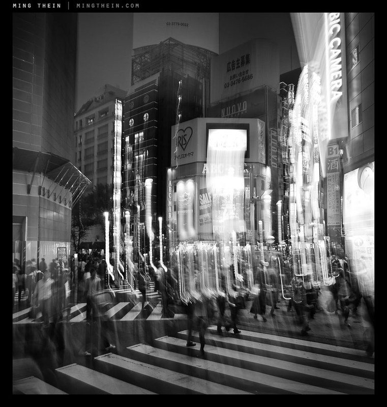
Instead, I was forced to test the stabilizer of the OM-D to its limits – even with something to brace against (And sometimes not), I’d be needing shutter speeds in the 1/2s-1/5s range to achieve the effects I was looking for. Needless to say, you can only do this when the sun is going down. To give me a higher chance of success, I used the 12/2 for most of these shots, and shot in continuous high burst mode – not for the frame rate, but because I’d be able to keep my finger on the shutter button to minimize camera shake, and have only short intervals between frames. When I had to shoot using the LCD instead of the EVF, I would pull the neck strap tight to tension the camera somewhat against my neck and hopefully reduce shake – this technique is actually surprisingly effective. In hindsight, I should have used the self timer + burst function to completely eliminate finger-induced shake.

One of the things with this kind of photography is that you really don’t know exactly what you’re going to get until you get it; there may not be enough motion, or too much, or you might have streaks in the wrong part of the frame; all you can do is do a lot of takes until you get the right one.
Compositionally, the most important thing to remember when involving motion in your shot is that there must always be some clearly static and sharp object in the frame to serve as a visual anchor for your composition; if this is missing, the photograph just appears to be blurred or out of focus without the same directionality and focus that is implied by motion blur. In fact, having a large number of people moving through the frame is somewhat reminiscent of the energy of strong, dynamic brush strokes in a painting. I like the idea of abstracting out the people from the scene, and the contrast between the animate and inanimate. For these images, I chose the visual anchor first, then followed it by imagining where I’d want my flows of people to go; needless to say, there were a lot that didn’t work out because I didn’t have enough people moving close to the camera – a foreground is of course a necessity of using a wide-angle lens.

I did use the 45/1.8 for some of the images, but this proved to be extremely challenging as the lower practical limit for handholding a 90mm equivalent was somewhere in the 1/10s range on the OM-D, which is fractionally higher than what I needed for the desired effect. Still, I did manage to get lucky a couple of times with both very stable shots and convenient things to lean against. I also tried some more and less conventional techniques – panning blur, and combining staticness with abrupt motion of the entire camera to impose an impression of chaos whilst maintaining some semblance of a visual anchor. Overall, I’m pretty happy with the results though. Notes for a future experiment: I’d love to try this with a tripod and a longer lens. MT
____________
Visit our Teaching Store to up your photographic game – including Photoshop Workflow DVDs and customized Email School of Photography; or go mobile with the Photography Compendium for iPad. You can also get your gear from B&H and Amazon. Prices are the same as normal, however a small portion of your purchase value is referred back to me. Thanks!
Don’t forget to like us on Facebook and join the reader Flickr group!
Images and content copyright Ming Thein | mingthein.com 2012 onwards. All rights reserved


