Reader meet-ups: Kuala Lumpur and Singapore

I’ll be in Singapore at the end of this month from the 23rd-30th of April, representing Leica at the World Gourmet Summit. Since there’s bound to be some downtime between sessions, and I know there’s a decent chunk of traffic here from people in Singapore, I’d like open up the idea of a reader meet up – you know, coffee and a chitchat. Anybody interested? If so, please leave a comment below.

Similarly, I’d like to do something in Kuala Lumpur once I’m back (sorry, packed out until then work-wise) – perhaps at the beginning of May? Once again, please drop a comment below to let me know if you’re interested. I’m thinking a weekend afternoon or weekday evening. MT

Finding inspiration, or the lack of it

We’re all familiar with the feeling: sometimes you go to a place or an event and there’s just no end to the photographic opportunities you see. At other times, life is an artistic desert: there’s just nothing inspiring you to shoot at all, and all subjects are too familiar, too uninteresting, or just plain flat and boring.

_M9P1_L1012712 copy
Shadow crossing. Leica M9-P, 35/1.4 ASPH FLE

I thought of the idea for this article on a recent business trip to Bangkok (last month). Ostensibly, I was there for a conference but did have some down time between sessions, some of which was spent socializing with my group, some of which was spent trying to shoot.

_M9P1_L1012732 copy
Untitled. Leica M9-P, 35/1.4 ASPH FLE

Bangkok is familiar ground for me. I worked there (in something non-photographic) for just over a year in 2006, right up until the first round of protests against the government. The photojournalist in me wishes I’d been stationed there during the action, but the rest of me is happy that I didn’t have to do my day job with everything severely disrupted. During that year, I did find things to shoot, but looking back I realize that most of it was social – there was very little documentary photography or travel photojournalism going on.

_M9P1_L1012673 copy
More traffic. Leica M9-P, 35/1.4 ASPH FLE

I put that down to two things: it really isn’t a city made for walking; it’s too big, for one; the climate is too hot to spend much time outdoors, for two; and the public spaces are predominantly malls and shopping complexes, with the exception of the 500 various temples and shrines that dot the city. It’s also a concrete jungle, with overpasses and highways and monorail lines arcing high overhead even downtown. Unlike Tokyo, where there’s plenty of money left over for beautification, there is nothing of the sort in Bangkok – anything new becomes grey and grimy and coated with a layer of urban dust after not much time at all.

_M9P1_L1013094bw copy
Concrete jungle. Leica M9-P, 35/1.4 ASPH FLE

The upshot of all this is that when walking, you feel like you’re in some sort of canyon – everybody who can afford to, drives. And there’s not really a lot of things you can do with people in cars, or trying to shoot from cars – except perhaps traffic.

_M9P1_L1012658 copy
Interesting light, and yet more traffic. Leica M9-P, 35/1.4 ASPH FLE

There is of course the adult entertainment industry, which does advertise on the streets (even if the transactions take place behind closed doors) – but that’s not something advisable to shoot casually, or without a local guide. I was told by a reliable source that there are a lot of underworld figures involved, and they don’t take too kindly to the seedier aspects of their business being documented. It is not something that interests me, in any case.

_M9P1_L1012660 copy
The relentless pace of progress. Leica M9-P, 35/1.4 ASPH FLE

So we return to the initial point of this article: there will be times when you’re stuck in a photographic or inspirational desert; it happens. But what can you do to get out of it?

_MT87548 copy.jpg
The monk. I was in Chinatown for this one; off my normal circuit but good enough to get something different. 2006. Nikon D2H, 80-200/2.8

1. The obvious thing to do would be to change location.

2. If you can’t do that, look specifically for things within your location that do interest you – I landed up doing a lot of abstract geometry and architecture – Bangkok does really have some nice buildings.

3. Change something in the mechanics of how you shoot: in other words, run an experiment. Reality is that something different will increase your chances of wanting to get out and shoot – it could be forcing yourself to work with maximal or minimal depth of field; getting a new piece of equipment, or using one that’s been neglected for a while; or simply trying to replicate a different style or trying a new idea. It’s because it forces you to change the way you perceive the world (or the world through the viewfinder) – which in turn makes you have to consciously focus on looking for shots or adjusting your composition to make it work; you can’t just run on autopilot anymore.

_M80_DSC3030 copy.jpg
Zap. Through the office windows, long exposure. 2006. Nikon D80, 17-55/2.8

And this is where a modicum of self-reflection and assessment is useful: I didn’t change anything, but in hindsight I realized I should have, which is the genesis of this article. I did initially go with only one lens in an unfamiliar and un-intuitive – to me, anyway – focal length of 35mm; but I don’t think it was different enough to force the creativity out. I should have tried shooting with only my iPhone or something. Or perhaps painting the camera pink, just to disarm the public to provoke some interesting reactions from street photography subjects.

_1_DSC0620 copy.jpg
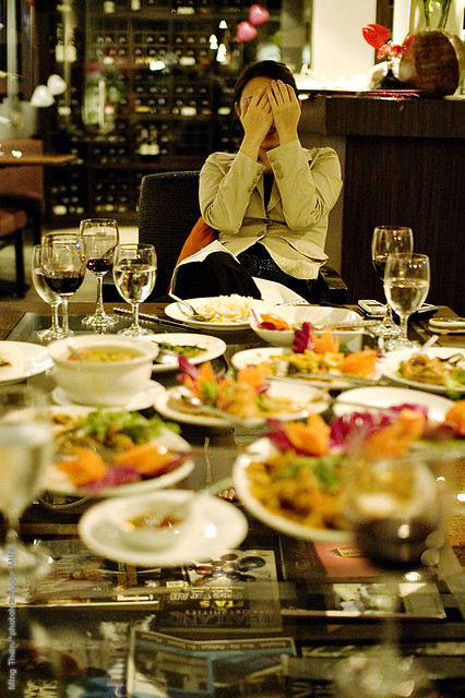
The embarrassment of gluttony. 2006. Nikon D50, Sigma 30/1.4

By the opposite logic, it’s also worth making conscious observation of what does inspire you – what do your favorite subjects or images have in common? It might be one simple thing – I’m drawn to the mechanical intricacy of watches, for instance – or something much more complex; like the juxtaposition between man and environment; dramatic lighting; harmonious geometry – or a mix of all three.

_MT92533 copy.jpg
Seafood seller. 2006. Nikon D2H, Sigma 30/1.4

The underlying moral of the story is action: don’t wait until afterwards to change things, it might be too late. I’ll never know what shots I’ll have missed, but you can bet next time I won’t wait to find out. MT

Bonus points to those who noticed the difference between the first set of images in this series – shot this year with an M9-P – and the second set, from my first long stint in Bangkok, shot with various other equipment? Why is this? Many things have changed: location (different parts of the city), equipment, most of all, experience, and the benefit of a lot more experimentation in the intervening years.

POTD and Off Topic: Test drive notes of a different sort

_8001318 copy
Eyes, part one. New F30 BMW 328i Sport. Nikon D800, 28-300VR.

_7025483 copy
Eyes, part two. Outgoing E90 LCI BMW 320d M. Nikon D700, 28-300VR.

Perhaps I should have called this post ‘a parable in headlights’. I am a BMW fan, which isn’t to say I don’t like other makes; the lower vehicle is my daily car, and serves me well in a versatile manner for everything from grocery shopping to ferrying the wife around to the occasional spot of sideways driving along my favorite piece of road on Sunday morning. It also has a remarkable engine that puts out somewhere in the region of 210bhp and 450Nm after a little ECU tweaking – oh, whilst managing a consistent 35mpg in our abysmal traffic. (I’ve seen it go as high as 58mpg for long distance cruising, and it’ll do 0-62mph in about seven seconds). I’d say this is much like the car equivalent of the D700: you can do pretty much anything with it, and it does a very competent job and doesn’t get in your way. Even the standard non-M sport base 320i petrol version is a nice drive, and the only difference between the two is body roll, power and suspension stiffness. Otherwise, they handle much the same – think of one as moving along at five-tenths, and the other as eight-tenths.

The new model – codename F30 for BMW geeks – is a bit of a different beast. I test drove two versions – the normal, base, bog-standard 320d with no frills or options; and the ‘sport’ package 328i with (optional) adaptive suspension, active steering and BMW’s new masterpiece turbocharged 2-litre petrol that puts out about 250bhp and 350Nm. The 328i was one of the most nimble, responsive cars I’ve ever driven. It was just so easy to drive; I felt confident straight away and able to push the car to perhaps 90% of its limits (or at least the limits to which I feel comfortable driving on public roads). Even the new electric power steering system, whilst oddly and irregularly weighted at low speeds – the sensation of the rack ratio changing while maneuvering at 5mph feels like the front wheels are losing traction, but you’re most certainly not – becomes perfectly weighted and direct (if a little less communicative than I’m used to) at speed. The paddle shifters, combined with the new 8-speed ZF gearbox, make firing off a gear change fast and easy. And that engine…oh boy. It’s got power and torque everywhere in the rev range, and just feels more eager to rev than the 2 litre turbo diesel I’m driving now, even though the car I drove only had 40km on the odometer. The only thing I didn’t like about the car (apart from the increased price tag, nearly 10%!) was the odd-feeling steering at low speeds. Would I buy this? Hell yes, if I could find some spare organs I didn’t need, or perhaps a hidden hoard of diamonds under my floorboards.

The base 320d (F30) on the other hand, was utterly horrid. I hated it. I didn’t feel confident in the car at all; the suspension wallowed and rolled; the steering was equally odd at low speeds, but strangely disconnected and uncommunicative at high speeds; even the interior materials felt a step down from the other car – even though they were supposedly built at the same plant. Even though the engine was a supposedly updated version of the one in my car, it felt tight and underpowered, lacking the midrange punch between 1800 and 2800rpm that I’m used to. Would I buy this one? No.

I felt that this odd duality gave the new 3 series a similar personality to the D800: a specific tool, which if configured (optioned?) correctly, would do a peerless job; but was also capable of being entirely inappropriate in some situations compared to the old model.

Conclusion: newer isn’t always better, often the refinements mean that what you’re going to use it with (i.e. the engine and options, in this case) is almost equally as important as how you’re going to use it. As a consumer, don’t always get fooled into thinking that you need to change something. Just because a new model is out doesn’t in any way reduce the capability of the existing model you own: yes, it might be better for some things, but if those things aren’t important to you, then why spend more money? You’d be surprised at the number of emails I’ve been getting in the last few days asking ‘D800 or D700?’ when clearly the person using the camera has no need for large file sizes, but every need for speed or higher ISO. Know what you need your tools to do first before you buy them. MT
100,000!

_PM06233 copy

I would like to say a big thank you to all of my readers and followers, because as of late this morning, this site has hit a new milestone: 100,000 views in the last month. To know that there are that many of you out there who are interested enough to spend a few minutes looking at my images and reading my posts is both humbling and very encouraging at the same time – thank you.

Please continue to return, revisit, reblog, share with your friends, comment, ask questions…it will enable this site to grow, and hopefully achieve my objectives of helping whoever I can out there to be a better photographer – one frame at a time. I’ve got a whole load of great content already in the works for the next few months; but in the meantime, if there’s anything you’d like to see, please ask – either in the comments or drop me an email. Enjoy! MT
Photoessay: St. Vitus Cathedral, Prague

A fantastic piece of gothic architecture, St. Vitus is arguably the centerpiece of Prague Castle – itself at the northern part of the old Malastranska district and overlooking the rest of the city itself. I’ve been inside a number of famous cathedrals – St. Paul’s, Canterbury, Notre Dame, St. Vitus, the Sagrada Familia, and Stefansdom – and the one thing that always amazes me is that we humans could build such structures as early as nine hundred years ago, when the majority of people were living in shacks and huts without sanitation or any other modern infrastructure. Even more amazing is the degree of architectural finesse involved in building these structures in stone – remember, there were no structural members that could take tensile loads, let alone pre formed or pre stressed panels. Everything was reliant on gravity to stay in place. Construction took generations; even with modern building techniques, the Sagrada Familia began in 1882 and isn’t expected to be complete until 2026 – that’s <em>144 years</em>. Frankly, it doesn’t look very different today than when I first visited in 2003. Glass <em>had</em> to be made with lead frames holding together small pieces, simply because there was no way to make big sheets. But the craftsmen of the day found a way to make that beautiful, creating the incredible stained-glass mosaics that survive to this day; a lasting testament to their devotion to their faith. MT
Series shot with the Leica M9-P, 28/2.8 ASPH and 50/1.4 ASPH

_M9P1_L1006136 copy

_m9p1_l1006504 copy

_M9P1_L1006161 copy

_M9P1_L1006470 copy

_M9P1_L1006548 copy

_M9P1_L1006458 copy

POTD x3: Food photography with the Nikon D800

_8005414 copy

Goldeneye steamed in miso and ginger

_8005366 copy

Seared tai (seabream) with momeji oroshii chili.

_8005295 copy
Iso-bagai snail, I believe poached in mirin and soy.

This series shot with a Nikon D800, PC-E 85/2.8 D Micro, and two LED light panels. Chef – Kenny Yew at Hanare

Two of the toughest things to get right color-wise (in my experience, at any rate) are people and food. There’s something about the way organic materials reflect light – probably due to the fact that they are both reflective, transmissive, and have odd properties in the infrared and ultraviolet regions (think: flowers, or cat’s eyes) which is just a huge challenge for most cameras.

Up to this point, I was fairly convinced that the Olympus Pen Mini plus Zeiss lenses (usually ZF.2 2/28 via adaptor) delivered hands down the best color; perhaps not the most accurate, but certainly the most pleasing. The Olympus sensor’s color bias would take care of global saturation and hue, and the Zeiss glass would ensure great micro contrast and accurate color transmission. Similarly, for landscapes – anything with skies, especially – the Leica M8/M9s excelled; I still can’t match the blue with any other camera. To my eyes, the Leicas (with Leica lenses) deliver the best sky blue bar none; and a decent skin tone (with Zeiss lenses – yes, there is a difference in color transmission; it’s subtle but I’ve always felt the Zeisses are slightly warmer.) The Nikons…well, I learned to correct them, but frankly, they weren’t that accurate (thought the D700/D3/D3s was the best of the bunch to date). I think it has something to do with the way Nikon designs lenses for global contrast rather than micro contrast, which affects the transmission of subtle tonal variations. Color improves markedly with Zeiss glass, which is designed to optimize micro contrast.

After this shoot, however, I think I’ve stumbled upon the best of both worlds. The D800’s sensor delivers the best color I’ve ever seen – accurate and highly pleasing, which is an achievement (and I believe DXOMark found the same thing). Paired with the Zeiss 2/28 Distagon, it’s pretty incredible. But what if it could get better? What if you could have accuracy, saturation, micro contrast, macro contrast and everything in between? Apparently, you can. The PC-E Micro-Nikkors now take the cake for me as the best lenses to use with the D800; resolving power is there even wide open; color transmission and micro contrast are on par with the Zeisses; edge performance isn’t an issue because they were designed with enormous image circles to support the tilt shift movements; and finally, you solve the DOF vs diffraction issue through tilts or swings.

My only complaint is that focusing ring feel is rather inconsistent, for some inexplicable reason. The 24 PCE is silky smooth; the 85 PCE is so stiff and dry that it’s very difficult to move in small increments. And sadly, Nikon has changed some components internally so that moving the tilt and shift axes to be parallel now requires new internal PCBs and about $400, instead of just removing some screws. This begs the obvious question: why the hell didn’t they design it that way in the first place, since a) clearly, enough people want the lens that way that they designed a separate PCB for such cases; b) almost all of the lenses I’ve seen on ebay have been modified and c) it doesn’t make any sense photographically unless you want to do a horizontal pano! For architectural work, macro work, and everything else, you need to have tilt and rise/ fall, not tilt and shift or swing and rise/ fall. Makes you wonder if anybody is actually a photographer on the lens design team.

All of that aside, being able to shoot at wide open or nearly wide open and still have sufficient DoF is a joy. It makes small LED light panels useable as your primary light source at ISO 100, handheld even. This is great, because studio strobes and speedlights will make the food wilt in double time, and anything raw will start to look slightly parboiled under the heat if you don’t work fast. On that note, enjoy the sushi. MT

The ideal camera

I’m going to disappoint you upfront: it doesn’t exist, at least not yet. But what if we did a hypothetical – yet realistic – exercise to see what a product like this would look like?

First disclaimer: I, and a group of partners, were very close to building this – but we were let down partway through by a key technology partner, and found funding challenging – despite the continuing growth of the photographic industry, especially at the advanced amateur and entry-professional segments. Alas, it never materialized. In any case, the idea has matured a bit since then, both through the benefit of time, and ideas gleaned from intervening new product releases.

Second disclaimer: This is what I would like as a photographer, and may not necessarily apply to everybody.

I’m not going to suggest a 100-megapixel, 25fps, point-and-shoot sized body with a full frame sensor, and built in 10-600/1.4 zoom. That’s stupid, and the preserve of equipment masturbators on camera forums who don’t actually use their equipment.

Right now, I use four systems: full frame Leica M digital, for photojournalism, reportage, portraiture and travel work; full frame Nikon FX for extreme low light, macro and controlled lighting work; Micro Four Thirds for personal work/ carry where photography isn’t the primary objective of the outing, and where anything larger might be obtrusive; and finally, a number of compacts for social documentary use. I’ve never been told by a client that I have insufficient resolution; and I’ve delivered images as small as 5MP before. Why? Because I’m a stickler for practicing shot discipline; that means even though I’m ‘only’ giving you 5MP, they’re 5 extremely clean MP at the pixel level, well exposed, perfectly focused, not posterized, and will print cleanly at A2. More MP – say 18 from the M9 – just means you can make larger prints before fine detail breaks down at close inspection distances. That’s all. I’ve only come up against the low light limits of the Nikon system once – and that was photographing a wedding in near darkness (only candles) in rural Nepal; but I was still able to get good quality images with ISO 12,800 and f1.4 glass. I don’t need ISO 512,000.

Let’s take the best parts of each system, and see what our bastard-camera would look like:

1. Sensor size: This is a tough one, actually. There are times when I want a smaller sensor for more DOF (think very compressed perspectives) – I will often use a compact for this. There are times I want a larger sensor for even shallower DOF for a given field of view – this is the main attraction of systems like the Leica S2. Let’s go with full frame, because we can always have a 2x crop factor (it’s easier to multiply out than 1.5x, and when you want a smaller sensor it’s generally because you need more reach or more DOF and more reach.)

2. Sensor spec: 48MP. Whoa, really? What happened to I don’t need huge MP, you’re wondering? Simple: pixel binning. 48 million photo sites – with RGB + Luminance values coming from individual photo sites, would mean amazing detail, fantastically accurate color, and low noise. Output file resolution of 12MP – but actual pixel detail of 12MP. With this technique and today’s sensor architecture, I don’t think it’d be a problem to get a clean ISO 12,800 file. And that’s enough for me. Add a Bayer algorithm mode to give a 12MP crop, and that takes care of my telephoto/ compressed perspective/ high DOF needs.

3. Speed: Doesn’t have to be fast – 5fps is plenty. I work just fine with the single-shot M9-P; most of the time bursts are for stability rather than action.

4. Video modes: I don’t use it, but I do like to experiment – so perhaps a 1080P/ variable frame rate mode would be nice, with full manual controls, of course. But no rolling shutter!

5. Autofocus: Let’s take the best there is now and match it: CAM3500FX in the Nikon D700 is eerily psychic at tracking moving subjects; however, it could use more frame coverage – expand the points to cover out to say 80% of the frame linearly, and we’re in business.

6. Firmware features: Lots of scope for customization: I don’t mind going through a lengthy setup process to ensure the camera does exactly what I want. I want to be able to hide things in menus and reassign all of my buttons, and have custom modes that set all camera behavior – including base exposure parameters – at once. And of course the ability to remember, save and transfer to another camera body.

7. Lenses: AF, fast aperture – at least f2, preferably f1.4. Useable wide open, of course. Physical aperture rings. I don’t need zooms, or extreme focal lengths; 18-24-28-35-50-85-200 and a short tele macro (maybe the 200 could double as a macro) will do me just fine. It could even be reduced to 24-50-85 in a pinch, so long as one of those was a 1:1 macro with capability to take a bellows or extension tubes.

8. Body: Robust, thick-gauge metal (tactility is important) and weather sealed; plenty of sensible physical controls; an optical viewfinder or excellent EVF – I think the new Sony OLED unit in the NEX-7 or 5N is about the minimum. But I much prefer the enormous, bright finder of say the Leica S2. I think M9-size is about perfect; big enough to have some heft and solidity, sufficient space to house all of those controls, and (yes, I’m shallow – or at least some clients are) impressively professional-looking. That would have to have an EVF to maintain the body thinness and accurate framing. If it’s an optical finder, we could probably make it small-SLR size – I don’t see why a full frame sensor won’t fit inside a D7000-sized body; the flange distance is FX-sized, and there were film SLRs of similar dimensions. Ergonomic comfort is very, very important – especially if you’re going to use it for 12 hours a day (or sometimes even more). Plenty of sticky rubber and thumb/ finger hooks, please. Buttons big enough to use with gloves, and wheels/ switches that don’t move unless you want them to – think locking buttons or very stiff detents.

9. Other considerations: File format: Compressed 16-bit DNG. It’s future proof, past-proof, and easy to handle and archive. Don’t bother with JPEG because I don’t use it. Live view would be nice, but not critical; it can be useful for awkward angles but is greatly enhanced by a swivel screen (which frankly I hate because they’re flimsy and compromise body integrity). A vertical grip is nice, but not necessary. What is necessary is a high magnification, high-eyepoint (I, and a lot of other photographers, are poorly sighted thanks to plenty of shooting into bright point light sources and so need to wear glasses) and with a nice big rubber eyecup. A high-resolution, color-accurate LCD is important for review. Most important is operating speed – menus and such – the camera should never feel laggy. This is the #1 reason why I’ve given up on a piece of equipment in the past.

Okay, so who’s going to make me one of these things? MT

Photoessay: Piccadilly Circus by night

If this isn’t one of the most recognizable urban spaces on the planet, I’m not sure what is. Piccadilly Circus, London, is a gathering point for both locals and tourists, and all levels of the social stratum. The upscale thoroughfares of Regent Street, St. James and Piccadilly flow into a public square-cum-tube-station-cum-bus-stop-cum-traffic-junction, and mingle with the Theatre District and Chinatown in Shaftesbury Avenue, and the movie hub of Leicester Square.

I didn’t intend to shoot on this trip; I was based in Kuala Lumpur at the time and visiting London for work – to get some very confidential prospectuses securely printed, of all things – and only had a compact camera on me. Still, there are some places where you are compelled to break out a camera – of any sort – and shoot; this is one of them. And having a compact is not a bad thing in security-paranoid London; it just makes you like another tourist. Even better if it’s dusk, and your camera is black and nondescript. Not so good with the small sensor, but hey, there are compromises everywhere. MT

Series shot with a Ricoh GR-Digital III

_0011022 copy

_0011141 copy

_0011016 copy

_0011073 copy

_0011069bw copy

_0011148bw copy

_0011029bw copy

POTD: Retail party

_PM03166 copy
Retail party. Olympus E-PM1 Pen Mini, Panasonic 20/1.7

On assignment again this weekend – shooting watches for my upcoming exhibition at Starhill, Kuala Lumpur (from May 2nd, more details to come in a future post) with Jaeger Le-Coultre and Leica. This one’ll be an interesting challenge because the entire set will have to be shot with a Leica M… and I don’t scrimp when it comes to magnification. MT

Reader photo critiques

I have to admit, I totally underestimated the popularity of this offer after putting it up. I’ve decided to pick the first six images to critique, in a more brief fashion than the previous two – it does take time, after all.

A thank you to our generous donors is in order – you have sacrificed your images on the altar of photography for the education of the greater good, and that’s a commendable thing. Thank you to everybody who took the time to submit – I’m sorry I don’t have time to do a detailed critique of all of the images, but I will reply all of your emails – that’s the least I can do.

Here goes.

Untitled / Roland Tetenbaum

I’ll start with the good things. It’s a well exposed frame, has a clearly defined subject, and said subject is well isolated from the background. Kudos for getting the focus point right: for all living things, if there’s a face in the image, you should focus on the eyes. (I’ve tried to think of an exception to this rule, but I simply just can’t come up with any.) Similarly, well done for capturing some of the subject’s soul – great expression on the dog’s face.

However, there are thing thats that could use some improvement. The placement of the corners and edges is distracting: that green triangle top right is just odd. It should be a little more to balance out the empty squares bottom-left, or left out altogether. A square crop with the dog slightly off-center to the right might actually work better in this case; you wouldn’t get that feeling of emptiness which those particular bottom-left squares of lino suggest.

I can’t speak too much of the processing, because in many ways that’s to personal taste; I’m not sure I like the level of saturation that much, but it’s tastefully done and there aren’t any blown channels.

One final detail: the sliver of little blue tag on the dog’s collar is a little distracting – pulling it all the way out, or tucking it back in first or cloning it out (it’s not photojournalism, so it’s acceptable) would probably be better.

Untitled / Brad Radcliffe

For some odd reason I can’t put my finger on, this is a very familiar looking image. I can’t claim to have a photographic memory, so perhaps I came across it while browsing Flickr or something.

In any case, the first thing that hits you is the color – quite literally. I’ve never seen blue chocolate before (or at least I assume that’s what it is). The macaroon appears to be its native color, though; it’s an interesting counterpoint as the yellow macaroon stands out well against the cool blue of the background. However, with food photography, the point is usually to make the subject seem appetizing – I’m honestly not sure the photograph achieves that intention because I don’t really want to eat something blue; I suppose it must be human conditioning. If heavy hue shifts are to be used in one channel, you have to watch the other channels – colors are a mixture of channels, and you may land up having odd effects in other areas of the image if things aren’t masked off properly – note the slight green/cyan cast to the top right of the macaroon.

From a technical point of view, subject placement is good, though the in-focus area at the bottom of the frame feels cut off. Focus point for this image would be trick to select – it’s a smallish subject and relatively near, so DOF would be limited; if you pick the front of the macaroon, the edges won’t be well defined and vice versa; tough choice but I think the one used by the photography was the correct one. However, to avoid that awkward cut-off in focus area in the foreground, I’d try positioning the camera at a lower angle so the focus plane on the background chocolate is closer to the macaroon; this would work better with this composition.

Untitled / Choohaw Ding

I’m going to assess this one as a family snapshot – the subject looks pretty candid, and the positioning is somewhat casual – though the perfect straightness of the vertical elements suggests otherwise. Kudos for the latter, by the way. The telephoto perspective separates the frame into several distinct zones, which do not intrude onto each other, for the most part; the only area where this becomes an issue is the background tree that very nearly encroaches onto the head of the subject. The wire in the background to the top left of the subject is also distracting because it breaks the strong verticality of the scene – it’s fine if it’s part of your subject because the eye is naturally drawn to it; it isn’t if it’s just a background element.

Shifting the camera position down and to the right would have placed the girl nicely in the gap between the tree and the pillars, also conveniently blocking out the horizontal wire.

The only other odd intrusions into the frame are bottom right (should have been cloned out or framed slightly higher, or taken care of by the previously suggested framing) and an odd dangly immediately above the tree. Some shadow recovery on the door at right would have also removed the heavy blockiness from the right hand side of the frame, which would also reduce the confined vertical feeling of the subject and allow a bit more breathing room.

To be honest, however, the image as a whole appears flat – it’s the lighting, or lack of any strong dynamic to it. This is also the number one reason the shot doesn’t really work for me as a whole. Unfortunately, if you’re shooting available light, there’s not a lot you can do in a flat lighting situation like this other than move on and find another location to shoot in.

Untitled / Juraj Balaško

Although it doesn’t look it, there aren’t any truncated elements in the scene – the cranes just meet the edge of each side of the frame. And that’s a nice bit of framing precision – well done. The sky adds interest, though I personally think the color may be a little overdone – but it’s quite tasteful and works.

There are three things I’d change with this composition, none of them major. The first is the position of the central crane – I don’t know if it would have been possible to wait for it to move, given the time of day and probably rapidly changing sky, but it would be nice if all three were aligned in a row. The second, is the slightly empty central portion of the frame; if the load on the third crane were in the middle and partially hoisted, that would also be ideal – however, I can imagine this would also be unlikely as it doesn’t appear that there is any reason to raise the load up. The final thing is perspective correction: keystoning with wide angle lenses is common; correcting it is not. There are two ways of doing this: tilt/shift lenses, or go a bit wider to leave room for correction at the edges of the frame, and use Photoshop to distort the whole image.

Overall though, nice job – especially considering the equipment choice (Canon S95) – compact cameras are not really suited for capturing tonal subtlety in skies; the color gamut required is far beyond what the sensor can capture, and certainly beyond the range of the ADC converter when saving.

Klara / George Gravett

Nice strong colors and light; there’s a nice variety of texture in the wood of the ship’s hull, the sea in the foreground and the buildings in the background. Exposure and focus are both good. Overall, this is a competent snapshot. What prevents it from being a great shot – the critical elements of clear subject and dynamic lighting are all present – is the framing. The image feels weighted down at the bottom left; the right side and top portion are both quite empty and simply do not balance what’s going on in the remainder of the frame. Furthermore, there are odd intrusions at top left (leaves), top center (cut off rope ladder horizontals) and right side (buildings on the hill?).

An alternative framing that would have been stronger would be to aim the camera to the left and down slightly; this would show some of the dock and sea in front of the boat to better frame it. I can see hints of a reflection at the bottom center edge, too; a lower angle would definitely have captured this and further improved the overall visual texture of the image.

If you wanted to push it a bit further, I’d go in closer and with a wider focal length to emphasize the ship a bit more; I’m guessing this would have been possible because the EXIF data reports an odd focal length and aperture (38mm f4.4) which can only be the result of using a zoom lens – and since zooms seldom start at 35mm, there’s probably a bit more width to be had.

Rapeseed Runner / Christoph Papenfuss

I really like this image – the strong color and repeating geometry make it visually arresting. However, I suspect it’s one of those shots that is really best appreciated as a large print – you can’t really make out the runner at web sizes. Exposure and processing are both good, so let’s get that out of the way.

The framing is strong, with minimal intrusions at the edge to distract the viewer. However, the plow line on the left side of the frame that intersects the left edge feels truncated; I’d either crop that bit off, or move the camera to the right to frame the runner and only two plow lines. I suspect the hill probably sloped to the left a little, but without the context of the greater landscape, the image feels like the camera wasn’t held straight. Although the orientation may be technically correct, sometimes we need to use a little artistic license; I’d rotate the whole thing to the left slightly to create the perception of a flat horizon. You’ll notice I don’t have a lot to say about this image – it’s really quite good.

Overall tip: Watch your perspectives. If you’re going to shoot something shorter or lower than you, come down. If it’s higher, move up if you can. Not moving results in a human but very standard perspective to your images – if you saw one in a pile of other shots, you probably wouldn’t stop to give it a second glance because the perspective is very familiar. Even if you have a strong subject, a change in perspective can only help. This is especially important when using wide angle lenses. MT

Shameless plug for Ming Thein’s Email School of Photography:
I would love to help you all improve your work by critiquing, but the reality is that if I opened up my email box for everybody, I wouldn’t have time to do anything else – and that includes commercial work that now pays the majority of my bills. However, I was asked by a couple of readers if I’d consider doing this on a more formal basis: the answer is sure.

Here’s the proposal: I will do a highly detailed, offline (i.e. individual over email) analysis of your image for a small PayPal donation of US$50, with of course personal follow up to any ongoing questions. I’ll also open up a bulk rate of US$350 for ten images, which you don’t have to submit at once – it doesn’t expire. I’m open to how people would like to learn; if you want me to do a detailed portfolio review, that’s fine; if you’d like me to set you a ten-image assignment which you do image by image and revert back for feedback/ tips etc., that’s fine too. Please drop me an email at mingthein(at)gmail.com if you’re interested. Thanks! MT