Following an odd resurgence of emails lately about system matching, lens quality (on non-native systems), sample variation, decentering and similar topics – I thought it made sense to revisit this topic from the archives. ‘Which is the best lens for X?’ might seem like a very obvious question, but the moment you try to define a set of criteria to quantify ‘good’, you soon realize there’s quite a lot more to lens performance than immediately meets the eye. And this is before (but really should be much after) creative considerations, perspective etc. In any case: for those of you without the ability to try a large number of lenses – let alone samples of the same lens – how do you know if the one you’ve got is ‘good’?
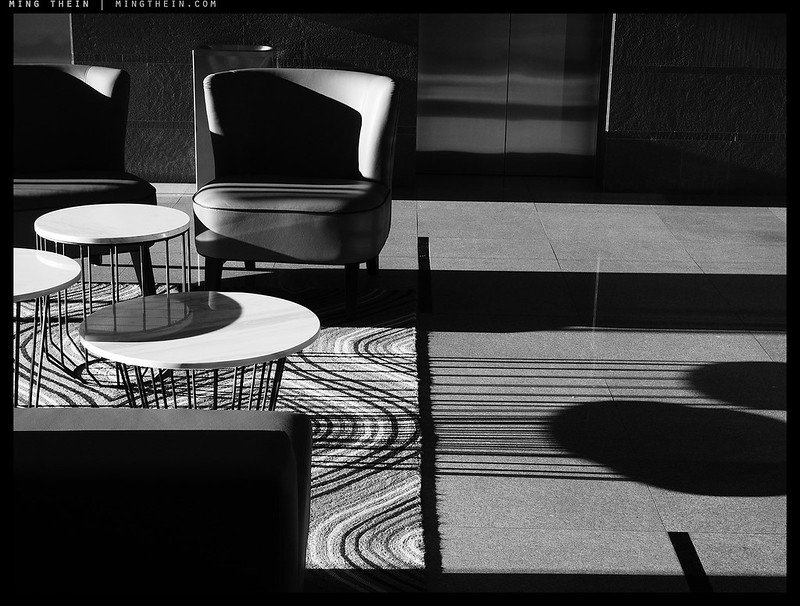
MT’s scrapbook: Shadow play
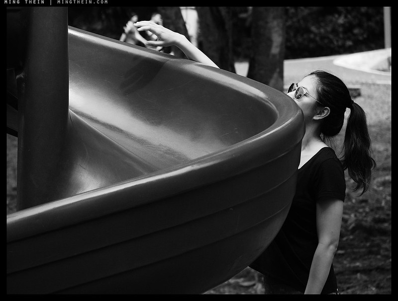
It’s actually very rare to get this kind of hard afternoon sunshine in the tropics – by the time it’s late enough in the day for the shadow angle to be this oblique, the day has usually been so warm that evaporation of ambient moisture has created sufficient clouds to block the sun. Yet you still need just a hint of something in the atmosphere to make the light golden and warm. The quality of shadow actually reminds me a lot of the Atlantic coast of Europe – specifically Portugal – around autumn or spring. Why monochrome though, if the joy is in color? Two reasons: you still see the effects of warmer light when you apply a color pass filter, and secondly – without the distraction of color, the hard definition of form becomes that much more acute. MT
The Scrapbook series is shot on an Olympus PEN F, with unedited JPEGs straight from camera bar resizing (and of course some choice settings).
Photoessay: The anonymous flaneur, part I
Leading on in the spirit of the previous post, I present a set of observations of anonymous individuals passing through the stage of life, without leaving anything more than a transient wisp. Are we equally observing each other, or are we preoccupied in our own bubbles? The more people around us, seemingly the more impermeable and discrete those bubbles become. As there’s less and less personal space we seek to defend it more closely. Is human nature wanting what we cannot have? MT
This set was shot with a Nikon D850, 24-120VR and post processed with Photoshop Workflow III.
Le flaneur
From Wikipedia: “Flâneur (pronounced [flɑnœʁ]), from the French noun flâneur, means “stroller”, “lounger”, “saunterer”, or “loafer”. Flânerie is the act of strolling, with all of its accompanying associations. A near-synonym is boulevardier.” A holdover from the class divides of 19th and early 20th century in Europe when the gentry could spend their time engaged in leisurely walking, observing and enjoying the cities, the concept might sound a bit indolent today but is actually still quite apt: these were the original street photographers, most of whom went without cameras. Fast forward half a century and we had the tourists; who perhaps could be thought of as serial visitors herded in predefined courses from important sight to sight. In parallel, photography went from an academic and scientific curiosity to being a mass-medium for personal recording, and then public exhibition. And then a means to show off: this brings us to the present day.
Thoughts on portraiture
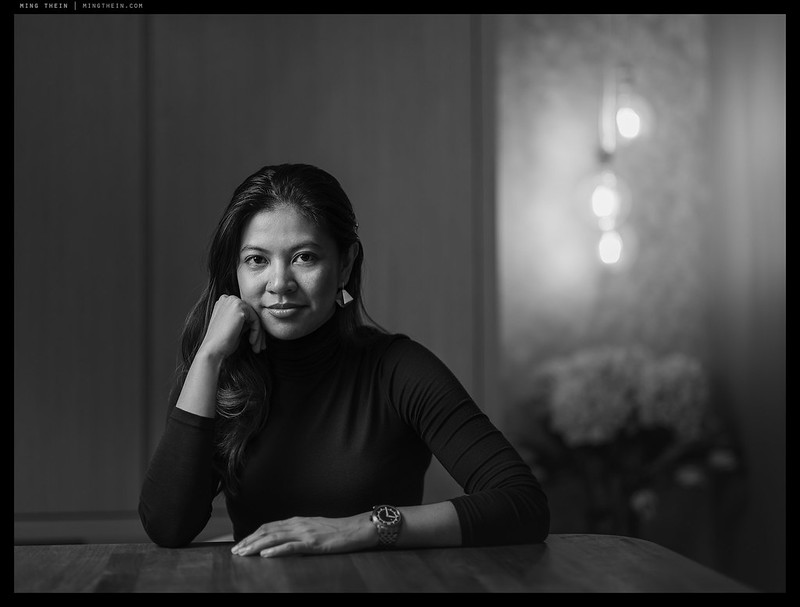
I have never been a portrait shooter – and as much as I find satisfaction (the reasons why we will discuss in due course) in a well-executed portrait, I don’t think it will ever be the mainstay of my photographic repertoire. The reason is both simple and complex: a portrait is not a photograph of the physical person – it’s a visual representation of your relationship with that person. A sort of mirror, if you will; even though all subjects reflect light and thus the environment to some degree, there are more and less reflective ones. Highly polished objects can land up being entirely representations of their surroundings only, with the merest interference of interpretation; one of the tenets I live by in watch/jewellery photography has always been ‘light for the reflection’. That’s not really relevant to portraiture, or is it?
Repost: Achieving visual consistency
Cue one from the archives, with updated images: tomorrow’s post will make more sense when viewed in context after this…
One of the questions I’m asked also (unsurprisingly) happens to be one of the biggest challenges for a lot of people: how to achieve visual consistency across multiple systems/ cameras/ media, and across multiple subjects. Though the latter is really getting into the question of what constitutes style and how can one consistently apply it, there are still things you can do to ensure that you are in control of the final presentation: not your camera. I certainly cannot tell a client ‘sorry, it looks different because I used two different cameras.’
MT’s Scrapbook: Sunday afternoons
The first entry in the Scrapbook is a quasi-narrative one from a lazy Sunday – the perfect kind of thing for which to test the entire pretext of the exercise. There was enough photographic content to keep me challenged and in practice, but not so much as to turn into the primary purpose of the day – oddly, not something I’ve had to worry about too much in the past, pre-family. Finding that balance again is challenging. Definitely not perfect, but more importantly – with enough verisimilitude that it’s pretty much as we remember it, which oddly, reminds me a bit of shooting film on family holidays when I was much, much younger (and pre-serious-photography). MT
The Scrapbook series is shot on an Olympus PEN F, with unedited JPEGs straight from camera bar resizing (and of course some choice settings).
The continued adventures of the traveling audiophile: going wireless

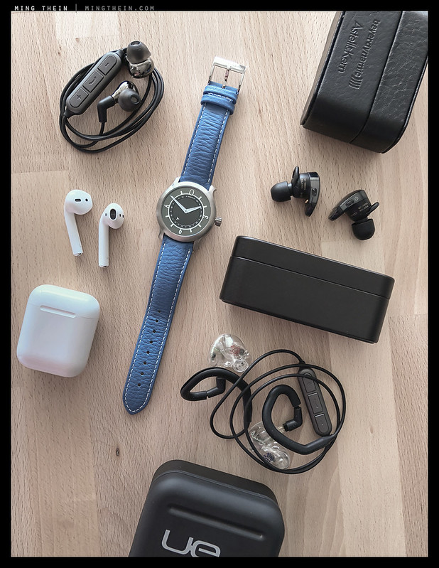
As with everything, it’s very easy to go off the deep end with audio – even personal, in-ear audio – and land up in a position where you have an extremely expensive piece of hardware that has zero secondary value (anything custom, for instance) and feel compelled that you have to make that decision before trying all options. And even if you’re lucky enough to be able to try all feasible options, 10-15 minutes of listening and A-B comparisons in an often less that representative (let alone ideal) location simply aren’t enough to make an informed decision. It also doesn’t help that you (I, at least) hit fatigue after perhaps half a dozen samples and can’t really hear the difference anymore – even if I might have fairly acute hearing on a normal day. But, I digress before I’ve even started. Last year’s move to the iPhone 7 and its forced choices of a) no charging with music if you use the Lighting to 3.5 adaptor, b) charging if you use the bulky as hell USB multiport thing and a small amp such as an AudioQuest Dragonfly Red, or c) wireless – has left me with a messy solution when travelling, which with involvement in three businesses in four countries and international clients, I seem to be doing even more of these days.
On-assignment photoessay: the face of construction
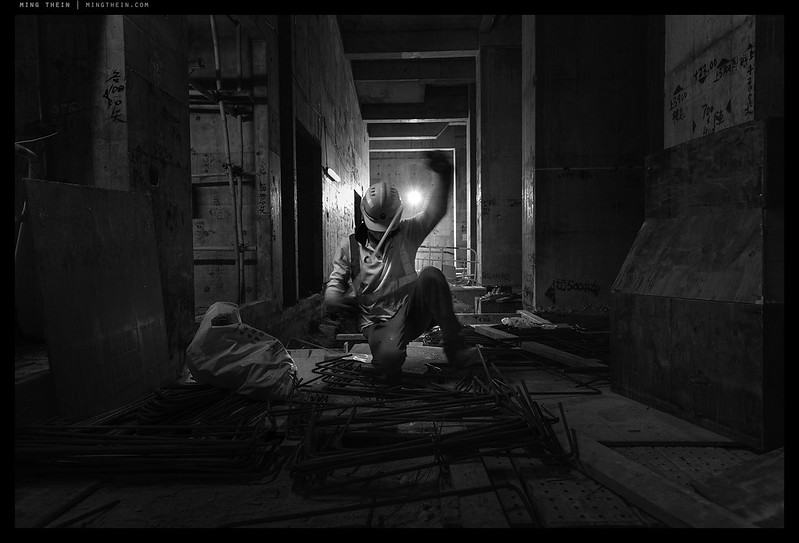
Over the course of the last few years, I’ve had the chance to shoot quite a number of contextual portraits of the people behind construction – some I’ve presented previously, and thus are not shown here. Almost all of the images in this set are new, and the result of a much larger curation project I’ve been meaning to do for some time. Even as extensive as a single shoot for this client tends to be – thousands of images over a week or so – the subject matter and light conditions are so diverse that you seldom have a chance to shoot a thematically and visually consistent sequence; thus the only way to make a project like this work is over a longer period of time. It also ties in nicely with some monochrome portrait experiments I’ve been doing over the last couple of months. Interestingly, the main challenge with this body of work overall was not opportunity, but the fact that construction workers in Hong Kong seem to all be exceedingly shy… MT
Images shot with various hardware over the last three years, but all post processed with The Monochrome Masterclass workflow.
Crystal ball gazing – have we reached a plateau?

The split, redux: all will be explained in the article…
In the late 90s/early 2000s, film photography arguably reached its zenith in many ways: you could get all sorts of hardware in all sorts of form factors; emulsion technology peaked in both proliferation and quality, and it was easy to get anything developed and printed, and developed well. There were high end pro compacts, super fast DSLRs, consumer megazooms, large format folders, sub-frame cameras…films varying in speed, look, positive/negative, and even crossover-types like C41 process black and white. I’d even argue that since then, film emulsions have not really improved (undoubtedly due to the vanishingly poor business proposition created by the emergence of digital) – and we’ve lost most of the major manufacturers and choices. (To say nothing of the labs.) The core technology reached a balanced plateau: lenses were matching emulsions in resolving power; AF systems were matching the rest of the system in precision required to consistently deliver the aforementioned resolution. On film, there’s not much difference between one of the better 50mms of the time (say a C/Y 1.7/50 MM, A Leica 50/2 Summicron, or a ZF.2 2/50 Makro-Planar) and arguably the best of today – the Zeiss 1.4/55 Otus APO-Distagon. I tried this experiment on an F6 some time back, with Fuji Acros: I couldn’t really see much of a difference in resolving power. Drawing style, yes, but not resolving power. Your ability to focus made far more of a difference. And running the same film through my 1979 F2 Titan or the 2005 F6 made no difference at all, of course. Ultimately, during the film era: image quality was proportional to format size. How is this relevant to now?