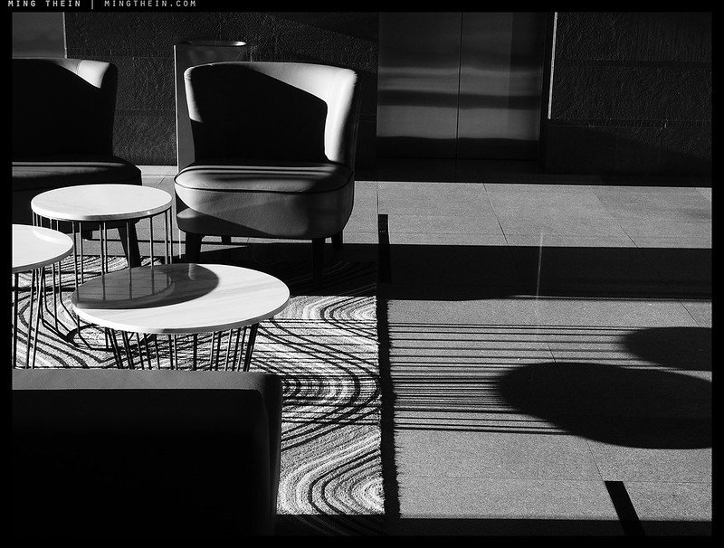
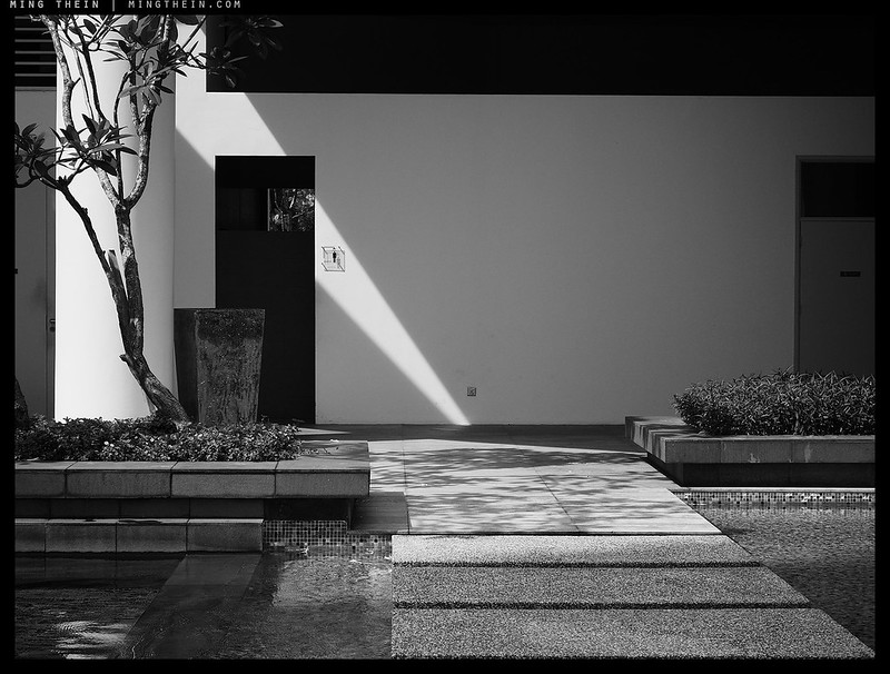
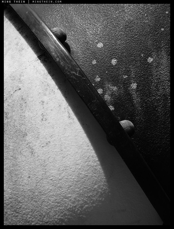
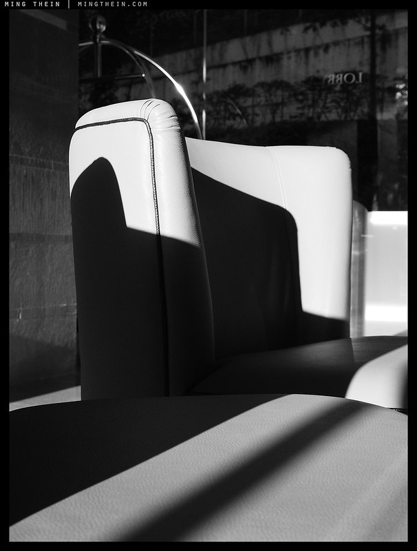
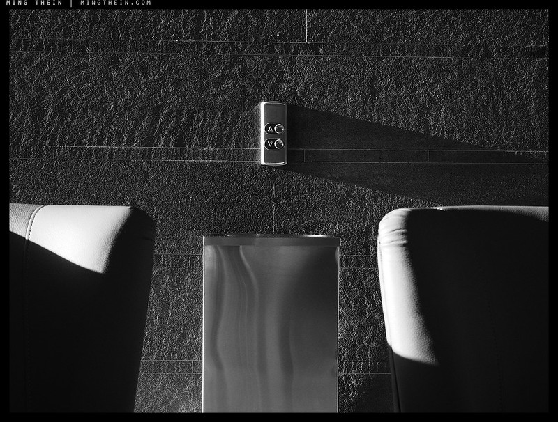
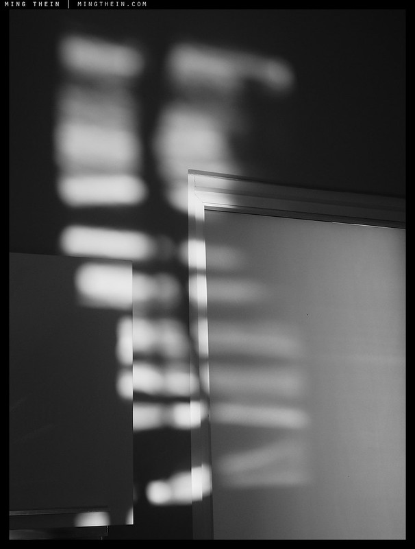
It’s actually very rare to get this kind of hard afternoon sunshine in the tropics – by the time it’s late enough in the day for the shadow angle to be this oblique, the day has usually been so warm that evaporation of ambient moisture has created sufficient clouds to block the sun. Yet you still need just a hint of something in the atmosphere to make the light golden and warm. The quality of shadow actually reminds me a lot of the Atlantic coast of Europe – specifically Portugal – around autumn or spring. Why monochrome though, if the joy is in color? Two reasons: you still see the effects of warmer light when you apply a color pass filter, and secondly – without the distraction of color, the hard definition of form becomes that much more acute. MT
The Scrapbook series is shot on an Olympus PEN F, with unedited JPEGs straight from camera bar resizing (and of course some choice settings).


__________________
Visit the Teaching Store to up your photographic game – including workshop videos, and the individual Email School of Photography. You can also support the site by purchasing from B&H and Amazon – thanks!
We are also on Facebook and there is a curated reader Flickr pool.
Images and content copyright Ming Thein | mingthein.com 2012 onwards unless otherwise stated. All rights reserved


So, Olympus body with Panasonic lenses. Is it because the Lumix lenses are better, or that there aren’t any similar M.Zuiko-glass in those focal lengths? I’m just curious.
And that lens did you use on the last image (the one with the feet)? I’d assume it’s an adapted one since there’s no EXIF data?
Nothing so profound, unfortunately – I already had those lenses from the GX85 (it’ll only dual-IS with Panasonic lenses with OIS built in) and didn’t want to buy new ones. Coincidentally there are also no Olympus equivalents for the compact zooms…
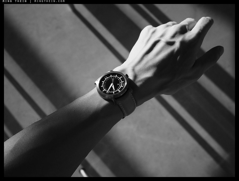
Last image was a Leica 50/1.4 M ASPH.
Moral of the story is that quality of the light is more important than anything else.
Or: things before the ‘click’ always matter more than post processing activities.
That’s always been the case – you can’t change composition or light after the fact.
Thank you for sharing these. They’re an inspiration for me to get out and do more with my Pen F.
Thanks!
Olympus should hire you to promote their cameras! Oh wait… too late 🙂
I just use what works for me at the time. I could have shot these with anything which has the same angle of view…
Very nice. I love looking at images made with an understanding of tonal control.
Thanks – just getting initial exposure right in this case, given they’re SOOC JPEGs :p
Wonderful compositions!
Thanks!
Lovely, many of them,
and great fun, some of them
and some are like listening to chamber music,
by, say, J.S. Bach or Shostakovich…
Thanks – lyrical and mathematical? :p
*Not* mathematical.
Lyrical? Maybe, but I didn’t think or feel in that direction.
It’s more like patterns and rythms with associations to musical structures.
Bach for lofty and bound structures – for lack of better words.
Shostakovich also for his humor.
Both for what is common in their music.
( To hard to explain anyway, 🙂 .)
I think I know what you mean, especially with respect to Bach – it’s structured and precise – mathematical – in the sense there’s recursion and layering, but not repetitive.
Structured but not precise !
I don’t enjoy when pianists are playing almost by the metronome, not even Bach – although that is common enough and was by many considered an ideal in the late 1960s. I liked Glen Gould’s recordings though, although even they were a bit too precise for me.
Yes, there is a kind of precision in much of Bach’s music – you mention recursion and layering, and there is that in some of the photos.
But I was thinking more of a combination of structure and feelings I experience when some of (still J.S.) Bach’s chamber music is played more musically – or Shostakovich’s, although the feelings then are different but of a similar structure.
( Damn, but if there were words for this, we wouldn’t need the music… 🙂 . )
As to Shostakovich, try his 24 preludes and fugues or some of his string quartets.
[ For an example of what I mean by “not precise” and “musical”, search YouTube for recordings by Elly Ney of some late Beethoven sonatas. She made new recordings at an old age that are even more deeply musical by playing with even less consideration for the notation. Enjoy!]
Actually, much like visuals: if we had right thousand words, we wouldn’t need the picture… 🙂
I think I know what you mean by musicality – it’s small changes in pacing, minor variations in tone; the kind of thing that puts emotional emphasis on certain notes.
Aye, 🙂 ,
and with Elly Ney’s late recordings quite large changes in pacing, and, with her, it *works*!
Try her!
Thanks for the tip, will do! 🙂
Like your use of light and shadows well done!
Thanks!
Dear Ming
I am really enjoying these scrapbook posts -inspiring and fun.
Thank you so much
Mike
I’m enjoying shooting them too – intuition vs the usual micro-planning 🙂
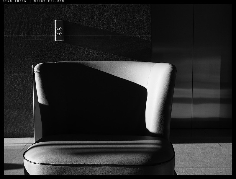
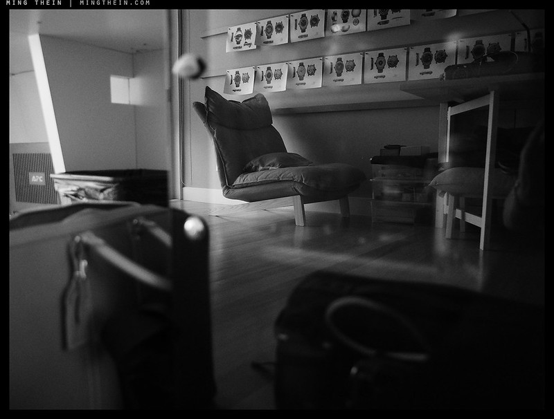
When I reviewed this set (especially the photos of the watch, the chair & the wall) one name came to mind… Ralph Gibson. …and that’s a compliment. The contrast in these photos is bold and confident. And the wonderful texture of the watch photo makes it a mini masterpiece. Nice set!
Thanks – wasn’t intentional, but I can see why they being him to mind…
Sometimes when dealing with harsh lighting I find the post processing works while I stay in the RGB palette, but when I switch to the CYMK palette to create a print, the system falls apart – and it is often better to print in B&W, instead. The result might look fine on screen, in RGB, but it sometimes seems to be too much of an ask to translate the image into a satisfactory colour print.
Maybe I need to investigate LUTs more deeply?
The problems in switching gamut usually occur at the very edge of the color space – which is precisely where you’ll be in harsh light because you’re either at the edge of highlight clipping or saturation (or both); these are the most undefined/out of gamut areas. I’d recommend both a wide gamut monitor (so you can see both RGB and CMYK and soft proof accurately) and a good LUT…
Fantastic minimalist shadow play and geometry. Love it 🙂
Thanks Gerner!
Clair obscurs et contre-jours excellents !!!
Merci beaucoup!