The inexact science of color and emotion

_7037890 copy
What makes this photo identifiable as dawn instead of sunset? Hint: it’s the color. We expect sunsets to be warm, but mornings to be cool and clear.

A series of experiments was done many years ago that showed humans have been conditioned to expect certain things in the way of color: blue ketchup just doesn’t fly, for instance. The theory is that it’s a primeval subconscious response to warn us of danger. Think of it this way: rancid meat looks a certain way, and has a certain color. Even if we can’t smell it – looking at a photograph of vomit or something decomposing makes us go ewwww. Such examples are to be found in nature all the time – think of those brightly colored poisonous beetles, for instance. In fact, the link between color and range (and thus emotion) is so strong that many species mimic the coloring of more dangerous species to warn away predators, but at the same time rely solely on that as protection because they pack no venom or toxicity. (Toxicity is energy-consuming to produce, and in food-scarce environments, you want to waste as little of your nutritional intake as possible producing something that’s only going to help you if you’re eaten – and thus probably going to die anyway.)

_7049521 copy

_7049526 copy

A tale of two cities. Shot minutes apart, though. How does the first image make you feel? The second?

How does this relate to photography? Quite simply, when you look at a photograph, how does it make you feel? Ignore the subject for a moment. The remaining emotional response is mostly down to your reaction to the processing: specifically, color. Why do black and white images have that ‘timeless’ or ‘ageless’ quality? Why do they make you feel slightly detached, as you’re an observer but not really part of the scene? It’s all due to color, or in this case, the lack of it. It’s difficult to relate to something if your information or perception on it is limited to tonal information only.

_7060545 copy
Why does this shot imply richness and juiciness? How would you feel about pale gray steak with red tomatoes, even if it tasted the same?

In fact, if you look through historical photographs and video – you’ll see that each recent era or block of ~10 years in modern history actually has quite distinct color and tonal styles. And looking at this often makes one feel something – nostalgia, hatred, wondering what one was doing with their youth. Early color photos from the 1930s and 40s have that vintage look, for instance.

_7036896bw copy
To me, this screams classical photojournalism – because of the contrast, the tonality, and the lack of color. Early photographers didn’t purposely go for that look – they learned to work with it because of the limitations of darkroom chemistry.

A lot of modern photography software capitalizes on this. Instagram and all of those software filter packages are a good example – hell, even Lomography to some extent – they let you instantly create a feeling through a combination of color fiddling and contrast manipulation. There’s a reason why a photo from a Lomo or Instagram looks like a vintage hippy polaroid: it’s because the white balance was shifted warmer by several notches, the saturation decreased slightly, the contrast decreased a lot, and the relative luminance and hue of the red and yellow channels shifted. And there’s probably some grain and gaussian blur in the mix, too. Try it yourself in Photoshop, if you don’t believe me.

_7014252 copy
Cool mountain. Nikon D700, Zeiss ZF.2 2/100 Makro-Planar

The point is, polaroids looked that way because of the chemical process of the day: not because they wanted them to look that way. I’m pretty sure the engineers there were chasing perfect color, too. The upshot of all of this is that a modern photograph processed that way invokes memories of the polaroid era, because that’s how most social images looked then.

_7013736 copy
Mmm, natural green freshness.

Most humans respond in similar ways to color, namely:
Red – danger, warning, attention;
Blue – cool, calming, relaxing;
Yellow – warm, friendly, open;
Green – natural, fresh;
Black – mysterious, sinister, classic, premium, heavy;
White – pure, open, light, honest, clean
Gray – apathy

_7035572 copy
Multiple light sources can be confusing as hell, but almost always signal ‘party!’

Simply put, there’s a reason why most Ferraris are red, and most hospitals are white.

How does this help you as a photographer?

Actually, it’s fairly simple. Color enters your image everywhere, but makes an impact in at least two major ways. The first is if you’ve got one dominant color in the scene that registers on the subconscious of the viewer even before they figure out what the subject is; it can be the color of the backdrop, for instance. A more subtle way is the ambient light temperature – for instance, a warmer white balance setting will result in a shift towards the red and yellow channels; this in turn imparts the ambient light with a particular quality and tone.

_5100_DSC1276 copy
Warmth. The ambient WB was shifted further away from the primary light source (the flame) to preserve the warm color.

The second major way is through contrast: if you’ve got a subject of one color against a backdrop of another completely opposite color (red and green or blue and yellow, for instance) then it’ll stand out because it’s the only thing in the scene that is visually discordant. It’s a good thing, in this case, because it draws your eye to the subject and lets the background serve as a stage – which is the way it should be.

_7037150 copy
Why does my subject stand out? It’s a different color to the background, of course.

But what if your scene has no dominant color, or is very washed out or low in saturation? Do what the cinematographers have been doing for years, and either impart a global tint as described above – you can easily do this if you shoot raw by shifting the white balance; lower color temperatures that what is accurate are cooler and bluer, and vice versa for higher color temperatures. The other alternative is to use a filter over your lens, or color the light – the latter obviously assumes you’ve got some control over your lighting, though. By far the easiest way to shift color and not land up with odd hues due to the nature of color addition and subtraction is to adjust your white balance.

_7049662 copy
KLCC dawn, color slightly shifted. Nikon D700, 28-300VR

One final comment: you need to start with an accurate white balance before you shift the color temperature. This is so you don’t land up with strange colors due to shifts along the green to magenta axis (white balance and color temperature affects only blue to orange/red). Also, remember not to overdo the saturation: shifting the white balance can cause other channels to blow, even if the original appeared to be correctly exposed. And over saturated images just look crude, frankly.

And on that note, I’m going to break until the next topic: chasing perfect color, and white balance myths. MT

_7029367 copy
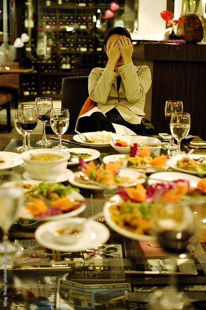
Funky diner colors. Sometimes, your ambient light is close to exactly what you want – and all you have to worry about is color accuracy. Nikon D700, 85/1.4 G

____________

Visit our Teaching Store to up your photographic game – including Photoshop Workflow DVDs and customized Email School of Photography; or go mobile with the Photography Compendium for iPad. You can also get your gear from B&H and Amazon. Prices are the same as normal, however a small portion of your purchase value is referred back to me. Thanks!

Don’t forget to like us on Facebook and join the reader Flickr group!

appstorebadge

Images and content copyright Ming Thein | mingthein.com 2012 onwards. All rights reserved

Balancing content and technical perfection

_M224835 copy.jpg
Base jumping off the KL Tower. There are no do-overs for either the shot or the participants. Nikon D200, AI-P 500/4

Suppose you had one opportunity to get the shot: what do you do? The obvious answer is go for broke; who cares if it’s slightly overexposed, out of focus or the framing is a little off. Maradona is probably only going to use the ‘hand of god’ once; the millennium is only going to roll around once in your lifetime. Bigfoot will probably only appear once, and only in out of focus or foggy areas*.

That’s one end of the spectrum: it’s all about the content rather than the execution.

_7045452 copy
Benzinger Skeleton. Full control of everything, full repeatability. The second, third, fourth and fifth shots would look exactly the same.

The opposite end would be fine art still life: any one of the aforementioned photographic sloppinesses would probably get you thrown out of the gallery, unless perhaps you were very, very good at explaining why out of focus images represent the current zeitgeist of society, how rushing around and achieving complete form and ‘just getting it done’ rather than doing it well – quantity over quality – are also paradigms of modern corporate living.

_MT98674bw copy.jpg
What’s this? A situation in the middle: you can anticipate what’s going to happen and be prepared, but you don’t get a do-over. You should be able to get a perfect result with practice.

Enough sarcasm. Basically, if you’re going to create a still life, you’d better damn well be in control of the elements, or it just makes you look sloppy and incompetent as a photographer. There’s no way you can excuse compositional errors, slanted horizons, overexposure or things intruding into the edges of the frame. Studio commercial photography also falls into this category; it’s 100% controlled, and if you can’t get your image right when there isn’t anything left to chance – and the shot is repeatable – then you should probably hang up your camera.

_M9P1_L1003919bw copy
It wouldn’t have worked without the man. Schonbrunn Palace, Vienna. Leica M9-P, 28/2.8 ASPH

And that’s where the dilemma comes in: for photography that isn’t clearly at one end of the spectrum or the other, where do you draw the line of acceptability? If there is no expectation to create perfection, is there any necessity? In fact, if the expectation is of something slightly imperfect – to capture the chaos of reality – then perhaps perfection would actually weaken the impact of the overall image.

_M9P1_L1005830bw copy
I like the lyricism and movement in this image; in fact, nothing is perfect. It was underexposed because the meter gets fooled by backlit situations so I went manual and got the exposure slightly wrong; then the limitations of my equipment meant motion blur in the subject was a certainty, so I decided to work with it; finally, none of the verticals are straight – it bothers the perfectionist in me, but I bet you it wasn’t the first thing you noticed about the image. Malastranska, Prague. Leica M9-P, 28/2.8 ASPH

That last point isn’t immediately obvious. In fact, it’s quite counterintuitive; I was only made aware of it because I personally tend to drift towards the technical perfection end of the spectrum, and various clients have commented that my images look a little too perfect in some ways, especially for photojournalistic work. For studio photography, on the other hand, my clients love the attention to detail.

_7008086 copy
If This Looks Too Perfect, That’s Because It Was Staged. Artfully constructed scene for a promotional video. Nikon D700, Zeiss ZF 1.4/85 Planar

A year or two ago, I would have thought that the ideal combination would be to nail content, composition and the technical aspects of the exposure to produce a perfect image; however, this is not only nearly impossible to do, but somehow also results in slightly lifeless images. The soul is missing – or perhaps it’s not so much soul per se as humanity represented by the slight imperfections which impart the character of the photographer onto his or her image.

_M9P1_L1005824bw copy
More lyricism. Malastranska, Prague. Leica M9-P, 28/2.8 ASPH

Perhaps I’m just confusing myself with the philosophy now, because this is my current photographic worldview:
1. We strive for perfect images.
2. Technical perfection isn’t perfection per se, because that slight bit of imperfection humanizes an image and gives it personality.
3. This means that we must have skill and ability to achieve technical and compositional perfection, even under spontaneous circumstances.
4. However, we need to have even more control than that, because we need to have the ability to add imperfection at will.
5. Go out and create, with this brief of perfect imperfection in mind.

_PM04193 copy
Just your average slice of life. Olympus E-PM1 Pen Mini, Panasonic 20/1.7 G

I hear questions from the back of the room. Does this apply to every situation? More importantly, how much imperfection should we apply?

The answer to the first is obviously not; if you can do this in a situation where you have little or no control over the subject – think war zone photojournalism, for instance – that probably makes you one step removed from God, and a clear notch above the great PJs like Capa, HC-B et. al. Remember from the Magnum Contact Sheets book, even they had to work the scene a bit to get the final composition they wanted.

_8001696bw copy
The foot. The one aberration in this abstract urbanscape is actually to me what makes the image. Nikon D800, AFS 24/1.4 G

The answer to the second is nowhere near as clear cut. And frankly, I have no idea how much is too little, how much is enough, and how much is too much. The only way to determine the answer to this conclusively is to experiment, and get your work out there and opined-upon. Modern Japanese photographers tend to be at the very haphazard end of the spectrum – some of their work seems almost random, albeit very carefully constructed random – and the other end I suppose are the environmental portraitists who bring lights and modifiers and everything else with them even into the middle of conflict areas.

_7060984 copy
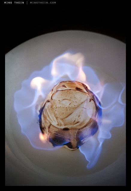
Flambe. Repeatable, but not controllable. You can set up the shot and do it again, but you can’t control what the flames are going to do. And this is the interesting thing that gives a little variation and makes each shot different. Seascapes are another good example. Nikon D700, AFS 60/2.8 G Micro

Personally, I’m going for something in the middle; but before I even get there, I need to shoot more – to have full intuitive control over my camera so that whatever adjustments I make come to me as second nature. And at this point something has to be said about good cameras, bad cameras, and too many cameras; good cameras are intuitive to use and require little training or practice to master. They do what you want them to, nothing more and nothing less. Bad cameras are ones that you never feel fully in control of, no matter how much practice you have. And too many cameras is just that: if you have too many cameras, you’re bound to eventually forget which button does what. And that could cost you at the most critical moment. This is why I’ll continue to use my D700 for reportage assignments until I’m fully comfortable with the D800; I know exactly habit will do under every situation, born of seventy thousand frames of experimentation – not counting the fifty thousand I shot with the D3, which is pretty much the same camera. MT

*Did anybody get the Futurama reference?

_7058402 copy
Would the burger be as appetizing without that juicy pickled onion marmalade peeking out? Probably not. Nikon D700, AFS 60/2.8 G Micro

____________

Visit our Teaching Store to up your photographic game – including Photoshop Workflow DVDs and customized Email School of Photography; or go mobile with the Photography Compendium for iPad. You can also get your gear from B&H and Amazon. Prices are the same as normal, however a small portion of your purchase value is referred back to me. Thanks!

Don’t forget to like us on Facebook and join the reader Flickr group!

appstorebadge

Images and content copyright Ming Thein | mingthein.com 2012 onwards. All rights reserved

Defining style, and finding your own

Introduction: This has been one of, if perhaps not the most difficult essay to write so far: it concerns a topic that’s fundamentally important for all serious photographers, yet is extremely difficult to define in a strict technical sense due to its very nature. It’s the only essay I’ve had to stop and start writing several times because I penned myself into a corner. What you read is the culmination of many sessions and days of work. I hope you find it useful.

What is style? Dictionary.com gives a lot of options – 16 to be exact – but I think perhaps the most appropriate definition of style from a photography perspective is best described as:

A particular, distinctive characteristic mode or form of execution, construction, appearance of a visual work which can be associate with a particular person or group of people.

Let’s think about this for a moment. It probably isn’t an exhaustive definition, however, it captures the essence: style is distinctive. It’s individual, or belonging to a group of individuals, associated with them because they created it or they promote and propagate its use. What are the distinctive visual elements or combinations of visual elements that define a style, specific to photography?

1. Color (or lack of it)
2. Tonality
3. Perspective
4. Lighting
5. Focal point/ depth of field
6. Fidelity
7. Quirks, the personality of the photographer, or perhaps the X factor

Let’s examine each one individually.

Color
This one is fairly simple: is there color or not? Is it black and white? Is the color saturated, bright and punchy (think happy commercial product shot) or is it monochrome and gritty (think classical photojournalism and war photography)? Consistent use of color is one of the fundamental things that defines a style – but it isn’t exhaustive on its own. Similarly, consistent use of filters or digital gradients to apply a consistent hue shift to a set of images can also define a style; for example, I personally associate that warm, golden light with California; I have no idea why, perhaps it’s the pollution of LA or a fetish of the Hollywood directors.

Tonality
This splits out into a few options: neutral, high key, low key, low contrast and high contrast. The former three options can be combined with the latter two options; you can have something that’s neutrally biased but high contrast, or neutrally biased but low contrast. In digital terms, think of the former as where the majority of the histogram is bunched: neutral would be evenly spread, high key would be towards the highlight end, and low key towards the shadows. Contrast then becomes the bunching: if you’ve got strong gradients in the histogram at any particular point, that’s high contrast. Low contrast images don’t show this. A good example of distinctive tonality would be the works of Sebastiao Salgado: you always know it’s a Salgado because of the tonality of the image, before you even see the subject. It’s a distinctive signature that’s there in his corporate work covering the Channel Tunnel and his humanitarian work in Africa.

Perspective
This one is a highly technical characteristic, and linked to the focal length of the lens used – only. If a set is shot predominantly with a wide angle lens – modern photojournalism tends to do this a lot, with the subject placed center or near-center foreground and the environment in the background around it to give context – then that’s gives a distinct exaggerated perspective. Similarly, sport and wildlife almost always employ compressed (telephoto) perspectives due to inability to get close to the subject.

Ligthing
Lighting is linked to tonality and contrast: direct lighting produces harsh shadows and flat images for subjects in the frame that are perpendicular to the camera; diffuse lighting produces nice textures and gentle gradients. If you’re not shooting with studio lights, you might not always be able to control this; but you do have control over when and where you shoot, which of course affects the quality of the lighting. Some photographers are nocturnal, for instance. Others choose to always use direct flash in daylight – Bruce Gilden, for example.

Focal point/ depth of field
How much of the image is in focus? Granted, sometimes this is linked to the perspective because of optical limitations, but there are ways around that – fast ultrawides for DSLRs give a telephoto-like separation of subject from background, but with exaggerated perspective; similarly, small sensor super zoom cameras will let you achieve compression but also short hyperfocal distances.

Fidelity
This is a tricky one to define: how close is the image to reality? Is it a feasible scene, which you could happen upon with your naked eyes, or is it something that’s been so heavily photoshopped that you can’t tell between what was shot with a camera or created with a Wacom tablet? I’d put HDR imaging somewhere on this spectrum, too. It isn’t reality, but HDR can be used properly to actually create more natural looking results (to be the subject of a future article).

Quirks
We end with the broadest possibility of all: anything open to the creativity of the photographer. Some photographers leave a little in-joke in frame; others have a particularly distinctive way of retouching; others may only shoot one particular subject. I deliberately haven’t put subject in as a component of style, because it’s possible to shoot the same subject in many different styles – and this wouldn’t be consistent.

Now that we have some idea of how to define style, how do you define your own? Firstly, it must be consistent: you need to be shooting and finishing images in this style consistently, without having to think about it. There may be more than one style you do routinely; I have three which I’m aware of. Using my work as an example, I do three things:

_7037081bw copy
Classical Photojournalist.

1. Classical photojournalist. High contrast black and white, with almost everything in focus, finessed tonal transitions in the subject – I expose and process for the the subject and let everything else fall wherever on the tonal scale it may – and mostly wide angle, mostly 28mm but with some ventures as wide as 24mm or as long as 50mm, but no longer. I’d describe it as as mix of Salgado and HC-B.

_7034062 copy
Cinematic.

2. Cinematic. This is perhaps the style that defines me the most: shallow depth of field, mostly long perspectives (85mm) with some wide, dramatic shots; strongly dynamic lighting, with heavy manipulation of color and tonality to affect atmosphere. (Color will be the subject of several future article). Heavy focus on the subject and just enough background to give context, but no more.

_7050700 copy
Commercial.

3. Commercial. Although there are elements of the previous two styles in here, I prefer to think of this as the clean, perfectly-lit product shot: it’s what I do with the majority of my watch photography.

At this point, I should take a step back: how do you even find your style, before you define it? Simple: look at what’s out there, and experiment. For the first few years – hell, it might be a lot of years – you will probably be following other people’s work. You might not even be able to consistently reproduce a style that isn’t your own. Don’t worry – that’s not the point. Your own style should evolve naturally after sufficient experimentation. I know that I didn’t really have a distinct style until 2009 – though I dabbled in many up to that point – which was the classical photojournalist. Cinematic developed at the end of 2010. Commercial has been continuously in refinement as I improve my lighting skills. Other than proving I’m nothing if not a schizophrenic photographer, it shows that even if you can define your style, you may not necessarily have found the one that works best for you: I can shoot in any one of these three, and often have trouble deciding which one would look best.

_0012575 copy
Natural.

And you know what? I’d be very disappointed if I stopped developing here. I think there’s a midpoint between all of these three styles – something I’ll tentatively call ‘natural’ – which seems to be the direction in which my work is going now, be it available light or studio. The characteristic of this style seems to be perfect color, with a little cinematic hue shift where required; a mix between dynamic and natural lighting, with an emphasis on the subject; and an overall natural perspective to the images – as though you could have seen them with your own eyes, without much artificial intervention (think monochrome, or long exposure, etc.). I’m looking forward to seeing where this goes in the future. MT

____________

Visit our Teaching Store to up your photographic game – including Photoshop Workflow DVDs and customized Email School of Photography; or go mobile with the Photography Compendium for iPad. You can also get your gear from B&H and Amazon. Prices are the same as normal, however a small portion of your purchase value is referred back to me. Thanks!

Don’t forget to like us on Facebook and join the reader Flickr group!

appstorebadge

Images and content copyright Ming Thein | mingthein.com 2012 onwards. All rights reserved

The relationship between talent, creativity and experience

Let’s start with some semantics:

Talent: is your innate ability to do something – it’s inborn, and for the purposes of this essay, you can’t change it. It’s fixed. Think of it as your starting point; you also can’t lose it.

Creativity: in the photographic context centers around your ability to construct a unique composition from a given scene. It’s a continuum; the more different your composition to anything that’s come before, the more creative you are. This applies for both the elements you can control (e.g. studio lighting, flashes, focal length/ perspective etc) and the ones you can’t – the subject, for instance. The amount of creativity a person has is generally fixed; however, unlike talent, you can train yourself to be more creative.

Experience: is the knowledge you gain from having done something (or something related and relevant) before – for instance, if you’ve used a fire before, you know it’s hot and you won’t put your hand into it because it hurts. In a photographic context, it could be something as simple as knowing that telephoto lenses work better for wildlife photography than wide angles, or it could be as subtle as choosing a thick carbon-fiber monopod over a thinner steel one for its rigidity and vibration damping properties to enable as low a shutter speed as possible. This is the biggest area of opportunity for all photographers.

It’s easier to understand where I’m going next if you have a baseline: I’ll use myself as a guinea pig, and score out of 10; 10 being the best and 0 being poke-your-eyes-out-with-a-stick bad.

Ming, in 2003 (Brand-new, wet-behind-the-ears hobby photographer. Doesn’t know the first thing about shutter speeds, finds aperture numbering confusing, and can’t figure out the whole perspective thing.) Here’s an early shot:

_DSC0633 copy
Random abstract.

At the time, I thought this was actually one of my better ones. Shocking, huh? I think nobody would question an assessment of Talent = 0. Creativity – hmm, harder to judge; it obviously isn’t really a standard shot, but at the same time…execution is lacking. I’ll be generous and say this merits a 5 on the creativity scale. It does tell us something about the experience rating, though: had I known better, I wouldn’t have overexposed, and I’d have used a tripod. I’d probably also have selected a more suitable exposure combination commensurate to the effect I was trying to achieve. Let’s give experience another zero.

Fast forward a bit to today.

Ming, in 2012 (Getty Images member, Nikon Professional Services UK member, Leica Camera-sponsored, veteran of countless pro shoots, etc…I’ll stop blowing my own horn now 😉

_7053570bw copy
Jaeger Le-Coultre Gyrotourbillon 2 escapement

I don’t think anybody would argue that this is an easy shot to produce. It requires advance knowledge and mastery of a) lighting; b) composition and visual balance; c) being able to see the unique in something not immediately visible or obvious (the frame covers approximately 12x8mm); d) post processing; e) familiarity with the subject itself; f) the ability to get one’s equipment to deliver exactly what is required.

So what’s changed in the last nine years? My talent remains the same: it can’t change, and it’s approximately still zero. My creativity has definitely improved; I’m both trying different things and executing them so that they manage to communicate my initial vision – that shot was supposed to give the impression of an x-ray view into the heart of a complex machine, which this particular watch absolutely is.

But the biggest improvement is experience: in the last nine years, I’ve shot more than half a million frames – some in the course of getting the shot for a particular assignment or location; some out of pure experimentation; and some just in the course of capturing and recording life as I see it. But each one of those frames has given me the benefit of being able to refine my skills incrementally more. Although the laws of diminishing returns definitely kicked in a long time ago, I’m told there’s still some progress going on. The way I shoot now is not the same as the way I shot even a year or two ago.

Shooting lots is one thing – but remembering what you’ve learned is even more important, otherwise you’ll hit diminishing returns pretty early on in the process. There are many times where I’ll do experiments concentrating on one particular aim only – for instance, refining my x-ray processing technique – and ignoring the other elements. Or perhaps it might be to master the use of lighting very small reflective objects at close distances. I probably won’t keep any of these experiments because compositionally they don’t work (and that wasn’t the point) – but it’s the experience and knowledge that’s important. And then when I *do* need to put it all together – the above shot, for instance – then I have confidence that my techniques and experience will let me pull it off.

There is no substitute for experience. There’s plenty of evidence to support that it takes 10,000 hours of dedicated practice to master something – give or take a little depending on whether you do it continuously (benefit of not forgetting between sessions and having to backtrack or repeat) and your intellect. This means one task, continuously, for three years or more. And that’s why there were a) so few master photographers in the film days (practice cost a lot of time and money, and there was a delay between taking the shot and getting feedback, during which it was easy to forget what you tried) – and b) lots of ‘new talent’ emerging today.

Which brings us to the conclusion of this article: I’m often asked what is the one best tip I can give to an aspiring photographer: practice, practice, practice. I still do it, and I’m still learning. MT

____________

Visit our Teaching Store to up your photographic game – including Photoshop Workflow DVDs and customized Email School of Photography; or go mobile with the Photography Compendium for iPad. You can also get your gear from B&H and Amazon. Prices are the same as normal, however a small portion of your purchase value is referred back to me. Thanks!

Don’t forget to like us on Facebook and join the reader Flickr group!

appstorebadge

Images and content copyright Ming Thein | mingthein.com 2012 onwards. All rights reserved

Zone focusing and shooting hyperfocal

Hyperfocal shooting is a subset of zone focusing. Both are very, very useful tools in the arsenal of a photojournalist or street photographer; especially so if you’re using a manual focus lens, or one with a meaningful depth of field scale engraved on it. It means that if you know what distance your subject has to be at to fill your frame correctly, you can set that and just shoot straight away when you bring the camera to your eye – a very fast way of working. It’s what I usually do when I have enough light and a wide lens on my Leica.

Let’s start with zone focusing. It’s simple if your lens has a depth of field scale:
1. Pick an aperture
2. Find the depth of field scale markings corresponding to that aperture.
They’re on the bit of the lens that doesn’t rotate.
3. There are two of them. Everything between those two marks will be inn acceptable focus. Why the hesitation around ‘acceptable’? Because sharp-at-the-100%-pixel-level defines acceptable focus, and that will vary from camera to camera – the higher your pixel density, the narrower the acceptable focus margin will be. You’ll have to experiment for your camera and find out how much (if anything) to compensate by – for some cameras, you might find you have to as much as halve the width of the gap between the two markings.

_D90_DSC7238bw copy
Leica 21/1.4 Summilux-M ASPH.

Example: in the image below, the lens is focused just after 1.5m. This means the sharpest point will be at 1.5m, but if we set f2.8, objects from 1.2m to a bit over 2m will be in focus. Selecting f5.6 expands this further to 1m to 5m.

A good rule of thumb is 1/3-2/3: one third of your DOF will be in front of the focus distance, and 2/3rds behind.

Simple, right? There are a few more things to know.
1. It works best for wide-angle lenses, because they have more DOF for a given aperture. (You could zone focus with a telephoto, but you’d need a silly small aperture and probably run out of light).
2. It works best during daytime, because you’ll have enough light to stop down a bit (and thus increase your margin for error).
3. It works best if you have some practice estimating distances, because you can adjust on the fly without having to bring the camera to your eye.
4. It works best with smaller sensor cameras, because again there’s more DOF for a given angle of view (focal length equivalent) and aperture – for instance, the Ricoh GR-Digital III has a ‘snap’ mode that sets focus to certain distance; at f2.8 and 1.5m, almost everything will be in focus from 0.75cm onwards or so.
5. You can’t do it easily with modern AF lenses – those which do have DOF scales usually only give f11 and f22, which are heavily restricted by the amount of light you’ve got to work with; then the distance scale itself is short and probably not very precise, with few distances marked; lastly, there isn’t enough precision in the focusing ring. You could do it by using the AF system to focus on a distance, switch to MF, and set your aperture – but you’d have to memorize your DOF tables, which is never easy or fun.
6. Some compacts are better than others for this than others; the best kind have manual focus with a DOF indicator bar and scale – the Leica X1 and Ricoh GR-Digital series come to mind.

Let’s move on to hyper focal. The hyper focal distance is the setting beyond which everything is in focus to infinity at a given aperture. Even super-shallow DOF lenses like the Noctilux 0.95 have a hyper focal distance – but it’s probably 50m or something at f0.95. Once again, the wider the lens, the nearer the hyper focal distance will be for a given aperture. With lenses in the 28mm range, you can work at a reasonable aperture of f8 or so and have hyper focal distance at about 3m on a full frame sensor, which is great for capturing spontaneous moments in photojournalism or street photography.

There are several very useful calculators online, such as DOF Master – playing around with this will give you a good idea of which of your camera/ lens combinations is best suited to zone focusing. I personally do it with my Leica M9-P, and sometimes with the Ricoh GR-Digital; but never with the DSLRs because AF is very nearly as fast, especially on the D700. Also, beware lenses like the Olympus ZD 12/2 for micro four thirds – it might look like it has distance and DOF scales, but the focusing ring is electronically coupled, and lacks the resolution to make it truly useful. MT

Professional photography with compact cameras

_0011047 copy
Regent Square architecture, London. Ricoh GR-Digital III

The title of this article isn’t a contradiction: I did really just suggest shooting for clients, for money, with a compact camera. I’m not talking about compact system cameras or ILCs like Micro Four Thirds; those have recently come of age and are very, very competent indeed – in fact, for most purposes, they produce indistinguishable final results (think print, or web, rather than pixel-peeping at 400% on a perfectly calibrated monitor) from larger cameras if used within their limits.

_0012621 copy
GuB Marine Chronometer. Ricoh GR-Digital III

The reality is that while the big guns have been steadily improving, and have almost all surpassed the image quality level any professional photographer may require, there have been steady improvements in compact cameras (fixed lens, small sensor) too. It’s often not clear which arm of sensor development leads which: the desire for lower noise and improved photosite efficiency has undoubtedly helped improve dynamic range and noise properties of larger sensors. And vice versa, development of CMOS technology for larger sensors is slowly finding its way into point and shoots.

_0011852 copy
Gas Malaysia. Ricoh GR-Digital III

What does this mean? In the real world, my clients almost never have final uses for the images that require more than 12MP when properly shot and composed (i.e. not heavily cropped). We can delude ourselves into thinking more is better – all else equal, it usually is – but most of the time, it makes no difference. Even if you’re doing a billboard, you don’t need medium format – I’ve done a couple with the mere 4MP Nikon D2H – simply because the individual pixels are about the size of golf balls, but nobody notices because you never get any closer than 20 meters.

_0011137 copy
Selfridges, London. Ricoh GR-Digital III

I recently shot some wildlife images for the local Malaysian launch for the Leica V-LUX 3 (a full review is here on the official Leica Blog). The spec is ambitious: a fixed 24-600mm lens,12MP, and full resolution images to ISO 3200. Did I mention the sensor was just 1/2.33” in size? It doesn’t get much smaller in the compact realm; there’s 1/2.5”, 1/3”, and then you’re into cellphone sensors.

_VL31_L1000236 copy
Scarlet Ibis. Leica V-Lux 3

In any case, the images were printed to at least 20×30”, and in some cases, larger. I even used ISO 400 (base of 100) and very dodgy shutter speeds for some of them. Was the color odd? Did they look grainy and horrible? Not one single bit, even with your nose pressed up to the print. I shot raw and did zero noise reduction – zero. Would they pass for fine art, let alone commercial use? Absolutely. In fact, the results were on par with the Nikon D200 and it’s APSC sensor that I used for the same kind of thing about five or so years ago.

_VL31_L1000944 copy
Leica Visoflex III on M9-P. Leica V-Lux 3

I did some other testing with that camera, too: studio product work with flash. Here, the result was even more difficult to distinguish from a larger sensor camera – at base ISO, controlled lighting and optimal apertures, everything looks superb even to the pixel level. In fact, possibly better, because to achieve the same depth of field in the final image, I’d have to stop down so far on a full frame camera that I’d be incurring a softness penalty due to diffraction.

_0010773 copy
Tulip staircase, Queen’s House, Greenwich. Ricoh GR-Digital III

So what about putting my money where my mouth is? I have already. There are photos I submitted to Getty Images – which were shot with an iPhone 4 (5MP) – and accepted. I swear the file quality is fine for A3+ prints, so long as you’re shooting at base ISO and watch exposure carefully – I’ve tried. I recently shot another job (to be the subject of a future On Assignment article) with another compact – the Leica D-LUX 5. Yes, it has a slightly larger sensor, and I was using LED light panels, but the result was successful: the client (and I) would not have been any happier had I used a larger camera.

_0011302bw copy
KL Drift. Ricoh GR-Digital III

We all know Alex Majoli made his name shooting with compacts – famously half a dozen Olympuses C5060s – because of their silence, unobtrusiveness and low replacement cost, especially important in combat or hostile environments. (I’m told he uses an M9-P now, though.)

_1002177bw copy.jpg
Welders; Hommage a Majoli. Ricoh GR-Digital I

I should probably talk a bit about the situations in which a compact would be more useful than a larger DSLR or even ILC:

1. When size or weight is a priority. I haven’t done it (and probably never will) – but I wouldn’t want to climb Everest with a Nikon D4 and suitable lenses. There’s plenty of light, so I’d probably go with one of the more robust compacts.

_1002147bw copy.jpg
Shipyard inspection. Ricoh GR-Digital I

2. When you don’t want to stand out. Sensitive or covert photojournalism/ documentary photography immediately springs to mind. Nobody is going to pay you a second thought or glance if you’re ‘just shooting with your cellphone’ – everybody else is doing it, so you just blend in. Compacts are pretty much socially acceptable and transparent in most situations; if you’re not 100% sure of that, adopt the shooting pose of a complete photographic ignoramus and you’ll soon see what I mean.

_0010486bw copy
Nepalis protesting in London. Ricoh GR-Digital III

3. When there’s a lot of light. This sounds stupid: it’s not, because you’re going to have a to stop down a DSLR in the tropics if you’re shooting in bright sunlight; I’ve hit the 1/8000s limit even at f4 or f5.6 and base ISO before – especially with anything even slightly reflective, like water or glass. Short of using a grad ND so you can open up the aperture a bit more, you’re going to land up having to stop down anyway. And guess what: compositionally, there’s no longer any difference between the images cameras of a different sensor size produce. (Dynamic range is something else entirely).

_0010059 copy
Tea time. Ricoh GR-Digital III

4. When you need extended depth of field. There are compositions that only work with compact cameras precisely because everything is in focus – something which may be optically impossible with an SLR, especially if you need a telephoto perspective. You’re probably wondering why I don’t use one for macrophotography: simple, nobody makes something that delivers the right perspective, and since you can’t change lenses, there’s not a lot I can do to rectify that. Secondary optics and adaptors are an option, but then you’re going to be getting compromised image quality because you’re adding components to an optical system that’s optimized for something else.

_0011006bw copy
Trees. Ricoh GR-Digital III

5. When you want a different look. There are times when the harsher, higher contrast look that’s a property of smaller photosite sensors (specifically: lower dynamic range, because the electron wells are physically smaller and can’t collect as many photons before reaching full charge capacity and overflowing – i.e. blowing out or saturating). If you’re shooting in bright daylight, this could look like exposing for the shadows and completely losing the highlights to white; or exposing for the highlights and leaving the shadows dark (or even black). The latter produces some very arresting black and white work, actually. Or if you’re totally masochistic, perhaps you like the look of massive chroma and luminance noise.

_780_IMG_2630bw copy
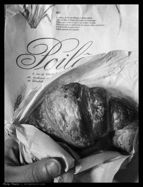
Croissants a Poilane. Canon SD780 IS

The one final piece of advice I suggest is that you talk to your clients beforehand to make sure they’re okay with you using a small camera: very often, it’s about perception rather than reality; your client may not be aware that you can deliver the same image quality or unique images through your choice of equipment – it may negatively affect your reputation. Most importantly, make sure you have enough practice and confidence that you can actually deliver what you claim with your compact – don’t experiment on paid work, unless it’s B-roll. And as ever, always carry a backup. MT

____________

Visit our Teaching Store to up your photographic game – including Photoshop Workflow DVDs and customized Email School of Photography; or go mobile with the Photography Compendium for iPad. You can also get your gear from B&H and Amazon. Prices are the same as normal, however a small portion of your purchase value is referred back to me. Thanks!

Don’t forget to like us on Facebook and join the reader Flickr group!

appstorebadge

Images and content copyright Ming Thein | mingthein.com 2012 onwards. All rights reserved

Finding inspiration, or the lack of it

We’re all familiar with the feeling: sometimes you go to a place or an event and there’s just no end to the photographic opportunities you see. At other times, life is an artistic desert: there’s just nothing inspiring you to shoot at all, and all subjects are too familiar, too uninteresting, or just plain flat and boring.

_M9P1_L1012712 copy
Shadow crossing. Leica M9-P, 35/1.4 ASPH FLE

I thought of the idea for this article on a recent business trip to Bangkok (last month). Ostensibly, I was there for a conference but did have some down time between sessions, some of which was spent socializing with my group, some of which was spent trying to shoot.

_M9P1_L1012732 copy
Untitled. Leica M9-P, 35/1.4 ASPH FLE

Bangkok is familiar ground for me. I worked there (in something non-photographic) for just over a year in 2006, right up until the first round of protests against the government. The photojournalist in me wishes I’d been stationed there during the action, but the rest of me is happy that I didn’t have to do my day job with everything severely disrupted. During that year, I did find things to shoot, but looking back I realize that most of it was social – there was very little documentary photography or travel photojournalism going on.

_M9P1_L1012673 copy
More traffic. Leica M9-P, 35/1.4 ASPH FLE

I put that down to two things: it really isn’t a city made for walking; it’s too big, for one; the climate is too hot to spend much time outdoors, for two; and the public spaces are predominantly malls and shopping complexes, with the exception of the 500 various temples and shrines that dot the city. It’s also a concrete jungle, with overpasses and highways and monorail lines arcing high overhead even downtown. Unlike Tokyo, where there’s plenty of money left over for beautification, there is nothing of the sort in Bangkok – anything new becomes grey and grimy and coated with a layer of urban dust after not much time at all.

_M9P1_L1013094bw copy
Concrete jungle. Leica M9-P, 35/1.4 ASPH FLE

The upshot of all this is that when walking, you feel like you’re in some sort of canyon – everybody who can afford to, drives. And there’s not really a lot of things you can do with people in cars, or trying to shoot from cars – except perhaps traffic.

_M9P1_L1012658 copy
Interesting light, and yet more traffic. Leica M9-P, 35/1.4 ASPH FLE

There is of course the adult entertainment industry, which does advertise on the streets (even if the transactions take place behind closed doors) – but that’s not something advisable to shoot casually, or without a local guide. I was told by a reliable source that there are a lot of underworld figures involved, and they don’t take too kindly to the seedier aspects of their business being documented. It is not something that interests me, in any case.

_M9P1_L1012660 copy
The relentless pace of progress. Leica M9-P, 35/1.4 ASPH FLE

So we return to the initial point of this article: there will be times when you’re stuck in a photographic or inspirational desert; it happens. But what can you do to get out of it?

_MT87548 copy.jpg
The monk. I was in Chinatown for this one; off my normal circuit but good enough to get something different. 2006. Nikon D2H, 80-200/2.8

1. The obvious thing to do would be to change location.

2. If you can’t do that, look specifically for things within your location that do interest you – I landed up doing a lot of abstract geometry and architecture – Bangkok does really have some nice buildings.

3. Change something in the mechanics of how you shoot: in other words, run an experiment. Reality is that something different will increase your chances of wanting to get out and shoot – it could be forcing yourself to work with maximal or minimal depth of field; getting a new piece of equipment, or using one that’s been neglected for a while; or simply trying to replicate a different style or trying a new idea. It’s because it forces you to change the way you perceive the world (or the world through the viewfinder) – which in turn makes you have to consciously focus on looking for shots or adjusting your composition to make it work; you can’t just run on autopilot anymore.

_M80_DSC3030 copy.jpg
Zap. Through the office windows, long exposure. 2006. Nikon D80, 17-55/2.8

And this is where a modicum of self-reflection and assessment is useful: I didn’t change anything, but in hindsight I realized I should have, which is the genesis of this article. I did initially go with only one lens in an unfamiliar and un-intuitive – to me, anyway – focal length of 35mm; but I don’t think it was different enough to force the creativity out. I should have tried shooting with only my iPhone or something. Or perhaps painting the camera pink, just to disarm the public to provoke some interesting reactions from street photography subjects.

_1_DSC0620 copy.jpg
The embarrassment of gluttony. 2006. Nikon D50, Sigma 30/1.4

By the opposite logic, it’s also worth making conscious observation of what does inspire you – what do your favorite subjects or images have in common? It might be one simple thing – I’m drawn to the mechanical intricacy of watches, for instance – or something much more complex; like the juxtaposition between man and environment; dramatic lighting; harmonious geometry – or a mix of all three.

_MT92533 copy.jpg
Seafood seller. 2006. Nikon D2H, Sigma 30/1.4

The underlying moral of the story is action: don’t wait until afterwards to change things, it might be too late. I’ll never know what shots I’ll have missed, but you can bet next time I won’t wait to find out. MT

Bonus points to those who noticed the difference between the first set of images in this series – shot this year with an M9-P – and the second set, from my first long stint in Bangkok, shot with various other equipment? Why is this? Many things have changed: location (different parts of the city), equipment, most of all, experience, and the benefit of a lot more experimentation in the intervening years.

Perspectives, revisited

The two images below demonstrate the difference between choosing your perspective before you shoot and then composing around it, against choosing your angle of view then just picking whichever focal length happens to match where you are standing:

_3027115 copy
2008. (Yurakucho, Tokyo; Nikon D3, 24-70)

Being self-critical, I was trying to ensure that all parts of the frame were filled; shooting with 24mm on full frame was a new experience for me, and the one mistake I continually made was not putting the subjects close enough to the foreground to be identifiable. Whilst a visually appealing image with nice lighting and geometry, there’s no real focus; the man should be in the gap closer to the traffic light to balance out that space. The most important thing to note here is that I wanted to get the whole scene in the frame to give it context – but failed to put a subject in.

_M9P1_L1003753 copy
Late 2011. (Vienna U-Bahn, Leica M9-P, 50/1.4 ASPH)

Note how the diagonals converge onto the center of the image, precisely where it’s focused; there’s symmetry in the arrangement of the people to the left and right of the pillar, which balances the composition. I was shooting with a normal lens this time, and still managed to get some perspective in the frame. The red frame further focuses your eye onto the subject, which (in a large print) would be clear – the sign. The image is a metaphor for choices – left, right, back, forward – everybody is different, so everybody makes the choice that suits them best, which is why there are people on both sides of the platform. I’m pleased with this image now, but I have no doubt that I’ll find something to improve on if I look at it another five years down the road.

Metaphors and stories in an image aren’t so easy to capture, especially when you only have a very short amount of time to get the shot – most of the time it’s instinctive, if you happen to capture anything of deeper meaning at all. If you don’t, try again and practice until it does actually become intuitive. I’ll be the first to admit that I don’t manage this consistently, and it’s something I need to work on. MT

Mirrorless system lens compatibility recommendations

For those of you with legacy system lenses, compact system cameras seem to make sense, yes? You can use all of your old lenses on newer bodies via adaptors and you’ll not only get to use your favorite optics, but you’ll save money to boot. And the really short back flange distances of some of the lenses mean that just about everything from an SLR or RF mount will fit with the right adaptor.

Well, not quite: firstly, all the fields of view will be different unless you’re going between APSC and APSC. Then there’s also the issue of size: why buy a compact mirrorless systems with the intention of reducing weight when you then go stick an enormous lens on the front?

Bottom line: there are many disadvantages to using legacy glass on mirrorless systems; more so than advantages. I knew that going in, and only use my micro four thirds system with dedicated lenses; but I have got a whole drawer full of adaptors, mostly purchased out of sheer curiosity.

If you are hell bent on making unholy pairings, then read on.

Quick aside: ‘Good’ means lenses work well, and deliver excellent or outstanding optical results; better than the system’s native lenses. ‘OK’ means that they work about as well. ‘Bad’ means that you shouldn’t bother; most of the time this is due to non-telecentric wide angles not playing nice at the edges due to very short back flange distances and a lack of offset micro lenses on the sensor to counter sharp angles of incidence between image rays and sensor. This manifests as purple fringing, chromatic aberration, vignetting, and corner softness. It could also mean the lens just doesn’t have enough resolution to deal with a very high density sensor – for instance the 24MP Sony NEX-7. There are exceptions to this rule, and where I’ve found them, I’ve noted them. The Ricoh GXR M-module is an exception because it does have offset micro lenses and was specifically designed for RF glass.

Sony NEX
Good: Legacy Sony/ Minolta telephotos and normals; new Sony midrange and high end zooms; Leica M telephotos
OK: New Sony wides; Leica M normals
Bad: Older wides; Leica M wides; C-mount/ CCTV lenses (won’t even cover the image circle!)

Micro Four Thirds
Good: SLR high end telephotos, SLR normals, RF telephotos. Exception: Zeiss ZF/ZF.2 glass, Leica 35/1.4 ASPH FLE.
OK: SLR midrange telephotos; some of the slower RF normals
Bad: Leica M wides (pay attention to your adaptor: cheaper ones probably won’t be planar, and land up causing obvious astigmatism. They may not even focus to infinity, or minimum distance!). The Leica Noctilux 0.95 does not do well on micro four thirds; it displays a lot of CA and blooming. I suspect that it is only optimized with the focal plane precisely at 28mm from the flange. Most C-mount/ CCTV lenses – these lack the resolving power and flatness of field.

Nikon 1
Good: Any of the new Nikon lenses, say post-2009; almost all of these are telecentric and of sufficiently high resolving power. Any of the SLR high end telephotos, RF telephotos
OK: RF normals, all other cheap telephotos; older Nikon MF glass; RF normals
Bad: Cheap C-mount/ CCTV lenses – these lack resolving power; RF wides

Ricoh GXR
Good: Any Leica M

Sushi, and the philosophy of photography

_PM07501 copy
Seared Wagyu beef with momeji oroshii.

Sushi is a universe in itself – there are so few components that if you get any one of them slightly wrong, the taste will be horrible. But if you get every one of them right, the experience can be magical. Specifically, your fish must be fresh and in season; precisely the right amount of soy sauce should be brushed on to the top, with a little dab of wasabi hiding between the rice and the fish. The fish itself is cut slightly concave so it drapes perfectly over the rice, itself measured to precisely the right quantity to make a mouthful and shaped by hand, not too tightly packed and not too loose, either.

_PM07411 copy
Katsuo (bonito) with ginger.

And then there’s the seasoning that accompanies the rice – a mix of mirin and rice vinegar – which must offer the right degree of tartness and sweetness to provide a counterpoint to the fish and soy sauce, but not so much that it overpowers or tastes sour. And this is before we even talk about more complicated creations that involve multiple types of fish, or searing, or additional condiments and seasoning.

_PM07492 copy
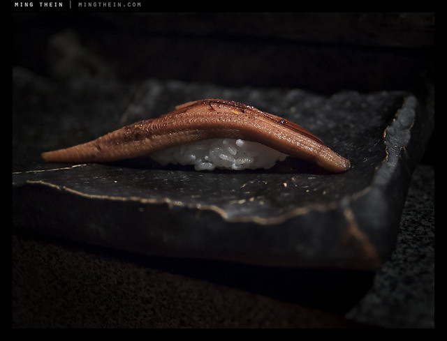
Broiled anago (freshwater conger eel).

There’s a parallel between sushi and photography (and sushi and many other things, actually) – aside from the obvious that it’s art, sushi making requires both technical skill and creativity. There are constraints, but you can work around them. It can be learned, it can be honed by experience, but there’s definitely an element of talent and intuition involved which all great sushi chefs possess. Photographs and sushi both come in small, bite-sized increments – they require little time to create if all the elements come together, and can be enjoyed in moments or contemplated for hours – I’ve eaten sushi dinners with 20+ different varieties served over many hours; I suppose that would be like going through the Magnum annual. Neither photography nor sushi is cheap, either; and mastery can take years.

_PM07485 copy
Torigai clam.

There’s even an anticipative element to it – the feeling of curiosity before you go to eat (wondering what is in season and came from Tsukiji today) is much like the feeling I get before a shoot; you’re all excited and ready to go. It’s also entirely possible that it’s just me.

_PM07471 copy
Seared katsuo

The best sushi I’ve ever eaten – so far – comes from a local chef in Kuala Lumpur at a restaurant called Hanare; Kenny Yew is an absolute genius when it comes to creating new things – for instance, seared wagyu with momeji oroshii chili – as a sushi. I need to go at least once a month or I get withdrawal symptoms and the DTs, because I just can’t eat sushi anywhere else now. The few lucky friends I’ve taken there feel the same way. It really is art – some of the pieces make me tingly and others nearly bring me to tears. I’ve eaten things there I never would have though edible, let alone ordered – and loved them. That’s much like how certain exhibitions, art or equipment inspire me to try photographic experiments that work out a lot better than expected.

_PM07446 copy
Seared hama-tai (sea bream)

And best of all, you can mix the two. The lighting conditions at that restaurant are pretty horrible, but they save me a seat at the counter which happens to have a halogen spot over it; I position my sushi carefully to be well-lit. This set might appear the same, but that’s because I wanted a consistent point of view; (and comparison)
they were also shot during the same meal. I discovered one other thing that night: the best color I’ve yet managed to achieve is delivered by a combination of Zeiss glass and Olympus cameras.

_PM07395 copy
Oo-toro. (Fatty yellowfin tuna belly)

I had the ZF.2 2/28 Distagon on the Pen Mini via an adaptor, and was utterly floored by the color when I opened up the raw files on my computer – the sushi literally looked like it had in real life. Every bit of the color, texture, iridescence and freshness was captured. I’m guessing it’s a combination of the fortuitous lighting, the great color and micro contrast of Zeiss lenses in general, and the pleasing color palette of Olympus cameras. Whatever it is, I think I’ve found my perfect sushi-camera.

_PM07426 copy
Red snapper.

My parting advice is that if you do get a chance to eat sushi made by a master, do as you would do at an exhibition of photographs by a great photographer: put away your preconceptions, go in with an open mind, and enjoy. You’ll probably be surprised. MT

_PM07424 copy
Kamburi (giant yellowtail).