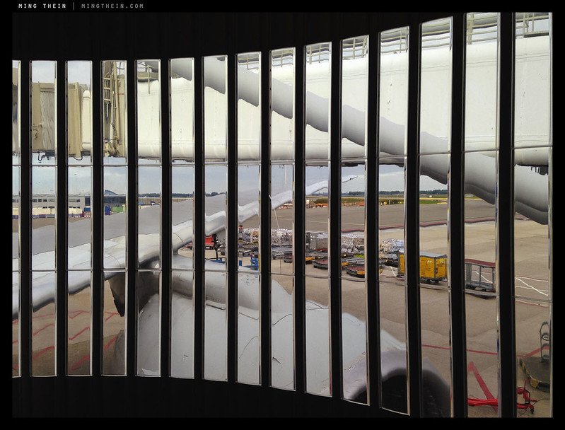
A traveller’s view. We have the required visual cues to say ‘airport’ – the aircraft, boarding gates, apron, terminal, bits of ground hardware. But also the vertical bars that suggest perhaps we are being imprisoned or limited in some way, and the lack of clarity or definition from the plastic windows making it unclear if the view is a reflection or perhaps the illusory product of jetlag…
In previous articles, I’ve explored what makes a technically good image; what makes a visually balanced image; what makes an emotional image, and of course what makes an outstanding image. But at no point have I really addressed what makes an interesting one. I’m going to attempt to tackle that today; but bear in mind this is an extremely subjective topic, and opinions may diverge enormously.
You have been warned.