Photoessay: Catwalk fashion with a Leica M

Here’s an unusual challenge. During my ‘early Leica era’, I decided to challenge myself: I shot a catwalk fashion assignment with a Leica M8 and 35/2 ASPH, rather than my usual D3/300mm combination. How did it turn out? Different – and that was the point. The client magazine was pleased, which is what mattered. And boy, it was possibly the most difficult shoot I’d done up to that point – this being early 2009 – because of the combined challenges of extreme lighting, new and unfamiliar equipment, manual focus, and a much shorter focal length than usual. The plus side is that nobody seemed to mind too much when I was roaming in and amongst the guests; an M8 is surprisingly at home in this environment. One nasty surprise was the IR pollution issue – at this point, my UVIR filters hadn’t yet arrived, and I spent a LOT of time afterwards correcting the color. Even so, you’ll notice a higher than normal proportion of black and white images in this set. MT

Series shot with a Leica M8 and 35/2 Summicron-ASPH.

_M8_L1010697bw copy

_M8_L1011001bw copy

_M8_L1010842bw copy

_M8_L1010857 copy

_M8_L1010745bw copy

_M8_L1010802 copy

_M8_L1010775bw copy

_M8_L1010886bw copy

_M8_L1010558bw copy

_M8_L1010895bw copy

The process of editing

Let me clarify: by editing, I mean the process of selecting which images to keep, which make the final cut, and which aren’t wroth bothering with. I’ll generally do three edits: one almost immediately after shooting, in-camera; one when I get home and dump the cards/ start converting raw files; and the final cut after I’m done making finished files, but before I archive or deliver complete sets to clients.

As an example, let’s take the contact sheet I used in an earlier article on how to use contact sheets. For the purposes of this exercise, assume that this set is one that came fresh out of the camera (in reality, it’s already been through the complete selection process, and no, I don’t shoot jpeg unless I have no other choice.)

First cut (in camera)
I’ll delete images which are:
– Clearly out of focus
– Incorrectly exposed
– Compositional failures/ experiments that didn’t work
– Clearly meaningless/ no obvious subject
I’ll leave duplicates or near-duplicates of good shots; you can’t judge fine detail or critical focus off the back of a camera screen.

For the example, I’ve already taken out the first cut in camera, so let’s move on.

Second cut (before raw conversion)
I’ll delete images which are:
– Not critically sharp
– Didn’t work as well as expected when viewed at a reasonable size (full screen, usually)
– Compositionally weaker than the rest of the set
At this point, I also pick the best image if there are a series of duplicates or near-duplicates. (Duplication is something I do where possible to give me the best possible selection of raw material to work with.)

Final cut (before delivery)
– Eliminate similar images, so that what you’re left with is a series of individually very strong photos, each with a clearly different character
– Chose only the best X images, where X is your delivery target/ agreement


Final cut. Notice how each image in the final set is distinctly different from the other, yet I haven’t ‘lost’ any critical shots, and manage to capture the essence of the movement of the watch.

I’ll leave you with one final thought: the mark of a truly good photographer is not how many good shots he produces, but rather how many good shots the audience remembers: if you only show good shots, nobody is going to think you’re capable of producing a dud. Furthermore, if you aren’t your own harshest critic, your skill level is never going to improve. This is why editing is so crucial to the entire photographic process; I force myself to keep only the best 1-2% of everything I shoot. MT

Photoessay: Hanoi, part two

Here’s an opportunity to compare the difference between a set shot in color, and one shot in black and white – same subjects, same location, same equipment, same time. Which do you prefer? Which do you think works better? There are no right or wrong answers (nor should there be if both sets are executed well enough). MT

This set shot with a Nikon D700, 85/1.4G and 28-300/3.5-5.6 VR.

_7016762bw copy

_7016864bw copy

_7017139bw copy

_7016917bw copy

_7017070bw copy

_7016989bw copy

_7017479bw copy

_7017164bw copy

_7017234bw copy

_7017327bw copy

Looking at images

“I don’t need to be told how to look at an image! I just walk up to it and use my eyes.”

That’s what most of you are probably thinking, right?

Wrong.

There are a few simple things you can do when viewing a photograph – or an image of any sort – to get the most out of it; both from a personal opportunity to learn as a photographer, as well as to ensure you understand exactly what it is the creator of the image intended to convey.

_M9P1_L1005590 copy
Reflections. Prague. Leica M9-P, 28/2.8 ASPH

1. Composition
What is the subject? In any good image, this should be obvious. If you can’t tell what it is immediately, either look again (and think about the image – sometimes it’s the image itself, if an abstract composition, for instance) or consider the possibility that it’s just a weak image. Is the composition balanced? Does it feel right? Is there something about the layout of elements in the frame that bothers you – either in a deliberately provocative (i.e. good because it makes you think or suggests something) way, or a bad (it’s distracting) way? How could it have been improved (e.g. were things cut out of the frame due to poor camera placement?). What’s the lighting like? Does it create a strong sense of mood, or emotion? Most importantly: does the picture draw you into the scene and make you feel like you are there just by looking at it?

_7031244 copy
Retirement. Patan Durbar Fire Station, Kathmandu, Nepal. Nikon D700, 24/1.4

2. Metaphors, allegories and tricks
A good example of this is your stereotypical beggar-against-a-luxury-goods-store contrast. What other compositional and subject-based tools has the photographer used to make you stay that little bit longer to consider the content of the image? Does it make you think? Sometimes the contrasts can be obvious, such as the previous example. Use of reflections or inversions are another example. Inclusion of the photographer in the frame, as a conscious observer. Multiple exposures, allusions to popular culture, folk lore, etc. Chronological progression or development in a single frame. At other times, it can be greater than that and more complicated – a story in a frame.

_7031206 copy
Letting sleeping dogs lie. Kathmandu, Nepal. Nikon D700, 24/1.4

3. Context
Often, images aren’t strong enough to stand alone. This isn’t a bad thing, because it may not be possible to get a single frame that conveys the entire story for whatever reason. This is where the context of the image becomes important – where is it placed (consider advertising, as an example)? What is the accompanying text? Are there other images that accompany it in sequence that frame it? Most importantly, is the image stronger with the accompanying material, or would it be better on its own?

_7036946 copy
Soldiers enforcing martial law. The outskirts of Kathmandu, Nepal. Nikon D700, 24/1.4

4. Technical details
To help the photographer tell the story, there are a whole battery of techniques that can be used – extreme perspectives, HDR, long exposures, shallow DOF, etc. How well were they used? A good litmus test is whether you notice the technique first, or the subject and content of the image first: if the image just screams ‘HDR’ because of overlapping tonal zones, then it’s probably not a good photograph. However, if the composition wows you first, and then only you notice it must have been shot with a small sensor camera because of the perspective and extended depth of field, that’s a good thing. Equipment and techniques are tools, not the subject. It’s often difficult to create an image that doesn’t bear the signature of the tool used to create it – for instance, the perspective created by a fisheye lens or anything shot with the Leica 50/1 screams ‘Noctilux!’ because of the swirly bokeh. It’s a personal choice, because the specific property of the tool can be used to create a stronger image (for instance, the fantastically smooth rendition of out-of-focus areas in front of the subject delivered by the Zeiss ZF 85/1.4 Planar) – you just have to be careful not to overdo it.

The hardest part of this process is to apply it as a filter to your own work; that will be the subject of a future article. MT

_7052227-8a copy
Internal complexity. A. Lange & Sohne Datograph, two images. Nikon D700, 60/2.8 AFS macro

POTD: Photography is a team sport…and a commentary on competitions

_PM01783 copy
Canon Photomarathon, Kuala Lumpur. Olympus Pen Mini E-PM1, ZD 45/1.8

This isn’t a recent event, but a group of photographers running around the streets of KL in a pack yesterday reminded me of this shot. The aim of the event is simple: it is a competition with several categories of prize, but everything must be shot on the day, in the same location, and you’ve got to wear the same damn shirt as everybody else. Editing is permitted, but everybody submits prints for judging, made on one of those dye sub printers.

Several thoughts:
1. There’s a HUGE market for photography equipment in Malaysia. This relatively small segment of the population was at least a thousand-strong, with easily $3,000 or more of gear for each person on average. There was more than one person going around with 1-series bodies and 300/2.8s.

2. It’s commendable that somebody bothers to organize something on this scale at all.

3. How on earth the organizers expect to see good results when you restrict the participants is ludicrous – it just makes you look bad because the level of photography is is low.

4. You’re not going to get any good reportage style images or candids when you’re milling around in a pack of hundreds or thousands of very conspicuous people. And more often than not, if you try something that looks out of the ordinary, a whole bunch of people will follow you immediately afterwards and it ceases to be unusual. And in the end the entire event just turns into an equipment masturbation session, with plenty of mine-is-bigger-than-yours. Or maybe that’s what the organizers want, so they can sell more cameras.

5. Postprocessing is as much part of the modern photography process as darkroom work was for film. So treat it as such, not an aberration or ‘cheat’. If you’re going to do something unnatural like HDR, it’ll be obvious to the judges (we hope).

6. Dye sub printers produce horrible color. Perhaps processing doesn’t matter because you won’t be able to appreciate the subtle tones anyway.

7. My final point is a criticism leveled at the organizers of almost all competitions, not just this one: yes, I can understand why you’d need limited rights to republish the image afterwards, but why on earth do all competitions result in the photographer having to surrender any and all rights to all images entered? Don’t the organizers realize that the really good photographers and pros will never agree to do this? I certainly would not enter my best images if I know I’ll have to surrender the rights to them. And if I’m not going to enter my best images, then why bother entering at all? If you’ve got a whole pool of people who think like this – and I know a lot of pros and talented amateurs do – then you’re just lowering the standard in general.

What I’d like to see – or perhaps even organize – is a competition based solely on merit; with no rights transferral or ownership, so we’d see people putting their best foot forward. Anonymous entry, so we don’t bias based on names or fame. Something to think about for the future, perhaps. MT

Photoessay: Hanoi, part one

Hanoi is one of the more interesting places I’ve been recently – these images were shot during downtime on a business trip about a year ago. It’s a fascinating mix of French colonial and Southeast Asian chaos; juxtapositions abound, and rich textures are plenty – making for great shooting. Part one, in color. I’m told Ho Chi Minh City is a lot more developed an interesting, but I haven’t had a chance to visit yet. MT

This set shot with a Nikon D700, 85/1.4G and 28-300/3.5-5.6 VR.

_7017983 copy

_7018078 copy
Quantum mechanics at work again: the scene changed because the subjects noticed the photographer.

_7018135 copy
Feels like France.

_7017154 copy
A vomit-inducing ride. Notice passenger on the right hand bike.

_7017252 copy

_7017122 copy
If only I knew what cards she was holding.

_7017042 copy

_7016973 copy

Contact sheets, and how to use them

This article is a lead on from my earlier review of the Magnum Contact Sheets book.

Contact sheets are a tool that date from the days of film: basically, the developed negatives are laid out directly on top of photographic printing paper, exposed for the appropriate duration, and fixed. They aren’t ‘proper’ prints per se, but a provide the photographer and editor a quick way of looking at all of the images in a sequence at once.


A printed (or from negatives) contact sheet would probably look something like this.

The photographer would then mark out his first and second cut images, followed by the verification from the editor; the chosen images would then be printed properly from the original negatives, with any tweaks required (such as dodging and burning, increasing exposure, changing print density etc.) With the analog photography process, that marked the end of the line for the photographer unless they also did their own printing – which was rare.

Interestingly, contact sheets were considered something of a luxury item for photographers because of the cost of producing them – especially when there were a lot of rolls of film to go through – most photographers just used a loupe and light table, or if desperate, held the negatives up to a window.

Contact sheets still remain a useful tool, not just because they allow you to see all images at once and judge their relative merits, but also because they force you to look at the distilled essence of an image: if a shot makes a compelling thumbnail, it’s generally also quite powerful at larger sizes. However, the reverse isn’t true: some shots need to be printed large to work well, landscapes, for instance. With images like this, contact sheets aren’t necessarily the best tool (unless you’re shooting medium format, or have larger thumbnails to work with).

Not shooting film? Don’t worry. We can still do the same thing today in the digital world. Photoshop itself has an automated tool (File>Automate>Contact Sheet) to create contact sheets of images; these are useful to print or send to clients. Alternatively, programs such as Bridge and Lightroom effectively let you create digital contact sheets which you can interact with on the fly:


Today’s contact sheet: screenshot of Adobe Bridge, thumbnail view.

What these programs let you do is a) see everything at once; b) see only the ones you wanted; c) use a magnifying loupe to check sharpness on a particular image or several images to compare; d) here’s the important bit: rate images. With Bridge and LR, Command-[number] lets you tag a star rating from 1-5; later on, you can filter by images rated at a certain level or above. And it works for raw files too, so long as the camera is supported by Adobe Camera Raw.

My current process is to keep all images from a shoot (except the obvious duds or unsuccessful experiments, which I bin in camera) and then conduct a first pass edit using the contact sheet view as soon as they’re in the computer – I’ll rate my images 3, 4 and 5*; 3* are kept because they’re useful for stock or remembering a particular event; 4* are good images and deliverable to clients; 5* are portfolio grade, best-of. The rest aren’t worth keeping and get binned. I’ll work on the 5* images first, and go down the quality ladder from there. That way, my best images are immediately ready to go, and if I don’t get a chance to make a final file (analogous to printing) of the 3*s, I can always come back later.

As photographers, we often fall into the trap of either being overcritical (bin all) or sentimental (bin none) – neither approach is good. For personal work, using contact sheets helps you to edit and see what worked and what didn’t (and by combination, what ideas might work in future if combined). On assignment, it lets you see the relative merits of each image and ensure that you’re only turning in the very best. Contact sheets are a powerful tool to help you achieve this – and the cost of printing is no longer really an excuse. MT

Look out for a future article on Editing: how to select images.

Photoessay: Abstracts in metal

In an earlier photoessay, I covered some of what goes on at a shipyard; today’s coda represents the outtakes that didn’t make it into the final deliverable for the client, but I shot as part of my body of personal work. There’s just so much abstract geometry and texture going on with the interplay of parts, metals, surfaces and finishes at the yard it’s impossible to ignore; I’m pretty sure some of these would make rather interesting large prints. MT

This set was shot with a Panasonic TZ3.

P1030452b copy.jpg

P1030412b copy.jpg

P1030555b copy.jpg

P1030563bw copy.jpg

P1030573b copy.jpg

P1030593bw copy.jpg

P1030614b copy.jpg

P1030392b copy.jpg

P1030391b copy.jpg

P1030628b copy.jpg

Book review: Magnum Contact Sheets

Like most photographers, I do like a good fine art book of images – especially if the content is first rate. Books can be a source of inspiration and ideas, as well as a good reality check to see what’s out there in the world of photography. This will be the first in a longer term series of book reviews, in which I’ll highlight anything I find particularly interesting, and how it’s relevant to photography or developing your skills further. The minimum benchmark is of course that I must find the book worthwhile enough to purchase, but I’ll reserve the right to call out work so singularly execrable that I would be doing a disservice to the buying public if I didn’t warn them away from it.

First off: it’s a Magnum anthology, which means there aren’t going to be any bad images in here. Even the ones that are perhaps compositionally less strong are pretty darn impressive, more so when you read the context and understand the back story.

The book is also full of interesting little tidbits: I didn’t know that most of Robert Capa’s negatives from the Normandy invasion were actually spoiled by the developer – they were overcooked in the drying cupboard and melted – the few that were salvageable were the ones where the emulsion had slipped from the celluloid, but not completely come off; this is why all of the series seem to have some motion blur in them. I thought it was either due to the intensity of the moment, or the technical limitations imposed by cameras and films of the day. Interestingly, I think one could argue that the images are just as powerful despite being technically imperfect; the additional dynamic added adds a real sense of urgency, panic and chaos – which is precisely what war is.

However, the real kicker here is that the images presented aren’t just the single ‘selected’ iconic ones, but also the ones before and after – i.e. a contact sheet of that entire roll of film. For me, this was mind blowing: I have long been under the impression that the photography greats just take one, or at most two, shots and then nail the image; they don’t. They work the scene with at least one, sometimes more, rolls of film before they get what they need. It’s an incremental process. You can actually visualize the compositional development process in the mind of the photographer from shot to shot, especially if the subject is relatively static and predictable so they have the opportunity to try different things and execute incremental refinements.

What I’d take away from this – other than the powerful images and great (but not excellent) printing is that although the great photographers no doubt have huge innate talent – you can see that already from the first shot in the series, usually – but they also have the determination and patience to keep shooting until they know they’ve nailed it. That, combined with the selection process afterwards, is what makes all the difference between being perceived as a mediocre to average photographer, or an incredible one. It’s not that famous photographers don’t take crappy shots; we usually don’t get to see them.

There’s no referral program for people who live in Malaysia, so go ahead and buy it from your favorite retailer. Product images from Amazon. MT

Professional photography with compact cameras

_0011047 copy
Regent Square architecture, London. Ricoh GR-Digital III

The title of this article isn’t a contradiction: I did really just suggest shooting for clients, for money, with a compact camera. I’m not talking about compact system cameras or ILCs like Micro Four Thirds; those have recently come of age and are very, very competent indeed – in fact, for most purposes, they produce indistinguishable final results (think print, or web, rather than pixel-peeping at 400% on a perfectly calibrated monitor) from larger cameras if used within their limits.

_0012621 copy
GuB Marine Chronometer. Ricoh GR-Digital III

The reality is that while the big guns have been steadily improving, and have almost all surpassed the image quality level any professional photographer may require, there have been steady improvements in compact cameras (fixed lens, small sensor) too. It’s often not clear which arm of sensor development leads which: the desire for lower noise and improved photosite efficiency has undoubtedly helped improve dynamic range and noise properties of larger sensors. And vice versa, development of CMOS technology for larger sensors is slowly finding its way into point and shoots.

_0011852 copy
Gas Malaysia. Ricoh GR-Digital III

What does this mean? In the real world, my clients almost never have final uses for the images that require more than 12MP when properly shot and composed (i.e. not heavily cropped). We can delude ourselves into thinking more is better – all else equal, it usually is – but most of the time, it makes no difference. Even if you’re doing a billboard, you don’t need medium format – I’ve done a couple with the mere 4MP Nikon D2H – simply because the individual pixels are about the size of golf balls, but nobody notices because you never get any closer than 20 meters.

_0011137 copy
Selfridges, London. Ricoh GR-Digital III

I recently shot some wildlife images for the local Malaysian launch for the Leica V-LUX 3 (a full review is here on the official Leica Blog). The spec is ambitious: a fixed 24-600mm lens,12MP, and full resolution images to ISO 3200. Did I mention the sensor was just 1/2.33” in size? It doesn’t get much smaller in the compact realm; there’s 1/2.5”, 1/3”, and then you’re into cellphone sensors.

_VL31_L1000236 copy
Scarlet Ibis. Leica V-Lux 3

In any case, the images were printed to at least 20×30”, and in some cases, larger. I even used ISO 400 (base of 100) and very dodgy shutter speeds for some of them. Was the color odd? Did they look grainy and horrible? Not one single bit, even with your nose pressed up to the print. I shot raw and did zero noise reduction – zero. Would they pass for fine art, let alone commercial use? Absolutely. In fact, the results were on par with the Nikon D200 and it’s APSC sensor that I used for the same kind of thing about five or so years ago.

_VL31_L1000944 copy
Leica Visoflex III on M9-P. Leica V-Lux 3

I did some other testing with that camera, too: studio product work with flash. Here, the result was even more difficult to distinguish from a larger sensor camera – at base ISO, controlled lighting and optimal apertures, everything looks superb even to the pixel level. In fact, possibly better, because to achieve the same depth of field in the final image, I’d have to stop down so far on a full frame camera that I’d be incurring a softness penalty due to diffraction.

_0010773 copy
Tulip staircase, Queen’s House, Greenwich. Ricoh GR-Digital III

So what about putting my money where my mouth is? I have already. There are photos I submitted to Getty Images – which were shot with an iPhone 4 (5MP) – and accepted. I swear the file quality is fine for A3+ prints, so long as you’re shooting at base ISO and watch exposure carefully – I’ve tried. I recently shot another job (to be the subject of a future On Assignment article) with another compact – the Leica D-LUX 5. Yes, it has a slightly larger sensor, and I was using LED light panels, but the result was successful: the client (and I) would not have been any happier had I used a larger camera.

_0011302bw copy
KL Drift. Ricoh GR-Digital III

We all know Alex Majoli made his name shooting with compacts – famously half a dozen Olympuses C5060s – because of their silence, unobtrusiveness and low replacement cost, especially important in combat or hostile environments. (I’m told he uses an M9-P now, though.)

_1002177bw copy.jpg
Welders; Hommage a Majoli. Ricoh GR-Digital I

I should probably talk a bit about the situations in which a compact would be more useful than a larger DSLR or even ILC:

1. When size or weight is a priority. I haven’t done it (and probably never will) – but I wouldn’t want to climb Everest with a Nikon D4 and suitable lenses. There’s plenty of light, so I’d probably go with one of the more robust compacts.

_1002147bw copy.jpg
Shipyard inspection. Ricoh GR-Digital I

2. When you don’t want to stand out. Sensitive or covert photojournalism/ documentary photography immediately springs to mind. Nobody is going to pay you a second thought or glance if you’re ‘just shooting with your cellphone’ – everybody else is doing it, so you just blend in. Compacts are pretty much socially acceptable and transparent in most situations; if you’re not 100% sure of that, adopt the shooting pose of a complete photographic ignoramus and you’ll soon see what I mean.

_0010486bw copy
Nepalis protesting in London. Ricoh GR-Digital III

3. When there’s a lot of light. This sounds stupid: it’s not, because you’re going to have a to stop down a DSLR in the tropics if you’re shooting in bright sunlight; I’ve hit the 1/8000s limit even at f4 or f5.6 and base ISO before – especially with anything even slightly reflective, like water or glass. Short of using a grad ND so you can open up the aperture a bit more, you’re going to land up having to stop down anyway. And guess what: compositionally, there’s no longer any difference between the images cameras of a different sensor size produce. (Dynamic range is something else entirely).

_0010059 copy
Tea time. Ricoh GR-Digital III

4. When you need extended depth of field. There are compositions that only work with compact cameras precisely because everything is in focus – something which may be optically impossible with an SLR, especially if you need a telephoto perspective. You’re probably wondering why I don’t use one for macrophotography: simple, nobody makes something that delivers the right perspective, and since you can’t change lenses, there’s not a lot I can do to rectify that. Secondary optics and adaptors are an option, but then you’re going to be getting compromised image quality because you’re adding components to an optical system that’s optimized for something else.

_0011006bw copy
Trees. Ricoh GR-Digital III

5. When you want a different look. There are times when the harsher, higher contrast look that’s a property of smaller photosite sensors (specifically: lower dynamic range, because the electron wells are physically smaller and can’t collect as many photons before reaching full charge capacity and overflowing – i.e. blowing out or saturating). If you’re shooting in bright daylight, this could look like exposing for the shadows and completely losing the highlights to white; or exposing for the highlights and leaving the shadows dark (or even black). The latter produces some very arresting black and white work, actually. Or if you’re totally masochistic, perhaps you like the look of massive chroma and luminance noise.

_780_IMG_2630bw copy
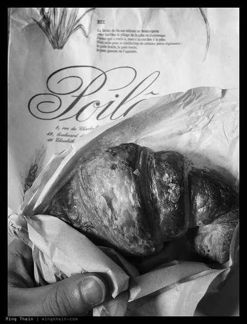
Croissants a Poilane. Canon SD780 IS

The one final piece of advice I suggest is that you talk to your clients beforehand to make sure they’re okay with you using a small camera: very often, it’s about perception rather than reality; your client may not be aware that you can deliver the same image quality or unique images through your choice of equipment – it may negatively affect your reputation. Most importantly, make sure you have enough practice and confidence that you can actually deliver what you claim with your compact – don’t experiment on paid work, unless it’s B-roll. And as ever, always carry a backup. MT

____________

Visit our Teaching Store to up your photographic game – including Photoshop Workflow DVDs and customized Email School of Photography; or go mobile with the Photography Compendium for iPad. You can also get your gear from B&H and Amazon. Prices are the same as normal, however a small portion of your purchase value is referred back to me. Thanks!

Don’t forget to like us on Facebook and join the reader Flickr group!

appstorebadge

Images and content copyright Ming Thein | mingthein.com 2012 onwards. All rights reserved