In the previous article, we distilled down the two components of an interesting image: subject and presentation. We looked at the theoretical implications of both; today we’re going to attempt to address practical application. It will be in a very limited subjective way, as there’s simply no way to do it at an absolute level; I suppose it will be as much a snapshot of my current state of interpretation of the purpose of photography as a medium as much as anything. I certainly would not have had this line of logic two years ago, nor will I probably agree with everything again in another two years. The more we see, the more we experiment, the more our own vision evolves together with the creative philosophy behind it.
What makes an interesting image, part one: subject and presentation

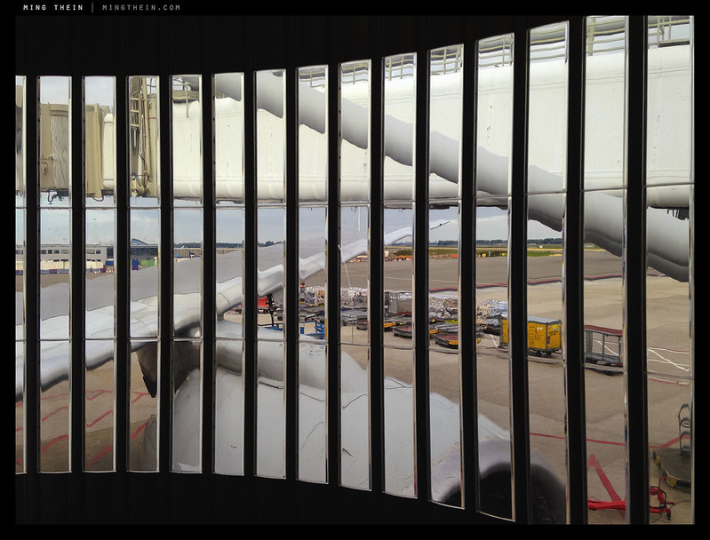
A traveller’s view. We have the required visual cues to say ‘airport’ – the aircraft, boarding gates, apron, terminal, bits of ground hardware. But also the vertical bars that suggest perhaps we are being imprisoned or limited in some way, and the lack of clarity or definition from the plastic windows making it unclear if the view is a reflection or perhaps the illusory product of jetlag…
In previous articles, I’ve explored what makes a technically good image; what makes a visually balanced image; what makes an emotional image, and of course what makes an outstanding image. But at no point have I really addressed what makes an interesting one. I’m going to attempt to tackle that today; but bear in mind this is an extremely subjective topic, and opinions may diverge enormously.
You have been warned.
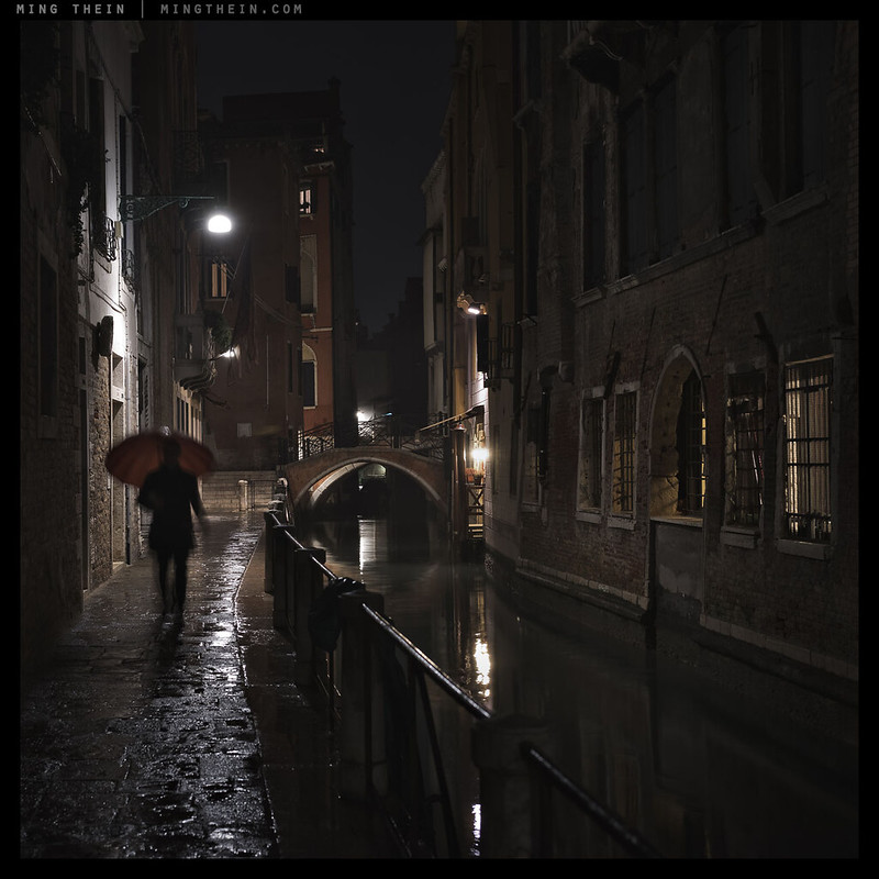
Photoessay: Venetian nights

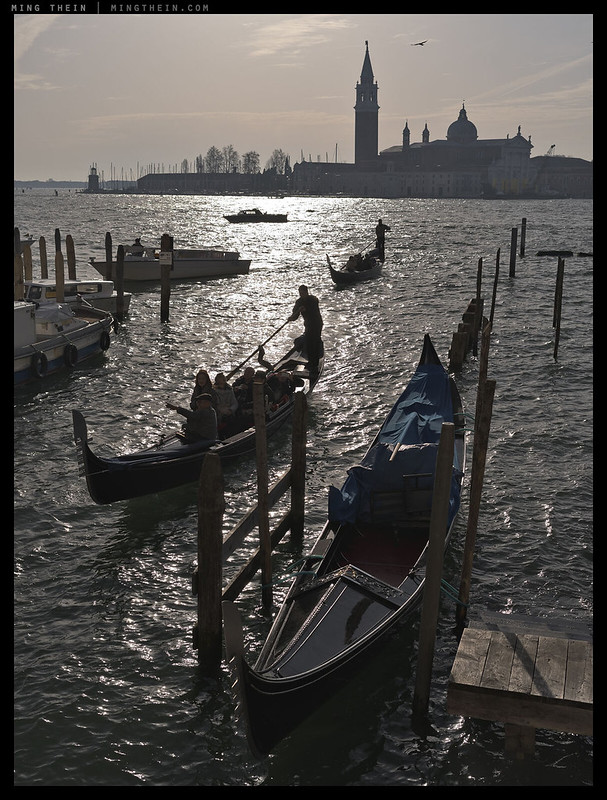
An alternative to the Venetian Cinematics
Evening falls early in Venice in the winter; on a grey day, you can start thinking about blue hour come half past three in the afternoon. Coming from a country where sunset and sunrise vary very little through the course of the year (I’m pretty much on the equator), it’s a little disorienting – but very productive for photography once you get used to the time difference. I always find one of the more interesting things about higher latitudes the fact that changing daylight hours result in the visually unexpected: everything closed and empty streets with sun out, for instance (late in the evening) or normal activity in what appears to be the dead of night. There is a progression here from the active to the inactive and empty; the difference is in the presence or absence of people – not the light. I admit it was difficult to resist a cliche or two, but for the most part, I stuck to the brief…MT
This series was shot with a Pentax 645Z, 55/2.8 SDM and A 150/3.5 lenses.
Long term review: The Nikon D810
It’s very easy to write a polarized review – positive or negative – about a new piece of equipment; it’s much harder to commit to really using and learning it inside out for months until you are intimately familiar with its peccadilloes and able to extract every last drop of performance from it. It’s obviously not practical to do this for everything; it’s clear that some bits of hardware just don’t quite make it as long term tools after a few days of use. But the ones that stick are probably the ones that are really interesting.
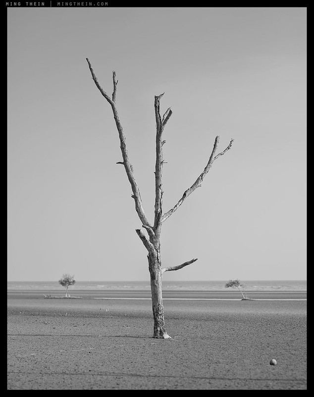
Photoessay: dead tree beach

Skeleton and ghosts. The monochromes in this set were processed to be as natural as possible using my ‘balanced’ workflow in The Monochrome Masterclass.
Today’s photoessay comes from a beach near Banting, on the west coast of Peninsula Malaysia and about an hour and a half’s drive out of Kuala Lumpur. I’ve been to this location in the past; those of you with exceptional memories might remember it from the Panasonic GM1 review and early large format landscapes. Truth is, I’d been meaning to come back to this location for a long time, earlier in the day, to have some more time to work with it before the fast-moving tide ended play*.
*It’s a mangrove beach, which means extremely shallow gradients and even quicker tides – I’ve seen it come in at about a foot every three to four seconds. Not somewhere you want to be stuck in the middle of a long exposure!
Understanding native tonal response
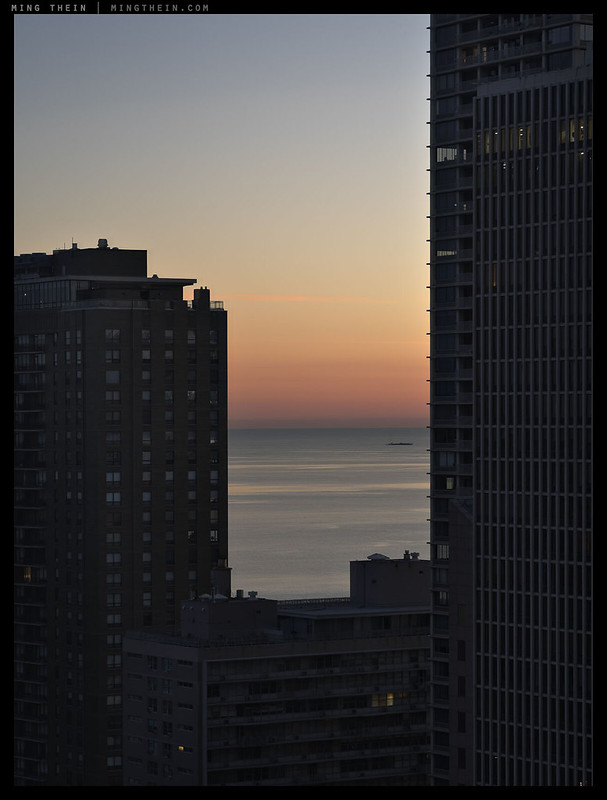
Sunrise over Lake Michigan
Continuing this little series on tonality, mood and monochrome, I’d like to explain a little about the idea of native tonal response: it’s something I’ve frequently referred to in reviews, but never fully explained. Unfortunately, there are a very large number of variables, so bear with me.
Photoessay: Life in Tokyo
Tokyo ranks extremely highly on my top places in the world for street photography – the sheer visual difference notwithstanding, it is also an extremely tolerant society to photography, and photography of random people in public. Everybody is doing it to the point that nobody notices anymore; however, unlike in other parts of the world where camera phones dominate, there are plenty of people using more serious equipment, too. Blending in has never been much of a problem. That difference I mentioned earlier is eroding somewhat, though. Once again, globalisation has meant that a lot of the more unique ‘character’ areas of the city are becoming clones of international streets (or vice versa) or even other parts of Tokyo; the area around almost any major railway station is the same, for instance – an agglomeration of fast food eateries, convenience stores, and one or two major chains plus a business hotel. It’s a formula that probably works for practicality, but not so much to keep the world an interesting place for its inhabitants.
Photoessay: The boats of Venice
Venice is a city of water. Perhaps the city of water. And in such a city, a boat is a necessity, not a luxury – today’s photoessay is a little celebration of the the Riva, a tribute to the workhorse vaporetto, a nod to the cruise liner that dwarfs the city it arrives at, and a grudging acknowledgement of the ubiquitous gondola. They’re so ubiquitous that it’s near impossible to make an image of Venice that doesn’t have one in it somewhere, in some form – whether literal or represented only – and even more difficult to have that image not turn into a cliche. Enjoy! MT
This series was shot with a Pentax 645Z and Ricoh GR.
Repost: Aspect ratios and compositional theory

Round plate in a square frame. The composition is ostensibly balanced, but a little randomization is created by the uneven lighting. Leica D-Lux 5
Today’s article is a repost of a classic from two years ago (has it really been that long?) I bring it up again on the back of an interesting offline discussion I’ve been having with one of my email school students. How many people think about the relationship between idea, subject, composition and the final presentation format before hitting the shutter? The missing link is usually the last one – and almost always results in a necessary compromise in composition. But, there are ways to fill the empty space, as you shall see…