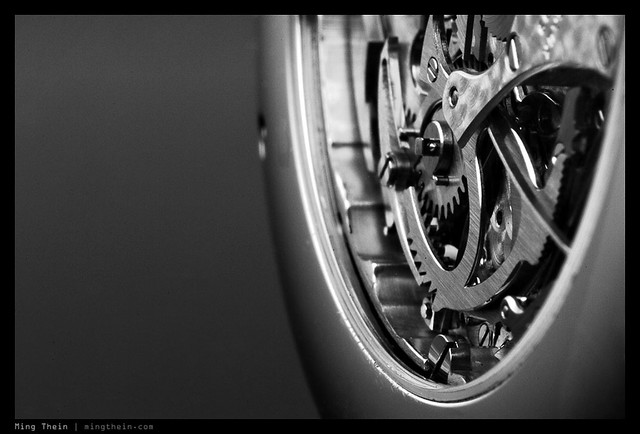
Hiding behind the subject

Photographers normally hide behind the camera (though we shouldn’t, because it distances us from what we’re shooting and makes us observers rather than participant-observers, but that’s another story for another time) right? So what’s with hiding behind the subject?

A friend once said this to me about a watch: I’m expecting exceptional photos because it’s an extraordinary subject. I didn’t quite understand what he meant at first, but I do now. How many images are famous because of the content – maybe the rarity of the subject, the famousness of the person, the momentousness of the situation – rather than because the photograph itself is exceptional? Look carefully. For instance, imagine the photo wasn’t of say Obama, but instead an ordinary man. Would it still be a special photograph? Probably not. The examples go on. Some of these images are truly special for their composition etc – but a lot are also well known solely because the photographer happened to be in the right place at the right time.

I’m not saying that news photographers can’t shoot, but there is a continuum. I often wonder whether I’d be able to produce images as good or better than other people if I was in one of those once-in-a-lifetime situations. The honest answer is, I don’t know.

But I digress; back to the watch.

Supposing you make what is perceived as an ordinary photo of an ordinary subject; that is probably par for the course. If you can make an exceptional photo of an ordinary subject, then the talent lies with you as the photographer rather than the subject for being special. However, if you fail to make a ‘wow’ photo with a very special subject – I dunno, say a Bugatti Veryron for instance – then you’ve both failed to capture the essence of the subject in the photograph, and failed to apply your nascent talent as a photographer.

I bore this in mind as I photographed the watch – a Lange & Sohne Datograph.

The image on the manufacturer’s site looks like this (slightly different to the actual watch shot because this is an updated model):

It’s technically competent, but a very flat, very boring shot that fails to capture any of the magic of the piece. I can’t say I was happy with my first, second or even third try; I too made an ordinary photo out of an exceptional subject (you’ll see why, shortly) or at best, a good photo. Which still didn’t do the subject justice, in my mind.

_7051575 copy
Early attempt. Nikon D700, 60/2.8 G

_7051614 copy
Later attempt, which you’ve probably seen in another article; I use this for illustration purposes. Yes, it’s compositionally and technically much stronger, but also fails in many ways to capture the essence of the subject. Nikon D700, 60/2.8 G

_PM03763 copy
Here’s an interesting attempt to capture the idea of cool precision. I think by throwing out conventional notions of how I’d shoot a watch, I was definitely making progress. I didn’t even use my usual D700 and 60 macro combination with flashes; this was shot with the Olympus Pen Mini, Panasonic 20/1.7 and continuous LED lights.

_7052948 copy
Final attempt. I like this idea because it subtly represents the ‘best of Germany’-teutonic-aesthetic, yet it’s still a little bit imperfect (like anything handmade, especially the subjects) and a bit surreal. The watch was actually resting on the same surface as the lens, but the laws of optics reverse the projection (and in turn required mirror-imaging in photoshop to make the orientation look correct). Nikon D700, 60/2.8 G and a Leica Noctilux 0.95 ASPH.

This philosophy is something I now keep in the back of my mind when I shoot: don’t hide behind your subject. At very least, do it justice. If you can, then make an extraordinary photo. If you can’t, then try, or at least know when it doesn’t come up to scratch. It isn’t easy to do, but I think just one more way to raise your game. MT

POTD: The roof-harp

_M9P1_L1012574 copy
The roof harp. Siam Paragon, Bangkok. Leica M9-P, 35/1.4 ASPH FLE

The Nikon D4 – ergonomics

I was at my regular purveyor of addictive substances camera equipment this afternoon; fresh in: four Nikon D4s. That’s it. Four units for one of the largest dealers in the country, and only because he had two stores. The unit that I got to handle briefly was a customer unit to be collected later this week; because of that, I got to hold it and that’s about it – certainly no deflowering of somebody else’s baby.

Three surprises. Firstly, it was light – it felt a lot lighter than the D3 I used for a year or so; almost as light as my D700. Secondly, the ergonomics are the best of any Nikon I’ve held to date: everything just falls to hand precisely under your fingers, as though the thing was designed for you, personally. The D3 felt a touch large to me, but the grip was comfortable. The D4, is perfect. Perfect

The final surprise was the price: close to RM20,000 – or US$6,500. Apparently, the deferral in collection by that customer was because he wasn’t sure if it was worth it – and for a tantalizing moment, I could have walked home with it (and a much, much lighter wallet). It felt so good in the hand that I was contemplating it seriously, if only for a moment. And how things feel in the hand is very important because if something feels good, you’ll want to use it more, rather than cast it aside in frustration.

However, I did come to my senses: I actually need the built in flash to trigger my speed lights and strobes, and 16MP is not really a meaningful increase in resolution. I don’t need 9fps or a vertical grip. And I certainly don’t need to pay that kind of money for it. But – if you do need the speed, then you’re absolutely going to love using this camera – I figure the image quality and menu system/ firmware can’t be any worse than the D3, and that is still the benchmark in many ways. MT

Reader photo critique: Temples


Leica M9

Today is the second in the series of my reader’s image critiques. This images comes from Hilmar.

Once again, I’ll break down the assessment into three categories – composition, technique and other; the other category deals with things such as lighting, timing, subject opportunity, etc. Photography is subjective, so I won’t give points or scores.

Composition
The body of the composition follows classical rule of thirds division – 2/3 sky, 1/3 subject/ foreground. However, the intrusion into the sky of the tree at left both breaks up the monotony of the solid block of color, but also creates a bit of an imbalance, despite sitting neatly in the notch between the left hand temple and foliage. Lateral balance is good, with the architectural detailing mirrored somewhat in the plants and trees, as well as being roughly symmetric about the middle (again, except for the tree at left). It is a pleasing composition, but not a particularly strong or dynamic one.

However, the biggest question I’m left wondering is: what is the subject? The temple? Which temple? The tree? The sky? The scene in general?

Technique
The last point bridges into technique: clearly this image was shot with a wide angle lens; remember one of the golden rules of photography: select your perspective, THEN only select your focal length. I suspect that this shot was composed in reverse: get in whatever you wanted to get into the frame with the lens you’ve got. Although there is clearly perspective distortion and keystoning present caused by the perspective, there’s no clear foreground-background separation – which means the dynamic potential of the lens could have further been maximized. Yes, it would have resulted in a significant change in composition (as is the norm when moving the camera slightly with all wide angle lenses). However, it’s important to remember that the end goal isn’t to ‘get the scene in’ but to create a representative image which contains the key elements you wish to capture – in effect, the essence of the scene – not necessarily the entire scene.

I want to talk a bit about post processing. In a scene with challenging dynamic range, you’ve got three options: expose for highlights and lose shadows; expose for shadows and lose highlights; finally, HDR and retain all or nearly all tonal information. In my mind, only the former approach works well here; exposing for shadows would have resulted in a very washed-out image, with white sky (and lots of seemingly blank space). HDR looks unnatural, and should be avoided unless there’s no other way of retaining the desired tonal information – and even then, used with great care. In a nutshell: the exposure here is bang on, and the photographer deserves commendation for that. However, I feel a little more shadow detail could have been extracted through judicious use of ACR or the shadow/ highlight tool.

Other
How would I have framed this shot with the same equipment? Assuming the key elements of the scene are sky, temple and tree (i.e. natural context/ setting), I’d have gone closer to the temple at left to place it in the foreground and lower half of the image; shot in portrait orientation and placed the tree silhouetted against the sky in the upper half.

In conclusion
One important takeaway here: choose your perspective then only compose, not the other way around.

MT

POTD: The boatman

_M9P1_L1013067 copy

The Boatman, Chao Phraya River, Bangkok. Leica M9-P, 35/1.4 ASPH FLE

Some of my favorite lenses

I thought some of you might be curious about what I consider to be my staples. There are some lenses that I consider best-in-class, or best for a special purpose, but I don’t own because it’s impractical, expensive or I simply wouldn’t use often enough; there are others that are workhorses for me and happen to be excellent. Some I like simply because they have interesting quirks that make for unusual or unique image rendition.

Rule #1: Don’t compromise on glass. I can’t remember who told me this, or where I read it, but it’s true: the lens makes the image, and it makes the most obvious difference, too. If you know that lens X is the best for what you shoot, but you decide to save a few hundred dollars and buy lens Y which will do the job but isn’t as good, you’ll probably land up regretting it and buying lens X anyway. Best case – you manage to sell lens Y without too much of a loss, and land up paying more than had you just bought X in the first place; worst case, you land up having to pay for both.

With that in mind, let’s start at the wide end and move on from there.

_PM04496 copy
Mmm, lenses. Most of my current equipment, except the Leica 35/1.4 ASPH FLE is missing.

Superwide
This is not really a class of lens I use often, but if I did, my money would go to the Nikon AFS 14-24/2.8 G. It’s an incredibly impressive piece of glass that’s sharp in the corners wide open and almost entirely free of CA. It’s an achievement for a prime, let alone a fast aperture zoom. I did actually own one when I had a Nikon D3.

_3030433 copy
What was actually a very small restaurant. Somewhere near Nara, Japan. Nikon D3, 14-24/2.8

Wide
Wide and fast is an important combination for photojournalism, especially available light work; I like the Nikon AFS 24/1.4 G, Leica 21/1.4 Summilux-M ASPH, Zeiss ZM 2.8/21 Biogon and curiously, the 28/1.9 equivalent on the Ricoh GR-Digital III, but my all time favorite lens in this category is the Zeiss ZF.2 2/28 Distagon. This lens shares the same optical formula as the much vaunted ‘Hollywood’ in Contax mount; except it has a chip to meter on Nikon bodies. Bokeh is exceptional, it focuses very close, has biting sharpness at all apertures, and above all, a very unique rendition that emphasizes the subject because the plane of focus is curved in a spherical section, with the camera at the center. That means edge subjects are rendered oddly, but if you stick to the border zones you’ll be fine. And the micro contrast structure is beautifully detailed, which works well with the lens’ high native color transmission to deliver a very 3D image. Note: I haven’t included the Olympus 12/2 in this list, because whilst it’s technically pretty good, it’s frankly also characterless. Kinda like ordinary vanilla ice cream.

_7009593 copy
Film making. Nikon D700, Zeiss ZF.2 2/28 Distagon

Wide-normal
This range has usually been no-mans’ land for me; I tend to prefer a wider or longer perspective. However, I’m rediscovering the joys of a conventional view with the Leica M9-P; in my mind there is only one lens in this range – the Leica 35/1.4 Summilux-M ASPH FLE (Floating Lens Element – though technically it’s a group of elements). It’s about as close to a technically perfect lens as you can get; sure, we could ask for a closer minimum focus distance, but that isn’t really possible with a rangefinder due to parallax issues on framing. It even works incredibly well for super macro work with a bellows on the M9-P, or extension tubes and an adaptor on the D700. Who’d have thought? A distant second in this category would be the Panasonic 20/1.7 for Micro Four Thirds.

_M9P1_L1009886 copy
Inversion. Leica M9-P, 35/1.4 ASPH FLE

Normal
Again, another desert for me. I’ve owned a lot of lenses in this range – from Nikon alone, the 45/2.8 P, AF 50/1.8 D, AF 50/1.4 D, AFS 50/1.4 G (two of them, embarrassingly), pre-AI 55/1.2 SC, AF 60/2.8 D Micro and AF 60/2.8 G Micro. Except the macro lenses, somehow none of the standard lens offerings for SLRs have inspired me at all. They’re either characterless or surprisingly bad, considering the low demands; the only exception is the brief impression I got of the new Nikon AFS 50/1.8 G, which contains aspherical surfaces and has a bite to it that’s sorely lacking in the faster or older versions. However, I’d give the gong to the Leica 50/1.4 Summilux-M ASPH, which if you get a good copy, is absolutely incredible. It’s sharper wide open than most lenses ever get stopped down; the subject separation is amazing, and your frame is literally dissected into planes. I think it has to do with the transition from in-focus to out-of-focus being very abrupt; it shoots much more like a telephoto than a normal lens. Special mention should be given to the Leica 50/0.95 Noctilux-M ASPH, which is special because it delivers performance very close to the Summilux ASPH, but over one stop faster. It isn’t a practical lens though, due to size, weight, long focus throw, criticality of rangefinder alignment, minimum 1m focus distance, cost…I could go on. And the swirly bokeh (caused by uncorrected residual spherical aberration) of the old Noctilux is gone – I don’t miss it, to be honest. But I’ve been amazed by it every time I’ve used it, which is thankfully frequent due to my relationship with Leica. A commended award go to the Zeiss ZM 2/50 Planar; it doesn’t really have any character of its own, but it is a very competent, transparent lens.

_M9P1_L1007858 copy
Convergence. Shot out of the window of a moving train. Leica M9-P, 50/1.4 Summilux-M ASPH

_M9P1_L1001196 copy
Smoke fountain. Leica M9-P, 50/0.95 ASPH

Short telephoto
Tough call, actually. There are two contenders for this prize: the Nikon AFS 85/1.4 G, and the Zeiss ZF.2 85/1.4 Planar. If I could have both, I would; their rendering styles are quite different. The Nikon performs like modern aspherical glass – sharp, saturated, contrasty, creamy smooth bokeh, fast transition between in-and-out of focus, but a little clinical. The Zeiss is more lyrical and definitely less perfect; it does suffer from CA at high contrast edges, and edge sharpness isn’t as good as the Nikon (which somehow manages to maintain pin sharp corners even at f1.4). It’s bokeh can present as odd cats-eye shapes from light sources that aren’t centered. But oh boy, the tones! Especially for black and white work. It’s unbeatable. And the way it renders micro contrast is slightly more refined and textural than the Nikon. Since I have to choose, I’ll give it to the Nikon, by a hair; I can consistently get useable images with that, but the Zeiss isn’t so easy to nail focus with because it’s manual – even with my modified D700 (F6 micro prism screen, precise mirror alignment and screen shimming, DK-17M).

_7048556 copy
Levitation. Nikon D700, AFS 85/1.4 G

_7008086 copy
If This Looks Like It Was From A Commercial, That’s Because It Was. Nikon D700, Zeiss ZF 85/1.4 Planar

The difference in micro contrast rendition betweens the two lenses is pretty obvious even at this size – the Zeiss is just more refined, somehow. But there’s no question that the Nikon is punchier. Same camera, too – so it’s like to like.

Telephoto
I used to shoot telephoto a lot during my birding days – relying primarily on the Nikon AI 500/4 P (because it was cheap, light and optically excellent) and later on, the Nikon AFS 300/2.8 VR – which I still think is one of the best lenses ever made, if a little short. Tough to give an award here because I haven’t tried many of the available options, but from what I’ve seen, I’d still probably give it to the 300/2.8 VR.

_MT84782 copy.jpg
Scarlet ibis. Nikon D2H, AI 500/4 P

special purpose
This category includes macro, tilt-shift, pinholes, toy lenses, and other weird and wonderful optics. I love the Nikon PC 85/2.8 tilt-shift macro; it offers both incredible sharpness and great control over your depth of field thanks to its built in movements. But sadly it only reaches 1:2, and doesn’t do so well with extension tubes – which makes it significantly less useful for my purposes, so I sold it. If they made a 1:1 version, I’d be all over it in a heartbeat. My current mainstay in this range is the Nikon AFS 60/2.8 G Micro; it’s excellent but again, a little characterless and suffers from longitudinal chromatic aberration (‘bokeh fringing’) which can be quite annoying on specular highlights, i.e. most watch cases. It does require special processing to remove, which can be tricky if you want to maintain the underlying color of the original object. I’d love to try the Coastal Optics 60/4 APO-UVIR Macro; except it’s in the same price range as a Noctilux. The output from that lens looks incredible – between the completely apochromatic behavior and high transmission throughout the spectral range, color accuracy should be superb.

_DSC0405bw copy
Extended depth of field control. Girard-Perregaux Opera Two. Nikon D2Hs, PC 85/2.8 Micro

There is one upcoming lens I’m looking forward to, also; chief of these is the new Olympus 75/1.8 for Micro Four Thirds – it should be a very cinematic lens, if the 45/1.8 is anything to go by. MT

____________

If you enjoyed this post, please consider supporting the site via Paypal ([email protected]) or via Ming Thein’s Email School of Photography – learn exactly what you want to learn, when you want to learn it.

You can also get your gear from Amazon.com clicking through this referral link. It doesn’t cost you any more, but a small portion of your purchase value is referred back to me. Thanks!

Don’t forget to like us on Facebook!

Incoming new gear: Nikon D800

Just spoke to my NPS rep today – my Nikon D800 will be arriving in the next week or two. Look out for my first impressions post, and a detailed long term review in a couple of months once I’ve had a chance to put it through its paces.

In the meantime, does anybody have any specific questions about the camera they’d like me to answer once I get it? Please leave a comment below.

And in case you’re wondering why I’m getting a regular D800 instead of the D800E, the answer is because I’ve long past the point of pixel sufficiency, however I do need a replacement workhorse camera ASAP as my current (very high mileage, I might add) D700 is throwing the occasional black frame at me. MT

POTD: Evening shadows

_M9P1_L1012712 copy
Evening Shadows, Bangkok. Leica M9-P, 35/1.4 ASPH FLE

Photoessay: Mount Yotei

Mt. Yotei overlooks the Niseko area in Hokkaido, northern Japan, and is itself a popular skiing destination. In many ways, it’s the archetypical ‘perfect’ mountain, being symmetrically conical – much like the iconic Mt. Fuji. It also happens to provide a perfect backdrop to a golf course. Shot during the summer off season, when everything is green and not covered in snow. MT

Series shot with the Nikon D700, Zeiss 2/28, 2/35 and 2/100 lenses.

_7013841 copy

_7013875 copy

_7013195 copy

_7013429 copy

_7014255 copy

_7014399bw copy It’s everywhere, even in town!

Reader photo critique: KL Skyline


Canon 5D Mark II, Zeiss ZE 2/28 Distagon

By popular request, I’m now accepting an image or two from readers to critique every month. Today’s image was submitted by Aizuddin Danian, a friend and fellow photographer here in Malaysia. I’m going to go easy on him and say he’s in the keen amateur category; otherwise the assessment criteria would be much harsher 🙂

I’ll break down the assessment into three categories – composition, technique and other; the other category deals with things such as lighting, timing, subject opportunity, etc. Photography is subjective, so I won’t give points or scores.

Composition
The main subject here is obviously the KL tower, dominating center frame. A diminishing row of buildings to the right of the tower, including the Petronas Twin Towers, creates a nice flowing dynamic to the edge of the frame. Unfortunately, it feels like this never quite gets to finish and is artificially truncated on the right hand side. The left side, is empty; there is nothing to balance out the right hand wedge of buildings. It doesn’t help that the last two buildings are dark colored and seem to blend into the background. Then there’s the intrusive pointy building at the bottom left edge of the frame – again, it’s intrusive and distracting. The composition overall is simply not balanced; something that could have easily been fixed by watching the edges of the frame – shifting the camera right and down a little would have helped immensely here.

Technique
I was told a 3-frame HDR technique was used for this shot – it’s fairly obvious, actually; you can’t get overlaps in luminance values without using it. There are also visible haloes around the darker buildings, which is not particularly pleasing and gives the impression of buildings masked out and pasted onto a background. The same can be said for the mountains in the background: they just don’t look like that in real life. I have never been a fan of HDR for scenes of normal contrast – I believe this scene could have been properly exposed for with a single frame and careful processing – and anything more tends to look very, very unnatural. The simple reality of HDR is that the display medium of a photograph is not capable of more than about six or seven stops (a good print) or perhaps eight to nine stops (LCD monitor) – by its very nature, trying to display fifteen stops is simply going to look odd. The other weakness of HDR images is that they tend to look flat, with no particularly strong contrasts leading the eye to the subject; I feel this image looks flat overall, and could be fixed with some judicious curve use combined with strategic dodge and burn. A couple of very obvious dust spots should also be removed.

When shooting architectural subjects – cityscapes included – care should be taken to ensure that building verticals do in fact look vertical; either by aligning the camera properly, or using a perspective control lens. This avoids keystoning (note buildings at edges; they have a pronounced lean). One exception is extreme perspectives, where leaning buildings/ tilting edges are acceptable as they create a strong visual dynamic.

Other
HDR is not the only thing contributing to the overall flatness of the image; it’s also the time it was shot. By the lack of shadows or dynamic lighting (but obvious contrast in the sky), it’s fairly clear the image was shot around noon or thereabouts. It’s a bad time to shoot buildings because there isn’t enough tangential light to provide detail on the facades; when there are many buildings it also doesn’t create enough shadows to isolate one from the other. This shot at sunset or sunrise would be considerably more arresting.

In conclusion
Bluntly: it is a flat, ordinary shot; but there are several very simple fixes that would have turned this into a decent image.
1. Watch your edges.
2. Don’t HDR.
3. Watch the lighting: shooting at noon is like using direct flash only for your subject.

MT