Pro photographers have to be two things: able to deliver (i.e. technically and creatively competent) and fully aware that the whole business hinges critically on being a relationship game: if anything, this is more important than the execution. We are not just service providers, but in a way also providing confidence and reassurance on a product that is both intangible and highly subjective. Uncertainty can be self-reinforcing and the beginning of a negative spiral. Yet the longer I’m in this business, the more shocked I am by what I’m seeing – especially at the ‘developing’ end; both from a country/locality point of view and an immature service provider’s point of view.
Diminishing returns and cutoff points
//embedr.flickr.com/assets/client-code.js
The look of money evaporating in frustration
Written as a counterpoint to the earlier justification for being a lens hoarder, I have a feeling this is going to be one of my most unpopular posts ever. It will be widely circulated by I will be metaphorically burned at the stake for it, because it will not make me popular with camera companies, fanboys, enthusiasts or anybody who has a single bone in their body that appreciates a good piece of hardware – I know I do, and it pains even me to write it. But the common sense logician in me demands a stage, so here we go.
Optical finder or EVF?

Continuing on from the ‘right tool’ discussion, I thought I’d address one of the recurring topics amongst photographers: optical finder, or EVF? Both have their advantages and disadvantages, and oddly they seem to be converging towards the middle of late. That’s to say: optical finders on the whole are getting worse, and electronic finders are getting better. Where does this game end? Is there an ideal solution for you? Let’s take a look…
Discussion points: An ideal format?

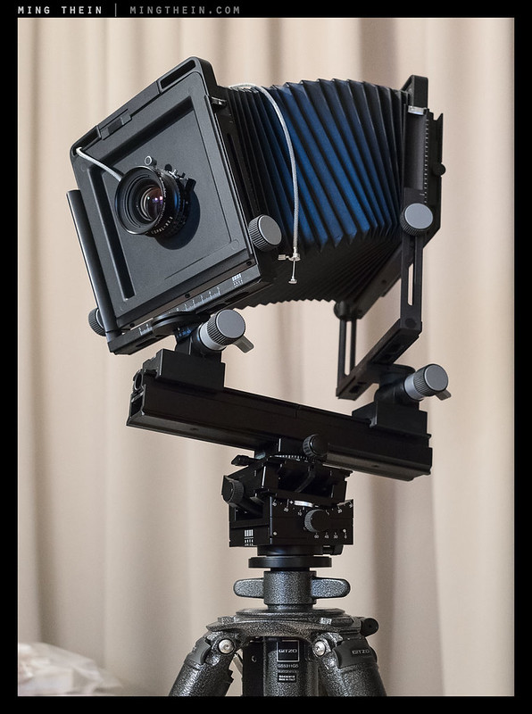
Flexible? yes. Practical? Not exactly…
Today’s post will be the first in the experimental ‘discussions’ theme proposed a little while back.
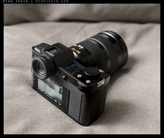
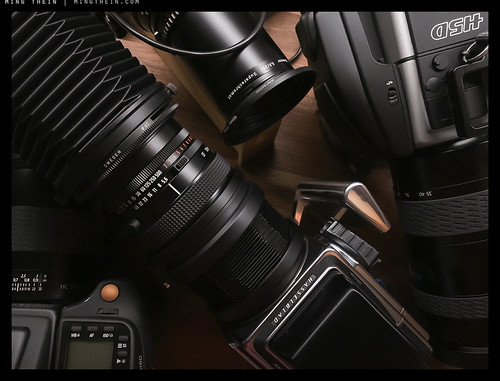
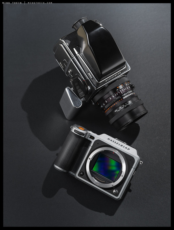
We all know there is no such thing as the ‘perfect’ format or system – there are myriad considerations for selection, based on creative properties and technical ones – for example, depth of field, dynamic range, ‘graphic-ness’, color depth, shooting envelop, ability to deploy under certain conditions that might be weight restricted, system completeness for specialised lenses, camera movements etc. And this is before we even get into any thoughts around cost (for hobbyists) or return on investment (for pros). In most cases, we’re left either stuck with a single system that fills all needs but perhaps not perfectly, or multiple systems and formats and the inconvenience of both overlap and lack of it. For example – I love to create graphic images with a lot of compression and infinite depth of field, but this requires a narrow angle of view and thus longer equivalent focal length. I could do it with my H6D-100c, but the sensor on that is so large that I can clearly see a difference in focal plane at f8 and just 150mm-e, with a subject 100m away. Clearly, this is not workable – so I also have an E-M1.2 and Canon 100D with their respective telephotos for that kind of work. The graphic intent of the output means that limited dynamic range and crushed blacks aren’t so much a problem as desired most of the time.
Repost: The idea of a ‘5’, or that extra element

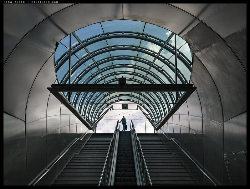
Stairway to heaven. In the larger version it’s clear the solitary figure is elderly; we’ve got the manmade foreground/environment to emerge from, and the metaphorical representation of utopia in blue sky/perfect clouds…
After the last few posts on ideas, projects and distillation, I thought it’d be a good idea to revisit this earlier article around how to take things further: finding that extra something to elevate an image into something really memorable. Of course there are no rules, because if there were, an image be easily repeatable and at odds with the very nature of an outstanding image being exceptional. But perhaps we can learn to recognise and use this…
Most of the regular readers here will be familiar with the concept of ‘the four things’ – this is to say that there are a few elements that are independent of content that every image must have in order for it to leave some sort of impression on its audience. The framework is both a useful checklist and teaching tool to get a photographer to a certain level of proficiency; however, it can be restrictive in the sense that it is still somewhat formulaic. And that’s half the challenge here: if you can fulfil a list of objectives to make an outstanding image, then what is the function of the photographer? Surely these things could be programmed into an algorithm and left to its own devices to make the next hundred great photographs of the century? Wrong. There’s still one last element which will never foreseeably be automated or predicted or planned.
Turning an idea into an image

Alienation and transience in Prague, I
Today’s article has proven to be another one of those significant challenges to write, once again for reasons of limitations of language to describe visual elements. On top of that, there are three conceptual leaps that have to be made: abstract idea, to descriptive language/ elements to characterise and quantify the specific unique traits of that idea so we conceptually understand it, then the final translation to a visual idea that can be understood by a wider audience than just the creator. There are really two questions at hand here: firstly, what is the idea, and secondly, what’s needed to convey it – and what do we need to avoid overdoing that results in dilution or confusion?
Curating to a theme

Images chosen from past exhibitions/ collections/ projects: note how they stand alone, but not together…this doesn’t necessarily make them bad…or I suppose that depends on your point of view.
I’ve recently been asked by a couple of people about curation – specifically, the process I use when putting together a portfolio, photoessay, exhibition or something similar. Turns out that whilst I’ve talked about the importance of curation in the past, and evaluating images individually and against each other in Photoshop Workflow II, I’ve never actually addressed about the process as a whole. It’s actually a pretty interesting topic that isn’t as straightforward as you might think.
Balance beyond photography
I’ve always thought there were more senses beyond the obvious physical ones – perhaps they’re synergistic, perhaps otherwise. I suppose to call it pure aesthetics would be not really accurate, either – but the upshot is of course a result that is either pleasing or not. In the course of many discussions with a wide cross section of people on the topic, it seems that the ‘sense of balance’ is either there, or it isn’t. It doesn’t necessarily mean that those with a heightened sense of balance can consistently create strong images – arguably, in some ways it’s the opposite – but there’s definitely at least recognition of what works and what doesn’t. Two immediate thoughts follow: why? And more importantly, how can we use this to make a better image?
On the curation of a book
Though a book of photographs is something that I’ve been asked for time and again – I’ve honestly felt that it doesn’t really make a lot of sense to do, both because ultimately the audience is quite limited, and because the economics are a bit of a disaster if you care the slightest about quality. Speaking to many possible publishers, printers, and photographers who’ve done it (including those considered to be highly successful in this game, such as Nick Brandt) – it’s clear to me that any sort of photographic-only book is only worth doing if somebody with deep pockets is funding it for you. For example, Brandt doesn’t break even on any of his books – because his required standards for printing are so high; the problem is once you’ve seen what’s possible, it’s very difficult to compromise. Yet…I’ve not only decided to do one, but my editor and I are well into the process of putting it together already. Why? Let me attempt to rationalise – and share some of the frustrations…