The ideal camera

I’m going to disappoint you upfront: it doesn’t exist, at least not yet. But what if we did a hypothetical – yet realistic – exercise to see what a product like this would look like?

First disclaimer: I, and a group of partners, were very close to building this – but we were let down partway through by a key technology partner, and found funding challenging – despite the continuing growth of the photographic industry, especially at the advanced amateur and entry-professional segments. Alas, it never materialized. In any case, the idea has matured a bit since then, both through the benefit of time, and ideas gleaned from intervening new product releases.

Second disclaimer: This is what I would like as a photographer, and may not necessarily apply to everybody.

I’m not going to suggest a 100-megapixel, 25fps, point-and-shoot sized body with a full frame sensor, and built in 10-600/1.4 zoom. That’s stupid, and the preserve of equipment masturbators on camera forums who don’t actually use their equipment.

Right now, I use four systems: full frame Leica M digital, for photojournalism, reportage, portraiture and travel work; full frame Nikon FX for extreme low light, macro and controlled lighting work; Micro Four Thirds for personal work/ carry where photography isn’t the primary objective of the outing, and where anything larger might be obtrusive; and finally, a number of compacts for social documentary use. I’ve never been told by a client that I have insufficient resolution; and I’ve delivered images as small as 5MP before. Why? Because I’m a stickler for practicing shot discipline; that means even though I’m ‘only’ giving you 5MP, they’re 5 extremely clean MP at the pixel level, well exposed, perfectly focused, not posterized, and will print cleanly at A2. More MP – say 18 from the M9 – just means you can make larger prints before fine detail breaks down at close inspection distances. That’s all. I’ve only come up against the low light limits of the Nikon system once – and that was photographing a wedding in near darkness (only candles) in rural Nepal; but I was still able to get good quality images with ISO 12,800 and f1.4 glass. I don’t need ISO 512,000.

Let’s take the best parts of each system, and see what our bastard-camera would look like:

1. Sensor size: This is a tough one, actually. There are times when I want a smaller sensor for more DOF (think very compressed perspectives) – I will often use a compact for this. There are times I want a larger sensor for even shallower DOF for a given field of view – this is the main attraction of systems like the Leica S2. Let’s go with full frame, because we can always have a 2x crop factor (it’s easier to multiply out than 1.5x, and when you want a smaller sensor it’s generally because you need more reach or more DOF and more reach.)

2. Sensor spec: 48MP. Whoa, really? What happened to I don’t need huge MP, you’re wondering? Simple: pixel binning. 48 million photo sites – with RGB + Luminance values coming from individual photo sites, would mean amazing detail, fantastically accurate color, and low noise. Output file resolution of 12MP – but actual pixel detail of 12MP. With this technique and today’s sensor architecture, I don’t think it’d be a problem to get a clean ISO 12,800 file. And that’s enough for me. Add a Bayer algorithm mode to give a 12MP crop, and that takes care of my telephoto/ compressed perspective/ high DOF needs.

3. Speed: Doesn’t have to be fast – 5fps is plenty. I work just fine with the single-shot M9-P; most of the time bursts are for stability rather than action.

4. Video modes: I don’t use it, but I do like to experiment – so perhaps a 1080P/ variable frame rate mode would be nice, with full manual controls, of course. But no rolling shutter!

5. Autofocus: Let’s take the best there is now and match it: CAM3500FX in the Nikon D700 is eerily psychic at tracking moving subjects; however, it could use more frame coverage – expand the points to cover out to say 80% of the frame linearly, and we’re in business.

6. Firmware features: Lots of scope for customization: I don’t mind going through a lengthy setup process to ensure the camera does exactly what I want. I want to be able to hide things in menus and reassign all of my buttons, and have custom modes that set all camera behavior – including base exposure parameters – at once. And of course the ability to remember, save and transfer to another camera body.

7. Lenses: AF, fast aperture – at least f2, preferably f1.4. Useable wide open, of course. Physical aperture rings. I don’t need zooms, or extreme focal lengths; 18-24-28-35-50-85-200 and a short tele macro (maybe the 200 could double as a macro) will do me just fine. It could even be reduced to 24-50-85 in a pinch, so long as one of those was a 1:1 macro with capability to take a bellows or extension tubes.

8. Body: Robust, thick-gauge metal (tactility is important) and weather sealed; plenty of sensible physical controls; an optical viewfinder or excellent EVF – I think the new Sony OLED unit in the NEX-7 or 5N is about the minimum. But I much prefer the enormous, bright finder of say the Leica S2. I think M9-size is about perfect; big enough to have some heft and solidity, sufficient space to house all of those controls, and (yes, I’m shallow – or at least some clients are) impressively professional-looking. That would have to have an EVF to maintain the body thinness and accurate framing. If it’s an optical finder, we could probably make it small-SLR size – I don’t see why a full frame sensor won’t fit inside a D7000-sized body; the flange distance is FX-sized, and there were film SLRs of similar dimensions. Ergonomic comfort is very, very important – especially if you’re going to use it for 12 hours a day (or sometimes even more). Plenty of sticky rubber and thumb/ finger hooks, please. Buttons big enough to use with gloves, and wheels/ switches that don’t move unless you want them to – think locking buttons or very stiff detents.

9. Other considerations: File format: Compressed 16-bit DNG. It’s future proof, past-proof, and easy to handle and archive. Don’t bother with JPEG because I don’t use it. Live view would be nice, but not critical; it can be useful for awkward angles but is greatly enhanced by a swivel screen (which frankly I hate because they’re flimsy and compromise body integrity). A vertical grip is nice, but not necessary. What is necessary is a high magnification, high-eyepoint (I, and a lot of other photographers, are poorly sighted thanks to plenty of shooting into bright point light sources and so need to wear glasses) and with a nice big rubber eyecup. A high-resolution, color-accurate LCD is important for review. Most important is operating speed – menus and such – the camera should never feel laggy. This is the #1 reason why I’ve given up on a piece of equipment in the past.

Okay, so who’s going to make me one of these things? MT

Reader photo critiques

I have to admit, I totally underestimated the popularity of this offer after putting it up. I’ve decided to pick the first six images to critique, in a more brief fashion than the previous two – it does take time, after all.

A thank you to our generous donors is in order – you have sacrificed your images on the altar of photography for the education of the greater good, and that’s a commendable thing. Thank you to everybody who took the time to submit – I’m sorry I don’t have time to do a detailed critique of all of the images, but I will reply all of your emails – that’s the least I can do.

Here goes.

Untitled / Roland Tetenbaum

I’ll start with the good things. It’s a well exposed frame, has a clearly defined subject, and said subject is well isolated from the background. Kudos for getting the focus point right: for all living things, if there’s a face in the image, you should focus on the eyes. (I’ve tried to think of an exception to this rule, but I simply just can’t come up with any.) Similarly, well done for capturing some of the subject’s soul – great expression on the dog’s face.

However, there are thing thats that could use some improvement. The placement of the corners and edges is distracting: that green triangle top right is just odd. It should be a little more to balance out the empty squares bottom-left, or left out altogether. A square crop with the dog slightly off-center to the right might actually work better in this case; you wouldn’t get that feeling of emptiness which those particular bottom-left squares of lino suggest.

I can’t speak too much of the processing, because in many ways that’s to personal taste; I’m not sure I like the level of saturation that much, but it’s tastefully done and there aren’t any blown channels.

One final detail: the sliver of little blue tag on the dog’s collar is a little distracting – pulling it all the way out, or tucking it back in first or cloning it out (it’s not photojournalism, so it’s acceptable) would probably be better.

Untitled / Brad Radcliffe

For some odd reason I can’t put my finger on, this is a very familiar looking image. I can’t claim to have a photographic memory, so perhaps I came across it while browsing Flickr or something.

In any case, the first thing that hits you is the color – quite literally. I’ve never seen blue chocolate before (or at least I assume that’s what it is). The macaroon appears to be its native color, though; it’s an interesting counterpoint as the yellow macaroon stands out well against the cool blue of the background. However, with food photography, the point is usually to make the subject seem appetizing – I’m honestly not sure the photograph achieves that intention because I don’t really want to eat something blue; I suppose it must be human conditioning. If heavy hue shifts are to be used in one channel, you have to watch the other channels – colors are a mixture of channels, and you may land up having odd effects in other areas of the image if things aren’t masked off properly – note the slight green/cyan cast to the top right of the macaroon.

From a technical point of view, subject placement is good, though the in-focus area at the bottom of the frame feels cut off. Focus point for this image would be trick to select – it’s a smallish subject and relatively near, so DOF would be limited; if you pick the front of the macaroon, the edges won’t be well defined and vice versa; tough choice but I think the one used by the photography was the correct one. However, to avoid that awkward cut-off in focus area in the foreground, I’d try positioning the camera at a lower angle so the focus plane on the background chocolate is closer to the macaroon; this would work better with this composition.

Untitled / Choohaw Ding

I’m going to assess this one as a family snapshot – the subject looks pretty candid, and the positioning is somewhat casual – though the perfect straightness of the vertical elements suggests otherwise. Kudos for the latter, by the way. The telephoto perspective separates the frame into several distinct zones, which do not intrude onto each other, for the most part; the only area where this becomes an issue is the background tree that very nearly encroaches onto the head of the subject. The wire in the background to the top left of the subject is also distracting because it breaks the strong verticality of the scene – it’s fine if it’s part of your subject because the eye is naturally drawn to it; it isn’t if it’s just a background element.

Shifting the camera position down and to the right would have placed the girl nicely in the gap between the tree and the pillars, also conveniently blocking out the horizontal wire.

The only other odd intrusions into the frame are bottom right (should have been cloned out or framed slightly higher, or taken care of by the previously suggested framing) and an odd dangly immediately above the tree. Some shadow recovery on the door at right would have also removed the heavy blockiness from the right hand side of the frame, which would also reduce the confined vertical feeling of the subject and allow a bit more breathing room.

To be honest, however, the image as a whole appears flat – it’s the lighting, or lack of any strong dynamic to it. This is also the number one reason the shot doesn’t really work for me as a whole. Unfortunately, if you’re shooting available light, there’s not a lot you can do in a flat lighting situation like this other than move on and find another location to shoot in.

Untitled / Juraj Balaško

Although it doesn’t look it, there aren’t any truncated elements in the scene – the cranes just meet the edge of each side of the frame. And that’s a nice bit of framing precision – well done. The sky adds interest, though I personally think the color may be a little overdone – but it’s quite tasteful and works.

There are three things I’d change with this composition, none of them major. The first is the position of the central crane – I don’t know if it would have been possible to wait for it to move, given the time of day and probably rapidly changing sky, but it would be nice if all three were aligned in a row. The second, is the slightly empty central portion of the frame; if the load on the third crane were in the middle and partially hoisted, that would also be ideal – however, I can imagine this would also be unlikely as it doesn’t appear that there is any reason to raise the load up. The final thing is perspective correction: keystoning with wide angle lenses is common; correcting it is not. There are two ways of doing this: tilt/shift lenses, or go a bit wider to leave room for correction at the edges of the frame, and use Photoshop to distort the whole image.

Overall though, nice job – especially considering the equipment choice (Canon S95) – compact cameras are not really suited for capturing tonal subtlety in skies; the color gamut required is far beyond what the sensor can capture, and certainly beyond the range of the ADC converter when saving.

Klara / George Gravett

Nice strong colors and light; there’s a nice variety of texture in the wood of the ship’s hull, the sea in the foreground and the buildings in the background. Exposure and focus are both good. Overall, this is a competent snapshot. What prevents it from being a great shot – the critical elements of clear subject and dynamic lighting are all present – is the framing. The image feels weighted down at the bottom left; the right side and top portion are both quite empty and simply do not balance what’s going on in the remainder of the frame. Furthermore, there are odd intrusions at top left (leaves), top center (cut off rope ladder horizontals) and right side (buildings on the hill?).

An alternative framing that would have been stronger would be to aim the camera to the left and down slightly; this would show some of the dock and sea in front of the boat to better frame it. I can see hints of a reflection at the bottom center edge, too; a lower angle would definitely have captured this and further improved the overall visual texture of the image.

If you wanted to push it a bit further, I’d go in closer and with a wider focal length to emphasize the ship a bit more; I’m guessing this would have been possible because the EXIF data reports an odd focal length and aperture (38mm f4.4) which can only be the result of using a zoom lens – and since zooms seldom start at 35mm, there’s probably a bit more width to be had.

Rapeseed Runner / Christoph Papenfuss

I really like this image – the strong color and repeating geometry make it visually arresting. However, I suspect it’s one of those shots that is really best appreciated as a large print – you can’t really make out the runner at web sizes. Exposure and processing are both good, so let’s get that out of the way.

The framing is strong, with minimal intrusions at the edge to distract the viewer. However, the plow line on the left side of the frame that intersects the left edge feels truncated; I’d either crop that bit off, or move the camera to the right to frame the runner and only two plow lines. I suspect the hill probably sloped to the left a little, but without the context of the greater landscape, the image feels like the camera wasn’t held straight. Although the orientation may be technically correct, sometimes we need to use a little artistic license; I’d rotate the whole thing to the left slightly to create the perception of a flat horizon. You’ll notice I don’t have a lot to say about this image – it’s really quite good.

Overall tip: Watch your perspectives. If you’re going to shoot something shorter or lower than you, come down. If it’s higher, move up if you can. Not moving results in a human but very standard perspective to your images – if you saw one in a pile of other shots, you probably wouldn’t stop to give it a second glance because the perspective is very familiar. Even if you have a strong subject, a change in perspective can only help. This is especially important when using wide angle lenses. MT

Shameless plug for Ming Thein’s Email School of Photography:
I would love to help you all improve your work by critiquing, but the reality is that if I opened up my email box for everybody, I wouldn’t have time to do anything else – and that includes commercial work that now pays the majority of my bills. However, I was asked by a couple of readers if I’d consider doing this on a more formal basis: the answer is sure.

Here’s the proposal: I will do a highly detailed, offline (i.e. individual over email) analysis of your image for a small PayPal donation of US$50, with of course personal follow up to any ongoing questions. I’ll also open up a bulk rate of US$350 for ten images, which you don’t have to submit at once – it doesn’t expire. I’m open to how people would like to learn; if you want me to do a detailed portfolio review, that’s fine; if you’d like me to set you a ten-image assignment which you do image by image and revert back for feedback/ tips etc., that’s fine too. Please drop me an email at mingthein(at)gmail.com if you’re interested. Thanks! MT

Sushi, and the philosophy of photography

_PM07501 copy
Seared Wagyu beef with momeji oroshii.

Sushi is a universe in itself – there are so few components that if you get any one of them slightly wrong, the taste will be horrible. But if you get every one of them right, the experience can be magical. Specifically, your fish must be fresh and in season; precisely the right amount of soy sauce should be brushed on to the top, with a little dab of wasabi hiding between the rice and the fish. The fish itself is cut slightly concave so it drapes perfectly over the rice, itself measured to precisely the right quantity to make a mouthful and shaped by hand, not too tightly packed and not too loose, either.

_PM07411 copy
Katsuo (bonito) with ginger.

And then there’s the seasoning that accompanies the rice – a mix of mirin and rice vinegar – which must offer the right degree of tartness and sweetness to provide a counterpoint to the fish and soy sauce, but not so much that it overpowers or tastes sour. And this is before we even talk about more complicated creations that involve multiple types of fish, or searing, or additional condiments and seasoning.

_PM07492 copy
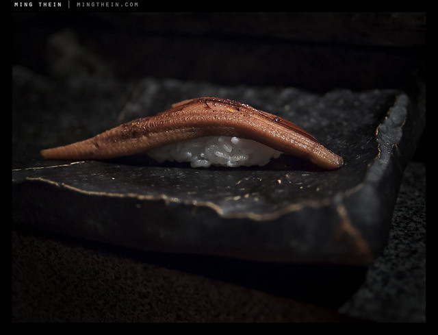
Broiled anago (freshwater conger eel).

There’s a parallel between sushi and photography (and sushi and many other things, actually) – aside from the obvious that it’s art, sushi making requires both technical skill and creativity. There are constraints, but you can work around them. It can be learned, it can be honed by experience, but there’s definitely an element of talent and intuition involved which all great sushi chefs possess. Photographs and sushi both come in small, bite-sized increments – they require little time to create if all the elements come together, and can be enjoyed in moments or contemplated for hours – I’ve eaten sushi dinners with 20+ different varieties served over many hours; I suppose that would be like going through the Magnum annual. Neither photography nor sushi is cheap, either; and mastery can take years.

_PM07485 copy
Torigai clam.

There’s even an anticipative element to it – the feeling of curiosity before you go to eat (wondering what is in season and came from Tsukiji today) is much like the feeling I get before a shoot; you’re all excited and ready to go. It’s also entirely possible that it’s just me.

_PM07471 copy
Seared katsuo

The best sushi I’ve ever eaten – so far – comes from a local chef in Kuala Lumpur at a restaurant called Hanare; Kenny Yew is an absolute genius when it comes to creating new things – for instance, seared wagyu with momeji oroshii chili – as a sushi. I need to go at least once a month or I get withdrawal symptoms and the DTs, because I just can’t eat sushi anywhere else now. The few lucky friends I’ve taken there feel the same way. It really is art – some of the pieces make me tingly and others nearly bring me to tears. I’ve eaten things there I never would have though edible, let alone ordered – and loved them. That’s much like how certain exhibitions, art or equipment inspire me to try photographic experiments that work out a lot better than expected.

_PM07446 copy
Seared hama-tai (sea bream)

And best of all, you can mix the two. The lighting conditions at that restaurant are pretty horrible, but they save me a seat at the counter which happens to have a halogen spot over it; I position my sushi carefully to be well-lit. This set might appear the same, but that’s because I wanted a consistent point of view; (and comparison)
they were also shot during the same meal. I discovered one other thing that night: the best color I’ve yet managed to achieve is delivered by a combination of Zeiss glass and Olympus cameras.

_PM07395 copy
Oo-toro. (Fatty yellowfin tuna belly)

I had the ZF.2 2/28 Distagon on the Pen Mini via an adaptor, and was utterly floored by the color when I opened up the raw files on my computer – the sushi literally looked like it had in real life. Every bit of the color, texture, iridescence and freshness was captured. I’m guessing it’s a combination of the fortuitous lighting, the great color and micro contrast of Zeiss lenses in general, and the pleasing color palette of Olympus cameras. Whatever it is, I think I’ve found my perfect sushi-camera.

_PM07426 copy
Red snapper.

My parting advice is that if you do get a chance to eat sushi made by a master, do as you would do at an exhibition of photographs by a great photographer: put away your preconceptions, go in with an open mind, and enjoy. You’ll probably be surprised. MT

_PM07424 copy
Kamburi (giant yellowtail).

The confusion between T-stops and f-stops

f-stop – we all know what that is, right? The size of the hole in the lens that lets light through. The faster the better, and the faster the more expensive. The faster it is, the easier it is to shoot in low light. An f0.95 Leica Noctilux is easily ten times more expensive than an f2.5 Leica Summarit, yet it’s only three stops faster.

That’s all. Right?

Not quite.

_5100_DSC1518 copy
Zeiss ZF.2 2/28 Distagon. Notice how the front few elements almost disappear – that’s because they’re not reflecting anything. This despite a huge diffuse light source – it’s the mark of excellent coatings, and promises a T-stop close to the f-stop.

f-stop is the relationship between the physical aperture of the lens – the effective optical diameter, usually limited by the diaphragm – and the focal length. Specifically, focal length over physical aperture equals f-stop. So a 50mm f2.0 will have an effective physical aperture of 25mm. This affects one property, and one property only of the lens: the minimum depth of field. All f1.4 lenses of a given focal length will have the same depth of field. However, they may appear to have different depths of field because the speed of transition between in focus and out of focus differs depending on the optical formula of the lens. As does the quality of the bokeh. (See my other article ‘A word (or ten) on bokeh’ for more information).

_7052666 copy
The legendary Leica Noctilux.

T-stop (curiously, always written with a capital T) is a number measuring the effective transmission aperture of the lens – in other words, the physical aperture might be f2.0, but how well does the light actually transfer light to the image plane? Why would it even differ from the f-stop in the first place? Lenses are actually black holes: they absorb or reflect or refract light in directions other than the imaging plane. It could be due to poor coatings, or internal polished elements, or simply having many elements – at every air/glass or glass/glass interface, 100% transmission is impossible. There will always be some reflections which decrease the effective transmission factor of a lens.

_5100_DSC1488 copy
The famous Zeiss T* coating.

Modern coatings go a very long way towards ensuring that all light entering the lens makes it to the image plane, with flare reduction and increased contrast as a bonus. However, as lens design gets more complex – take those 18-270mm super zooms for instance – the number of elements required to correct aberrations across all focal lengths covered increases, and so does the complexity of the lens design. Remember, more surfaces means less light transmission.

_D90_DSC7216 copy
Leica 21/1.4 Summilux-M ASPH. Again, note how the front few elements disappear thanks to the coating. Interestingly, this is a very complex design for a Leica lens – 10 elements in 8 groups.

Practically, this means that prime lenses will generally give you a higher shutter speed for a set aperture; it might be a small difference, or a noticeable one. Your f5.6 super zooms probably have a T-stop closer to f8 or f10. Conversely, a good prime lens with few elements and excellent coatings will give a T-stop very close to the actual f-stop.

Example 1: the older Nikon 85/1.4 D has a T stop closer to T-2; the Zeiss ZF 85/1.4 Planar yields almost double the shutter speed for the same exposure, with all other variables constant. The T-stop is around T1.47.

_1KD_MG_0064 copy
Old Nikon 85/1.4 D – note visible reflections off every single element. That’s light that isn’t going to reach the sensor anymore.

Example 2: ignoring the minor difference in focal length, consider the Nikon 105/2.8 VR macro and the Leica 90/4 Elmarit-M macro. The Leica has only four elements. The Nikon, 14 elements in 12 groups. What do you think their T stops are? Unsurprisingly, not very different.

Not all lenses are made equal. And don’t think because there are fewer elements, the lens design isn’t as good. It’s very difficult to design a well-corrected lens with few elements – designs such as the Cooke Triplet and Double Gauss are pretty much as simple as they get. MT

____________

Visit our Teaching Store to up your photographic game – including Photoshop Workflow DVDs and customized Email School of Photography; or go mobile with the Photography Compendium for iPad. You can also get your gear from B&H and Amazon. Prices are the same as normal, however a small portion of your purchase value is referred back to me. Thanks!

Don’t forget to like us on Facebook and join the reader Flickr group!

appstorebadge

Images and content copyright Ming Thein | mingthein.com 2012 onwards. All rights reserved

Observing vs. participating: behind the camera

Today’s post is a follow-on spurred by the discussion following yesterday’s article on hiding behind the subject. Apologies to anybody if I lose you in the second paragraph, but I promise it will be worth it.

A camera can be many things.

A tool, to produce an image.

A bridge, to start a conversation.

An observer, to record an event, or bear witness to something.

A shield, to distance and separate the photographer from the scene he or she is attempting to capture.

There’s a big difference between being part of the action, and just being a witness to the action. Which do you think makes for stronger images? Unquestionably, the former. However, it’s not that simple: photojournalism is like quantum mechanics.

Let’s take a little detour. Quantum mechanics 101: under the quantum mechanical realm – i.e. the very small – an observable event has no distinct state, but rather a continuum of probability. This means that there’s the potential for any possible outcome to our observable event; however, until we observe it, we don’t know what the outcome will be. However, the very act of observing the event changes the outcome – because once the outcome has been observed, it can no longer be any of the other possible outcomes. This changes the probability continuum for the event, thus changing the event itself.

The best example of this is Erwin Schrodinger’s (the famous physicist) cat experiment. A box contains a live cat, whose lid triggers a mechanism that <em>might</em> kill the cat. So until you open the lid of the box, you don’t know if the cat is dead or alive; by observing the cat, you interfere with its state of being: namely, you might kill it by checking if it’s really alive or not.

_PM05775 copy
A demonstration of the link between quantum mechanics and photography. Behaviour of the person in the middle didn’t change until he saw me bring the camera up.
New year’s eve 2011-12, Kuala Lumpur. Olympus Pen Mini E-PM1, 12/2

Back to photography. As a photojournalist, if you are an observer, you do not generally interfere with the course of events – other than any secondary impact arising from people viewing your images, and possibly taking action or interfering with the course of history. However, if you are a participant rather than an observer – then by taking photographs, you are directly interfering with the event. From a photographic point of view, it means that the images you get may be more powerful, but not necessarily as genuine because the subjects are aware of the camera and will almost certainly change their behavior accordingly, which again changes the image and changes the course of events because the subjects change the way they act around the camera. As a stealth operative, you will capture the natural reactions of your subjects – but at the expense of involvement for the viewing audience.

_PM04759 copy
Active participation at a family event. Olympus Pen Mini E-PM1, 12/2

They’re very different types of images, and both have their advantages and disadvantages – to say nothing of the ethical dilemmas posed for a photojournalist when covering certain events, for instance wars and natural disasters. I can’t say whether one is better than the other, but I do know that it’s much more difficult to get powerful images if you are not a participant – simply because the focus of the subject is not the camera.

_7048120 copy
Passive observer. Epicure 2011. Nikon D700, 85/1.4G

I’ve always felt the best compromise is to be an observer, but an active one: anticipate and seek out your targets; study behavior and be ready for what comes next, so when that one fleeting moment of critical action – what HC-B memorably termed ‘the decisive moment’ – you are ready, and manage to capture it.

_N8_L1000374bw copy
The kiss, hommage a HC-B. London. Leica M8, Zeiss ZM2.8/21.

Required a lot of anticipation because a) the M8 is manual focus; b) you have to shoot wide open in the low light conditions of the Underground; c) here’s the kicker: they were on an escalator moving in the opposite direction to me, so there was really only one chance to get the shot.

There are times when you should not be a passive observer. In intimate social situations, for example – hiding behind your camera would just come across as awkward, antisocial and downright rude. Portraiture is another example. People naturally connect and express emotion more easily when there’s another human on the receiving end, rather than an enormous and intimidating piece of glass attached to a big black camera.

Perhaps this is why smaller cameras such as the compact system cameras and rangefinders are seeing a modern resurgence (aside from the obvious size and weight benefits) – they remove a layer between you and your subject in a couple of ways. Firstly, if you’re interacting with your subject, they can see your face; body language is the vast majority of communication, and your subject will take visual cues from you. If you’re not interacting with your subject, smaller cameras attract a lot less attention, and let you shoot without the subject being conscious of your presence. I have no problem shooting in very close quarters with a good point and shoot or mirrorless camera – the Ricoh GR-Digital III and Olympus Pen Mini are my favorites because of size and responsiveness – and to a lesser extent, the Leica M9-P. The full-sized Nikons are a no-no (especially anything with a battery grip or large aperture lens) unless you’re in a public situation where the expectation is a lot of people will have cameras and be taking photos.

_M8_L1022749bw copy
Never a problem finding a protest if you’re shooting a Leica. Just look like you’re a world-weary photojournalist and you’d be surprised how many ‘official’ lines you can get past. Leica M8, Voigtlander 50/1.1 Nokton

Speaking of expectations, this should be a good guide to what equipment and technique is best suited to get the best images: if you’re expected to look and play the part of a photographer – a fashion shoot, for instance – using a small camera so the model can see your face probably isn’t going to get you the results you desire. If you’re trying to be stealthy and cover an insurgent protest, then a point and shoot probably is a good idea to help you keep a low profile. Street photography is something else that’s best done with compacts, too. Bottom line: take your cue from your subjects.

One final word: if you are not comfortable, then it will show in your body language. Remember, most communication is nonverbal: this means you’re also going to make your subjects aware of your discomfort (and probably also make them feel uncomfortable with the situation). Most important tip: be confident, regardless of whatever your equipment choice, and however you chose to shoot. Photographers create images: appearing the part is a very important piece of the puzzle. MT

Hiding behind the subject

Photographers normally hide behind the camera (though we shouldn’t, because it distances us from what we’re shooting and makes us observers rather than participant-observers, but that’s another story for another time) right? So what’s with hiding behind the subject?

A friend once said this to me about a watch: I’m expecting exceptional photos because it’s an extraordinary subject. I didn’t quite understand what he meant at first, but I do now. How many images are famous because of the content – maybe the rarity of the subject, the famousness of the person, the momentousness of the situation – rather than because the photograph itself is exceptional? Look carefully. For instance, imagine the photo wasn’t of say Obama, but instead an ordinary man. Would it still be a special photograph? Probably not. The examples go on. Some of these images are truly special for their composition etc – but a lot are also well known solely because the photographer happened to be in the right place at the right time.

I’m not saying that news photographers can’t shoot, but there is a continuum. I often wonder whether I’d be able to produce images as good or better than other people if I was in one of those once-in-a-lifetime situations. The honest answer is, I don’t know.

But I digress; back to the watch.

Supposing you make what is perceived as an ordinary photo of an ordinary subject; that is probably par for the course. If you can make an exceptional photo of an ordinary subject, then the talent lies with you as the photographer rather than the subject for being special. However, if you fail to make a ‘wow’ photo with a very special subject – I dunno, say a Bugatti Veryron for instance – then you’ve both failed to capture the essence of the subject in the photograph, and failed to apply your nascent talent as a photographer.

I bore this in mind as I photographed the watch – a Lange & Sohne Datograph.

The image on the manufacturer’s site looks like this (slightly different to the actual watch shot because this is an updated model):

It’s technically competent, but a very flat, very boring shot that fails to capture any of the magic of the piece. I can’t say I was happy with my first, second or even third try; I too made an ordinary photo out of an exceptional subject (you’ll see why, shortly) or at best, a good photo. Which still didn’t do the subject justice, in my mind.

_7051575 copy
Early attempt. Nikon D700, 60/2.8 G

_7051614 copy
Later attempt, which you’ve probably seen in another article; I use this for illustration purposes. Yes, it’s compositionally and technically much stronger, but also fails in many ways to capture the essence of the subject. Nikon D700, 60/2.8 G

_PM03763 copy
Here’s an interesting attempt to capture the idea of cool precision. I think by throwing out conventional notions of how I’d shoot a watch, I was definitely making progress. I didn’t even use my usual D700 and 60 macro combination with flashes; this was shot with the Olympus Pen Mini, Panasonic 20/1.7 and continuous LED lights.

_7052948 copy
Final attempt. I like this idea because it subtly represents the ‘best of Germany’-teutonic-aesthetic, yet it’s still a little bit imperfect (like anything handmade, especially the subjects) and a bit surreal. The watch was actually resting on the same surface as the lens, but the laws of optics reverse the projection (and in turn required mirror-imaging in photoshop to make the orientation look correct). Nikon D700, 60/2.8 G and a Leica Noctilux 0.95 ASPH.

This philosophy is something I now keep in the back of my mind when I shoot: don’t hide behind your subject. At very least, do it justice. If you can, then make an extraordinary photo. If you can’t, then try, or at least know when it doesn’t come up to scratch. It isn’t easy to do, but I think just one more way to raise your game. MT

Photography equipment is a circle…

…and not because the lenses and control dials are round.

[Tongue in cheek] The phases of equipment euphoria go something like this:

Absolute newbie: Buys the sexiest, smallest point and shoot they can find. Then gets frustrated that it’s slow or the pictures look horrible in low light.

Modern alternative: Cameraphone.

_D90_DSC4534bw copy
Canon IXUS SD780IS. It was the sexiest, smallest, point and shoot I could find at the time. But I had my reasons for buying it, as you’ll see later.

Beginning hobbyist: Upgrades to a prosumer thing, the more buttons and dials the better; a longer zoom is just a bonus, as is if it looks like a DSLR – take that Nikon thingy with the 24-1000mm lens, for instance. 1000mm!

_0012295bw copy
Leica D-Lux 5.

Amateur: A DSLR is a must. But why bother with the SLR bit if you’re going to hold it at arms’ length and use live view?

_D90_DSC0506bw copy
Nikon D40, swallowed by 400/2.8VR hood.

Serious amateur: A bigger, more serious DSLR. Maybe the same one as before, but with a battery grip and telephoto lens. Carries it around everywhere they go, complete with backpack containing 1001 other ‘essentials’ such as cleaning supplies, chargers, spare tripod heads, etc. Given a few years, will develop into an aspiring pro.

Semi-pro: An anomaly: may just use whatever midrange DSLR is given by their company, or use serious amateur gear.

P1070221 copy.jpg
Why choose between systems when you can have both?

Aspiring pro: Always has the latest and greatest; a pair of pro bodies, full set of f2.8 zooms and f1.4 primes, carbon fiber tripods, and…no work to pay for it all.

Pro: Only carries what they need; usually a matched pair of bodies for redundancy, with one lens each, and maybe a flash. No superfluous gear, because they know how much of a pain it is to carry. After several years, will develop a pronounced lean towards the shoulder that carries the spare body and a stoop from carrying 5kg around their necks.

_7048856bw copy
Going light. Olympus Pen Mini.

Old hand: May or may not have been a pro, but now forced to sell some or all of their gear to cover chiropractor bills and divorce settlement after wife got ignored on too many holidays in favor of sunsets and sunrises and magic hour reflections; still can’t quite let go of the photography bug, so they look for the lightest thing they can find that just manages to do the job, but at the same time not require eating ramen or baked beans for a year.

And guess what: we’re right back where we started.

Now, you’re probably wondering why I’ve got photos of all of this gear: at some point or other, I went through it. Read carefully, and seriously, learn from my costly mistakes before you have both a bad back and an empty wallet. You have been warned. MT

Pet peeve: Proper perspective practice

Enough Ps for now.

One common mistake I used to make a long time ago, and continually rears its head is the proper use of wide-angle and telephoto lenses. A common conversation goes like this:

Friend: Can you recommend a good wide-angle lens?
Me: Why, what do you want to use it for?
Friend: Sometimes I can’t fit everything in the frame, so I thought something wider might help.
Me: [wrings hands in the air, launches into a tirade]

_3016323 copy
Dinner. Any closer and my lens would have been in the bowl of soup. Nikon D3, 14-24/2.8

Rule One: They are NOT to ‘get more into the picture’ or ‘get closer’. That’s absolutely the wrong way to shoot, and will result in far-away looking and very, very boring images.

Why?

It’s all about perspectives. A wide angle lens has a wide angle of view, as the name suggests. This means, that things closer to the lens will be exaggerated in perspective compared to things further away; simply because the foreground subjects of a given size occupy a larger percentage of the field of view. A telephoto lens compresses perspectives; which is to say, a mountain 5km away will appear to be about the same size as one 10km away, because the angle of view of the lens is narrow, and both mountains occupy similar proportions of it – despite the difference in subject distance. It also helps that because of the higher magnification of a long focal length, your subjects are naturally going to have to be much further away.

_7016424 copy
Ipoh hills at sunset. Nikon D700, 28-300VR.

Rule Two: Choose your perspective before you choose your lens.

If you know how you want the composition of your frame to appear – specifically, the relative prominence of subjects and other supporting elements – then you’ll know whether you need to use a wide-angle (all about the main subject, the rest is required to give context), a telephoto (isolating the main subject, or the main subject is compressed against the background) or something between.

This is one of the great secrets of professional photographers. Look carefully at news or photojournalism images: they’re shot with wide lenses, with main subjects front and center – that’s because the lines of perspective converge on the main subject, and the background is diminished. Give it a try, and you’ll find your images a lot more powerful. MT

What influences your photography?

A random thought struck me while driving today (it seems to happen often, but then again with Malaysian traffic, I do spend a lot of time in the car): what are my conscious and unconscious photographic influences, and how do they affect my images look?

I think this is a topic worth exploring because it’s useful to analyze how you think as a photographer, because it will both consciously help you to identify potential shots sooner, as well as tap into other sources of influence you might not have previously considered. As sacrificial guinea pig, I’ll go first.

_7016973 copy
Hanoi. Nikon D700, 85/1.4G

1. Cinema.
I love dramatic lighting, shots with huge expanses and a small bit of human context, tight crops, 16:9 and wider aspect ratios, creamy smooth foreground (contextual?) and background bokeh, spectacular lens flare, and facial emotion. And let’s not forget the influence of color tone, too. It’s all about setting a mood or feeling for the image, rather than conveying a specific story. But it’s easy to get too carried away; a close shot of a facial expression might work in cinema because you’ve got the establishing shots before and after to give context; there’s a flow of events that requires that one detail element to be complete. If you don’t have enough background context, a standalone still is rather weak and hard to place. Where I find the cinematic style does work very well is when you’ve got a series or sequence of images.

_M8_L1023466bw copy
Surprise at goodbye, London. Leica M8, 35/2 ASPH

_N8_L1001358bw copy
Loiterers, London. Leica M8, Zeiss ZM 21/2.8

2. Classical photojournalism.
There’s power in emotion here; criticality of timing; and frequently, only monochromatic, moody images because technology of the time couldn’t do better. You exposed for the subject and let the rest of the tonal range fall wherever it might. I’m avoiding the look because I prefer the cinematic feeling, but not the critical principles.

_M8_L1017820 copy
You’ve probably seen this shot before – it’s one of my all time favorites, and my interpretation of a Salgado.
The scavenger, Canacona Beach, Goa, India. Leica M8, 50/1.4 ASPH

3. Sebastiao Salgado.
Salgado’s work is characterized by emotion, location, and wonderful tonal processing; in some ways he showed the world what HDR was by dodging and burning away in the darkroom long before digital. And not to mention, he didn’t overdo it or make it unnatural. If only he’d used color once or twice.

_N8_L1001161bw copy
Perhaps what Ansel might have shot today, if he were still alive. City Hall, London. Leica M8, Zeiss ZM 21/2.8

4. Ansel Adams.
If you’re looking for technical perfection in an image, Ansel comes pretty darn close. Large formats. Tripods. Super fine grained films, and optimal developers; platinum and selenium toning. It’s the equivalent of shooting raw with a medium format digital camera at optimal apertures and individually adjusting each image in the RAW converter before printing it off a RIP-optimized 16 bit TIFF from a printer with, oh, I don’t know, say 16 different ink tanks. But it looks spectacular.

P1030452b copy.jpg
In Rothko we Rust (complete with signature). Jaya Shipyard, Singapore. Panasonic TZ3

5. Rothko.
The modernist abstract painter isn’t somebody I’ve consciously followed; I’ve seen his paintings here and there, but it’s the simple geometry of color and strength of line that makes his compositions compelling. Lately I’ve been shooting quite a lot of architectural abstracts where this dominates; it’s not a style that works all the time though, because it’s heavily subject-driven.

_VL31_L1010016 copy
I have a huge white soft spot for clouds. Leica V-Lux 3

6. Rene Magritte.
It’s the low-angled evening light and the clouds. They get me every time. There’s nothing more to say, really.

_1002147bw copy.jpg
Inspection tour, Jaya Shipyard, Singapore. Ricoh GR-Digital I

7. Alex Majoli.
Early on, Majoli was noted for using only a brace of compact cameras to document and nothing else – his style is dark and moody; perhaps a reflection of his personality, or more likely a way of overcoming the limitations of the equipment by exposing only for the highlights (first ensuring the subject is in the highlight zone, of course) then disregarding the rest. He taught me two things: firstly, there are workarounds to every equipment limitation that might actually yield very interesting results; secondly, if the composition is strong enough, you don’t need to rely on extreme perspective or bokeh as a crutch.

_7014252 copy
Mount Yotei wears a hat, Hokkaido, Japan. Nikon D700, Zeiss 2/100 Makro-Planar

8. Hiroshige.
He makes me see things in layers – and not in the photoshop kind of way.

9. Dr. House.
A character from a TV series? Yes. My wife often tells me I’m very much like him: morose, intense, slightly damaged, and very, very focused on getting it right – usually at the expense of other things. I don’t think that’s a bad thing. When I’m shooting, I go into the zone and everything else becomes peripheral; you notice a lot of small details that normally pass you by. I think pushing yourself, pushing your creativity, trying new things, and seeking tangential inspiration are precisely what keeps things moving. The problem, unfortunately, is convincing your clients.

_7045226 copy
I believe it’s called a chocolate dial. Jaeger Le-Coultre Master Ultra Thin 1833. Nikon D700, 60/2.8 G Micro.

10. My subject.
As obvious as this seems, I think it’s either second nature or ignored. If you’re conscious of your subject, you’re probably going to try and present it in a natural looking way. Or maybe an unnatural contextual juxtaposition, if discordant photography is your style. I think either is fine – and I do both. The former when I’m trying to encapsulate a story in a moment; I try to look for all of the elements to put into the same frame. The latter when I’m trying to be ironic, or when the story itself is in the juxtaposition.

IMG_1091b copy
I can’t figure out why, but shots like this seem to be acceptable with an iPhone – maybe it’s a property of the medium. Also, I smell a little Magritte on the wind here.

11. My equipment.
I’m not afraid to admit that different gear makes me shoot differently: there are some things you can do with certain cameras that you can’t with others. I’ll never attempt all-in-focus compressed perspectives with an SLR, because I know you just can’t do it without running out of DOF (or shutter speed as a consequence of stopping down for more DOF). But you can very easily do it with a compact superzoom, because 300mm equivalent is really something like 50mm and at f5.6 and nearly infinity, it’s all going to be in focus anyway. Or, the opposite – shallow DOF cinematic wide-angle work with a compact. Different tools for different things – and I’ll pick my tool depending on both what I anticipate shooting, and the style I want to try out on the day. I’ve shot an entire job for a shipyard client on the compact Panasonic TZ3; they thought I was using the D2H and 70-200/2.8 slung over my shoulder. In reality, I managed to produce work that I never could have done with the SLR – and they were very happy with the result.

Have you figured out what influences the way you shoot? MT

A word (or ten) on bokeh

Bokeh. Possibly one of the most misunderstood, yet most bandied-about terms in the world of photography today – right up there with dynamic range, resolution, A-is-noisier-than-B and other such myths.

The term is a derivative of the Japanese word boke, which doesn’t really have a good translation into English. The closest we can get is ‘the nature/ character of blur’. It’s certainly not quantitative in any way – what constitutes good bokeh and what is bad or ugly bokeh is very much up to the viewer. There are some who like ‘busy’ bokeh where out of focus areas take on double images, swirls or other patterns; some like the pentagons and other shapes on highlights. Yet others prefer a uniform wall of gaussian blur foreground-background.

_7008133bw copy
Cigarette. Nikon D700, Zeiss ZF 85/1.4

What factors affect bokeh? Mechanically, the lens design plays a big part. The nature of the optical formula and placement and design of the diaphragm, specifically. In general, round diaphragms produce the best bokeh; though having said that, the Leica 50/1.4 Summilux-M ASPH has some of the nicest bokeh around, but that has a strange multi-pointed star-shaped diaphragm. Telecentric lens designs generally have better bokeh than conventional spherical designs; this is because you’re less likely to get crossing of rays after and before the nodal point within the lens, causing double images and the like. It’s also why most of the new Nikon f1.4 lens designs have beautiful, non-offensive, smooth bokeh; they’re all telecentric designs and optimized for digital sensors.

One important concept to explain up front is depth of field. For a given aperture and focal length, a certain percentage of the focus distance will be in acceptable focus. This percentage doesn’t change with the focus distance; the difference is the longer the focus distance, the wider the actual, physical range that comes into focus.

_0010497bw copy
The beginnings of snow. Ricoh GR-Digital III – yes, a compact!

The rules of optics also play a big part. The degree of blur is related to:
1. Real focal length (not effective 35mm focal length; longer focal lengths have shallower depths of field and thus more pronounced blur)
2. Aperture (wider apertures have shallower depths of field and thus more pronounced blur)
3. Distance between camera and subject (shorter subject distance means shallower depth of field – remember the percentage explained above).
4. Distance between subject and background (the further away your background from your subject, the more the blur).

_7034062 copy
Indian wedding. Nikon D700, 85/1.4 G

With that, let’s look at two examples.

A. Worst case: subject is far away from the camera and close to the background; very short real focal length and moderate aperture. What will happen? Everything will be in focus. This scenario is precisely why compact cameras are incapable of delivering any noticeable blur under most conditions.

B. Best case: subject is close to the camera, with a distant background; long real focal length and fast aperture. This is your typical telephoto shot: beautiful isolation and no hint of foreground or background. It’s why you can shoot through light foliage or fences with a telephoto and not even notice their presence in the final image.

_M9P1_L1000397 copy
Evening. Leica M9-P, 50/0.95 Noctilux-M ASPH

Good and bad bokeh, generally?

Remembering that it’s down to personal preferences, most individuals prefer:
1. Good gaussian defocus in background areas: uniform blur all over, with no double imaging
2. No color fringing on highlights, either left-right (lateral) or background-foreground (longitudinal).
3. Round highlights with uniform luminance, smooth edges and no internal pattern (those circles you sometimes see in out of focus areas are interference patterns caused by imperfect lens grinding or minute surface imperfections in moulded plastic elements)
4. Similarly smooth uniform blur in foreground out of focus areas. The foreground is something that few people look at or consider when addressing bokeh; it’s important because distracting foreground bokeh means that you can’t shoot through or around things. Nice foreground bokeh dramatically increases your composition options.

_7004487 copy
Flowers. Nikon D700, Zeiss ZF.2 2/28 Distagon

Which lenses do I think deliver good bokeh?

There may be some surprises in this list.
1. Any of the fast-aperture super telephotos.
2. The new Nikon f1.4 AFS lenses; 24, 35, 85.
3. The Nikon 105/2 DC and 135/2 DC.
4. Most of the Leica M ASPH lenses; specifically the 35/1.4 ASPH FLE, 50/1.4 ASPH, 50/0.95 ASPH, 90/2 APO ASPH. I don’t personally like the swirly bokeh of the older f1.0 Noctiluxes – caused by uncorrected spherical aberration.
5. The Zeiss ZF 85/1.4 Planar, ZF 35/2 Distagon.
6. Special mention to the Zeiss ZF 2/28 ‘hollywood’ Distagon – its curved plane of focus increases the apparent bokeh at the border and edge zones because the plane of focus is brought even closer to the camera than the central zone. It’s a pretty unique optical formula, and delivers spectacular results.
7. The Ricoh GR-Digital III – what, a compact? Yes. Used close up and wide open, the bokeh is up there with the best of them.
8. The Canon 85/1.2 L II
9. The Olympus ZD 45/1.8

Parting shot: Light is much more important than bokeh. You can always isolate a subject by the way it’s lit regardless of your lens and camera; you can’t do it if you’re using a telephoto lens as a crutch. What happens when you can’t get far away enough to get the whole subject in the frame? MT

_PM00661 copy
Apple. Olympus E-PM1, ZD 45/1.8