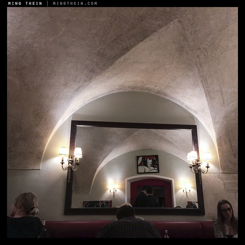
Symmetry and clean termination points – lowered contrast at the edges helps, too.
In the past, I’ve written about the importance of conscious exclusion in the process of composition: you don’t want to confuse your audience by including elements that are irrelevant or worse, distracting and visually stronger than the main subject. As we know, the very act of composition itself is one of both cropping and curation: we are choosing what not to show as much as what to show, based on our own preferences and biases. How we structure the rest of the composition around that is very much up to us, and of course the intended story or message of the image. But where do we end things – and in what situations is a little trimming necessary? How can we achieve a clean frame and a clean idea?









 Ming Thein | Photographer
