Travel minimalism: one lens to go

_M8_L1025017 copy
Canterbury in autumn. Leica M8, 21/1.4 ASPH

Every time I travel for personal purposes, I’m always torn between experiencing the place, and photographing the place. Photography is such a part of me that sometimes I feel that I experience and understand things more through trying to capture the essence of them. Or perhaps it’s because doing so forces you into conscientious observer mode, and this in turn makes one’s mind more receptive to things, and more willing to question what you see and find juxtapositions or contrasts.

_M8_L1024931bw copy
Canterbury Cathedral crypt. Leica M8, 21/1.4 ASPH

That aside one of the things which inevitably keeps me up the night before departure is trying to figure out what to bring equipment-wise. If it’s on assignment, then I bring everything I might possibly need, plus spares – to hell with overweight baggage, if you don’t have it, it could mean a lost job – on the other hand, if I’m traveling for myself, I’d rather carry as little gear as possible. Well, little enough that I don’t notice it after walking around for hours on end, but with sufficient coverage that I don’t get frustrated and feel like I missed a rare photographic opportunity because I didn’t bring along a wide angle. Or something along those lines.

_M8_L1026056bw copy
A Parisian in her natural habitat. Leica M8, 21/1.4 ASPH

My last personal vacation saw me bringing an Olympus Pen Mini, the 14-42 kit lens and a Panasonic 20/1.7 pancake. We went to the beach. Frankly this made the choice easy as I didn’t really want to expose any of the more expensive gear to moisture, salt and sand; the M9-P definitely would not have been suitable, and the D800 might have produced great landscapes, but it would also have worked fine as a boat anchor.

_M8_L1026132bw copy
Three conversations, Paris. Leica M8, 21/1.4 ASPH

I’ve been trying to fine-tune this over the years. I’ve been on trips where I did carry coverage from 14-450mm and a spare body; whilst I got some great images, I also had a sore back, and landed up leaving everything but one body and the 24-70 zoom in the hotel room for the last week. More crucially, I felt the images produced from that trip lacked focus; I brought everything, so subconsciously I was actually trying to capture everything. The upshot is a set of images that isn’t as strong as it could have been, and worse still, experiencing that slightly chaotic panicky feeling that you just might have missed a shot opportunity somewhere.

_0011006bw copy
Tate Modern yard, London. Ricoh GR Digital III

My preferred travel kit is a moderate wide, and a moderate telephoto – both fast – and one body. I might carry a spare compact or something similar as a backup, just in case. I’ve gone with the D700, 24/1.4 and 85/1.4 – this is an absolutely fantastic and hugely flexible combination – plus a spare compact, either the Fuji X100, Leica D-Lux 5, or my favorite, the Ricoh GR-Digital III. Most recently, I spent two weeks in Europe with an M9-P, 28 and 50mm lenses, plus the Pen Mini and 45/1.8 (giving me 90mm in a pocket). This was also an excellent combination, and in some ways better than the Nikon based setup due to weight and instant availability of the telephoto. However, it lagged hugely in low light performance. I think the next trip I take will probably be Micro 4/3 based; an OM-D and Pen Mini with 12, 20 and 45mm lenses will cover the vast majority of situations handily. And not weigh very much, either.

_0011022 copy
Piccadilly Circus, London. Ricoh GR Digital III

So what’s all of this talk about a single lens?** Or single camera? There are advantages to this approach: firstly, you’re unencumbered and free to enjoy the atmosphere, people and culture without feeling like a packhorse; a small camera around your neck is probably much easier to manage than an entire backpack full of lenses. Also, you don’t have to worry as much about security – frankly, carrying several Leica f1.4 Summiluxes and a Noctilux around even safe Singapore made me pretty nervous.

**Let me clarify: I don’t mean going with a 28-300, though I suppose this might be a viable option for some situations. That lens has more compromises than strengths, and if you don’t know how to manage your perspectives properly, then you’ll land up with weak images too, because you’ll always be trying to ‘zoom in’.

_0011001bw copy
The Shard, under construction. Ricoh GR Digital III

The main advantage, however, is that it frees up your mind from having to think about what perspective to take for a scene. Do you find the essence in the details, or do you go for something wider and more encompassing, with context? Trouble is, there is often no right answer – and from experience, I know that inevitably you’ll land up trying to make both work and being satisfied with neither. On the other hand, if you’ve got just one focal length, then you can pre visualize what your frame will look like; with sufficient experience, your eye naturally looks for compositions that fit within the perspective and angle of view of the lens you’ve got. Thus: instead of wondering what perspective to use, you’re free to spent that mental capacity on fine-tuning the elements inside the frame of the only perspective you have. It can be liberating – providing you’re thinking about the photograph, and not about the equipment you left at home. There’s also the side benefit of not having to change lenses, and thus always being ready.

_7017234bw copy
The doorway, Hanoi. Nikon D700, 85/1.4 G

I actually did this on several occasions. At the end of 2009, I made short trips to Oxford, Canterbury and Paris; for these I brought two lenses (21 and 50mm for the M8) but only used the 21. I did it again in 2010; the first trip saw me bringing a D700 and several lenses, plus the Ricoh GR-Digital III; I only used the Ricoh and its fixed 28mm because it was both much more convenient, as well as matching the way my eye was tuned at the time after my first Leica-M experience. I got wiser on the second trip and left everything behind except the GR-Digital III. Hanoi later that year saw me using only the D700 and 85/1.4 G.

_7017494 copy
A Vietnamese stereotype. Hanoi. Nikon D700, 85/1.4 G

If you are going to try this exercise, I’d recommend going for a wide normal rather than an ultra wide or a tele; for the simple reason that these are the most flexible focal lengths to use. 35-50mm can appear wide or moderately telephoto depending on how you choose to use the foreground elements in your scene. And at some point, chances are you’ll probably want to take a photo of yourself or your traveling companion (or both of you, or your family…you get the point) – and it’s generally much easier with something wide or normal than say a 300mm.

_M9P1_L1005025 copy
Prague castle and stars. Leica M9-P, 28/2.8 ASPH

Some people may find a telephoto easier to use in these kinds of situations because they can snipe from a distance; I’d personally advise against it because it’s very difficult to make images with context; and that’s one of the cornerstones of travel photography. The bokeh may be great, but if the background gives you no clue as to where the subject is, then the image could well have been shot anywhere – and that somewhat defeats the point of travel photography.

_M9P1_L1004062 copy
A Viennese moment. Leica M9-P, 28/2.8 ASPH

Personally, if I had to pick, I’d go with either a 28mm, or a 35mm – depending on whether my images would likely be more people-biased (longer), or more location-biased (wider). And it’d have to be fast, too; I’d be using the lens at night, and anything slower than 2.8 wouldn’t cut it. Frankly, in some situations, even f2.8 may be a little borderline. Finally, it’d have to go on something small, light and unobtrusive; responsiveness is important because your ability to anticipate things will be a little bit diminished thanks to the foreign environment. Right now, my choice is probably between the Olympus OM-D and Panasonic 20/1.7, the Ricoh GR-Digital III/ IV, or the Leica M9-P and a 35/1.4 ASPH FLE.

Give it a try. On your next trip, just use a 35 or 50 prime for at least a day or two; if it makes you feel better, bring along your zooms too, but don’t use them until you absolutely feel that you’re missing shots. MT

_M9P1_L1013074 copy
Wat Arun and Boat, Bangkok. Leica M9-P, 35/1.4 ASPH FLE

____________

Visit our Teaching Store to up your photographic game – including Photoshop Workflow DVDs and customized Email School of Photography; or go mobile with the Photography Compendium for iPad. You can also get your gear from B&H and Amazon. Prices are the same as normal, however a small portion of your purchase value is referred back to me. Thanks!

Don’t forget to like us on Facebook and join the reader Flickr group!

appstorebadge

Images and content copyright Ming Thein | mingthein.com 2012 onwards. All rights reserved

Some thoughts on reprocessing and revisiting images

Reprocessing
The difference of seven years of Photoshop skill: 2012 (left) vs 2005 (right). Mandarin duck; Nikon D2H, Tokina AF 80-200/2.8

From day one, I was told by every serious photographer two things: one, don’t delete anything because opportunities never come twice, but storage is cheap; two, shoot raw, and keep your raw files somewhere in an archive. Or at very least, keep your original jpegs if your camera doesn’t do raw.

I only recently started doing the former: I keep all of the raw files from a commercial shoot, and then send a contact sheet off to the client to let them pick the ones they want retouched – usually between 10 and 50%, per whatever the commercial agreement was. The rest stay in the archive in case they come back later and want to license additional images, or I need to composite in bits during the retouching. For my personal work, I cull ruthlessly – the rationale and the methodology was previously covered in this article.

_DSC8648b copy
Venice, 2004. Nikon D70, 24-120VR

One of the more popular justifications given for being the image-hoarding equivalent of a packrat is that you might want to go back and reprocess your files later once technology or your technique improves, so you can get more out of the original image. This makes sense from a logical point of view, but from a practical standpoint, if you’ve improved that much as a photographer it’s probably because you’re out there shooting new stuff and refining both the shooting and processing portions of your technique. In short: I’ve never gone back and reprocessed anything. Well, there might have been a couple of exceptions when an image was licensed to a client and adjusted for print or to the client’s taste, but nothing more than that. I honestly don’t have time to reprocess my personal work.

_DSC8648-2012 copy
Venice, 2012

However, I suppose we could all find time to do things if we thought they were important enough. And this brings me to the biggest argument against reprocessing images: your artistic vision for that particular image, or what you saw in that particular scene, will never be stronger than at the time of shooting. It just fades gradually as time passes; this is just a consequence of the way the human brain works: we forget things over time. And unless you suddenly look at an image again later and find something that bothers you hugely, you’re probably just going to go with whatever you thought was best at the time.

_MT39141bw copy
Courchevel cloud, 2005. D2H, Sigma 70-300/4-5.6 APO

However, in the interests of academic curiosity, I’m going to do some reprocessing for this article. I don’t know how it’s going to turn out: I’m writing this philosophical portion of the article before doing the work. Frankly even finding shots that meet my compositional standards is tough, because I (hope, at any rate) have moved on significantly in my photographic abilities since these images were shot. There’s no point in reprocessing something from last month, because I don’t think you’ll see any difference in the before and after – one’s style changes slowly, like a tree growing. But one’s style is also defined by the way you shoot, and there are things I do routinely now – for instance, cinematic, very shallow DOF in low light – which I couldn’t physically have done back then, because the equipment didn’t exist.

_MT39141-2012 copy
Courchevel cloud, 2012.

The archives have been raided, and yielded a number of images. In some cases I’ve had to use the original JPEGs as a starting point because I didn’t have raw files; this is obvious in the lack of file quality and noise. There’s not a lot I can do about that, unfortunately; 8 compressed bits of tonal information can never be made into 16 complete ones. You’ll also see in some places I disagreed with my original processing choice of B&W vs color, and even the final crop – I guess as one’s style and eye evolves, we see different things in the same image. The eagle-eyed of you will also notice small corrections to composition via distortion, cropping or stretching; I normally do these things today, but I’m sure I wasn’t doing any of it at the time. Similarly, dust/ speck cloning was something I never bothered with. I’ve picked a wide range of subjects, too. I’m going to post the final state I arrived at back at the time – usually a mildly edited jpeg – and the reprocessed, 2012-version. I would highly encourage all of my readers to share their thoughts on which they prefer, and why; let the comments section be a forum for discussion. I’ve also provided some thoughts below on each individual image.

_M227904bw copy
Nikko station, 2007. Nikon D200, 17-55/2.8

_M227904-2012 copy
Nikko station, 2012. There’s a lot of empty space in the top portion of this image, especially the overexposed window at top left; it threatens to imbalance the composition – hence switching to a 16:9 crop. The original colors in the scene were delicate and tonally interesting, so I opted to rebalance for true color instead of do another monochrome conversion.

_DSC8280b copy
Piazza San Marco, Venice, 2004. Nikon D70, 24-120VR

_DSC8280-2012 copy
Piazza San Marco, Venice, 2012. This is one of the very early images from my DSLR career; up til this point I’d been using a super zoom compact. If I’d known any better, I’d have used a different exposure time to retain more suggestion of people in the scene, or better yet, stacked many exposures. And f10 isn’t exactly the optimal aperture on the first-generation 24-120VR. Aside from the obvious color fix – this is much closer to the reality I remember than the original processing – verticals, horizontals and tonal maps have also been tweaked. I don’t think the composition is particularly fantastic, but gimme a break, I just started at this point, okay? 🙂

_M227348 copy
Kinkakuji, Kyoto, 2007. Nikon D200, 17-55/2.8

_M227348-2012 copy
Kinkakuji, Kyoto, 2012. You’ll notice there isn’t a lot of difference between the two; this was from a later period in my photographic career where my processing was both more refined, and I was shooting RAW (with all of the associated available adjustments) to hand. I didn’t change the composition, though I’m not 100% happy about the positioning of some of the edge elements in the frame; the majority of the change was to sort out the dayglo colors, and the horribly inaccurate foliage. It was a particularly hot summer that year; the image was shot in August, and the trees were looking a little dry and wilted – I think this is much closer to the reality I remember at that point.

_M215519 copy
Scarlet Ibis, 2007. Nikon D200, AI 500/4 P

_M215519-2012 copy
Scarlet Ibis, 2012. Not a lot of change; I punched up the color a little, because these birds are pretty darn striking in person. I don’t remember the color of the swamp, so I left it much as-is. Again: a late 2007 image.

_MT39064 copy
La Tania sunset, France. Nikon D2H, Sigma 70-300/4-5.6 APO

_MT39064-2012 copy
La Tania sunset, France. WHOA! You’re probably wondering what happened here – of all the images, this is the one which is the most different from the original. Aside from the obvious change in crop, I’ve now got the shadow recovery tool at my disposal, and better yet, an intimate familiarity with it. The problem I faced at the time was the sunset was a) both not very punchy and b) the native dynamic range of the scene was already quite challenging, meaning that making the highlight portion punchier would have sacrificed tonal detail in the shadows. At the time, I had no clue how to unblock it. I don’t remember the exact color of the the scene, but I suspect it was probably somewhere between the two images. Which one do you prefer?

_DSC8121bw copy
Venice, 2004. Nikon D70, 24-120VR

_DSC8121-2012 copy
Venice, 2012. At the time, I was influenced heavily by a number of ‘classical’ monochrome shots I’d seen in magazines; as a result, this street scene was instantly converted. What I failed to notice in the original – until now, fortunately I still have the original color jpeg – is that the light spillage from the shop windows at left actually give the image an interesting structure that’s lost in black and white because of the similarity of luminance values between the warm-lit stone and the regular stone. I’ve attempted to bring this back, however the limited dynamic range of the jpeg has led to less smooth tonal transitions than I’d be able to achieve with a raw file. Actually, working this ‘vintage’ jpeg reminded me a lot of dealing with iPhone files – imperfect color, blocked shadows, blown highlights, and a decidedly averse reaction to resizing.

_DSC8066b copy
Canal reflections, 2004. Nikon D70, 24-120VR

_DSC8066-2012 copy
Canal reflections, 2005. To me, reflections are juxtapositions. Our minds invert them subconsciously anyway, otherwise we would recognize them as the mirror images of their own selves; I usually take this further by treating the image as the real subject, and the subject as the abstraction – what’s the difference anyway, since all images are subjective and facsimiles of the real thing? Aside from that obvious flip, the verticals have been corrected, and the tonality smoothened out – especially in the water, so it looks more like liquid and less like a block of color.

_MT73080 copy.jpg
Mandarin duck, 2005. Nikon D2H, Tokina AF 80-200/2.8. For some odd reason Flickr won’t let me re-upload a modern duplicate of this image with the right border and matching image size, so I apologize. However, the original image remains the same.

_MT73080-2012 copy
Mandarin duck, 2012. Improved color accuracy and worked on micro contrast a little.

With all of the reworked versions, I’m not sure I can say that I 100% prefer the 2012 version over the originals – photography is very much the sum of the parts, and the interaction between the original framing and the processing is very much a large component of that. The processing methodology I currently use doesn’t really fit the vision I had back then, and vice versa. Score one for the argument against do-overs: you really can’t fix it in post; you can enhance an image, but not fix something that’s fundamentally wrong with the composition or lighting. Here’s another interesting idea for a future article – reprocessing somebody else’s raw files. Might provide an interesting insight into how much difference Photoshop really makes…MT

____________

Visit our Teaching Store to up your photographic game – including Photoshop Workflow DVDs and customized Email School of Photography; or go mobile with the Photography Compendium for iPad. You can also get your gear from B&H and Amazon. Prices are the same as normal, however a small portion of your purchase value is referred back to me. Thanks!

Don’t forget to like us on Facebook and join the reader Flickr group!

appstorebadge

Images and content copyright Ming Thein | mingthein.com 2012 onwards. All rights reserved

How serious do you want to get?

At some point, every enthusiast photographer is going to want an upgrade. It’s a natural consequence of human society; more and newer is better. Since money doesn’t necessarily correlate to ability – in fact, it’s frequently the complete opposite situation – the people who’ve bought the best and latest gear generally aren’t the best photographers. In fact, I think a solid argument can be made that if you are very committed and passionate about your hobby, then you’ll find ways to make do without resorting to technology.

Advance warning: this article is as much about individual soul searching as it is about gear lust. Many of you will probably disagree with what I have to say, or find the truths a little uncomfortable; you of course don’t have to listen to me, but you might well find doing so unburdens you and allows you to develop even more as a photographer. Why am I saying this? Because I went through the process myself, and have to make a conscious effort to stop myself from falling into the gear trap. (It’s actually a lot worse when you’re a pro because you can justify buying anything as ‘work related’ and a tax-deductible expense.)

Notice the question I asked was ‘how serious do you want to get?’ not ‘how serious are you?’. There’s a difference: the former is aspirational, and the latter is slightly insulting, specifically in the implied stagnation and doubt of one’s ability.

Rule Number One: don’t confuse need and want.

There’s nothing wrong with wanting something. It’s what makes us human, in many ways. But don’t think you need it. Having a D800 will not make you a better photographer than D700. In fact, it might well make your images worse if you lack the discipline to use it properly. But if you desire one, and that’s all there is to it, then go ahead. If the ownership experiences gives you pleasure, and you’re happy carrying the weight around, then who’s going to stop you? These types of purchases tend to be accompanied by positive personal emotions.

Need is different: you’re going to find it difficult to do product photography without lighting gear. That’s a need, if the situation calls for it. I wouldn’t argue any other way. These types of purchases often feel like paying tax: we do it because we have to, not because we want to.

This brings me on to Rule Number Two: only buy something if you know you’ve exhausted the limits of your equipment.

There are so many advantages here: you’ll buy exactly what you need. You won’t waste money on trying things that ‘might’ be useful. You will actively seek the skillset required to make the most of the new acquisition.

Rule Number Three: learn to use what you’ve got. This one is a biggie. The number of people who keep buying bigger and faster lenses and cameras thinking that it’s going to solve basic compositional problems never ceases to amaze me. Fps and bokeh are tools and enablers, not a crutch for compositional imbalance! Yes, the ‘Photoshop tax’ is painful, but if you think about it, not unreasonable. I use photoshop for every single image I shoot. There is no other piece of equipment that falls into this category, yet some of the other tools I own cost far more. How is this unreasonable? I look at it as cheaper than having a darkroom, or paying somebody to develop films for you. Furthermore, signing up for a decent course or educational program is going to cost less than a new camera, but teach you far, far more. Buying a professional camera without understanding photography is like driving a Ferrari with traction control off in the rain: you can go fast, kinda wing it, probably hold it together most of the time, but sooner or later, you’re going to crash in a big, messy way.

This brings us around full circle. I don’t define seriousness in photography as whether you make your living from it or not; there are plenty of ‘pros’ who make big money but don’t really care about the output – so long as it’s about 90% there, the clients can’t tell the difference. Even more shockingly, I was told this in person, by more than one person whose fees are rather high. Similarly, there are amateurs who are outstandingly good photographers – probably without the commercial inclination or personal interest in making a living out of it – but their shooting discipline and workflow shows incredible attention to detail, even though very few people (if any) see their images.

Rather, seriousness is probably closer to how much of a sacrifice you’re willing to make; this comes in many forms. Cost. Weight of equipment. Time spent processing, which could be spent on other things. Sleep sacrificed for that perfect sunrise or sunset. Personal security, to get the shot in a dangerous area. Photographers who try to capture things they cannot control – think photojournalists and wildlife shooters – rank pretty darn high on the seriousness ladder.

I think it’s very important to know where this boundary lies personally. Like every other wildlife photographer, I once had aspirations to shoot for National Geographic; the reality is that after a bit more research into what they do while on assignment; I don’t think I’d be happy with that kind of life; sacrifices are high. But on the opposite side of the coin, I’m willing to put up with PC lenses, tripods, focusing racks etc. in order to eke out a tiny bit more image quality for my watch photography – which I don’t think many people would bother with.

Perhaps another definition of the spectrum is whether you’d go out of your way to get the shot or not: a serious photographer would either go far, far out of their way and plan specifically to get that one image; a not-serious one would be more opportunistic and just make causal images as and when the opportunity arises.

Knowing where you stand on this continuum  – enables you to make decisions without that slight discomfort and doubt that you’re compromising on other things at the expense of photography – but without really knowing why. It’s a lot easier to be happy about the choice to carry 20kg of equipment on holiday because you know that you aim to get some very specific shots that can only be done with that equipment; as opposed to bringing-it-along-because-you-bought-all-of-it-already-because-it-made-you-look-like-a-pro-and-now-you-should-probably-use-it. Similarly, you won’t feel bad about missing that amazing sunset your 20kg-toting friend got because he woke up at 5am, and you were hungover after partying the night before – but you know how to make a decent shot with your mirrorless camera when the opportunity arises, even if you don’t actively go out of your way to look for it.

That liberation brings happiness and contentment. Very simply, that makes it a hell of a lot easier to enjoy what you do; the fact that you’re here and reading means you’ve got a choice. And given that choice, would you want to do anything for any other reason? MT

____________

Visit our Teaching Store to up your photographic game – including Photoshop Workflow DVDs and customized Email School of Photography; or go mobile with the Photography Compendium for iPad. You can also get your gear from B&H and Amazon. Prices are the same as normal, however a small portion of your purchase value is referred back to me. Thanks!

Don’t forget to like us on Facebook and join the reader Flickr group!

appstorebadge

Images and content copyright Ming Thein | mingthein.com 2012 onwards. All rights reserved

Start with the end in mind: visualizing your shots

_M9P1_L1004614 copy
Lighting candles at Christmas outside Stefansdom, Vienna. Leica M9-P, 28/2.8 ASPH

Most of the time, we shoot first and then figure out what to do with the images later. That’s the wrong way of doing things. A healthy portion of famous photojournalism work was premeditated: not in the sense of the scenes being staged, but the photographers had some idea of what they were looking for, what might happen, and if it did, how they wanted to capture it. The final composition was most probably unplanned and spontaneous, relying on the photographer’s experience and training to deliver the precisely ‘right’ combination of elements in the scene.

_M220119bw copy.jpg
Market thespian, Kuala Lumpur. Nikon D200, 12-24/4

Even street photography works best with some degree of forethought: you might not know what’s going to come into your frame, but you do have to be conscious of light direction, possible backdrops or natural frames, and of course the flow of people. It isn’t planned, but a lot of the time I see locations with interesting urban geometries and abstractions, then wait around for something interesting to happen or for a person to be in precisely the right location to complete the shot. Often, most of these scenes would be acceptable but slightly boring without the human element – however, short of hiring a model, all you can do is wait and be prepared for somebody to turn up at the right place and time – and for that, you have to be both able to see what the difference would be, and ready to capture that instant.

_N215560 copy.jpg
Vintage Lemania chronograph for a book on military watches. Double page spread, text in white to go on the black column at right – planned and shot as such. Nikon D200, 105/2.8 VR Micro

On the other side of the spectrum, almost all commercial work is planned, right down to the smallest of details. There are blank spaces left in compositions that look awkward on their own, but are there because of intended text placements or cropping to fit strange aspect ratio spaces. And that doesn’t even begin to touch on the conceptual side of things – often most clients know what they want, but are unable to communicate it to the photographer because describing visual things requires a wholly different an unfamiliar language to somebody working in say, hamburger sales. The trick here then becomes trying to understand the end use of the image, its intended goal, and how you translate that into a photograph – in a sense, we photographer have become more than just executors – we have to think actively about human psychology to some extent, too.

_7021848 copy
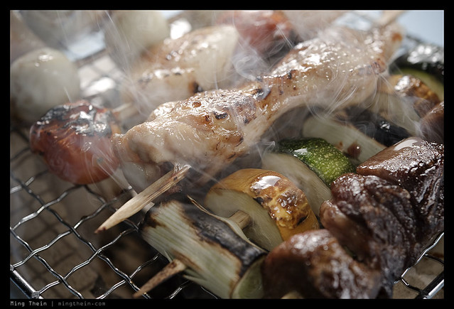
I bet you feel like a grilled snack on a skewer right now. And that’s the end goal. Nikon D700, AFS 60/2.8 G Micro

Fortunately, this is usually pretty simple: the end goal of commercial photography is almost always to sell more product. Which means that if you look at the image and it doesn’t stir some desire in you – whether it’s to go out and buy something or make you feel hungry – then the photograph has failed its objective.

I’m digressing here. What I really want to talk about is how the previsualization process works. I’ve already said a little bit about how I go about street photography – find the location and light, and then wait for the people or the action – but it’s different for every subject. Although photojournalism is pretty close in technique and execution to street photography, there’s one huge difference: you have to capture the story in a frame or a few frames, not just find an interesting random slice of life that may or may not be significant in a greater societal context. This means you have to identify what key elements you want in the frame beforehand – what you need to tell the story, in effect – and then go out and actively look for them. Throw the unpredictability of lighting and action into the mix, and you can see why it’s such a difficult job. You can also see why most photojournalists favor wide angle lenses; they allow the primary subject to be easily made prominent, and then context to be easily included in the frame as background – but not dominating the subject.

_0010675bw copy
Construction works on evacuation break. Ricoh GR-Digital III

In fact, wildlife, sport and photojournalism use similar processes. This is because you have no control of the subjects, but need to include key elements in order for the image to work.

Architecture is actually fairly simple: the architect usually wants to showcase a particular design detail or feature of a building, which means all you need to do is visualize how to present it in several ways – either with human-scale context, with environmental context, or in a more abstract, purer design-focuesd form. The remainder of the planning goes into figuring out what time of the day produces the most favorable light, and which vantage point and perspective you need to use. (I’ve got an upcoming On Assignment feature on an architectural shoot in Singapore, within a few days, actually.) In fact, the most unpredictable thing is the weather: there’s no way you can control it, and a few days of rain can completely kill your schedule.

_X1_L1000845 copy
Rain would have killed this job. Leica X1

Food, watches and other commercial object-things work in a very similar manner to architecture, with one key difference: you can control the light. And you can plan the light to give the object certain characteristics, and in turn create controlled emotions in the viewer – remember the earlier article on color and emotion – it applies equally to light, too, since color equals light equals image. Most commercial shoots have controlled compositions, too – for the reasons mentioned above – most of the time, there’s an intended final use. And frequently, the client knows exactly where the text is going to go, or what other layout features the image has to work around.

_7045122 copy
Jaeger Le-Coultre Master Ultra Thin 1833 limited edition. Nikon D700, AFS 60/2.8 G Micro.

Finally, there’s portraiture. I’ve left this one to last because it’s really a mix of everything; you can choose your background like street photography; elect to include or exclude contextual elements like photojournalism; pick the best and most flattering features of your subject like architecture; and finally, control the lighting like for food and watches. But yet there’s an uncertain element in the form of your subject; no matter how well you know a person, 99.99% of people will act differently in front of a camera, and that makes capturing a natural expression hugely challenging. Often I’ll find I shoot or pretend to shoot lots of frames at the start of a portrait session, but the ones that I submit in the end (and the client prefers) are the unplanned candids grab shots that happen during the informal downtime. In fact, doing this has almost become a habit with me – I should see if I can figure out how to drop the pretense in the future and just go straight to the informal bit.

_D90_DSC7558 copy
The beefeater. Nikon D90, 18-200VR

The upshot of all of this is one simple thing: no surprises. You get what you are expecting, and you can safely say a) job done, work delivered and b) the preplanning frees up your mind to focus on the other parts of execution, like lighting and fine tuning composition. All in all, producing a stronger image. MT

This post was brought to you by Ming Thein’s Email School of Photography – learn exactly what you want to learn, when you want to learn it. Don’t forget to like us on Facebook!

Black and white conversion options

_3100_DSC0450bw copy
Water drops. Nikon D3100, 60/2.8 G.

I’ve gotten a lot of emails after the Leica X2 and M-Monochrom reviews asking about B&W conversion and processing; I guess the M-Monochrom announcement had a knock on effect on the way people started seeing things. It doesn’t make color cameras redundant for B&W work, though.

Let’s start by demystifying two things.

1. Certain cameras have certain particular B&W characteristics. True, but only if you use JPEG. If you are shooting RAW, they provide different starting points – this is from a tonal response point of view – but ultimately you can get a consistent look regardless of the camera. I know, because I do this all the time.

_DSF1170bw copy
Singapore. Fuji X100

2. There are benefits to a monochrome-only camera. True. The Bayer filter and subsequent conversion is an interpolation of neighboring pixel image data to extract color information; luminance information is lifted from the photosite. Any sort of interpolation will reduce tonal accuracy and increase noise, because the luminance value you’ve got is now an approximation instead of a true value. However, it’s fairly easy to see that whilst there are benefits to shooting monochrome-only, you can actually convert a color RAW file into a monochrome one, and lower the perceived amount of noise – though not to as low a level as a monochrome-only camera. If you have a poor interpolation method, then the luminance values can be affected too – once again, increasing the perception of pixel-level image noise in a color image. Bottom line: yes, lower noise, and yes, better detail.

_M9P1_L1014802 copy
Trees. Leica M9-P, 21/3.4 ASPH.

Also one of the images available in my print offer.

However, what you lose from a monochrome-camera is the ability to do control the relative luminance level of individual color channels. Why is this important? Suppose your color scene has a relatively small range of background tonal values, but your subject is a very different color. Its luminance may be the same as the background, but it stands out because of the difference in color. As we concluded in a previous article, this kind of image is a very bad candidate for B&W conversion off the bat, because you’d land up with something very flat-looking. (Real life translation: running out and buying an M-Monochrom isn’t going to solve your B&W conversion woes, but it will give you an interesting starting base – especially when it comes to noise and dynamic range. Those of you who don’t mind doing a bit of work, hold on to your normal cameras. And in fact, these techniques apply to the M-Monochrom too.)

_7006528bw copy
Noryn Aziz in the spotlight. Nikon D700, 24-70/2.8

Actually, if you’re prepared to do some work, this not necessarily the case. It’s still possible to separate the subject from the background on the basis of luminance only; you just need to work a bit harder. You’ve even got a few options here. Park that thought for a moment, we have to introduce the basics of B&W conversion first.

_M8_L1022658bw copy
Shadows. Leica M8, Voigtlander 50/1.1

_5000935 original
A sample image for the purposes of demonstration for this article. This is the original file, converted from RAW, with all of the sliders set to zero. Olympus OM-D, 45/1.8.

The simplest method is to desaturate. All this does is throw out color information, and leave luminance information only. You are then free to do whatever you wish to complete processing of the file. After much investigation and experimentation, this is actually the method I use, coupled with another trick or two. Desaturation can be done in ACR (saturation slider, first tab) or in Photoshop (Hue/Saturation tool, then desaturate the master)

_5000935 desaturate
Straight desaturation. Note overall lack of contrast.

Slightly more complicated is the gradient map. You can use the standard linear black to white transition (press D in photoshop first, then add a new gradient map adjustment layer) – which gives very similar, but not quite the same, results as desaturation. Gradient maps with a straight gradient tend to be a bit more contrasty than desaturation. If you want to experiment a bit, it’s actually possible to put in intermediate control points into the gradient and bias it towards a high key (mostly white, black fades out faster) or low key (black stays for longer) look. What actually works here will depend on your image, however, so be prepared to do some fiddling. The good news is that if you use a new adjustment layer, the gradient is easily modifiable without having to redo your entire conversion.

_5000935 grad med copy
Gradient map, linear gradient. Note increased contrast over the straight desaturation.

_5000935 grad lo copy
Gradient map, low key gradient (mostly black)

_5000935 grad hi copy
Gradient map, high key gradient (mostly white)

Finally, we’ve got the channel mixer. Best used on the RAW file in ACR, this lets you decide how much of each individual color channel goes into making the final image. Note that the tool only uses the luminance components of each channel, and it’s additive; this means that color (and perceptual color) information is discarded. To make things even more complicated, there’s a separate B&W conversion adjustment layer in Photoshop itself that effectively does the same thing as the ACR conversion, but it only has six channels for you to play with instead of the eight in ACR.

_5000935 channel mix red heavy
Channel mixer via ACR, decreased reds; note how the subject (in this case, predominantly in the yellow channel) stands out more from the background.

Remember the conundrum of how to isolate a different colored, but similarly luminous, subject from the background from earlier? The solution to this is the channel mixer. You can increase the luminance of the primary color of your subject, and decrease that of the predominant background color; the converse also works. The problem comes when you’ve got a mixture of colors in both subject and background, and some of those are common colors. (Don’t get carried away though: remember that some images just don’t work in black and white).

This isn’t, the entire toolkit, of course. You’ll find that after this kind of conversion, things look rather flat. That’s because a lot of how the human eye perceives contrast and separation is dependent on differences in hue; obviously we have removed that, so we have to artificially put it back in again. Two of Photoshop’s tools will be your best friends here: the dodge and burn brush, and the curves tool. Understand how both of these things work, what the dos and don’ts are, and you can work magic with any B&W conversion. A tablet is also extremely helpful for these things, as it gives you precision control and feathering over your brush application. It lets you avoid hard edges, odd abrupt transitions, and permits highly precise editing.

_5000935 desaturated grad  copy
Desaturation with grad blue filter layer in multiply mode (higher density at the bottom of the frame) to darken the bottom red sign

At this point, it’s probably worth talking about plugins and filters. The former are either a set of Photoshop actions, or a separate program, that controls the conversion – specifically the luminance translation of each colour channel into a luminance value – and the tonal map of the final file. Whilst they are extremely popular and used by many ‘internet street photographers’ either to save time or because they are unable to get their desired results from a nuts and bolts conversion, I personally avoid them because they do not give you enough fine control, and even worse, everybody’s images that were run through that filter look the same. There is no personality or skill in that.

Photography is arguably art and very much down to personal taste. If you are 100% happy with the way those results look, great; I’m jealous of the amount of time you’ve saved in your workflow. However, claiming this is art is disingenuous; it’s like finding out Ansel Adams shot BW400CN (a B&W film designed to be run through a C41 color processing machine) and developed it at the local pharmacy – instead of Tri-X or Plus-X, controlling his development time and chemical composition, and then cutting precision masks to dodge and burn portions of his subjects.

_5000935 copy
That ‘arty’ high contrast, high grain look. It’s actually what heavily pushed Tri-X used to look like, but how many people actually know that firsthand?

There’s a second type of filer that’s useful, and in either form, it performs a similar function to the channel mixer – it either admits or cuts out light that’s of a certain range of wavelengths. The most common example of this is a physical red filter that goes over the end of your lens; the effect is dark skies, because very little of the blue spectrum passes through the red filter and onto the recording medium. It works with digital too, but you have to remember to adjust exposure accordingly, and obviously not use it in color mode. You can also replicate this effect digitally. Add in a new layer, make it one color, and then select the appropriate blending mode; then only do your B&W conversion. There are interesting results obtainable through this method.

_5000935bw copy
Final image, desaturation + curves + selective dodge and burn + second round of curves + slight palladium tone layer

If you pull back the B&W conversion layer slightly – assuming you didn’t directly apply the conversion to the image – then it’s also possible to use a color layer to create a toning effect; sepia or platinum is probably the most common. You can even use a graduated fill layer to provide a variable effect; this is especially useful for increasing the density of skies, for instance.

Personally, I prefer to shoot color and then convert to B&W; not because I can’t decide upfront how a scene should be presented, but because there’s a lot of flexibility in how I want to handle the conversion later to highlight certain aspects of my subject, or achieve certain tonal looks.

I’ll go into detail on my personal B&W workflow with an end to end example in a future article. MT

This post was brought to you by Ming Thein’s Email School of Photography – learn exactly what you want to learn, when you want to learn it. Don’t forget to like us on Facebook!

Color or black and white?

In advance of tomorrow’s review of the Leica M-Monochrom, it seems that this is a an appropriate question to tackle (if a completely academic one if your camera doesn’t shoot color in the first place.) It’s actually one of the tougher problems I face on a regular basis. Does a shot work better in color or black and white? What if it’s both? There are generally a few things that I look for which help, either to define the obvious or if I’m on the fence. This article is a short distillation of that process.

1. Is it commercial? If so, then 99% of the time, the required output will be color. Especially if it’s food or product; architecture can be either.

_7059099 copy
Commercial architecture. Nikon D700, AFS 24/1.4 G

2. Are there strong dominant colors in the image? If so, then color. Generally, if the image is about strong color, monochrome almost always never works because for a color to be perceived as strong, you need to have fairly constant luminance values across the scene. And luminance variation is what you need for a good B&W. If the strong dominant color as a good range of luminance values, then either can work.

_M9P1_L1011009 copy
Offerings of strong color. Leica M9-P, 35/1.4 ASPH FLE

3. Is the image naturally washed out or low saturation because of the subject or lighting? Generally, black and white works better here; however, you’d be surprised at how different an image with subtle color and very low saturation looks vs one that is completely colorless.

_M9P1_L1006123 copy
Subtle color works well, sometimes. Prague castle. Leica M9-P, 28/2.8 ASPH

_M9P1_L1003919bw copy
But sometimes there is just no color to be had – the scene in reality was almost monochrome already due to the flat lighting and fog. Schonbrunn Palace, Vienna. Leica M9-P, 28/2.8 ASPH

4. Is the subject isolated or highlighted by the lighting of the scene? Either can work, but my personal preference is for black and white because you’ve got enough luminance isolation already without having to overdo it.

_M8_L1025558bw copy
Isolation by lighting. Note how the backlight rings the subject. Paris. Leica M8, Voigtlander 50/1.1

5. Is the subject isolated by color? Stupid question, easy answer. Go with color. If not, you risk running into the problem of small differences in luminance values again. Sometimes, color IS the subject.

_M8_L1017941 copy
Isolation by color. Goa, India. Leica M8, Voigtlander 15/4.5

6. What emotion or feeling are you trying to achieve with the image? Classical timelessness always requires B&W, otherwise, go with color and shift the white balance a little.

_M8_L1023455bw copy
Film Noir. This could have been 8 days or 80 years ago. It was neither, actually. London, Leica M8, 35/2 ASPH

7. Is the image part of a series, group or set? Whatever the answer is, be consistent. You could produce two different sets, but make sure the style (including color or lack thereof) is consistent between images in the set. If you’re only delivering or using one set, then don’t change styles halfway through. See what best fits the images and overall goal of the series.

_7007311 copy
The man behind the scenes, literally. If the backdrop was monochrome, would the blue screen effect metaphor have been as obvious? I think not. Nikon D700, Zeiss ZF 1.4/85 Planar

Of course, the easiest way to avoid all of these problems and questions it to pre visualize your shot and start with the end already in mind, so you know what you’re going to do with it. And that will be the subject of a future article 🙂 MT

This post was brought to you by Ming Thein’s Email School of Photography. Don’t forget to like us on Facebook!

Chasing perfect color, and common myths about white balance

The previous article on the inexact science of color and emotion dealt with why color was important, and how we can use it as a tool to alter the mood and emotional response of the viewer of our photographs. This article explains how we get there.

_7061647 copy
Sandwiches. Did you know greens are heavily affected by the yellow channel? Nikon D700, AFS 60/2.8 G Micro

Although highly saturated color is visually striking, and B&W images are timelessly classic and elegant, there are a lot of times when neither is appropriate or an accurate representation of the scene. I’ve recently realized that I like accurate color above everything else – saturation control then becomes a matter of seasoning to taste. Color accuracy is actually quite critical when it comes to things like food – if the color of cheese or lettuce is off, it just looks moldy or unfresh. This is definitely NOT good for commercial work! My recent work is what I’d call in a ‘natural’ style – the color, saturation and hues are as close to my perception and remembrance of the scene as possible. I’ll do some shifting of white balance to make things warmer or cooler as required, but not a huge amount because it can do some very strange things to tonal accuracy.

_VL31_L1000539 copy
Scarlet Ibis. The red in is plumage is due to pigments in the shellfish that forms the majority of its diet. Leica V-Lux 3

Skin tones are perhaps the most difficult to replicate accurately; this is because skin is both reflective of ambient light (easy for the camera to capture) and emissive – we’re warm, and there’s some passive IR radiated by warm objects. Although modern cameras have very effective UV/IR blocking filter packs, they also produce (in my opinion) slightly dead-looking skin tones. I actually liked the skin tones from the Leica M8 for this reason, which was notorious for having perhaps the weakest UVIR filtration of any camera on the market – to the point that to get accurate blacks you’d have to use a UVIR filter on your lens.

_M9P1_L1002674 copy
Black fabrics in the sun are notorious IR-emitters. Leica M9-P, 28/2.8 ASPH

Other objects that are notoriously difficult to reproduce accurately are flowers, some animals, and some fabrics. Again – this is because of the way they interact with the near-UV and near-IR spectra, which affects the way our eyes perceive color (though we can’t see UV or IR directly unlike some animals). To date, there is no camera that accurately reflects the spectral response of the human eye – and I suspect it might be very difficult to make one, because the filter pack would have to be calibrated to transmit or cut out a certain amount of each wavelength. It’s much easier to make a filter that cuts out everything above and/or below a certain wavelength. Throw in the added complication of mixed light sources, and you’ve got a minor nightmare.

_PM02066 copy
Colors. All of them. Which one do you balance for without shifting the others? Answer: focus on your subject – in this case, skin tones and blacks. Olympus E-PM1 Pen Mini, 45/1.8

So what can we do to achieve perfect color?

First clarification: we are not trying to achieve perfect spectral reproduction; we’re trying to achieve perfect perceptual reproduction. It’s not quite the same thing. Basically, you want to get to the starting point of being as close to what you remember seeing as possible, then work from there. That way, you know that all of your tweaking isn’t going to create some strange shifts in certain parts of the tonal spectrum.

_7047057 copy
Chilis. Nikon D700, AFS 60/2.8 G Micro

White balance is inextricably linked to color. And there are some important things one has to bear in mind:

1. You have to get it right first time if you’re shooting JPEG. There just isn’t the tonal headroom in 8 bits to be able to make anything other than minor channel adjustments and not encounter posterization or weird hue shifts.

2. Manual white balance and a piece of paper are your best friends.

3. If you’re shooting RAW, white balance is less critical, but if you blow a channel, you’re not getting it back. Usually reds and yellows are the first to go. With earlier cameras, you might have to underexpose by as much as two stops to maintain tonal detail in the reds. I think it’s something to do with IR-sensitivity, the effectiveness of the filter pack over the top of the sensor, and how the red pixels respond very strongly to IR pollution.

_5100_DSC2749 copy
Cigars are one of the most difficult colors to get right. I don’t know what it is about the tobacco leaf, but that rich, deep brown hue requires a lot of work to perfect. Nikon D700, AFS 60/2.8 G Micro

4. White balance does affect exposure. This isn’t immediately intuitive; the reason is because if you get it very, very wrong, you’ll find that after correction, the dominant colors in the shot will shift, and the sensor may not have gained up enough at the extreme ends (red or blue) resulting in underexposure – most likely. You can to some extent recover this in post, but the bigger problem is that you’re going to land up with a very noisy image – the blue channel is generally holds the most noise for most cameras as it is the least sensitive due to the laws of optics, photon energy and filtration…but I won’t go into that here; complex quantum mechanical formulae are beyond the ability of my blogging software to input and display. 🙂

_7035823 copy
Prayer wheels, Nepal. Nikon D700, 24/1.4 G

Bottom line: shoot raw, and get in the right ballpark. Small adjustment are fine, and you can never get it 100% right all the time with a manual balance because ambient light is always changing. AWB works reasonably well on most cameras these days, but you have to watch out for the very warm light sources. I was told by several people in the camera industry that it was a conscious choice to leave the yellow/red components in the tungsten AWB because people expect the light to be warm (back to perception) – and having pure whites just looked odd to most consumers. I can attest to that as a lot of my students have asked me why the color is so blue when shooting indoors! Although I can’t say whether it’s a visual expectation on the part off the photographer, or whether inaccurate white balance is something they’ve come to expect because it was inadvertently dictated by the industry.

I’ve been playing with a handy little tool recently called a WhiBal. Basically, it’s a very, very accurate neutral gray card. I’ve found there are two ways to use it – one, take a shot under AWB with the card in the frame, and use that as your reference frame; eyedropper tool WB from the card in ACR, then sync white balance between the remainder of your files. Note that these two methods only work when your lighting is consistent from frame to frame, i.e. under studio conditions. The other option is shoot the card under the lighting conditions you’re going to use to set the preset in camera; I find this works better because all of your frames are automatically synced from the shoot. And if you’re using the same setup – as I do for watches – I can basically do it once and just leave one of my manual presets to match my flash and diffuser combo.

_7035796 copy
If any of you have shot purple flowers, you’ll know they’re notorious for shifting towards blue: that’s because of the UV reflectance. Flowers have UV and IR reflective pigments to signal to other animals – in this case pollinating insects and birds – that can see UV and IR.
Nepal. Nikon D700, 24/1.4 G

Next, make the tweaks – in your RAW converter, (I use ACR 6) perfect your white balance. Use the eyedropper tool on various gray areas in the scene until, it looks close to what you remember. (This is another reason why I like to process as close to immediately as possible: you might forget what the originals scene looked like, or any processing ideas you might have had at the time). Don’t worry if the eyedropper tool doesn’t get it right; you can shift the color temperature and hue sliders a little until you do.

_7025478 copy
This blue is one of the most difficult colors to get right. What makes it so appealing as a car color – the fact that it changes a lot under different lighting conditions – also makes it a royal pain to photograph and represent accurately. The honest truth is that I have no idea what RGB value this actually is, because it’s both reflective and in many spectra. Nikon D700, 28-300VR.

Open your file, make whatever contrast adjustments you need to – curves/ levels – then only use the Hue/Saturation tool to adjust the individual channels. Using curves inevitably shifts the saturation and hue slightly – there’s no way out of that – so you’ll need to bring back the individual channels. For instance, if it’s predominantly red and you used a curve that darkened the image, you’ll have to compensate for that by reducing saturation and increasing lightness slightly in the Hue/Saturation tool. There is no exact science to this – it’s all about experience, perception, and having the most accurate monitor you can find.

_7021997 copy
Remember what I was saying before about shellfish and birds? Nikon D700, AFS 60/2.8 G Micro

Each camera has a different filter pack and spectral response. Even though manufacturers try to keep the color output consistent from model to model, there will be differences. The D3100, for instance, has a crappy color gamut that I was never happy with – much like the NEX-5 – however, the D700, D5100 and D7000 are all pretty similar. The D800 is close, but even more accurate and with a wider supported tonal range out of the box. The M8 with UVIR filter, M9 without and S2 are almost identical. Since I use a whole bunch of cameras – at the last check, Leica, Nikon, Olympus and Ricoh – I’ve created individual color profiles for each camera in ACR and saved them as camera defaults. The look I like is somewhere between the tonal richness of Leica and the warmth of Olympus – perhaps Olympus + Zeiss glass describes it best. Oh, and different lenses have different spectral transmission characteristics too, just to make life more interesting. Your personal preferences will almost certainly be different because each individual perceives color differently. But I suggest that if you have the time, this is a worthwhile exercise.

_7022462 copy
The challenging pale but saturated lightness of macaroons. Nikon D700, Carl Zeiss ZF.2 2/2.8 Distagon

One important final note: all of this is in vain if your final output use is extremely limited gamut or highly compressed (*cough*FACEBOOK*cough*) – all of the additional tonal information you tried to save is going to be lost and compressed to hell. Some browsers (Safari) and photo sharing sites (Flickr) are better than others because they are color profile aware and don’t compress images, but the issue then becomes monitor accuracy. So unless you know the final output method and have some control over it, it’s very tricky to ensure that everybody is seeing the same thing. And printing is a whole separate blog on its own…MT

____________

Visit our Teaching Store to up your photographic game – including Photoshop Workflow DVDs and customized Email School of Photography; or go mobile with the Photography Compendium for iPad. You can also get your gear from B&H and Amazon. Prices are the same as normal, however a small portion of your purchase value is referred back to me. Thanks!

Don’t forget to like us on Facebook and join the reader Flickr group!

appstorebadge

Images and content copyright Ming Thein | mingthein.com 2012 onwards. All rights reserved

The inexact science of color and emotion

_7037890 copy
What makes this photo identifiable as dawn instead of sunset? Hint: it’s the color. We expect sunsets to be warm, but mornings to be cool and clear.

A series of experiments was done many years ago that showed humans have been conditioned to expect certain things in the way of color: blue ketchup just doesn’t fly, for instance. The theory is that it’s a primeval subconscious response to warn us of danger. Think of it this way: rancid meat looks a certain way, and has a certain color. Even if we can’t smell it – looking at a photograph of vomit or something decomposing makes us go ewwww. Such examples are to be found in nature all the time – think of those brightly colored poisonous beetles, for instance. In fact, the link between color and range (and thus emotion) is so strong that many species mimic the coloring of more dangerous species to warn away predators, but at the same time rely solely on that as protection because they pack no venom or toxicity. (Toxicity is energy-consuming to produce, and in food-scarce environments, you want to waste as little of your nutritional intake as possible producing something that’s only going to help you if you’re eaten – and thus probably going to die anyway.)

_7049521 copy

_7049526 copy

A tale of two cities. Shot minutes apart, though. How does the first image make you feel? The second?

How does this relate to photography? Quite simply, when you look at a photograph, how does it make you feel? Ignore the subject for a moment. The remaining emotional response is mostly down to your reaction to the processing: specifically, color. Why do black and white images have that ‘timeless’ or ‘ageless’ quality? Why do they make you feel slightly detached, as you’re an observer but not really part of the scene? It’s all due to color, or in this case, the lack of it. It’s difficult to relate to something if your information or perception on it is limited to tonal information only.

_7060545 copy
Why does this shot imply richness and juiciness? How would you feel about pale gray steak with red tomatoes, even if it tasted the same?

In fact, if you look through historical photographs and video – you’ll see that each recent era or block of ~10 years in modern history actually has quite distinct color and tonal styles. And looking at this often makes one feel something – nostalgia, hatred, wondering what one was doing with their youth. Early color photos from the 1930s and 40s have that vintage look, for instance.

_7036896bw copy
To me, this screams classical photojournalism – because of the contrast, the tonality, and the lack of color. Early photographers didn’t purposely go for that look – they learned to work with it because of the limitations of darkroom chemistry.

A lot of modern photography software capitalizes on this. Instagram and all of those software filter packages are a good example – hell, even Lomography to some extent – they let you instantly create a feeling through a combination of color fiddling and contrast manipulation. There’s a reason why a photo from a Lomo or Instagram looks like a vintage hippy polaroid: it’s because the white balance was shifted warmer by several notches, the saturation decreased slightly, the contrast decreased a lot, and the relative luminance and hue of the red and yellow channels shifted. And there’s probably some grain and gaussian blur in the mix, too. Try it yourself in Photoshop, if you don’t believe me.

_7014252 copy
Cool mountain. Nikon D700, Zeiss ZF.2 2/100 Makro-Planar

The point is, polaroids looked that way because of the chemical process of the day: not because they wanted them to look that way. I’m pretty sure the engineers there were chasing perfect color, too. The upshot of all of this is that a modern photograph processed that way invokes memories of the polaroid era, because that’s how most social images looked then.

_7013736 copy
Mmm, natural green freshness.

Most humans respond in similar ways to color, namely:
Red – danger, warning, attention;
Blue – cool, calming, relaxing;
Yellow – warm, friendly, open;
Green – natural, fresh;
Black – mysterious, sinister, classic, premium, heavy;
White – pure, open, light, honest, clean
Gray – apathy

_7035572 copy
Multiple light sources can be confusing as hell, but almost always signal ‘party!’

Simply put, there’s a reason why most Ferraris are red, and most hospitals are white.

How does this help you as a photographer?

Actually, it’s fairly simple. Color enters your image everywhere, but makes an impact in at least two major ways. The first is if you’ve got one dominant color in the scene that registers on the subconscious of the viewer even before they figure out what the subject is; it can be the color of the backdrop, for instance. A more subtle way is the ambient light temperature – for instance, a warmer white balance setting will result in a shift towards the red and yellow channels; this in turn imparts the ambient light with a particular quality and tone.

_5100_DSC1276 copy
Warmth. The ambient WB was shifted further away from the primary light source (the flame) to preserve the warm color.

The second major way is through contrast: if you’ve got a subject of one color against a backdrop of another completely opposite color (red and green or blue and yellow, for instance) then it’ll stand out because it’s the only thing in the scene that is visually discordant. It’s a good thing, in this case, because it draws your eye to the subject and lets the background serve as a stage – which is the way it should be.

_7037150 copy
Why does my subject stand out? It’s a different color to the background, of course.

But what if your scene has no dominant color, or is very washed out or low in saturation? Do what the cinematographers have been doing for years, and either impart a global tint as described above – you can easily do this if you shoot raw by shifting the white balance; lower color temperatures that what is accurate are cooler and bluer, and vice versa for higher color temperatures. The other alternative is to use a filter over your lens, or color the light – the latter obviously assumes you’ve got some control over your lighting, though. By far the easiest way to shift color and not land up with odd hues due to the nature of color addition and subtraction is to adjust your white balance.

_7049662 copy
KLCC dawn, color slightly shifted. Nikon D700, 28-300VR

One final comment: you need to start with an accurate white balance before you shift the color temperature. This is so you don’t land up with strange colors due to shifts along the green to magenta axis (white balance and color temperature affects only blue to orange/red). Also, remember not to overdo the saturation: shifting the white balance can cause other channels to blow, even if the original appeared to be correctly exposed. And over saturated images just look crude, frankly.

And on that note, I’m going to break until the next topic: chasing perfect color, and white balance myths. MT

_7029367 copy
Funky diner colors. Sometimes, your ambient light is close to exactly what you want – and all you have to worry about is color accuracy. Nikon D700, 85/1.4 G

____________

Visit our Teaching Store to up your photographic game – including Photoshop Workflow DVDs and customized Email School of Photography; or go mobile with the Photography Compendium for iPad. You can also get your gear from B&H and Amazon. Prices are the same as normal, however a small portion of your purchase value is referred back to me. Thanks!

Don’t forget to like us on Facebook and join the reader Flickr group!

appstorebadge

Images and content copyright Ming Thein | mingthein.com 2012 onwards. All rights reserved

Balancing content and technical perfection

_M224835 copy.jpg
Base jumping off the KL Tower. There are no do-overs for either the shot or the participants. Nikon D200, AI-P 500/4

Suppose you had one opportunity to get the shot: what do you do? The obvious answer is go for broke; who cares if it’s slightly overexposed, out of focus or the framing is a little off. Maradona is probably only going to use the ‘hand of god’ once; the millennium is only going to roll around once in your lifetime. Bigfoot will probably only appear once, and only in out of focus or foggy areas*.

That’s one end of the spectrum: it’s all about the content rather than the execution.

_7045452 copy
Benzinger Skeleton. Full control of everything, full repeatability. The second, third, fourth and fifth shots would look exactly the same.

The opposite end would be fine art still life: any one of the aforementioned photographic sloppinesses would probably get you thrown out of the gallery, unless perhaps you were very, very good at explaining why out of focus images represent the current zeitgeist of society, how rushing around and achieving complete form and ‘just getting it done’ rather than doing it well – quantity over quality – are also paradigms of modern corporate living.

_MT98674bw copy.jpg
What’s this? A situation in the middle: you can anticipate what’s going to happen and be prepared, but you don’t get a do-over. You should be able to get a perfect result with practice.

Enough sarcasm. Basically, if you’re going to create a still life, you’d better damn well be in control of the elements, or it just makes you look sloppy and incompetent as a photographer. There’s no way you can excuse compositional errors, slanted horizons, overexposure or things intruding into the edges of the frame. Studio commercial photography also falls into this category; it’s 100% controlled, and if you can’t get your image right when there isn’t anything left to chance – and the shot is repeatable – then you should probably hang up your camera.

_M9P1_L1003919bw copy
It wouldn’t have worked without the man. Schonbrunn Palace, Vienna. Leica M9-P, 28/2.8 ASPH

And that’s where the dilemma comes in: for photography that isn’t clearly at one end of the spectrum or the other, where do you draw the line of acceptability? If there is no expectation to create perfection, is there any necessity? In fact, if the expectation is of something slightly imperfect – to capture the chaos of reality – then perhaps perfection would actually weaken the impact of the overall image.

_M9P1_L1005830bw copy
I like the lyricism and movement in this image; in fact, nothing is perfect. It was underexposed because the meter gets fooled by backlit situations so I went manual and got the exposure slightly wrong; then the limitations of my equipment meant motion blur in the subject was a certainty, so I decided to work with it; finally, none of the verticals are straight – it bothers the perfectionist in me, but I bet you it wasn’t the first thing you noticed about the image. Malastranska, Prague. Leica M9-P, 28/2.8 ASPH

That last point isn’t immediately obvious. In fact, it’s quite counterintuitive; I was only made aware of it because I personally tend to drift towards the technical perfection end of the spectrum, and various clients have commented that my images look a little too perfect in some ways, especially for photojournalistic work. For studio photography, on the other hand, my clients love the attention to detail.

_7008086 copy
If This Looks Too Perfect, That’s Because It Was Staged. Artfully constructed scene for a promotional video. Nikon D700, Zeiss ZF 1.4/85 Planar

A year or two ago, I would have thought that the ideal combination would be to nail content, composition and the technical aspects of the exposure to produce a perfect image; however, this is not only nearly impossible to do, but somehow also results in slightly lifeless images. The soul is missing – or perhaps it’s not so much soul per se as humanity represented by the slight imperfections which impart the character of the photographer onto his or her image.

_M9P1_L1005824bw copy
More lyricism. Malastranska, Prague. Leica M9-P, 28/2.8 ASPH

Perhaps I’m just confusing myself with the philosophy now, because this is my current photographic worldview:
1. We strive for perfect images.
2. Technical perfection isn’t perfection per se, because that slight bit of imperfection humanizes an image and gives it personality.
3. This means that we must have skill and ability to achieve technical and compositional perfection, even under spontaneous circumstances.
4. However, we need to have even more control than that, because we need to have the ability to add imperfection at will.
5. Go out and create, with this brief of perfect imperfection in mind.

_PM04193 copy
Just your average slice of life. Olympus E-PM1 Pen Mini, Panasonic 20/1.7 G

I hear questions from the back of the room. Does this apply to every situation? More importantly, how much imperfection should we apply?

The answer to the first is obviously not; if you can do this in a situation where you have little or no control over the subject – think war zone photojournalism, for instance – that probably makes you one step removed from God, and a clear notch above the great PJs like Capa, HC-B et. al. Remember from the Magnum Contact Sheets book, even they had to work the scene a bit to get the final composition they wanted.

_8001696bw copy
The foot. The one aberration in this abstract urbanscape is actually to me what makes the image. Nikon D800, AFS 24/1.4 G

The answer to the second is nowhere near as clear cut. And frankly, I have no idea how much is too little, how much is enough, and how much is too much. The only way to determine the answer to this conclusively is to experiment, and get your work out there and opined-upon. Modern Japanese photographers tend to be at the very haphazard end of the spectrum – some of their work seems almost random, albeit very carefully constructed random – and the other end I suppose are the environmental portraitists who bring lights and modifiers and everything else with them even into the middle of conflict areas.

_7060984 copy
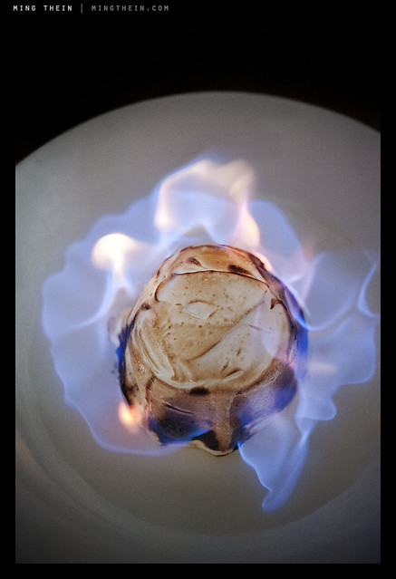
Flambe. Repeatable, but not controllable. You can set up the shot and do it again, but you can’t control what the flames are going to do. And this is the interesting thing that gives a little variation and makes each shot different. Seascapes are another good example. Nikon D700, AFS 60/2.8 G Micro

Personally, I’m going for something in the middle; but before I even get there, I need to shoot more – to have full intuitive control over my camera so that whatever adjustments I make come to me as second nature. And at this point something has to be said about good cameras, bad cameras, and too many cameras; good cameras are intuitive to use and require little training or practice to master. They do what you want them to, nothing more and nothing less. Bad cameras are ones that you never feel fully in control of, no matter how much practice you have. And too many cameras is just that: if you have too many cameras, you’re bound to eventually forget which button does what. And that could cost you at the most critical moment. This is why I’ll continue to use my D700 for reportage assignments until I’m fully comfortable with the D800; I know exactly habit will do under every situation, born of seventy thousand frames of experimentation – not counting the fifty thousand I shot with the D3, which is pretty much the same camera. MT

*Did anybody get the Futurama reference?

_7058402 copy
Would the burger be as appetizing without that juicy pickled onion marmalade peeking out? Probably not. Nikon D700, AFS 60/2.8 G Micro

____________

Visit our Teaching Store to up your photographic game – including Photoshop Workflow DVDs and customized Email School of Photography; or go mobile with the Photography Compendium for iPad. You can also get your gear from B&H and Amazon. Prices are the same as normal, however a small portion of your purchase value is referred back to me. Thanks!

Don’t forget to like us on Facebook and join the reader Flickr group!

appstorebadge

Images and content copyright Ming Thein | mingthein.com 2012 onwards. All rights reserved

Defining style, and finding your own

Introduction: This has been one of, if perhaps not the most difficult essay to write so far: it concerns a topic that’s fundamentally important for all serious photographers, yet is extremely difficult to define in a strict technical sense due to its very nature. It’s the only essay I’ve had to stop and start writing several times because I penned myself into a corner. What you read is the culmination of many sessions and days of work. I hope you find it useful.

What is style? Dictionary.com gives a lot of options – 16 to be exact – but I think perhaps the most appropriate definition of style from a photography perspective is best described as:

A particular, distinctive characteristic mode or form of execution, construction, appearance of a visual work which can be associate with a particular person or group of people.

Let’s think about this for a moment. It probably isn’t an exhaustive definition, however, it captures the essence: style is distinctive. It’s individual, or belonging to a group of individuals, associated with them because they created it or they promote and propagate its use. What are the distinctive visual elements or combinations of visual elements that define a style, specific to photography?

1. Color (or lack of it)
2. Tonality
3. Perspective
4. Lighting
5. Focal point/ depth of field
6. Fidelity
7. Quirks, the personality of the photographer, or perhaps the X factor

Let’s examine each one individually.

Color
This one is fairly simple: is there color or not? Is it black and white? Is the color saturated, bright and punchy (think happy commercial product shot) or is it monochrome and gritty (think classical photojournalism and war photography)? Consistent use of color is one of the fundamental things that defines a style – but it isn’t exhaustive on its own. Similarly, consistent use of filters or digital gradients to apply a consistent hue shift to a set of images can also define a style; for example, I personally associate that warm, golden light with California; I have no idea why, perhaps it’s the pollution of LA or a fetish of the Hollywood directors.

Tonality
This splits out into a few options: neutral, high key, low key, low contrast and high contrast. The former three options can be combined with the latter two options; you can have something that’s neutrally biased but high contrast, or neutrally biased but low contrast. In digital terms, think of the former as where the majority of the histogram is bunched: neutral would be evenly spread, high key would be towards the highlight end, and low key towards the shadows. Contrast then becomes the bunching: if you’ve got strong gradients in the histogram at any particular point, that’s high contrast. Low contrast images don’t show this. A good example of distinctive tonality would be the works of Sebastiao Salgado: you always know it’s a Salgado because of the tonality of the image, before you even see the subject. It’s a distinctive signature that’s there in his corporate work covering the Channel Tunnel and his humanitarian work in Africa.

Perspective
This one is a highly technical characteristic, and linked to the focal length of the lens used – only. If a set is shot predominantly with a wide angle lens – modern photojournalism tends to do this a lot, with the subject placed center or near-center foreground and the environment in the background around it to give context – then that’s gives a distinct exaggerated perspective. Similarly, sport and wildlife almost always employ compressed (telephoto) perspectives due to inability to get close to the subject.

Ligthing
Lighting is linked to tonality and contrast: direct lighting produces harsh shadows and flat images for subjects in the frame that are perpendicular to the camera; diffuse lighting produces nice textures and gentle gradients. If you’re not shooting with studio lights, you might not always be able to control this; but you do have control over when and where you shoot, which of course affects the quality of the lighting. Some photographers are nocturnal, for instance. Others choose to always use direct flash in daylight – Bruce Gilden, for example.

Focal point/ depth of field
How much of the image is in focus? Granted, sometimes this is linked to the perspective because of optical limitations, but there are ways around that – fast ultrawides for DSLRs give a telephoto-like separation of subject from background, but with exaggerated perspective; similarly, small sensor super zoom cameras will let you achieve compression but also short hyperfocal distances.

Fidelity
This is a tricky one to define: how close is the image to reality? Is it a feasible scene, which you could happen upon with your naked eyes, or is it something that’s been so heavily photoshopped that you can’t tell between what was shot with a camera or created with a Wacom tablet? I’d put HDR imaging somewhere on this spectrum, too. It isn’t reality, but HDR can be used properly to actually create more natural looking results (to be the subject of a future article).

Quirks
We end with the broadest possibility of all: anything open to the creativity of the photographer. Some photographers leave a little in-joke in frame; others have a particularly distinctive way of retouching; others may only shoot one particular subject. I deliberately haven’t put subject in as a component of style, because it’s possible to shoot the same subject in many different styles – and this wouldn’t be consistent.

Now that we have some idea of how to define style, how do you define your own? Firstly, it must be consistent: you need to be shooting and finishing images in this style consistently, without having to think about it. There may be more than one style you do routinely; I have three which I’m aware of. Using my work as an example, I do three things:

_7037081bw copy
Classical Photojournalist.

1. Classical photojournalist. High contrast black and white, with almost everything in focus, finessed tonal transitions in the subject – I expose and process for the the subject and let everything else fall wherever on the tonal scale it may – and mostly wide angle, mostly 28mm but with some ventures as wide as 24mm or as long as 50mm, but no longer. I’d describe it as as mix of Salgado and HC-B.

_7034062 copy
Cinematic.

2. Cinematic. This is perhaps the style that defines me the most: shallow depth of field, mostly long perspectives (85mm) with some wide, dramatic shots; strongly dynamic lighting, with heavy manipulation of color and tonality to affect atmosphere. (Color will be the subject of several future article). Heavy focus on the subject and just enough background to give context, but no more.

_7050700 copy
Commercial.

3. Commercial. Although there are elements of the previous two styles in here, I prefer to think of this as the clean, perfectly-lit product shot: it’s what I do with the majority of my watch photography.

At this point, I should take a step back: how do you even find your style, before you define it? Simple: look at what’s out there, and experiment. For the first few years – hell, it might be a lot of years – you will probably be following other people’s work. You might not even be able to consistently reproduce a style that isn’t your own. Don’t worry – that’s not the point. Your own style should evolve naturally after sufficient experimentation. I know that I didn’t really have a distinct style until 2009 – though I dabbled in many up to that point – which was the classical photojournalist. Cinematic developed at the end of 2010. Commercial has been continuously in refinement as I improve my lighting skills. Other than proving I’m nothing if not a schizophrenic photographer, it shows that even if you can define your style, you may not necessarily have found the one that works best for you: I can shoot in any one of these three, and often have trouble deciding which one would look best.

_0012575 copy
Natural.

And you know what? I’d be very disappointed if I stopped developing here. I think there’s a midpoint between all of these three styles – something I’ll tentatively call ‘natural’ – which seems to be the direction in which my work is going now, be it available light or studio. The characteristic of this style seems to be perfect color, with a little cinematic hue shift where required; a mix between dynamic and natural lighting, with an emphasis on the subject; and an overall natural perspective to the images – as though you could have seen them with your own eyes, without much artificial intervention (think monochrome, or long exposure, etc.). I’m looking forward to seeing where this goes in the future. MT

____________

Visit our Teaching Store to up your photographic game – including Photoshop Workflow DVDs and customized Email School of Photography; or go mobile with the Photography Compendium for iPad. You can also get your gear from B&H and Amazon. Prices are the same as normal, however a small portion of your purchase value is referred back to me. Thanks!

Don’t forget to like us on Facebook and join the reader Flickr group!

appstorebadge

Images and content copyright Ming Thein | mingthein.com 2012 onwards. All rights reserved