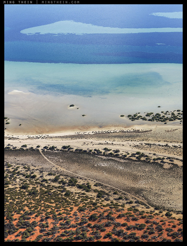
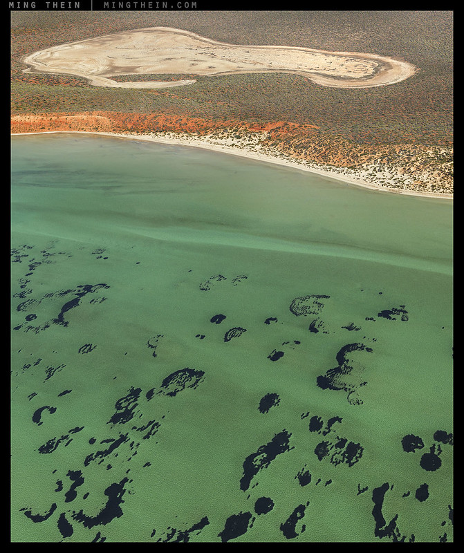
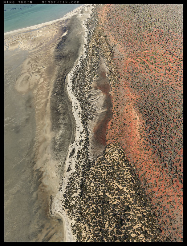
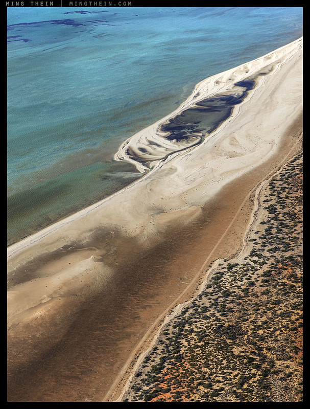
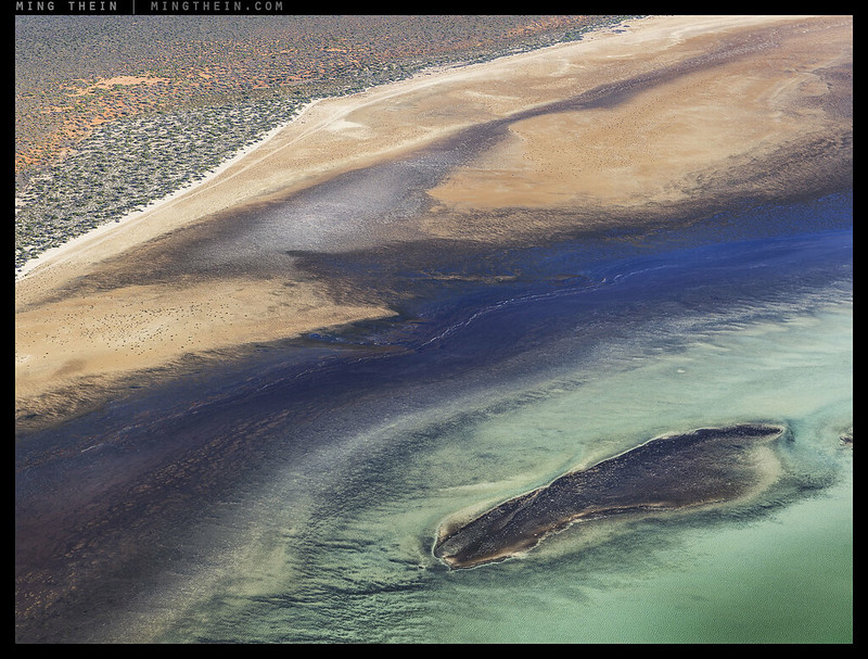
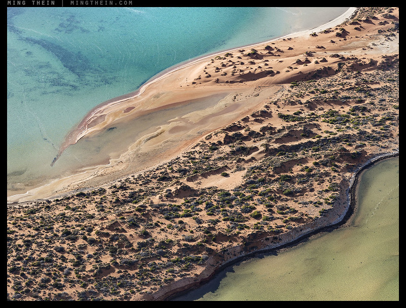
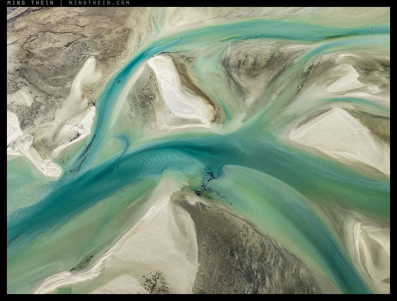
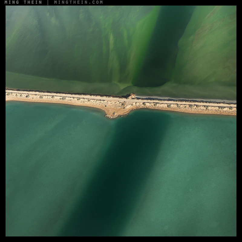
As promised – here’s the other half without obviously identifiable reference points. I often find that with aerial images, it’s either very easy to abstract or very hard to get a consistent sense of scale – especially when the subject matter is not something that jumps out at us as something our subconscious can pattern recognise. The landscape here is simply so randomly full of formations that you’d have trouble dreaming up. This can be a good or bad thing, depending on the aim of the photograph. I don’t think one approach is better than the other, but it is an interesting cognitive exercise. Personally, when selecting images to fill the walls of the apartment we moved to earlier in the year – I found myself hanging quite a number of the less identifiable ones, and other images which were not an obvious choice based on my own screen preferences; proof printing plays a huge role here (assuming of course you print large enough!) Which do you prefer? MT
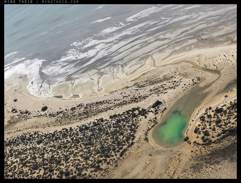
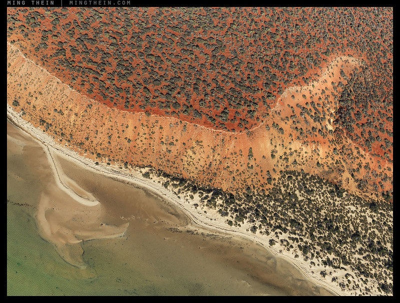
This series was shot over Francois Peron National Park in Western Australia, with a Hasselblad H5D-50c and processed with Photoshop and Lightroom Workflow III.
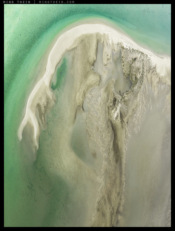
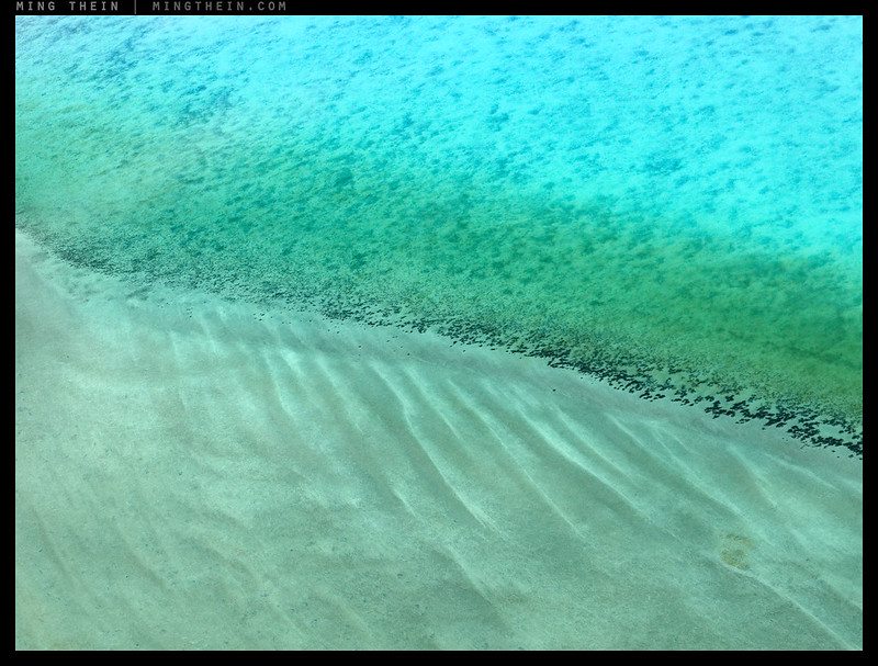
For some odd reason, I’ve always thought of this image as ‘the daring fireball’.
__________________
Ultraprints from this series are available on request here
__________________
More info on Hasselblad cameras and lenses can be found here.
__________________
Visit the Teaching Store to up your photographic game – including workshop and Photoshop Workflow videos and the customized Email School of Photography. You can also support the site by purchasing from B&H and Amazon – thanks!
We are also on Facebook and there is a curated reader Flickr pool.
Images and content copyright Ming Thein | mingthein.com 2012 onwards. All rights reserved


New Yorker piece on Burtyansky http://bit.ly/2gtBGmh
Great stuff as usual! These aerial sets remind me of Edward Burtynsky’s work. I just had the opportunity to see some of his large prints. Hopefully someday I’ll get to see some of your ultra prints.
If you’re ever in Kuala Lumpur…
Totally beautiful!! Love the complex abstraction…radom and yet harmonious
Should be random
Thanks!
Very hard to choose — I hope your new place has a lot of walls!
More than the old one 🙂
Hi Ming, The blues and greens of the water are gorgeous. Were you using a polarizing filter in any of these?
No, that’s natural and a consequence of the water clarity (and what’s underneath it, of course)…
What I prefer? It depends on the purpose. If I look at it from an artistic standpoint, I’d prefer them to be as abstract as possible, with an as much compelling composition as possible. Looking from a documentary standpoint, I think good references are necessary. Well, I’d go for the first genre, if I would be a buyer. I like #5, 8, 9, 11 the most, but maybe (probably) I’d change my mind, when I’d look in large format.
Intersting – yes, the output size matters enormously. Some that may seem a little flat and uninteresting at web sizes are very different large; the ones that work small still work, of course.
“the ones that work small still work, of course”
I wonder, if in larger formats some details would become clear references, maybe the abstract character would be lost, and with it maybe some of the artistic power…
Nope, they’re still abstract (he says looking at a couple of 60″ prints on the wall)…
Wow these are amazing. I haven’t made it over the WA, which is poor show really, as I’ve been in the country for 15 years. Did you commission a chopper for these?
No, light aircraft – choppers that fit within the budget don’t have enough range 🙂