Beauty is in the eye of the beholder: the relativity of aesthetics, and a (partial) reconciliation with hipstagram-things

A4517116bw copy
A slight inclination for coffee. This image goes against so many of my personal rules – the horizons are slanted, the main subject is out of focus, and very out of focus, and the light is so-so – but I like it. The important question here is, why?

This is an old carrot: it’s been used to lead the same set of donkeys around the garden path so many times that the donkey himself doesn’t even believe it he’s ever going to get to eat it anymore, at least not deep down in its heart of hearts. But I think it’s still a topic worth discussing because relativity affects people in many more ways than they are conscious of; and being conscious of what works for you and what doesn’t is of course a very, very important part of making strong images, and moreover, ensuring those images are in a style that’s consistent and reflective of the personality of the photographer. (And of course the latter exploration and understanding of one’s personal style is important because following what comes naturally to you makes it much easier to develop and evolve as a photographer.)

Of course, what we’re really talking about here is relativity: everybody has a different point of reference. If you’ve never left Saharan Africa, then the concept of a suit would seem rather foreign to you; but if you came from an upper-class English family, you’ve probably owned one since you could walk. Hence the roots of relativity: an observers’ – let’s leave photography out of this for now, because it introduces some additional complications – personal taste is defined much by the familiar, be that good or bad. For the most part, people are naturally curious to varying degrees. Add that to the mix, and preferences can start to vary wildly: just because it’s not familiar doesn’t mean that it isn’t good or favorable, and just because it is doesn’t mean that it isn’t extremely distasteful – think of teenage rebellion, for instance. (I’m told by a psychologist that a good portion of teenage rebels grow out of that stage fairly quickly and land up turning into their parents in middle age; it’s the silent, too-good types we have to worry about.)

The attractiveness of a piece of art is of course purely a function of personal taste; art is inherently controversial simply because of the sheer number of potential forms it can take. By definition, almost anything can be art – be it completely familiar, or completely not. To a limited extent, the same goes for photography. However, because of the nature of the medium, there are more constrained limits the artist has to operate within – you’re (mostly) stuck in two dimensions, cannot use moving imagery, have finished work that is (today) viewed at many reproduction sizes, and (again, today) is affected by the quality of the viewing device. Making it worse, is the fact that it’s perhaps the medium with the highest diminishing returns; it takes no skill to take a photograph, and not much more to luck out and produce a good one if you take enough of them. Yet to do so consistently and in a way that’s fully controlled is incredibly difficult because of the sheer number of variables that one has to deal with, often in a very short space of time.

Perhaps it’s this medium-induced limitation that has meant photography in the early days took some time to be taken seriously as proper art form in its own right; imitation of reality was always the intention, but until relatively recently, the results were but a poor facsimile. The same of course cannot be said for art, because nobody expects a painting or sculpture to be a copy of the original subject, but an interpretation of the subject as seen and translated by the artist. In reality, what this means is that the photographer’s primary tool of control is subject and composition, and to some extent the reproduction method – this includes format, color and output. The difference between a fairly good photographer and a truly oustanding one can be subtle, and I’m of the opinion you can’t really tell if you only see one image: it’s simply too easy to get lucky. Repeatability and demonstrable control is not to be underestimated.

And here we run into a bit of a dilemma: what if a lack of control is the desired output? What if some degree of uncontrolled randomness is a signature of the artist? (I personally don’t find it appealing, but I suppose this is one of the reasons Lomos and Holgas have become popular in recent times, along with the digital-fake hipstagram-alikes.) This of course is personal taste too: taking off my photographer hat and putting on one belonging to an objective commentator, it’s important to recognize that whilst I might not personally like putting artificial light leaks and scratches onto my cameraphone images to disguise poor composition and hand shake, there are a lot of people who find it appealing – hence the success of such products.

But is there anything inherently wrong with it? A recent – let’s say heated – discussion with my wife over her use of instagram has lead me to seriously consider this question. Whilst deep down it offends my artistic sensibilities greatly to even consider using such things, I admit that I cannot think of a single objective reason against it. But why am I against it? My full (and definitely not-objective) thoughts can be found in this article, but the gist is that basically you’re outsourcing a large chunk of the creative decision making to the preferences of a third party; worse still, all of your images will have the same style and look as everybody else who uses the same program. By nature, it’s designed to make images look like something they’re not. It’s the integrity of the thing – or specifically, the lack of it – that really irks me. The fact that some of those looks were products of a certain workflow or method that was developed, learned over time and refined; earned, if you will. Yet now they’re being adopted and trivialized by a bunch of hipsters who have no clue that Tri-X is a film, or Rodinal comes in bottles.

Let’s back up a minute, and be objective again. The two core points in that argument are really hokum: firstly, that one is in total creative control of the photographic process from end to end; secondly, that one has to earn the right to use a method or technique through understanding and practice. By that flawed logic, I shouldn’t have the right to use a camera unless I grind my own lenses made out of glass I fused myself from sand I collected off a beach somewhere, with optical formulae I derived myself, coupled to a camera I made myself, with either film whose emulsion I concocted out of household chemicals, or a sensor whose chip pattern I photolithographed from a hand-drawn mask and a projector. And I can’t use Photoshop unless I wrote the program myself, either. Clearly, this is utter crap.

I can prefer to take over some elements of the process because they give me more creative control over elements that matter to me; postprocessing or developing, for instance. But whilst I might prefer a Distagon design to a Sonnar, there’s no way I’m going to go out and make myself one. I think the cutoff in this process is generally the point where you can no longer do a better job than the third party – be it in processing, or lens design. But preferences change this: whist we may get better results if we sent our film off to a pro lab, or avoided mucking around with retina-searing HDR and just using our camera’s expanded dynamic range JPEGs, we might prefer to do it for whatever reason – personal accomplishment or satisfaction, learning, or perhaps something else. I suppose it’s just like how most drivers would be faster with a double-clutch gearbox or a modern automatic, but might still prefer a stick for the feel and experience.

This preference – subjectivity – extends of course to equipment, images, compositions and subjects, too. We use certain types of cameras because we prefer to, either because of the way they make us feel, or because somebody we respect says they’re the best, or because we simply want to. Cameras that seem masochistic, ugly and antiquated to some – meterless Hasselblads come to mind – might be really quite enjoyable to others (me, for instance).

It’s of some critical importance to a photographer to understand both what they like, but also why it appeals. This exploration upfront saves a lot of time both in avoiding exploring creative avenues that might later prove to be dead ends, but also helps hone artistic development by focusing on the elements or subjects that feel inherently natural and instinctive to the creator. There’s no point in forcing yourself to try and replicate somebody else’s style if it doesn’t come naturally to you, or shooting with a wideangle lens if you natively see normal or telephoto compositions. It might be worth trying it as an experiment, but why bother if you simply know you don’t like the way the images look? Now, if you knew that it was because you didn’t like the diminished background or lack of depth of field separation or the keystone distortion when you point the camera in any orientation away from the horizon, then you could avoid buying that lens and wasting three months shooting with it in mild dissatisfaction instead of just enjoying that 85/1.4 and making cinematic.

Bottom line: look at lots of images in a wide variety of styles; it’s likely that you’ll find some you like the look of, but it’s also likely that none of them will be a perfect fit for your own personal preferences. You’ll just have to understand which elements about them you do like, as much as which you don’t; the next step is to translate this into a technical how – if it’s not obvious, then find yourself a mentor or friend. (My Email School of Photography is designed precisely to help with this.) This will in turn help focus your own work on honing the skills you need to make the images you want, or if you’ve already got those skills, then on the elements and subjects that you prefer. Quite often, it’s not the how that needs the kick: it’s exposure that’s required – of course, how the balance lies is down to where you stand in the creative stages of evolution as a photographer.. I find it too easy to get shuttered down one’s own creative alley – even if you have a good idea of what works for you – which in turn closes off potential ideas and developments.

Closing with a full circle, I want to talk about why I like the opening image: it’s because from the viewer’s point of view, it throws you a bit off balance, and draws you into the details of the scene to understand and give context to the image as a whole. Did it have a caption originally? No, none of my images ever do, but this one seemed somewhat appropriate. It was made with unfamilar equipment in an unfamiliar location – a mall at night, with a Hasselblad 501C and CFV-39 digital back at high ISO – not exactly my first choice for this kind of work. Yet I’m reasonably pleased with the outcome, despite it disagreeing with most of my cherished tenets. Metaphorically, look around a little: force yourself to see the different, either vicariously or by putting yourself in an unfamiliar situation. It might just yield some unexpected results, but you’ll never know if you don’t stick your neck out in the first place. MT

____________

Enter the January 2012 black and white challenge – win a multispectral Sony NEX-5 B&W machine modified by yours truly!

If you enjoyed this post, please consider supporting me via Paypal ([email protected]). Visit our Teaching Store to up your photographic game – including Photoshop Workflow DVDs and customized Email School of Photography; or go mobile with the Photography Compendium for iPad. You can also get your gear from Amazon.comhere. Prices are the same as normal, however a small portion of your purchase value is referred back to me. Thanks!

Don’t forget to like us on Facebook and join the reader Flickr group!

appstorebadge

Images and content copyright Ming Thein | mingthein.com 2012 onwards. All rights reserved

The pricing game

IMG_0699b copy
Just your regular headache.

Following on from an earlier article on understanding licensing, I thought it’d be instructive to spend some time on the remaining elephant in the room for any photographer – especially newly-minted ones – is the question of how much to charge. Attached to that comes the mechanics of it all: invoicing, accounting, collecting payment, and the big one: licensing. Oddly, I find that this part of the business is something that seasoned pros are the most reticent to discuss; perhaps it’s part self-protectionism, perhaps it’s the cultural omerta towards money (at least in Southeast Asia, everybody seems to judge you by how much you earn, but to ask outright would be a major social faux pas*) or perhaps it’s because some of us are afraid to admit how little we’re actually charging.

*Nobody is likely to tell you the truth anyway; culturally, it’s like asking a lady her age in the West. It’s the age-old dilemma of one’s ego wanting to show their success, but simultaneously being afraid of being a target of jealousy. Whilst boastfulness is never a desirable trait, I think we need to be proud of our work and position as professionals and craftsmen – like every other form of social posturing, others tend to judge your implied relative value on external appearances.

And here’s the dilemma (or is it a trilemma since there are three options?): if they ask, do you tell your competition – remembering that you may well be competing for the same job – what you’re billing, in order to maintain rates across the board? Do you not tell them so you win the job, but potentially at the expense of eroding rates for everybody? Or do you give them wrong information – for any one of a number of possible reasons? Let’s consider the last situation for a moment: perhaps you give a false answer because you simply don’t want anybody else to know. It could be higher or lower than the other guy – in the end it probably averages out to no harm, no foul. You could deliberately give a higher number – all other things being equal, that would win you the job at the expense of long term sustainability. Or you could lowball and hope the other guy just backs off without submitting an even lower quote, in which case you’d lose the job and affect future rates.

The problem with all of these scenarios is that none of them are win-win situations for everybody. The only situation that’s sustainable is complete transparency and meritocracy in selection – and we all know that not only does this not happen, it’s pretty much impossible to be objective when judging the relative artistic merits of photographers. Here, client opinion is law – if they don’t like your work, there’s no point in trying to argue otherwise. (In fact, there are plenty of reasons not to pursue the job – but that is another topic for another day.) As a photographer and industry member – this situation is concerning, to say the least.

Like it or not, the reality is that the professional photographic industry – perhaps to a greater extent in Asia than elsewhere – is a numbers game. Education plays a big part in this: even relatively savvy clients will choose a photographer on price as one of the primary considerations. If the difference in image quality or output is say 10%, but the price is 50%, diminishing returns never wins. This of course means two things: firstly, mediocrity thrives because it’s cheap and easy; secondly, it’s very, very difficult to perpetuate and promote a premium product and service because the incremental cost to do so far outweighs any potential returns. And in the end, if you’ve got to charge the same or close to it to get the job and the client doesn’t really appreciate the difference, then all you’re doing is running at lower operating margins than the competition. This will not be in your favor in the long run. This is also one of the reasons I decided not to switch to medium format even though there was definitely a clear jump in image quality. I’d have to spend north of US$30,000 just for a basic kit, and even then I’d still have to retain the Nikon for some things – it simply didn’t make sense in our economy.

This brings us back to the core question: pricing. You can’t charge more just because you’re using a more expensive camera, or at least it makes no sense that it’s justified; I’ve said it time and again: your equipment is in no way indicative of your skill level. And if anything, if one photographer requires less equipment to achieve the same results as another, then it should be clear that the deficit is being made up through skill. But how does this translate into money? How much better qualitatively is a $100 image vs a $1,000 one?

Ultimately, it’s down to the client, of course. But it’s important to have at least some internal scale of charges you use as a baseline to start from. Although ostensibly getting a rate quote from a photographer should be fairly simple, it’s not. Let me explain why by starting with a list of things we have to consider:

  • Physical shoot time required
  • Retouching
  • Travel costs, if any
  • Complexity of setup
  • Whether we have to bump or reschedule other things – you might do this for a large project, but not for a small one – this of course comes at the expense of other things and potentially written-off revenue
  • Permits and planning
  • Any additional things we might need to hire or buy – props, talent, lights, location, equipment, makeup artists
  • Volume
  • The client – both ability to pay, and how much you want to work with them
  • License model

In practice, the last two items are the ones that invariably provide us with the largest headaches. Let’s look at three examples, and calculate cost on a per-image basis.

  1. Photojournalism/ reportage style assignment for a corporate client, one day of shooting. Let’s say it’s documenting a new production line process or something. Final delivery of 50 images, for internal PR and comms use only.
  2. Commercial shoot for an ad campaign for a large international brand, five images of a couple of watches, some of which involve props. Has to be done on-location at the factory in Switzerland. Images will require heavy retouching and compositing, and be used worldwide for a period of two years across multiple media.
  3. Whilst on job 2, another one of your existing clients calls you up and says they heard you were in Switzerland; would you mind coming over and shooting a couple of watches for them? They don’t know how many images they’ll need, but it’s two watches and you can do your usual thing of shooting first, sending over a contact sheet and they’ll pick what they need from there. You happen to have a spare day, and the necessary equipment.
  4. A new client calls up and says they got your name from a friend, they’re opening a restaurant and need some photos of the food and interior. How much do you charge?
  5. You get an email from a small agency who would like to use one of your images they saw on Flickr for an advertisement in Peru. There is no indication or offer of payment.

Life is suddenly not quite so simple, is it? Day rates go out of the window for #3, 4 and 5. And yes, I’ve had all five situations happen to me. In the same month. For 1., I’d go with a day rate – let’s say 100 units**. That number of images and the scope of what I have to cover sounds like about a day of work; the retouching/ postprocessing should be relatively minor since it’s documentary rather than commercial work – perhaps another day at most. I generally assume a day of shooting translates into a day of processing; this is mostly true except for the most demanding commercial work, where it’s higher. This might seem counterintuitive, but if you’re shooting fewer pictures in the first place, chances are a) you’re getting more of it right in camera, and b) those images are going to need increased amounts of individual attention. So for the most part, it’s accurate. I price retouching in with my day rates – I’ve found it easier than to split the two out; if you do, clients tend to ask ‘would it be cheaper without retouching?’ The answer of course is yes, but there is no way any halfway serious commercial photographer worth their lenscaps would even contemplate releasing unfinished images. As for licensing, in this situation the images probably have zero value to anybody but the original client, so the license model doesn’t affect pricing – I can’t make any more money off them, so whether it’s single use or worldwide unlimited exclusive makes no difference.

**I’m playing coy Asian now. Of course, how you determine what 100 units translates to in real dollar terms depends on several factors in itself: your skill level, your credentials, your client list – clout and experience, if you will – prevailing domestic conditions like cost of living etc – and how much you personally need to survive off. I figure there are two ways to do this: either make it a low number so you’re billable and busy for a relatively high portion of each month – income will be consistent, but you will be tired and not really able to grow – or assume you’re going to shoot only about 1/4 of the time or less, and extrapolate from there. The reality is that I average between four and six shooting days a month. The rest of the time is retouching, planning meetings, client pitches, producing content for the site, teaching etc. This allows for both variety and expansion: if suddenly I’m shooting 10-12 days a month, my income doubles – success means that I spend less time pitching and meeting, and more time planning and shooting because people come to me. 

So, in situation 1., we have a per-image cost of 2. In situation 2, we’ve got travel costs, props, rental of stuff over on location, possibly location rental itself and permits, and in this case, either a day rate or a per shot rate. I’m guessing it’ll take two days to shoot, but given that it’s for a global ad campaign, even a raw per shot cost of 40 is on the low side. Here, I’d probably start with say 100 per shot, add incurred expenses at costs – travel – I dunno, perhaps another 200 – rentals etc – another 100. Now we’re up to 800, for a total of 160 per shot. Would the license model make a difference here? Oddly, again not directly: you can’t use the images for anything else, but what it does give you an idea of is the scope of use, and how much money they’re throwing at the overall campaign – and thus its relative importance, and the relative importance of your images. If your work is helping to sell more expensive product, why shouldn’t you get a larger portion of the proceeds? It seems like a win-win to me.

Scenario 3. is a tough one. You can’t charge travel costs because they  know you’re already there and your costs are being covered by the other client – and it’s important to find out if they mind or not for the longevity of your relationship – and you can’t charge a day rate either, because you know the end images will be used commercially and require similar levels of work to the campaign images. But you’re also going to have to shoot a lot of raw material because the client hasn’t given you a shot list or have a concrete idea of what they need. In this situation, I have an idea of what these kinds of images cost – let’s say 30-50, on a relative scale compared to situation 2. – so what I’d probably do is say it’s 50 per image for x images, then if you pick more, I’ll give you a sliding scale discount down to 30 per image. You’ve already done half the work, so if for not much more incremental work you can increase your revenue, then you might as well do so. At the same time, if you’re the client, you need some incentive to buy more images – especially if they’re ones that that are ‘nice to haves’ rather than critical. I see this situation as an incremental opportunity rather than a new one – so the rates tend to be dictated by  preserving the relationship and long term sustainability.

Scenario 4. happens more often than you might think. If the brief has that little information in it, chances are you’re dealing with a client that has absolutely no concept of IP, licensing or even retouching. They’ll ask you to do things like ‘photoshop in people to make the place look busy’. With jobs like this, I will usually ask for an estimated number of shots and assume unlimited use since they’ll probably be no good to anybody, and explaining any other kind of licensing model is near-impossible; if they can’t even give me that, then it’s a day rate and a guess based on what they need. If the number works, then we go ahead. If not, then I don’t touch it with a barge pole: I’ve been burned in the past. Convincing people isn’t the problem; it’s the disconnect in their expectations and yours. Never underestimate how much of a headache the inability to communicate your artistic requirements can be. Many years ago, I once had a fashion client that insisted he didn’t want the model looking at the camera; I warned him that the images would look distant because of a lack of direct viewer engagement; he insisted; and then complained afterwards when ‘the model isn’t even looking at me!’. Ugh.

The final scenario is also fairly common. I start off by informing them that I’m a commercial photographer and images are available for license; rates depend on the usage. If they come back after that, then usually we’re good to go – name a number and if it’s reasonably in line with prevailing rates, then you’ve just gotten a sale. I guess it’d be around 10-20 or perhaps more, depending on usage. If you get a reply along the lines of ‘but it’s only for xyz and it’ll be great exposure for you’, then thanks, but no thanks. Not only will nobody remember the photographer in some obscure campaign in some obscure location, but chances are your image will probably land up being used somewhere else too because they have no understanding or respect for IP. It’s one of the many reasons why I will never put full size images with any remote sort of commercial value online anywhere^. The basis is this: clearly your work has commercial value because the end user would like to employ it to help sell whatever widget or service it is; but they are not willing to reward that value, so why should I give away something for free – especially when there’s no value that returns to me?

^And given that I refuse to show unfinished work in case it’s attributed to me, this means I’ll just never post full size images period, no matter how many review commenters ask.

In these five fairly common scenarios, we’ve got per-image prices that range anywhere from 2 units to 160 units – a variance of 80x – for the same photographer, and probably the same equipment. Now, see why the question of ‘how much do you charge?’ is about as easy to answer as ‘how long is a piece of string’? Of course, if you only shoot one style – say full blown commercial campaign only, or reportage only – then your prices are likely to be a lot more consistent, but I’m sure you can also understand why there’s no way I can charge 160 units per reportage image, and 2 units per campaign image would be completely unsustainable.

To some degree, this means that rates are self-moderating; I can’t actually think of that many other photographers who both shoot reportage assignments and luxury watch campaigns. And within the categories, there are of course tiers; the more famous you are, the more you can charge. Of course, we all know that fame doesn’t necessarily correlate with ability the domestic wedding photography market is perhaps the best example of this, and also the worst example of a regulated industry. You’ve got famous society ‘pros’ who are little more than button pushers charging five figures per day; at the same time you’ve got some seriously skilled amateurs who do it as a weekend hobby for a few hundred for the entire event. There is simply no consistency here.

The same applies to teaching and workshops: if that’s all you do for a living, then you need to have consistency of income, which is brought on through volume. If you’re a bona fide working commercial photographer, then there’s always a tradeoff: the time you spend teaching is time you can’t bill a client for, and it must be committed to far in advance of the actual workshop – and you have to do it even if you have another better paid job for the same period, and less than half capacity. Here, as a student, you’re paying for the photographer’s opportunity cost and of course their knowledge and experience. Value here is relative; clearly there’s more to be learned from somebody who’s proven their images have commercial value than somebody who just blogs. Yet this doesn’t seem to be the case in the market, most of the time: as usual, the loudest voice wins. Just because he shouts loud doesn’t mean what he has to say is worth listening to. As usual: judge value by output. Be very careful of people whose images are either limited in style/ subject matter – a lack of diversity points to a fundamental lack of skills in some areas – or just downright crap.

In a roundabout way, this brings us back to our starting point. I firmly believe in a couple of things: how much you charge should be proportional to both the work required (obviously) and your level of skill. And your level of skill should be determined by both your clients, and by implication, your peers who also shoot for those clients. There’s a degree of information available that should give you a fair idea of what to quote; if not, be honest and ask what your client’s expectations are. Some will try to lowball or game you; most will be honest. The nice thing about this system is that whilst nobody really knows how much everybody else charges, they all have enough of an idea not to spoil the market. In the long run, whilst charging less will get you the job today, it means that things become tougher in the future: in every other industry, rates up with inflation and experience, not down. At the high end, a lot of this is semi-regulated by the agencies; whilst traditional ad agencies engaging photographers directly almost always take a sizeable cut of the bill presented to the client, they also handle a large number of major commissions; large enough that there’s a general benchmark for prices. Still, in recent times I’ve experienced (and heard) a lot of companies going direct to the photographer in the interest of saving some money; the photographer, not always being aware of the agency markup, will (if they’re smart) quote a lower price than the agency would, but a bit higher than their normal rates; there’s a bit of a positive shift going on at the moment.

Now what we need to do is be consistent to ensure that a) everybody wins and b) rates don’t erode further in the longer term. I don’t think the sharing of actual numbers is a bad thing, but I think we need to be a bit careful who we share with: you want to make sure that a) they’re not direct competition but still in a similar line, or b) you have tacit agreements not to poach each other’s clients unless the client makes the first move. There are a small circle of pros here who believe the same; in the longer term, the plan is to set up some sort of agency or accreditation/ regulatory body with the aim of both taking care of the long term commercial interests of the photographer, as well as educating clients and ensuring quality control. Despite what everybody thinks – it isn’t all doom and gloom in the industry, but it’s going to require a lot more collaboration than we have at present*** to make it stick. MT

Coda: Look out for a future article on understanding licensing: I originally wanted to roll it into this one, but by the time I explained the pricing model, we were already at dissertation-length and probably broaching the limits of most readers’ patience.

***In Malaysia, at least

____________

Enter the January 2012 black and white challenge – win a multispectral Sony NEX-5 B&W machine modified by yours truly!

If you enjoyed this post, please consider supporting me via Paypal ([email protected]). Visit our Teaching Store to up your photographic game – including Photoshop Workflow DVDs and customized Email School of Photography; or go mobile with the Photography Compendium for iPad. You can also get your gear from Amazon.comhere. Prices are the same as normal, however a small portion of your purchase value is referred back to me. Thanks!

Don’t forget to like us on Facebook and join the reader Flickr group!

appstorebadge

Images and content copyright Ming Thein | mingthein.com 2012 onwards. All rights reserved

Why cropping is bad

For the longest time, I’ve been saying (perpetuating the popular adage?) that cropping is bad. I’ve touched on the reason in previous articles – notably these two on compositional building blocks, and proper perspective practice – But I don’t think I’ve really explained why. There are several reasons; I’ll go through these in some detail over the course of this article, and finish with a commentary on what really happens in the commercial industry – and why we photographers frequently want to strangle the creative directors, agency people or layout artists on the other end of the shoot.

But firstly, an example. Look at the image below: compositionally, it works, yes? What focal length was it shot with? The EXIF data says 16.8mm – oops, that’s a small sensor, so it’s probably about 100 or 150mm or something right? After all, the perspective fits.

_RX100_DSC2745-1
Fear and exhilaration. RX100

Think again.

_RX100_DSC2745-2

And again.

_RX100_DSC2745-3

And yet again.

_RX100_DSC2745-4

Oh, whoops. It seems that perhaps 16.8mm is actually somewhere closer to 40mm or thereabouts. At this size, with no other visual cues like depth of field to give away the technical properties of the image, there’s really no way to tell from the crop. This matters nothing to the viewer: each of these crops works compositionally, and doesn’t feel as though it was a compromise or chopped down from something larger. (Perhaps this is one of the hallmarks of a strong image period, I haven’t given it that much thought.) So long as them reproduction size doesn’t exceed the amount of resolution you’ve got to work with, there really is no way for the viewer of the image to know that what he or she is seeing wasn’t the original intention of the photographer.

Frequently, in the world of commercial photography, this is precisely what happens. In my earlier days, I spent a lot of time getting my compositions perfect with the intention that the images be used as-is, without cropping; of course I would leave space for copy etc. depending on the requirements of the client or the final aspect ratio. The intention was to preserve as much image quality as possible for whatever enlargements – sometimes billboard size, certainly poster size – would be required. When working with experienced clients and creative teams, this was certainly a viable approach.

_5011164-1
Another example. Senso-ji, Tokyo.

The trouble started when working with less experienced clients who either didn’t have a creative/ PR/ advertising team, or whose team was equally inexperienced: I started getting requests to leave a lot more space around my images ‘for cropping’. I was perplexed by this: on one hand, they wanted the same style and quality of images that were in my portfolio – all of which were perfectly framed and had zero loose space whatsoever – yet they still wanted the extra room to crop. Did they not realize that these two things were at diametric odds with each other? It wasn’t the file sizes that were the issue – good-quality D800E files are usually more than enough for almost any use – it was the space around the outside. I tried to argue the point to no avail, and in the end, the client wins – I leave extra space around the border. This has the upshot of making my compositions look a bit ‘small’. But the client is happy, so I suppose that’s one good bright spot.

_5011164-2
Senso-ji, original. Even between the crop – probably about 350mm equivalent – and the origina 90mm equivalent, there’s a lot of difference even though both are ostensibly of a telephoto perspective.

Personally, as an artist, this bothers me. It feels as though I’m ceding control of my composition to somebody else who may not have the same eye for it; almost certainly not a photographer. In fact, it’s exactly what is happening. You have no idea how the final image will be used or cropped; you can only hope it’s in a way that maintains the balance of the composition. It’s like a chef cooking the main portion of the dish, but having the waiter plate it and then running the risk of the diner complaining that the proportions of component sub-dishes are wrong, or the food is ugly. It’s now become such an ingrained habit that I’ve got to be careful with my personal work – not to be sloppy with the edges and empty space in a composition.

I realize I still haven’t explained why dead space and cropping are bad. The former is to do with compositional balance. Empty space can be used as a natural frame to isolate your subject; as a sort of visual cue to signal something anticipatory (if placed in front of your subject), or something historical (if placed behind). Or it can simply be used to show remoteness and emptiness in and of itself. The problem comes when the emptiness is not in harmony with the rest of the elements in the frame: this is what is meant by ‘balance’. A very busy center area and empty borders doesn’t work, because it feels as though the subject in the center has been artificially constrained and not allowed to use all of the space in the frame. Same case if all the action happens heavily to one side of the frame or the other. Clearly, this is not conducive to a strong composition – you’re neither using all of the available space in your frame, nor are perspectives properly employed.

_5013173-1
A more extreme example, from my experiments with motion. Definitely a telephoto perspective, right?

It’s the latter which is the cause of the biggest problems in cropping. If you leave say a quarter of the frame width empty on all sides around a center subject, then you’re in fact cropping the frame down to a quarter of the original area, which is doubling the focal length. A 24mm becomes nearly 50mm. 35mm becomes 70mm. Wide becomes telephoto. Take a 35mm shot: the real questions is, at the time of shooting, is the shot composed as a wide, or a tele? Both call for very different arrangements of foreground, midground and background objects to create an effective composition.

_5013173-2
And the original frame – a wide 24mm equivalent.

And here we come to the crux of the problem with cropping: it confuses perspectives. Poor use of perspective in composition is one of the major progenitors of weak images. This is generally more of a problem with wide angle than telephoto perspectives, simply because cropping a wide image can completely alter the angle of view of the shot to become a telephoto image, whereas this does not happen on cropping an image that’s already of a telephoto perspective to begin with (there is little difference in perspective between 300mm and 600mm, for instance). Wide-angle images with no clear foreground subjects result in the action being flattened into the background of the image and seeming very far away; there’s no obvious subject to come forward and attract the attention of the viewer.

At this point, if you haven’t read the earlier linked article on proper perspective practice, I highly recommend you do so now.

In order to make a strong image, you have to use both all of the available space in the frame, as well as the perspective of the lens effectively. And to do that, there has to be a degree of previsualization on the part of the photographer before taking the shot; it might be as simple as consciously putting your subject into the foreground with a wide, and looking for layers with a tele, or as precise as knowing exactly what focal length corresponds to what field of view. With practice and a degree of conscious observation, the former turns into the latter. This results in the photographer having the ability assess a scene and compose images in his or her mind’s eye before even looking through the viewfinder; combine that with a degree of anticipation, and you’ve got the skills to see strong images.

However, if your 28mm lens sometimes yields a 75 degree field of view (which is what 28mm should yield in on 35mm full frame format), sometimes it yields 50 degrees, or 42 degrees at others – how are you going to know where to position your subjects in the field of view arc to use up the full 75 degrees? The answer is, you won’t. And this results in dead or empty space in the frame, which in turn leads to compositional imbalance, which then results in a weak image. Familiarity with how to compose for a given field of view (and focal length) is therefore the key to strong images: frequent cropping makes this completely impossible.

In some ways, this is like an amateur who doesn’t understand perspectives shooting with a zoom: the lens does the framing, rather than the photographer. Sometimes you want to your subject to occupy a large proportion of the frame, but still retain context; the answer is to shoot wide and go closer, of course. Zooming in completely destroys context; cropping after the fact is the same. A competent photographer shooting with a zoom will pick their perspective first, then use their feet to frame – perhaps tweaking very slightly with the zoom to finesse things, but not by more than a few millimetres – any more, and the perspective deviates noticeably from what was intended.

The final reason not to crop has to do with reasons of image quality: why pay for 36 million (or however many) pixels, and throw away half of them? You might as well save yourself some money, processing time and storage overhead and just buy a 18 megapixel camera instead (assuming of course shot discipline is identical in both situations). Basically, you’re shortchanging yourself.

At this point, you are probably wondering if there are any situations in which cropping for composition is acceptable – other than the hack-fisted art director. This might surprise you, but I think the answer is a definite yes. Firstly: if you have an imprecise viewfinder, you might make proper use of the intended perspective, but still be left with a bit extra which you couldn’t see; trimming the edges to what you did see is fine. (Though with experience, you’ll soon learn to compensate for this.) Secondly, if you really, really, really have no choice: the rest of the frame is may be unimportant, and you have no way of getting closer, but this once-in-a-lifetime historical event is happening now in front of you. Then maybe. (But even so, I’d probably find a way of composing to use the rest of the frame as context to the main event.)

I think the only major reason for cropping is to achieve aspect ratios that are non-native to the sensor/ camera combination you’re using; but this of course goes with the intention that you will compose for these aspect ratios at the time of shooting, with the perspective considerations that are implied. Explicitly, this means that the final cropped image must always retain one original dimension from the original source file – height if cropped to a more square aspect ratio, or length if cropped to a more panoramic one. Otherwise, we’re back to throwing away perfectly good pixels again 🙂

My personal shoot philosophy is not to crop with the exception of different aspect ratios. I don’t trim for viewfinder inaccuracy, even when I shoot with rangefinders; I guess I’m trained to ensure that my subject occupies a reasonably central portion of the frame, and stands out strongly enough that the viewer isn’t distracted by any bits that might creep in around the edges. Do commercial requirements bother me? Without a doubt yes, but I do my best to manage the client so they understand why framing and shooting with the final use in mind always delivers the best results. MT

____________

Visit our Teaching Store to up your photographic game – including Photoshop Workflow DVDs and customized Email School of Photography; or go mobile with the Photography Compendium for iPad. You can also get your gear from B&H and Amazon. Prices are the same as normal, however a small portion of your purchase value is referred back to me. Thanks!

Don’t forget to like us on Facebook and join the reader Flickr group!

appstorebadge

Images and content copyright Ming Thein | mingthein.com 2012 onwards. All rights reserved

Choice, sufficiency and intangibles

_M9P1_L1013449 copy
Nobody needs one of these to tell the time, but that doesn’t mean we don’t want one.

The incredibly strong and polarizing responses to the Hasselblad Lunar post in the last few weeks have lead me to think a bit more about why exactly people are so riled up about it, even those who aren’t going to buy one. I’ve even had people who’ve never commented on any of my other posts before either leave comments on the site, Facebook or Flickr – or in the case of a couple of people, email me and openly question my sanity and whether I have a financial interest in Hasselblad (!)

Firstly, I have zero financial interest in any camera company. I was in private equity and M&A for many years before turning pro; I would never invest in a camera company because the business has such incredibly low margins and high risk that any potential returns are simply not worth the risk. There are other reasons, but it’s not necessary to go into them here. The only financial interest I have in any camera sales are referrals via Amazon, and that’s both constant across all camera brands, as well as completely irrelevant here simply because you cannot buy a Lunar from Amazon.

Now that I’ve cleared up my personal position, lets take a fresh look at things. Clear your mind and try to be as objective as possible for the next thousand or so words; put aside your personal biases and preconceptions for the moment. And ultimately, remember that you are always free to vote with your wallet.

Let us begin.

I’m going to start with a bit of an analogy: the auto industry. In the early days, everything was quirky and heavily manufacturer-dependent. You might not always find the accelerator and brake pedals in the same place from car to car, for instance. To drive one effectively – and end up at your destination without breaking your car or your passengers – you really had to know your machine. Today, with few exceptions, the accelerator is always on the right, the brake is always in the left, and the stick between the seats controls the direction and speed of travel.

Cars have reached a point of development where not only so they all operate the same, but they are increasingly looking the same, too. For getting from A to B, pretty much anything will do the job just fine – yes, a Bugatti Veyron can get you there faster than a VW, but to do so requires some skill to operate and seriously diminishing returns in cost terms and general usability. That said, under most driving conditions, the VW will be easier o operate and produce exactly the same outcome. (Hell, my wife’s VW Polo will happily do over twice the legal speed limit without breaking a sweat.) For most people, it’s not necessary. But that doesn’t stop you wanting one, no matter how impractical and expensive it may be. At a more achievable level, plenty of people buy BMWs or Mercedes over Hondas; they don’t fundamentally do the job any differently (ironically, I’m writing this post on my iPhone while waiting for my car to get a new battery*) but we still want one anyway.

*And here’s a good example of sufficiency – I would prefer to write this on a proper keyboard with my 27″ monitor, but I’m certain the content and message of the article wouldn’t have been any different. The same applies to using a pen and paper, etc. I can make do just fine with something less, but I would prefer to use something else – and do so, because I can.

Your car choice is as much a personality statement as it is a tool. You probably use it every day, so you want it to be comfortable, familiar, and perhaps have some of the conveniences that might matter to you – it could be a third row of seats or wheel-mounted shift paddles. A mom of three is going to have very different requirements from a professional race driver. Even within our budget and specification requirements, there are often myriad similar confusing choices; I hate car shopping because you never get to try one for long enough to decide if it works for you or not in the long run.

The moral of the story is about sufficiency. Once we have achieved sufficiency, we then have choice. Once mass penetration has been achieved, proliferation is the only way that such consumer markets can sustain themselves, especially when most buyers are only going to make one such large purchase every few years. The investment required to develop a complex consumer product is enormous; I have no doubt that a new sensor easily runs into the millions, if not tens of millions.

As much as I like quirky products as much as the next guy, there has to be some commonality or economies of scale to make these products sustainable in the long term. I don’t want say Brand X to produce the perfect camera for me only to find that they go bankrupt three years later, leaving me with no upgrade path or after sales support. I want them to be able to survive and continue evolving the design. If that means the sensor has to be one bought and shared with other brands – take the 1/1.7″ prosumer compacts for instance – then so be it. I’d rather be able to buy a Ricoh GRD IV with the same sensor as the G15, S110, XZ-2 and LX7 than be stuck with the GRD I because the company went under making its own sensor.

Such competition is not a bad thing. It forces manufacturers to improve their product and make a compelling argument for the consumer to choose it over similar alternatives. This is a buyer’s market; if there were only one or two products in this category, we would be forced to buy them if we needed the functionality – regardless of whether we liked it or not, or if the rest of the camera was an ergonomic disaster. I, for one, don’t like the the feeling of being at the mercy of the manufacturer. Why should I hand over my hard-earned money if you don’t deserve it – don’t earn it yourself – by making something that I want to buy?

Photography has always been about making pictures. It still is, but a lot of people have now confused it with equipment collecting. (Don’t get me wrong, there’s nothing wrong with that so long as you know you’re a collector and and don’t pretend to be a serious and competent photographer just because you own some exotic lenses and cameras.) We have now past the point of sufficiency for the vast majority of uses – getting from A to B in the automobile analogy – but the difference is most consumers don’t know that. If you lose control of a 300km/h car, you’re probably going to lose your life. If you lose control of a 50MP camera, at worst you get an enormous blurred file. This lack of consequence I suppose is the root cause of a different psychology in most consumers; you want more if you can afford it.

But like with cars, we all want choices, individuality – look how strongly people identify with their camera brands. They are an extension of your personality, your choice of camera seems to have become a semi-religious thing that must be openly defended and fought over on Internet forums. I’ve seen people who are normally sensible, rational individuals in their real world dealings become infantile zealots. It’s almost a wonder that there aren’t riots and lynchings a Photokina – you’d never see a trade show of all the world’s major and minor religions without things descending into primal chaos.

Yet this is what photography seems to have become for most people. Just as there are religious extremists who give things a bad reputation, there are also sensible moderates who are decent individuals who just get on with their lives and contribute meaningfully to society. Cars, religion, cameras. We now have a choice, and lots of them at that. You don’t have to buy one particular car because it has a lower chance of exploding than another brand; nor do you have to switch religions because one now offers you slightly faster resurrection than another.

The ability to make a free choice according to one’s personal preferences is a first world problem. Pick whatever camera that suits you – both in technical requirements and personal aesthetics/ ergonomics – and just use it. If you don’t like it anymore, get another one, but don’t think that more of something will improve your personal skill level; at best it might make you want to shoot more, which is what will up your game – not more fps or megapixels. If you like to shoot with a large DSLR, then do so, and don’t attack others who prefer compacts. One won’t give you improve composition over the other, that’s down to the driver. There will be people who don’t understand why anything more than a compact is required; others who don’t go smaller than medium format (I know both) and still others who swear that Leicas give them a certain feel. But all of them have one thing in common: they will shoot more with a camera they enjoy using. This means if somebody wants to cover their camera in gold and vajazzle it because they think it suits their personality, why not? It may not be to our personal tastes, but I’m almost certain that they’ll probably produce better images with it than an ordinary camera simply because they want to use it in the first place.

The only reason this is becoming such a hot issue in the photography world is because the proliferation of choice is now reaching a point where it’s noticeable. Not every camera has to be black – you’d probably be mortified if you suddenly found that Honda now only made cars in one color – just as you also don’t have to buy it. But there will be somebody who does, and those people will put some small contribution back into the industry which will eventually let the manufacturers produce something that might well be perfect for you. Without these products, we face a period of stagnation and lack of choice – and I think we can all agree this is something nobody wants.

I don’t have to like every product, let alone buy it – and neither do you. But I think for the industry to survive and grow, products like the Lunar are necessary – and I wouldn’t be surprised if we see more of them in future from other brands. I say let the manufacturers go wild, and let the market make it’s choices; I’m almost certain that they know what’s going on in the general market sentiment (or at least they should if they’re worth their salt) – but at the same time, I double Bugatti are going to make a budget hatchback for those who complain the Veyron is too expensive, and if you can’t afford a Lexus, there’s always Toyota. In the meantime, I’m going to appreciate the good problem, pick up a camera that feels good to me and get on with the business of making images. It’s the main reason why I hate making camera recommendations – I’m sure a 5DIII is capable of as good or better images than a D600, but I know I won’t be able to make them because the way the camera feels and operates is simply counterintuitive to me. I’d still be stuck trying to think about which button to press, and as a result miss a shot that a seasoned Canon shooter would have nailed. Personal preferences matter.

Ultimately, if your photo is good enough, nobody is going to care what you shot it with – but if you hadn’t brought the camera with you in the first place, or didn’t feel like shooting with it, then the image would never have happened. And that definitely does make a difference. MT

____________

Visit our Teaching Store to up your photographic game – including Photoshop Workflow DVDs and customized Email School of Photography; or go mobile with the Photography Compendium for iPad. You can also get your gear from B&H and Amazon. Prices are the same as normal, however a small portion of your purchase value is referred back to me. Thanks!

Don’t forget to like us on Facebook and join the reader Flickr group!

appstorebadge

Images and content copyright Ming Thein | mingthein.com 2012 onwards. All rights reserved

Film diaries: thoughts, truths and realizations

During the course of the last few months – shooting a grand total of a roll and a half, and processing one – I’ve had a few thoughts. Admittedly, these may be premature given that I haven’t even seen what came out of roll 2 yet, but I’ve already had a number of observations along the way which I thought I’d share with you all here.

_8025534bw copy
Muse at work. F2T, Delta 100, 45/2.8 P

The look is very different. I think it’s very polarizing: what you gain is highlight headroom, at the expanse of shadows (to some extent). And there’s grain everywhere, even in the highlights; but it’s non-uniform, non-digital, and varies in size enough that it adds texture rather than distraction. I find that I definitely like it when the light is directional; I don’t like it at all under harsh sun/ midday especially in the tropics, because it seems you lose most of the midtone definition. Here, digital’s linearity seems to help considerably with exposure latitude.

Digital passed film resolution a long, long time ago. Even shooting fine grain film and processing it in a reasonably clean developer – Delta 100 in DDX – the grain is still very noticeable. Oddly, it doesn’t seem to affect the ultimate resolving power of the medium, but what fine details are there are somewhat indistinct compared to what can be achieved with digital (duh, due to the digital nature of the constituent medium – i.e. uniform block pixels.) I will try PANF in colder developer next time to see if that helps. The last time I shot/ scanned seriously, I came to the conclusion that there was at most somewhere between 8 and 10 MP of equivalent resolution in a good negative or slide – I don’t think that’s changed; I’m just not seeing any more of that regardless of the lens used. In fact, if I had to compare the output, I’d say Delta 100 feels much like a D700 shot at ISO 3200+, with similar tolerance for lenses. I must have messed something up in the developing, because I don’t remember Provia 100 being this grainy. Bottom line: we’re utterly spoiled by modern digital; even the RX100 handily outresolves 35mm film – if it had better dynamic range, I’d probably use this as my copying solution instead. Whoever is still complaining about resolution out to have their head seriously examined, probably with a baseball bat.

_8026198bw copy
The Vase. Hasselblad 501C, 80/2.8 CF T* on Ilford Delta 400

That said, I’m seeing a very healthy amount of detail from my Hasselblad negatives: single pixel detail is being resolved at the 20MP level (the magnification limit of my ‘scans’), and I suspect that there may be about ~40MP worth of real detail in a low-ISO 6×6 negative. This makes sense, since the area is approximately four times the area of a 35mm negative.

The Noct-Nikkor has some noticeable focus shift issues wide open. Even on film, you can see the focus plane move as you stop down (or shoot wide open). I think this lens is going to have to be partnered with the D700 for future use, or a D600 with live view and an LCD magnifier.

35mm film is very forgiving of lenses. By f5.6 and sometimes even before, all of my ~50mm lenses (45P, 2/50MP, 58 Noct) all look equally sharp and pleasing. I actually prefer the 45P’s rendition wide open because its slight field curvature I feel adds to the image in the same way the 2/28 Distagon’s does. The good lenses, remain good, of course; some of that magic still comes through – the 2.8/21 Distagon comes immediately to mind – but it’s not as obvious as on a D600 body, let alone a D800E.

_8025548bw copy
Graphic inverse. F2T, Delta 100, Zeiss 21/2.8

I like the negatives more than the positives sometimes. This appears to be a consequence of the scanning process (or, specifically, the D800E imposing its own tonal response curve onto the reproduction) more than anything; still, some of the really abstract, graphic images seem to work better if tone-adjusted and kept as a negative. Perhaps there’s a creative avenue to explore here…

I work faster with film than digital – even if my camera has no meter. The inability to chimp or make iterative improvements to subsequent shots means that subconsciously, you put all of your effort into getting it right the first time and being absolutely sure before you shoot: this is both efficient, and makes you better. One, or at most two, frames, and I’m on to the next shot. This definitely wasn’t the case with my previous experiences – perhaps my skill level has improved a bit since then.

Each roll is a bit like receiving an old-fashioned letter. Both in the fact that you have to open the container to see what’s inside, but more so because you aren’t 100% sure how it’s going to turn out – you remember most of the images (I suppose that’s like anticipation when you see the sender’s address) but there’s enough variables in the developing that the tone – no pun intended – of the message might not quite turn out how you’d expect – either good or bad. I suppose there’s also the aspect of ‘will-it-or-won’t-it-arrive?’ anxiety when you’re doing your own developing, too.

_8025501bw copy
Zigzag. F2T, Delta 100, 58/1.2 Noct

Individual style is much more difficult to impose without lighting or postprocessing. I suppose this seems obvious in hindsight, but I’d say that 50% (or more, if you rely on filters and HDR) of an individual’s style is imprinted during the postprocessing phase. I know that personally, it affects my tonal map and color signature; the latter is gone with B&W film, and the former is highly dependent on the film type, developing and scanning process (and subsequent conversion). I’m trying to write a conversion action that takes my raw file and turns it into something approximating the image I expected at the time of shooting; it’s not easy because there are multitudinous variables. I suppose I could process each one individually, but that would defeat the point of shooting film: I actually don’t want that much control, otherwise I might as well shoot digital – there are fewer steps to achieving an output image, and far more repeatability.

I’m not really seeing any differently with 35mm, but the shots that work are not the ones I expected. I think compositionally, nothing much has changed. But I’m even more acutely aware of the quality of ambient light now; situations in which I’d make up any deficits in the scene for with postprocessing (uneven light, overly harsh light, colour casts etc.) are pretty much no-go with film. The positive upshot is that the scenes that work are simply gorgeous in tonality. I suppose this does actually affect the way you compose, since shadows always define the shape of an object.

It’s different for medium format, though: 6×6 really has a neat zen balance about it that I’m rather enjoying.

_8025999bw copy

For film, bigger is definitely better. Or harder/ faster/ stronger/ whatever adjective you prefer. And if you’re going to be shooting it in old, manual, quirky cameras without meters anyway, it’s never, ever, going to be convenient – so you might as well go large. Different story with digital, of course.

I keep forgetting to remove the damn dark slide. Enough said. One of these days, I’m sure I’m going to bend or lose it when I’m in a hurry.

Developing is both simple and hard. There aren’t that many steps to it – mix chemicals, open cannister, load reel, put inside tank, seal tank; add developer and time; rinse; add fixer and time; rinse. Hang to dry. Scan, or print to taste. The trouble is, many of the critical steps are both impossible to repeat exactly one time to the next, and there are several of them. And batches of film aren’t always consistent. I’m sure there’s an art to all of these things, but that’s something much like digital processing: you can only get a feel for it through experience. Perhaps once I’ve developed enough rolls I might get some of the touch too; and maybe then I’ll write about it (i.e. when I have something worthwhile to say). Also, 120 film is considerably more difficult to load on the reels than 135; I suspect it’s because the film is both wider and seemingly slightly thinner, too.

To say a particular film has a ‘signature’ seems to be as much a fallacy as saying a particular sensor has one. The development process affects the outcome to such a large extent that I don’t think it’s possible to separate it from the outcome – i.e. it’s really not all down to the film. I certainly don’t have the experience yet, but I’m pretty sure I could make most B&W films turn out the way I expect once I have some handle on their native tonal characteristics and that of the chemistry – much like the various raw files from different cameras.

I need to figure out this drying business. By sheer dumb luck, my first roll turned out okay; the problem was drying it. I rather unwisely decided to hasten the process by wiping the film with a microfiber cloth – it worked fine for the first few frames, then really buggered up the ones at the end with streaks and scratches (presumably from something that got stuck in the cloth). Moral of the story: go buy some hydroflow agent, hang and have patience. Or maybe a rubber squeegee thingy.

_8025984bw copy

Dust spotting isn’t as bad as I remember it to be. It seems that my early slides picked up a considerable amount more dust than these B&W negs – no idea why. But what used to be easily 10+ minutes of spot removal is perhaps 30s on a bad image – a very fragile-emulsion negative such as PAN-F, for instance; and one or two strokes on a clean one. Incidentally, it’s the same technique that I use for retouching dust on watches.

Highlight roll-offs are gorgeous. I suspect this is because most of the dynamic range is in the highlights – something to do with reciprocity error or perhaps the underlying photochemistry of the medium. There’s always a bit of gradation left in even the brightest zones, and nothing ever seems to truly overexpose (unless you do so by more than three or four stops).

That said, there’s not as much dynamic range as I expected. Perhaps this is not entirely accurate. The dynamic range is there, it’s just not distributed as I expected; I’m used to the extreme linearity of the D800E and its brethren, which let you basically expose to the right and be almost sure that all of the shadow information will be there. With film it appears the cost of the wonderful highlight tonality are very compressed shadows. Personally, this means to get the tonal style I’mm after, I’ll have to expose my primary subject highlights in zone 7-8 and let the rest fall where it may, but specifically look for scenes which work with heavy shadows.

How much of the tonal qualities of them D800E are being imposed on my ‘scans’? Unfortunately, without printing, there’s no real way to know – any digital conversion is going to result in some…reinterpretation, I suppose, of the original tonal values.

I doubt I can get anywhere near the same color accuracy with film. Although color films have some latitude to their working ambient light Kelvin temperatures, there’s simply no way you can have film that works at 5500K for one shot, and 4375K for the next – but you can with digital. For this reason, I’m just not going to bother with color film – for now.

_8026160bw-2 copy
Inverse (this is the negative). Hasselblad 501C, 80/2.8 CF T* on Ilford Delta 400

Ah, grain. I’ve always been of the opinion that there’s nothing wrong with it, so long as your image is in focus and your idea is clear; film has just made me recalibrate my expectations. Hell, ISO 1600 from the OM-D looks better at equivalent magnifications than ISO 100 35mm film…

So far, it’s been an interesting experiment – both creatively and in an attempt to better understand some of the technical and artistic history behind photography and why some particular images look the way they look. For instance, I now understand why most film street photography is both grainy and very high contrast; similarly, I’ve developed a new appreciation for Salgado’s developer and printer – I would still love to see his negatives though, to figure out how much of his look is down to light at the scene, how much is down to developing voodoo, and how much of it is down to skillful printing. In the meantime though, I think so long as I’m shooting with a serious focus on creative development, film is probably here to stay for me. Time to pick up more 120 for the ‘Blad; I have a feeling I won’t be doing much 35mm film shooting because it isn’t quite the creative break I wanted. 6×6, on the other hand, is absolutely magnificent. MT

____________

Visit our Teaching Store to up your photographic game – including Photoshop Workflow DVDs and customized Email School of Photography; or go mobile with the Photography Compendium for iPad. You can also get your gear from B&H and Amazon. Prices are the same as normal, however a small portion of your purchase value is referred back to me. Thanks!

Don’t forget to like us on Facebook and join the reader Flickr group!

appstorebadge

Images and content copyright Ming Thein | mingthein.com 2012 onwards. All rights reserved

Photographic resolutions for the new year

_7026879 copy
Cheers! D700, 85/1.4G

Firstly, it’s been one hell of a year. I don’t think I’ve ever written and thought so much over such a sustained period of time; in producing content for the site and its readers, I’ve been forced to thoroughly think through all aspects of my photography and workflow. In fact, I’ve written so much that the keys on my primary computer have gone from brand-new-Apple-matte to mirror-polished-in-the-middle in that nine months. (I’m now on my way towards wearing out a new keyboard.) Thank you all for the support and the encouragement.

I’m assuming that those of you who are still here are the kind of photographer who cares about the kind of images they produce more than the equipment – or at least just as much as the equipment. Whilst I write a lot about gear – a good tradesman needs to be familiar with his tools, after all – I never forget that ultimately, it’s all about the images. I would love to find a set of equipment that works for me which I will never have to replace; give me two of those bodies and I’m all set. But, as we also all know, there is no such thing. So gear reviews will continue.

But, if you care about your images, then you surely care about the process of improvement and getting to the outcome you want; this necessarily means that it can also sometimes be a bit painful. We have to force ourselves out of our respective comfort zones in order to progress artistically. Even subjects, styles or locations that on the face of it might not have anything to do with our preferred material might well prove to impart a valuable lesson or two which we can use alter on. I’m all for cross-pollination of ideas; I know for a fact that my wildlife stalking certainly improved my street photography, and attempting to replicate the various lighting styles in paintings have helped both my commercial work and my personal work.

With that, I’d like to share my own personal photographic resolutions for the new year.

1. Shoot less.
Quality, not quantity*. And if you can have both, then tip the balance even further in favor of the quality mark. I’m shooting a lot – more than I’ve ever done – and the upshot is that I don’t always have the time to process all of that. Yet I realize that experimentation is very much part of the creative evolution process; for the two days I had on my own during the last Tokyo workshop, I shot over five thousand frames, 800 of which I kept to review in detail later on a computer, and about 200 which made the final cut. That’s still too many, in my mind: what if I could capture the essence of a place in say, 100, or even 50 truly outstanding images? I have to be even more ruthless with my seeing and editing process; conditioning yourself to throw out the crap is the only way to keep improving.

*This applies to my personal work. Commercial work is a slightly different matter; you simply can’t negotiate down a shot list – nor would you want to – if you’re being paid per-shot or billing an hourly rate.

2. Use what you’ve got.
We’re all guilty of buying something with a flimsy ‘rational’ justification when in reality it’s because we just want it; it’s about gratification rather than necessity. I think that has to stop; we need to recognize real necessity – if a job calls for 300mm, then you have to get a 300mm lens – as opposed to ‘I’ve always wanted a big lens therefore I’m going to get a 300/2.8.’ I’m sure there are pieces of equipment in my stores that are severely underused – the 45/2.8P for example – I should either pare down what I’m not using, or use it. I’m one of those strange people who feels guilty for having something sitting there, underutilized.

3. Try a new format.
If you shoot large, go small. If you shoot small, go larger. And that doesn’t mean going from a compact to medium format digital; you can try MF film for not that much money, and lose very little (if anything) if you procure all of your gear second hand. Different formats have different properties in the way of depth of field and sometimes also tonal rendition (to do with sensor/ film characteristics etc.); consequently, they can also help you to see and compose differently – which adds to the mental list of options for a particular scene. Alternatively, try shooting with a different aspect ratio – perhaps square or 16:9 – which will also help to find frames where you might perhaps have seen a photographic desert, or create something non-cliched in a popular spot.

4. Reverse your lighting.
Shoot with flash where you normally wouldn’t, and vice versa. Yes, the look will be odd and different at first, but it will help to improve one’s familiarity with light – both recognizing it, and creating it. I find that using lights makes me focus more on the composition because it imposes a higher level of discipline over your shot; you’re setting up and taking time which means that all of the elements are within your control. Similarly, shooting with available light forces you to have a higher awareness of the quality of ambient light, and the way it renders on your sensor/ film – it can really help you to previsualize compositions.

5. Travel more.
My wife always says I’m guilty of not taking enough time out to see the world – she’s right. Part of the reason why is that a consulting career completely killed the joy of travel for me; in one particularly memorable year, I’d flown 120 sectors. But travel for work and travel for personal exploration and education are completely different, and it’s taken me a while to realize that – all airports and airplanes look the same in the end. But perhaps instead of spending money on gear, I should spend money on finding new subjects. After all, there’s nothing better than a completely fresh subject to train one’s seeing and observation skills.

6. Share your knowledge.
I of course plan to continue this site in the forseeable future; I’ll certainly have to find more things to write about, but so far that doesn’t seem to have been a problem. One thing I do realize is that I rarely post on-assignment articles anymore; part of the reason is that I don’t have time on site, and part of the reason is that I’m so focused on the job at hand that I simply forget to shoot B-roll. I really need to hire an assistant.

7. Experiment with video.
One of the questions I’m frequently asked has to do with the video capabilities of the various cameras I test; to be honest, I’ve been a bit frightened of video production up to this point – I don’t really see things in sequences, and the whole production part scares me. What I’d really like to find is software that lets me edit video the same way I edit images – bulk color/ tone curve corrections etc – but I’m not sure I want to spend thousands on something I might not even use that often. I am advising on a number of small productions next year, however, so I’ll have an opportunity to have an in-depth chat with the production people – and hopefully shoot some interesting B-roll (or at the very least, stills) for the website.

8. Develop my own film.
I actually learned to do this many years ago at university, in the pre-digital days. My dissertation involved investigating the use of shorter wavelength lasers for increasing measurement precision using holography – we’re talking down to nanometers here – and of course the holograms had to be produced on film; if I remember correctly, it was Ilford PAN-F and some glass plates. (I still have those somewhere, but have no idea where exactly.) The process was slow and laborious – one exposure, three hours of developing time in a completely dark room – no safe light – and then repeat if you got the exposure wrong. Months and months of it. I think I bought my first music player around then. Now that I’m shooting with the F2T again, I want to regain control of that portion of the process – it’s not so much about throughput and efficiency as it is about furthering my understanding. We’ll see. I’ve got to somehow convince the wife that turning the spare bathroom into a darkroom is a good idea.

9. Conquer 35 and/or 50mm.
For some odd reason, I’ve always had a strong aversion to both focal lengths; 35mm more so than 50mm. They both just seem unintuitive to me – I don’t natively ‘see’ in either. I even sold a particularly excellent copy of the superlative Leica 35/1.4 ASPH FLE because I simply couldn’t get used to the focal length. 50mm I make do with on a rangefinder because it’s the longest practical focal length – the 75s and 90s tend to be a bit hit and miss with focusing due to the relative size of the frame and RF patch – but it’s not my favorite. 35 always seemed a bit tight to me, or not quite long enough – compositional no-man’s-land. The funny thing is that I have 40, 45, 50, 58 and 60mm lenses – yet I only use them for commercial work when required, and not for my own personal shooting. I suppose I should do the requisite shoot-for-a-month thing with one of them.

10. Streamline my workflow even more.
You can never be too efficient – the more throughput I can manage, the more work I can take on, or the more time I have to spend on other things – either site-related, or family related. The problem is the workload per image has increased because of file sizes; even if the compute/ conversion time is faster, the retouching time doesn’t speed up simply because I can only physically work so fast. But perhaps if I could improve the throughput for the files that don’t need retouching, I might find some time that way; I might well investigate Lightroom…

That’s it for me – you’re welcome to try any or all of them if you feel they might give you the creative kick you’ve been looking for. If you have any of your own, please feel free to share them with the other readers in the comments below – I’m sure we can all benefit from some ideas! In the meantime, enjoy the festivities and here’s wishing all of you a happy, creative, fulfilling and prosperous year ahead. MT

____________

If you enjoyed this post, please consider supporting me via Paypal ([email protected]). Visit our Teaching Store to up your photographic game – including Photoshop Workflow DVDs and customized Email School of Photography; or go mobile with the Photography Compendium for iPad. You can also get your gear from Amazon.comhere. Prices are the same as normal, however a small portion of your purchase value is referred back to me. Thanks!

Don’t forget to like us on Facebook and join the reader Flickr group!

appstorebadge

Images and content copyright Ming Thein | mingthein.com 2012 onwards. All rights reserved

Still life experiments

_RX100_DSC3094 copy
Legs

If you think about it, there’s actually not a huge leap between product photography and still life; after all, they are pretty much the same thing technically. The only tangible differences I can see are of course the intention/ message: one is to sell a product, the other is a visually interesting use of light and texture; and product photography tends to be with controlled lighting, whereas the majority of still lifes I’ve seen tend to use found available light. (Come to think of it, there’s not that much difference between still life and architecture or urbanscapes either, other than scale and occasional inclusion of human elements.) In fact, traditional still life photography was almost always of food – there’s an interesting avenue to explore for my next culinary assignment; it’d certainly be very different to the styles currently in vogue.

_RX100_DSC3103 copy
Better days past

Admittedly, it’s not something I’d consciously tried to shoot earlier. The main reason I’m now giving it a try is because I’m trying to further heighten my awareness of the quality of ambient light in order to improve both my available light photography (remember, light, subject, composition, idea) and of course the quality of my constructed light. This exercise has taken me down two paths: firstly, the use of film cameras forces me to get it right in camera, whether it’s observation or construction; I want to speed up my workflow even more by paring the amount of postprocessing work I have to do to the bare minimum and absolutely unavoidable. I’m also training my eyes to work as a meter; so far, not too bad – I’m within a stop most of the time, which is about as accurate as the meterless film Nikons can go anyway. (Some lenses give you half stops, shutter speeds are always whole stops; my ‘Blad gives me half stops on the lens.)

_RX100_DSC3064 copy
Real or artificial?

The second effort is focused on a study of the light used by the great painters of days gone by; they didn’t have the luxury of making their own in real life, so they had to be masters of observation, imagination and replication. In some ways, not having the technical constraints of execution probably made this easier; in others, it’s not easy to replicate realistic lighting entirely with paint! It of course goes without saying that the quality of light achieved by the Dutch masters, Da Vinci, the Italians hyperrealists like Canaletto et al was fantastic, if slightly impossible at times. Still, they conveyed mood perfectly with color and use of shadows. Though such light is seldom found in nature, we can create it now – and to some extent, make up the balance in postprocessing (the colour part, and dodging and burning for contrast, at any rate.)

_8016610 copy
Classical painting experiment I – hommage to the Dutch Masters.

_8016759 copy
Classical painting experiment II -hommage a Monet

The images in this set were mostly shot in the last couple of months with a variety of equipment, though there are a couple which date from earlier. I don’t think I’ve quite figured out what my style is for still lifes yet; I’m still in the imitation-experimentation phase, but feel quite drawn to darker imagery with strongly directional single light sources; I like to think of it as ‘tonal richness’. From a postprocessing point of view, it’s not easy to achieve because preserving the quarter tone contrast tends to result in oversaturated primary color channels, which you of course have to correct for individually, which results in hue shifts especially in non-primary colors. Once again, monitor gamut and calibration are critical in achieving the desired outcome.

_RX100_DSC3066 copy
This is not a carafe*

*Spot the Magritte reference

On the film front, since I’ve decided to eschew color in favor of the tonal possibilities offered by black and white – not to mention full end-to-end control over the process – it’s more about lighting management and attempting to visualize the native tonal response of the film, which is both very different from digital and not much like my normal postprocessed output, either. It doesn’t help that there’s the intermediate conversion step post-digitization which further complicates one’s ability to clearly imagine what the end results will look like. I like to think I’m fairly capable with Photoshop and can quite easily previsualize my end results at the time of shooting with digital, but that extra step has thrown me out. I suppose it’s a matter of consistency, practice, and getting to know the characteristics of one or two film emulsions very well.

Enjoy the images. I’m off to shoot some more. MT

On an unrelated note, if anybody has been wondering about the lack of On Assignment posts of late, it’s because I both simply haven’t had time on some of the more demanding recent assignments, or the setups haven’t been that exciting; just seeing me hold a camera in a still pose is not really very instructive or insightful. I’ve got a couple of jobs in the planning stages for next year that should be more interesting…

____________

Visit our Teaching Store to up your photographic game – including Photoshop Workflow DVDs and customized Email School of Photography; or go mobile with the Photography Compendium for iPad. You can also get your gear from B&H and Amazon. Prices are the same as normal, however a small portion of your purchase value is referred back to me. Thanks!

Don’t forget to like us on Facebook and join the reader Flickr group!

appstorebadge

Images and content copyright Ming Thein | mingthein.com 2012 onwards. All rights reserved

_5002731 copy
Cutlery

_5002793 copy
Spectrum

_5006897 copy
Froth

_5014201 copy
Wholecut

_RX100_DSC1746 copy
Before lunch

_5A00001 copy
Umbrellas

_5001007bw copy
Study of a lamp

Film diaries: the first roll

_6001446 copy

Some months ago, I acquired a vintage Nikon F2 Titan in the hopes of both fulfilling a longtime photographic dream, as well as perhaps shooting a little film again in the name of stimulating creativity. Many of you have been anxious to see the results; I bet none more so than myself. The trouble is, I feel that I’ve set a standard here that I must uphold; if the images from this roll don’t meet that standard, then I think there’s going to be a lot of hand-wringing, rude gestures and cries of ‘pah, amateur’. In this post follows the highlights of that first roll.

2012-12-13-F2T-D100

Before I show any images, I want to give some background: I’ve shot film creatively before. I’ve even processed it before, as part of my dissertation on improving measurement precision using short-wavelength laser holography (don’t ask, because I don’t really remember). But I’ve never done both, and my processing days predate my creative photography days by a considerable period of time. Finally, the last time I shot film was in mid 2009, with a Leica M6TTL. Before that was 2005, with another Nikon – an F2A. Note: EXIF data will say ‘D800E and 50mm’, because that’s what I used to digitize the negatives.

_8025538bw copy

This roll is both the first roll of true B&W I’ve shot*, processed and scanned entirely singlehandedly. It shows, too: it’s grainy considering it’s Ilford Delta 100 exposed at ISO 100; in places it’s uneven, and there’s a streaking problem from where I got impatient and decided to try to wipe the film dry with a microfiber cloth. In hindsight, one of those Dyson Airblade hand dryers would be awesome for the task.

*An embarrassing, dirty confession: all of my previous film B&W work was C41 process (BW400CN, XP2-400) for convenience – finding somebody to develop black and white film in Kuala Lumpur is not a trivial task because serious shooters do their own, and consumers don’t do it at all.

_8025536bw copy

The ‘scanning’ was accomplished with an interesting hack-rig: my product photography lightbox, lit by a speedlight within, film passed through a cardboard mask (to prevent scratches) and the camera resting above, spaced perfectly with the long hood from a Zeiss ZF.2 2/100 Makro-Planar but fitted to the 2/50 Makro-Planar which coincidentally has the same bayonet. Add a 20mm extension tube, and the spacing is not only perfect, but I now have a 4000+DPI scanner.

_8025550bw copy

I’ve spent some time in Photoshop to automate the conversion process as much as possible, to try and keep the character of the film intact and consistent, and minimize the amount of individual work required on each image. I can’t say I’m 100% happy with the results yet, but we’re getting there. If I can run an entire roll of RAW files as an automated action – cropping excepted – then the total scan and process time is actually about the same as a comparable number of digital files.

_8025545bw copy

Anyway, more on that in another article. For now, I just want to leave you with one thought: resolution both matters, and doesn’t – we’re seriously spoiled by the degree of image quality obtainable from the current state-of-the-art FF digitals. Enjoy! MT

These images were shot with a 1979 Nikon F2 Titan on Ilford Delta 100, with a mixture of lenses – Voigtlander 28/2.8, Nikon 58/1.2 Noct-Nikkor, Nikon 45/2.8 AI-P, Zeiss ZF.2 2.8/21 Distagon, Zeiss ZF.2 2/50 Makro-Planar, Zeiss ZF.2 2/100 Makro-Planar. Can you tell which is which, other than through perspective? I can’t.

____________

Visit our Teaching Store to up your photographic game – including Photoshop Workflow DVDs and customized Email School of Photography; or go mobile with the Photography Compendium for iPad. You can also get your gear from B&H and Amazon. Prices are the same as normal, however a small portion of your purchase value is referred back to me. Thanks!

Don’t forget to like us on Facebook and join the reader Flickr group!

appstorebadge

Images and content copyright Ming Thein | mingthein.com 2012 onwards. All rights reserved

_8025531bw copy

_8025525bw copy

_8025515bw copy

_8025508bw copy

_8025502bw copy

_8025495bw copy

_8025499bw copy

Less is more

_M8_L1026011bw copy
Too many options can be a confusing thing. Leica M8, 21/1.4

This article started out as an exploration of the liberating experience when shooting with the compact point-and-shoot camera. It then morphed into a small dissertation upon the use of the Sony RX100 is a street and travel camera; in the end I landed up rewriting the whole thing because I think there is a larger topic at hand here which is probably of more use to the photographer at large.

In previous articles, I have dealt with subjects such as using just one lens for a trip and shooting with compact cameras professionally. The August competition was the compact challenge which required participants to shoot solely with a fixed-lens, small-sensor point-and-shoot camera. I have also talked about points of sufficiency, and knowing precisely how much resolution or how much told you need for the job at hand. What I want to cover in today’s article, is something a concept spanning all of these subjects, and perhaps a little bit more.

_M8_L1024673bw copy
Ninja coffee. Leica M8, 21/1.4

Let’s throw the entire photographic rulebook and all of its associated dogma out of the window for moment. What really matters when you’re making an image? (I recently dealt with this too in a two-part article here, and here on what makes an outstanding image.) What is it that you audience sees when they look at your photograph? It certainly isn’t the camera, in so far as in that it created the image and the lens and format used enforce both perspective and depth of field properties; going beyond that, the View of a photograph sees light first. In fact, that’s pre-much all they see because without light of some sort, it is impossible to make a any photograph. Thus, the sole function of the camera is reduced to a light capturing, measuring and visualization device. Beyond this, it is all fluff and gravy.

_N8_L1002520 copy
Color coordinated car. Leica M8, Zeiss ZM 2.8/21

Suppose for a minute that a photographer has no preference for any particular focal length, is able to see compositions everywhere they go, and utilize perspectives correctly. In short, they could use any camera and any lens/ field of view combination and still produce strong compositions. Let us continue to assume, that the same photographer also has the ability to recognize interesting light. He or she should also have some modicum of technical capability – perhaps the minimum required to understand the basics of exposure and mechanics of taking a photograph. Last, but not least, they should also be able to recognize interesting subjects. In short: we want a photographer who knows how to see, aim the camera, and press a button.

I don’t think this is a very difficult set of criteria to fill; I’m sure there are many, many people out there who would have no problems in meeting the brief. Now, notice how much the camera has been decoupled from this entire process; in fact, not just decoupled, but completely relegated to being almost unimportant. Photography is about writing like to create images. If the mind of the author is clear, and his command of the language strong, then the type pen and paper employed simply do not matter.

_M8_L1017764 copy
Perfect spacing. Leica M8, 50/1.4 ASPH

In practical terms, what does this actually mean for photographers? Once a photographer has mastered the use of light, composition and perspective, identifying subjects, and I suppose the degree of postprocessing, it means that they are able to create magnificent images regardless of the equipment to hand. I remember personally going through this moment of liberation – a kind of ‘eureka!’ – after which I realized the camera really does not matter; any focal length or format is fair game. Light and composition take center stage, and all else is secondary.

Many of you have probably noticed a high level of consistency in the look and feel of the images I present on the site, regardless of whatever camera was used to capture them. I have actually been criticized for this in the past, with the prosecution claiming that I do not allow the natural qualities of the camera/ lens I am using or testing to shine through in the final image. I beg to differ; I believe that the ability to produce exactly what you envisioned in your mind at the time of pressing the shutter button means that your artistic vision is not compromised or tempered by the equipment. This is not to say that you may not choose to use a particular piece of equipment because of its artistic qualities; however, one needs to know exactly what these qualities are, and how their use affects the final pictorial impression of the final image.

_M8_L1026600bw copy
Questions or directives? Leica M8, 21/1.4 ASPH

I think this liberation came about for me around the end of 2008, or perhaps early 2009. I was shooting with a Nikon D3 at the time in Japan; I carried lenses providing continuous coverage from 14 to 300 mm. Needless to say, this was an extremely heavy way to travel. By the end of the trip, I was leaving everything except my 24-70 zoom in the hotel room and just walking around with one camera and one lens. After a couple of hours, I realized that rather than seeing compositions which I was unable to execute because I wasn’t carrying the right lenses, I was now seeing only the ones I could; a little while after that, I was seeing potential shots everywhere I went.

The second phase came later in 2009. I spent a couple of weeks with the Leica M8.2 whilst writing a review for the magazine I served as editor of at the time; I was only given one lens – a 35/2 (45mm due to the M8’s crop factor). Being completely unfamiliar with the operation of a rangefinder; I stuck to that one lens just to try to familiarize myself with that way of working and seeing. Guess what: I liked it so much, and found the small size and unintimidating nature the camera so liberating, but I landed up selling my D3, and most of my Nikon lenses in order to fund the exact same combination for my personal use. I was never able to afford more than one or two lenses at any given time, given the price of Leica glass, and my humble occupation at the time.

_N8_L1000065bw copy
Looking for company. Leica M8, Zeiss ZM 2.1/28

This austerity by necessity actually forced me to focus on improving the quality of my images through the strength of the compositions; more importantly, I learned the skill of previsualization of both composition and perspective even before bringing the camera to my eye. The were occasions, for instance social gatherings, where I felt the need for a smaller one nondescript camera. I landed up purchasing the smallest Canon point-and-shoot I could find. That IXUS SD780IS landed up following me everywhere, riding shotgun in a pocket – simply because it was so small and unobtrusive. However, I don’t think it was the camera or its size that did this; rather it was me applying the previsualization techniques learned with the Leica M8 to the smaller format. I was getting images I liked, and which were compositionally strong – regardless of the format or type of camera. For the first time in my work, the camera became transparent.

Now, rather than buying something because the spec sheet looked good, or because it came with bragging rights, I bought equipment because it allowed me to achieve the specific look or feel I desired. Coupled with my postprocessing experience, I now felt completely in control of my images; I could create and share exactly what I saw in my mind’s eye.

_780_IMG_2695bw copy
Rushing for the train. Canon IXUS 100 IS

Let’s take a step back and deconstruct my experiences along the road to compositional liberation into something which any photographer might find useful and actionable:

1. You have to begin with a reasonable degree of understanding of the technical skills for both capture and post processing. However, remember that these are merely tools, not an end in themselves.

2. Force yourself to shoot for an extended period of time with what you would perceive to be a limited set of equipment. This may be one zoom, or one prime; the point is that it conditions your mind into recognizing what you can capture and ignoring all of the things that you can’t.

_780_IMG_1784bw copy
The ladder. Canon IXUS 100 IS

3. The ultimate distillation of this is using prime lenses, shooting a good number of frames with each. By using nothing except a single perspective on extended basis, your mind is trained to pre-visualize the angle of view before you look through the viewfinder. You know when you have mastered a particular focal length or field of view when you start seeing compositions everywhere, and you can execute these with the proper perspective and relative prominence of foreground and background. It’s even better if you can do this with the lens stopped down; by eliminating shallow depth of field as a compositional crutch, you are forced to fully think about and utilize all of the space in your frame. You cannot simply fill it with a merely pleasant-looking but non-contextual wall of blur. This of course leads to developing full control of composition, even in the out of focus areas of your frame.

_780_IMG_2485b copy
Canterbury Cathedral. Canon IXUS 100 IS

If you are able to shoot with a compact camera or perhaps a camera phone, and achieve the exact composition you intended, you have come full circle. Image quality, is of course the subject of a completely different discussion. Although many photographers believe that they could manage with much less equipment, or much simpler equipment than they currently have, almost none of them put it into practice. Even I find it difficult to select which get bring on a trip; I am sometimes drawn into the trap of bringing something ‘just in case’ rather than picking a practical selection and concentrating on working with it. It requires a strong and conscious effort to avoid this. (Once again, if I am on assignment then I have the opposite philosophy; this is because you have to be prepared for contingencies, and failure to plan and deliver because of oversight is simply unprofessional.)

_RX100_DSC0319b copy
A little urban abstract. Sony RX100

Unfortunately, the fastest – and perhaps only – way to truly experience this liberation, is to go through the process. (If any of you have managed by other means, I would love to hear from you in the comments.) But I think it is important to at least try it if you’re serious about taking a photography to the next level; in my article on the stages of evolution of a photographer, you’ll remember that the most difficult thing to achieve is the ability to visualize your image first, and then execute it as intended. Strength of the idea and how obvious it is to your audience is paramount. MT

____________

Visit our Teaching Store to up your photographic game – including Photoshop Workflow DVDs and customized Email School of Photography; or go mobile with the Photography Compendium for iPad. You can also get your gear from B&H and Amazon. Prices are the same as normal, however a small portion of your purchase value is referred back to me. Thanks!

Don’t forget to like us on Facebook and join the reader Flickr group!

appstorebadge

Images and content copyright Ming Thein | mingthein.com 2012 onwards. All rights reserved

_RX100_DSC0664b copy
Service. Sony RX100

Objectively critiquing images: a primer

_PM03858 copy
The ephermeral idea of sushi. Does this image work? Why? Why not? Read on to understand and come to your own conclusions – leave your thoughts in the comments, and let’s start a discussion. For the original essay featuring this image, click here: Sushi, and the philosophy of photography

A reader sent me a great email a couple of weeks back with some suggestions on how to improve the reader Flickr group.

Since inception, it now has 400+ members, tens of thousands of submissions, about 2,500 that have made the cut – and continues to grow every day. Whilst you do get some indication of what constitutes a good image and what doesn’t based on my acceptances and rejections, it doesn’t really provide a structure for objective critiques and feedback from a wide audience – something I’d always wanted to have. Unfortunately, the infrastructure of Flickr isn’t that conducive to this – there’s no real way to tell which comments were left by a member of a particular group without having badges etc. What I propose instead is that anybody who wants to solicit feedback on an image posts it in a new thread on the attached discussion board; if you’d like to weigh in, go ahead – but remember to be objective and civil. (If the volumes get silly, then we’ll deal with it later.)
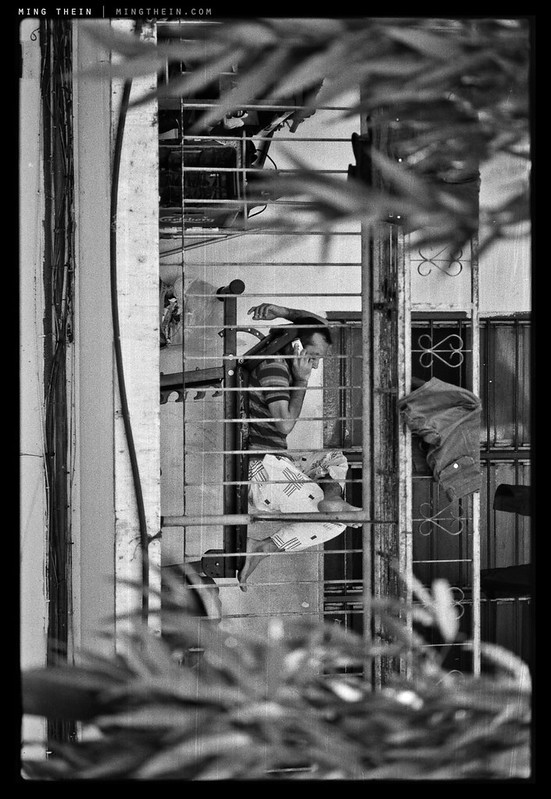
This brings me to the second problem: what is objective? How does one deliver an objective critique? Hell, what do you even look for in the first place? How do you set a benchmark and what do you compare it to? The aim of this article is to cover these bases, and provide both a structured simplified assessment/ critique framework. Its usefulness of course goes beyond the Flickr pool comments: it’s also a quick way for you to assess your own images on the fly. (The challenge there is of course stepping out away from the personal attachment that every photographer has to their photos – they’re like our children – and learning the art of detachment.)

First up, if you haven’t already read my article on What Makes An Outstanding Image, I highly recommend you do so first and then come back here afterwards. Part one is here, and part two is here. (Both open as links in new windows.)

Boiling everything down, there are only four things I look for in every image. The first three are fundamentals. The last one is a bonus. (In fact, I’ve said these things so many times at so many events and workshops that I wouldn’t be surprised if somebody decides to engrave them on my tombstone.)

1. Light
Every photograph needs light; no light, no photograph. Fantastic light can transform the most pedestrian subjects, and vice versa. I’m looking for light that isolates the subject, that shows off its textures and physical form and lines in a (preferably) unique way; a color temperature that’s either perfectly natural and accurate and puts you into the scene, or a color temperature that’s artfully shifted to elicit an emotional response in the viewer in a cinematic sense. The subject doesn’t have to be the brightest thing in the frame, but it has to be the most obvious.

2. Subject
Subsequent items get more nebulous and harder to define. In short, the subject is what the image is about. It can be a small part of the frame, or the entire frame itself; it can also be the idea. Basically: a viewer should be able to look at the image and know straight away what the focus is; who is the protagonist in the story? Timing is also a key element that affects both subject and composition – both positioning and expression. Abstracts are a little more difficult to assess, because they may not have a focus per se. In such cases, is the frame sufficiently well abstracted that you lose the sense of relativity and scale that provides the normal visual cues for identification of an object?

3. Composition
I like to think of composition as the way in which the elements within a frame relate to each other. It’s to do with positioning, balance and context; are the secondary subject positioned in such a way as to give priority to and not take away focus from the primary subject? Next, do the secondary subjects enhance the story, or take away from it? How are they relevant to the main subject? Would the image be stronger with or without them in the frame? Are any of them distracting? Next is balance; this is even tougher to define and probably should be the subject of an entire article in itself. In short, it isn’t symmetry, but it is about geometry. Are there things that make one side of the frame look heavier than the other? It isn’t a problem, but something that draws the eye in a particular direction – leading lines, for example – should do so in a way that supports the primary subject. Natural frames can also be used to help isolate the primary subject. You’ve also got to look for things that are distracting and not meant to be in the composition – edge and border intrusions are perhaps the most common example of this.

4. Bonus: the idea.
This is the hardest to define of them all. In its most concise form, does the viewer share the vision the photographer had in mind when he or she pressed the shutter? Note: it’s tough to communicate an idea if there wasn’t one to begin with, or it wasn’t well-formed in the photographer’s own mind. In fact, this is perhaps the toughest part in making a good photograph: you need to know what the final image should look like even before you take the shot. The best photographers do this consciously all the time; I know that if I can’t get what I want, I usually won’t bother taking out the camera. A lot of the time it’s because I don’t have control over the light, or because it’s not being cooperative; sometimes it’s because of technical limitations – I physically can’t get close enough, or I’m not carrying the right lenses to get the perspective I want, for instance.

On this basis, an image that scores a 2 is reasonably strong, but maybe lacking in one or two areas. Grade 3 images are excellent, and grade 4s are outstanding. Of course, there’s more to it than that, but at least you could say something along the lines of ‘3, composition is a bit loose around the edges of the frame’ and that would be implicit that the rest of the aspects of the photograph are strong. In the reader Flickr pool, I don’t admit anything less than a 2.5, or a 2 if the idea is very strong. There are a good number of 3s, but very few 4s. It might be an interesting exercise for you to go through the pool of images again to see what qualifies.

Of course, this is all relative; and that’s why it’s important to view and consciously assess as many images as possible to get an idea of what works and what doesn’t; that was one of the reasons to set up the flickr pool. There’s a lot to be learned from looking carefully at famous images: there’s a reason why they work, even if some aspects of the capture may be weak. And it’s almost always because ‘the idea’ is extremely strong, to the point of overshadowing and dominating the any potential shortcomings. (Robert Capa’s Normandy Landing series is a fantastic example of this).

Here’s the proposal – if you’re going to start a thread in the Flickr group putting your image up for critique, then give it a number (rating) – objectively, of course – and talk about what you think is missing, or what you think is exceptionally strong. That provides a good basis to begin discussion.

Even if you don’t put your images up for critique, keeping this framework in mind when viewing and assessing your own images can help immensely: you will land up with a much stronger raw material, and more times to postprocess them – which of course in turn results in an even stronger final set of images. Iterating this process has two positive consequences: firstly, you land up making ever stronger images, and not being tempted into keeping ‘not bad’ images; secondly, you will find you have a heightened cognisance of your own artistic style. This is of course a good thing – and one that’s extremely difficult to achieve. In the end, the greeks had it right: know thyself. MT

____________

Visit our Teaching Store to up your photographic game – including Photoshop Workflow DVDs and customized Email School of Photography; or go mobile with the Photography Compendium for iPad. You can also get your gear from B&H and Amazon. Prices are the same as normal, however a small portion of your purchase value is referred back to me. Thanks!

Don’t forget to like us on Facebook and join the reader Flickr group!

appstorebadge

Images and content copyright Ming Thein | mingthein.com 2012 onwards. All rights reserved