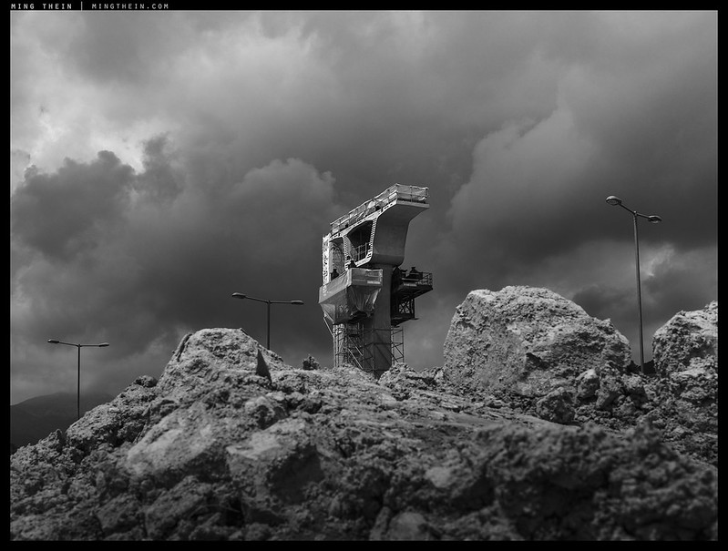
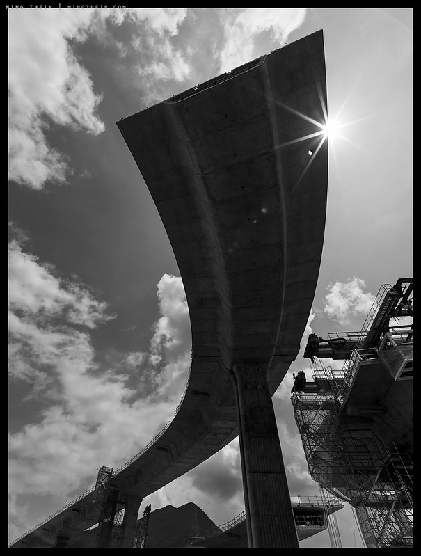
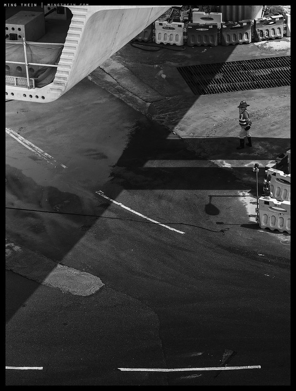
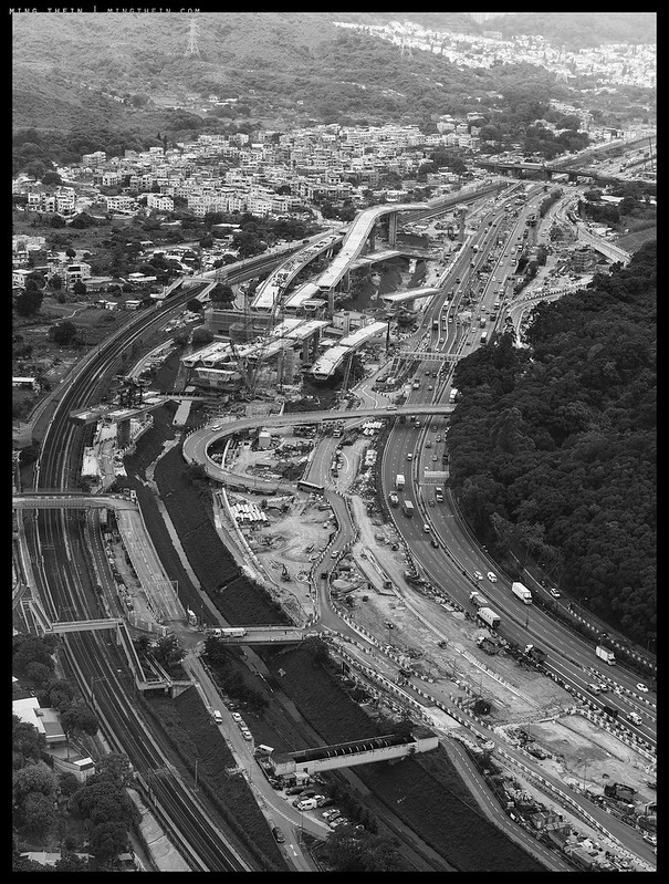
My biggest challenge with projects and assignments of this scale is always adequately capturing them and conveying that scale – too wide or too far away, and you lose identifiable detail; too close and you don’t get a feeling for the immensity. There’s no way you can keep an identifiable and isolated human figure in the shot and show the whole extent of a 3km+ long project; even with a silly-sized print from a camera of extremely high resolution. This is where the narrative comes into strength, but also poses challenges. It’s much easier to give a complete impression of something by detailing critical parts; however, with the narrative in mind, you’ll find that there are certain ‘filler’ images required for continuity that might not necessarily stand on their own – and similarly, certain hero shots just don’t flow with the rest of the sequence. This of course leads to a very focused curation, which may well change massively should the intended message also change.
I certainly faced that challenge with putting together this story – there were bits missing that I simply didn’t have because they weren’t taking place on the times I was there, and there are other bits that I had too much of because I was making the most of the available opportunities. Think of it then as a work in progress overview…MT
Images from the Lintong project reproduced with kind permission from Chun Wo Development Holdings.
These images were shot with a Hasselblad H6D-50c, H5D-50c, 24, 35-90 and 150mm lenses, and post processed with the Monochrome Masterclass workflow.

__________________
More info on Hasselblad cameras and lenses can be found here.
__________________
Visit the Teaching Store to up your photographic game – including workshop and Photoshop Workflow videos and the customized Email School of Photography. You can also support the site by purchasing from B&H and Amazon – thanks!
We are also on Facebook and there is a curated reader Flickr pool.
Images and content copyright Ming Thein | mingthein.com 2012 onwards. All rights reserved


Ming,
Marvelous. And the Idea of Man seems to have crept into a couple of shots. I guess it could be stuck in your subconscious as your work.
R/Carlos
I think it might be. Tends to happen when you work on a project for that length of time 🙂
Impressive! I like post apocalyptic theme but the first picture (against dark clouds) gives a totally opposite feeling. A feeling of hope and things to come. How do you manage to infuse the positive feeling in your picture, I don’t know. I just like it. 🙂
Thanks – just enough light to suggest the end of the tunnel? 😉
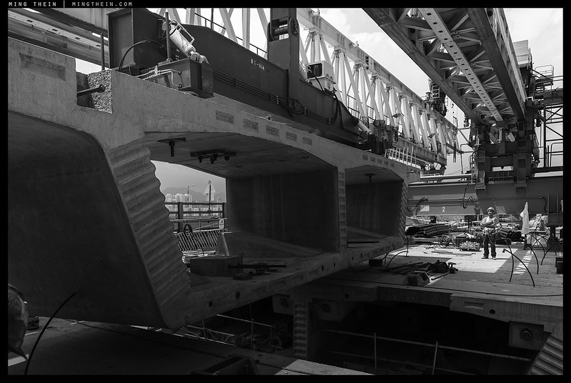
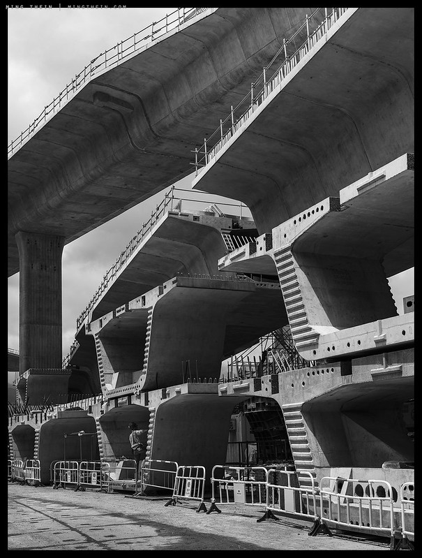
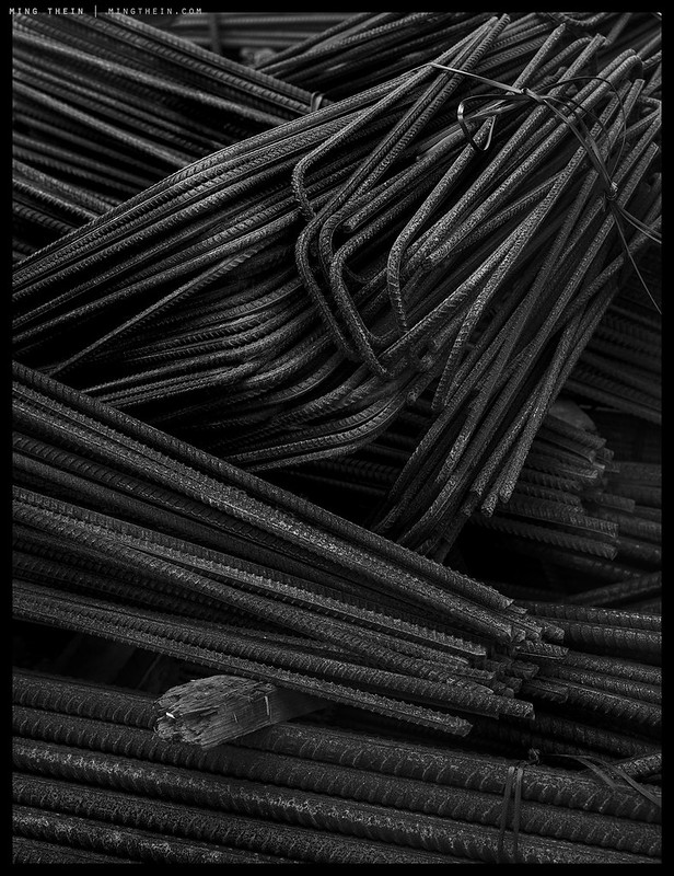
Ming — These are impressive images — you seem to do an especially astute job in capturing these “industrial scale” projects. Too, the monochrome processing is well done over a wide range of tonalities, bringing much to each image. Too often, photographers think monochrome processing is about extreme contrast but you clearly show us differently. Even low key images such as the image of rebar is crisp and full of texture. Lastly, it’s good to see that civil engineers beyond those at CalTrans (California Department of Transportation) like to work with precast, pre-stressed concrete construction. Thanks for you post. Frank
Thanks Frank. I believe the vast majority of the big scale civil projects these days are done with precast simply because it’s faster…
Mind-boggling from start to finish! Well done!!
Thanks!
Hi Ming, I think these photos are great! Having watched your Monochrome Masterclass videos a few times and Making Outstanding images 1-3 I think these photos here do a great job at portraying what makes an outstanding image. Without the distraction of colour, the elements of light, selective contrast, composition and making sure the subject stands out just enough to know it’s the subject is really well displayed here.
And to follow up up on a previous post about people saying your images don’t have soul – the only thing I would say is that the neutral colour profiles you tend to shoot with maybe can be a bit plain to some viewers who perhaps like a certain look applied. Not necessarily a filter but I’ve noticed there are images or styles I like where it could have slightly faded and crushed the blacks and pushed certain colours around and I enjoy looking at the photo. I’ve noticed some recent shots of yours have a very artistic feel to them and probably would be much more appreciated on a large print hanging on a wall.
If you feel so inclined, I’d enjoy seeing a series from you with some cinematic/filmic colour grading and a bit removed from the neutral colour style you tend to go with. But again, I think these photos here show off all the elements of an outstanding image. Great work.
Application of that ‘certain look’ doesn’t work with all subjects or clients, nor does it accurately portray the intention of the artist most of the time. I find that filters of that kind are far too distracting and land up simply taking attention away from the subject and composition.
As for output sizes – well, let’s say I don’t shoot for web size…
“If you feel so inclined, I’d enjoy seeing a series from you with some cinematic/filmic colour grading and a bit removed from the neutral colour style you tend to go with. “
Done, many years ago: have you seen the archives?
You have to work in the style that suits you and your subject best, not the audience – unless the audience isn’t a contributing factor to supporting your work or your ability to do that work. Creativity is unsustainable otherwise.
Thanks Ming, I have seen those previous posts and I like what you did. I actually agree with you in terms of not liking the use of filters. I’ve tried it myself and prefer to process based on the subject. Perhaps if I was shooting a series or a project and I knew a certain filter or colour profile would work and I took that into account when shooting but otherwise they end up driving me crazy.
It was more an observation as to why I think some people’s photos might be identifiable in terms of a look even though they don’t have a clear subject or good composition. I think your work is clearly identifiable but also needs an understanding of what makes a good image to be fully appreciated. There are some photos I see which are purely eye candy in terms of the colours/tones but there’s nothing thought provoking or story telling about it.
Very fine work here Ming, perhaps more emotional than usual – been following your site for a long time now.
Thanks Ned. Curious though – why emotional, given the inanimate nature of the subject and fairly flat presentation?
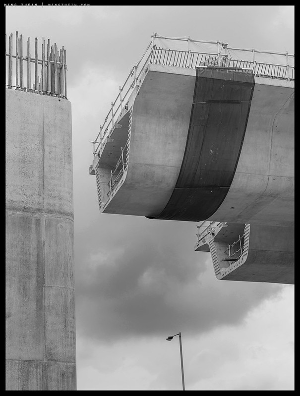
Wow!! Massive….certainly on the way ! I think b n w add to the story.
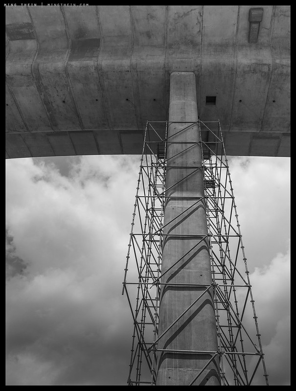
It looks totally scary that those spans are being supported by that one column.
Balance, and they’ll be connected up eventually…
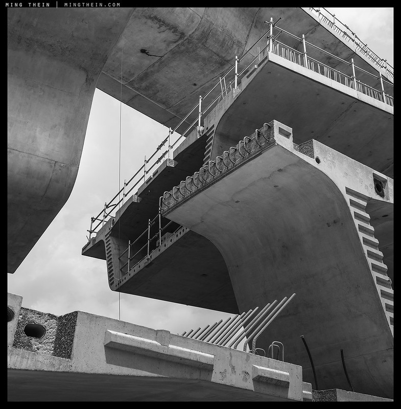
Wonderful images Ming! These shapes and textures work so well in black and white.
Thanks.
Hi Ming, Reminds me of my dad taking me to see the huge Avonmouth Bridge footings being laid and then latterly as a grown up photographing the chaos of the Severn Crossing construction with Ilford XP2 and my Pentax MX. Epic work. Tim
Thanks Tim.
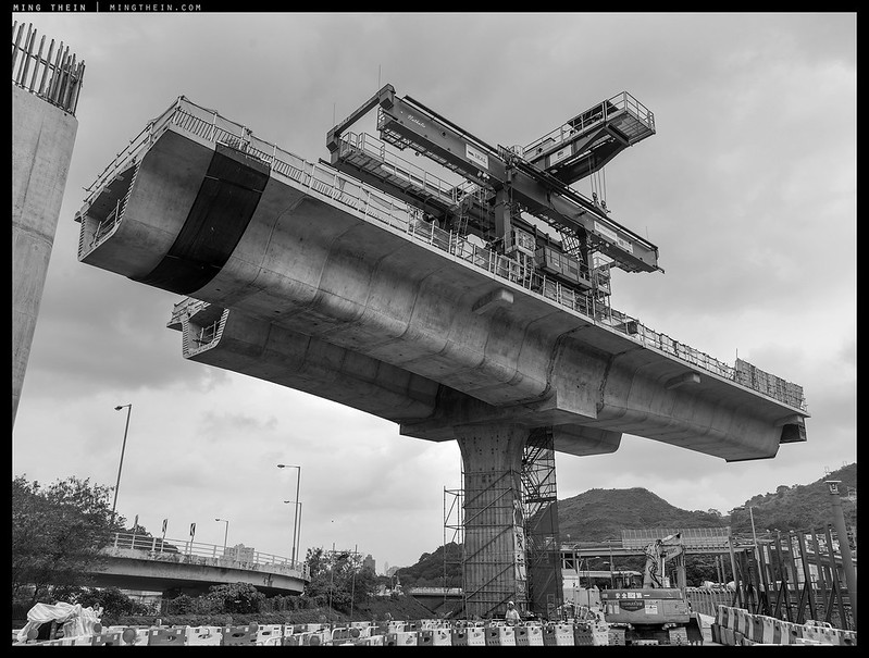
Interesting depth of field on the first pic. Almost seems impossible to my eyes, but then I don’t use medium format.
The foreground is much closer than the background.
Extraordinary! There’s a lot to be said for literal photography.
Sometimes it works, yes.
First and fifth are my favorites. Would love in the first one a human figure with outstretched arms decrying the havock cause to mother earth. By the way what the location of this wonderful landscape enrichment, outskirts of KL?
There*s an interesting statement you made- There’s no way you can keep an identifiable and isolated human figure in the shot and show the whole extent of a 3km+ long project; even with a silly-sized print from a camera of extremely high resolution.
There must be a way to calculate the combination of maximum a distance and sensor resolution in order to render a recognisable human silhuette meaning it has a head, arms and legs and is not a running baboon. 🙂
“Would love in the first one a human figure with outstretched arms decrying the havock cause to mother earth.”
Um, I don’t think that would have fit into the client brief somehow.
Location: Hong Kong.
You are nothing if not prolific and consistent .
With the eye of an artist and the soul of a civil engineer .
Great work , Ming Thein !
Thanks Rosa, it’s the subject doing the talking here 🙂
Hi Ming, this is my first post n hopefully not my last. 🙂
Been ‘observing on your site for a while; gotta love your images and these B&W’s are exceptional. It’s prompted me to have a peak at your ‘Monochrome Masterclass’ training video.
Thanks, enjoy the video!
Impressive! Both the construction and your photos.
Thank you.
If this is a work in progress, Ming, I look forward to seeing what you capture next. Fabulous imagery. R.
Thanks – yes, work in progress insofar as the actual underlying construction is a multiyear endeavour…
Aaaaahhhh, your “work” photos are killers. great stuff.love the second to last , remember balance …:-) …otherworldly …excellent…thanks Ming. going by slow train into Bangkok from the north one can follow some overpass work and i took some shots out the winda too…..
Thanks Richard.
OMG – well, one thing’s for sure & for certain – you’ve captured & conveyed the enormity of project brilliantly, Ming !!!
Thanks!
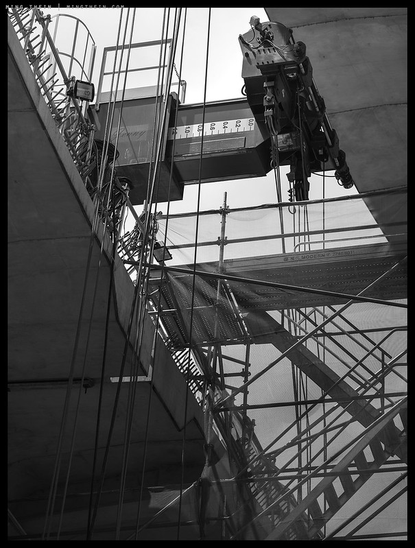
It’s not always easy to move as freely around a construction site as you might like – and there’s the element of danger. I wonder if you’re ever tempted to risk that extra level of scaffold/crane/ladder for the sake of a better angle? (I know I’ve ended up in a few rivers over the years for just that reason). As always – thanks for the images.
Yes, I actually do it pretty often – especially with the underground stuff.
Salgado’s gold mine images come to mind as images of grand scale projects that emphasize the scale of humanity. There individuals stands out only by their peculiar packing order. You don’t see individuals per se but you instantly recognize the organic pattern. This pattern is not common in a modern more mechanized construction project. It would be interesting, at least to me, to experiment with selective saturation although I realize I am perilously close to committing heresy. Wonderful images as always.
Actually, the main thing that strikes you when looking at a modern project is ‘where are all the people?’ Much, much less labor is required than ever before to undertake ever larger endeavours. Often we have to time the shoots when there are more people than normal (!) on a certain part of the site…and even then it’s sparsely populated.
Love the lines and shapes. Excellent!
Thanks!
You’re welcome