
Sophie, the mime: the image resonates and means something to me because I have an emotional connection to the subject, to the setting, and I know the narrative story on either side of the frame. It may resonate with you because you happen to like children, or because the facial emotion is a strong an unambiguous one, or you like monochrome documentary portraiture, or for some other reason. But if it were executed differently, you may feel different about it – but not necessarily or consciously know why. It is up to the photographer to control the unconscious influences in such a way that at least their intended communication is fulfilled, but not in a way that draws attention to itself (and thus breaks that illusion).
After the huge amount of very interesting and thoughtful discussion that ensued in the comments – thank you for your thoughts, everybody – and a few days of settling time, I couldn’t leave the previous article on soul hanging inconclusively. There are few very interesting observations made, higher conclusions that one can draw from the responses here, and further logical leaps from contemplation of one’s own work and raison d’être. Firstly, a clarification though: I’m not looking for a magic formula to ‘inject soul’ into my own work, and I’ll explain why later. I was and am simply seeking to understand why certain images move certain people in a certain way – and if there’s anything one can use there to make a stronger image, given the choice, and providing of course it fits one’s own idea.
An image is not about the subject.
There are several filters of interpretation that take place here: the image in its objective, singular form is the photographer’s interpretation of the scene and subject; they have isolated the elements that are of interest to them and hopefully discarded the rest or presented them in a way that is contextual and not conflicting. What is seen in the image is up to the audience – you cannot notice something that doesn’t catch your attention in some way, and whilst there’s the whole psychological logic behind subject isolation methods, we cannot discard individual biases. It is very, very difficult – almost impossible – to look at an object purely impassively and think of it solely as a collection of shapes and colors and geometries. Ultimately: the audience sees what their subconscious is geared to seeing, which is a bias that’s a function of their experiences, preferences and personality. The number of possible interpretations for ‘only the clouds are truly free’ was far more than I expected – struggle of migration was my intention; imprisonment and mental illness came out of it (and not something I’d ever envisioned).
The subject bias can often dominate the image.
Our brains pattern recognise: a face is a face not a collection of arcs and gradients. We know what the object is – or we think we know, because we project our imagined or experienced qualities of similar objects in reality on what we see in the image. It’s Magritte’s ‘Treachery of images’ all over again: what we are seeing in the photograph is an implicit representation of the object, not the object itself. A Ferrari might look fast, and we expect it to bolt at the slightest push of the pedal and we can almost imagine that adrenaline rush, but there’s no way to tell from the photo it’s a static display model with no engine. Similarly, the quotidian is often dismissed out of hand as a foregone conclusion. Who really stops to look at a traffic cone or garbage can?
We subconsciously project ourselves and our emotions.
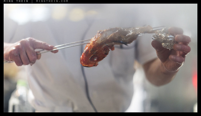
Take that hypothetical face again: even without knowing the actual person or circumstances, we read or project expression and thus emotion on that face, affected by our experience and likely further biased by our own personal emotions at the time of viewing the image. That is also impossible to decouple: we project ourselves into the image, and if the return is incompatible or incomprehensible, there’s no emotional engagement. And if there’s no emotional engagement, we feel nothing, and the image is dismissed. It doesn’t ‘work’ for us. Ergo: no soul. Worse still, if there are no human elements – and our own experience or imagination cannot connect the dots – we can’t visualise ourselves in the place and scene and what emotions we might experience there – it’s a blank feeling, and once again the image is cold, devoid of emotion. Interpretation is cultural, too: take the fish image in the previous article. A lot of people got hungry, but equally many felt revulsion; fish are served with heads in Asia as a means to attest species and freshness. In the west, it’s merely a carcass.
Emotion runs both ways.
Just as many have identified ‘soul’ as having a sorrowful or melancholy or negative or sad component, and we want people to like our work – it’s important not to write off the other half of the continuum. To feel strongly about something – love or hate – means that it has touched you in some way; you either resonate with it or against it. And a strong dislike or revulsion is not necessarily a bad thing. Happiness is not preferable to sadness or vice versa; it’s just the opposite emotion. But it is an emotion nevertheless. The worst case would be if an image evokes nothing at all: you remember something if you hate it or love it, but not if you were completely indifferent. I’m not sure a feeling of isolation or coldness is necessarily indifference, either.
Thought is emotion, too, and reflective of the audience.
We do not involuntarily think about things we don’t care about – and given image viewing is very much a voluntary action rather than a compulsive one, we have to think that we feel cold about it or don’t understand it (after trying to) or that it doesn’t resonate: there is still emotion here, but the opposite of what we expected to find. Just because we feel no empathy with the presentation, subjects, emotions or arrangement – actually says less about the photograph and the photographer and more about the audience. Think of it as two very specific beams trying to overlap: the more focused and sharper the photographer’s interpretation, the tighter but more intense the beam is going to be. It’s going to hit less of the audience, but the few it does will be lit much brighter. Is that good or bad? I personally would rather really resonating with a few than generating a few more social media likes.
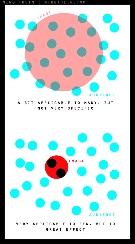
Soul theory in graphic dots: an image (upper, pale red) can affect a large number of people a bit or a few but very strongly (lower, intense red) – it can’t do both, simply because it’s not possible for an image to contain that much information (the density of the red). Given the choice, I’d rather have the bottom scenario: if you make an image that’s only remembered by a few, but it sticks with them forever rather than a transient image that’s seen by many but soon forgotten – I think that’s much closer to my personal philosophy of chasing the last percent. But some may prefer the former; there are reasons for either.
The only way to achieve this collimation/coherence is by trying to more accurately reflect yourself.
The photograph is a reflection of the creator’s interpretation of the scene/subject. Firstly, the creator must feel something about the subject or there is nothing at all to reflect. Secondly, without knowing and being certain of their own feelings – that reflection is never going to be defined and clear. Thirdly, without instinctive command of the right language – think of this as the technical aspects of camera operation, post processing, and compositional psychology – they’re never going to be able to lucidly express their point of view. Tools are not an end pursuit, they’re merely enablers for vision. I can’t make that clear enough: I only pursue tools and skills to be able to better express myself, and focus that beam. One has to be able to do the mechanical motions as a reflex, intuitive action to be able to concentrate on defining and translating the idea.
Imperfection, perfection, spontaneity, ambiguity, emotion – are not in conflict.
I think the key missing word here is deliberation: perfection and cleanliness and order and precision are not end goals, they’re a manifestation of a very deliberate way of shooting and translating one’s own ideas. Without that control, a successful image – even by assessment of the creator – is reduced to nothing more than a game of chance. There is no point in doing this; it’s like the monkeys at typewriters eventually producing Shakespeare. If you have the skills to write, compose a narrative and find the right audience, you can save yourself quite a lot of effort (and wasted resources); spewing random words is unlikely to successfully communicate your thoughts. At the same time, successful communication is also dependent on your audience understanding the language you speak: this represents the common visual language we need to understand as photographers. Except, unlike language, there are often more mismatches and incomplete blanks than commonalities. Spontaneity requires the intuition I described in the previous paragraph: you might see it, but if you have to think about how to capture it, you’re going to miss the shot. Ambiguity can be deliberate, too: choose to expose to reveal only the intended portions of your frame, or to partially hide things to create the ability to allow the audience’s imagination latitude to fill in the (literal) blanks.
Experience > Personality > Biases > Self-identification > Projection of emotion > Empathy > SOUL
This is the strongest conclusion or clearest definition I can arrive at: ‘soul’ happens when something in the image – regardless of the intention of the creator – resonates with the audience and generates an emotion. We as creator have no control over how or in whom that emotion is triggered: each viewer is different, and has different biases, preferences and passions. There may be some common things everybody responds to – strong facial emotions etc. – but this is an immediate and instinctive empathetic reaction that may be more involuntary than deliberate. My personal belief is that a response has to be deliberate and thoughtful to be lasting. Many will probably disagree, but if an image yields all completely at immediate glance and does not reward viewing – then there’s no reason to revisit or contemplate it, which in turn does not encourage memory.
I personally have no intention of trying to second guess what those emotional triggers are for my audience – doing so will only result in an image that isn’t even self-consistent or that works for me. It only makes sense to make images that work for you – in this way, the integrity of the idea is preserved, and if it resonates with an audience, it does so with force. I suspect a good portion of classical ‘great’ art is like this too: it was not understood in its day because it only rewarded the small number of people who bothered to view it objectively and invest some time to understand; some of those people may have been influential, and in turn shaped opinions and preferences of a much wider (and more uncertain) audience. In short: we make art because we have to, and because it resonates with us, the creator. The rest is a bonus. MT
__________________
Visit the Teaching Store to up your photographic game – including workshop and Photoshop Workflow videos and the customized Email School of Photography. You can also support the site by purchasing from B&H and Amazon – thanks!
We are also on Facebook and there is a curated reader Flickr pool.
Images and content copyright Ming Thein | mingthein.com 2012 onwards. All rights reserved


This is a very interesting discussion; thank you for your thought-provoking essays.. I have looked through your initial list of examples and my view on what is the most soulful picture in your set and my views have changed. Despite being initially repulsed by it, the picture of the fish is now at the top of my list. Here is an attempt to explain why.
A fish with a colourful red head is threaded onto cooking skewers that are held by somebody who seems to be the cook that just finished grilling the creature. We can see a white, dead eye in the fish’s head, that appears to be the focus of the photograph. The closely controlled depth of field makes the focus more prominent, and the haze of smoke provides an added feeling of depth. The cook’s left hand appears to pull away a chunk of the body, which at this stage has disintegrated quite significantly. Strangely, even at this stage, we can see the curved shape of the body, a memory of the swimming movement.
I do not consider this to be an attractive picture. As Ming points out, in the East fish are cooked with the head to prove freshness and to help identify the species. As a westerner, I prefer to pretend that my fish comes in the form of fillets, which is a standard cultural disconnect where I live. When I first looked through Ming’s list of examples, the fish picture was fairly low as a candidate for a photograph that has soul. However, looking closer, there is much in the photograph that merits thinking about.
First, the fish. While the head has retained its attractive red colour, and the texture is still visible and lifelike, the dead white eye creates an immediate and disturbing dissonance. Behind the head, the body has clearly been grilled and all living colour has disappeared; somewhere around here the fish undergoes a transmutation from a once living creature to somebody’s snack. Secondly, the skewers have fixed the fish with a deadly finality that suggests violence, and it is clear that there is no escape from their grip. Finally, the headless body of the cook dwarfes the remnants of the fish, representing superior power that has determined this creature’s destiny.
From these three main parts one can weave a story of life and death, of the eternal struggle against overwhelming force in a battle that we all are destined to lose, and from which there is no escape.
Thanks for the interesting interpretation – I can’t claim to have seen that consciously (who knows about subconsciously) but yes, that’s life in a nutshell… 🙂
I think the fact that you photography luxury items and deal with many luxury items/cameras/lenses etc. You’re now a “Hasselblad Ambassador”. It translates directly into your work. Which is also sterile. Lacking emotion. You present what is in front of you well. Not a bad thing. Again, subjective. You are very gifted when it comes to process. You don’t appear to struggle in life and that in a sense translates to your images. Some people just have “it”, and others do not. That “it” is the emotional beat to realize and capture moments in front of them in a way that can churn stomachs. Positively or negatively. All depends on that moment in time and being there. In it.
“You don’t appear to struggle in life and that in a sense translates to your images”
Sorry, but I think that’s both being presumptuous and overreaching, as is assuming that I only photograph luxury goods and somehow it’s all easy. I don’t see how looking incompetent and struggling is attractive to anybody. I photograph just as much industrial documentary where I’m lugging 25kg of gear in tropical heat for 14 hours a day across huge dirty sites – that’s not luxurious, easy or glamorous. I suppose it’s the same reason most people only seem to think I write reviews for a living (if only those economics worked!) – we only notice what we want to see…
I never implied that you never struggle. We all have our own struggles/battles. But what you show and how you portray your work give the appearance that things aren’t particularly terrible for you. It wasn’t a personal attack. It’s not right or wrong, it just is. You seem to be taking it personally. That certainly was not my intention. All I’m saying is your work/focus to me, doesn’t capture the emotion… the intangibility of looking into the absolute soul of a moment or a situation I see in other photographers work. You do however take nice photographs. Which is and has been completely fine you have found your niche which is a lot more than most photographers out there can say. The important take away from this is the fact that you’re always self assessing your own work. In order to make progress in your own work/style, this I feel is of the utmost importance. So you keep doing what you’re doing. It’s all good stuff.
It seems that you think that to have a terrible life or to experience terrible things is a must in order to produce art. Bach (music) and Rubens (painting) had good, prosperous lifes and the produced first class art.
I think you certainly need to experience strong emotion to make good art – there has to be some feeling to translate to begin with – but that could well be positive or negative…
You need true, raw… life experience(s) to see and feel the intangible in order to be in tune with capturing images that conjure that emotional response from the viewer. The ability to read people and situations and have an almost uncanny sense of what’s coming next to be able to document it “properly”. Sometimes people get lucky here and there.
Do you ever wonder why most musicians (not all…) have an amazing debut album, and then the ones that follow throughout their career are absolute rubbish? There’s a reason for that. It’s called being too comfortable. Eventually the silver spoon finds its way to the mouth. Losing that sense of struggle… that human beat. Some never have it, others have it and then lose it, and those very few hold onto it until their passing.
A very recent article by Ami Vitale “Why Photos Should Be ‘So Much More Than Beautiful'” (August 9) doesn’t add a great deal more to the discussion but is perhaps worth a read:
http://www.nationalgeographic.com/photography/proof/2016/08/ami-vitale-photographer-q-a.html
An excerpt:
“I see lots of technically beautiful images. They are perfect in every way, but for me, it has to be so much more than just beautiful. The image needs to have soul. It needs to make me think and have meaning behind it. I also look at how images work together. It’s not just one perfect photograph that matters. Visual storytelling is different from making a single, “perfect” image. The images must work together to create an understanding of a place and culture.”
Thanks – hadn’t seen that. I read that as curation again: a single image is very different from intent to create/illustrate a story…
Very interesting stuff here. I suspect asking photographers to be able to explain themselves is probably pointless. Harry Callahan, whom I regard as a very great photographer (and unrecognized pioneer of color) apparently liked to talk about gear and darkroom stuff, but not aesthetics.
Susan Sontag’s old criticism is, I think, very thought provoking, although she’s often wrong, she’s never not interesting. She did formulate a warning. In a letter to her NYRB editor, Bob Silvers, she said, “I really didn’t know what I was getting myself into: writing about photography is like writing about the world.” (Cruel irony that her cancer agonies became grist for Liebowitz’s heartless gaze.)
I’m much more comfortable discussing music (playing the piano for 63 years) than the visual arts (took up photography because I’m an ignoramus), but I’ve always found it easier to learn from mediocrity than excellence, which is transcendental and somehow inexplicable. But if you study near misses, the absence of the excellence casts a shadow of what might have been. So you can get some hints, perhaps.
I realize that it’s churlish of me, but I do wish this discussion has been based on something more interesting than “soul,” which tends to bleed into sentimentality, prettiness or grotesquerie.
Ming, since you are kind of asking for advice, I think the references to Irving Penn are very relevant. You are a brilliant product photographer. It’s a very honorable trade and the gateway to some great work. Maybe your should forgo soulfulness for sprezzatura for a while. Or, at least in my opinion, the sublime is rarely soulful – it’s more clear-eyed than that.
“I suspect asking photographers to be able to explain themselves is probably pointless.”
Well, I’d like to think not – but sometimes I think I talk so much people accuse me of being soulless 😛
“…writing about photography is like writing about the world”
Yes, because photography is – has to be – a reflection of the world, and our interpretation of it. We can’t photograph something that doesn’t physically exist somehow.
“I do wish this discussion has been based on something more interesting than “soul,” which tends to bleed into sentimentality, prettiness or grotesquerie.”
There are other articles that aren’t that, but somehow they failed to capture the audience’s interest as much (gear of course excepted). Who knows why?
“…at least in my opinion, the sublime is rarely soulful – it’s more clear-eyed than that.”
This is an interesting comment…
At last!
And so we find our hero approaching the the bewildering terrain of Formalism, Post-modernism and Post-Structuralism.
Qingyuan declared that there were three stages in his understanding of the dharma: the first stage, seeing mountain as mountain and water as water; the second stage, seeing mountain not as mountain and water not as water; and the third stage, seeing mountain still as mountain and water still as water.
Forget the terrain, how’s the light? 😛
The light?… like reading a map by lightning — brief but brilliant illumination with a great likelihood of mis-direction
I think I’ll set a long exposure and stick to my internal compass 🙂
Long exposures only keep static objects sharply focused… and how do you (and how often) calibrate your internal compass?
Okay, we’re so deep in metaphor at this point I think I’ve lost you…
“My critics are always fond of saying my images are too cold, too precise, too unemotional, too lacking in soul.”
“…I’m probably the wrong person to write about this topic, but that’s also precisely why I need to.”
“My basic premise is that soul in an image is related to emotion, and the evoking of an emotion in the audience by the photographer.”
Being the polite fellow you seem to be, compelling your critics to clarify their terms isn’t an option. Had you been so impolite as to demand that they elucidate, you might find some pretty fuzzy thinking (see my previous link to becoming a Soul Artist). My suggestion was that your investigation into the evocation of emotion in the audience by the artist will lead you into the realm of Art Theory. And that realm is vast and bewildering. Lots of profound ideas have been developed over centuries (flashes of brilliant illumination) and each is so persuasive as be immediately compelling — but ultimately leading to a derivative ‘product’ i.e mis-direction. Familiarity with such theories involves thinking about perception, cognition, psychology, politics… maybe even a visit with Dr Chomsky (Semiotics). By ‘long exposure’ I hope you meant that in the coming decades, as you learn more from your investigations, your concept of soulfulness will expand — but there is the chance that over that period you might come to a very different place than where you expected to be: rejection of Photography as a Fine Art; the superficiality of images in general; the supremacy of the word — perhaps even a Marxist frame of mind — who knows. Having a ‘personal compass’, by which I gather you mean an intuitive sense or a sense of direction based on, say, pragmatism or reason (at best) is risky: Art theory and history will give you a map — of what has been done and thought, what is being done and thought and what the future might hold. An uncalibrated compass might lead you to a remote backwater… rather than to the Land of Saatchie.
Art Theory is not for the faint of heart or the casual image maker.
I agree with Martin Fritter’s comment: “You are a brilliant product photographer. It’s a very honorable trade and the gateway to some great work.” Steichen, HCB, Smith, Penn, Avedon… Annie L. — all commercial photographers — working for money and producing what has come to be known as Art. For that matter, the same can be said of Leonardo, Michelangelo, Reubens, Rembrandt.
Contradictions do not exist. Whenever you think you are facing a contradiction, check your premises. You will find that one of them is wrong.
Ayn Rand
Hi Ming
I do not know how to post the picture here but your comments were:
And this one definitely needs an explanation as to what’s going on – I see anger/sorrow/pain, but why? Nothing in the image explains that, and that’s a barrier we cannot cross without help from the artist (or presenter).
I think otherwise. One may not know the background in the photo but the pain/sorrow and emotions were well captured. The reader can then éxtrapolate’ his/her background/experience into the settings and identified with the people inside the image. Here-in lies the soul of the photo. The soul does not come from the photo itself but calls out the soul in you. Sorry I could not articulate my thoughts well.
I think we’re saying the same thing: the suggestion is provided by the image…the completion, by the audience. Emotional response isn’t 100% artist-only or audience-only…
Actually, I think this is a ‘breakthrough’ post. Not so much because of the post itself, but because of the commentary it’s sparked. Where else, on this barren waste of an Internet, will you find an artist so willing to set himself up in this way; to lay out the question, take the critical discussion on the chin and acknowledge the outcomes, in public.
I think this, itself, is a rarity much to be treasured. I cannot begin to put into words what I think about the subject, except only to venture that what works for me hopefully resonates with others. I continue to strive to make images that made me think, and my hope is those images will spark something in the viewer – for whatever reason. Sharing an image is, for me, like sharing a poem. There should be something ‘other’ than the literal. It should, in some sense, encapsulate an ‘essence’. Technical competence and visual ‘quality’ is a bonus.
Well, depends if you think I’m an artist, I guess 😉
I’m doing it for purely selfish reasons: to further my own understanding and knowledge. But to find so many people with a) interest b) erudite opinion is definitely quite heartening…
Ming, for what it’s worth, I think you’re an exceptionally gifted photographer. Contrary to what’s been suggested, you have formidable composition skills and consistently put together images that are very beautiful — but images I also find boring and not particularly intriguing to lo look at. It’s of course my personal view and you may well entertain the same feelings towards mine. A lot of this, I think has to do with WHAT you shoot, not HOW, and WHAT you focus on and want to bring out.
Since we’re talking about McCurry, I think it’s worth mentioning a recent article by Teju Cole in the NYT entitled “A Too-Perfect Picture:
I know of course that you and McCurry are very different kinds of photographers, but I think there is a valid point here about the relationship between excessive contrivedness and boring (soulless) images. Where McCurry is guilty of over-staging his pictures in over sentimentalised way, you are often seen as putting together images that are too clinically perfect. As an example of photos that transcend these shortcomings, Cole cites Raghubir Singh (a fantastic photographer, in my view too) whose strength lies (among other factors) in taking pictures that have an organic, spontaneous and authentic quality to them.
And here we are opposites, but the irony is the same: McCurry stages what is meant to be natural or spontaneous, and gets called for faking it. I don’t stage anything, and work with what the world presents: but I get called out for staging! 🙂
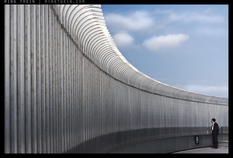
Not staging. Clinicity is the accusation. Keep in mind that an HDR might be perfectly ‘authentic’ too but it’s rendered in a way that makes it an unfaithful representation of reality. Take for instance your wall and clouds image. It doesn’t, at least to my eye, look like the real world — look being the operative word. It looks far too ordered and in being so lacks the vibrancy and organicness of what we perceive do be “real life”, [Apologies for the multiples ‘ness words! :-)]
Understood. To play devil’s advocate: what’s wrong with staging, or the implication of it? Gursky and Crewdson do the same…or would you consider their work also somewhat cold and clinical?
To some extent all photography is staged. The frame if you like is a stage. And to extend the point further, painting is of course staged and yet it too has the same power if not more to trigger emotions. But to answer you directly, there’s absolutely nothing wrong with staging if you can pull it off and create something that looks believably real, authentic, organic, and of the moment. Beyond technical and compositional excellence, that in a sense is what art is all about — it’s forgive me, the soul!! 🙂
Understood.
I wish I were intelligent and articulate enough to add something of value to this conversation and I hope I can.
Your work ethic, professionalism and technical skill are very good and you find the ability to create images in many varying situations however honestly I find your images conceptually and aesthetically unsophisticated. Their strengths come from their technical constructions which I think are one side to what makes great art. So I perceive them to be unbalanced images as they don’t stimulate my so called right brain.
I studied fine arts first majoring in painting and then switching to photography. I remember being in a still life painting class one day and the teacher came up to me while I was painting and said “Andrew you have good technical skill, your attempt is very good but you haven’t captured the essence of the subject.” Then he gestured to another students work and I knew what he meant as she had created something that had a life of it’s own, something that stood apart from the subject, it wasn’t just an attempt to copy or record the reality. Maybe painting and photography are two different mediums but to they still require the “creator” to respond to a subject in a way that then informs their choices as to how to interpret on to their medium of choice what they have experienced.
I believe people who have a strongly developed sense of aesthetics have the ability to create images with what you would call “soul” but not always necessarily. It’s a skill that can be developed but some just have that innate ability to create images which captivate an audience and that are artistically and conceptually sophisticated, stimulating and engaging. Those images add something of value to life rather than contributing to the over abundance of mundane and banal images suitable for advertising and corporate catalogues.
There are no absolutes here, so every opinion is equally valid so long as there are some reasons behind it 🙂
Teach me something, then. What would be your interpretation of balance? Can you give some examples? How about sophistication?
I make two kinds of images: the kind I want, and the kind the clients pay for. If the latter falls into the “mundane and banal images suitable for advertising and corporate catalogues” then – well, we have to earn a living somehow…
I guess Andrew’s talking about great art — the kind you, he and I all aspire to create. The stuff of Salgado, HCB, Maier … . it’s worth pointing out that even when you look through the works of the “great photography” there are actually a lot of images that I consider mediocre or I should say do nothing for me. Truth is soulful images are a rarity even when it comes to grandees of the photographic world. Fame, reputation, mystique and money often cloud our judgement.
“Fame, reputation, mystique and money often cloud our judgement.”
I wonder how much of what we perceive as greatness is actually jus going along with somebody else’s judgement because…everybody else is doing it, and we don’t know any better…
I will do my best … I can appreciate technical sophistication and excellence and many creative people lack this strength, for me however it only goes so far.
I think image makers who come to mind that create work which has a balance of both technical skill but perhaps a stronger conceptual sophistication (you could say this work might lean too much towards being overly concerned with ideas rather than being engaging for a wider audience) would be Hiroshi Sugimoto, Stephen Shore, Andreas Gursky, Bernd and Hiller Becher, Philip Lorca Di Corcia and a photographer that not many people understand, appreciate or ‘get’ but is a powerhouse in the world of conceptual photography – Jeff Wall. There are many more but these are the photographers who have affected me deeply. I would probably call them the post-modern photographers and are some of the originators of many of the trends you see in contemporary photography circles and by extension in popular and fashion culture. They area able to reference art history and add to the conversations and concerns from that history in an intelligent and informed way.
Sorry I don’t yet know how to attach image examples but if you like you google them and be able to get some good examples.
In terms of traditional photographic craft the first that comes to mind would be Steve McCurry probably because I love travel photography and also a lot less known would be Hideki Hamada whose joyful and fun photographs of his children are to my mind and sensibility refreshing.
I see. If you don’t understand the idea, that makes it unsophisticated. You make it clear why you’ve cited McCurry – “because I love travel photography” – but he would hardly be a good example of traditional craft given his ineptitude with photoshop (or indifference to quality control of outsourced production). All of the other names you’ve quoted with the exception of Hamada are popular names. Sorry, but the personal why is what I’m trying to understand here, not a list of people the art world endorses.
You asked for examples and I provided some that would be easily accessible. Not understanding an idea doesn’t make it unsophisticated quite the opposite actually. I find a lot of contemporary art difficult to understand but I can acknowledge that it can have strong conceptual merit and depth. McCurry is skilled at creating an aesthetically pleasing image but I wouldn’t consider his work conceptually sophisticated either. Creating an image with aesthetic richness is more important than photoshop or printing to me which are skills that can be learned or outsourced.
How are you supposed to create the aesthetic richness of you can’t control the final outcome? That’s like staying the choice of film doesn’t matter, or the perspective isn’t important, or exposure can be left to somebody else. I just don’t understand how this is possible, which makes me think I’m seriously missing something. But I’m not really seeing an explanation here, either – just a list that was vetted by somebody else. Again – please explain it to me; *why* do those artists emobody the qualities you describe? What specifically about their work makes you use them as examples? How does their work affect you emotionally?
This is interesting Andrew said this….I find your images conceptually and aesthetically unsophisticated….. the assumption is that he does understand them conceptually/idea wise but finds them wanting.
Looking at Andrew Jaconas website he shoots film as did McCurray for most of his career, that I am guessing is the traditional craft, of being a film photographer, in particular one who shoots transparency which means getting it right first time in camera, not in post production is that which Andrew is alluding to, McCurray’s use of photoshop good bad or indifferent is not relevant in this case.
Popular has no bearing on this either there is room for everybody in this world some will be popular some less so some rockstars some dormant waiting to be discovered it is what it is good or bad, in the end everything that people are passionate about touched by is endorsed by those very people and I am sure there are multitude of reasons why in these multitudes.
Andrews point about your images being conceptually and aesthetically unsophisticated is personal to him, and to you, to him as a personal response to your work in what is missing, to you as something to consider in what might you may be missing in trying to craft work with more than the sum of its parts…which in essence is what soul is.
Andrew said this which is very interesting…Their strengths come from their technical constructions which I think are one side to what makes great art. So I perceive them to be unbalanced images as they don’t stimulate my so called right brain….So what does this mean? To me he is saying that your images are simple well crafted constructs they are formula, they come across as constructed in this they are simplistic without depth…”soul”.
Now in that in itself is not a problem as all images are this in a dazzling array of ways.
So then how to add in that which will set them alight in a way that makes them sparkle and seduce the soul of the photographer and the viewer, how to craft them into something which is more than the sum of its parts?
How to balance them?
Andrew has this to say…I believe people who have a strongly developed sense of aesthetics have the ability to create images with what you would call “soul” but not always necessarily. It’s a skill that can be developed but some just have that innate ability to create images which captivate an audience and that are artistically and conceptually sophisticated, stimulating and engaging……
Soul the bit that is missing the personal is a skill that can be developed, so how to do this?
I think artists musicians photographers writers all at some point reach a level of skill that they can coast with, to move on takes desire the willingness to learn and be taught by others, by life itself..sometimes shear frustration… I think becoming a student in all that means is the first step, putting your journey your learning in the hands of someone who can teach that which you cannot learn by yourself and getting to work. It involves letting our ideas our self esteem which is wrapped sometimes into our personal theology go, or at the very least holding it lightly so what has less or no value in this journey can drift away and that which truely has value will stay without effort and be added to.
I think this journey is one where the pursuit the encoding of the symbolic the mysterious mystical illusion memory humanity in all its forms of self expression engagement etc into the work is the way, this it seems is to me what Andrew is pointing to. He is saying to me at least, move from the literal rational structures of your image making and experiment with visual metaphor allegory doing this is the start of the balancing of your work, of creating surface and allusion.
This is what I take from his thoughts on the personal, on creating balance in your work imbuing it with “soul”.
“the assumption is that he does understand them conceptually/idea wise but finds them wanting.”
Which is fine, but not useful unless the commenter can explain why: similarly to why the list of other photographers he cited *do* have qualities he finds appealing. I know none of this is absolute, but you can’t state a viewpoint and expect it to be accepted without at least cursory explanation. I’m trying to understand both what he perceives is missing/wrong, and what is present/right from his point of view – but so far there’s been nothing of the sort forthcoming. An example of something useful/constructive might be “I don’t like them because you always place the subject in the centre, disregarding the immediate background or edges – which might contain other distracting elements that take away from the subject, and remove all context through the use of shallow depth of field, and the overall aesthetic, style and processing of the image appears to imitate photographer R”; rather than “I don’t like it”.
“I believe people who have a strongly developed sense of aesthetics have the ability to create images with what you would call “soul” but not always necessarily. It’s a skill that can be developed but some just have that innate ability to create images which captivate an audience and that are artistically and conceptually sophisticated, stimulating and engaging……”
Sorry, but that doesn’t really explain anything…this is a tautology. It is ugly because it is simple and simple because it is ugly. It doesn’t explain or even hint at why – again, we haven’t even defined what that ability is!
What I take away is that I can’t take away anything other than person A doesn’t like the work of person B – which isn’t terribly constructive, unfortunately. My frustration comes from there being possibly something to learn here, but no way to learn it…
Please give me some time to think through and put together something for you to take away of positive value.
If you wanted to I would look into immersing yourself in the study of postmodern photography and by extension photographers.
The work that most comes close to being a good expression of aesthetic and conceptual depth is your forest series. If you want I can go into more detail as to why but I think it’s just something I feel. Your other work does not give me those feelings.
What is to learn and I’m not sure it really can be taught is sensibility. I think if you spent some time with some professors of Art history and especially post modern history you might gain some valuable distinctions and people who can talk to you on the intellectual level that you operate at would benefit you. Especially those that can articulate in a logical manner answers to your questions and that maybe able to open new doors for you.
The artists I gave as examples I first discovered in the library at Art school in 1996 before I learnt anything about them and if they so happen to be popular and successful at that time and more so since then I had no idea or concern for. I picked up their books because I could see something in their work that impacted me emotionally. Those emotions I would identify as awe, respect, wonder, intellectual stimulation and a feeling that there are other ways to see and experience life other than through a literal sense. That opening up of possibilities created excitement and gratitude in me. In other words you could say they expanded my consciousness and connected me to life present and past in new and exciting ways. Those emotional experiences came from viewing the images but combined with the writing that accompanied the work by authors knowledgeable with art history and art theory compounded that sense of wonder and awe. They were moments when light bulbs turned on in my head, when all that art history and theory came to make sense. Now maybe you would not have that same reaction to their work but there would be artists out there that could do that for you I’m sure.
It’s up to you to search for them and learn from them. Maybe conceptual work is not your thing and you will stick with appreciating and emulating modernist photographers but I think if you neglect the post modern era it would be a disservice to yourself.
I hope I have been able to provide at least some clarity on my position and have given you some ideas to consider which may be of benefit.
Firstly, thanks for explaining your position.
“The work that most comes close to being a good expression of aesthetic and conceptual depth is your forest series. If you want I can go into more detail as to why but I think it’s just something I feel. Your other work does not give me those feelings.”
Yes please – why Forest but not the others? It was the least responded to of all the work I’ve posted here, I suspect because the size and medium doesn’t really translate the idea well. Large prints are something else entirely. I take away that a) people don’t like to see it, but b) I still shoot it for myself. And there’s a lot I shoot that I simply don’t show because there’s no interest. Knowing why might be useful, too.
“I picked up their books because I could see something in their work that impacted me emotionally. Those emotions I would identify as awe, respect, wonder, intellectual stimulation and a feeling that there are other ways to see and experience life other than through a literal sense. “
This is interesting, because a lot of those artists – Gursky especially, for instance – photograph very static and non-human subjects. Some have such literal interpretations that I can’t see any other way of looking at them – Wall, for instance, is basically what you see – or what you choose to notice, I suppose. But I’m not seeing the ambiguity or alternate interpretation there. I’ve seen exhibitions and books from almost all of the examples you cite, and honestly – they didn’t move me at all, other than to wonder why they were so overhyped.
It’s possible we have different ideas/ expectations for the terms ‘conceptual’ and ‘literal’ – I’d consider Forest to be literal, but idea of man to be conceptual. This set sits in the middle. Would you agree?
Thank you. I’m just feeling a little frustrated because you’ve got very definite opinions: but I can’t learn anything from them other than your preferences, which isn’t so helpful in making a better image 🙂
David thank you for your interpretation and analysis, your time to help clarify and contribute. I appreciate it very much.
It’s funny because from my initial experience you embody those qualities of fame, reputation and money.
Oh how I wish that were true. If I was selling prints at half a million dollars a pop, would I be seeking opinions online or shooting ‘soulless aesthetically unsophisticated product and advertising catalogs’? Do any of the artists on your list host an open forum, write four times a week and engage with every single one of their audience members who wants it?
No they do not and I applaud you highly for being accessible, open and giving I think it’s part of your success and appeal. Part of the problem with the elites in the art world is their inaccessibility unless you are able to access their social circles which are selective.
And it’s a reinforcing cycle: a few promote the few who they socialise with and so on…whilst there is almost certainly work out there that’s undiscovered and worthy of promotion, it’s almost impossible to see it or even know it exists because we don’t even know where to look. Or if we do, it’s shot down because it isn’t from that circle…
As usual, a thoughtful post. I don’t see how the graphic has anything to do with soulful creation, though it seems accurate in describing targeted work. A great and soulful work can appeal both to a large audience and to those who understand it on a more technical level. The Mona Lisa does so as do the buildings of Angkor Wat. I know nothing about the technical qualities of music but had to pull my car over the first time I heard Dave Brubeck’s Take Five. I was a callow youth who only listened to rock music at the time.
At the same time, I do admit that as my concerted study of photography has progressed, I’m much more appreciative of photographers who have a voice, whether I would own their works or not. That is artists who are making work that reflects their personal view of the world. You’ve made this point a number of times from both a maker’s as well as a viewer’s point of view. Right on!
Finally, I think that it’s difficult for thoughtful and introspective people to understand creators who are not. I have an artist friend who’s work moves me deeply (I own two of her paintings), who just shrugs when she is asked what they mean. As a retired psychologist, I’ve long realized that we each have unique motives and modes of operating in the world. We like to think our personal way is in some sense special. It’s just idiosyncratic.
It’s not meant to describe soulful creation – but rather the response to and impact of work. Few works will hit the level of Mona Lisa or Angkor though, and those have had plenty of exposure to the public consciousness and literally hundreds of years of sitting/maturation time 🙂
“I’m much more appreciative of photographers who have a voice, whether I would own their works or not. That is artists who are making work that reflects their personal view of the world.”
I really don’t think there’s any other way to do it and be true to one’s own self: how can you express somebody else’s thoughts/emotions, no matter the method? I really don’t see it.
“I have an artist friend who’s work moves me deeply (I own two of her paintings), who just shrugs when she is asked what they mean. “
That may be the opposite end: the creator is so moved by them at a level deeper than he or she can consciously explain or understand. This is pretty rare, I think.
A few further thoughts:
Firstly another funny insight into your “Ming Mind” is the dot graphic to illustrate your soul theory-a highly logical attempt at explaining the illogical, fuzzy and emotional ;)! I think that the soulful image is by definition one that has such undeniable emotional power that it is almost universally experienced and admired-a deep red dot at least as big as the pink one illustrated. So the Napalm and Afghan girl images that Sohail mentioned or the Eugene Smith Minimata portrait of a mother bathing her physically and mentally disabled daughter have become Iconic photographic works like Imagine, A Bridge over Troubled water, No Woman no Cry or Stairway to Heaven in popular music. I’m not saying that a photograph or any other art form for that matter approaches music’s abstract ability to move us-far from it, just that soul is undeniable when present and becomes a universal cultural touch stone as a result:
Don McCullin’s war and documentary work is also very emotionally expressive and a great example of what you might consider the B+W grainy cliched images of the homeless and tragic that you have referred to a couple of times in slightly dismissive terms:
Maybe these iconic images are so powerful that they naturally spawn legions of inferior imitators and kitsch versions just like Sargent Pepper or Pet sounds did?
Going back to your grid I think its much better to communicate deeply/effectively in red with as many people as possible like Great artists often can’t help doing or risk the danger of being the photographic equivalent of music snobs who would rather boast of their obscure knowledge of a certain influential but cult band while looking down at the commercial successes who lack the cache or credibility just because they are popular. Some people dismiss a band like Radiohead for that reason taking it to a ridiculous level IMHO.
I do think that it’s useful to ask what the majority of your readers think constitutes a soulful image with specific examples as Sohail suggested to define no matter how loosely some parameters and to offer a counterpoint to what people seem to have had no problem identifying what it is about your images that seem to be lacking in soul. What soul is and therefore isn’t or the opposite. This is the very crux of your question for me: Your attempt at getting to the bottom of why some people view your work as lacking in soul and what can possibly be done to have them respond in a more emotionally engaged way to become an even stronger, more effective and more powerful image maker. To become even better at what you do? A fascinating question to ponder regardless!
“…Imagine, A Bridge over Troubled water, No Woman no Cry or Stairway to Heaven in popular music. “
Interesting examples: the second and last songs just sounds whiny and lacking force to me, but the other two are pretty emotional.
Agreed: the emotion translates here. I think it’s the contrast between the mother and the daughter’s faces that does it; either element on their own would not. The technical execution is also very good here; there are no distractions and we see only what we are meant to.
No, sorry. Just feels exploitative.
This is borderline, and I think depends on the context of the presentation. If it’s a flickr submission for likes, no. If it accompanies some much deeper expose into child labor conditions, then yes. Association is important…
And this one definitely needs an explanation as to what’s going on – I see anger/sorrow/pain, but why? Nothing in the image explains that, and that’s a barrier we cannot cross without help from the artist (or presenter).
“Going back to your grid I think its much better to communicate deeply/effectively in red with as many people as possible”
Well yes, but we often can’t have our cake and eat it. It’s not possible to touch everybody on such a deep level with an image – otherwise, it’d be religion, not photography. Triggers for the reciprocal emotional response that enables us to elicit empathy in anybody at all differs from person to person – your and my interpretation of the musical examples you cited above is a good example. This means that one image cannot possibly contain all the elements necessary to trigger a response in all people, without adding confusion (and thus diminishing the intensity of the red spot).
“This is the very crux of your question for me: Your attempt at getting to the bottom of why some people view your work as lacking in soul and what can possibly be done to have them respond in a more emotionally engaged way to become an even stronger, more effective and more powerful image maker. To become even better at what you do?”
Ask yourself a slightly different question. Why does it matter that I get approval from this audience? There are no art buyers here. There are almost no commissioners of work here. 99.99% are photographers, and thus would prefer to display or make their own work. They are here to seek knowledge or affirmation. My work getting approval from this audience actually doesn’t make any difference to how I’m viewed in the commercial or art world, because there isn’t anybody here making those decisions. Moreover, I can’t force myself to instinctively make images of subjects that hold no resonance or interest for me. Aside from producing some rather mediocre compromises that nobody is happy with – it’s antithetical to the whole premise of art being something that has to be done because the creator doesn’t see any other way of doing it.
The reason I’m asking this question at all is to better understand how human psychological response works, and what that range of emotions/empathy/’threshold for resonance’ might be. Whilst I might not necessarily be able to use that information in my personal work (note: ‘coldness’ is also an emotion, though) – somebody else reading here might do, or I might be asked for this kind of thing professionally. And whilst it doesn’t resonate with me and thus I amy not be able to make a 100% perfect emotional translation to image (not having the right emotions to translate) – I can at least do an above average job if I understand what the audience responds to. 🙂
Agreed with the basic premise that all likes and dislikes are totally unique to the individual and subjective and that you can only be true to your own subjective biases and tastes in the hope that by sharing what’s pleasing to you it will be pleasing to others for whatever their own subjective reasons might be. You can only be true to yourself ultimately and attempt to satisfy your own creative impulses and challenges. Lucky is the individual who can please most of the people most of the time.
BTW I think still lives of inanimate objects can have soul in color too as the work of the Great Irving Penn demonstrated for the whole of his career. He seemed to give everything he focussed his lens on a sense of gravitas and monumentality that was always moving to me. Things became more of themselves shot by him:
http://static1.squarespace.com/static/541373efe4b0f910e30f82e1/55ec7d06e4b01d7150924556/55ec7d09e4b0518639db168e/1441561865544/artnet-galleries-flower-by-irving-penn-from-hamburg-kennedy-photographs-1363897174_b.jpg?format=500w
And joy and energy can be soulful too:
http://api.ning.com/files/VU86J5u**4*f1tX7CWTDuFrXwSRyBS6rgRUhaOFDC0Ko48zn27ealqDKONI7QaHHlh7MQROjHdbWRX-Rai3k*vzCMJ-1LoB2/halsman_jump5.jpg?width=400
“And joy and energy can be soulful too:”
And much better than all the negative emotions 🙂
As for still lives and Irving Penn – were you thinking of the animal skull series?
Yep-Skulls, blocks and flowers. His Flowers book a high water mark for color reproduction in printed form-the paper so thick and glossy and color depth miles beyond anything I’ve ever seen-do you have a copy Ming? You must get one if not! actually Irving Penn my vote for Greatest photographer of all time such was the breadth and depth of what he photographed.
Haven’t been able to find one, actually…
Ironic, because I frequently get panned for ‘not being focused’ and photographing too many things.
Found it for $175.00 on this site. Worth every penny. For a photographer so intent on print quality you’ll really appreciate it! The photographic printed page reality actually better than real thing!
http://www.biblio.com/book/flowers-penn-irving/d/872561034?aid=frg&utm_source=google&utm_medium=product&utm_campaign=feed-details&gclid=CKK-vOqdrs4CFYwfhgodV9gPug
Thanks for the tip!
Actually whatever he photographed it didn’t matter it still had that Penn weight. You have to check out the work of Guido Mocafico who’s his natural inheritor in the same vein-it will be very inspiring for you:
http://www.guidomocafico.com
Very nice. Wonder if he’s ever photographed anything not in the same style (studio, on black, square on, single diffuse/directional source)…
How to keep it fresh? Well you can buy a new camera every six months, but we all know that isn’t gong to work. Concentrating on the subject is more important. Fortunately there are so many ways of doing this, at least one for each of us. One very important thing about good photography or art in general that it should be honest. (Enter Irving Penn).
What makes a photograph powerful? One can fill a website for years and years with thousands of images and millions of words. And then come up with a simple eye catching picture of a little girl kissing a glass window that says it all. The proof of the pudding…
Talking about pudding. When the young talented Irving Penn was spotted a by Edward Steichen the curator of the MoMa he was invited for the opening of an exhibition. Steichen then asked him where he was concentrating on at that moment. “Pudding,” was the answer, because Penn worked on an advertisement for Jell-O Pudding… It lasted a very long time before he got his next invitation.
You can get his ‘Flowers’ a lot less expensive. But for me it would not be the first Irving Penn to buy.
‘Irving Penn,’ the monograph by John Szarkowski is a must have. ‘A notebook at Random’ is a lovely book about Penn’s way of working. ‘Still Life’ is good if that’s your field of interest, and he made stunning fashion photography books with Issey Miyake. But the first one to buy of course is ‘Worlds in a Small Room,’ one of the top ten photography books ever. On par with for example the Aperture monograph of Diane Arbus or ‘In the American West’ by Richard Avedon.
There is a fairly inexpensive recent publication with a general overview of Penn’s work. ‘Beyond Beauty’ is an attempt to give an overview of his complete oeuvre. That’s not possible in one book. I miss many of his iconic images, but it sure answers your question if he’s ever photographed not in the same style et cetera…
—
And when you want a real ‘soul’ image please look at this perfect imperfection by Art Kane:
http://www.artkane.com/#!aretha-franklin-1967/c1udi
“One very important thing about good photography or art in general that it should be honest”
Honesty to the creator has to be paramount, I think – there’s no way it can gain any depth or meaning otherwise (how do you communicate a meaning you don’t necessarily believe in or understand?)
“And then come up with a simple eye catching picture of a little girl kissing a glass window that says it all. The proof of the pudding…”
But do you think that image has soul? It has meaning to me, but that’s because it’s my daughter – not necessarily for any more merit than that, and I recognise that too. I can’t even really comment with the tiniest degree of objectivity because of subject bias.
Irving Penn: I saw large original prints of his work at one of the museums in Venice a couple of years back; now that I recall, they did have a couple of books of his monochrome work but I decided against buying because they didn’t have anywhere near the impact of the actual prints, of course. No color to be found.
Art Kane/ Arethra Franklin: I just feel dizzy.
Here’s a Great documentary about McCullin that provides the context for the making of those very images:
I wrote a lengthy reply TWICE containing Irving Penn Still lives in color that I think are soulful and happy pics with energy and movement but for some reason they wouldn’t post and I lost both drafts frustratingly!
So defeated and knackered the potted version is that photographers who have managed to create their own unique visions or style or points of view can only express themselves subjectively and hope that by sharing their own tastes and personal biases in a way that pleases themselves that others will respond and connect for whatever their own reasons. That you can only be and please yourself at the end of the day and lucky and rare is the man who can please most of the people most of the time. You are definitely well ahead of the game and winning in all the most fundamental respects so if it ain’t broke…
Don’t worry, it was just held for moderation because the number of links in it I think. I’ve cleared it and replied to it.
“…lucky and rare is the man who can please most of the people most of the time.”
Does that actually exist, or is it only an illusion because a lot of people like what they do because they are told it is worth liking? Influence in art is a huge thing especially when people aren’t quite sure what to think…
Oh I see..cool! I did post lots of links-sorry if they overloaded the system.
“Most of the People most of the time” Maybe not in photography as it has never had the mass appeal that film or pop music or even fine art have had: Millions and millions of people love Thriller and the Godfather, The Mona Lisa and Sargent Pepper. Most people in the World have never even heard of Penn or Salgado or HCB.
Much better read (for lack of other way to describe) than previous one. Maybe because this is less open ended. 🙂
On the topic of “injecting soul” into the pictures… photographers have limited tools. An author can build a character or develop a plot very carefully since there is luxury of time. In contrast, a photograph does not have much context. One can try to provide it by displaying in a particular exhibition, as a part of a set or giving it a title and description/narration but as a medium one has limitations. Other than context, many other techniques can also be used to make audience “see” what photographer intends them to see. Mastery of techniques help here.
But first the photographer himself/herself has to feel strongly about the photograph and “feel” the soul. Then only one can hope that the same “soul” is felt by the audience.
(I commented separately on the question of soul in Jan van Eyck’s portrait on Sohail’s post, which do not have any context).
We had to have the other article to ask the questions before we could have this one summarising the answers 🙂
I think we’re in agreement about photographer’s emotions > translation > technique > resonance in the audience.
“I think the key missing word here is deliberation: perfection and cleanliness and order and precision are not end goals, they’re a manifestation of a very deliberate way of shooting and translating one’s own ideas.”
And yet if the cloud didn’t turn up floating over the wall, with a man standing looking… who happened to be there like the cloud unless they were placed there in a photoshop creation, chance happened, recognising that chance instant, story, the shutter was pressed. (even if you knew this was the image you wanted and went back again and again its chance you are waiting on unless its manufactured) This deliberation order precision is your way of shooting, some us us may work this way others not.
Nearly everyone missed, I would actually say everyone missed your story in that particular image not because the clues did not exist they were there, instead other visual and cultural languages and experiences that gave up different insights feelings understanding from the viewers, maybe the thing to explore is the language of imagery within culture. Maybe your visual language is too small for your worldwide audience?
This discussion has been curious, I am not sure you have the answer, an answer yes I am still pondering yet it feels like James Kirk trying to elicit an emotion out of Spock in Star Trek.
“Maybe your visual language is too small for your worldwide audience?”
Possibly, but since my audience appears to be pretty much everybody: I’d be limited to very simple images. So, one has to make a choice. The ones who actually bought the print understood it – and whilst it’s somewhat self-reinforcing, I’m not sure it matters if you didn’t. And one more thing: nearly everyone who commented missed – what about (according to my server) the other 50,000 people who saw the image in context of that article, but didn’t comment? Or the other uncounted individuals who saw it out of context? I think you can see my point…
It’s also possible the image displayed online is far too small to make out most of those elements. They’re pretty obvious at larger sizes because there’s very little else in the frame.
Your audience in theory is everyone but its not, its people who are in some way tied in to what you write or photograph with whatever resonance attracts them to your work and words, like minded people and those attracted to your your and thinking.
Its about being yourself that is the only unique thing you have to offer, its part of the resonance I think…I don’t know how anyone can simplify their work so it crosses boundaries hearts cultures education etc. It is an interesting thought though.
The cool thing is their is room for everyone and I like the way you make room for people pondering out loud things that puzzle and are close to your heart, its brave.
I understand about the image size in which case if we cannot see the clues because of scale another voice may need to speak for them otherwise the misunderstandings will continue. We cannot speak for the quiet ones but if most of us could not see the clues because of the image size and didn’t know the location etc its likely most not( I agree my apologies) all did not understand your image story.
Did I like the image, no, not because I didn’t understand it but because it has no lingering resonance…soul… for me personally, however… if I knew the implication your backstory idea embedded in the image would that be enough to overcome my visual response, no, not in this case, but it poses an interesting question….
“Your audience in theory is everyone but its not, its people who are in some way tied in to what you write or photograph with whatever resonance attracts them to your work and words, like minded people and those attracted to your your and thinking.”
But they had to come form somewhere, which means potentially it could be anyone: you don’t know if you like coffee til you’ve tried it. Conversely, if they’re attracted to my thinking, then changing that is going to cause other problems. Ahh, the paradox… 🙂
“…all did not understand your image story.”
That’s not just possible, but highly likely, in fact. And this is important, because it isn’t the intended result I want to change, or necessarily the style – it’s making sure that the translation is just that little bit wider. And to do that, I need to understand not just one audience – but the whole possible range of audiences and responses and hows and whys. Because without that successful translation, the rest is academic.
I understand It is an interesting paradox!
It will be interesting to see how this shapes your visual and written thinking great topic.
I’ve really enjoyed reading these two articles and all the comments Ming. There is another element in this that perhaps could be more explicit: the style of the photographer. Seeing a photo for the first time, the viewer might like its style (part of how the photographer has expressed their personal point of view). If a viewer knows the artist already, this might influence how they interpret the photo. Seeing the photographer’s style across a photoessay or book might add to a general mood/feeling that the viewer senses, which may also influence the interpretation of individual photos.
Agreed, and that bias might influence us to give the photo the benefit of the doubt or not to give it enough of a chance. There are other posts on finding style here and here, and influences here…
Twenty years ago, I turned in a poetry assignment to my college professor. On return of the assignment, she interpreted it much differently that I’d intended – emotionally powerful but for a different reason.
Two months ago, I was looking through some B/W portrait photographs and asked a professional photographer, “how do you create these images that seem to reveal the soul of the person.” His response, “it’s not who they are, it’s who YOU want to believe they are.”
I think great art evokes emotion – it just might not be for the reason the artist intended…but does that make it any less great? I don’t think so.
His response is bang on, I think. Whenever I have to shoot portraits I’ll go through the expected ‘ritual’ first, then talk to the subject and then only I’m really shooting (in my own mind at least). By that point the subject has loosened up a bit and is more their usual selves instead of trying to put up a front…
I read your blog primarily because of your excellent insights on what it means to be an artist — many thanks for those. While photography is one of my artistic outlets, I mainly focus on writing music and I would say your dense red dot theory is spot on. Some songs, for example ‘Valentine’ by Ruth Moody (great version here https://www.youtube.com/watch?v=kIpo6tTdXGg ) will resonate devastatingly with a tiny audience (anyone who has been in a relationship with an alcoholic in this case), but come across dull and meh to anyone else.
There’s a hint of something in that example, but I think I must be outside the red dot. I definitely get the feeling Moody is trying to communicate something because of the emotion in the delivery and lyrics – but I can’t empathise with it, because I have no idea what I’m supposed to be feeling. Is there a photographic equivalent to this?
Well, your now-famous fish head pic is perhaps a good photographic equivalent — as a vegetarian and biologist I look at it and think, “what species is that?”, “What a shame, it was quite happy swimming around”, and “So you’re going to .eat. that?” etc etc Now this is at least an emotional response to a piece of art, just not what the author intended … does that matter?
Perhaps a better equivalent would be the snapshot / realism movement — a fairly grotty building is just a fairly grotty building to me. No reaction at all. Others apparently see artistic decay and and imagined stories of those who inhabited it, pathos etc …
So the boundaries of the dense red dot may be blurry or they may be sharp …
So you have the intense red dot covering a few smitten people. Then a pink wash covering a far wider number. Then the vast bulk of humanity who are completely untouched.
In music, a hit could be something that connects with a vast number of pink-washed folk half-hearing it on the car radio, yet may actually invoke dense redness in no-one at all … the net (aggregate?) amount of red pigment is what quantifies the success …
I suppose that would depend on whether pigment represents financial success or emotional response, no? The two unfortunately are not equivalent and interchangeable.
Hah! Well, those are responses I definitely didn’t think of – it was dinnertime, I was in Japan, that was a specialty of the restaurant (according to the sign) – ‘mmm’, was about the extent of my emotional response. But yes, I see the revulsion, the curiosity, the detachment…which is a surprising range of emotion coming from a simple image of a grilled fish!
A grotty building can be interesting if presented in the right way, with the right suggestions that might make you think what you suggested (imagined stories etc) – I think it could go either way. Probably a good idea of where execution is critical, actually.
Boundaries of the dot are for illustration purposes only; shapes and sizes may matter; edges are subjective etc. 🙂
A single image can of course work on several levels (or layers). On one level, it can reach out to the many and on another, to the few, which is why the diagrammatic representation here of ‘soul’ in photography doesn’t quite work for me. Take for instance image #1 (very beautiful BTW). It’s an image that may connect with the many because it represents the playfulness of childhood and yet at the same time with the few who know the subject or the moment.
Further, one of the problems lacking in the last discussion (though not totally) and here too is not grounding our thoughts in real or actual examples. To avoid talking too much in the abstract, it might be helpful to ask or trigger an exchange along the following lines:
1. What are (well-known) photos you find most soulful and why?
2. Which (well-known) photographers are good exponents of soulful images?
3. What photography genres engender the most soulful images?
Briefly, images that end up assuming iconic status tend to be those that work on a deep emotional level (e.g. Napalm Girl, Afghan Girl, Aylan Kurdi, vulture and starving child, etc). For lesser known images, they work because they stop you in your tracks and hold the viewer’s attention for much longer. The aesthetic quality of these images is consequential and/or secondary.
For me, effective exponents of emotionally impactful images are (off the top of my head right now) Nachtwey and Mary Ellen Mark.
Last, and I think this is a crucial point, there are some genres that will always trigger a much greater emotional response. Anything to do with people (portraiture, reportage, street) is always going to be “soulful” than say landscape, wildlife, product, still life, and abstract.
Which (well-known) photographers are good exponents of soulful images? Jarrad Seng
All three of your questions are highly, highly subjective – so I don’t know how useful my answers will be.
1. Perhaps some of Salgado’s early ‘Workers’ images, or Nick Brandt’s work. But HCB, the war journalists, no. I feel something – anger, depression, frustration – but it isn’t touching me at a deeper level than that. I don’t think that’s soul.
2. Answered by #1, but again – subjective.
3. Personally, I don’t think there is one: if the photographer felt something for the subject and managed to make an image that conveyed that, it generally feels soulful to me – regardless of genre. Perhaps there’s a much higher barrier to non-human subjects, as you say, because we (people in general) have trouble relating to the inanimate. That said, I don’t see how random photographs of a road with some indistinct people or worse, homeless people photographed downwards at – qualifies as soulful. I can however imagine the challenge to be even greater still if that inanimate is abstracted and requires the imagination to complete the circuit. Perhaps I’m weird, but people I don’t know or haven’t interacted with somehow – I find extremely difficult to feel any connection or empathy with. They might as well be abstract forms…
They are inevitably subjective questions. There’s of course no (and never can be) an objective answer to the question of what amounts to a soulful image. It is useful to the extent that we can convey to others what we have in mind when we’re talking about soul — as a matter of reference.
Re the anger, depression and frustration you feel in war journalism, those are quite powerful emotions — precisely what the photographer sets out to trigger. I’m not sure how deeper you need to go. I should add though that I’m not holding up war journalism as the pinnacle of soulful photography, whatever that might mean. It’s perhaps just the easiest one to explain or refer to in the context of this discussion.
Re Salgado’s Workers. I too find his work “soulful” — not of course in the same wat that Nachtwey elicits an emotional response. There’s an atmospheric quality to Salgado’s work that makes you feel the toil, sweat and pain of being among his subjects.
On the matter of portraiture of ‘indistinct’ people, I can only say that it has a very long history in photography. And if we want to place it in a broader historical context, artists have been making portraits since as far back as the early renaissance period. When for example I look at Jan van Eyck’s portrait (1433) of a man with a red turban (that’s all we know about him), it strikes me as a very soulful image:
http://static1.squarespace.com/static/5591afc8e4b09a6f405fb88c/t/55e1d425e4b099039c5c12b6/1440863309774/
The vivid colours, the lighting and the facial expression work synergistically to create an arresting image that I personally want to look again and again. Maybe I’m the weird one! 🙂
That example looks pretty distinct to me – or am I missing something?
Don’t follow. In what way distinct?
You said it was an example of “indistinct people”? It seems to be the opposite to me: extremely well defined.
Not sure what you mean by “indistinct” at this point. If you mean identifiable, which is what I initially thought, then the man in the red turban is, yes, “indistinct” because to this day it is unclear who he is.
You were the one who used the term “indistinct” in your original post – hence my confusion. If you mean anonymous, that’s something else entirely…
Your word not mine, Ming! I 🙂 Please look back.
Okay, I think I know where the confusion comes from: I’m thinking of silhouettes, backs, etc. – probably a miscommunication somewhere. In no way was your example indistinct 🙂
I have a slightly different take on Jan van Eyck’s portrait. If all I have is this portrait (no other context, frame of reference) then I get the feeling of intrigue than anything else. Being a powerful portrait, it makes me want to know more about the real person. My imagination start going into overdrive about who and what this person was. Will you call that connecting with it’s “soul” ? As I have mentioned elsewhere, any art (music, painting, photography, theater…) which leaves a lasting imprint into the memory, as a “soul”. Bigger the imprint, bigger the soul.
van Eyck portrait :
It’s the eyes.
Try blocking one or the other of his eyes, you get two different facial expressions.
( His right eye is looking straight at you, his left just past you to your right side.)
I see that intrigue is a good interpretation.
He needed corrective surgery or spectacles? 😛
Noo.. , I believe the subject’s eyes were *perfectly* normal.
😉
I disagree that images resonating with audiences is independent of the intentions of the creator. Everything comes back to the intentions of the creator, even if the intention is just to hit something that works for themselves. Individual responses are unique and out of the creators control, yes, but this does not mean the creator gives up their intention to influence others. The fact it’s so difficult and inconsistent is what makes art so challenging and rewarding.
It’s worth noting too that art is very much a social concept, and art is only art when a group of people agree it is. It’s historically been a means for upper classes to demonstrate power by choosing who is lauded, funded and rewarded. There’s something exclusive about great art, whether it is an intellectual barrier (the lower classes ‘just don’t get it’) or a physical one behind gallery walls and private ownership. There’s always something the art provides, such as capturing beauty, elevating the human spirit, reinforcing celebrity or challenging a social norm, but sometimes it’s purely exclusivity. We generally focus on the artist, but it’s really the artists audience that makes or breaks their career, and you should possibly consider how you’re positioning yourself and your audience. To me your draw was seeing the output of good gear rigorously used, and explained along the way. It’s been an inclusive journey and the sheer number of words you’ve shared has been generous in the extreme. In particular I love the idea that gear isn’t the limit most people face, it’s education. We can all have a go, and we can learn together.
I’m worried that you’re moving into a justification that your work is exclusive and too ‘intellectual’ for many viewers who all must want cliches and sentimental slop. There’s always been a hint of that with the expensive watches, cars and cigars, but there’s a fine line between work being aspirational and unobtainable.
Agreed: art is definitely social. It’s a person’s response to their environment, which in turn may or may not be influenced further by external factors.
“..but it’s really the artists audience that makes or breaks their career, and you should possibly consider how you’re positioning yourself and your audience.”
If one’s goal is to be an artist, and even then, which audience matters: my site readers came – as you say – because they’re photographers and looking for gear and technique and perhaps application and education. Not to buy art.
“I’m worried that you’re moving into a justification that your work is exclusive and too ‘intellectual’ for many viewers who all must want cliches and sentimental slop. There’s always been a hint of that with the expensive watches, cars and cigars, but there’s a fine line between work being aspirational and unobtainable.”
I don’t think there’s any point in aiming for ‘good enough’, is there? We wouldn’t be having this discussion at all if I’d decide I was happy much earlier on in the process, and there definitely wouldn’t be as many people demanding reviews of the most expensive and latest equipment. As for my commercial clients, I photograph what I’m given. And the way I spend my leisure time is frankly my prerogative. It sounds to me like you’re implying that to be taken seriously as an artist one has to constantly be commercially on the brink of failure, and we can’t work hard and enjoy the result?
Sorry Ming, I didn’t mean to imply that you should be a starving artist or that you should shoot what someone else wants in your own time. Apologies if I gave that impression. Stay true to yourself. Bring us along for the ride.
Perhaps if I provide two views (exaggerated for effect) you seem to be struggling between:
“This is what I see and feel. I’ve worked really hard on it. Do you see it too?”
“This is what I saw and captured. Anything you see must be unintentional because meaning is subjective and communication ultimately futile. Even if you think you see something, I doubt it’s as well thought out as what I intended. Most people don’t understand me, and I only shoot for the most refined audience (myself)”
One of these I’m 100% behind, the other I’m not.
I want to buy your art. I’ve been looking for a second piece for the house and feel an Ultraprint would be perfect, but I haven’t seen anything good enough yet. Technically I’m sure it’s there, the subjects are what have been lacking. I’m sure it’s connected to the soul discussions, but I’m looking for something to bring into my home to look at on a daily basis. It has to have an immediate impact but also reward further viewing, and there needs to be a story and connection between the artist and audience which both stands independently but also encourages questions and discussion. I’ve only ever found one piece this good, and to this day it still manages to surprise people who’ve seen it multiple times, but then look at a further detail and literally exclaim with joy their new realisation. I’ve never taken an image I consider worthy of this honour. I feel like you’re close, certainly closer than anyone else I’ve seen recently. I hope this discussion is part of a barrier that you’ll break through to get to that next level. I’m excited that it might be and thankful that you’ve opened up a difficult criticism for the world to view and dissect. I’m sure it’s not easy and I appreciate what you’re doing. It may result in you changing the images you take and show slightly. I’m increasingly of the opinion that the answer will be in better communication, and I think these pieces are already a big part of that communication.
No problem. 🙂
Your interpretations: the first one is correct. The second one definitely isn’t. Where I am is here:
“This is what I see and feel, and I’ve tried to translate it to the best of my ability. If you don’t see it, it’s probably because I didn’t do the translation well enough yet: what do you respond to so I can communicate more clearly? (note: not necessarily differently, or saying what you might want to hear.)”
That’s the purpose of these two articles and this whole exercise: how can I better communicate what I want to say, but not change what I want to say? Does this make sense? It’s not chasing the last 0.1% for the sake of being exclusive; it’s because the difference between something working and not might lie there. For example, if you can’t show or print or capture a particular color, you can’t describe that color.
Prints: one of the reasons I shoot with the discipline and hardware I do, is because pretty much anything I’ve shot recently can be Ultraprinted – not just what I put in the editions. So if there’s something else that you think might work, I’d suggest you get a larger version from me and then decide – the whole point of the Ultraprint is to give you that level of immersion and transparency that certainly isn’t there with normal viewing. It’s definitely not the 800px jpegs you see here: that’s often less than 1% of the total captured information; in any other discipline (except perhaps consulting or politics) it would be impossible to make a choice on that little information alone…the trouble is there’s no way of explaining that without physically seeing the damn thing, and the reactions I’ve gotten from everybody who has seen them seem support my theory.
That makes perfect sense, I’m so glad to hear it.
May I recommend some (more) A-B testing with the audience? Present an image and ask for the reactions. You can share your intent upfront, afterwards or never if you choose, but you can test to see what translates and what doesn’t. You can set boundaries, such as describing it in 1, 3 or 5 words or only describing emotions felt on viewing.
Regarding prints, the issue is not resolution. It’s an immediate visceral reaction to the image I’m after, which you can judge off any size. It happens in the first second or two of viewing. The added resolution I see as a double wow factor, and I’m sure is amazing enough on it’s own, but for me the subject comes first.
I have no idea about what subject is right, which is why it’s so difficult to either take a worthy image or find one taken by someone else, but you know it when you see it.
“It happens in the first second or two of viewing. “
This supports another hypothesis I’ve had for a while: the image has to be arresting enough to work at a glance, but at the same time structured and precise enough to hold attention beyond that. This…is not easy to achieve at all.