Two of the most common words I hear used when describing images are ‘tension’ and ‘balance’. I’ve got a good idea what the latter means, and how to translate it into an image – but the former is much more nebulous. A brief look around online also showed that they’re both not that well understood, or badly defined, too. At the risk of putting my neck on the block, I’m throwing my contribution into the ring, too. Feel free to add your thoughts in the comment section…
In a previous article, I touched on balance in relation to aspect ratios and compositional theory: this had to do with the spatial distribution of active elements in the frame, empty space between those elements and surrounding them to the frame edge. The wrong aspect ratio for the frame would result in unequal area between each element and the edges, leading to a feeling of imbalance since the viewer’s eyes would be drawn to the unequal area due to asymmetry. Note that there is no right or wrong in this case: the dominant unequal area might actually be desirable in say a landscape to emphasize the distance between the foreground and subject, or the expanse of sky. I suppose this is a bit disingenuous because what is really happening is that portion of the frame is being turned into a compositional element itself.
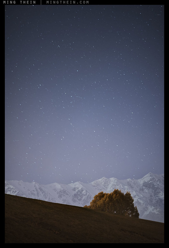
Here, the tree and mountain are ‘heavy’ enough to counterbalance the stars – and this is even further emphasised in the full size version as only the tree is in the focal plane.
Of course if an element takes up more space in the frame than it leaves behind, it turns into the background; what’s now happening is tension is being created between the remaining elements and the background or space. The tension is really creating a differential of interest between the different zones or elements in the frame, causing the eyes of the viewer to flow between one and the other.
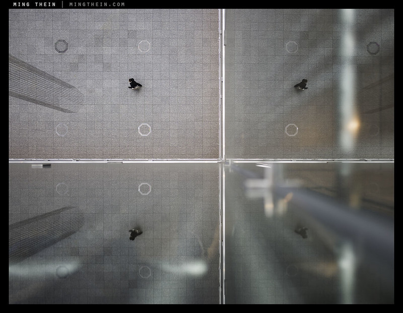
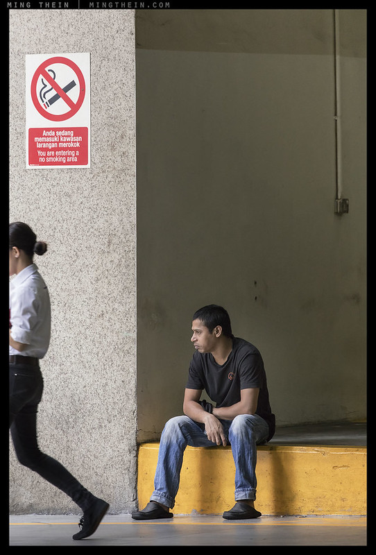
Balanced, but not particularly tense. The only tension is implied by the human figure walking out of the frame.
It’s not quite that simple, of course: if the differential is too great, then your viewer goes straight out of the frame and isn’t encouraged to linger; if they don’t linger, they don’t spend more time considering the image, and if they don’t do that, then the image is unlikely to be memorable. The smaller element must therefore be strong enough to capture audience attention and bring it back against the ‘pull*’ of the rest of the frame. The bigger the empty space, the stronger the remaining element must be; that can of course be countered somewhat by conscious exclusion of all of the unwanted and potentially distracting elements – it’s probably the reason very imbalanced compositions tend to only work well if they’re minimalist.
*At this point, I must apologise for the language used: part of the problem of discussing such topics is the vernacular simply isn’t very well developed to describe visual concepts; we land up using analogies and metaphors and examples and hoping the thoughts get translated fully.

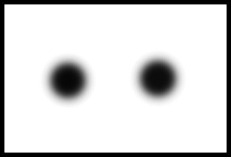
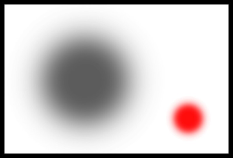
Back to the coloured dots. Neither balanced nor tense; the empty space to the right is distracting – and made more so by the absence of any other elements in the frame – but not a subject
Balanced, but not very tense – both elements are equal in interest
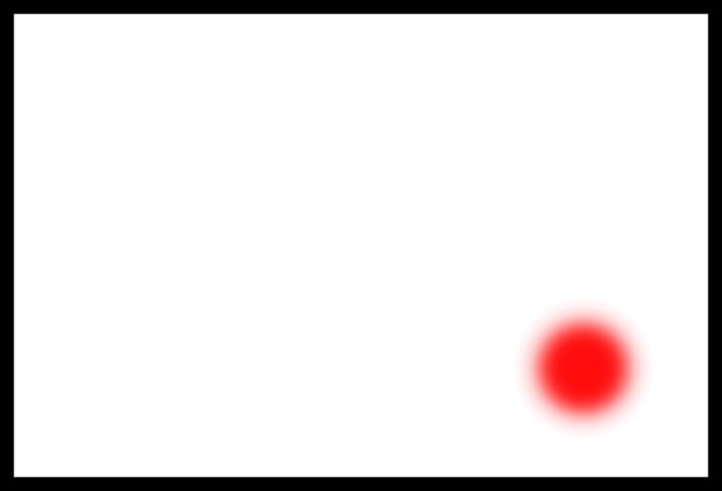
Tense, but not balanced: the empty space is now so dominant we interpret as deliberate
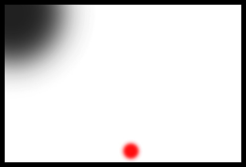
Tense, but not balanced – again, the empty space dominates, but this time, it’s distracting, as are the cut off secondary elements
Balanced and tense – unequal elements placed in such a way they have relatively equal visual weight without external distractions keeps your eyes bouncing between them; your brain creates the implied relationship
At this point, I think it’s clear that tension and balance are not the same thing – at least not as most photographers understand it. They’re not mutually exclusive, either; you can have an image that’s perfectly balanced (think a reflection, or something highly symmetric) that has no tension but still ‘works’; but off the top of my head, I can’t think of any extremely high-tension images that are effective but not balanced (please feel free to make suggestions). Of course, the ideal case is one in which you have both.
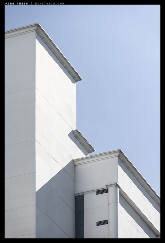
The dominant downward-right lean to the image is balanced and offset by the strong shadow to the bottom left. Note that this image reads differently to different audiences: I’ve found it seems imbalanced to people who read right-left, but not left-right.
Here’s the crux: balance is a visual and aesthetic consideration; tension is a conceptual and intellectual one. I think balance really transcends culture and social preferences; I think an image can feel harmonious and balanced even if there are no recognisable elements to it. On the other hand, tension requires some recognition of the subject matter – it is a consequence of the implied relationship between the various elements, and in order for that relationship to exist, the viewer must be able to connect the dots in their own mind. The only way for this to happen is if the elements are both identifiable and understood to some degree. A person who has never seen a car might not know that it was a movable object, or that certain elements of the bodywork can open.
Tension, but is there balance? The half-figure is implied to be exiting the frame by motion blur and the direction of her face.
We actually see this quite a lot in photojournalism: many images result in an incomplete narrative if you don’t read the accompanying caption or body copy. This isn’t always the fault of the photographer; sometimes contextual elements simply do not coexist in the necessary physical proximity to make the composition work, and even then, the real relationship between them may be far too complex to convey visually. Are there limits to storytelling in images? If you are looking for a definite, rigid narrative, then yes; a still image is in many ways more of a strong suggestion than a definite flow because causality can only be an implicit product of the audience’s expectations rather than an explicit one. Take for example an image shot profile-on of a car and a man standing in front of the bonnet: is the car parked, reversing, or about to run the man over? Is the man crossing the road, standing there, blocking entrance, or the owner admiring his new ride**?
**As far as tension goes, the weight our minds attach to the human figure probably balances the car – we tend to be more strongly attracted to people in images than anything else, except perhaps cats and bokeh.
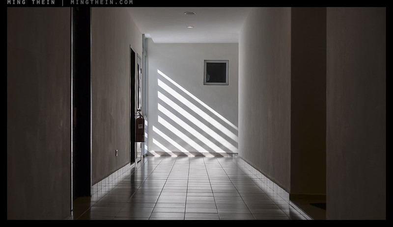
I come back to the first image again:
There is balance here because the left and right sides of the image have equal visual weight; but note how there is also tension implied by the diagonal shadows/light connecting the two halves, bridging what would otherwise be an empty hole between them.
Whilst I think a near-endless discourse on balance and tension is possible, let me try to wrap it up succinctly: tension is used to create a visual flow to an image, together with the suggestion of a relationship between the dominant objects. It is important from a narrative perspective because it forces the eyes of the viewer to move away from the single most outstanding element in a frame. Ideally, this should be a conscious choice – if there are unintentional elements creating that tension, then they just land up being confusing and/or distracting to the subject and overall narrative. Balance is the spatial arrangement of elements in a composition that firstly draws audience attention to the intended portion of the frame, but establishes an order of priority based on the degree to which subjects stand out and attract our attention. Overall compositional balance is also what keeps the audience’s eyes within the frame. Ideally, a good image needs both deliberate balance and tension. MT
__________________
The Singapore Architectural Masterclass from 1-7 July 2016 is now open for booking. Click here for more details and to book.
__________________
Visit the Teaching Store to up your photographic game – including workshop and Photoshop Workflow videos and the customized Email School of Photography. You can also support the site by purchasing from B&H and Amazon – thanks!
We are also on Facebook and there is a curated reader Flickr pool.
Images and content copyright Ming Thein | mingthein.com 2012 onwards. All rights reserved


One of the most informative/inspirational articles I’ve read in a while. Tension is a concept I hear about but could never really visualize when composing. Now I understand why many of my “balanced” photographs still seem dull (even to myself, haha). I couldn’t quite figure out what was missing. Thanks for the explanations and examples.
Thanks Michael. I am still not 100% convinced I’ve managed to define the concept properly, but such is the problem when you’re dealing with the disconnect between a visual and idea-driven language. At least hopefully it’s a little less vague though!
Another one for the hypothetical ‘best of’ book. Welcome return of the coloured dots!
Thanks Todd! Couldn’t let the modernist painters not get a bit of influence in 😉
Ming, the way I understood your article is that Balance and Tension are like Ying and Yang… One is mostly static. Once “read” the balance “settles” in the mind of a viewer and makes the viewer feel “comfortable” with the photograph. Then tension comes to play. Tension makes the viewer “look around” the photograph, not just stare at it statically.
So, if I understood you correctly, when Balance and Tension are in harmony, we get the successful photograph, because it is both “pleasant”/balanced to look at and it has an interesting “tension”/dynamic in it.
Just my two pixels.
P.S. On a technical note, in my Chrome, for some reason great portions of the text are actually links to images. Which is, if I could say so, a little “unbalanced”.
I think that’s a good way of putting it.
Links: may be chrome. I’ll check it once I get a decent internet connection – I’m literally on dial up in the middle of the Australian outback…
I think I smell some of your awesome landscapes coming in the future … Can’t wait ! 🙂
Cheers
Richard P.
To me it depends, depends. Often a seemingly perfectly balanced image of a pole standing upright or two symmetric black holes in the empty space induce a feeling of unease of lurking catastrophe making me think- when is the pole will fall down or when two black holes will clash? On other hand a picture of apparent kaos like dashing kids on playground or scattered objects on the floor make me more relaxed as the chaos is a natural state of things in the course of time.
I think it’s because in your second example there are often also additional elements that fill the rest of the frame to balance out the main subjects…whereas in the first example, there aren’t – and the solo elements are all you see.
great post indeed.
As a theatre director I knew the tension of a scene…but nvere found th ebalanc though.
Thanks.
…thank you for that modest input Andrasikladi. I think that I will simply continue with the day job and enjoy my photography and Ming’s articles.
Unnecessarily rude comment.
I read his contribution with a lot of interest; it made me wonder about my own compositional skills and goals. Not for you apparently.
I think you totally missed the point, Christopher
Really like the article Ming. What is the difference between tension and dynamic (as in static-vs- dynamic)? Would this image from the flickr reader pool be considered to have tension? https://www.flickr.com/photos/eric_hanson_photostream/13555350873/
That image: Not really. I think the difference is whether there is an implied sense of motion or not – that’s dynamic. If there are elements that pull you in opposite directions, or contradict thematically, that’s tension.
Hi Ming,
I rarely post here, but when I do, I recommend books. I bet you will enjoy these two (if you haven’t already…but from the post I guess no) if you have the time to dig in. Basically after reading dozens of books about composition (both photography and fine art), these are the two that I can wholeheartedly recommend. It doesn’t only cover the hows but the whys:
1, Rudolf Arnheim: The power of the center
In this book he sets up a system of eccentric and centric centers and forces acting on them in the visual field, how they balance. It’s very similar to what you described here but in a lot more detail. Pretty much the whole book is about that but also introduces how frames and aspect ratios affect the balance, people’s natural tendencies for finding balancing spots, why diagonals/horizontals/verticals work (not just how)…to things like how looking at a print flat on a table or in a book vs. hanging on the wall changes the way the pictorial plane is perceived a little more flattened due to the anisotropic nature of our world due to gravity…etc.
2, Rudolf Arnheim: Art and visual perception
In this other book (and I recommend reading this one first) he starts from scratch: introduces the basics of the Gestalt theories but then it doesn’t stop there, he talks about how shapes are perceived based on their visual structure, figure ground (and not just what’s so popular to talk about now in photography), how what we see and what your eye sees are different…then a bit of overlap with the other book, talks about balance and tension (and pretty much all elements of artistic composition).
So what he statess in respect to what you wrote:
– art is the expression of an idea and good art is the clear expression of said idea
– good composition (clear subordination, readability, massing….etc) is to establish a clear hierarchy to express the idea clearly
– balance is a necessary but not only aspect of good composition: it’s necessary so that the expression is not haphazard but consciously stated
– balance can be boring: the struggle of the artist is to then introduce visual tension to achieve more involvement and to stimulate his own and his audiences brain. Tension is what in old art books used to be called “movement”: something that forces you to discover but whereas even in the early XXth century it was thought that lines are actually leading the eye. Instead, apparently Kandinsky* was the one to recommend “tension” and Arnheim fully subscribes to the idea and elaborates in The power of the center (released sometime in the late 80’s by the time he was supported by the discovery of saccadic eye movements and tons of visual psychology experiments).
The beauty of it all is that he nails that fine balance: he writes about art yet instead of “rules”, he presents a single, cohesive system that works.
(*Wassily Kandinsky: Point and Line to Plane. Dover Publications)
Thanks for sharing this. Interesting read!
Thanks for the tips!
Hi Ming,
I rarely post here, but when I do, I recommend books. I bet you will enjoy these two (if you haven’t already…but from the post I guess no) if you have the time to dig in. Basically after reading dozens of books about composition (both photography and fine art), these are the two that I can wholeheartedly recommend. It doesn’t only cover the hows but the whys:
1, Rudolf Arnheim: The power of the center
In this book he sets up a system of eccentric and centric centers and forces acting on them in the visual field, how they balance. It’s very similar to what you described here but in a lot more detail. Pretty much the whole book is about that but also introduces how frames and aspect ratios affect the balance, people’s natural tendencies for finding balancing spots, why diagonals/horizontals/verticals work (not just how)…to things like how looking at a print flat on a table or in a book vs. hanging on the wall changes the way the pictorial plane is perceived a little more flattened due to the anisotropic nature of our world due to gravity…etc.
2, Rudolf Arnheim: Art and visual perception
In this other book (and I recommend reading this one first) he starts from scratch: introduces the basics of the Gestalt theories but then it doesn’t stop there, he talks about how shapes are perceived based on their visual structure, figure ground (and not just what’s so popular to talk about now in photography), how what we see and what your eye sees are different…then a bit of overlap with the other book, talks about balance and tension (and pretty much all elements of artistic composition).
So what he statess in respect to what you wrote:
– art is the expression of an idea and good art is the clear expression of said idea
– good composition (clear subordination, readability, massing….etc) is to establish a clear hierarchy to express the idea clearly
– balance is a necessary but not only aspect of good composition: it’s necessary so that the expression is not haphazard but consciously stated
– balance can be boring: the struggle of the artist is to then introduce visual tension to achieve more involvement and to stimulate his own and his audiences brain. Tension is what in old art books used to be called “movement”: something that forces you to discover but whereas even in the early XXth century it was thought that lines are actually leading the eye. Instead, apparently Kandinsky* was the one to recommend “tension” and Arnheim fully subscribes to the idea and elaborates in The power of the center (released sometime in the late 80’s by the time he was supported by the discovery of saccadic eye movements and tons of visual psychology experiments).
The beauty of it all is that he nails that fine balance: he writes about art yet instead of “rules”, he presents a single, cohesive system that works and incorporates all.
(*Wassily Kandinsky: Point and Line to Plane. Dover Publications)
I forwarded this to my email. I can’t find my glasses! LOL