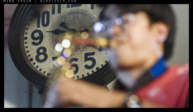
Jazz time.
I believe good photographs can be divided into two camps: the literal and the ambiguous. (There’s a third kind, which you cannot really classify into either because they are lacking something fundamental like a clear subject – these land up as being ambiguous by default, but not intentionally.) From an interpretative/ artistic standpoint, a photograph is perhaps the most literal of all art forms; assuming minimal postprocessing, the translation between reality and finished interpretation is predictable and consistent across all subjects and capture conditions. The resultant image has to obey the laws of physics, after all – and these are generally quite consistent. But then how can we use ambiguity to our advantage to make a stronger image?
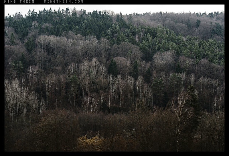
A literal image: you would not think to be looking at anything other than trees.
In its simplest form, a properly-focused lens will project a scaled image of the subject onto the focal plane. The relative spatial relationship between elements of the subject will remain the same – if the real object has a line at 2/3rds of its height, then there will be a line at 2/3rds of its height in the image*. This is clearly not the same as an interpretative representation like a painting, where that line may be drawn 1/2 way up, or 3/4s of the way up, or not even exist – and the subject may still be recognisable because it is not a necessary defining characteristic. Even if we use lenses that do not match ‘natural’ human eye perspectives, the difference in foreground-to-background proportion is always consistent and predictable. We can therefore say this is the defining characteristic of a photograph: it is a recognisable and relatively linear representation of reality, both in spatial arrangement and luminosity.
*Ignoring distortion – but even then, except for fisheyes, the distortion is relatively minor and does not affect the overall impression of proportion.
How then, is it possible to make a photograph that is ambiguous?
There are three aspects to consider and control here: resolving power, spatial arrangement and conscious exclusion. The first is simple: if you cannot see it, there’s no way you can know for sure an object is there. This may be achieved through size, light or depth of field – if something is so small as to be insignificant, you won’t notice it or be able to see sufficient detail to know what you’re looking at; if it’s dark there are no visible textures or details; if it’s out of focus then the optical system cannot resolve sufficiently high frequency structures. We simply do not have enough information to match what it is we’re seeing with our visual memory bank.
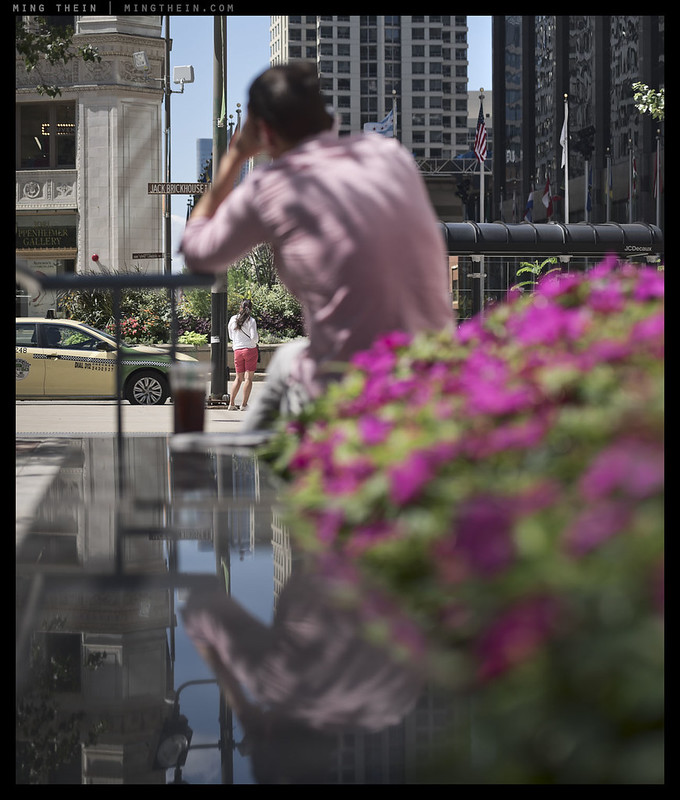
We are all tourists
Spatial arrangement is more complex: our perception of the real world does not enjoy hard boundaries, which means that there is no real ‘frame’ and you can always turn your head to get additional context, or move the camera angle to get a second point of reference. What you see in a photograph is all you get: and there is an implied limitation to the composition delineated by the edges of the frame that forces the viewer to consider only what lies within it. It is the spatial relationship between not just the elements within the frame but the frame itself that has implications on causality and story: forced empty space in the center of the frame suggests deliberate avoidance; proximity suggests collaboration. This is both an important storytelling tool as well as a visually balancing one.
Finally, we have the obvious: if it isn’t in the frame, there’s no way the audience can know it was there. Intentional omission is as good as not existing. We can get caught out by this – the number of times I’ve heard people say ‘but X was also here’ – is a sign of the disconnect between our live perception and the camera’s defined limits – and we can use it to our advantage to make our audience make certain assumptions and think a certain way. Perhaps an extreme example, but an image of a child playing happily in a park is very different if you don’t know there’s a pack of wild lions surrounding him or her just outside of the frame.
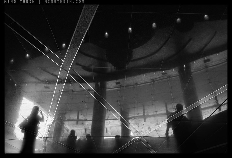
Peeping tom
That’s already three conscious choices, controlled by depth of field/focal plane, perspective/spatial position and composition. On top of that, we have the ability to use captions to add a further layer of suggestion to the viewer. It’s actually more than enough to dial in the precise amount of definition desired in your story. Whilst a very tight visual story with no ambiguity is the ultimate goal of most photojournalists in order to present exactly the same story to the entire audience independent of extremely specific contextual information, this isn’t always desirable in an image that’s intended to make you think. If the story itself is unusual, that may have the desired effect – and from experience, specificity isn’t easy to achieve when you are photographing in an uncontrolled situation. However, to find something that breaks sufficiently from the normal in daily photography or to present a philosophical question in an image requires a bit more interpretative latitude.

Thought bubble
Such an image benefits from extra layers: not just compositionally and structurally, but interpretatively. It has to be aesthetically pleasing or challenging to attract attention in the first place; have an obvious message to make the viewer receptive, then a subtler one (or alternative interpretations) that reward on more focused study. Such elements can take the form of the unexpected, the hidden, the juxtaposed, or the out and out ambiguous – is it a man or a woman? Are those objects actually stacked or is it a trick of perspective? Is there actually a building there, or is it merely a reflection? Is this landscape at a large scale or a macro one? The more an image can give back to the viewer, the longer it is likely to be viewed, the more it will be thought about, and therefore more likely to be remembered.

Specifications and expectations/ reduced to numbers
In order for this to happen, ambiguity is necessary: too much information and there’s only one interpretation. There’s a very thin line between ‘vague enough’ and ‘too vague’, though: an image with no clear subject or focus and all sorts of messy elements falls into the latter category because either the interpretation is too complex and impossible to fathom. An image with too much bokeh is the same: the background is so undefined that it is impossible to determine exactly what we are looking at, thus rendering it irrelevant from a conceptual standpoint.

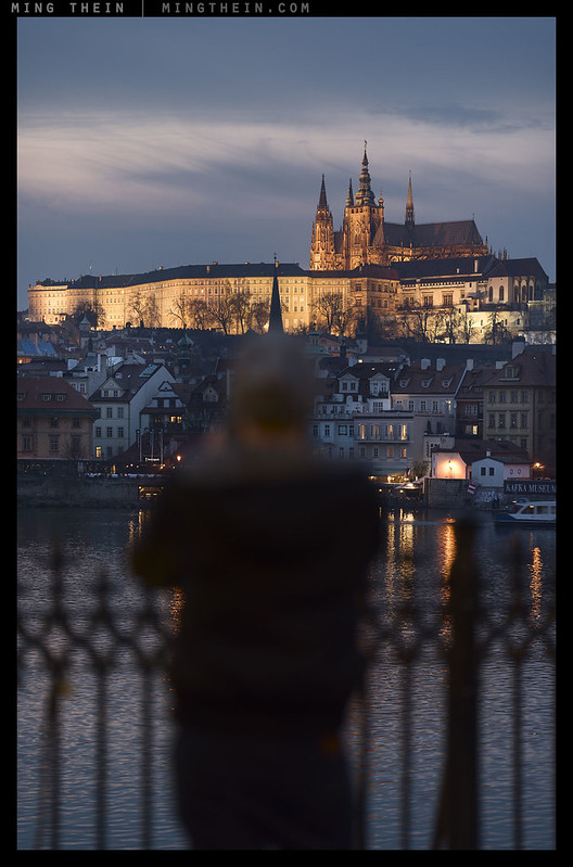
Lost in translation
Imagination is what bridges the gap between the literal presentation and translation of the idea into the mind of the viewer: it is both the logical leaps required to determine causality and the personal interpretation of the situation that fits the experiences, biases and preferences of the audience. It also lets you keep a wider range of the audience happy: they can see what they want to see in the areas that are not concretely shown. You cannot see outside the frame or into the black shadows. A silhouette has no face; you have to guess the mood of the figure in the frame by their body language, but you cannot know for sure. It is difficult to put yourself in the position of a figure whose face is completely different to your own, but much easier if you cannot see their facial features. This is also the reason behind the popular wisdom that ‘the book is always better than the movie’ – a movie is a very literal interpretation; a book leaves a huge amount of latitude open for the audience to decide just how large a waistline defines ‘fat’, or how many stories is ‘tall’, or whether there was a cloud in the sky or not. We are only unhappy when our expectations are not met.

Virtual banking
This brings me to the crux of the matter: one needs to have just enough information for the audience to have a fairly good idea of what is going on in your mind (the ‘idea’) but not more than that. Just make sure there’s sufficient immediately obvious information to hold attention and encourage further viewing. Reduction of a complex idea to the bare minimum number of elements is one of the most difficult things to do; however, to make a very strong image, the photographer must understand exactly what they are trying to say, and thus know what is absolutely necessary and what isn’t. Photography is as much a dialogue between the photographer and the audience as it is a presentation – there’s nothing wrong with letting the viewers work for their entertainment. MT
__________________
Images from this series are from the ongoing Idea Of Man project. Ultraprints are available on request here
__________________
Visit the Teaching Store to up your photographic game – including workshop and Photoshop Workflow videos and the customized Email School of Photography; or go mobile with the Photography Compendium for iPad. You can also get your gear from B&H and Amazon. Prices are the same as normal, however a small portion of your purchase value is referred back to me. Thanks!
Don’t forget to like us on Facebook and join the reader Flickr group!

Images and content copyright Ming Thein | mingthein.com 2012 onwards. All rights reserved


This is a good article to get people thinking about this. Though really understanding it and applying it regularly will take a lot more thought and conscious practice and effort. Lost in Translation is a great image btw. Thanks Ming!
Thanks Praneeth.
Beautiful pictures and a very nice write up! A very interesting perspective!
Thanks Arvind.
Great article. Yours is my favourite photo-blog and having lived in KL it often reminds me of my good times there (and my wife is Chinese Malaysian too 🙂 )
Is lost in translation available as an Ultraprint? I would love to have this on my wall.
Thanks Colin.
Yes, Lost in Translation is available as an Ultraprint – I’ll send you an email…
Ming, I would also be interested in an ultra print of “Lost in Translation” – that’s an epic picture and up there with your best.
“Thought bubble” reminds me of one my pics. I’m not sure if you encourage linking but what the heck: https://www.flickr.com/photos/57909628@N08/23017980816
I’ve sen you an email…and that empty patch needs something in it 😉
Great article but, to be totally honest, most of the images didn’t really do it for me. Moving humans, symbolising the passing nature of life, immovable, stationary objects symbolising… eternity?
Ambiguity? Maybe. And then there’s the captions.
I found the first b&w image very impressive though. Geometric, conflicting patterns, shadowy figures moving way from, not towards each other. I rather like that sort of in-built tension in images.
I’ve been contemplating a very brief essay on images and meaning lately (to publish, somewhere), and know what images to use, just not sure of the narrative yet. As I’ve mentioned here before I leave the attaching of meaning, if any, to the viewer, if any. Browsing through Ed Ruscha’s photographic work a few days ago, it struck me that all he did was date (sort of) and place (sort of). Good enough for me.
All this probably mostly means I strive to lay meaning, tension, interest, ambiguity? in my images, but usually don’t succeed. Oh well, having visited the Magnum Contact Sheets exhibition a few times, I now know it very often takes a lot more than one shot to get that meaningful image…
You’ve already expressed your dislike for captions, I thought we agreed to disagree a long time ago… 🙂
That’s another (age related?) failing; unnecessary repetitions… 😉 . The search for meaning (in an image) still baffles me though.
I think it has to be clear to you what the meaning is otherwise there’s no way you can make it clear to anybody else since you won’t know what you’re composing for…
Ming, I beg to differ.
Not wanting to be too philosophical, but meaning can be a search, a journey, much more than a destination, a firmly affixed label. I might be in doubt about the meaning (if any) of an image I make. How then can I object to the searching, wavering, dithering, undecided, opinion of the random viewer? How about that for ambiguity? 😉
When I go to a museum or gallery, there’s noone there explain to me or lecture me on the meaning of what I’m seeing, and if there is, I steer clear of them.
Who am I to claim that a portrait I make shows the real person? I try to, but it’s only my view… Ambiguity, or multiple meaning, there as well.
Doesn’t work in a museum have a title and frequently also an abstract though? (Assuming an art museum; historical museums are different). The viewer can choose to read it or not – surely this must also count as guidance…
True, although there are many flavours there, ranging from “Untitled XVIII” to “Jack and Jill in the garden on a summer’s day”. What I mean is, there are not all that many titles that convey the meaning that the artist had in mind, and they (the artists; not me, I’m not an artist) are usually quite loath to engage in that sort of explaining. They leave that to the viewer. A bit like The Beatles weren’t so keen on explaining what “Strawberry fields” or “I’m the walrus” was all about. What were they all about anyway?
I suspect there was cannabis or other similar substances involved 🙂
Haha! Following in the tracks of popular opinion? Connotations of Timothy Leary I’d say… 🙂
And then there is “eye candy.”
Great article, Ming!
Yes, there is. Thanks!
Well said, Sir.
The great Australian/Chinese Cinematographer Chris Doyle once said about Asian filmmaking vs. American filmmaking, “What happens in western cinema is that, ‘Look at this! You’re so stupid, you don’t know what we’re trying to tell you. Let me tell you something.’ and we say, ‘Hey, discover this.'”
If you haven’t seen In the Mood for Love, you haven’t lived.
The competition is always for the biggest wow – the other way around in most other parts of the world. The former leads to a road of visual oversaturation to an audience that might get desensitised if explosions are always the order of the day; the latter is requires a lot more attention to appreciate, I think.
Your very personal approach in writing this blog is extremely useful and informative. Being an amateur, I have come to realize how difficult it is to direct the result and get what I want in an image after getting the technique halfway right. This is something you do and in a style that I absolutely can relate to. You are helping me a lot and very generously so at this juncture in my photographic development. Maybe one day, I will have the opportunity to take one of your classes. Thanks
Thanks – in the meantime, there’s a lot more detail in the videos…some things have to be demonstrated…
This is an excellent article and Lost In Translation is a fantastic photograph that works on so many levels. Thanks so much for this.
My pleasure.
Ming, this is a great thought provoker. I see it as all ambiguous and only truly literal to the original photographer, if mean’t in a literal way. If I did not know the true intent could accept that a shot was literal, but could not be sure. A literal shot may also become ambiguous at a later point in time as events change. just a thought provoker.
Yes, that’s also true – and the immediate historical context can also easily be lost. There is also a difference between an ambiguous meaning but clearly identifiable/ defined subjects, and the opposite of ambiguous subjects but a clear meaning…
Ha ha, literal ambiguity of course
As a purveyor of ambiguous imagery I find this a very interesting article. There are times when you want and need photographs to be literal, documenting a situation in the least subjective way possible. But, I’d venture for most it is this ambiguous, open to interpretation, let the imagination in element we want to achieve to some degree. From brutally stark direct literal images to totally amorphous imagery there’s plenty of scope to play with.
Would ambiguous images be more universal, easier to strike a chord with? Whereas with literal images you need a common context to get engagement?
Hard to say. If they’re too ambiguous, you might not stir any recognition at all, which makes getting any sort of emotion out of your audience completely impossible.
True enough. And there’s probably not a universal configuration of line and form that can be used convey a precise message, but then that’s the definition of ambiguity. It needs to be open to a different interpretation, raise a different set of emotions. Except bokeh that is, everyone likes bokeh. 🙂
And cats. And test charts. And more pixels…
Cats are definitely ambiguous, when I see a cat pic I get a totally different set of emotions then that was intended. Still though at least it is a response. So yes, we can make ambiguous images, but why do we want to with photography and not use other mediums? Seems a conflicting thing to want to do.
Hi, Ming interesting read. Ambiguity for me is a personal thing. I consider myself to fall into this camp. For me its really about looking at the peripheral side show. Through editing you start to build elements that through pattern and repetition form personal narratives. I like to leave some dots for the viewer to connect and avoid the didactic. What is needed regardless of the intention is an entry point for the viewer. We have a very short moment to grab the viewer regardless of the aim; commercial or personal. To even being to look at the intention the viewer needs to be engaged on a pure surface level initially. In this way all photography is tied to a certain extent. I find regardless of the subject or intention, if I break the image down into shapes and perspective. The dynamics that pull me toward certain pictures often have similar formal qualities across any genre.
Agreed: and entry point is critical. I think of this as the hook – it has to be obvious and stand out (subject isolation) plus interesting, which is harder…
All true. But isn’t it more, that one mainly sets out capturing, what one considers “captureworthy” intuitively ,to later decide, which of the pictures got one or more qualities for visual storytelling? Discarding the many, were storytelling didn’t “happen”. The more you do of this, the better your intuition will be trained to automatically recognise situations to react to with seeing, recognizing, framing in and click.
The main art is, to start looking for stories in what one sees everyday, everywhere. Our eyes work well, sending off all those imagery to our brains, which can not process all of the visual information, so blocks out most of it, unless recognizeable and relevant. To train your brain to let in and notice more useable by-information is the crux of the matter, I think
You start that way but should soon realize what works and what doesn’t, and land up pre curating the scene so you don’t land up even shooting if it doesn’t seem like the elements will come together.
Very nice read. I also enjoyed the photos.
Thanks Eric.
Another very useful essay Ming, thank you.
The only statement that didn’t ring true on first reading was this one:
“Finally, we have the obvious: if it isn’t in the frame, there’s no way the audience can know it was there. Intentional omission is as good as not existing.”
A picture of a golfer at the end of his stroke, looking up, implies the ball is aloft even if it is not in the frame. The story is implied literally rather than figuratively. While the story is incomplete (was it a good shot?), it is perhaps the other end of the spectrum compared to your wolf story, despite a very key element in the story – the ball – not being in the frame.
That is not the same because we *know* the causality and sequence of golf – it isn’t necessarily the same for an ambiguous and specific situation…
To perhaps clarify Linden’s idea, how about a photo of a bunch of people looking at the sky off in the distance? That could imply the existence of an object outside of the frame? There was an analysis of Michael Bay’s style of directing which makes the case that he employs this device to give his audience a feeling of something big off frame — a far bigger thing than if he had shown it on screen.
There’s another recent show I saw in which a female dancer is auditioning for a male director, but all the camera shows you is the director’s face and not the dancer. It’s an interesting multilayered commentary on the vagaries of that world. The most recent Godzilla movie was also an interesting exercise in ambiguity, and you often saw Godzilla partially cropped out, indirectly, or not at all (but he was still in the scene). One scene had a TV tuned to a news network, and you could see only see Godzilla wreaking havoc on that screen.
I think there are more layers of ambiguity. There is, for lack of a better word, physical ambiguity, which I think is what’s being addressed in this essay. There’s also ambiguity of idea or intent. For example, propaganda photos are very clear about their subject: they’re either super awesome or super bad people. But what about a photo that is a bit more equivocal about how it feels about its subject? How would you do that? I’m not sure, but it’s an intriguing thing to think about. Portraiture is an interesting place to explore this too, especially if the photographer has mixed feelings about the subject.
I think once someone has a handle on that, it might be interesting to go back and look at the most powerful photos from photojournalism, and see that perhaps it’s not as objective as one might think it is. That’s not a bad thing, but I think we might find that the photojournalists cared very much about their subjects one way or another.
Anyway, just some food for thought, which these philosophical articles always encourage!
Good examples, Andre – the suggestion/implication of something works as well as the something just so long as there are sufficient cues for us to make the connection.
Ambiguity of intent is probably the worst of the lot, because it results in ‘meh’ or no feelings and a very unmemorable image as a result.
Photojournalism cannot be objective because photography by nature is not objective. By excluding anything – which we must do to frame – we already introduce bias of omission.
Good day Ming
If you would indulge me, I’d like to know what camera you use most often.
I have no idea. Roughly equal split, depends on what I need to do.
Fantastic read!
Thanks!