1
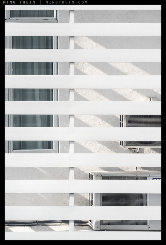
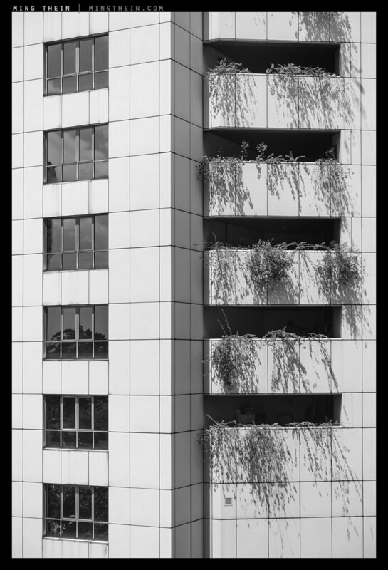
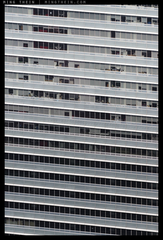
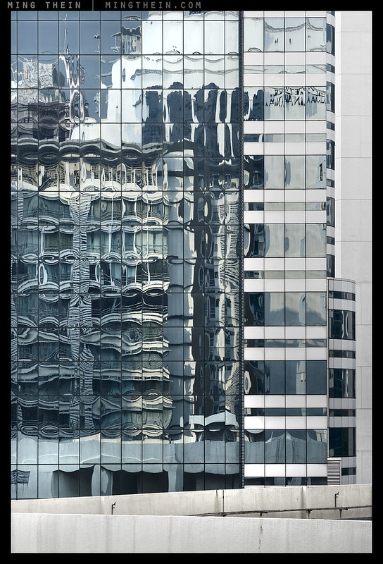
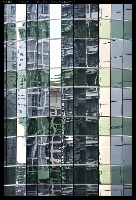
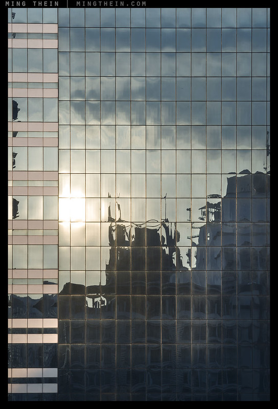
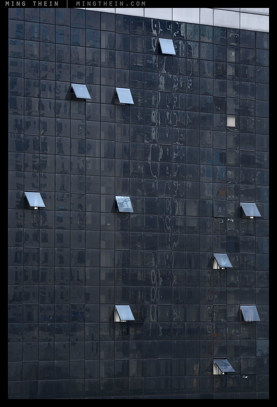
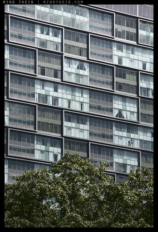
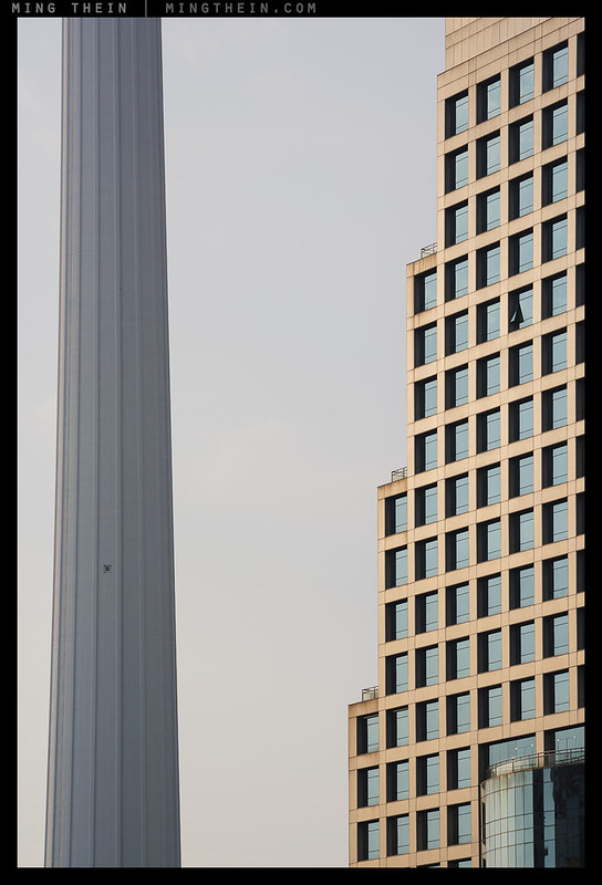
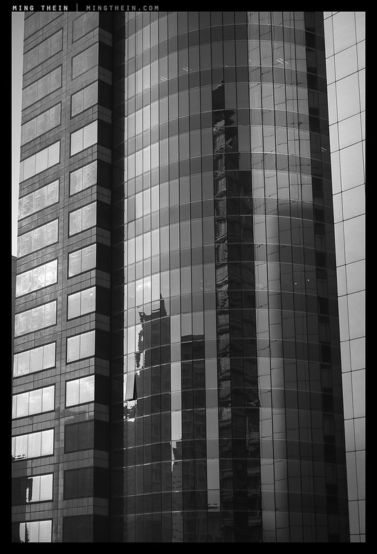
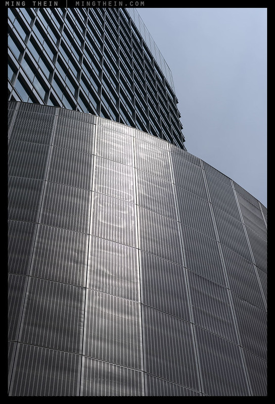
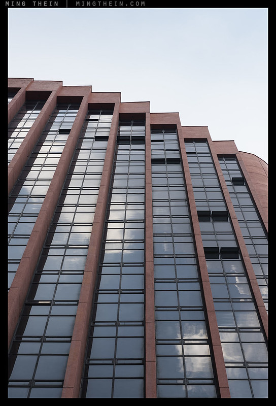
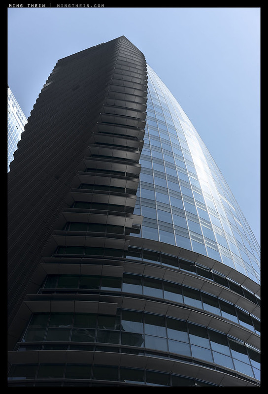
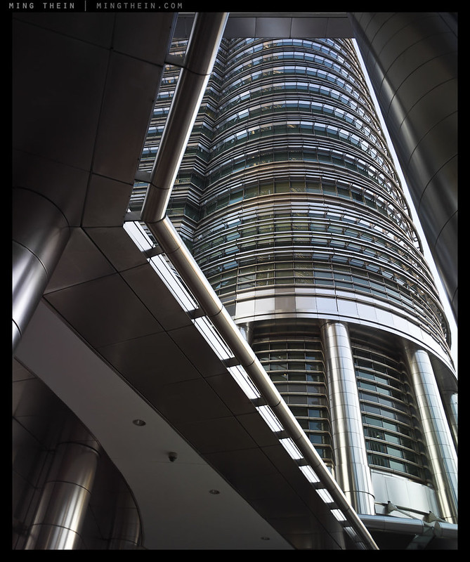
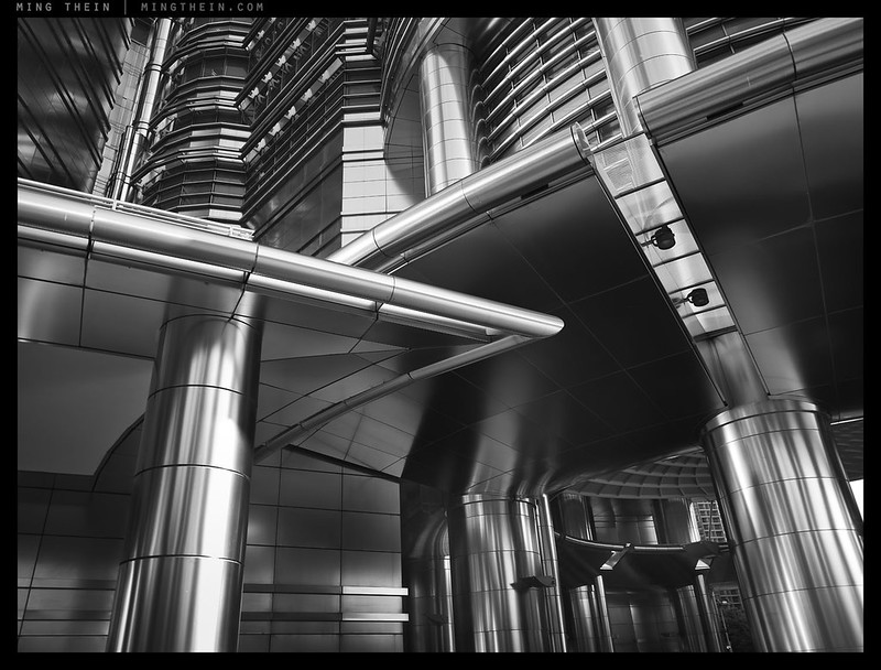
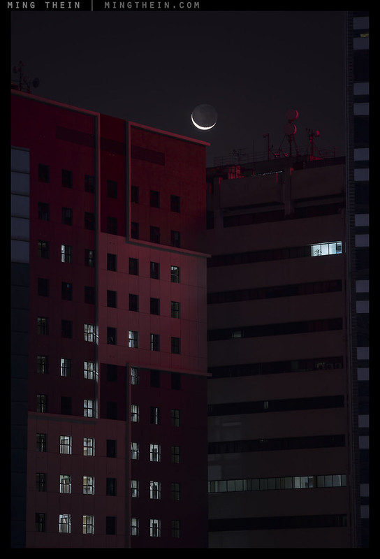
Today’s photoessay is I suppose about both intention and serendipity: architects intend for certain parts of certain buildings to work with their environment in a particular way, but also for them to be self-contained, individually functional and internally consistent. Whilst the macro environment is always taken into account during planning of the gross features, the way these features interact with the immediate environment cannot always be foreseen; for instance, take large reflective surfaces like glass and metal claddings. If the weather and skies change, so does the entire appearance of the surface. If the surrounding environment changes 5, 10, 15, 20 years down the line with demolition of old buildings and erection of new ones – there’s simply no way this kind of thing can be envisioned at the planning stages. What I find interesting in effectively living in a forest of skyscrapers is that their personality keeps changing with light and evolution of the neighbourhood – on any given day, my surroundings can be really impressive or dull as ditchwater. What I’ve attempted to do with this photoessay is try to share some of that feeling with you – of course, there are limitations of screen in scale and gamut. The sequencing is deliberate and focuses more on abstraction and evolution of form and colour than subject – in this case, the specific individual subject doesn’t much matter anyway. Enjoy! MT
Shot with a wide range of equipment over several months, but mostly the Nikon D810 and Voigtlander 180/4 APO-Lanthar and processed with PS Workflow II or The Monochrome Masterclass.
2
3

4
5

6
7
8
9
10
11

12
13
14
15
16
17
18

19
20
__________________
Turn the mood and style up to 11: the Hanoi Cinematic Masterclass in association with Zeiss (21-26 July and 28 July-2 August inclusive) is now open for registration – click here to book and for more information.
__________________
Ultraprints from this series are available on request here
__________________
Visit the Teaching Store to up your photographic game – including workshop and Photoshop Workflow videos and the customized Email School of Photography; or go mobile with the Photography Compendium for iPad. You can also get your gear from B&H and Amazon. Prices are the same as normal, however a small portion of your purchase value is referred back to me. Thanks!
Don’t forget to like us on Facebook and join the reader Flickr group!

Images and content copyright Ming Thein | mingthein.com 2012 onwards. All rights reserved


This is really an area of photography I love! Really like 4&18 🙂
Thanks!
Inspirational, as always! I’ve got to ask though – and sorry if you’ve been asked this 1×10^9 times before! – but can you really shoot THAT straight or do you correct the images in post? I mean, you’d have to be able to get the camera in absolutely the right vertical and horizontal position, absolutely level, absolutely parallel to the building’s surface etc…!
Thanks – only 10^8, so carry on… 😉
I really can shoot that straight. A tripod + tilt shifts or telephotos + geared head gets you there without that much effort.
I’ve never tried a tilt-shift. Mind you, I quite like those converging lines when I shoot wide-angle…
There are definitely ways to use the convergence for some compositions, though clients don’t always agree 🙂
Yes, I can imagine. It is something I’d like to try, but the lenses are horribly expensive. And perspective correction in LR works remarkably well provided you weren’t a mile out!
There’s visible degradation at the edges that were stretched, though – and the perspective looks different because you cannot change your height, virtually, through projection or otherwise 🙂
That said, the older Nikon 28 and 35 PC lenses are pretty cheap on the secondary market, and worth a shot.
… I was wondering about this too. I also have never used a tilt shift. Following your Photoshop tutorials, you drag corners to correct perspective. This leads me to two questions:
1) if not looking for absolute perfection, how would you rate the ability to transform in Photoshop for prospective versus the use of a tilt shift lens
2) excluding the use of tilt shift lenses, do you find the Photoshop drag corner to be quite effective (I assume so since you do it)
3) your suggestion above sounds quite good: because I assume by definition tilt shift is tripod mounted, manual focus and other “sacrifices” is not an issue. Therefore older/legacy lenses maybe completely appropriate with very little drawback versus current offerings. Is that true?
Yes, I was going to ask that too. Obviously the software correction comes at some cost – and an unnatural perspective can be one of them – but used within sensible limits it delivers what I would consider professional standard results. It’s like distortion correction – it doesn’t come for free, especially in terms of its impact on the corners – but it’s still very good, provided the distortion wasn’t massive. Presumably you don’t have a principled objection to it?
Alex
No, no objection so long as you don’t see the degradation I’m image quality or feel the proportions are off (which they will be if one dimension is stretched but not the other).
It’s effective if your effective height doesn’t matter and your output isn’t going to be compromised by the interpolation. For anything more than a minor – say 10% – correction, I’d prefer a tilt shift.
A great collection.
And a great Sequence.
But I felt better after viewing it the other way around, last to first!
I agree on nr. 11 , and it stands out, like a “,” , as does the Full Stop, nr.20 .
🙂 Well, I was trying to finish on a high!
Thank you for showing us how ugly and cold the world is going on! People have kitchens like Sugery Rooms.
I have seen thousands of pictures like that. They don´t meat my Heart.
But composition and processing is top!!
Can’t change the world, sorry.
4, 11 , 17 and onwards … made my day 🙂
Thanks Gerner!
Can’t decide between 18 and 19 . . . truly stunning . . . does make me all the more grateful for living in a cottage by the sea though ; )
Good thing there’s no need to choose then 🙂
11 goes to 11 for me! 🙂 I’m always amazed when I’m in Walt Disney Concert Hall (designed by Frank Gehry) at how many interesting, accidental ways you can find the lines and shapes interacting with each other in all sorts of really interesting ways. I can’t imagine how he planned this all out, and just decided he was a genius.
Haha, thanks Andre! I too think he was a visual genius, though the internal spaces aren’t that usable 😛
Interesting. I’d heard that the Disney Hall was an outstanding venue with both excellent sight-lines and acoustics. Regarding this set, I find the 18 and 19 especially compelling: inhuman and dystopian spaces revealed for what they are.
I’m sure it is – I meant the total internal volume vs actual usable floor space…
WDCH has really great acoustics and sightlines. There are actually bad seats for acoustics, but they tend to be in the nosebleed sections on the sides. The impractical space thing is a real thing: there are so many nooks and crannies that are unusable, but it does look cool! 🙂
The seats are also quite cramped, but I think that’s because they wanted to have more seats so they could sell more tickets. It turns out no one knows how to make a good concert hall that’s larger than 2000 seats, so they make the seats smaller and more crowded.
You’re increadible with metal. I also love 19
Sorry, iPad typo, I meant 11 ( and several others 17-21 and more)
Thanks!
I am always impressed with your metal shots. I think it is harder than it looks. 🙂
Thanks Eric – the tricky bit is getting the tonality/color to look convincing…