Ready to go
The idea of a photograph looking like a painting isn’t a ridiculous one. In fact, I personally find it quite appealing, and a very good solution for the times when you don’t have strong enough light to make something more dynamic. It’s certainly a style I’ve been exploring increasingly – beginning consciously with Havana – but what exactly makes a photograph ‘painterly’?
Tribute to Edward Hopper
We need to understand the whys and the characteristics of such an image before we can hope to replicate one photographically. Paintings can certainly be bold and have high contrast; they can have impossible perspectives, or highly real ones; they may be impressionistic or faint – but all of them have one thing in common: they convey the idea of their creator. I believe the process of a painter is very different to that of a photographer: a painter must create every single little detail in their finished product. It is a process of conscious inclusion and creation; he or she has to think about whether the floor should be one texture or another, and then execute it. On the other hand, a photographer doesn’t: we are conscious excluders. We identify our subjects, and the secondary subjects and whatever other contextual elements are necessary to tell the intended story, and then so long as the rest isn’t distracting, we leave it be. Only if something is distracting do we do something about it.

Yellow
That’s difference number one: a much higher level of consciousness over the elements that go into your finished scene. In a painting, there is nothing outside that might have been included: in a photograph, there’s always something else.
The creation process also has bearing on one more important property: light, or perceived light. A painter must create their own highlights and shadows: in this sense, they have the option of making physically impossible light (missing shadows, no distracting reflections, multiple sources, no issues with white balance mixes between candles and daylight etc.) The quality of light in a painting is therefore again a conscious choice. To a certain degree, still life and studio/ commercial photographers also have this level of control; we are photographing things that are static or under our direct influence and we can control the surrounding environment. If you work entirely in the real world with ‘found’ objects, this is definitely not the case: we need to recognise the quality of light we want, and then know how to capture it. There are also none of the dynamic range challenges we might encounter in the real world: I think of the contrast as ‘measured’; it’s enough to separate but never to block up a shadow or blow a highlight unintentionally. It’s one of the reasons this style is a useful thing to have in the arsenal for overcast days.
Tribute to Monet
Beyond what must be consciously created, there are also a few other traits that paintings typically have. I’ve never noticed out of focus elements in a painting, for instance; it’s much easier to convincingly arrange things such that the background immediately behind the subject isn’t anything distracting; you just paint a plain texture. There are definitely no out of focus foregrounds. I don’t have a good explanation for why this is; perhaps because it’s simply easier to paint everything in focus than convincingly replicate bokeh. Or perhaps it’s because it’s a more accurate representation of the way our eyes see the world: we scan from object to object, and it appears that what our attention is directed is always in focus, and the rest not exactly out of focus, but not distracting, either. Lytro aside, this is not an option for photographers. And we all know that refocusing an image changes the composition significantly, anyway.
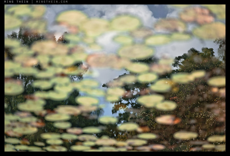
Wet paint
There’s also the question of perspective, or specifically, forced perspective: in painting verticals are always straight, there’s no geometric distortion in an extremely wide scene, and if the background mountain layers need to be compressed to a certain degree to get everything in, they are. Therefore, we land up with a perspective that’s sometimes physically impossible – but still appears natural to us, again because it’s a direct reflection of the way our brains process the world. I believe that in a photograph, we must therefore stick to perspectives that are representative of the human range of vision – somewhere between 28 and 85mm, or thereabouts, but mostly centered around the normal; add correction where necessary or possible.
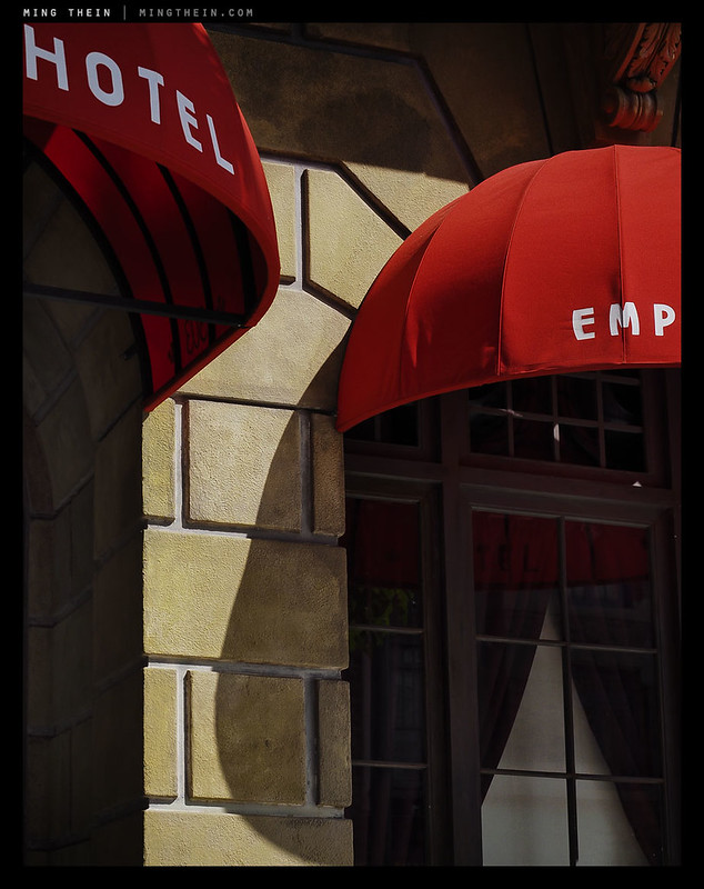
Red hotel awning
Lastly, we must consider colour: needless to say, the majority of paintings are in colour, which is often dictated by the available pigments and the perception of the artist. Monet’s warm shift in later life is a famous example of this; degradation of his vision caused him to compensate in such a way that his ‘white balance’ was visibly quite off. I’ve seen very saturated paintings, but I get the feeling that the majority – or at least our impression of paintings – tends to be a little desaturated and with a quite deliberate bias towards being high or low key. Beyond that, there’s frequently a unifying colour palette that links all of the elements in the frame together and lends them a certain level of coherence. We must also consider the physical properties of the medium itself: for instance, there’s this deep, dark textural richness in oil paintings that’s a consequence of both the nature of the pigments and the way light reflects off the paint surface itself; it lends a secondary quality to the subject being represented that’s very difficult to replicate in a photograph. A computer monitor is a very poor substitute to a baryta fiber print that has similar reflective qualities to an oil painting. Perhaps, to complicate things further, there’s also some evocation of a different era simply because of the colour palette used.
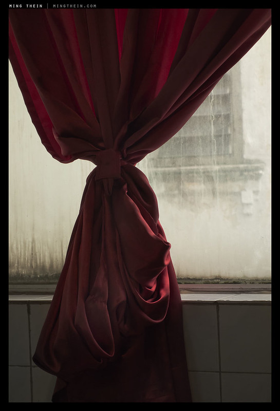
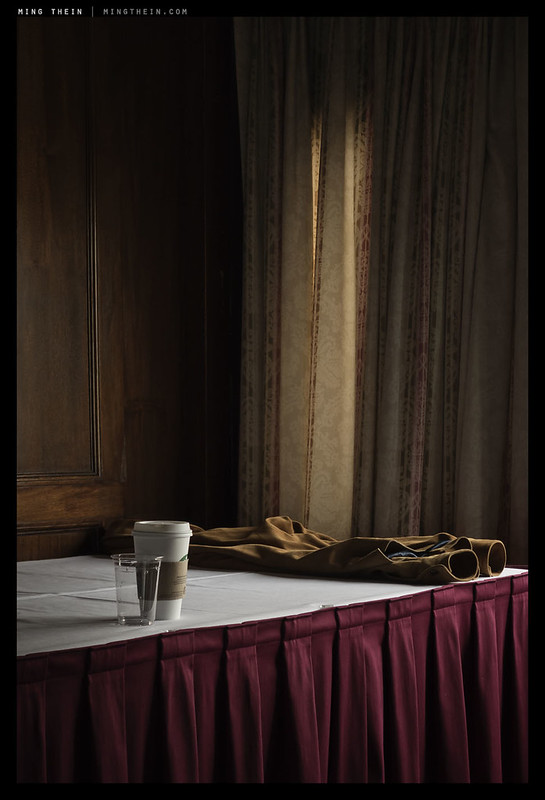
Drapes
Like every style, however, there’s no right or wrong – there’s only ‘like’ or ‘dislike’, and perhaps some feeling of suitability to a given subject. I can see this being immediately useful for still life and portraiture, but personally I like to apply it to modern urban scenes; the geometry is quite conducive to abstraction in a modern, semi-cubist way; the colour palette tends to be either very muted or very strong; and finally, I simply don’t feel it’s done that often. The photographs in this article are obviously the best illustrations of a painterly ‘style’ that I’ve been able to produce; I’m fairly sure there’ll be more to come. MT
__________________
Limited edition Ultraprints of these images and others are available from mingthein.gallery
__________________
Masterclass Venice (November 2014) now open for booking – click here to book or for more info
____________
Visit the Teaching Store to up your photographic game – including workshop and Photoshop Workflow videos and the customized Email School of Photography; or go mobile with the Photography Compendium for iPad. You can also get your gear from B&H and Amazon. Prices are the same as normal, however a small portion of your purchase value is referred back to me. Thanks!
Don’t forget to like us on Facebook and join the reader Flickr group!

Images and content copyright Ming Thein | mingthein.com 2012 onwards. All rights reserved


Lovely! I am not a pro, but I appreciate and enjoy what you do and just want to thank you for sharing and wish you the best!
Discovered you site recently and I am enthusiastic and want to see more and more!
Thank you.
While looking at your recent recommended gear list I found this article which resonates with me, being from a content objective I just think/look for a painterly/cinematic photo opportunity. When I think of this subject Saul Leiter’s life long body of work comes to mind. Who was also an abstract painter…. Happy New Year Ming- wonderful work as always. Daniel
Thank you, Daniel.
I like the painterly look in photos as well, but it rarely happens for me. As your article describes, a lot of elements have to be present in an image for it to have the “painterly” look. Given this, can you really develop a “painterly” style, that is, take pretty much any scene and give it a painterly rendering by virtue of your photographic skills and interpretation?
My view is – with the exception of some unusual circumstances or a lot of post-production – a photograph of a scene is going to look like a … photograph of a scene.
Yes and no; I think you can certainly recognise when a scene will be painterly – e.g. light falls within dynamic range of camera, is directional enough, color palette looks unified etc. – and shoot when that happens, or not shoot when it doesn’t.
I disagree that a photograph of a scene will only ever look like a photograph of a scene, irrespective of how much PS afterwards – remember, you can play with perspective and camera position too, which is something that can detach the resultant image from the expected human perspective of that scene. I may not show this kind of image often because it isn’t my artistic/creative aim, but it can be done.
“shoot when that happens, or not shoot when it doesn’t”
… but that’s my point. The lighting and structure of a scene has to lend itself to the painterly look; we can’t impose this on any scene. I’m picking up on your reference to “style”, which I interpret as the “look” a photographer can impose on just about any scene.
Well, you could be shooting studio-based, in which case…it’s all down to you.
But I disagree: you can’t do a high contrast B&W style if there’s no contrast because the light is flat. So, ultimately it *still* comes down to light. 🙂
Over at Luminous Landscape, Frank Sauer has put up an interesting post on this very topic. http://www.luminous-landscape.com/essays/i_wish_i_knew_how_to_paint.shtml. (Sorry, not sure how to embed hyperlinks.)
He’s partial to using bokeh to create out-of-focus areas, or blurred motion to shape the subject. The general approach in this blog is more of a Group 64 aesthetic. (I would be very interested in a discussion of bokeh from both technical and aesthetic perspectives.)
Of course, the fly in the ointment is what is meant by painting: Lucien Freud? Ingres? Turner? Rothko? Agnes Martin? You get the idea!
For me the quintessential painterly photography is Harry Callihan’s color work. The dialectical relationship between Pop Art and photography is well known – see Edward Rauscha who works in both media.
Yes and no. I’m all for the right amount of bokeh – enough to enhance subject isolation, but not so much as to remove context. It just seems that most people tend to do all or nothing and have no feel for intermediate stages. That’s definitely not f64…
I’m not sure I agree with Frank Sauer, but your excellent question about what is meant by painting lead me to think about why that is. I think painterly has to refer to fundamental painting technique before photography. After photography, there’s might be too much cross-influence as painters started appropriating photographic elements, and we kind of start chasing our tails.
So what is this fundamental technique? I think it has to do with the material the painter has to work with and its limitations: paint and brushes. The look of a particular artistic medium is pretty much governed by its limits. You don’t generally try to paint every detail. Instead, with dabs of color, you try to suggest some element of a scene. It’s about the large gesture and shape than the overwhelming small detail that photos are so good at.
One might think that one easy way to do this in photography is with focus as Sauer suggests, but control of focus in a photo is a global thing: it affects everything in the frame, while painters have complete control over every bit of color they put on canvas, so some things can be soft and others hard. So if you try to defocus, it still looks like a photo (and often more so since you are bringing to the forefront one of photography’s native features).
Similarly with tonality: you have really nice gradations where you want the focus, and everything else which is not the main subject is flat or blocked up. Some of this is oversimplifying, but I’m thinking this through as I write.
I think instead you look for scenes that are inherently painterly, by some combination of light, color, and texture. That scene will probably be composed of a minimal number of elements, made up of large swatches of solid color, like if you had to paint those elements with a broad paint brush. Saul Leiter’s photos often have large blocks of color, but with soft and vague borders, and he placed his defocused elements masterfully so they add to the scene instead of just being a blurry background of color like Sauer’s work. His blocked-up tones serve as frames, and tonality exists mostly on his main subjects.
I think Ming’s painterly Cuban pictures also have these features: you see large blocks of colors that become elements in the scene, and the best have a suggestiveness to the shape of the object by use of the color and light. The red drapes above are a great example of these qualities, too. Notice also where the tonality is really separated, and where it’s flatter.
Anyway, I’m thinking through this as I write, as I’m a big fan of Leiter’s work, but I may have missed something. It’s still something fun and instructive to think about!
You’ve given me an idea, Andre, and I think it centers around control, or the illusion of it. Painters are unquestionably in full control of composition, light and final output/ presentation. Photographers usually are not (studio, still life etc. being exceptions). Perhaps a painterly photograph is really one in which the illusion of control over every spatial, physical and lighting element in the scene is complete…
I think that definition works well for other photographers, but I wonder what normal people see in a painterly photo. It’s got to be more of the surface elements like light, color, texture, and composition.
Directional light, unified color palette, shadows creating the impression of texture, and precise control in the composition? Of course finding somebody who can describe that and verify your thoughts is going to be tricky…
Many cataracts, as what Monet had, are yellowish in color, with the denser ones turning brown. These people perceive everything with warmer tones, but since it creeps up so gradually, the warm tones become ‘normal’ for them. After surgery these patients wonder why everything suddenly appears with a blue cast, and it’s only when they compare the vision with the unoperated eye that they realize the effect of the cataract!
This may also explain the preference for rose or amber tinted glasses…
My first formal art class was in Reading England, 1972ish.
I took photography classes as a hobby and O-level Art.
I remember distinctly in my painting class, trying so hard to conceal my brush-strokes so as to achieve that Photo-realistic look the Old school painters ( and later, the -photorealist school) would labor to produce.
“No! Master Mahmoud. Do you know what differentiates painting from photography” he inquired.
“TEXTURE man. TEXTURE” when you conceal the texture, you conceal and therefore defeat the beauty of a painting.
That’s what a painting is. TEXTURE on canvas. Streaks and bleeds in a watercolor.
He was right. A photo can be grainy and thus it crosses the chasm between early photography and the pointillist school. But for a painting, even a pointillist painting to be such, there has to be some texture when viewed a noses distance away
🙂
Good point on texture that doesn’t exist naturally in the scene – completely agree.
But surely we can get close by finding/recognizing/creating the kind of light that accentuates texture in a surface by creating shadows, and the right kinds of subjects?
digital apocalypse….I love that description Martin.
The great Janet Malcolm has a very useful discussion of the painterly in photography from the perspective of the Photo-Secession school in “Diana & Nikon, Essays on the Aesthetic of Photography.” It’s out of print, but can be found used quite easily. It was published in 1980, well before the digital apocalypse. (There’s another essay about the extraordinary work of Chauncey Hare.) Rebecca Solnit covers similar ground from the point of view of the West Coast (US) and Muybridge in “River of Shadows.” She’s a genius and one of the most interesting writers on technology and culture.
Finally, for me the benchmark of the painterly in photography is Gerhardt Richter’s “blur” paintings of color snapshots: paintings of photos!
I’ll keep a look out for those writings…
There’s something about the light in you pictures that make them so great. I’m jealous. Grrrr.
Thank you. Every image starts with light 🙂
If I was your ‘fine art’ curator, ‘Drapes’ would be flagged for inclusion. Very nice work. I hope you decide to include it in a print run one day.
You never cease to amaze me with your intellect and examples to support it. Bravo!
Thanks!
Love the Drapes, Ming… So classic. Amazing color. Bravo!
Thanks!
Thank you for this amazing article and beautiful photos. “Painterly” has been on my radar ever since I started photography. In 2008, after just finishing a drawing class, I wanted to try composition studies with a digital camera. I also thought of Hockney and Hopper as very inspirational.
For me “painterly” photography means applying the composition tricks of modern and classical paintings to photography, for example rule og thirds, negative space etc. Its about composing the scene first as a colection of color planes, lines and abstract shapes. the content is not so important, but texture qualities and the mood are.
Is there a Flickr group devoted to the style of “Painterly”?
Can you recommend some books or photographers who are relevent to This style?
The compositional rules should apply regardless of lighting and presentation style; when you control every aspect of the composition – as painters do – then there are no excuses for extraneous bits or areas of composition that don’t ‘work’.
No idea on your last two questions, sorry. I’m sure there are plenty of groups with heavily filtered images, but I’m pretty sure that isn’t what you mean. The whole concept of ‘painterly’ as discussed in this post is unfortunately a bit more nebulous and difficult to define.
Some of your best work so far! Very impressed, also by your ability to shift between styles and themes, though I guess many of the basic rules still apply :). Any chance of these (or your earlier cinematic series) ending up in your Gallery?
Thank you. Yes, the basic set of ‘four things’ always apply…
‘Tribute to EH’ and ‘Wet Paint’ were both in earlier print runs. The former still has a couple of unallocated numbers left, ‘Wet Paint’ is not to be reprinted, and the others are fair game if you’re interested; please drop me an email with the specific images you’d like. 🙂
Incredible concept but, Ming, outstandingly illustrated. Extremely enjoyable post. Thank you again for your insight. “Tribute to Monet”… speechless. R.
Thank you! Prints available of course if you’re interested 🙂
These are simply beautiful Ming…love the Monet. Looks like a great idea for your next video on how to process in this manner. I certainly don’t know how to do it and would really enjoy learning. How about it?
Thanks – it’s not a postprocessing thing though; it’s pretty close to what came out of the camera.
and that’s what really caught my eye – and expressed more fully what you are driving at in a way I’d never thought about in just this way before. I’ve re-looked at all the images you made and used to illustrate your points and your thoughts are something I want to ponder more and perhaps look to incorporate in my own work in a more purposeful manner. As I’ve been in a year long study of the history of photography and its roots in the visual arts of painting and sculpture, I’ve been wondering if perhaps the art of photography may have strayed for a time too far into a kind of technical isolation from the older visual arts and might be moving back into a closer association with them. Again, thanks for taking the care to write so well on topics that stimulate, challenge and motivate us.
Another great article and great set. “Wet Paint” is ridiculously beautiful.
Thank you. That image was actually offered in a print edition some time back.
My personal goal in photography is to be able to answer in the affirmative this simple question: Is the photo visually pleasing enough to hang on my living room wall, and can I enjoy looking at it for years to come? If the answer is “yes”, then, in my opinion, it’s a great photograph. All of these photos you took in this essay, Ming, are great photographs. Very nice work, and very inspirational.
Thanks, Dave. I wouldn’t let that criteria limit you though: there are great photojournalistic images which you probably don’t want to hang on your walls, but it doesn’t diminish their impact.
I think these are some of the best photos of yours that I have seen Ming – thank you for sharing them, in particular the first and the last ones.
One thing that sometimes strikes me about photography and the production of beautiful images thereby is the influence of the accidental – not just in terms of the composition (disparate actions or objects come together in unexpected and unplanned ways), but in terms of a mistake in a camera setting or an undesired attribute coming to the fore (shake in Capa’s D-Day Landings pictures for example). I think there is less of this second type of accidental in the world of sculpture or painting (the dreadful work of Pollock notwithstanding*), in part because the work is constructed over a period of time and inherently allows for greater control. I’d be interested in your take on this as you seem to be a photographer for whom technical perfection is clearly so vital – this isn’t meant as a criticism at all, merely an observation.
*NB: Different views are possible.
Thank you. I’m not sure there’s that much accidental in these, but I do absolutely acknowledge the role of serendipity: you can have the intention, but the idea isn’t fully formed or executable until you find a cooperative subject. Even if you’re in the studio and creating a still life from scratch, you *still* need to find the right objects, for instance. Is there a process to finding these? Perhaps. Are we fully in control? Never.
Wonderful pictures and good words. Thank You!
Thanks!
Great, Ming. I suppose a photo is painterly, when the photographed object “disappears” behind his appearance as colour and structure and composition of light and shadow. William Egglestone, Saul Leiter and Fred Herzog are very painterly photographers. And some of the famous b&w people too: HCB e.g.
Bingo.
Well, “painterly” is the style I always said I wanted to bring to my photography, and Thomas mentions Leiter and Herzog, and indeed these are men who inspire me, along with Ernst Haas, in this regard. Of course there are painters, and painters…Hockney or Hopper or De Lempicka or Vermeer? I love them all…which “painterly” do I bring into my work? I guess it is somewhat subject dependent, and ultimately should be a flavour rather than a slavish recreation. Lovely set of supporting image MT, and have to say it’s when you go “painterly” or “cinematic” that I really start to just shake my head in wonder.
First and foremost the style has to suit the subject and idea – otherwise, it’s useless and merely a cliche…
Very inspiring article Ming.
I’d say the examples you show us here are definitely painterly style. Perhaps *Ready to go*, *Tribute to Monet* and *Drapes* are closest to the way I perceive painterly.
The Ultraprints I have bought are all of them deviations of painterly and the reason why is I like this style above any other to decorate my walls. Abstract would do as well I have to say too. I do not think I would ever choose an image of a demonstration, a hospital scene and this kind of documentary style to find their way to my walls, no matter how outstanding these images might be.
I’ve seen photographers in your pool that have developed their own unique painterly look, and with great success to my book. A style I would like to pursue in my own way when I have matured a bit.
I am glad this article comes now. I have been obsessed by strong light/shadow photography as if there were no other quality of light. My bad and I don’t see why outstanding images can’t be made in much softer light. I.e. some of you examples above. We have had some talks about tranquil style or theme. Your images here is just about that.
Interestingly, despite the lack of resolution and some deliberate degree of ambiguity, I’d actually argue that Ultraprints are more necessary to make this style work in print because of the very subtle tonal gradation required…lose any of that and images just look flat.
Thank you very much for this article of great interest.
I remember an unplanned image you made of a flower, I think it was in the corner of a room and captured with a compact — my memory may not be reproducing it accurately but by memory it seemed to fit the painterly style.
About OOF areas, I recall watching some contemporary painters use extremely low detail and sometimes highly abstract strokes to suggest objects in the distance. In some cases these were a single line, a smudge, or a blob. I might think about this some more but without rigorous contemplation I might initially have equated them with bokeh.
I’d like to offer another thought about “painterly” although I have only limited formal studies in art or art history: paintings seem typically to involve less than “real” (human vision) levels of detail. The included strokes of a painter are suggestive of a subject, yet the suggestive representation involves reduction or abstraction of detail compared to what a “live” scene would be. Again without rigorous study I might guess at first that this notion holds partially true even for notoriously detailed or “realistic” paintings. If there’s any merit to the notion would this mean that photographing in light that obscures a certain amount of subject detail, and/or constrained micro-contrast, would be helpful in contributing painterly appearance to a photo?
Lovely images; it’s a style I like very much.
Was it this one?
The suggestive aspect is interesting: it allows room for interpretation outside the literal, and I suppose in a way everybody can be satisfied because they can see what they wish (or expect). Personally, it bugs the hell out of me because I like to control the reality presented… 🙂
This still life is very like the Baroque artists who were beginning to experiment with photo-realism having departed from the renaissance style. Here is one by Velazquez (the artists’ artist) that is very like the above in several aspects: http://en.wikipedia.org/wiki/The_Waterseller_of_Seville_(Velázquez). You can see in the top version that he was playing with depth of field – or the painting was not completed. Lovely photo above, as are several in this series. It would be easy to pull a number of paintings of the most acknowledged artists with strong similarities to your work. In particular Ready To Go, Tribute To Monet (obviously), and Wet Paint. I am particularly attracted to this style.
Interesting – I’m not sure the first one is a depth of field thing or whether it’s simply heavier shadow use (or not completed) – I now have a suspicion that the lack of shallow DOF emulation is not because they couldn’t paint it, but because it’s an artefact of the camera/photographic process and not something that had been seen naturally with the naked eye up to that point. They didn’t paint it because they hadn’t seen it before (and it isn’t exactly the kind of thing that’s easy to imagine, either).
Now you have aroused my curiosity. I did read some time back that some of the artists of this era used a camera obscura to project images. Canaletto is reputed to have used the device in some of his work, and it is suspected that Vermeer did as well. In any case, the phenomenon was known by the Chinese as early as 5 centuries B.C., and Aristotle observed that sunlight passing through a square hole would leave a circular patch on the ground (Bokeh?). Don’t know enough about these devices to know if the projected image would exhibit depth of field, however.
A camera obscura definitely wouldn’t, I think.
Yes, I do believe that’s the one. Obviously it made a positive impression on me because it lodged pretty well into my memory. 🙂
Wonderful article Ming! Really like the style. I always thought this photo of yours was painterly as well: https://www.flickr.com/photos/mingthein/13954666717 but I see that bokeh takes it out of consideration for this style. However I see this arrangement of people with the center focal point being the one everyone is looking at often in paintings
Thank you!
Timely article Ming. I’ve been working on painterly images for some time and find the effects I favour are achieved from applying a texture or canvass effect overlay. Difficult to explain but whole heartedly agree that this type of effect is very attractive. Look forward to seeing more of your efforts in the future.
That wasn’t really what I meant. It’s about creating a mood or feeling with light and composition, not postproduction filters…or am I misunderstanding something?