
My eyes, my eyes! I had to work quite hard to make this as a) I don’t own any of those filter programs and b) I don’t do this kind of hyper toned, overlapping HDR. The actual, final version of this image is at the end of the article.
HDR/ High Dynamic Range photography is perhaps one of the greatest blessings and curses of the digital age of imaging. On one hand, we have retina-searing rubbish that’s put out by people who for some odd reason celebrate the unnaturalness of the images, encouraged by the companies who make the filters that make doing this kind of thing too easy – and on the other hand, there are a lot of HDR images out there that you probably wouldn’t have pegged as being anything other than natural. There is, of course, a way to do it right, and a way to do it wrong. I use HDR techniques in almost all of my images – I live in the tropics, remember, and noon contrast can exceed 16 stops from deep shadows to extreme highlights – we simply have no choice if you want to produce a natural-looking scene.
I originally wanted to explain my recent digital B&W conversion epiphany, but I realized that I couldn’t do it without explaining the whole concept of dynamic range and briefly touching on the zone system first. All photography centres around light, and how that light is represented in a way that captures the scene to represent and convey the artistic intentions of the photographer. Taking the quality and quantity of light in the scene as a given, it always then becomes a question of how you map input luminance to output luminance, especially when one exceeds the other.
We also need to understand something around how human vision works: our eyes are nonlinear, and this is partially because our brains are extremely sophisticated processing devices, and partially because of the way we see: the eyeball scans rapidly many hundreds of times a second, building up a detailed picture that’s then composited together by the brain. This is known as persistence of vision, and is the reason why cinema at 25fps still appears to be mostly smooth motion even though we are seeing discrete frames – our brains fill in the blanks. While it’s doing that, it’s also dynamically compensating the iris and the signal processing to maximise dynamic range: the upshot is that whilst we almost never have to deal with blown highlights – no matter how bright a scene is, we can almost always make out some luminance gradient – we don’t see so well into the shadows; seeing pure black with almost no detail is normal. This is a consideration of perception.
A photograph is a static scene: we view it and the brain doesn’t get any additional information from scanning it again with a larger iris or while collecting more light. We therefore need to ensure that the limited tonal range contained within a static image – be it backlit and transmissive as on a screen, or reflective in a print – represents the actual scene in such a way that the observer’s brain can reconstruct the relative tonal relationships. I put heavy emphasis on ‘relative’ here; again, because our eyes scan the image and the brain uses persistence of vision to reconstruct the whole (see these two articles – part one, part two – on psychology and how we view images for more information) – the absolute difference doesn’t matter; only the relative difference. So long as the image maintains an overall semblance of separation, and the right relative separation to adjacent areas, then all is well – and the image appears natural.
This is a good thing, because even if our cameras can capture 16 stops of dynamic range – none of our output media can display it; digital or print. We therefore need to find a way of allocating input to capture, and capture to output. The final stage isn’t so much of an issue as the nature of the technology tends to take care of this for us – the extremes of the range will become compressed, but they will never overlap. It’s the input to capture portion that one must be extremely careful of. Of course, all that follows applies only to scenes where you are not in control of the light; if you’re using a controlled lighting setup in studio and have to use HDR to control your dynamic range, you are an embarrassment as a photographer.

Here’s what normally happens: input (top) goes to output (bottom). The gray wedge represents the tonal/ luminance scale; it’s grossly oversimplified as there’s one for each colour channel, but this is purely for purpose of explanation. In the process, there’s some tonal clipping – the areas represented by the red triangles is usually lost and compressed to either extreme of the tonal scale; i.e. everything below a certain luminance level goes to pure black only, and everything above goes to pure white only. The same process is generally true of the digital file (or film negative) to final output process, except it’s the digital file on top, and your output medium of choice at the bottom.
Assuming we extend the recorded dynamic range of the scene by bracketing and compositing or using grad ND filters or some other process – we are still going to be left with more input dynamic range than output dynamic range. We need some way of allocating the extra information, preferably in such a way that it a) doesn’t look unnatural and b) is useful – i.e. opens up the shadows slightly, or tames the highlights for a smoother rolloff. What is typically referred to as ‘HDR’ is this allocation process.
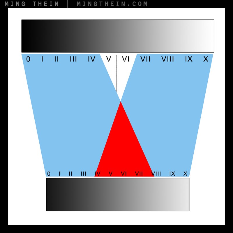
Your typical HDR image has tone mapping that has undergone a process that looks like this. The Roman numerals are zones; a zone is basically a luminance band/ range. The problem here is that the allocation results in overlaps: input zones 0-IV are output as zones 0-VII; but zones VII-X output as IV-X. Thus zones IV-VII become this ambiguous soup: we have highlights that are darker than shadows/ midtones, and shadows that are brighter than midtones/ highlights. And this simply looks unnatural – it’s also what I’ve done with the first image in this post. In case your retinas are still intact, here it is again:
You’ll notice that there’s something not quite right with the naming convention of the zones: I suspect this is the root cause of all of the bad-looking HDR is partially because whoever is using or writing the software makes the mistake of thinking that there are as many output zones are there are input zones: there simply aren’t. (This is why we have to do HDR in the first place: we cannot accurately capture or represent the full input tonal range; maybe our monitors don’t go perfectly black, or bright enough, or it’s because our sensors are limited, or because paper can’t get any brighter than zero ink density.) On top of that, most of the tone mapping is performed in the full RGB channels, instead of luminance only: hues doesn’t change when it gets darker. This results in hue/ colour shifts and the rather strange palette you see above. To understand why this is the case, we need to consider how the software works: you put in a number of images taken at different exposures; for each given pixel address, the program calculates an average luminance value for each RGB channel based on the input files. It may then run those through a curve to bias input/output. This of course is is a purely mathematical approach – it has to be, as every situation is different, and there is no such thing as an ‘ideal exposure – it varies based on artistic intent – it simply cannot beat personal, perceptual adjustment on a case by case basis.
Now, here’s how to do it right:
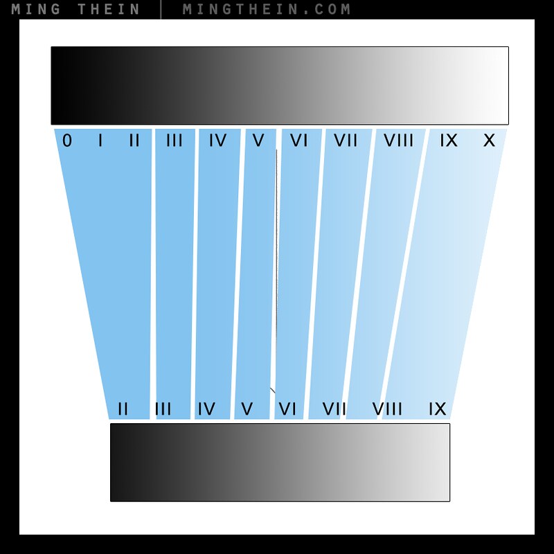
First, remember that everything is relative: there are fewer output zones than there are input zones. Golden rule: there should be no tonal overlaps. The input tonal band is always wider than the output band; even within the bands we must make sure there are no tonal overlaps. This way, the relative brightness transitions across a scene and between the subjects in the scene are preserved.
Second, and perhaps more importantly, HDR gives us the ability to choose the bias of the tonal allocation: whether we have priority given to the shadow areas, or the highlights, is up to us; this can still be done without overlaps:

Shadow bias; highlights are compressed into fewer output zones, shadows are not

Highlight bias – the opposite of above
This method allows us to maintain the smoothness of the transitions, especially at the shadow and highlight borders – areas where our eyes are particularly sensitive, and digital becomes binary – an area is either white and detail-less (i.e. no contrast because it’s fully desaturated) or it isn’t. A good HDR starting point should appear very flat: i.e. little apparent output contrast between adjacent areas in the image – because this gives you the flexibility to put the contrast where you want it later on, i.e. the ability to do the above allocation by means of a curve or local adjustments like dodging and burning.
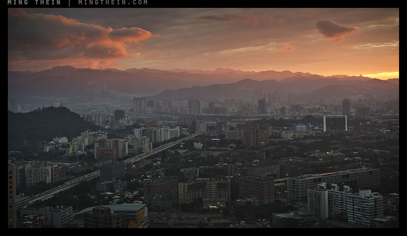
This is the same image, also run through a HDR process, but I think you’ll agree that it looks far more natural: firstly, there are no tonal overlaps. Secondly, colour remains natural and accurate to the scene (assuming a calibrated monitor). Thirdly, if you look closely, you’ll see that there are no large clipped areas in the image – there are small areas to allows the viewer’s eyes to automatically calibrate and get a feel for overall scene brightness only. Finally, pay close attention to the deep shadow and extreme highlight transitions: they’re smooth, and natural. But here’s the thing: if I didn’t tell you it wasn’t a single exposure, would you have known? In my mind, the benchmark of good processing – HDR or not – is that the first thing you should notice is the subject: not the post-capture adjustments. MT
There will be updated Photoshop Workflow videos available in the near future, including one specifically covering black and white conversions and preparation for print – I have made a lot of improvements and refinements to the process in the two years since the first video…
____________
Places left for 2014 Making Outstanding Images Workshops: Havana and London – click here for more information and to book!
____________
Visit the Teaching Store to up your photographic game – including workshop and Photoshop Workflow videos and the customized Email School of Photography; or go mobile with the Photography Compendium for iPad. You can also get your gear from B&H and Amazon. Prices are the same as normal, however a small portion of your purchase value is referred back to me. Thanks!
Don’t forget to like us on Facebook and join the reader Flickr group!

Images and content copyright Ming Thein | mingthein.com 2012 onwards. All rights reserved


Hi Ming, your “Golden rule: there should be no tonal overlaps” shouldn’t be so golden, in fact. The human visual system is more sensitive to local contrast than global contrast, and that’s how it achieves its HDR capabilities. And local contrast is achieved through global overlaps in tonal ranges. Painters have long known this and necessarily use overlap to express a scene. Imagine you have the morning sun shining through a window on a piece of white paper, and the frame (whether photo or painting) has both the paper and the sun itself in it. To depict the scene, you’d use whitest white paint for both the sun and the paper, which differs in brightness by whatever (put a large number here) amount. So, that’s overlap. And that’s why some HDR images look like painting as first impression. Of course, doing it too much is no good, as you pointed out, but overlap in absolute tonal scale to achieve relative and local contrast is the way both the brain and painters handle HDR.
You’re right – I wasn’t specific enough. There should be no tonal overlaps in areas that simultaneously register.
Fantastic!!!
Other than the purely technical “this goes there and this goes here, press the button here, and click this tab there” kinda HDR tutorials, yours is THE best I have ever seen. It tells us a whole LOT in very FEW words; succinct and possibly one of those pearls of wisdom many of us will remember until we die.
Thanks.
Thanks. Now, time to put it into practice…
Yes indeed.
That’s a piece of advice I get regularly.
My friend Neil says that I am suffering from a serious bout of not GAS (Gear Acquisition Syndrome) but TAS (Training Acquisition Syndrome)!! So I need to get out and shoot more!! 🙂
The retina-searing version reminds me of old color postcards circa 1910 or so, when low-cost color printing was primitive and had infinitesimal dynamic range.
I think at that point they may even have been B&W with manually-added color…
I laughed quite extensively at your “we have retina-searing rubbish that’s put out by people who for some odd reason celebrate the unnaturalness of the images” statement. I, too, am perplexed as to why one would do such things. People do actually buy this stuff. There is an individual in my home town that generates this retina-searing rubbish. He sells prints. I don’t get it.
They sell far more prints than you or I do, I bet…
Ming, nice article!
Overprocessing is so rampant in the photo forum where I hang out that it is making me sick.
VSCO film like over saturation of color, heavy contrast color images devoid of any special light or any worthwhile composition.
Look forward to your advanced B&W processing video.
I remember you had a good post on that last year some time.
Hope to get my own Outs tomorrow! 🙂
Otus that is!
Time to change forums 🙂
Enjoy the Otus!
Thanks! Probably will either join your email school or do a portfolio review.
I’m full at the moment but can put you on the notification list for when a place opens up if you’d like?
When I learned how to make black and white prints, I was taught to always strive to have a true black and a true white in each print. Often the dynamic range of the negative exceeded what I could print on paper, but that is what was so special. One could choose whether to print high contrast-low contrast using filters to influence the mood of the print; in conjunction with how one exposed the negative, you could achieve dramatic results. Now with B&W film you often shoot to preserve the shadows in the negatives, and the reverse is true as well with E-6 and digital negatives: shoot to preserve the highlights.
However, I don’t really understand the need for HDR with the advent of digital sensors that can produce near 12 zones or more of dynamic range especially with how it easy it is to slightly raise shadows in post with modern sensors. I understand that one can only lift shadows so far before noise becomes a problem, but so what? As you stated, we can’t perceive it in the output media. To me it seems like blowing a highlight with a digital negative is the ultimate sin… Nail the exposure and you have more dynamic range than you can actually use.
My questions how close could you get by spot metering part of the sky in your photo, and raising the shadows in post to achieve a similar/realistic look without HDR? Could you really not produce a similar result by selectively dodging and burning like we used to do in the darkroom?
I’ve always thought of exposure and printing as a trade-off. You make a conscious decision; you cannot capture every tone in the image, but preserving as much detail in the negative allows you print an image/display an image as close as possible to the image in your mind eye. Printing/Displaying is the next part of the process where you work with what you have… if you captured 16 stops why would you need HDR?
Most of the time, I expose to the right so the highlights just clip, and then dodge and burn as required. There are however some times when you need to extend that DR into clean shadows and have no choice/ control over lighting – commercial architecture for instance – and that’s when HDR comes in useful. I honestly don’t need to use it very often, though. I’m fine with shadows or highlights clipping, so long as they do it in a graceful way.
I may have misread your article, or maybe somebody else already pointed it out, but I think your explanation of how HDR works is mistaken. As I understand it, HDR is not a process that treats the entire image the same — it doesn’t just adjust the brightness of individual pixels based on the entire image, but rather it adjusts it based on the surrounding area of the picture.
What it does is that it looks at each pixel one after the other and adjusts its contrast based on the surrounding area of the picture. For example, if it’s dealing with a pixel that’s part of a cloud, it will compare its brightness to the surrounding area (the cloud). So while the pixel may be extremely bright compared to the overall image, it may be dark compared to the area of cloud that surrounds it, so the software will darken it as it tries to increase local contrast. The same software may analyze a dark pixel in a shadowy area and determine that it’s bright compared to the surrounding shadows, so it will make it brighter. Three pixels of the exact same original brightness will be treated differently if they’re each in the middle of a bright, moderate or dark area.
If you overdo it (by setting too intense parameters), you’ll get what should be shadows that’s brighter than what should be highlights, and that looks like crap. Another problem is that you can end up with an image that has no global contrast: every small area has good contrast, but globally there’s no area of the image that’s darker or brighter than average — the sky as a whole is just as bright as the ground — so it all looks like a gray mess.
Because the software analyzes each pixel separately based on its individual surrounding context, you need special software to do it. You can’t just apply a curve on the whole image. That’s also why the process can take a few seconds to process: it’s a not a single process applied to the whole image, it’s separate processes applied to each pixel in turn.
That’s also correct, but I’ve seen it done both ways – and the individual pixel method almost always yields odd results. You still need to have some global guide to set general areas for brights/mids/darks.
Are you sure that “the eyeball scans rapidly many hundreds of times a second”? The retina is composed of highly luminance sensitive rods and spectrally selective cones for color (but with non-uniform resolution, with concentrated cones centrally in the fovea where the visual acuity is at its maximum) that do parallel processing of the visual field with the assistance of retinal neurons, but not really “scanning”, with the electrochemical nerve signals then being conducted to the brain, also in parallel, by the optic nerves. Not sure what you mean to convey with the description “eyeball scans rapidly.” Are you oversimplifying short time decay constants of the individual retinal cells and calling that rapid “scans”? The eyeball does scan, but these are saccades where the gaze direction jumps (sudden mechanical rotations) which is necessary because an unchanging image on the retina decays over seconds to blank. But saccades do not occur as fast as “many hundreds of times a second.”
Honestly, no. I’ve read it many times, but as with everything on the internet it’s difficult to confirm. So you may well be right…though I do know that if you stare at the same area long enough and hold a finger against your eyeball with light pressure to stop it moving, then the image degrades to grey pretty quickly.
Updated Photoshop Workflow videos eh?! *reaches for wallet* 🙂 Loved this post and the one on medium format digital; I’m catching up after having been away for a couple of days (shooting that wedding for my friends, actually).
Possibly. I haven’t figured out when to schedule it in yet, to be honest. But I feel perhaps it’s worth revising some aspects of the workflow to take I to account new tools in CC.
I’d definitely be up for that. Really enjoying Outstanding Images Ep5; it might finally have lured me away from LR for good!
Finally! 😛
Ming, perhaps you might have added graphs of the gamma curves corresponding to your mapping examples to ease understanding for some of us readers? Or suggested the reader exercise of drawing them?
( I remember having a curve tool as the only way to influence my old b/w printer’s output..)
Thanks for an very instructive article!
– – –
I’ve done a little reading on HDR, and one thing surprises me.
Some people recommend letting their “blending” software blend up to seven bracketed exposures.
As two or three should give enough tonal overlap, I guess there is some problem in the “tonal stitching”.
Is it that the software has too little information of the nonlinearities of the sensor in question?
If so, there would be some fairly complex interpolation, can this create tonal overlap?
Actually I don’t play around with the gamma, which is why I didn’t include it here – I don’t think it’s necessary.
You need more exposures if you’ve got nonlinearities or very high dynamic range. And no, there’s no way of transferring that linearity information to the program.
When I read about PP, the curve tools are often presented as the only tools which give total control of the result.
As I haven’t yet tried Photoshop (or any other serious PP program) I’m rather ignorant. (XF1 in camera PP saves my slighter mistakes.)
So Ming, when you don’t use the gamma tools, does it mean that your shot discipline only requires simpler tools, or does it also mean that Photoshop has a set of other tools giving enough control even for larger corrections?
( In the future, maybe I had better invest in your post processing video…)
I think we may be confusing gamma with curves. I definitely use curves; sometimes multiple times – and only PS lets you do this. That in addition to dodge and burn…
I seem to have used a bit of (not too uncommon perhaps) sloppy terminology, but I haven’t found good definitions.
( I used “gamma curve” for the transformation curve of input luminance to output luminance.
And a curve tool is also such a transformation, and thus a tool to transform the original “gamma curve” into a new one?)
I guess you mean that “gamma curve” should be used only in it’s original meaning for
[Output] = [konstant] x [Input] xx [Gamma] ?
(where xx means “to the power of”)
Is there a term for the original – or final – transformation curve from input to output luminance (when it isn’t a gamma curve in the original sense of the term)?
– – –
When I drew the tonal transformation curve corresponding to your example of tonal overlap – the graph with the red region in the middle – I understood better what was going on, hence my original suggestion.
🙂
That makes sense. My bad for misinterpreting.
And mine!
For being imprecise.
Thanks for your patience!
Now, is there a correct terminology?
( If you still have time …)
No idea. I just call them curves or tonal curves.
OK, Thanks!
( There seems to be a bit of confusion out there, and I’ve seen “gamma curve” used also in this sense, maybe one should avoid that.)
Thanks for the explanation! I just wrote on the same topic, but much less technical and featuring images to show how NOT to do it.
I have a somewhat different reaction to bad HDR photography / processing out there, ie. of the sort that you show in that first image Ming. Instead of “My eyes, my eyes”, I experience something visceral, as if coming from the gut or sometimes throat area if the HDR image is very bad. As if I’m going to throw up. Sadly, I am not exaggerating. It’s accute and unmistakeable – it’s a very real, visceral response. Do any of your readers experience this?
It certainly makes me feel uncomfortable, but not to that extent. I suppose there might be some art in being able to control the physiological response of the audience, but I don’t know if that’s necessarily a good thing…
A Sensitive reader think by reading Mings article means thats Ming is writing to. ( being dumb) . Come on- stop reading if he think that so – go fly a layang instead for goodness sake.
This is a sensational piece of analysis and explication. A revelation. Hopefully you’re getting calls from software developers.
Thanks. Nope, no calls – just the usual spam…
Is it possible in Photoshop to merge, say, +/- 1 EV bracketed 14-bit files into one true 16-bit image by simply picking the values above or below the range of base exposure from the bracketed files? I.e. if a highlight pixel is blown, pick the value from -1ev file, and output to the top of the 16 bit range instead of compressing the midtones (on screen they would still be compressed). That would require a fairly linear response from the camera sensor to work, but in theory could simulate a 16 EV range flat out from the sensor. In practice the optimal transition points would be further from the base exposure’s limits to reduce noise.
Or maybe this is exactly how the proper method works? I’m not very familiar with PS…
You probably can, but I dont know what the point would be if there is no available display or print format which could display an image with that much dynamic range.
My thought was to create an image that you can pull and push and dodge and burn to your heart’s liking without running out of information on any channel. That’s basically the benefit we get from the huge dr in new sensors, since they’re already recording more than any normal medium can display (tonal resolution is another thing).
I’m not familiar with the inner workings of photo editing software, but isn’t your blending approach virtually the same as dodging and burning the raw file in a 16-bit editing space? Or do you make other adjustments like wb separately to each copy? Thanks for the useful article! Ones like that tend to raise new questions…
It’s not the same because you don’t have 16 bits of information to start with – DSLRs are 14 compressed, and MF digital is somewhere between 15 and 16.
I think the point is to make manipulation easier, not purely for output. If you take a nicely spaced 16bit file, do your tonal adjustments and then let PS do the downsampling to 8 bit, the results will be better than pushing 8 bits around to 8 bits again.
Not that I know of.
That was a fantastic explanation, thank you. I am a fan of a ‘natural’ looking HDR images but have never really broken the theory down in such detail.
Thanks for this entry. I have seen so much bad HDR that I decided not to use it at all. (Plus, I’m lazy.) I’ve even seen images that are much less real than your first one–eye-searing though that is.
I try to make it a rule never to learn anything new, as that taxes my old brain. (As a corollary, I’m trying to forget much of what I once new. The process is moving ahead beautifully.) But this post is very helpful, and I may even benefit from it!
Thanks!
I honestly have no idea how to make the first one worse, nor do I even want to!
+100 Clarity and huge vignette? Maybe lift the output black level for that badly-processed C-41 print film look, too. 🙂
I think you showed HDR processing in Episode 5, for readers who might not want to wait for the revised PS videos.
I’m not even going to go there.
I know I did focus stacking in Ep.5, but can’t remember if HDR was there or not. It may have been in Intermediate PS.
Oh yeah, it was focus stacking. Maybe I’m just thinking about your general comments about not overlapping tonal regions.
It would work the same way in principle, but with focus stacking you need to have clear hard boundaries – with HDR you can blend. In fact, it’s better to blend.
New HDR II software will have a curves tool accessible on a graphic tablet, so the creator can draw his gamma curve on it.
Freedom for the artist, draw any roller coaster curve – even with loops in V. III.
Welcome to the new brave world of Tonal Art replacing Photography!
There will come the Gamma Qubists allowing only a chain of straight line segments at certain angles, and the Circulists etc. …
Personalize your art from photos of simple scenes by writing your signature as a gamma curve.
Sorry, my calender’s battery seems to be dead, it still shows April 1.
Hahaha…good one!
Excellent article. I never liked unnatural looking HDR photos. But done right, it certainly has it’s place in photography. Thanks.
Just the job, thanks!
Interresting article! Thank you for explaining the technical aspect of what happens when tonemapping.
Would have been nice to have a little explanation on how you managed to process the pictures for the final result.
That’s not so easy to do in text because it’s difficult to describe. It really needs a video…
Arggh!!! You should put a warning sign before showing that eye-poking image! NSFVP (Visual Perception!). And as always, a great technical read on a very confusing subject (at least for me). I have to admit that I my inability to properly control tonal mapping in HDR processing to create a natural look makes me kind of bias against the whole thing. This skill would be another one that I would have to invest time and money to be proficient with in the future.
Lately, (maybe starting 2-3 years ago?) there’s more and more tendency to use HDR to create a hyper real looking image. Do you think this trend will become a norm for viewers who are looking for a different kind of image?
Well, at least you know why I said they were embarrassing…
I certainly hope it doesn’t become a trend. Good B&W that uses all of the available tonal range is different. It isn’t eye-poking, either…
Very interesting article Ming!
I also agree that good B&W that uses all of the available tonal range is completely different. You often talk about the tonal response of sensors/image processors and how some cameras (e.g. Ricoh GR, Leica MM, Sigma DP3 Merrill) make it much easier than others (e.g. Nikon Coolpix A and D800E) to achieve tonally rich B&W images, especially regarding the mid tones, but I couldn’t find a precise, technical explanation of this on your website.
My guess is that it is primarily linked to the way these cameras map input luminance to output luminance by default, but I also guess that the camera specific hue/colour reproduction plays an equally important role in the way the relative tonal relationship end up in the B&W image and by consequence that to achieve a consistent look independently of the camera used (as you say you manage to do), a hue/colour adjustment of the colour image is needed before it is converted to B&W – an adjustment probably more complex than what can be achieved with simply the channel mixer in PS or even the HSL/Grayscale tool in ACR. I’d be very interested to know all the variables that come into play and how you do it. Maybe you could shed some light on this topic in a future article? Or have you already covered it in one of your processing & workflow videos? Thanks a lot!
There isn’t one, because I’m not 100% sure what’s going on differently in their ADC circuitry either. I just know the results are visually different because the PP that has to be done isn’t the same – and is significantly more complex. I think I’ve figure out how to make up the difference, but I still don’t know why it’s different in the first place. Especially with cameras that have the same sensors such as the A and GR.
Thank you for your reply, Ming. I really wish they would be more open about their choices regarding data processing and tonal palettes. Matching the output of different cameras – both in colour and B&W – wouldn’t feel like tedious (and in my case sometimes unsuccessful) reverse engineering.
It isn’t so bad if you use ACR for everything – at least it’s easier to be consistent…
Sadly, I think it has become a trend, not unlike how people came to “enjoy” the sound of highly compressed lossy mp3s over uncompressed music, it seems that people actually enjoy and are starting to expect to see this kind of overprocessed HDR photography. It can look nice done well, and indeed Ansel used the zone system to determine where he wanted his tones to fall and thought ahead to developing (post-processing) later on also. He knew, as you do, that you cannot accurately display the full range of tonality in a high contrast scene on the output media, but you can represent a very close approximation of what you saw. That said, photography doesn’t and shouldn’t always be accurate or faithful to the scene, rather it should simply impart feeling & the vision of the photographer. I still hate looking at those ugly hyper processed HDR photos either way!
I can’t ever recall a scene that really felt like it required over processed HDR or benefitted from it…
Very interesting. I think you should consider creating your own plugin!?
I’m also looking forward to many more articles on post processing and printing topics.
Can I be a pain and make one comment about the writing style though? You are free to disagree, this is the beauty of the internet, but I feel the ripping on people using terms such as “embarrassment as a photographer” and “put out by people who for some odd reason celebrate the unnaturalness of the images” is not that classy.
It’s obvious there aren’t many photographers, post processors and printers as good as you. There are indeed probably many amateurs who as you say may not know what they’re doing. But I just think you could be a little more classy than ripping on people who might otherwise be reading your article to learn how to be a better photographer.
It’s just an opinion of mine, you’re and other readers will no doubt disagree with me and flame me for this post.
You can’t automate something that requires aesthetic choices to be made on the part of the photographer.
It’s my site and I’ll say what I want. I’m normally pretty mild, but some of the images give me headaches. That’s embarrassing, in my book. I’d be embarrassed if they came from me. I never specified a single individual, so there’s no need to take it personally 🙂
I am DEEPLY embarrassed by some of the post processing I did early on (and even fairly recently) and don’t mind be called out on it. After all, I’m here (on Ming’s site) to up my game. A little tough love is absolutely okay with me. 🙂
…though just for the record, I haven’t done anything quite as horrific as the initial photo.
Trust me…I’m even more embarrassed by mine.
I can’t see why anyone should be offended by a general comment that there’s a lot of bad post-processing out in the world. But back to the subject of a plug-in…
Wouldn’t it be possible to get a pretty good starting point in a plug-in by allowing the user to specify how many “zones” are available in the output medium and using a slider to adjust gradually between highlight and shadow bias. Then wouldn’t it just be a matter of having the plug-in scale the values as necessary to cause the transitions between similar input values to map appropriately to the more restricted set of output values, with more compression in the zones being biased against and less compression in teh zones being biased for? Basically, I’m just trying to put into words what your highlight and shadow bias diagrams are displaying graphically. You could also have addition sliders for fine-tuning the “boundaries” between zones to allow finer control over how much compression there should be in progressing from zone to zone. As you indicate in your post, you’d want the algorithm to leave no space and no overlap between zones.
On the other hand, I have no idea how plug-ins are written and no experience with HDR, so maybe I’m all wet.
Yes, I’d imagine something like that is programmable and may already exist. However, the benefit of the erasing method is that you can have a shadow bias in one area, and a highlight bias in the other – this may be necessary to create the visual impression you’re after…
Hi Paul,
No one’s going to flame on you here. We tend to do a bit better; though there have certainly been heated discussions!
On “embarrassment as a photographer…” That line was for a photog in a studio, i.e., the photog creates and controls all the light, i.e., in that situation if you’re clipping anything you didn’t want to clip—well, you (not you Paul, but..) you are an embarrassment as a photographer. People that can do it, know how to do it, and are trying to make a living from doing it are embarrassed by that individual.
I’m not a professional and I’ve never shot in a studio; but I can appreciate the point.
Interesting again Ming. To be honest I haven’t really dabbled much in HDR. Though I had a few shots on my last holiday where I struggled with single exposures. My own thoughts were to expose for the foreground and background separately and then combine as a composite – still have to play with them in photoshop. I’m guessing the above shot was bracketing and then somehow ensuring there are no tonal overlaps?
Single image, one pulled, one pushed, and then overlaid/ blended with careful erasing.
Ah ok. When I was a complete photo noob a read an article where the chap was doing the same thing though no way near as thorough in the blending. Not possible to tell in the jpeg image but how difficult do you find it to control adding additonal noise from the pushing and pulling ?
Depends on the camera. The D800E will give you easily another 2-3 stops or more at each end if you exposed it well to begin with. A light NR pass and all is well.
Interesting. Something to play around with! I think I can see how this relates to your b&w epiphany….b&w processing like this would help with much smoother mid tones?
Nope. It makes the highlight rolloff more natural.
“Single image, one pulled, one pushed, and then overlaid/ blended with careful erasing.”
We’re referring to the natural image here, right? If so, I’ve heard people mention this approach before. However, I don’t quite understand how taking two versions of the same image, one pushed, one pulled, and then merging in Photoshop is better than using a single image and using something like the highlights/shadows/blacks/whites sliders in Lightroom to achieve the same result.
Potentially a really dumb question, but what am I missing here, gang?
Firstly, using the sliders and recovery tools results in haloes – especially around large continuous ares. It’s pretty obvious, actually. Secondly, you have much better control over NR. Thirdly, you can selectively apply the ‘recovery’ without having to resort to masking – and you can see the results realtime as you erase through the layers. Finally, it’s faster…
That said, if you need more than a few extra stops of latitude, then you will have to do the same but bracket.
Thank you for taking the time to reply, Ming. I continue to be inspired by your work, and this kind of feedback is really helpful.
Karl.
Hi Ming – excellent article as usual. I have a question: if I’m presented with a scene with some movement, and don’t want to bracket exposition, what about shooting a single raw image, then open it in Lightroom and export, say, 5 jpegs, with bracketed exposition values and THEN using it for hdr composition? Thanks.
No benefit over a single frame well-processed unless you are dying something separately to shadows and highlights – eg noise reduction or toning.
Understood, thanks!
+1 I have to be honest, I have some difficulty following all the technical aspects of your explanation (although I do get the gist of it) and the end result that you’ve shown is exactly what I wish most HDR ‘shooters’ out there aspire to. I am unable to elaborate what I’m thinking, I’ll just share my admiration of the article to you in person when I see you next.
Haha – well, the problem is simplifying it makes causes the first result…
Took me 3-4 reads to get the gist as well! But i found the diagrams very helpful. Would have been totally lost without them!
Excellent Read Ming! Also looking forward to the new videos once they are available!
It might be a while. We haven’t filmed them yet and I’m back to back until August 🙂
No problem at all. I will enjoy them when they do arrive… 🙂
When I saw the first image I was thinking “OMG I can’t believe I am seeing this on Ming Thein’s blog”. Thank goodness it was there just for illustration purposes! Indeed, my eyes, my eyes!
That was the point 🙂
Haha. I had the same reaction!
Me, I thought, “Awesome Capture, Instant Fave” ….
Very nice … but I believe our eyes see a bit more into the shadows then your final version. I wouldn’t be adverse to seeing it lifted slightly
It could be your screen calibration/ gamma. I have no way of knowing whether we’re seeing the same thing or not.
That said, our eyes may see that much, but it looks odd to have that level of DR presented on a display medium with much less – some parts of the tonal range will be compressed and look odd. You have to make a choice.
perhaps watching it with a darker wider blackaround the image rather than the white blog environment helps you see a bit more in the shadows too 🙂