
This image doesn’t work small: there’s far too much detail going on to appreciate at just 800 pixels high.
Here’s a question for all photographers: how many of you have considered the intended viewing method for an image at any point before final output? No need to answer this to anybody other than yourself. That said, I’m willing to bet that the number is very small indeed. In my recent article on pushing clarity and transparency in a photograph and the intense discussion that ensued, the one thing that stuck in my mind was how we (collectively) undervalue the output medium.
Even career photographers such as myself don’t really pay it enough attention; I suspect this is the source of another large difference between artists and photographers. For an artist, the display medium and the creation medium are one and the same; if you’re a sculptor or a painter, you work on the final piece and that’s also what gets seen by the audience. For the photographer, there’s an increasing disconnect between how we create images and how we view them. The fact that most photographers rarely print these days makes things worse. Let’s consider the typical photographic process for a moment:
1. We see something with our eyes;
2. We compose in a viewfinder, or on an LCD; both are fairly small in terms of physical size, to the point that we have to check accuracy of focus post-capture by magnifying the image – something which is usually clear at the final viewing size;
3. We do a first round edit/ cull by looking at thumbnails or a contact sheet, simply because it’s difficult to A-B compare large images with limited screen sizes;
4. We post process either at fit-to-screen size or full resolution or greater (for retouching)
5. We output to web (most uses) or print (rarely)
I’m sure you can all see the problem here: at no point do we ever evaluate or view the image at final output size until it’s done.
Not every composition works at every output size – I think that much is clear from the simple fact that resolution limitations mean some images can’t be printed above certain dimensions – but resolution aside, I think most of us do not take that into account when creating the initial compositions. This of course results in a significant discontinuity between what we see, what we shoot, and what we show – and remember, we as photographers are judged solely on what we show. It is therefore in every photographer’s best interests to ensure that they are showing their work in the best possible way.
Here’s the biggest challenge, though: with digital photography, most of the time we have almost no control over the viewing medium. Think about it: whenever I upload an image online, I’m never quite sure a) how large it’s being viewed by the other party; b) if their display is correctly calibrated both for colour and brightness; c) what effective screen DPI they’re running; d) whether there are other things on that page or screen which might land up distracting from the image.

Here’s an image that works best at small to medium sizes: larger, there simply isn’t enough detail in the subject to hold your attention for long.
At least with what I upload to my own site or social media channels, I have some control over how the images are used; if it’s an image for a client, there’s usually zero control whatsoever. I’m sure many pros can sympathise with me here: bad art directors/ departments can completely kill an image by poor CMYK conversions, poor printing, insensitive cropping, sloppy downsizing…the list goes on. And the worst thing is that we frequently get blamed for the images not looking right – after they have been completely butchered!
I think I now have an answer to why the work of the great photographic legends of the past seems to be significantly stronger – by which I mean more distinct and memorable – than the current generation: they had more control over their output media. A print was a unique thing, expressing the final artistic intention of the photographer. There was no reinterpretation possible afterwards by the use of different viewing media (eyes and personal biases notwithstanding). If you saw a reproduction of the print, there was usually some effort put in to ensure that the reproduction itself was as faithful to the original as possible. The important thing to take away here is that the photographer decided the print size, material, tones etc. – he might not always have executed it himself, but he certainly would have had final veto power.
Perhaps this is why having an exhibition is such a big deal – as it should be – because the work that’s being shown is about as close to the true intentions of the artist as possible – what is really a shame is that most photographers and sponsors I know here do not take the display part seriously enough; and by printing I mean size, paper choice, lighting etc. And these things have to be considered with sensitivity to the actual physical location, too: prints of the wrong size will either dominate or get lost in the walls, once again reducing the impact of the work.
The modern age of photography has effectively done away with that; other than if we print* and solely show our work via this medium, we’ve lost control to a large extent. There is simply no way that the images I show on this site – just 800 pixels wide – are a good representation of the actual file. Other than depth of field cues, it’s nearly impossible to even discern what format was used for the initial capture; sometimes I’m surprised by my own EXIF data. Many of my Photoshop workshop participants express surprise when they see my actual files on screen – both at the overall macro view (tonal map, colour) and the micro one (resolution, detail and acuity). I’m not surprised: I know just how much is being lost when we resize for web; there’s a degree of disappointment whenever I move down a size, and a degree of surprise and delight when I go the other way. No question that an iPad (with its decent gamut screen) is better than a web JPEG; moving up to a good laptop screen improves things a notch; full screen on the 27″ Thunderbolt Display is better still. And nothing yet beats a large format print – I produced one copy of ‘Verticality’ (below) at 30×30″ on cotton rag baryta and was blown away. I’d spent a lot of time with the 20×20″s from the print run, but that extra 50% length on either side took things to another level.
*See this article for a discourse on the importance of printing for modern photographers.
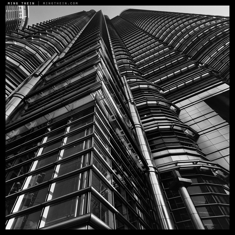
Verticality. It works at any size, but is really quite spectacular at 30×30″. Can you experience that on the web, or even on a monitor of any kind? Unfortunately not.
What I’m finding increasingly with my own images is that the compositions are being influenced by the intended output use – both size and medium – meaning that they might well land up being compromises most of the time, since the majority of people are going to be viewing things on the web anyway. Simply put, images with a lot of fine detail or subtle tonal gradation do not work well at small output sizes – anything less than 13×19″, for instance. Transitions become abrupt at the macro level, and take on the appearance of excessive microcontrast. Downsizing of fine detail inevitably becomes an issue since the output media seldom have the ability to reproduce at such high densities. The upshot of all of this is things start to look a little flat – and most of the time, I have a separate workflow action to produce the web JPEGs out of the actual files I’d use for printing or client delivery. It honestly makes me a little sad, because unless you’ve been to my office or one of my exhibitions, you’re only getting a small portion of the experience.
Though a large print is perhaps the ultimate discriminator, I was recently walking through a shopping mall and saw an 80″ 4K LED panel – that honestly blew me away. Granted, colour was a real unknown as it would undoubtedly require some calibration work (assuming gamut was large enough to begin with) – but the experience was something else. The detail/ resolution, the contrast, the physical size – all of it was more immersive and intense than anything I’d previously experienced. I think it was size without any apparently (at first glance) compromise that did it for me; I admit I’m seriously considering one of these for my office. Unfortunately that would widen the experiential gulf even further between what I see and what my audience sees.
Right now, we are at a point in time where the capture side of the technology is more advanced than the output side; as much as retina iPads have gone some way to bridging the gap (high output density, reasonably accurate and consistent colour) – we’re still far, far off. Average enthusiast cameras are pushing 16-24MP; mainstream displays barely manage HD – 2MP – and only for landscape images. Even the 4K panel was only 8MP; that’s still a 4:1 downsizing from a D800E image. And let’s not even talk about 3D reproduction. I’m going to leave all of you with one final thought: next time, consider upgrading your display devices before your camera; chances are, you’re probably not even seeing your images fully; if you aren’t, then who is? MT
_______________________________________
One last seat has opened up for the Prague workshop (2-5 Oct) due to a participant’s conflicting work commitments. Now available at the special price of $1,900 instead of $2,150!For full details and to make a booking, click here. Thanks! MT
_____________________________
Enter the 2013 Maybank Photo Awards here – there’s US$35,000 worth of prizes up for grabs, it’s open to all ASEAN residents, and I’m the head judge! Entries close 31 October 2013.
____________
Visit our Teaching Store to up your photographic game – including Photoshop Workflow DVDs and customized Email School of Photography; or go mobile with the Photography Compendium for iPad. You can also get your gear from B&H and Amazon. Prices are the same as normal, however a small portion of your purchase value is referred back to me. Thanks!
Don’t forget to like us on Facebook and join the reader Flickr group!

Images and content copyright Ming Thein | mingthein.com 2012 onwards. All rights reserved


Bit late to this. But I find the debate interesting because I only shoot to print. I have negs and slides dating back 40 years but I never look at them – only the few prints I made, mounted and framed back then. I can’t imagine that in another 40 years anyone will be able to read any of the digital files I now have. But even though I probably won’t be around, hopefully my prints will be.
That’s very true – I suppose shooting solely to print and having limited room for those prints makes you very discerning indeed with your editing…
“Images with a lot of fine detail or subtle tonal gradation do not work well at small output sizes…Transitions become abrupt at the macro level, and take on the appearance of excessive microcontrast.”
I’ve noticed this too with my D800E and RX1R files. I have resorted to dialing down clarity a bit to compensate but I suspect there is a more refined way to process in PS?
Yes, use bicubic smoother to downsize 🙂
What an irony and disappointment that we need to throw away info from these high-res cameras to make them look “good”. Maybe that’s why subconsciously I’ve started working on projects lately with large print sizes as final output.
Thanks for the tip btw 🙂
It’s the medium that’s the limitation, not the camera. You don’t actually need to do the same degree of faffing about if you’re just going to show it on an iphone display because of the pixel density…
Having been a photographic printmaker for many years, I agree that something is often lost when images are seen only on the monitor. The viewing medium is very important and most photographers would be well served to think about the intended use of an image, and it’s presentation size when gearing up to create it. While commercial images are increasingly aimed at web consumption, fine art images still are consumed at the print level. It’s only in the past decade that the option of consuming an image on a monitor has become commonplace. Unfortunately, the monitor has become the common denominator for most images today. Even juried art shows have entries screened by looking at portfolios on a monitor. While convienient, this is not the way to look at images that are to be hung in a show.
I think most serious photographers should spend time looking at prints, and learning the craft. If not with a darkroom, at least with a medium to large format injkjet printer. Learning the end of the process is often the best way to strengthen the beginning of creating an image.
The competitions which I’ve been involved in judging have always been judged as prints to both even out screen biases and level the playing field, but also to better be able to assess the skill of the photographer – preparing an image for print (implied, given the winners’ images are exhibited) is a skill that’s sadly being lost.
Fully agree with you on your last point: you need to understand all elements of the image creation process in order to be able to master it.
I might have at best 2-4 images truly worth printing. While the output medium is important, this is inevitably like a garnish that elevates a rustic home dish to a place suitable at gastronomy Michelin restaurant. Great printing is no substitute for a basically a substandard image.
That being said the lesson to be learned is how to make the best of our images sing. Thus enter the print. For the past year I’ve been playing with the canon 9500 MKii trying to get it right. Yikes, it is tough. As always, it is very refreshing and motivating to hear Ming’s thoughts and reflections on the nuaiances within photography.
No, great printing won’t fix a fundamentally bad image; just like photoshop won’t either. But it will make a good one sing even louder…
When shooting film to make prints, I freely used portrait or landscape orientation as best fit the subject. But when photographing with a digital camera for display on a computer, I find that I am greatly inhibited from shooting in portrait orientation because I know that the vertical image will be either cut off or displayed so much smaller than a horizontal image that matches the landscape orientation of the display. Disturbing, but I don’t see a solution.
I hope eventually we will have inexpensive flexible displays that cover walls like wallpaper so that image orientation will no longer be an issue and we can put up images around us with complete freedom as to size and shape. Manufacturing processes that rapidly create display electronics on large rolls of plastic or flexible glass by printing the electronics could make such ubiquitous displays very affordable.
It would be a nice experiment for a museum to create such an exhibit space with the walls covered with high resolution large screen monitors to start to get an idea of what this would be like, how best to utilize such a capability, and to help motivate companies to eventually manufacture inexpensive wall covering displays.
I agree with you on landscape vs portrait – what is really like is a square screen; at least it’s within the realm of reasonable technical feasibility, and doesn’t favor landscape or portrait images…
Interesting topic, but you know, before, we were (and I am still) making slides and could project them really big in our living room !
If you started from 6×6 slides…Wooooh ! And if you were making B&W slides, you lost interest in printing big !
So the hope for digital files stands in excellent projection devices at accessible price, and we are very very far from it !
Unless you have seen something I have missed on this projection matter, may be you could have an eye on this sometime, think how impressive it could be to have real big permanent projection of your photos in your office !
All the best
Michel Braud
There’s one very big fly in the ointment: ambient light and dynamic range. Projection doesn’t really work during the day; contrast is a disaster. Even at night, blacks are not really black, and the 3/4 tones lack the richness and depth of a good print.
Maybe you should try producing a photobook. That would give you substantial control over the viewer experience. Obviously it has severe size limitations, but you could choose suitable images. Having recently bought a few books after seeing photo exhibitions (one by a very famous photographer) I was left with an impression that the size of the medium is typically not given much thought in selecting the images. Which means that you could do better.
From business perspective you would probably reach a wider target audience than with large prints (not to mention exhibitions), but still work on your own terms.
So, who would buy a copy?
I thought of that, but the economics are disastrous – small runs are very expensive, the quality isn’t really up to par with gravure, and there’s a significant upfront investment required. To do things properly – i.e. to the standard matching individual prints – would require outlay of at least US$100k, and for a return of at most 10-20k – that doesn’t make any sense unfortunately. So as much as I too would love to see one, prints are the way to go for the time being.
As usual, a provocative post. I became a photographer quite a while ago, and was trained to “pre-visualize” the final print before pressing the shutter release. This was part of the method used by Ansel Adams and many other fine art photographers of that time. The whole process of development and printing revolved around getting back to that pre-visualization (with the option of modifying it later in some circumstances, of course). This was only practical if you did your own darkroom work. It also suited a deliberate type of shooting, optimally with a view camera or medium format camera with a good ground glass finder. But it could be done with any camera.
Today I find it difficult to pre-visualize with the current crappy viewfinders, even when the camera sensors are capable of high file quality. I’m still waiting for a really good EVF or, at the other extreme, a practical view camera digital back. At any rate, I find that printing my own files is critical to achieving my personal photography goals. I can’t imagine that even the best commercial printer could squeeze that important last 5% out of my images, because they can’t know my intent or feel my emotions.
Also, I would say that there is a trade-off between pre-visualization and varied print size. I agree that some photographs look much better at a particular size. But I also think that if you become totally familiar with a certain exhibition size (and paper, and ink set) then it can help in pre-visualizing the final result in the camera. It can also help in creating a consistent body of work. Like so many things in photography (or any medium), sometimes having limits is a good thing.
Nothing has changed in the previsualization process. It should be independent of the viewfinder anyway; you just need to know what is done in-camera, i.e. the starting point to give you the flexibility to do what you need to do afterwards – and what you need to do in post.
Depends how well you know your printer, I’d say. If he can print exactly what you intend in your completed file, and perhaps enhance that nuance a little by a) getting the most out of the printers, and b) suggesting either papers or methods to try you might not be aware of or considered, I think that’s more than one can reasonably ask for – especially if you’re not an expert at printing yourself. I thought about looking into it, but infrequency, costs and space requirements mean that it’s really impossible to justify the economics of keeping the hardware around.
Agreed on your last point: knowing the characteristics your medium – input and output – can indeed allow you to make the most of it.
Well, I still think it’s easier to pre-visualize while looking at a large ground glass screen than looking through a jiggling viewfinder tunnel or a grainy little EVF. Not impossible, of course. It’s just helpful to see the image in a clean form, at a slight remove, when picturing the final result, with all its tonalities. I actually look forward to better EVFs, which may have the best of all worlds.
I know many excellent photographers who rely on expert printers, and that works great for them. Including my wife! I myself print occasionally for other photographers, and they are happy. I’m very well calibrated, and the print will look just like the file. For me, though, making the print (including multiple proofs sometimes) is part of the joyful process of doing personal work, and it seems to enhance my ability to pre-visualize. There’s a direct kind of feedback loop, where I engage intimately with every aspect of how the print looks, or will look, or could look.
I had a similar experience in the darkroom days. No commercial darkroom worker ever fully clicked for me, even when their skills were as good as mine. So far, it’s the same with digital printmaking. That last 5% of decision-making at the printing stage puts some personal stamp on the final result that I value. To update the Ansel Adams saying: the file is the score, the print is the performance.
I can see the trade-off there, though: the more shooting you do, and the more prints that you look at from all that shooting, the better your pre-visualization skills can get. So shooting a lot and seeing consistent prints from a good printmaker has its appeal, compared to slaving over a hot printer….
Actually, the more I think about it, the more LCD/ LV composition is like a groundglass than the optical tunnel finder or EVF; better yet since it’s not inverted and can be magnified at will…
When I can tear myself away from this site, the current book I’m reading is Optics in Photography by Rudolph Kingslake [ex-Kodak optics chief]. It’s a great read –> I have a soft spot for technical writing and men of the previous but one generation.
I found the biggest revelation in there — so far, still page 40 so don’t hold me to this — and related to the topic at hand was perspective. Viewing perspective. To see the print, web jpeg, etc., truly as the photographer saw the scene through his viewfinder, we need to view from the correctly scaled distance [i.e., if the negative was scaled 10x for the print, then we need to 10x the actual camera-subject distance at time of capture by 10x to get the optimal viewing vantage point; I think good photogs who exhibit pay attention to this and guide the viewing position of visitors accordingly by positioning of lights, size of print, etc., etc].
I’m trying to experiment with it for my next chapter of discovery—I will only use a 45mm focal length on 36mm by 24mm sensor [diagonal is ~45mm] and will try and reverse engineer my subject-camera distance at time of capture [with typical eye-computer screen viewing distance in mind] to see if I can elicit a certain level of “reality” from my images. I’m not interested in realism, per say, just as a technical experiment and interesting thing to try [and probably fail at].
I’ve stil not yet printed [physically] a single image yet; but am really now at the point where I feel there’s nowhere left to run. I have hopes for a couple of color negatives [not digitized] and a couple of digital images. I want to try going straight to print with the negative –> analog and optical, no digitization. Just to see what happens. I’ll try the whole CMYK conversion and lab printer profile, soft-proofing dance with the digital files but am sure I’ll need to mess this up a good few times before I can get a result.
I mean, I was doing some files in LR today, and it struck me how little I know about PP even. Still. I’ve been doing it non-stop for six months. If this had been learning French or something, with the same effort and number of man hours I’m sure I’d be pretty fluent by now… Just a never ending story isn’t it, our thing. And I think this is what perhaps it boils down to for a lot of people, certainly for me, with all the stuff we have for making things easier, it’s still bloody hard to get it right.
If only some camera maker had the balls to make THAT their strapline 🙂
I think that logic for scaling holds true for reality of reproduction and perspective, but we lose control over the medium in most cases so it’s not possible to execute in practicality.
You’ll print, and if you get a good print, I think you’ll get addicted 🙂
As for PP – it takes time and practice, nothing more. I think things really sunk in for me after the first hundred thousand or so images; by that point you’ve pretty much seen it all. Fewer, if you have the benefit of my workflow video – all of the dead-end experimentation has already been done for you 😉
Sorry, I just wanted to nip in to correct that complete sleep deprived mixed up mumbo jumbo about scaling. Of course we don’t times the real life distance between subject and camera by the factor the negative was upscaled by: you’d be viewing from miles away! No I mixed two points:
1) Center of perspective –> scale the focal length by the negative enlargement. A photo taken with a 2inch lens (50mm) scaled 10x for printing, well, to view this print from the correct center of perspective, then we’d stand 20 inches from the print. We should now be seeing what the photographer saw. Am I sounding right, Ming? This is the principle projector/screen distances in theaters were designed on. You sit in the middle of the theatre, in the middle row –> you should be pretty much on the center of perspective and enjoy the movie better than the poor souls who got front row, left/right seating. Anyway: correct center of perspective.
2) Foibles of the medium. There is obviously no physical depth to a print though it is trying to depict objects in the back field that were a lot further away from the camera [at capture] than the viewer is from the print. Good control of this helps to emphasize the reality of a picture. [I’m sorry I’m not being more specific; the book is not to hand and I don’t want to go from memory too much and be wrong again!]
Now, to the washing up!
Cheers Ming. Cheers all.
Center of perspective makes sense. I’m still not quite sure I understand what you mean by the rest though – you’re saying the printed output should be life size? Or am I missing something here?
I’ve left the book at work, so will pick up on it again tomorrow [if it seems worth picking up on!]; but yeah, maybe just strike (2) from the record for now. Sorry MT. It’s a half remembered version of a full point from Mr Kingslake’s book. I think he was saying: though we have perspective in a photo: when viewed correctly, distant objects get smaller, train tracks converge, etc., though we have that there is no meaningful physical depth to the image rendered on the print itself, so a distant tree which might have been 50m away in real life when I took the photo [tree in the background], when I look at a print from half a meter away, even with the perspective effects in the image, i.e., the tree rendered much smaller than objects in the foreground, etc., something still feels “unreal” about it all. Mr Kingslake was talking about avoiding bad fits of focal length/camera subject distance to minimize [or, avoid maximizing] on this… though yes, I’m just going from sleep deprived memory here. I think the general point was just: troubles of recording a three dimensional field on a two dimensional media –> tree 50m away in real life, even rendered as tiny on a print viewed from half a meter still doesn’t feel as distant to the viewer as it should…
It’s funny that—as I’m a massive fan of something in physics called The Holographic Principle [a neat theory developed by Leonard Susskind]. All the three dimensional information should be recordable on two dimensions. Perhaps, to tie it in with display medium again, three dimensional holograms recreated from two dimensional recording media would be the way to go [the way to output].
Though, no, I think I’d still prefer the 2D image on a wall/screen, for some reason. Maybe that tinge of unreality is what makes it?
I guess Tom means:
Now, let’s suppose you have taken a half-length portrait at 3 metres, 10 feet. Allowing for a bit of space above the top of the subject’s head, the vertical height of the field of view is 1 metre. This subtends an angle of 36 degrees at the camera.
If you made a print 1 metre high and viewed it from 10 feet away, the angle subtended by everything in the picture would be exactly the same as the angle subtended at the camera and the perspective would be extremely convincing. But such large prints and viewing distances are scarcely convenient, so both can be shrunk in proportion. This is where the similar triangles come in. Let’s say you want to view the print from 60cm, a couple of feet. This is one-fifth of the shooting distance, so the print needs to be one-fifth as high: just 20cm, 8 inches. And now let’s say you want to put it into a book, which you assume will be read at a distance of 30cm, one foot. The print must now be a mere 10cm high, 4 inches: rather small.
Thanks for the save Wil m(. .)m
As soon as the word “subtend” cropped up, I knew you were making the point I’d forgotten/mixed up. Thanks.
Ah: that makes sense. So the subjects occupy the same FOV.
It’s too early in the morning for me to be sure, but in effect this is a restatement of the correct center of perspective guide, mentioned in (1) above, except now we might also be careful about unnatural perspectives [to the human eye] when we make the image. So you don’t put a 24mm on and take the corner headlight of a car from two feet away.
[though in Kingslake’s book he recommends taking a print of a picture like that and getting your nose to the page; the distortion should disappear. Which also puts paid to the thing about perspective distortion being a property of the lens. Which I still don’t feel confident saying out loud.]
That second statement seems a little counter intuitve to me, but I’ll try it at some point.
As for 24mm and car headlights – I was recently called in by a client to fix just that…the images they got from the last photographer looked rather cartoonish because I suspect they had to fit the whole car in a tiny studio and didn’t have any room to move back and use a longer lens…
Ok, I’ll do this the hard, but best, way as I’m a completely terrible witness and endlessly mix things up. Here’s a passage from Mr. Kingslake’s book [page 10-11 of Optics in Photography]:
—–
“True” and “Apparent” Perspective
From the preceding discussion it should be clear that if we look at a photograph from some point other than its true center of perspective, we must expect to see a distorted representation of the original scene. For instance, if our eyes are considerably too far away from the picture, foreground objects will appear too large, and background objects relatively too small. This effect is particularly noticeable in photographs taken with a wide angle lens, such as that in Fig. 1.10 The center of perspective of the lower photograph is at about 6 inches from the print, and if our eye is placed there, we have the impression that we are looking at a car from a reasonable distance away. For the upper picture, a wide angle lens was used and the camera was moved very close to the car. The center of perspective of the print is now only some 2 inches away, and if we place our eye there, we again see a reasonable picture of a car standing quite close to us. However, if we view the upper print from 12 to 15 inches away, the foreground becomes apparently magnified, and the near front wheel appears absurdly large.
The absurdity in this case is made up of two contributory factors: First, the true perspective of the picture is unusual in that the camera was placed decidedly close to one wheel of the car, whereas a better proportioned view would have been obtained by moving the camera much further away. Second, the apparent perspective of the picture is distorted by the observer since he or she is looking at it from a point of view far beyond its center of perspective. Unfortunately, both of these factors act in the same direction, with the result that few wide-angle photographs are really fair reproductions of the original scene.
We thus find that there are two independent ways of varying the perspective in a photograph: (1) by moving the camera lens relative to the original object, and (2) by moving the eye relative to the finished print. The first movement controls the true perspective in the photograph, which is fixed once the picture has been taken. Changing the focal length of the camera lens or enlarging the negative during printing cannot affect this perspective in any way. The second movement changes the apparent perspective of the photograph and thus indirectly affects the ultimate appearance of the scene. For the perspective to be correct, the photographic print must appear to the observer just as the original scene appeared to the photographer. This will occur only if the print is viewed from its correct center of perspective. An extreme example is shown in Fig 1.11.
It should be added that if we assume that all prints are to be viewed at a fixed distance, say 15 inches from the observer’s eye, then a change in either the focal length of the camera lens or in the enlarger magnification will affect the apparent perspective, because either of these changes will move the center of perspective of the print. Neither change, of course, will affect the true perspective in the picture itself since this depends only on the original position of the camera.
A minor effect of viewing a picture from too great a distance is that the depth of a scene, from the furthest to the nearest objects in it, appears to be increased, while if we look at the picture from too close a distance the scene appears collapsed and too shallow. This remark applies particularly to a large mural, or even to an oil painting, where the center of perspective may be many feet away from the picture, and the viewer can easily be too close to it. Indeed, if the average viewing distance is known in advance, the perspective conditions can be arranged so that the picture will enjoy the maximum degree of realism.
—–
Sorry for the sad iPhone copy photographs. Quick and dirty, just to give you an idea of the figures.
It’s an interesting book. I can recommend it to anyone on here.
That lack of 3D-ness can either be made up (put back in) for by visual cues like shadows, fading of backgrounds etc – i.e. light tricks – or removed entirely to form abstract projections and overlaps that would otherwise be impossible.
3D can be projected/ depicted as 2D, but we’ll always lose some information or require special apparatus to view it.
Some excellent points. The display was one of the reasons a few years back that I decided to get a macbook pro over a Windows machine. The difference at the time was huge. When I’m done with a file I always take it to view on our work 24″ screens and you really appreciate the file at full size and not just the crop.
Printing wise Europe is not so bad if you know where to go. I use whitewall and though not cheap I’ve been very happy with their printing. As a comparison I needed a quick print in black and white for a friend and like the poster above not exactly black and white.
Sadly I don’t have space to print and hang anything big and this is probably true for a lot of europeans so most things stay digital sadly
This is one of the reasons I’m looking at a quad HDTV – providing the color gamut is okay, hanging one of those on the study wall not only lets me work with more pixel area, but also proof and appreciate work at larger sizes; sadly as much as I love my barytas, there’s only so much hanging space in an average small apartment.
Thanks Sir,
A fantastic piece.
Only problem is, the rest of the world is not with you/us.
I have a 24 inch by 36 inch print of mine which lies, framed, on the floor of my study. My girlfriend can’t understand why it is yet to reach the wall.
It’s black and white, supposedly. But actually it’s f$&@ing purple. Bloody printers.
Here is why it’s important to know your printer 🙂
Thanks Ming! This goes to the heart of the transition in photography. It is not really about digital capture, but about digital output. I still shoot a lot of 4×5 black and white. This media makes beautiful large prints. Yet I recognize that on almost any digital display media – even big screen panels – an image from a well handled APS digital camera will look just as good. I do make prints, but in this WWW driven world, it is unlikely that anyone will see the actual prints. There are still some advantages to a view camera with its movements, but even that can be mostly equalized by photoshop. As I expect you find with your Hasselblad, there is a certain magic to the physical negative and the discipline of producing the picture in the camera. But only the photographer cares about the production of the image. I continue to shoot 4×5 because I enjoy the experience and love to see the occasional large print when I make it. I can understand why the alt-process folks get so involved in their media where they are working on the final object. It may be that handmade alt prints are the future of photographs as objects. Photographs as records will mostly migrate to digital display and storage.
Actually, assuming there are no visual cues like shallow depth of field, a well-exposed and focused image from an iphone doesn’t look that different from a medium format back at say 1000px wide output sizes – printing is quite a different thing altogether. I agree: the problem is that only the photographer experiences the final intention, unless you happen to see a print. There is definitely a future for fine art print photographs as objects – even from the limited sample of customers for my last print run, the feedback has been overwhelmingly positive; even from those who are artists themselves and/or familiar with large format printing. I can only chalk it down to the enormous difference between viewing media and the care taken with the final output…
Ming,
What a fine article. I feel like such a curmudgeon when I talk about the print being the end product. You have done a fine job of putting that concept into words for the digital era.
Thanks Fred – I think the print is the most refined and certain end product, but unfortunately that only works for a very limited audience; work these days has to be robust enough to stand up well across multiple media, which I feel is a bit of a compromise – but what can you do…
Very interesting, Ming. I suppose you just made the case for stopping the camera megapixel race at below 20M…
and for going back to good old prints. if only ink was not so damn expensive.
still, without web jpegs, where would we be enjoying the amount of fantastic work out there? no website, no Ming, at least for me here…
It depends on both the output medium and the quality of the pixels: 20 million 1.4 micron pixels will never be better than 20 million 10 micron pixels…
My point precisely: fewer, quality pixes that are compatible with ‘normal’ viewing conditions and ‘normal’ printing sizes…
Very interesting and for me, timely article Ming. I photographed a war time plaque for a museum last week and on screen the resulting image was very good – sharp & contrasty with accurate colours. The museum needed the print to send to Ravensbrook for an exhibition of wartime artifacts so I decided to print on Hahnemuhle Bright White Photo Rag – the result was an absolute revelation for me. The print was so much better than on screen (NEC Multisync 2690) – the client thought the print was actually better to look at than the original plaque.
So why don’t we print more often if the results are so good? Maybe it’s the price of printing or maybe we just can’t be bothered. My experience above (and your article) will make me look more closely at printing in the future
It’s a bit of both, I think: the price, the hassle, and above all, the fact that a lot of the time we don’t have as much control over the print as we might like if we work with a poor printer – I’ve recently been having no end of issues with another client’s printer messing up my files; they refuse to use my printmaster but clearly have no clue what they’re doing, as results are disastrous.
When covering callibration with students I usually ask them to go into a tv store and look at the wide range of colour and contrast between the different TVs that are showing the same footage, before comming to the class. It gets the message home, but I use it as a precursor to getting the right print. As you say for web purposes there is little control that you can exercise.
I am running an exhibition at the moment and all the prints are 24″ on the long side. For the most part it wirks well but I screwed the pouch though on three of the photos. Once I hung them on the wall I realised they we begging to be printed larger, it just never entered my head when I was looking at them on the screen or smaller proof prints.
The trouble is it’s very difficult to soft proof at larger sizes – who has 80″ monitors handy? 😉
… Not even we have to upgrade the resolution of a monitor but the size ot it also …
When I was doing only illustration work, the ideas started very small, and then the final results often scaled. Branding projects needed to work at business card size, and they needed to scale upwards to vehicle or building display. Ideas began as thumbnails. In a way, storyboards work in this manner with photographic images, though not every project goes that in-depth on planning. In our modern world, it is often tough to cut down the detail information in a scene to better match output needs.
The cameras I used are chosen based upon potential output needs. Even then most of these usually end up being complete overkill for how the images are finally printed. I suppose there is a little of the idea that starting with too much makes going smaller just another option. The reality, as you have suggested in this article, is that compromises come afterwards when it is time for output. Highly dense images filled with information may not always work well scaled downwards to smaller output.
I also look at this from a subject/scene basis, in that sometimes extra detail does not help an image. While there are photographers who use dense sensors for portrait work, it is not often as flattering as less dense captures; in other words, I would rather use a D3 for photographing people, than use a D800. There is another issue of tripod or not, and camera movement, but you have covered that quite thoroughly in other articles.
Agreed: more information is generally better, but some things just don’t scale. For portraits, I’ve come to really like the way 6×6 B&W negatives render…
I read somewhere Ansel would print specifically for the lighting (and wall colours?) for each exhibition. That made me stop and think about what I was doing.
When I print an image, I will quite often print and adjust several times, even with soft proofing on a calibrated system, it just translates differently to a print, now you mention it, it could be size related?
I think I must be in a shrinking minority, I print often, and never show my images online, except for the odd family snapshot email of course. Then again, I’m not trying to reach an audience.
Cheers
That makes sense. Unfortunately just about every exhibition I’ve been part of here doesn’t really take that into account; frankly, they mostly insist on using their own (very, very bad) crony printers.
For anything that matters, I do my best to control the output – but even then, there’s only so much you can do if the majority of viewing is going to be online…
Excellent thought to upgrade the display. I need to make some prints as well.
Trouble is, there aren’t that many options if you’re already running a good 24-30″ panel; beyond that, we’re talking silly money and silly space requirements, too.