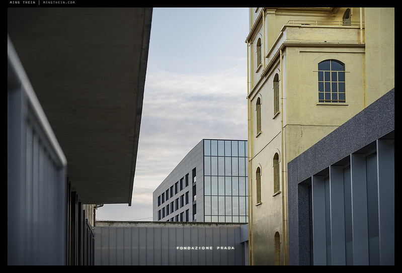
I’ll be the last person to pretend to understand the modern art housed within, but the architecture at Fondazione Prada was spectacular – partially rejuvenated, partially new buildings by Rem Koolhaas, and a very sensitive mix of hypermodern and classical Italian. The historical references to arches, stucco and what I think of as typically Italian tile roofs are all present; but modern volumes and spaces are added both above and below ground to house the exhibit and work spaces. I’m not entirely sure about the gilded palazzo, but I have to admit it does feel very much in keeping with the rest of the space and provides an interesting balance against the white tower. That said, I somehow associate this level of…bling with Gucci or one of the more showy brands. One of the most interesting things I found with the space was the feeling that whilst it was logically laid out and easy to navigate, there was always something left to discover – as though there was more volume hidden than actually apparent on first glance. Part of this is probably down to the mirrored theatre in the centre and the half-level offsets in the white tower, but also because there’s a surprising amount of open space present for what was probably a very expensive site. There just isn’t that feeling of crowdedness. Final bonus: the paninis at the Wes-Anderson-designed Bar Luce were pretty darn good, too. MT
This series was shot with a Nikon Z7, 24-70/4 S and my custom SOOC JPEG profiles.


