Regular readers probably know that I have more than a passing interest in all things horological; firstly as an aspiring collector, then a photographer (this is what motivated me to begin, to be the story of another article), then a low-budget collector, and fortunately, somebody who has access to the industry through client relationships and options that might not be available elsewhere. Eventually, I realised that the temptation to design my own was far too strong; finding the right collaborator proved less easy, but I eventually realised that dream (more detailed story here). It is, unfortunately, both an addictive and frustrating process: inevitably, once you’ve lived with any design for any length of time, you start to appreciate what works and get frustrated by what doesn’t. It’s even more frustrating when you have ideas you might want to try, and know that you can (somewhat) easily execute them. Some CAD and some sitting time later, the design has matured and you are making some phone calls. The trick is not to overdesign: it is easy to make something that’s too fussy and just doesn’t work.

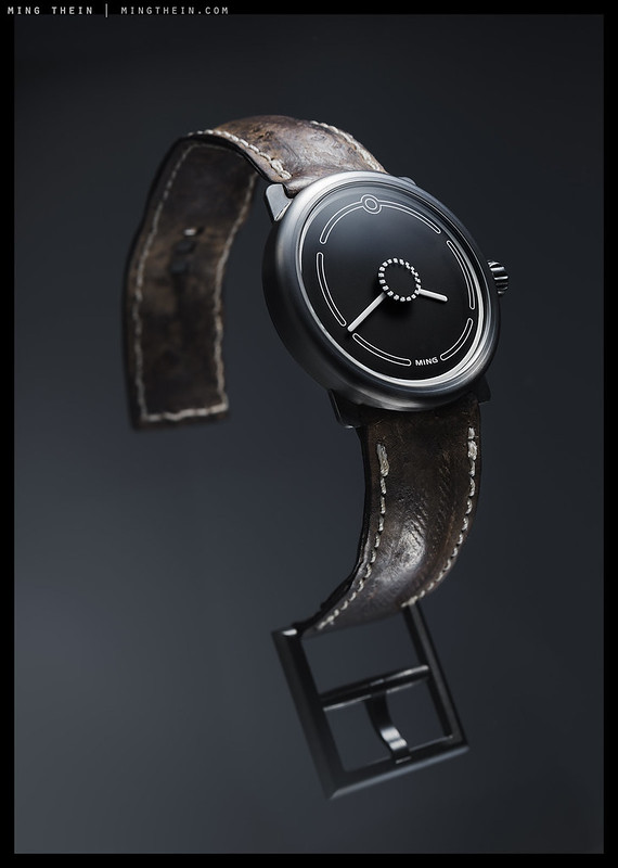
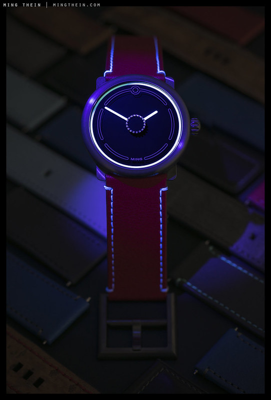
Presenting it is a whole different matter: I had some ideas that carried over from the previous watch, to do with different day/night personalities and even different hard/diffuse light personalities; the only way to demonstrate this is of course by shooting the watch in the same position under different light. You’re probably wondering why I didn’t use the Hasselblad for these images. There’s a simple reason: I wanted to, but due to the complexity of the setup for the ‘floating watch’ and multiple sheets of glass required, the camera has to go into a small gap in the diffuser at a very specific angle to allow polarising out of the reflections; the Hasselblad wouldn’t fit. 😛 MT
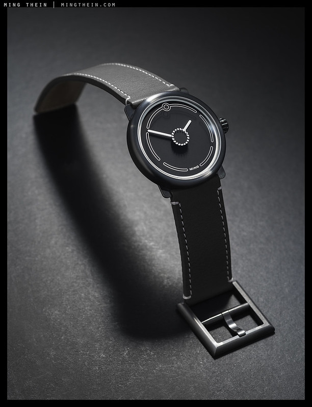
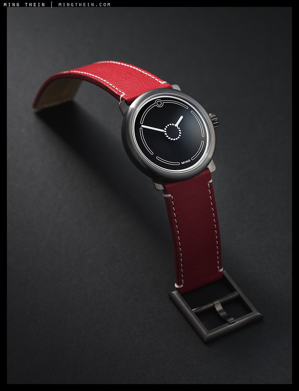
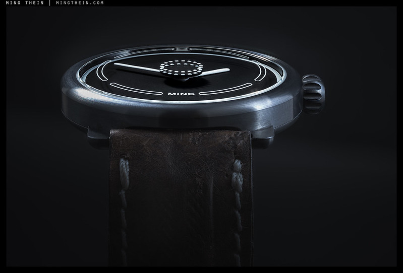
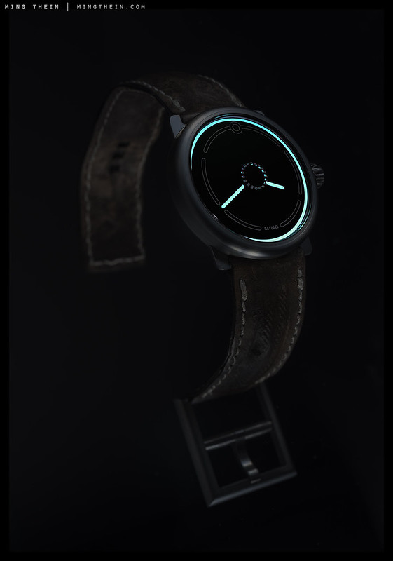
This set was shot with a Nikon D810, 45PCE, 85PCE lenses, several SB900 speedlights and post processed with Photoshop Workflow III. Learn more about watch photography in this series. For the watch geeks: Case in 7000 series aluminium, PVD coated. 40×7.5mm, with superluminova X1 markings and etching on the sapphire crystal. Pulse disk seconds hand with 24/25 markings and appearing to rotate once at the beat frequency. Manufactured as a piece unique by Ochs and Junior, Luzern.
 //embedr.flickr.com/assets/client-code.js

__________________
Visit the Teaching Store to up your photographic game – including workshop videos, and the individual Email School of Photography. You can also support the site by purchasing from B&H and Amazon – thanks!
We are also on Facebook and there is a curated reader Flickr pool.
Images and content copyright Ming Thein | mingthein.com 2012 onwards. All rights reserved


Ming,
Thanks so much for sharing your work, ideas and philosophy. Would you happen to have photos of the set up that you used to shoot the floating watch in the photo at the top of this article? The making of that image alone would make an interesting article.
Keep on clicking that shutter!
Regards,
Andy
Thanks. Unfortunately not – too much time pressure to make behind the scenes shots. Also, I’d like to keep some styles of image exclusive to my own brand 😉
Hi Ming. You might enjoy this bit of ‘science’, one of the trending articles on PubMed now: “Why Is 10 Past 10 the Default Setting for Clocks and Watches in Advertisements? A Psychological Experiment. Karim AA, et al. Front Psychol. 2017.”
Click to access fpsyg-08-01410.pdf
I’ve always subscribed to the smiley face theory, but personally I just want some symmetry…
Nice concept as always MT – look forward to whatever is next…..
Thanks!
Hi
I may consider making the Ming glow as well. Nice work.
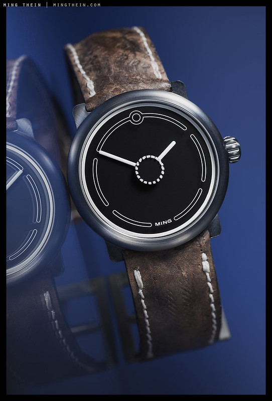
Not possible as it’s on the crystal…and much too small to carry luminous paint (requires some thickness as the paint is viscous). I wanted to though!
Your watches and your photos are pretty much cool. Congratulations !
Thanks!
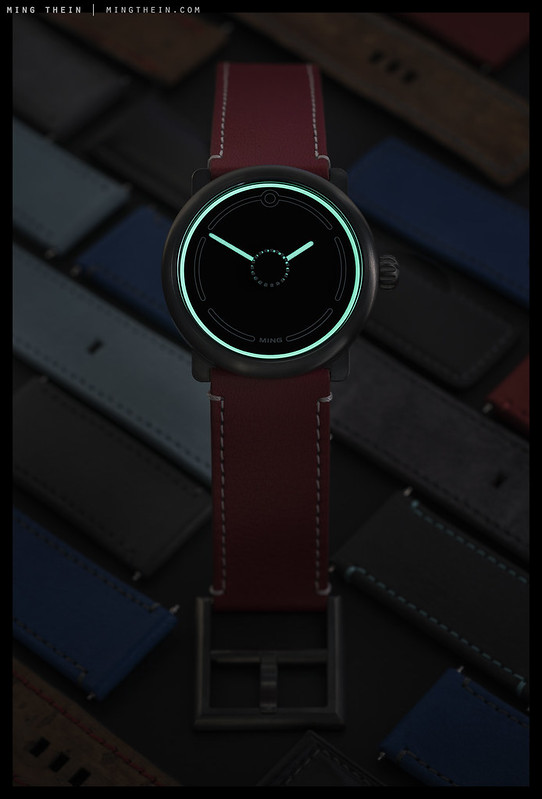
Let me get this straight. A set of reflective/glowing hash marks on a disk hides behind an identical set of marks on the crystal. As the disk turns and stops once per second there is a transient moment when both sets are seen in full, causing the illusion of a pulsing circle of light in the center of the watch. Right? Is this design patent worthy? Or does this sort of thing show up frequently in exotic watches?
For the watch geeks,,and no mention of the movement? Are you kidding?
No, because ultimately it doesn’t matter. It isn’t a watch about the movement – so in the interests of longevity and reliability I picked something easy to service and known to be a workhorse (Sellita 210). Far too many of the ‘watch geeks’ you refer to get hung up about movement and provenance: I’ve learned the hard way that’s complications and exclusive hardware are a quick path to expensive repair bills.
WOW! GREAT lightning!
I think, even Flash Gordon would wear this clock!! LOL
PS: just in case…, it was a comic books I use to read in the 80’s https://en.wikipedia.org/wiki/Flash_Gordon_(film)
Or Tron 🙂
Brilliant is the glow in the dark illumination – at least in the photos, it is very Tron like. Was it deliberately done?
It’s similar in person. And yes, deliberate. Time is a circle…
What’s the point of the glow-in-the dark circle? Does not provide essential information: which way is 12? The hour is unreadable at night. Would drive me nuts. Design for function.
It seems to emit enough light to make the orientation markings visible.
Bingo.
Once you strap it on your wrist, would the orientation not be obvious? I think it’s an excellent minimalist design. Well done Ming!
Thanks!
Actually, it does. The glow makes the indices printed on the sapphire over it visible, so you can tell the time.
I’ve been a minimalist ever since I was laid up for 12 months as a kid, with polio – aged 8 – and fell upon the stuff created by the Bauhaus and others of the same mindset. I have absolutely no difficulty whatsoever working out the time from your watch, Ming. I can clearly see where 2,4, 6, 8, 10 & 12 are – 1, 3, 5, 7, & 11 are self-evidently halfway between them – I’m OK at figuring where the other 48 minutes fit in between – and it’s a straightforward, clean, uncluttered design.
But then I’ve always been good at gauging “quantities” etc. Maybe other people have difficulties I don’t. What I do find appealing is that it ignores the feud between traditional horologists (who assert that a clock’s dial should use Roman numerals, not Arabic ones – and that “four” must be shown as IIII and NOT as IV) and the American school, which insists on Arabic numerals. Sigh – there must be something more important in life, to argue about 🙂
Thanks. Paring soothing down to the essentials is a tricky skill…you have to leave enough to be decipherable, but not so much as to be cluttered. In reality we almost never need precise, to the second timing anyway – I’d much rather have less. And I’ve not been late wearing this, but I have enjoyed the geometric interplay of shadows on the dial, which I wouldn’t have otherwise done if there was more on it…