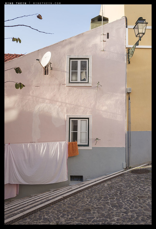
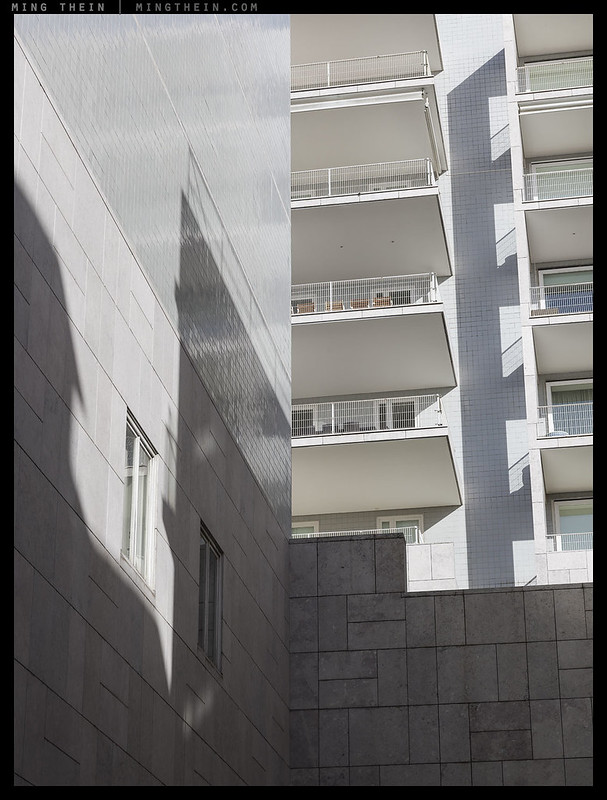
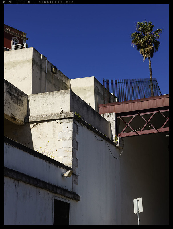
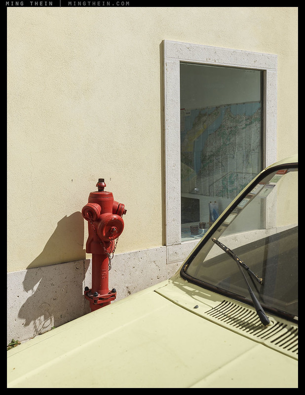
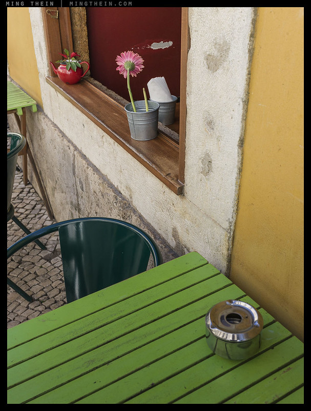
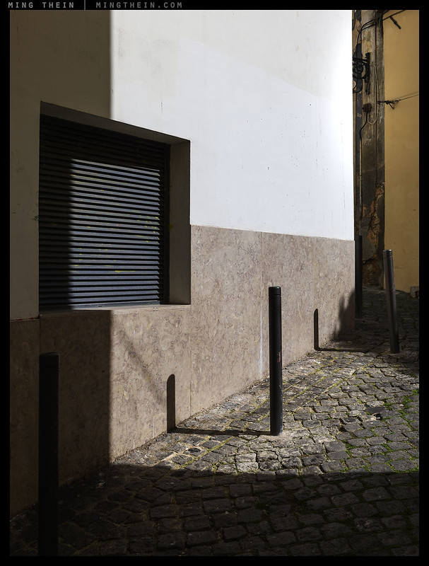
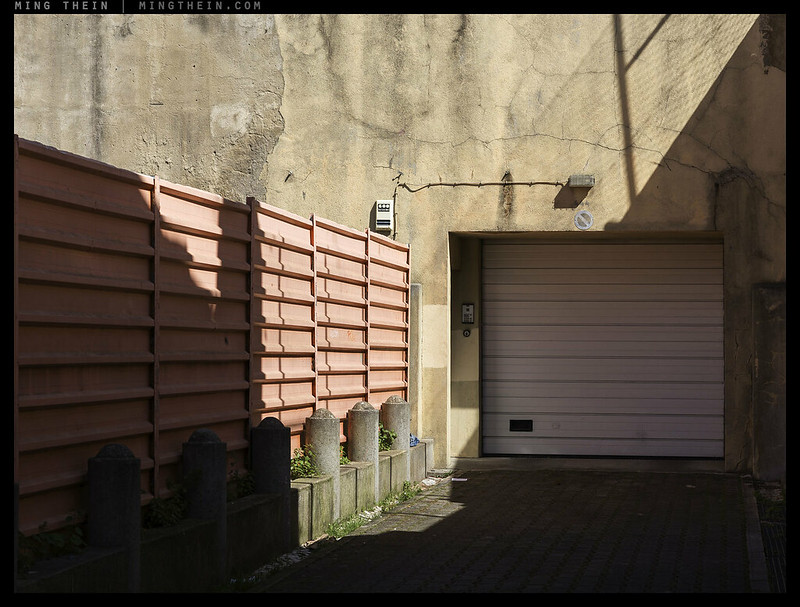
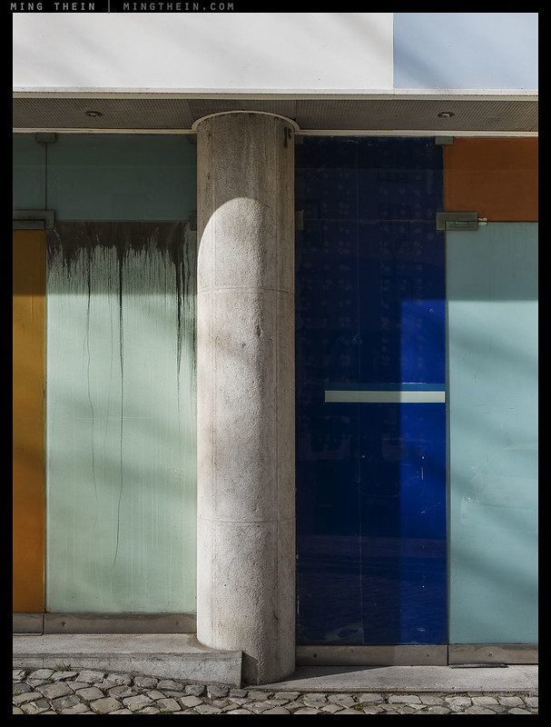
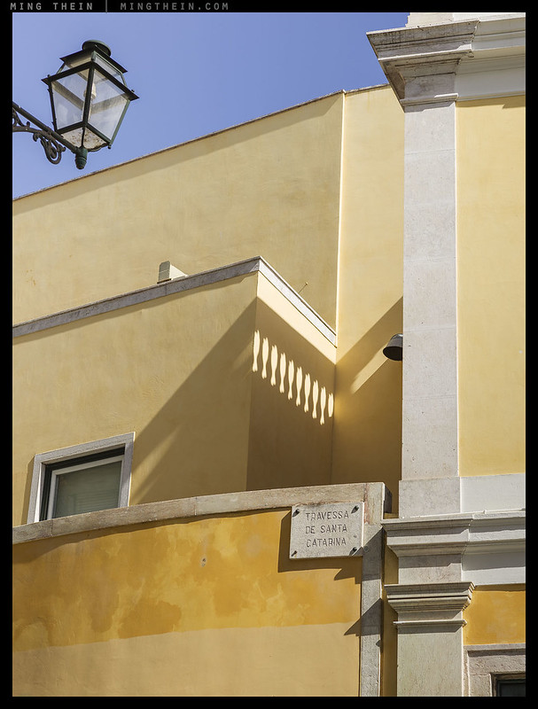
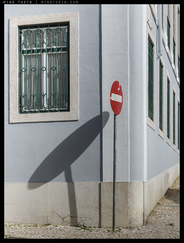
Unconsciously, I must have been searching for Mondriansque architecture – with a touch of diagonal Rothko thrown in by the shadows. I can’t really think of a good reason why, but it came through in the post-shoot curation. Perhaps it’s because those two artists decomposed form into nothing mor than shape, colour and luminance, and for the last few years I’ve been seeing the world not as ‘tree’, ‘car’, ‘person’, ‘building’ but ‘triangle on rectangle’, ‘organic contrasty shape on circles’, ‘matte organic shapes, round on rectangle’ and ‘coloured regular/ recursive squares’ – which I suppose fits in with their gestalt. It feels like visual reductionism, but isn’t – because I don’t consciously search for purely clean forms to the exclusion of some of the more textured and wimmelbild aspects of reality. I also don’t think it’d have worked as well in a location with less directional light and more faded colour – a certain blockiness/ solidity is required. MT
This series was shot mostly with a Hasselblad H5D-50c, 50mm and 100mm lenses in Lisbon, Portugal, with a couple of supporting images from a Leica Q. Postprocessing follows Photoshop and Lightroom Workflow III.


__________________
Masterclass Prague (September 2016) is open for booking.
__________________
Ultraprints from this series are available on request here
__________________
More info on Hasselblad cameras and lenses can be found here.
__________________
Visit the Teaching Store to up your photographic game – including workshop and Photoshop Workflow videos and the customized Email School of Photography. You can also support the site by purchasing from B&H and Amazon – thanks!
We are also on Facebook and there is a curated reader Flickr pool.
Images and content copyright Ming Thein | mingthein.com 2012 onwards. All rights reserved


you took the words right out my mouth Ming: i’ve been wondering (as an amateur) what this tug toward the juxtaposition of shape on shape was & you have articulated perfectly here. these shots are astonishing, the first one especially caught my eye, i love the depth you can achieve with reflections.
Thanks!
my pleasure.
What can I say, these images worked on me down in the belly. I have no idea how they have that effect, but they certainly do.
Fran
Thank you. I guess that’s ‘soul’!
The colors here are reminiscent of those I see when visiting Miami. These are really great. Architecture, framing, shadows and color done to near perfection!
Thanks Bill. I always had this impression that Miami’s colors were a lot more intense though?
A pity, your wimmelbild link does not work – perhaps you corrected the grammatical glitch “in der” instead of “im”?
I like these pictures very much, perhaps because I am also in a phase where I am through with my home town I photographed for decades… and then found that parts of it thrown together in one frame still have something.
Your first picture reminded me very much of one of the first such pics which I took not here but in Lisboa – “how portuguese!” i thought – and then the second already stated in printing that it was portuguese: Portugal? Macau?
Thanks
jm
Sorry, an extra space in the code was the culprit, it seems.
I think all of us eventually reach that stage with familiar subjects – no choice but to ‘force different’ and see what comes out, or stop photographing.
Macau feels very different to Portugal, even if there are some common visual elements. Just throwing in a smattering of Chinese text throws you completely…
I see only now at returning that „Lisbon“ had been indicated. I was there this year at San Antonio, in June. To me, „Portuguese“ means a special, friendly, calm and peaceful beauty, that you also find, well, which I also found in Macao, but not, for instance, in Hong Kong, so that I tend to find them similar…in a way.
The wimmelbild link now works, and I like the pictures and your thoughts, and your developing of these thoughts before your audience. The quality of your pictures is beyond my powers of praise.
May I add these details: for the native German speaker (and sometimes writer) that I am, to behold a „Wimmelbild“ from the verb „wimmeln“ (to teem, , swarm, be alive with, abound with) would be easiest looking at a meeting place of humans (like Bosch‘s villages) or at a beehive or at an anthill. And in visual arts in looking (also) at the cartoons of Gerhard Seyfried, a very ironical leftist, in glorious old West Berlin (1968+) – you‘ll find some of his cartoons googling his name, his site is //gerhardseyfried.de, and the most wimmling of the pictures shown on Google‘s first result page is the elections poster for the AL/Green party (http://www.beveswelt.de/wp-content/gallery/2015_11_gs/06_s.jpg) – but there were much better, wimmliger ones.
An element you did not include in your analysis of your interpretation of „wimmeln“ is that it is, at least to me, necessarily an abounding of life, and necessarily of diverse expressions of it. Thus, your Red wimmelbild (reflections of red bulbs) and your Green wimmelbild (forest scene) do not wimmel in my understanding. However, when one accepts your title, then your first pic (lonely man) and the seventh one (rear window of a car?) get a mysterious layer of meaning. Because for an outside person a wimmel scene has always something slightly threatening – these bees or ants or mountain market people have their secrets, their history, their knowledge, their strategies, so what if they decide to play some tricks on you, the outsider. Isn‘t that the situation the man in the first picture is in? He is – if the many other elements of the picture are really secretly alive. Same thing for the picture of the window, where I, the onlooker, may feel uneasy at the sharp and unsharp elements which may be about to exert some influence on me.
If I had the task to make a wimmelbild, I would probably try to find a tower next to a market, and photograph the market from the tower (primitive, sorry), but we don‘t have either in Berlin. There was a great Gewimmel at San Antonio‘s, though…
Excuse me if the 84 commenters before me did tell you all that already, I‘ll start to read them now.
Thanks
jm
Thanks for the thoughts.
“An element you did not include in your analysis of your interpretation of „wimmeln“ is that it is, at least to me, necessarily an abounding of life, and necessarily of diverse expressions of it. “
I think that’s something that doesn’t really survive translation; I’ve not seen it mentioned anywhere in English discussions on the topic but plenty in German references after being suggested to consider it by a couple of the other German speakers – this certainly adds another dimension…
I have a soft spot for geometry and abstract photography. All of these patricular images appeal to me, quite regardles of whether they are typical of the Porto carachteristics. My compliments.
*characteristics*, sorry.
Thanks Björn 🙂
Appropriately titled ; this group lacks the lyricisim of Painterly in Porto .
The first one is my favorite. It could be a painting. I don’t care whether it is a faithful representation of reality or not. It just appeals to me… lines and all. That’s art.
🙂
the first one is my favorite…nice
Thanks Richard.
I really enjoyed going through these. The repetition and juxtaposition of forms makes them so interesting for the viewer.
Thanks Karen.
I wonder if that quality of rigorous abstraction you are surfacing is tied into the “soul” discussion. My hunch is that some people will not find abstract shapes to be soulful in the same way that some people don’t find abstract painting soulful. Based on my experience of people, I think it is a significant fraction of people.
Additionally, there is essentially no direct human element in these pictures only the traces left by human activity. I suspect many people will struggle to connect with these pictures emotionally without a direct human story to latch on to.
This is not my emotional response, but I recognize this gradation in people’s appreciation for abstraction in a number of areas including music, painting and photography.
Thanks Tim.
I really like this set. It is, if I may say so, “soulful” and I’m not being ironic. It is also elegant and charming. Are you familiar with Manuel Alverez Bravo? Did a lot of classic monochrome stuff with the bright light of Mexico and the soft textures of adobe (the building material, not the software – obviously!).
Thanks Martin. Yes, Bravo did some interesting work…the quality of light there and the material itself makes for some great textures.
Out of curiosity are these pictures hand held? I like the red and blue one with the reflection, I think you should do some creative prossesing to it!
Yes, handheld.
Dear Ming. I’ve Seen à LOT off your images the last years and even if this ‘style’ you shown here could be close To earlier work IT seems to me you nail a wonderfull intuition inside you in these pictures which make me look and wonder very engaged. Peter
Thanks Peter.