After all the people have gone home
In a previous post, I tackled the general concept of an abstract photograph. I think it can be refined down something of the following: an image which is balanced equally across the entire frame such at that no one area attracts your attention more than any other area; the eye wanders, takes in the details, and never really lingers. By this definition, there is no subject since no one area or element of the photograph stands out more than any other; however, you could probably also argue that the entire frame is really the subject. Semantics is a funny thing, though, and this isn’t quite the definition of the term: we must think in terms of essences and summaries instead. An ‘abstract’ of a paper or article is really the core idea distilled down to the simplest possible terms; the objective elevator pitch rather than the marketing tagline. Today’s article tackles the visual equivalent of that: how do we take an idea and translate that into something visual?
Abstract, but that is the entire extent of the idea.
The first hint lies in something I mentioned earlier: the core idea distilled down to the simplest possible terms. In a live situation, if there are too many things simultaneously taking place, chances are you’re going to miss something or have your attention swayed by the obvious rather than the essential. The same applies to a photograph: if there are too many visual elements present, the main subject or idea is going to go overlooked. Thus the first order of business is not just to pare away the nonessential (the act of composition) but also to figure out exactly what the idea you’re trying to convey is so you know what is essential in the first place. I’ve seen a lot of finished images in the last dozen years or so – not just my own, but the work of others in the course of seeking inspiration or curiosity or something different, or social media; for the reader flickr pool alone, the rejection rate is such that I’ve probably seen close to a million images alone. That’s a staggering number. And these coming from people who arguably have more understanding of photography than most.
A deliberately weak image: lacking in idea, and not abstract enough to be truly whole-frame-subject.
Yet images that don’t work tend to be the ones that are lacking a clear idea; the technical stuff can be great, but if you a) have no idea what the image is about (i.e. the subject), and b) the implied relationship between that subject and its contextual surroundings (i.e. the composition) then the net outcome is confusing rather than memorable. Even the idea of chaos is something that has requires curated exclusion*: if you have elements of order, these contradict the idea of chaos, and the image and its message weaken.
*Modern Japanese photography is a good example of this: the photographs appear to be haphazard and messy, but if you consciously try to recreate this you’ll find it’s a lot more difficult than it looks – there’s frequently something in the scene which is not messy or haphazard and this spoils the frame.
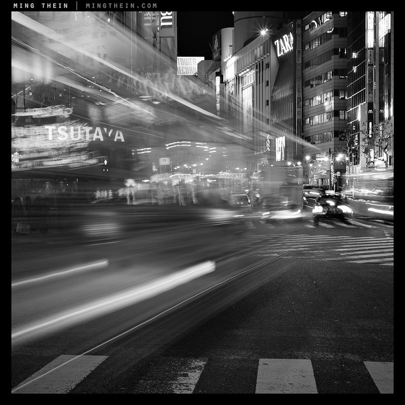
The feeling of flow from left to right is created both by the direction of dominant motion blur lines, but also the disorder/chaos to order. And we typically view things left to right with a Western upbringing – Asians may well view it differently.
This is not to say that every photograph must have a deep philosophical meaning; far from it. Some – what typically falls under the category of abstract images, for instance – are purely about color, light and form. A product photograph is first and foremost about showcasing the product – back to color, light and form. And frequently landscapes are nothing more than aesthetically pleasing, or aesthetically pleasing born out of an unusual combination of color, light and form. But I think you can see that even in those three examples, there is still a distilled concept and intention: you need to know what the subject is, and it has to be presented in an aesthetically pleasing way. That is both simpler and harder than it looks, of course.
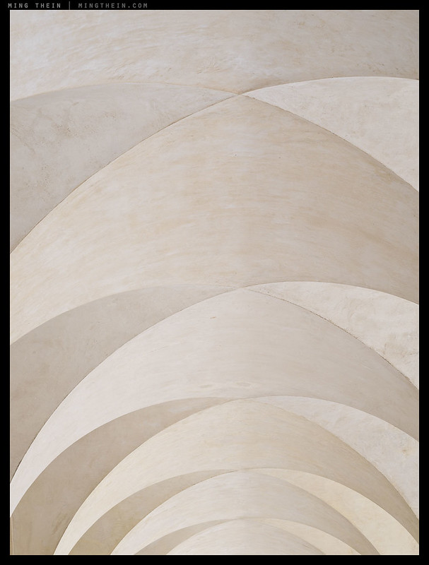
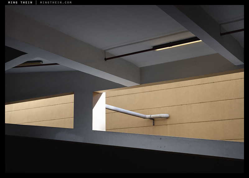
Arches
It is important for us photographers to be consciously aware of both the intended and unintended – anything included in the composition is necessarily assumed by the audience to be important and a conscious choice on the part of the artist. (Whether it is noticed or not is another thing, of course – it is our job to make obvious what is meant to be noticed** and not obvious what isn’t.) Their order of visual prominence matters, too – this dictates the order in which they are ‘read’ by the audience. The more something stands out – by contrast/color/texture/DOF/motion – the more obvious it is to us, and we consequently notice it first. It is therefore possible in that fashion to create a sort of ‘visual sentence’ or establish priority. As an audience, we make automatic assumptions about the relationships between elements in a frame based on what is implied by physical proximity or other spatial cues; e.g. two people sitting closely on a bench probably have some kind of relationship; solo persons each on their own bench probably don’t. We can use this to our advantage – both in implying relationships and implying lack of relationships.
**Covered under subject isolation in The Four Things and expounded on in practical detail in Making Outstanding Images Ep 1.
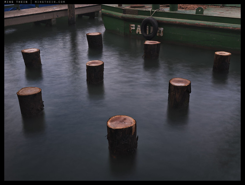
New Venice. The poles stand out, intentionally, because they are the subject, isolated by contrast, color, texture and motion (the water is moving). It’s Venice because that’s pretty much the only place where tree trunks are sunk into relatively calm water (not much amplitude or agitation suggested by the water, despite being obviously moving) to form foundations for new land by barges (visible) and at the edge of an existing artificial shore (the pier). Note lack of anything else in the frame.
The previous example of two people on a bench is a good one, because if the frame excludes everything immediately outside the bench we assume the image is about the people and their relationship; if they sit nearby they’re lovers or friends, if they sit far apart and consciously avoid each other they’re enemies. If they sit apart but in their own activities, they’re strangers. However, if the bench and the two people are just a tiny part of a much larger frame – say a desolate beach – we take it into context and their relationship pales in comparison to the expansiveness of their surroundings. In each case, the composition creates an implied relationship and message – and thus, an idea.
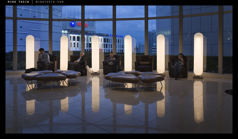
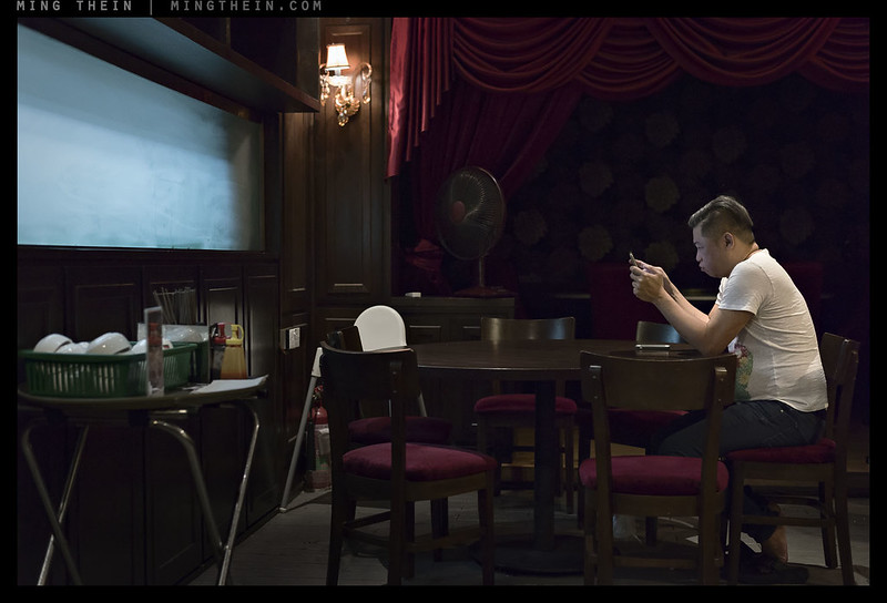
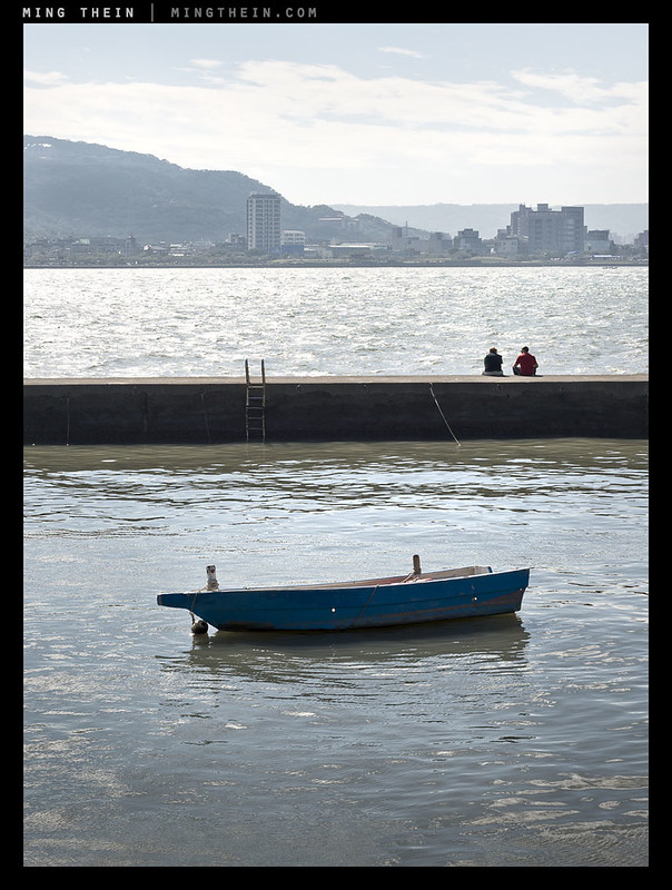
Are these people related, or in enforced but physically close separation?
It is clear, then, that we must really think carefully not just about subject inclusion, but also subject prominence and positioning. We cannot have an idea that centres around people with no explicit or implied people; the elements must be visually conspicuous through their presence (e.g. a crowd) or lack (e.g. a long exposure of a usually busy place like Times Square with no people). Empty space itself plays a part beyond visual/aesthetic balance, too: lots of it implies that isolation, solitude or something along those lines should be in consideration. Lack of it implies immediacy and rawness and immersion. Space in front of a figure suggests anticipation or something about to happen; behind it, history or escape. But you wouldn’t notice the space if it was full of irrelevant but distracting (for instance colourful) objects. Composition is really about conscious exclusion.
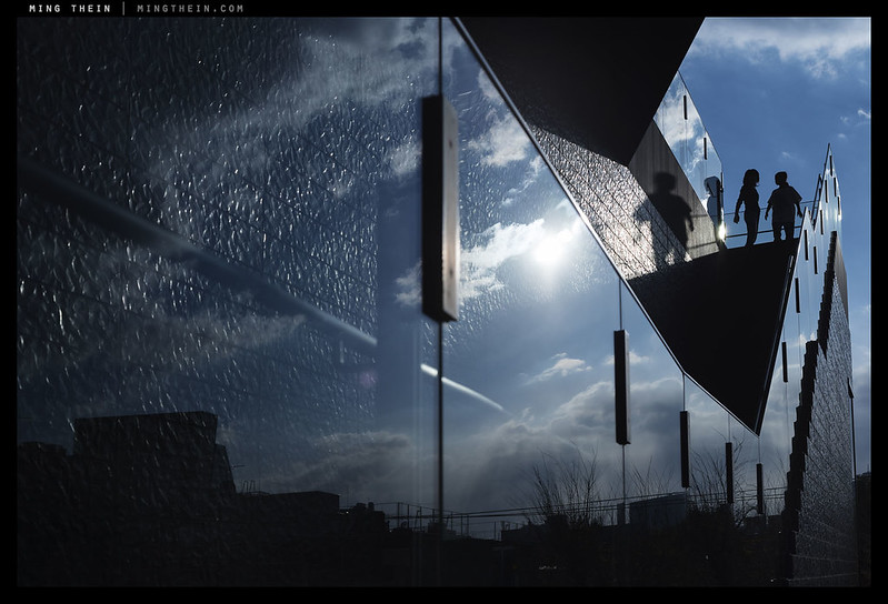
Endless possibilities of the imagination – note body language of ‘climber’ and position in frame relative to stairs; you could probably add one more metaphor into the reflection of the city, too.
For an image to be successful – memorable and visually impactful – we must first have the idea in mind, then evaluate each element or portion of the composition to see if it is relevant, irrelevant and/or confusing or simply unimportant. If it is either of the latter, why include it? For example, product photo – perhaps the simplest sort of idea – almost always never includes anything other than the subject itself. Advertising is a different matter – when the product is shown with some other objects, that’s because the intention is to associate the product with those other things or the ideas and feelings created by those other things – for instance, luggage and private jets implies luxurious travel; watches and movie stars implies fame and recognition if you wear one. You’d never see a Ferrari and a baby diaper together in the same ad; that would go completely against the high life the car supposedly gives you entry to.
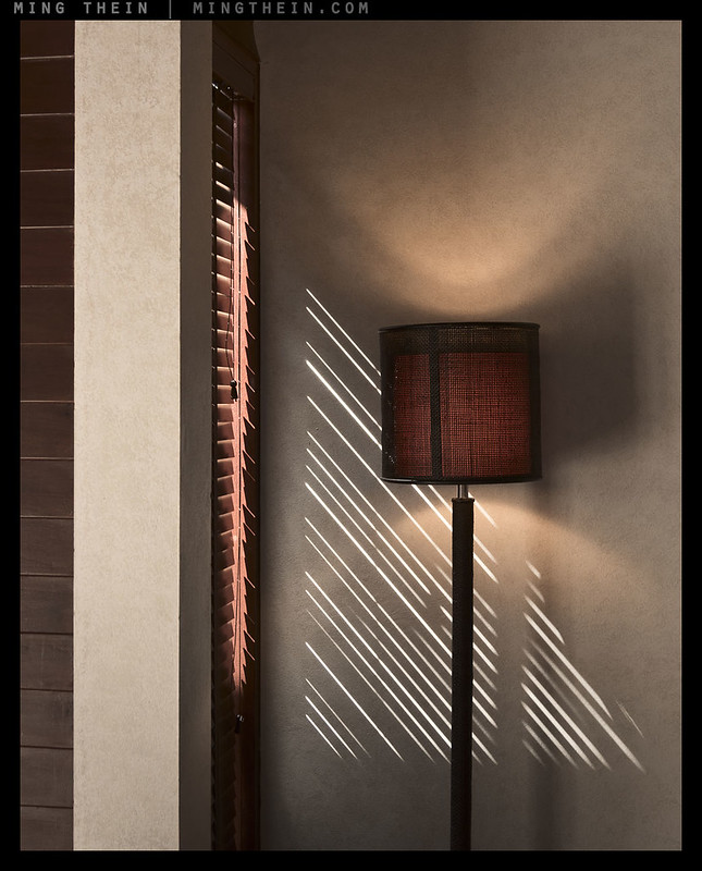
This lamp makes interesting light and is at home in a carefully designed and curated environment.
In a studio situation, it’s easy to have every element under control. This is obviously not possible in documentary or candid or street or general travel photography; we have to work with what we’ve got. The only controls at the disposal of the photographer are really composition and timing – we can re-aim the camera, or wait til something moves into the right position (or out of the frame). In these cases, it’s very difficult to translate a very precise and minimal idea; complete exclusion is usually impossible. We have to therefore compose such that we eliminate the distracting or confusing, and minimise the irrelevant. On top of that, there’s some further wiggle room afforded by making the main idea somewhat flexible and open to interpretation; a very nebulous concept (e.g. ‘freedom’) need not have a precise definition specifically because it likely conjures different imagery and means different things to different audiences.
Interpretations of freedom
This lack of specificity is not a bad thing – since every person is different and brings their own biases and expectations when viewing an image, the more room for interpretation without destroying the overarching idea, the better, simply because more people are going to go away happy having seen what they expected to see. All we have to do is remove the distractions that might guide thought otherwise, whilst leaving enough clues (captions included, especially in situations where there are specific cultural or regional references required) for our audience to piece things together – hopefully in the order and way we intended. I leave you with one closing thought: next time you frame up an image, ask yourself “what can I remove?” instead of “what else can I include?” MT
The Fundamentals and the Making Outstanding Images video series break down how to create a strong image based on the translation of an idea and subject into a series of exercises that will show you how to master every single detail of your composition and workflow process; they’re available here from the teaching store.
__________________
Turn the mood and style up to 11: the Hanoi Cinematic Masterclass in association with Zeiss (21-26 July and 28 July-2 August inclusive) is now open for registration – click here to book and for more information.
__________________
Ultraprints from this series are available on request here
__________________
Visit the Teaching Store to up your photographic game – including workshop and Photoshop Workflow videos and the customized Email School of Photography; or go mobile with the Photography Compendium for iPad. You can also get your gear from B&H and Amazon. Prices are the same as normal, however a small portion of your purchase value is referred back to me. Thanks!
Don’t forget to like us on Facebook and join the reader Flickr group!

Images and content copyright Ming Thein | mingthein.com 2012 onwards. All rights reserved


Yet another one to come back to again and again and again…
I love Arches. It’s got this minimalist painting quality that actually might work printed on canvas.
Thanks for sharing your great insights and wonderful outputs, Ming!
Thanks – Arches actually works best as an Ultraprint because continuity of tone is necessary – a sort of water-colour effect, to use the painting analogy. Canvas appears to discrete somehow (I have tried it on both).
Nice post. I really like Arches, “Endless possibilities…”, and “This lamp…”
Thanks!
Of all the images, image four is the best. Images seven and ten fall next in line. But, Image four more than all others offers what is generally missing in most all the other images; the viewer is not trapped. Image four presents space toward the immediate right for the viewer to step into the image. Image one would have worked if there was a path for the viewer to join the person at the table. One of the first things learned by an artist is not to trap the viewer, leave them space to walk into the image, to imagine. Image four offers the greatest possibility. Obviously, there are exceptions; portrait work is an example. But, imagine a boat upside down to the right of the image, with a path alongside the boat. The path clearly accessible to the viewer. Now the viewer can imagine walking along the path to view the boat close up. Or an image with a gazebo. the gazebo doesn’t dominate the picture, instead the gazebo is a bit off to the side with a path alongside, offering the viewer an opportunity to walk up to the gazebo or go past it. What is not messy or haphazard in image four, the right foreground, makes the image work.
Thank you – though I have to say your imagination sees far more in #4 than I did!
Yes, I can feel myself standing there with the photographer; a stable, calm area working against all the tension. Landscape paintings in particular, there is often enough a path for the viewer to enter into. Photos created from cameras with WLF finders tend to include this because of the vantage point of the photographer to the camera. Over time there has been a lot of praise given to the optics of TLR’s and Hasselblad, where the angle of view may be an equally important contributor. We don’t always know why we we are captured by an image, but we hear enough about lens sharpness, resolution, bokeh, etc. and try to apply those qualities; when in fact the photographer entered into a situation with perfect light, mood, etc… We don’t know and it doesn’t much matter. Of course, if we like the image enough we might even run out and buy the magical camera and lens that it was shot with.
The compositional experience is definitely different with a larger viewing method – you are far more sensitive to the details, and with LF/Hasselblad everything is also reversed, which makes you very, very careful with balance: if it works upside down and back to front, it’ll also work the right way up 🙂 Of course this is impossible to see with the tiny optical finder you get with most DSLRs today…
Yes, the larger viewing area is an important contributor. I just looked at your essay, “From the streets of KL” and the first image, “Connected isolation”, makes my point best. The viewer can find his way into the image. Perhaps to get a closer look at the young man or just continue walking. I understand the title, but the viewer is very connected. I can imagine walking toward the young man and he having a look over his shoulder. Part of this is psychological, the viewer needs to have a place to escape to. Everything else remaining the same, but with even a small fence or shrubbery between the viewer and the young man and it doesn’t work. It also matters to the viewer whether they are right or left handed, as a right handed person will tend to guard their weak side. That is, look toward the left, and left handed people tend to look toward their right. So, the image should work best with a left handed person. I bounced this off an artist friend and before I only had a few words out of my mouth and she was keenly aware with what I was going to say as this all gets covered early on in art classes. That said, from my perspective, “Connected isolation” is very well done.
Thank you. Yes, it’s not just left/right handedness, but also whether you’re trained to read from the left or the right – this may have something to do with the Asian design aesthetic being somewhat noticeably different from the Western…
Covered in classical art, but not in photography (for most) 🙂
Thanks Ming
Pleasure.
Another interesting article Ming. I like that you always come up with fresh views to make us think, re-think and re-evaluate our photography. Thanks, Drew
Thanks!
Very interesting post and helpful accompanying images. Thank you for sharing that.
Thanks!
Ganted this is only my opinion but among the massive quantities of work “called” art today, there are few who deserve the title and yet there is one who honestly qualifies, using only a simple visual recording tool.
I would guess it certainly isn’t Richard Prince 😛
A very educating article Ming. I am all the time struggling in no mans land between just getting better at it or forget the whole thing. The ambition getting there can drive you mad. The process baking the obvious subject into the scene in a balanced way is often obstructed by lack of my skills. I don’t think I even once took the deep breath and raised the bar of concentration to make the idea come through the way I had visualized.
What keeps me going is to see the success of others that makes me think I one day can lean back, view one of my images and say *Yes, I made it*
Thanks Gerner! Take a pause and if you have to force yourself to slow down, use a tripod 😛 That said, you seem to do just fine shooting instinctively and curating tightly…
There is one universal message I get from all of your posts Ming. I have to capture better. Inspirational as always.
Peace
Greg
We can all capture better – it’s a never-ending journey 🙂
Another amazing article again. Just had one of my pics added to the reader portfolio which is brilliant!
I’ve been struggling to get back into street photography after moving into more abstract/minimalist stuff, but your last couple of paragraphs are very telling, as are the following shots. Hopefully I can start to incorporate that style into my street work.
Cheers.
Thanks – and congrats! The bar to the reader pool keeps getting tougher 🙂
Great images and your narrative go straight to the core of abstract photographic challenges. In my view, there are three extremely difficult areas for photographers; abstracts, nature and food.
I found your approach to the abstract informative, interesting and drawing my attention back to abstract photography jin a most positive way. Thanks.
Thanks!
Wonderful refresher / article. The I have Climbed photo and freedom are two of my all time favorites of yours. 🙂
Thanks!
Great series of images!
When you compose an image that is strongly geometric and symmetric, do you find asymmetry to be a useful tool? I’m looking at you Arches! This is a fantastically subtle image. In the same situation I would have given it bilateral symmetry and tried to make the apex of the arches run horizontal. After consideration, maybe this ‘obvious’ approach makes for a more boring and less challenging image?
The asymmetry in Arches introduces a subtle discordance/left-right tension. I am not sure if I hate it because it is so strongly repetitious and symmetric, yet imperfect when I know it could be perfect. Or, if I love it it because it is so strongly repetitious and symmetric, yet imperfect when I know it could be perfect.
I find it a tease and for that I do like it…
Thanks. I think symmetry can go either way – if your subject has perfect symmetry, I would generally advise against using it in the image because then your two halves have equal visual weighted become divisive rather than cohesive; I’d split them unevenly so one half reinforces the other. On the other hand, if you have near-symmetry, then I think trying to force pseudo-symmetry works better because you can create the impression of coherence from incoherence. I really need to do a print edition of Arches…