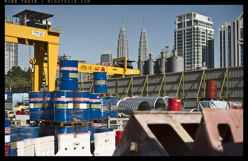
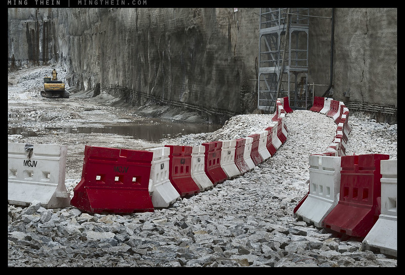
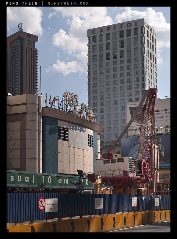
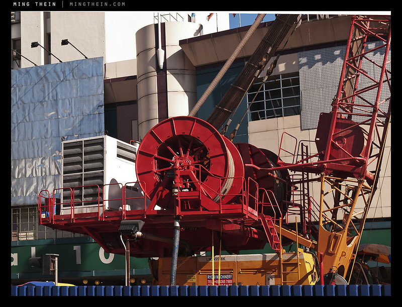
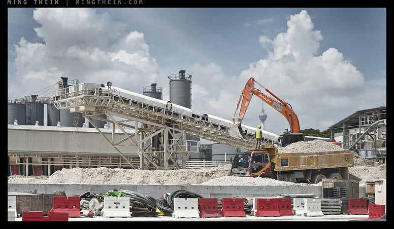
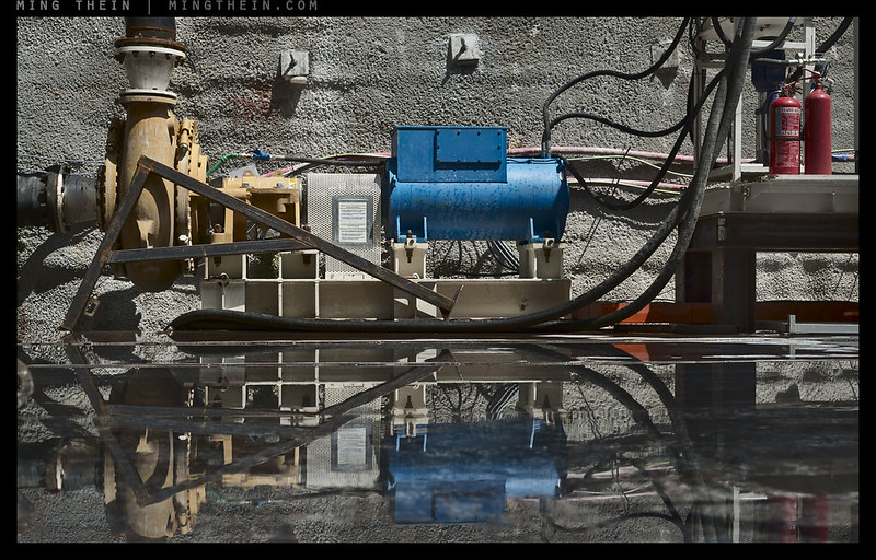
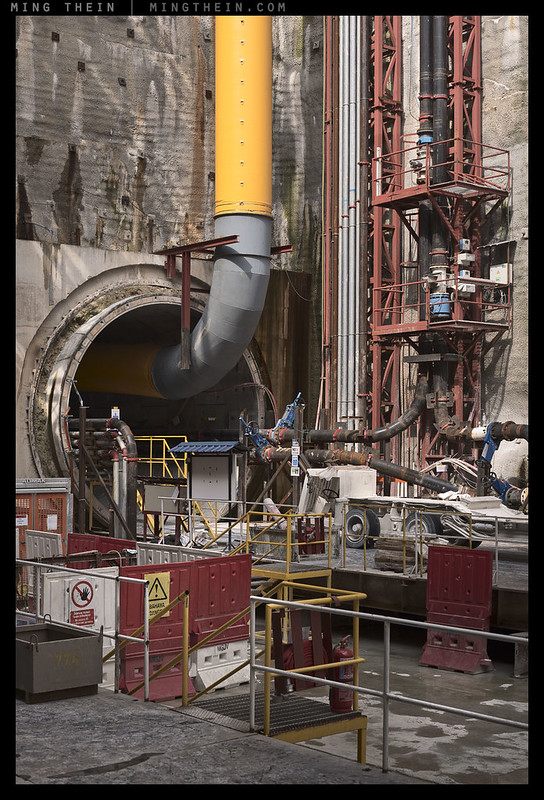
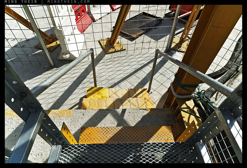
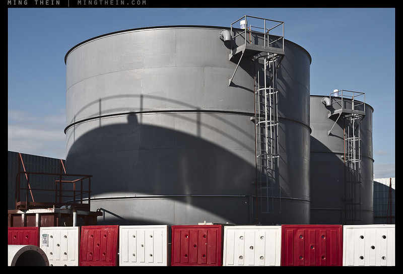
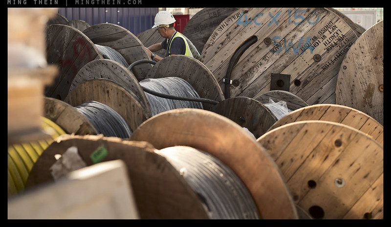
Today’s photoessay follows on from the last On Assignment; it’s the aboveground portion to the earlier underground portion focusing on the workers. A sense of scale is needed to appreciate the extent of the project, and this was the purpose of these images.
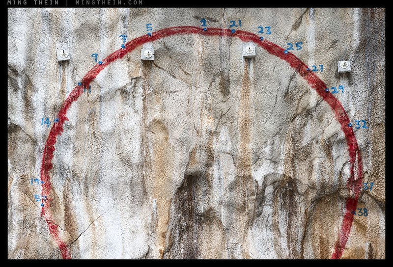
This photoessay splits into color and monochrome parts; one is commercial-friendly color abstraction and the other is entirely for my personal satisfaction to provide above-ground contextual and stylistic continuity with the earlier workers set. I’ve included a number of more abstract images in the color set; it somehow seemed fitting when focusing on the details. I shot this with a mix of equipment over an extended period of time – mostly Nikon D800Es, however. Enjoy! MT
__________________
H2 2014 workshops now open for booking – Making Outstanding Images San Francisco, Chicago and Venice; Masterclass San Francisco and Venice – click here to book or for more info
____________
Visit the Teaching Store to up your photographic game – including workshop and Photoshop Workflow videos and the customized Email School of Photography; or go mobile with the Photography Compendium for iPad. You can also get your gear from B&H and Amazon. Prices are the same as normal, however a small portion of your purchase value is referred back to me. Thanks!
Don’t forget to like us on Facebook and join the reader Flickr group!

Images and content copyright Ming Thein | mingthein.com 2012 onwards. All rights reserved


Nice set Ming! #7,8 and last one especially are my favorites.
Although on the last one I was wondering why you focused more towards infinity and left the foreground less sharp?
Was that shot taken with the 21 distagon?
Since you brought up comparing your different sets of images for this underground digging, my favorite images are #1 and #3 of your Underground workers in Mono set, especially #1 which i would not mind as a print on my wall next to the one I bought of yours of Taipei 101 building.
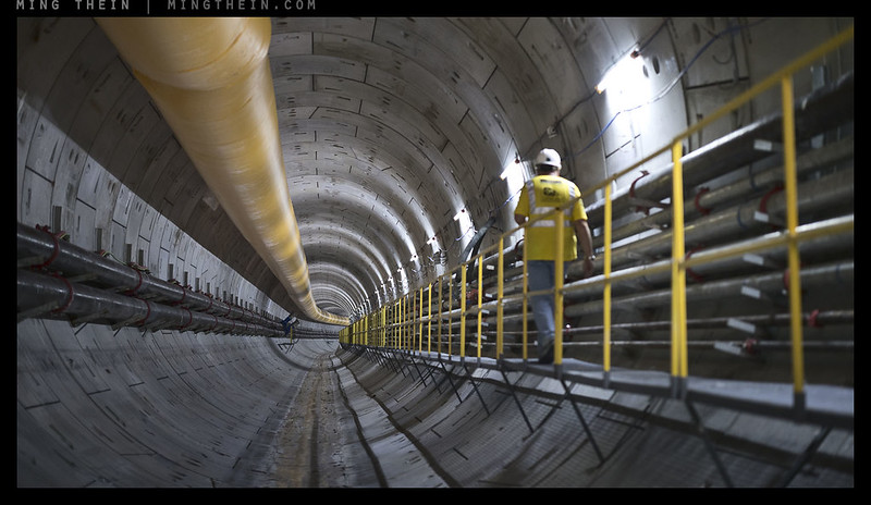
Love the railroad tracks leading into that tunnel with the worker on the side for scale. I guess I seem to prefer your B&W images more. Still looking forward to your new B&W conversion video! Any idea when that will become available? Thanks also for your excellent 645Z comparison review. I think for now I will stay with my D800E and zeiss lenses which I love so much.
When you talk about clarity and transparency of an image I see and feel that zeiss lenses give you that much more than other lenses. Like you can just reach out and touch objects in the image. Although monitor resolutions and sizes are getting better, can not wait for 4k monitors to get more prevalent, I still prefer the overall impact of large prints that are lit by gallery style lighting. 🙂
Thanks. Last one – foreground wasn’t the subject, the background was. Think of it as leading/ cinematic context; you actually lose the impression of convergence of the tunnel if you put the foreground in focus; I have two versions. Shot with the 55 Otus.
Sadly I can’t offer prints from this series because of the license agreement with the client. I think there’s something about the textures in these kinds of subjects that lend themselves better to mono, though you lose some of the visual punch when moving away from color in certain cases – only solution is to present both, but separately so that you don’t have visual inconsistency.
Monochrome Masterclass video is in the postproduction queue now. Probably around September, would be my guess. We have two other videos that need to go out first to keep the sequence.
The feeling washes over me with every set, but I have to use this chance to say something:
I rarely think about the art-theoretical side of it too much and have no artistic heroes or people I want to be like (I just want to be me), but you are the one I hold as a personal gold-standard on the finish of an image, Ming. Not so much for any Ps tricks or routines, etc., for your subjective sense and a following “just so” ness; and considered next to how hard it actually is with editable images to know when you’re “there,” at the strongest tonal expression of the picture… It’s simply not bettered by any other work I’ve come across (where sooner or later we often find an image where the artist doesn’t/didn’t know what he wanted).
I’m not just speaking from online output. Though, serious point, in today’s day and age to not appreciate printing to screen is a huge mistake, in my opinion—the screen is more than just for preview, etc., any viewer considers what he’s looking at, where he’s looking it at, to be what the work is. The screen is important; it is THE most popular canvas there is and shouldn’t be condescended to… Ming, you’re the only image maker I know that while being devoted to print, is not intellectually shackled by it, and can still consider a screen image when shown on a screen as the final delivery (as a standalone image itself, for that media) and grant it the according care and dedication. Everytime.
I’ve just never seen images on screen look so in the pocket, consistently, and on any device I choose to look at them on (I’m not saying they look the same on different devices). I think it’s down to well refined sense over and above dry technique. Honestly do.
Thank you, Tom. It seems you and I are amongst the few who share that aesthetic though – there seems to be very little commenting on this set vs the more dramatic/ in-your-face rendition of the previous post. What you and I are talking about is that idea of transparency/ clarity in the medium where you look through the image and into the scene, instead of looking at the image – a fine but important point.
I was much more devoted to the screen than print until about a year or so ago. Now, they work in tandem – what looks good on a good screen is a good starting point for color and tone in print, but what looks good in print under fine scrutiny will also hold up very well on screen. That said, I also do proofing on a limited-gamut color space to check that the output will look good on the majority of devices/ monitors, but there’s of course no way of knowing how any individual viewer’s device is set up. It generally seems that using an iPad as a starting point is actually not a bad idea because most people seem to use them…
Maybe this set has put us all in a contemplative mood? 🙂
I do agree with Tom about respecting the screen, especially because that’s how most people consume images today. Despite your admonishments, I’ve dived headfirst into printing. My process is also to get the image on-screen to where I need it to be (on a calibrated, but also limited to sRGB gamut monitor), and then tweak my picture so the print represents my intentions. Sometimes it’s different and much better than what I had on-screen.
It’s turning out to be both easy and hard. It’s easy to get in the right ballpark and tempting to leave it there because it’s good enough, but it’s really hard to really get it really exactly right. I also now appreciate how good my printing lab was, but I think this is a necessary step for me to have complete artistic ownership over what I produce, and it’s made me more aware of many things during capture as well.
My plan is to present my starting portfolio at the San Francisco workshop as finished prints … we’ll see what kind of disaster that turns out to be!
Who knows. The internet is all about sensationalism anyway…
As for printing – that says to me your screen calibration still leaves something to be desired; and you’re still going to need a bit more input into the print process if there’s a visible difference between your screen > lab screen > print. What I see on my screen is what I get in my prints.
Maybe my calibration is off, but I suspect that your printmaster is probably doing a good job giving you prints that are similar to your screen. The physics of the two media (screen and paper) are so different that I don’t think anyone could reasonably expect a print that looks like the screen without a bunch of processing for that particular printer, paper and inkset. For example, I find that my prints have much lower contrast in the low quarter tones than the screen, so I have to do something about that otherwise they come out crushed to the same tone on paper. Color is close, but the yellows are still off — that could be due to my viewing lights, which are just random houselights at a warmer temperature compared to a D65 screen.
To be honest, there are so many variables in the whole process that it’s a bit of a black art in itself. And color temperature is just one of them; gamma is another, and gamut/ gamut coverage yet another still. And that’s before we even get into the dynamic range and rendition differences between reflective and transmissive media…
Some of us think mucking about in a black art is fun! 🙂
I don’t think it’ll be a disaster, Andre. Your recent stuff has been a non-stop parade of excellence. But, as you know, disasters aren’t really so bad—nothing ventured, nothing gained.
Not that it’s a running race, but I think you’re well ahead of me now since I still haven’t printed anything and though I said I would this year, I was lying to myself and I know I don’t really intend to. Besides price — which I couldn’t really make a quibble about considering since Spring I’ve bought a DP3M, a D2Hs and an FE 55 1.8 ZA (a big copy job bonus, spunked away on cameras! Nobody does it better) — but besides the superficial excuse of having to pay a few thousands of yen per print, I’ve started to think that maybe I’m just not that interested in my photographs on paper. Let me be quick to say that generally, I very much like photographs on paper. I like them a lot—when they are other people’s. My favorite is Ming Thein.
If I’m coldly rational with myself, it’s simply a case that I must feel like I haven’t created anything strong enough to merit a print. But I question this again—because the position presupposes that I think print is the top of the tree when it comes to the expression of my photographs. I question it as I genuinely feel like I might be a guy that never feels the need to print, ever. I just feel no motivation to go there. Straight chicken hearted cowardice? Inertia? Or actually just the way I am… Who cares! is probably the correct answer 🙂
I was lucky enough to take some portraits for a friend’s fashion brand, which were then printed to a high standard in a 20P LookBook (proofing definitely not by me), and the book has now seen some success—the images helped, in a small way, attract bigger buyers for the brand, and it’s going to be carried in a famous boutique for the upcoming FW season, the boutique paid for another, larger, print run and the LookBooks will be given out gratis to customers in-store to promote the brand (and to try and sell stuff!). I also did a series of portraits for the clothing dept., guys at work who decided they wanted to do a similar thing as just mentioned, and work’s designers are in the process of choosing the photos for an A3 sized customer handout right now… I don’t say this to show off — it’s raw circumstance that I was able to do this — I say it to underline a point about printing: I’m not especially stoked by the LookBooks. I mean I am OVER THE MOON to have done something like this, and there be a final product, and the photographs look good—but it’s more like I’m happy for the guys I did it for than the images I took. I was honestly more smug about seeing them online than in print…
May change…
But I really quite like seeing them on screen. Perhaps I watched too much television as a child! 😮 🙂
Have a great weekend Andre, Ming, all.
There are no disasters in this game, just steps along the learning curve…
A few thousands of yen per print is nothing, if the print is to your satisfaction. It’s when you’re burning multiple 100ft rolls of Canson Infinity Platine Fiber Rag and 700ML ink cartridges in the testing/ R&D process that it gets expensive 😛
Interestingly, I find print is perhaps the ultimate curator: you really have to commit to an image to want to have it printed, and ‘made permanent’ in a way. I find that not that many of my images will make that cut once I am conscious of that level of commitment.
Tom, I hope you’re getting more out of the company following the success of the project…they should at very least be paying for your hardware. If not also your work – this is very much a billable job after all.
Screen isn’t print, and will never be because of the luminance properties of transmissive vs. reflective media. Different experience that suits certain images better than others – B&W I find tends to be better in print than on screen, color vice-versa. Especially if you’re talking about the latest Apple Retina displays.
I do share my camera collection (which represents a lot of hard earned) and enthusiasm for taking photographs with my company. I don’t ask for any money for images, and probably never will. I’m not a professional and have no designs or intention of going there—this, absolutely, is from the experience of having a lifelong love of words, going into copywriting, and losing almost all the joy of it. I could never give copy or writing up and I like my job, most days, but the thrill is gone. That is for sure. I daren’t let this ennui get close to me and my photos… So I don’t accept money and likely never will. When it comes to friends most certainly never; but I do make a Vito Corleone-like request that if I help a friend out for a photo, it is free because we are friends, but someday I may call on them to do something for me—and they are honor bound to do it… When it comes to my work, you’re correct, and I agree, that them getting semi-passable photography, for free, on the back of my equipment, is not a balanced state of affairs… I do get the experience and chances to do photos and for the photos to have a real purpose (and hence a bit of useful pressure on me) and that’s a plus on my side; but still incommensurate. I’ve known this from the outset.
I’ve long wanted a better computer and good screen — almost since beginning — and wanted my company to pay for it. But I kept that sentiment under my hat. After this last job for them (and a season’s worth of blog snaps before that), I felt it was time and made my request; and having shown I can deliver useable images for them, they agreed to it. In July I’ll take delivery of a MBPr, Thunderbolt Display, and a license for Ps CS5.5 (they offered me CC, but I said no because I’m philosophically against what Adobe is doing to ownership there—just my opinion, and I have no problem with CC users!). So I’ve gotten what I wanted. And that’s great. What I really want, though, is still not money or material. All I want is to make a photograph that unequivocally, directly, makes someone do something—like buy a garment, for instance. Or a photo that makes someone look a million dollars and actively changes a viewer’s opinion or impression of the subject (I want to make photos of our shop guys, and create an even greater following for them on the back of it). That ability won’t happen overnight—my estimate is that I need about a decade. I’m not even a fifth there yet.
I have excellent tools (cameras/lenses), with the upcoming computer and screen I have excellent support… All that remains is the continual learning and honing and building experience and visual memory.
My principle guide on this is me, but as I mentioned above, my gold-standard and reference for finish/quality/coherent and evolving and different (therefore interesting) philosophy is you and your ouevre, Ming. It’s a source of hints, often answers (not verbatim your answers, but answers from your answers if you know what I mean), and always dialectic.
I’ve bought photo books after being goaded by photographers I know through work (that we use a lot for proper photographs) and I still prefer coming here and reading your articles—mostly taking time to appreciate and respect that sense of yours I mentioned by looking at the photographs. Print or screen, they always deliver.
And now, France — Germany!
Well, that’s certainly a start – good on you. It beats the time I was the de facto company photographer (for high dollar consulting firms and PE companies, mind you) because they were too stingy to hire one. I certainly didn’t get paid for any of the gear nor did I get any recognition other than more demands…such is the financial industry, and yes, I was naive. Maybe the Next Best Thing is when you’re mostly working on photo-related stuff and they’re still paying you normal wages…
As for the rest…I’m flattered, and blushing somewhat. But I’ll also say that the development/ evolution only really happened when I was somewhat forced to do it as both part of creating content for the site, but also to offer my clients something different and better…
Thanks Tom — you are very kind, but you should know me well enough by now that I am a habitual self-flagellator! As proof of that, I hung my print of Ming’s Verticality IV right over my printer, so I have to look at that damned thing every time I take one of my prints out of the printer. It’s humbling in many, many ways.
BTW, don’t forget to budget for a Wacom tablet for your new computer. They’re not that expensive, especially the small, non-pro model which is available here for $79, and is Ming-recommended, too.
Anyway, it’s not any kind of race, and if it were, you already have me beaten hands down as your photos are actually used by other people for something useful! I think the print thing for me is having a physical artifact of my efforts. It’s a nice thing to have, and also does really force you to think carefully about the rest of your photographic practice. There are things that compositionally look OK on-screen, but make the world’s most boring prints. For reasons I have not yet figured out, blank areas become even more apparent in prints.
Cost is not low for sure, but it can be managed. I’m doing the TOP one-print-a-day exercise right now, and am using the Canon luster paper which is actually pretty cheap (50 8.5 x 11 sheets for about $15). I haven’t run out of ink yet, but it looks like it will be about 100 pages for half the cartridges, so the total for 100 pages is around $100, or $1/page. The printer itself is a Canon Pro-10, which is a rather good pigment printer that is perpetually on sale with rebates for around $600, so doing the 1-year TOP exercise will be less than $1000, or one rather fine lens or medium-high end camera. I think that similar to Ming’s economic analysis of film vs. digital a while ago, if one does the numbers, printing isn’t as expensive as it seems. But after a year, hopefully, I walk away with a new set of skills that will be applicable to any future photo equipment.
Now having said that, I have spent a bit more with a ColorMunki Photo and some Canson Platine (4x the cost of the Canon paper), which is one of the most magical papers I’ve ever seen. I’m also not counting all of the fine art prints and photo books I’ve been buying, but those are enjoyable for their own sakes, beyond their use as a benchmark.
Very nice. You seem to have relied on color contrast more than luminance one here.
Off-topic: given that internet has become one of the main mediums for sharing photographs and there is such an abundance of platforms, I would be very interested to hear what were your reasons for choosing WordPress.
Thanks – yes, color contrast here because this set is in color…
WordPress because it had more flexibility than blogger, and I didn’t have time or inclination to investigate further. Now…partially inertia, partially because it has a lot of tools that are handy for somebody working from multiple devices, some of them mobile.
How do you get people to allow you to take pictorials inside hazardous places? I have always wanted to create photo essay of construction sites.
I was commissioned by the client as part of a commercial reportage assignment?
You just couldn’t resist at least one Magritte cloud shout in there, I see!
Last shot, of the tunnel, all those yellow lines…marvelous.
Absolutely. I think it’s becoming a sort of signature of mine…
Mark, dont overstretch the Magritte iconography. Technically His clouds are either in a shape of something else or they are just in front of fx. building.
My clouds, or Magritte’s? Position is one thing, but the texture of this clouds and the color of the surrounding sky is quite distinct – and something I do actually consciously look for. I’ve mentioned Magritte’s clouds as an influence several times in the past.
His Majesty Rene Margitte The First and the Last clouds of course.
Haha, well, a homage at any rate.
Another great set, MT!
I always love the color and great texture of your pictures! Is there any video from you teaching store about this? Would you recommend me? Thank you very much!
Thanks. That would depend on what you think you need specifically…A,C,E4&5 for postprocessing. D,E1-5 for composition and style.
the link in the first line is giving an error 404 , MT. Just FYI.
Oops. I’ll fix it when I’m back at the computer.
Great set Ming!
Thanks.