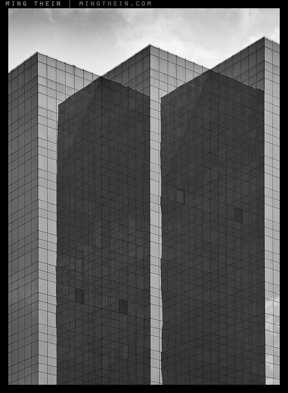
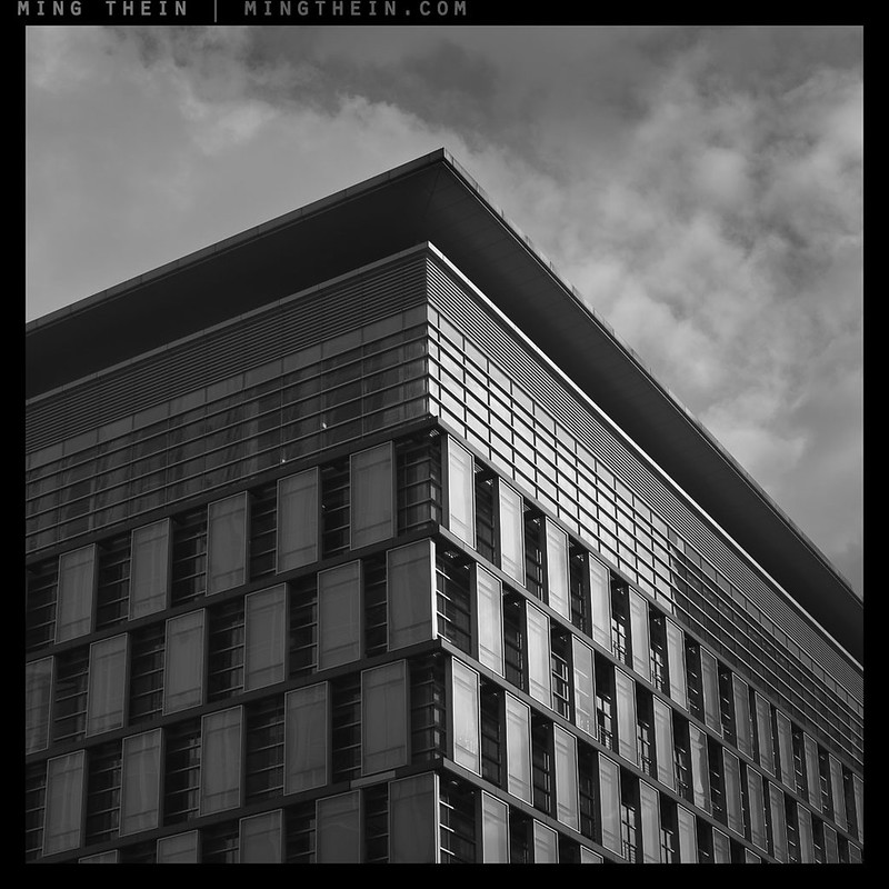
Transparency
Time to present a little minimalism of my own today, in the form of some architecture.
The very best buildings have form dictated by function and any stylistic elements appear to be nothing more than a choice on the part of the architect to make the necessary fit in with the environment and the people; in effect becoming functional by helping the users to feel at one with the building. As such, I’d like you to think of this photoessay as a distilled essence of that particular building. To produce most of these images required some unusual positions and contemplation of both the surrounds and the way I’d feel as a user or visitor to the site.
Please note that the first image, Transparency, is available as a 10×15″ Ultraprint in a limited run of 30 – click here to order.
Images were shot with a huge variety of equipment. Enjoy! MT
Ripples
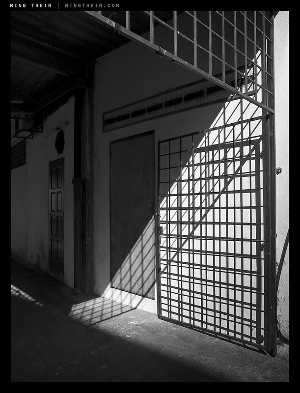
Grate shadow
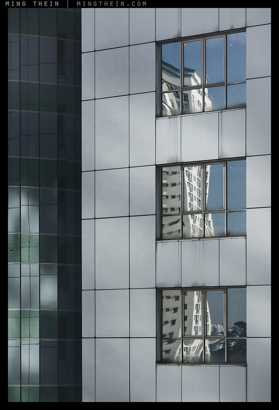
Windows
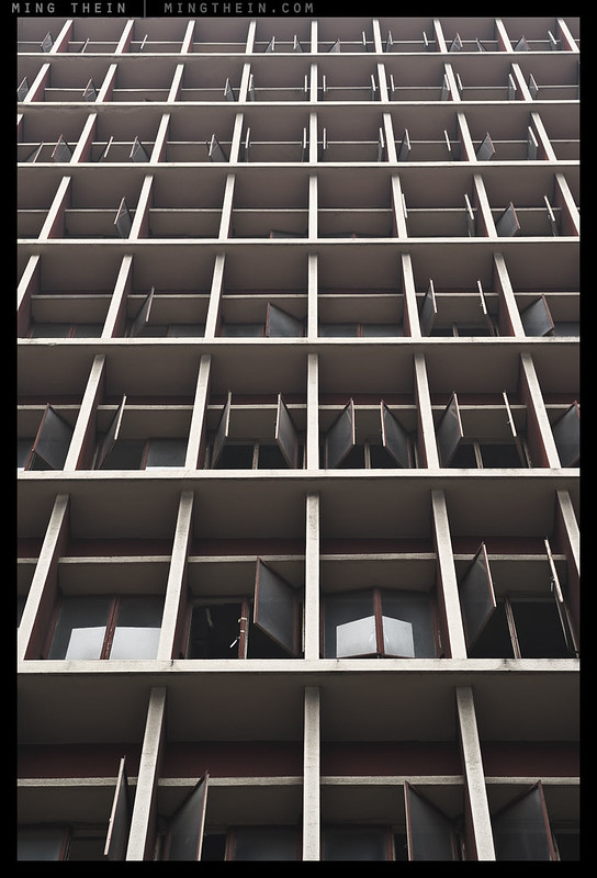
Verticality V
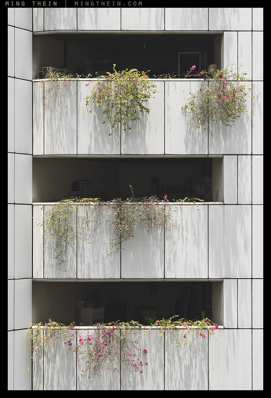
The hanging gardens

Irregular cubism
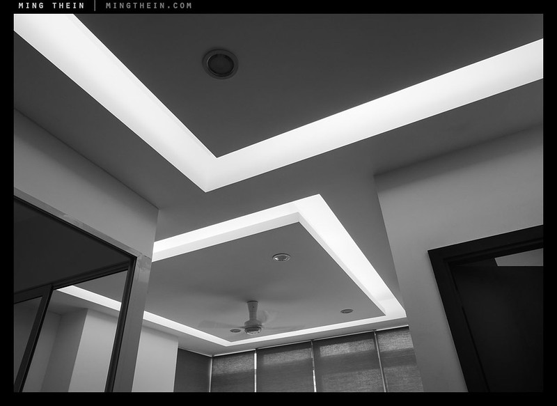
Lights
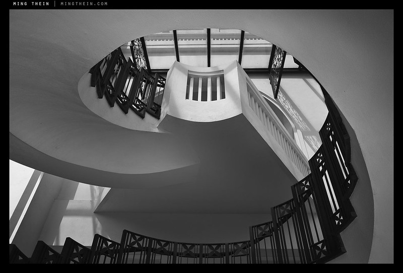
Spiral
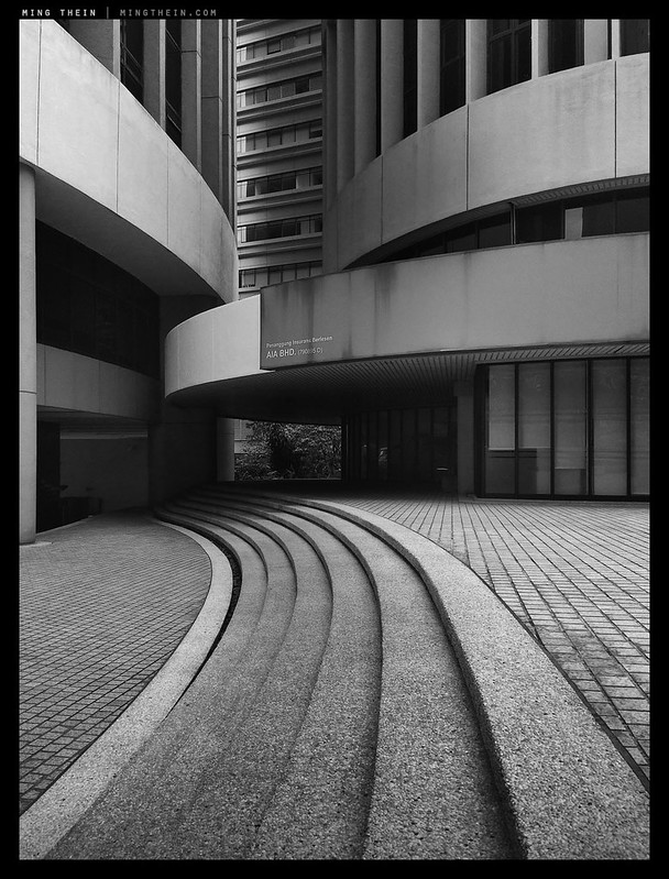
Curves
The Center
Tower

Shameless product placement disappearing into sky
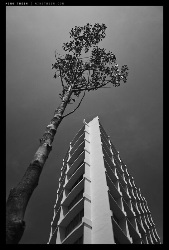
Tree and building
__________________
H2 2014 workshops now open for booking – Making Outstanding Images San Francisco, Chicago and Venice; Masterclass San Francisco and Venice – click here to book or for more info
____________
Visit the Teaching Store to up your photographic game – including workshop and Photoshop Workflow videos and the customized Email School of Photography; or go mobile with the Photography Compendium for iPad. You can also get your gear from B&H and Amazon. Prices are the same as normal, however a small portion of your purchase value is referred back to me. Thanks!
Don’t forget to like us on Facebook and join the reader Flickr group!

Images and content copyright Ming Thein | mingthein.com 2012 onwards. All rights reserved


I find it tough in achieving minimalism in landscape work, always too many distractions and the difficulty of maintaining consistent sharpness across the frame, sometimes the subject on the centre is sharp but it is almost impossible to get small subjects behind/in front/at the back in focus which ruin the whole picture.
Not necessarily; not everything has to be in focus – the bits that aren’t just have to be not distracting.
Ok, i dislike the trees with leaves as they always look mushy subject to their types.
#1 & curves are my favourites in this series.
Thank you.
Ming, your photos seem to capture the essence of the architects’ design intent. Wonderful work.
Thank you – though whether that’s actually the case or not, only the architects themselves can say…
‘Windows’ is really neat! For me, it creates an optical illusion such that the frame looks wider at the top and more narrow at the bottom. ‘Transparency’ messes with my eyes as well. What great work. You are the master.
Thanks!
Good work here! I recognize some of these buildings as well. Not having a PC lens of my own (not that a PC lens is the answer to everything) I find that I tend to correct most of the vertical lines in software during post-processing. It works well, up to a point, and then it tends to give unrealistic looking results, depending on the focal length of the lens used. So it’s a trade off, really.
“Windows” is my favorite in this series.
Thank you. PC correction in post works only if you’ve got small adjustments to make – anything too much and you’re going to see degradation of image quality quite fast along the ‘stretched’ edge, and you also need to compensate the vertical compression, which results in further degradation…
“Tree and building” is fabulous. Especially the velvet tonality of the sky.
Thank you!
Your photos are amazing. Thanks for sharing.
Thanks!
Reblogged this on Scribbles and Snaps.
Awesom and mindblowing! Seeing this kind of your images I always feel I should give up my own ambitions of improvement 😦
Best
Holger
Hey, we all started somewhere – me included. My early work would make you blind if you looked at it too long.
“Windows” is great…looks like one of those trick pictures where the top looks longer than the bottom. 😉
I love architectural photos, have some in my “portfolio” that I’m quite proud of, and these are, (getting predictable now, lol) excellent.
Just my cup of tea, indeed.
Thank you!
“Transparency’ Just blow my mind! Awesome stuff Ming..,
Thanks!
I’m really amazed at “Transparency”! So cool.
Thanks!
Irregular Cubism is fantastic. I would love Transparency for Christmas…
Great series!
Thanks! A print of transparency could certainly be arranged…drop hints to the right people in your life…
These are a great set of images! I really wish I could replicate this style. I don’t seem to have the passion for architecture which you obviously have in abundance
Thanks. It’s not so much architecture as abstract form and geometry – buildings have that in abundance…
Either way I really do like your take!
Regards
Bob
Haha, thanks!
Nice one!!
Thank you!
Your series is its own exclamation mark,
and still sets one, well-found, at the end!
“.. some unusual positions and contemplation ..”
I can most certainly believe that!
Thanks!
As an architect, I’m not so sure about your description of architecture. Often, form is dictated by economics, particularly in commerical and public buildings. Material selection and detailing of how to put the materials together is an exciting part of the process and where good architecture shines. As does designing for people scale, useability and visual delight. And… (I could go on and on but there are architecture theorists who describe the phenomenology of built environment far better than I do).
Having said that I, too, delight in the geometry and light of the built environment, and always enjoy your architecture photography.
Thanks for the insight. I agree with you on *good* architecture, but if you can’t read it in the building as a user of the building…perhaps something got lost in translation?
A really excellent set of images – I can well understand the careful setting up needed for “Transparency”!
Thanks!
When it comes to architectural photography, you’re the best!
Thanks! Less careful setting up than being there at the right time of day to get the desired effect…
Wow Ming. Truely awesome. I really always enjoy your architectual stuff. It’s pretty much what got me following you regularly.
Oh. And it looks like your link to the previous essay is broken.
Oops, that one is meant to go up later. Fixed!
Thanks!
Same here. Insane stuff. #1 & curves are super cool
Thanks!