
Why is it so difficult to get sunsets to appear ‘right’? Read on for the answer.
Many photographs do not work. Subsequently, we find out they do not work because there is a difference between what you saw and what your audience sees in the image. Sometimes this comes down to lack of skill in translating an idea, but often it’s more subtle than that: the camera doesn’t see what we see, and we need to be both highly aware of that and how to compensate for it. Yesterday’s photoessay is a good example: it’s no big deal to make a monochrome image, but our eyes only perceive a lack of color under very exceptional circumstances. Yet it’s these differences that make some images stand out, and others not really ‘work’.
There are a few important properties of the eye/brain combination to note: firstly, we have an incredibly wide dynamic range, but it isn’t linear. Highlights seldom clip to white or oversaturate, though blacks go black fairly quickly. Also, our vision switches to luminance-sensitive rods at lower brightness levels, meaning that the darker it gets, the more desaturated and flat things appear. A camera mostly maintains linear tonal response across the entire tonal range, and thus the final output will look different to both what we see and our idea of how a scene of that given brightness should look.
This is a structural difference: a sensor’s photosites are identical and equally sensitive across the entire field of view. They are color filtered (assuming a Bayer sensor) and ‘actual’ color reinterpolated later in software, but this interpolation is again spatially uniform. On the other hand, our eyes are not spatially linear at all. There are two types of cells; one sensitive to color but only with adequate amounts of light; one sensitive to luminance but less so to color and able to work across a much wider brightness range. Density of luminance-sensitive photoreceptor cells – 100-120 rods million in all – falls off gradually towards the edges, ending about 80 degrees or so off axis. There is a central ‘hot spot’ known as the macula, covering 3-4 degrees or thereabouts where there are few luminance-sensitive rods but a very high density of color-sensitive cones – about 6-7 million of them. These are responsible for both color and detail vision. This too falls off gradually further out to about 20 degrees off-axis or so.
This is the cause of the second difference: visual acuity of our eyes varies across the visual field; the corners are not as sharp or well defined as the centre, but there are no real corners to begin with. We can perceive motion in these areas, but not much detail or color. This structure is the reason we are aware of an entire scene at a macro level, but then ‘focus in’ on a detail even whilst simultaneously retaining some awareness of the wider context. Finally, the image processing portion complicates things further: our brains correct for all sorts of optical deficiencies (such as distortion, chromatic aberration, noise, skewed horizons or minor keystoning) from both experience and automation. Our eyes automatically scan a scene and use a latent image to perceive color and detail across a wider field of view than should be possible with a static eyeball and the cells in the macula alone. A photographic image obviously cannot do this: firstly, it has distinct ‘hard’ boundaries which make you aware of the edges of the image and your eyes scan an image as they would the real scene, so you still have to maintain acuity across the entire portion of the image which you wish your viewer to scan.

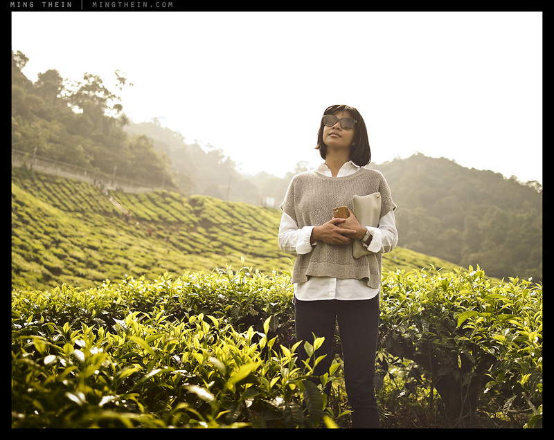
Dark areas must be less saturated to appear ‘natural’
The real differences in translation amount to what is probably best described as ‘strange tones’ and ‘subjects that looked a lot stronger in reality’. Tones look strange, because as mentioned before, a camera responds linearly to both luminance and color, but our eyes do not. Achieving this linearity has been the goal of engineers since the the advent of the device. However, now that the technical capabilities of sensors have come close to matching the eye in both resolution and absolute dynamic range – more thought needs to be given to the output presentation.
Anybody who has a color-sensitive eye and subsequently attempted to use a spectrometer to profile a monitor, camera or printer will know that the results aren’t quite what you expect. Even on a wide-gamut monitor, you may still land up with the images not quite appearing like reality; this is simply because a spectrometer functions like a camera – but we interpret the output with our eyes. The calibration profile put out by the spectrometer (in the form of brightness map instructions so that each RGB pixel matches an absolute color on output) is tuned for absolute output, not perceptual output. So you may still be able to achieve 100% saturation at 10% luminance, even if in reality our eyes cannot perceive this. This may at first seem odd: if we can’t perceive it, how would we know the calibration looks incorrect? Remember too that the luminance of the output device isn’t linear, either – introducing another complication into the equation. In other words, blacks are not truly black (even though they are input as RGB 0,0,0). This makes more of a difference to output than you might think, and it’s also the reason why after trying a large variety of calibration tools – I still find the best results to be achieved by eye because this is the ultimate viewing/input device anyway.
You’ll notice I haven’t said anything about dynamic range: this is a very difficult question to answer in absolute terms, but I have a feeling that the eyes are very highlight-biased. By that, I meant that we see shadows blocking up to black fairly quickly; it’s normal to see black. But it isn’t at all normal to see something fully over saturated to white with no spatial detail whatsoever – it has to be a painfully bright object for this to happen. Of course, the response is again nonlinear: we have less ability to differentiate between different luminance levels the brighter those luminance levels become. This is not the same as any sensor: most of the time, it’s a linear input-output relationship. The closest camera I’ve seen to matching this nonlinearity is the D810 in combination with ACR 8x – shadow recoverability is traded for a very long highlight shoulder. This is not so good for working in low light because of the noise penalty, but it renders normal to bright scenes better than anything else I’ve seen.
Smooth, natural highlight rolloff is not so much about not clipping as clipping gradually.
The answer to the disconnect between perceived subject prominence and photographic prominence is related to the ability of our eyes to ‘lock in’ on one specific angle of view, letting the periphery fade out thanks to those less-sensitive and less-dense rods: the rest simply seems less prominent because we’re not taking in as much information in those areas. For reasons explained earlier, a camera doesn’t do this. Furthermore, when we view an image, we scan the entire image (and thus take in plenty of extraneous distractions) rather than instantly focus in on one specific area.
Executionally, this means we have to pay extra attention to ensuring that the non-subject areas are distinctly non-prominent and don’t attract more attention (by breaking pattern) than the subject areas. Perhaps this explains why bokeh is so popular: it approximates the way our eyes work by smoothing out the areas that are not meant to be subject. It isn’t a perfect replication by any means, because of two more structural differences: firstly, we don’t have the ability to produce shallow depth of field with our eyes – or even really control it; the irises are limited to about f4 equivalent and we have no conscious control over how wide they open (in that respect, they’re more for light control than resolution or depth of field). Secondly, there are two of them: stereoscopic and binocular vision with two eyes means that the visual field is both rectangular in shape, and we are able to ascertain relative distances by interpreting the difference between images from the left and right eyes.
In reality, our eyes are somewhat like a video camera in program or shutter priority mode with auto-ISO: we maintain smooth motion and increase the impression of detail by continuous scanning; to do that, the exposure time must remain relatively constant. The amount of light collected is regulated automatically by the iris – removing depth of field control – and further compensated for by retina and brain to manage situations where the iris cannot open any larger to admit more light, or close down any more to restrict it. The iris’ action is involuntary, and the only slight control we have over it is to squint, which sometimes helps us to resolve distant or bright objects by both controlling the amount of light and stopping down.

For something to stand out, it has to really stand out ion a highly exaggerated way. But even with faithful tones and luminance, this image still appears unnatural because of the perspective compression and elimination of greater context – our eyes simply don’t work this way. Dies it make it any less interesting? Not necessarily.
And here we’re back to the difference in perceived and captured subject prominence again: the eyes are getting a bit of a bonus thanks to an extra dimension. We need to imply spatial relationships in a two dimensional image with depth of field cues and shadows; if a shadow falls on something as opposed to behind it, then you know the something must be behind the object casting the shadow. We can of course use these properties to create visual non-sequiteurs: removal of depth of field cues or creation of false ones through careful lighting placement and perspective allows a photograph to represent reality in a way that is not immediately perceivable to the naked eye. These image are interesting precisely because they are clearly reality, but in the same way, not fully agreeing with our personal visual experiences of it.
Here is where we need to learn to see like a camera. The easiest way is to compose the image as close to the final presentation medium as possible; I think it’s why we see people able to compose just fine with iPads and iPhones but struggling with optical finders. The large LCDs are simply much closer to how the image will be eventually viewed, and of course also preview focus and exposure – neither of which are accurately represented even with the best SLR finders. The advantage of optical finders of course remains immediacy and the ability to see every single nuance in the scene, both in tonality and detail; it requires some imagination and experience to translate that into a finished image.
Ironically, to come to a finished output image – let’s say a print – that represents the scene we’d see with our eyes, we have to do a lot of nonintuitive things. We are perceiving the output through the same ‘lens’ as we would perceive the actual scene – so in effect, we need to compensate for the limitations of both capture and output mediums to restore transparency. It’s not as easy as it looks – remember, thanks to pattern recognition, we already have an expectation from experience of how reality ‘should’ appear. The more familiar the scene, the harder it becomes to reproduce it in a transparent, ‘ordinary’ way simply because we have more personal experience with such scenes. We return to the sunset question posed at the very start of the article: every day, we add to our ‘experience database’ of what a sunset can and should look like. We perceive it as a dynamic thing that changes with time and physical position of observation. Colors are relative, especially if the main light source is heavily biased warm. Yet our image is static, there are extremes of dynamic range (especially with a moon in play), and we have no color reference point if nothing is actually or perceptually white. See the challenge? There is of course no right or wrong between camera and eye – we can use the limitations and properties of either to translate an idea into an image in an unexpected way, and create something memorable as a result. But we can’t do that without understanding both the technical differences and their impact of perception. MT
We go into far more detail on good compositional practice and the underlying psychology behind it all in The Fundamentals and the Making Outstanding Images workshop video series – available here from the teaching store.
__________________
Turn the mood and style up to 11: the Hanoi Cinematic Masterclass in association with Zeiss (21-26 July and 28 July-2 August inclusive) is now open for registration – click here to book and for more information.
__________________
Visit the Teaching Store to up your photographic game – including workshop and Photoshop Workflow videos and the customized Email School of Photography; or go mobile with the Photography Compendium for iPad. You can also get your gear from B&H and Amazon. Prices are the same as normal, however a small portion of your purchase value is referred back to me. Thanks!
Don’t forget to like us on Facebook and join the reader Flickr group!

Images and content copyright Ming Thein | mingthein.com 2012 onwards. All rights reserved


I believe that motion picture most dramatic visual impact is precisely the opposite to what our eyes perceive in the real world. I personally, flesh and bones, met Frederico Fellini, the legendary Italian film director, in 1962, in Rome, at the Cinecittà studios, with my father, who had won that year´s Golden Palm in Cannes Film Festival. I was 12 years old. During our dinner, Fellini stated that his major inspiration to create a motion picture were the images that he perceived in his dreams. He believed that the the way images in our dreams impact our emotional reactions far more intensely than the way we perceive the real world after we wake up. That´s how Fellini produced classical stellar images still being analyzed by millions of cinematic critics, DOPs, directors and the like around the world. My father, who was the first southern hemisphere winner of Cannes (best film), also best film in San Francisco, Karlovy Vary, edhimburgh, cartagena, Acapulco, and 6 other international film festivals around the world (including nominated for the OSCAR´s best foreign language film in 1962), also believed that, a beautiful still or cinematic image has no relation with our eyes perception but with our inner soul’s feelings. Therefore, he, and Fellini, and so many other cine geniuses never, never compose a still shot or a moving shot prioritizing their aesthetical visual values (DOF, lenses technical excellencies, etc.). These values should be always be seconded to the most important reference in photography or filmaking: the viewer’s emotion. Define first the emotion you want to convey to your viewer than adapt to it whatever lenses, cameras, rigging and all other hardware and editing and colour correction softwares available in today´s modern technological era. An ARRI, FUJINON or ANGNIEUX high end 60K lens on a ARRI Alexa, in the hands of a technically oriented still/filmmaker will not convey a significantly superior visually emotional impact than a still/cine shot created by an amateur 19 year old dreamer on his IPhone 6.
So, my dear Ming, I would wish that you would apply all of your vast photographic/cine gear reviews, which, by the way, I applause, to a complementary addition to how that particularly product could best used in a particular intention to cause emotional dreamy feelings, after all, the pinnacle objective of us all, photographers and video-makers.
I think there are better qualified videographers than I…
PH Emerson had some similar stuff to say, especially about isolating a subject.
Like you, he got a little carried away with technical details of the eye. Almost none of that actually matters much.
The elephant in the room is this: your brain makes up virtually everything you ‘see’. The sensation of a continuously running HD movie is a lie, see for instance the stopped clock illusion.
This means there’s a great deal more subjectivity in play than is obvious at first. It also means there are fundamental differences in how we see photo and the real world.
I’m aware of that, but as with all articles here they’re written for an audience that might not be. I’d even say go one step further: it means there are huge differences between how one person sees and the next. If there wasn’t, then every photograph would ‘work’…
“firstly, we don’t have the ability to produce shallow depth of field with our eyes”
This is an interesting point. Our eyes actually automatically stop down when we accommodate to a close object — presumably to keep depth of field constant or to reduce the amount by which the lens needs to be deformed to achieve a certain focus. It is called the near trias (the third thing being convergence of the two eyeballs). That’s probably why we don’t have voluntary control over it — it is a hard-wired reflex which is hard to bypass.
You have some control when you squint or try to ‘expand your eyes’, but in addition to the reflex you mention we also stop down or open up to keep the amount of light entering relatively constant too…
I didn’t mention dark-adaptation again because this is the obvious function of the pupil. The near trias is less well known. With adaptation, there are mechanisms in the retina as well as the physical aperture affecting the strength of the signal which is sent to the brain. Do you perceive the view getting dimmer when focusing on something close? I don’t; so despite the pupil closing down there is something else going on simultaneously which keeps the perception of brightness constant. In this context, another important feature of sensory perception is its recurrent nature: what we see is determined by what we expect to see: the tuning properties of visual cortex cells can be modulated by higher-level areas.
Hi Ming, just one short comment about depth of field and our eyes. I can easily see and control it by placing a finger close to my eyes, like 10cm. Then I can choose to focus on the finger or on the “background” and clearly see, with the edge of my eyes, that the other element is out of focus. It’s easier to notice with one eye closed. So I think that we experience shallow DoF much more often than we realise and this is why it communicate so much in a picture.
That’s not DOF control, that’s changing your focal plane. DOF control would be having both background and finger in focus (or not) and by choice.
I can see there is a huge difference between digital and film photography but as usual you get down to the detail of how modern sensors work in an enlightening way. I wanted to say as a quite old B&W photographer I don’t see that medium as having much to do with nostalgia although I can see why today’s photographers might experience it that way. When I started in the 50s B&W was photography and colour was an afterthought mostly favored for family photography or high end documentary like in the National Geographic. So my head is filled with the likes of Cartier Bresson and Edward Weston and goes back naturally to the origins of photography in Henry Fox Talbot’s The Pencil of Nature. So I see B&W as as having a much higher potential for serious art, and while realizing that colour has caught up big time – your work comes readily to mind – I get a special satisfaction from B&W. I use an OM D and usually set the EVF to monochrome to stand in for all those years of pre visualizing B&W in the viewfinder of a Nikon F. Mainly, I can see instantly what works in B&W and that increases my confidence immensely. I suppose it also greatly reduces the load on the brain as I instantly get a much better sense of the final photograph. Tellingly, I almost never crop because the EVF makes composition like shooting slide film where you can’t alter the cropping later. Post processing with digital tools is likewise much easier than the darkroom but most of all I can get so much more out of a a digital image than I could ever get with film. Clouds for a start but also a range of tones that I would have killed for when I tried to extract them from B&W film. This final point hit home when I saw the Richard Avedon exhibit here in Perth last year. We photographed some of the same people in the NY art world and were often using the same materials but what I saw 50 years later in addition to the magnificence of Avedon’s photographs was how much the B&W film of the day dictated technically the kind of images that could be produced. I realized how glad i was that I no longer had to live with the limitations of Tri-X grain and tonality.
Hi Ming. Another fabulous post, thanks!
.
After viewing all your workflow videos I previously, asked a couple of brief calibration questions. With respect for your time, I’d like to delve a little deeper here…
.
In essence this post is all about “calibration”- the camera to the eye and also capture to display. And, informed control thereof to replicate or deviate.
.
As to the hardware side of calibration, here is what I don’t understand (or don’t agree with, likely due to not understanding):
.
1) Monitor: By definition the photographer’s monitor is an intermediary view between camera and output. In this post and in your in videos you describe “by eye” calibration. Here’s my issue/confusion: because the photog’s monitor is intermediate view it SHOULD be calibrated to uniform numeric standards, and NOT include additional “by eye” adjustments to be perceptually correct. Only then can perceptual corrections occur in post-process (PP) of the image file as it is prepared for all desired output media. Said the other way, if the photog’s monitor is perceptually correct, the photog will NOT make needed PP corrections for output to be perceptually correct. To illustrate the point: if one manually calibrates the monitor, changing hue and lowering saturation of dark red, vs the spectrometer’s standard calibration, and thus one’s image LOOKS perceptually correct on one’s screen, then one omits that hue and saturation adjustment in their PP. Result: (i) If one displays on Web the image is less perceptually accurate, because no one else viewing has YOUR monitor calibration (yes, most viewers don’t calibrate and arguments can be made to calibrate for “web masses”); (ii) printer profiles (and therefore also soft proofing etc.) are designed to I/O map from numerically correct monitor to numerically correct printer (or if custom per printer to numerically deviant printer). Therefore, one’s non-standard calibrated monitor throws off the printer I/O mapping, e.g. the dark red hue and saturation shift is omitted in the print.
.
Again, because photog’s monitor is a middle step between capture and output it needs “numeric” correctness not perceptual correctness, so PP edits include ALL of the required corrections to the image. Only then can the output to be made perceptually correct.
.
2) Camera: Here it’s different: Your workflow removes differences between camera hue/tone/noise/sharpening signatures BY MAKING REQUIRED POST PROCESSING CHANGES TO THE FILE by applying your custom camera calibration preset in ACR/LR on import. By definition this perceptual change IS INCLUDED in all final output media. Therefore I completely agree with your approach
3) Final Output: (i) Print: You don’t discuss this much in your videos, except to say you feel it’s not worth the effort and one is better to find a good print shop due to comparable cost of paper and ink, let alone time/aggravation. Quite likely true, but those who do print (and don’t or can’t afford full custom profiling of all monitor/printer/paper combinations) rely on standard or semi-customized .ICC profiles and possibly corresponding soft proofing. Because soft proof and printer profiles assume a numerically correct monitor and PP that includes all required image file edits, if the monitor is calibrated in a non-standard way, the soft proof / printer profiles will not be correct. (ii) Web: Similarly, if the photog’s monitor differs from the “standard” calibration, what look perceptually correct on the photog’s screen will look correct on anyone else’s.
Would you please help me reconcile this?
Thanks, Ming
Thanks. To your questions:
1. The problem is we do not have a good absolute calibration that matches the way perception by eye works (i.e. taking into account slightly different response to different colours and shadow desaturation etc.). When I say ‘by eye’ I mean with reference to final output – whether that is web or print, though I really wouldn’t recommend proofing with a small sRGB image. There is no way the majority of the audience can see what you see, absolute profile or not – unless everybody is on the same monitor which has been identically calibrated. So, we have a choice to make – I’d rather be 100% correct for my reference, which is the print, than 85 or 90% correct most of the time (but not necessarily where it matters most).
2. That’s the point. The camera’s own ‘biases’ can be zeroed out consistently.
3. Let me clarify: it’s not worth it because it’s impossible to show differences. If you can’t see them in relatively low compression web images as it is, video has no hope of showing subtle differences in color or acuity in any meaningful way. It’s just not physically possible – if it was, we wouldn’t have print at all…
“The problem is we do not have a good absolute calibration that matches the way perception by eye works (i.e. taking into account slightly different response to different colours and shadow desaturation etc.). ”
Likely I’m not clearly expressing my point…
It’s exactly because of your sentence above that I don’t want to correct for those camera vs eye perceptual differences by doing it to my monitor, because then I would not be doing it to the image file…those corrections would be missed from PP and thus not in the final output, e.g. The camera sensor does not desaturated shadows. If I set my monitor to desaturate shadows then I don’t do it to the image file in PP and it’s not reflected in final output (except on my own monitor)
“When I say ‘by eye’ I mean with reference to final output – whether that is web or print”
This is a different matter than fixing perceptual differences between camera and eye and much more like camera calibration (which I agree with you about), i.e. Certainly one might prefer to tweak monitor calibration to more closely match their printer, e.g. If prints are darker than screen one may want to darken their monitor (or soft proof and add a final output specific PP curve, etc)
Bottom line, I just don’t understand why adjusting for camera/eye perpetual variance via monitor calibration helps final output ( as those adjustments would be excluded from image adjustments). I fully understand why monitor/printer variance may want to be addressed via monitor calibration.
Thanks!
I think we’ve got a miscommunication here. There are three ‘links’:
Eye>camera
Camera>screen
Screen>print
However, we can’t accurately assess what the camera is capturing unless we can see it. The easiest way to display the most information dynamically is via screen. So we must calibrate screen profile to absolute and adjusted relative perceptual first, then eye to camera via camera profile, and lastly one final cycle of adjustment again between screen and print. The wider the screen gamut, the more accurate the calibration and the better the print drivers, the least adjustment is needed.
Hope this clarifies things.
Eye>Camera is my only disconnect. If you want it in the output, adjustments need to be part of PP
As you say, this may be about word definitions. When I book a workshop I’ll tourture you more over a drink (can’t do Vietnam. Getting married then). Until then I need my Eye>Camera adjustments in my image files.
It’s also the only one that has no quantitative way of measuring – how do you profile your retina? The only way I can see is to assume your eye is constant throughout the process and work backwards from screen and print (which is what I described previously).
Interesting article. Something I found interesting: “Dark areas must be less saturated to appear ‘natural’” – I’ve always resisted adjusting shadows too much because I find it very easy to overdo it, and produce something that looks “over processed” in a bad-HDR style. I think though, this might be because I’ve never tried just adjusting Saturation on its own…..It’s sometimes the little points in your articles that make me think the most 🙂
Thanks – and try it out for yourself to see the difference. I agree the line between over adjustment and not enough is really quite fine, which is why color management is of critical importance…
You touched a couple of points and may have discussed it further in the comments (but I didn’t read them all) but I’d like to make them explicit. First, one of the biggest differences between the way the camera “sees” and the eye, is that a camera has only one “eye”, while we have two. Binocular vision enables us to perceive a greater sense of depth in a scene. There have been many occasions when I have seen a beautiful subject with my eyes, but the photographic image turns out flat, or a jumble of detail without clearly defined foreground and background. The camera must use other ways to imply the depth of a scene – by using limited depth of field; layering foreground, subject and background; or by using lighting to model the shape and form. Before taking a picture I will often hold my hand over one eye to view the scene with one eye only, the same way the camera sees it. If the scene lacks sufficient hints about its depth without binocular vision (assuming the image requires it) then I know the picture won’t work.
Second, as you mentioned, the eye sees high detail and rich color only centrally. To build up a mental picture it scans and darts around the scene. It peers into the shadows and squints into the highlights, continually adjusting to the brightness which greatly increases the apparent dynamic range. On the other hand, the camera and lens has to see the entire scene at once, corner to corner, with equal sharpness, from deep shadows to highlights, and capture it all in one instant – that is a much harder job!
Good points. I thought the first one was rather obvious so I didn’t explicitly state it (though perhaps should have). The only photographic control we have to somewhat approximate binocular vision is depth of field; otherwise I agree, foreground and background turn into a mess. And that’s probably why a good number of scenes that appear to be a good idea just don’t work photographically.
Even if we had proper stereo cameras though, we still don’t really have a good viewing solution yet…
I’ve followed some Oculus hardware developers’ commentary and they are saying that stereoscopic still photographs are much more impressive than one would imagine despite the limited resolutin. Here’s some ongoing contest (though most of it seems computer-generated): http://home.otoy.com/vr-competition/
Did you take these product shots btw? 😉 https://www.oculus.com/blog/first-look-at-the-rift-shipping-q1-2016/
Agreed – it’s the start of something, and no doubt when we have 4k/8k displays/ EVFs then it’ll be a Big Thing – once we pass that threshold of believability, at any rate.
Nope, no my product shots. Much too dark.
I suppose this explains the “crushed” dark tones in Fuji files and why JPEG-shooters like them. Hence the modification to your workflow. Too bad shadow recovery suffers due to the resulting low number of bits. Floating-point raw-files, anyone?
Suffers badly, but at least the rest of the file doesn’t look too bad. The transitions to black get harder and harder as you up the sensitivity though.
This got me thinking again about fashion photographer Craig McDean. I recall an interview in Picture magazine years ago, in which he stated he used an 8×10 to do cover photos, because it was the closest approximation of an actual magazine. He use to shoot 4×5 and a Mamiya RZ67 too at the time. I notice in his latest work, most of it is done tethered, which is another way of having a big preview image for the final print. Of course, fashion is about perception, colours, and ideas.
I come from a very different realm, which influences the way I photograph. I was formally trained as an artist, and worked for a while doing illustration. In that realm, we didn’t try to add every single detail, because the “mind’s eye” of the viewer would fill in the aspects that can create a realistic impression. I think about this often when I see portraits done with a D800/D810, because we don’t need to see the pores of someone’s skin to know in our mind that we are seeing skin. I suppose that may be anti-technology to some, though I know from photographing women that most do not want hyper-reality.
This article opens up far more questions for me, than it does answers. I’ve know about limits of the eye, because I learned that while pursuing my degree in art, and my later practical use was in commercial printing and pre-press. It’s a great technical achievement that camera sensors are resolving such finite detail, though it makes me question images of the past. Do many people now view older images wishing they had more detail? When we don’t have to think with our “mind’s eye”, do the images still leave a lasting impression? Is the current quest for more detail in all things in our lives, the driving force behind more detail in images?
We don’t need to see pores to see skin – agreed. But we may need to subconsciously register pores are there to see skin and not an image of skin – a subtle difference, I think, but not inconsequential.
And this leads me to my answer to your last thought: it isn’t more detail for the sake of detail (at least not for me). It’s for increased transparency in the idea, without any unintended ambiguity getting in the way. However, I honestly doubt that’s the case for most. Art directors and layout people are notorious in liking to crop…
A pair of crop bars (physical ones made from two L shaped boards) use to be in my main shooting bag for assignments. 🙂 I remember joking, more than a few times, that I should just shoot everything with a wide angle, then just crop to the final images. Architecture assignments use to feel that way at times. While I have worked with some very creative art directors, I’ve also run into my share of those who made me wonder how they got their job. 😉
…especially when they’re not creative nor can they direct. 😦
Food for thought.. wonderful article , thanks. Interestingly one eye can sometimes perceive colour and presumably luminescence differently to the other. This is smoothed out when processed, I guess by the brain.. but try as we may we don’t see in black and white. So how is this medium so popular.. is it nostalgia, ? maybe something to do with how some tones are more pleasing than others? But there again some people hate black and white. Oh blimey.. it’s complicated. Regards Drew
Thanks. Yes, that happens – along with color blindness, extra sensitivity to certain wavelengths, all the way up to synesthesia. It can definitely give the world a very different view.
I suspect B&W’s popularity is a mix of nostalgia and standing out for being different to reality in a medium that is obviously a very literal translation of it.
Really enjoyed this article Ming. One thing that I really love about your photographs is their colour. It is natural, and consistent through your portfolio. Well done.
Thanks!
Interesting article on a subject that should be discussed way more amongst photographers. It’s ironic that we produce imagery, yet so few are aware of such a vital topic.
I think the “processing” (brain) plays an even bigger role than you have already mentioned. It’s responsible for so much deception when we compare our visual perception with cameras and output.
Just think of white balance and how our vision can fiercely balance differences even within a scene. Your Venice night scene above is a good example – we would most likely not perceive the window openings left and right as blue.
And that whole blue/white/gold dress fiasco. In reality, a white balance/ ambient light color temperature issue but few understood it and even fewer pundits explained it properly.
That said, subtle shifts white balance can actually be used with great effect…even more so if you shift different areas of the frame.
Ahh the dress fiasco… I actually wondered if it would ever get a mention. An irritating internet sensation to be sure but also an interesting case illustrating how context and composition can help you calibrate the scene. There is little in that photo that allows a viewer to ‘dial in’ the correct white balance.
New Scientist wrote a decent article on the image. Two proper illusions are included. The real illusions are an interesting example of how our brains use both global and local information to inform how the scene is interpreted.
What a great article. I was always wondering why Mings images look so realistic.
Any tips on how do to create a “long highlight shoulder” from a RAW ?
Thanks. Almost impossible to describe in an article because there’s no way to show a) what small changes to the curve have on the highlights perceptually in different color spaces (RGB/LAB) and b) every image is different, so the adjustment amount required is different (and sometimes only local – then we use the burn brushes instead). It is however covered extensively for B&W in The Monochrome Masterclass and Photoshop Workflow II. 🙂
Thanks for this important article, Ming! My personal experience is that my use of a Canon 6D (with OVF) is much better synchronized with the digital output than I experienced with a Sony A7 or an Olympus OM-D. Only lately I took a pic of a rusty red-brown plane and the EVF turned it into something purple, impossible to put right in the EVF and without a chance to accurately correct the colors in PP. The Canon-file on the other hand was spot on (I was comparing the A7 with my ‘old’ 6D side by side). This is the opposite of what you say about those who are able to take more accurate pics with an iPad. My current conclusion here is that neither an EVF nor an OVF grants a success or makes things easier as long as we do not have enough experience with the camera we use. Therefore I found no reason to jump on the mirrorless trend and I can still feel confident with the gear I have.
My pleasure. I suspect it may be a color or native tonal response thing – those three things have a huge impact on how the final image is perceived, more than absolute dynamic range, noise or resolution. The OM-Ds produce nice looking (but not always natural) images – I find them a bit punchier than I’d like because of the limited tonal range, and not much you can do about it because there’s no information in the shadows. Still, this means they make great monochrome cameras in low contrast situations. The Nikon D810/Otii is so far the closest combination to human vision by some margin, for me. Even then, quite a bit of work is required to get there in the final output file.
As for OVF vs ipad – I really don’t think what you’re seeing is a consequence of the compositional method so much as the cameras’ technical properties. Of course there’s no way of knowing without a direct comparison and sensors/optics of comparable quality. That, and there’s still a big difference between and EVF and a 7″ or 10″ screen – much as there’s a big difference between even a FF DSLR and the finder of a 6×6 Hasselblad V. 🙂
Ming, enlightening as always. You always manage to open up avenues that I’ve never considered… and they’re so simple, so fundamental. I can’t tell you how many times I’ve read one of your articles and thought ‘why didn’t I think of that?’ Many thanks.
A pleasure!
Great article Ming! I am going to have to start de-saturating my shadows. Too bad there is not a curve for desaturation… 🙂
No, but the good news is using the sponge with a -20 or -30% setting for saturation and making a few passes works great 🙂
Interesting method… the first thing that came to mind was to use an adjustment layer, modified by a layer mask based on an adjusted monochrome image.
Why complicate things?
I suppose the layer method can be batched up into an Action to be saved up for later use, while the sponge is completely manual and by eye.
Well, that was the whole point of ‘perceptual’ – if you make an action, you’ll find different amounts of adjustment helpful for low vs high key images etc. Retaining some extra saturation in certain areas might be useful to concentrate/direct viewer attention.
True. On the other hand, the Action can also serve to setup a baseline, after which you can still adjust the opacity of the adjustment layer as well as draw on the mask to manually fine-tune different areas.
It’s really great to read your article. The things that I experience which I find quiet difficult to put down in weird are pen-downed by you in more realistic manner with I must say great depth of field.
An example- Bokeh ; while I was reading your article.
http://wp.me/60y6a
Thanks.
Wow! Great article. Since I am the process of taking your suite of training videos, this article complements them very well.
Thanks!