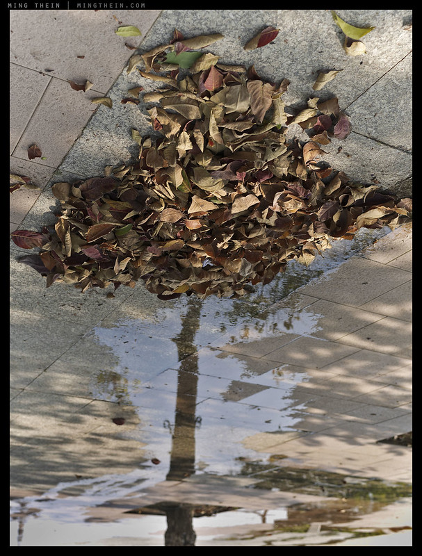
The reformed tree – available to buy as a 12×15″ Ultraprint in a limited series of 20, here. Please remember to include your phone number in the comment box for the shipper – thanks!
I’ve lost count of how many times I’ve mentioned ‘the four things’ in any context – teaching, essay, article, review, photoessay…and promptly realised that there’s actually no article in which I explain and detail them comprehensively. Granted, there’s a sort of semi-prioritized proto-version in these articles (first part, second part) on what makes an outstanding image; I go through it in quite some detail as it forms the underlying structure of the making outstanding images workshop series, and of course I go into significantly more detail in the teaching videos (episodes 1-3) including examples – but after wrapping up the San Francisco Masterclass yesterday, I was looking through the archives recently and didn’t find any solid mention of it anywhere. So, here goes.
“There are four things to consider in making an image that ‘works’: light, subject, composition and the idea.”
Light
Specifically, quality of light: in the simplest form, if there is no light, you won’t have a photograph. THe most ordinary subjects can be transformed into an interesting image if you have interesting light, or light that brings out the best of the subject, or light that is simply interesting in itself. There is really only one thing you need to look for here: shadows.
Shadows are our way of projecting a three-dimensional real world into our two dimensional photographs; in effect they are what gives our audience spatial and depth cues, and signals what’s in front or behind something. Without shadows we also have no texture or colour, if the object is reflective. Shadows give us contrast, contrast gives us the impression of depth and dimensionality, and that stops a photograph from appearing flat. If light is not off-axis relative to the camera-subject relationship, there can be no microcontrast, either. Note this only covers directionality; it says nothing about diffusion or colour or multiple sources.
Subject
You as the photographer need to know what your subject is. If you don’t, then you’re going to find out that your audience isn’t going to know, either. This is because you cannot consciously seek to isolate it and make it stand out if you don’t know what you’re trying to isolate and make stand out! The subject is what the photograph is about: it can be the whole frame, too. In the case of an abstract image, the entire frame is the photograph, and no one part stands out more than another; it’s actually not easy to do because most of the time, one or more elements wants to dominate because of luminance, colour, contrast or some other element of visual weight.
Beyond knowing what your subject is, there are five ways of isolating it: by light/ contrast, by colour, by depth of field, by texture, and by motion blur. Note that DOF and motion blur are really subsets of texture, and DOF is actually the weakest of the five and should be avoided so as not to make ‘maximum bokeh’ a habit. You might have an extremely fast lens, but if your subject is at infinity, then you’re still not going to be able to separate it from the background using depth of field alone. And finally, by the same token as a subject can stand out if it has the right combination of isolating methods, an unintended subject can also quickly turn into a noticeable distraction if it too is isolated in a similar manner.
Composition
Composition for a photographer is really an act of conscious exclusion, rather than one of inclusion. We have to carve out our frame from the rest of the world; even if you are fully in control of the subjects in say a studio still life, you’ll still need to decide just how much of the rest of the studio you want to show – even if this extends to nothing more than the backdrop. It is worth noting that to make a subject stand out, not just do you ensure that that element in itself is attention-getting, but also that the other elements in the frame do not attract any more attention than they should.
I think of composition as the spatial arrangement of the consciously chosen elements that make up your image, and the implied relationships between these images: if two objects appear relatively close together compared to the rest of the objects in the frame, or dimensions of the frame itself, then it is generally expected/ implied that there is some sort of relationship between these objects (or subjects). In controlling the arrangement of elements in your frame, you as the photographer can decide how the image ‘reads’ to your audience; which subjects have priority, which order the observer’s eyes travel in, and thus what implied message the image sends. It’s also worth noting that there are only two ways of controlling composition: move the subjects, or move the camera. The former implies a strict camera position, since any changes in composition are brought about through relativity; the latter is for situations in which perhaps your camera position is restricted for whatever reason.
There are many tools that can be used to control composition and visual priority of subjects in a scene – physical position and distance for starters; subject isolation, and beyond that, perspective and the relative visual prominence implied. The idea of visual balance must also be considered: as a viewer, dos your eye roam away from the intended subjects? It’s difficult to have this objectivity if you are too emotionally involved with the image; a bit of space – say a few days with the image removed from the front of your mind – can help.
Finally, composition also deals with the ideas of balance and aesthetics; both are relatively subjective, and therefore down to personal preferences. There are no hard and fast rules about the latter, and precious few on the former; basically, if you like the way it looks – it can’t be wrong. There are many, many ways to capture the same subject; even if each image fulfils the four things, some will appeal certain people more than others simply because of personal biases lodged in ones’ subconscious.
The Idea
Though I typically leave this til last because it’s much easier to put into place one has some solid command of the other there elements, it really should be both first and last: you want to have your concept, story or idea in your mind at the time of capture to ensure you capture the right thing, and compose for your final output intention: remember that ETTR might well give you ultimate image quality, but looking at an ETTR file tells you nothing if you intend to create say a very high contrast high- or low-key file at the end. Bottom line: it’s much easier to create an image if you have some previsualisation of how the final result should look before you start. There are some things – stacking, bracketing or stitching, as an obvious example – that have to be done at the time of capture and can’t be put into place afterwards.
Unfortunately, the idea is also the most vague of the four elements because it’s so subjective (you’ll probably have noticed that each subsequent ‘thing’ increases in vagueness). What makes sense as an idea to one individual may not to another because of a lack of visible context or implied local relevance; this is worth remembering when you’re trying to translate an idea of your own into an image. And quite often there are concepts that require non-obvious visual cues such as association, colour or texture to translate into an idea – think about moisture or temperature, for example. I firmly believe that the very best ideas are clear, but leave just a little room for ambiguity so that the audience has latitude for their own interpretations to satisfy their own expectations. Storytelling also falls into this category – think of the story you want to tell, the elements that are required, and then the order in which they should be seen to form the right chain of causality – then use the visual tools at your disposal to execute.
The three images I’ve chosen to illustrate this article (you may recognise them from the Pentax 645Z review a few months ago) were deliberate because they have a strong conceptual idea behind them; often – myself included – we make photographs because they appeal to us on an aesthetic level, but that’s not always enough to touch a greater audience. There’s nothing wrong with that; after all, art is subjective – but depending on your intention, you might want to go a bit further. Reformed Tree is a metaphor for growth and recovery. Fallen leaves from a tree have been gathered into a pile; there’s a small amount of water and light reaching them, and together with the reflection of another tree trunk in the water, they form the image of a new tree: think of it as rebirth from failure through encouragement and reflection. It is turned upside down partially to form the tree structure, but also as a suggestion of turning things (events) around. It is an image that conveys the idea of hope and the possibility of creating something unique and beautiful through unconventional means. There is no way this idea could have been realised without consciously envisioning it before capture. The light is directional and dappled, creating contrast and texture in the leaves and water reflection. The subject – the tree, leaves and reflection – are isolated from the ground by colour and texture. Compositionally, I’ve chosen to exclude almost all other elements to avoid distraction; the trunk forms a leading line to the crown of leaves, and is deliberately less defined than the rest through shallower depth of field. Finally, stylistically, colour is graded warm to convey a feeling of hope.
Face left, face right
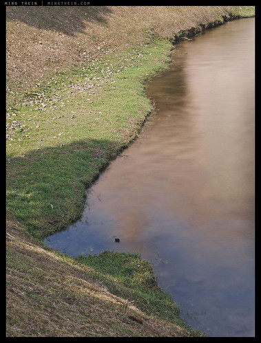
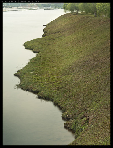
This pair of images is about humanity and balance. Face left, face right conveys the idea of people having two sides that fit together to form a whole; it may be our public persona and private persona, or people who say one thing and do another (interpret as you wish). This impression is created by the two halves of land/water fitting into each other; the dividing line down the middle isn’t exactly the same in both images, but then this isn’t required anyway as in reality, the boundary between different sides of personality isn’t strictly defined anyway. Light is diffuse but directional for both images, and comes from the same direction to lend a sense of unity to the pair. The subjects are clear – silhouettes created by variations in texture and colour. Compositionally, they are simple and again consciously exclude any distracting elements, but at the same time equally weighted visually about a vertical axis – neither left or right side of the frame dominates.
There is of course quite a lot more instruction to it than I can hope to fit into even a relatively long article; and of course everything is best learned with demonstration, and even better remembered with direct feedback – that is the purpose of the email school, the workshops, and of course the teaching video series – Making Outstanding Images Episodes 1-3 cover this in a systematic way in great detail with many examples. In practice, the best way to get to a level where a photograph becomes the visual translation of concept rather than a snapshot is to practice: start with light; move on to subjects, then composition, and finally, start thinking of ideas. Attempting to do everything in parallel is going to be rather tricky: there are a lot of moving pieces, and they definitely affect each other. For example, if you want a low key image, you will need to look for a different quality of light to a flat one, and compose according to what will be visible in the final output. What we are really trying to do is learnt to see with our brains, not just our naked eyes. MT
__________________
Limited edition Ultraprints of these images and others are available from mingthein.gallery
__________________
Masterclass Venice (November 2014) now open for booking – click here to book or for more info
____________
Visit the Teaching Store to up your photographic game – including workshop and Photoshop Workflow videos and the customized Email School of Photography; or go mobile with the Photography Compendium for iPad. You can also get your gear from B&H and Amazon. Prices are the same as normal, however a small portion of your purchase value is referred back to me. Thanks!
Don’t forget to like us on Facebook and join the reader Flickr group!

Images and content copyright Ming Thein | mingthein.com 2012 onwards. All rights reserved


Hi Ming,
I have respect for your intellectual accomplishments and artistic integrity, at such a – relatively – young age, and follow your site among only a handful, so far, related to photography. Well done, I believe, you deserve it.
Where I’m from, almost every human endeavour that is expressed in language (not all are) truly begins with an etymological reference. Photography (φωτο-γραφία) are “light inscriptions”, and I must maintain that they are “on reality”, not “on imagination”. The four things you listed are, without a doubt, integral to the end-result but not entirely sufficient. One could stretch the fourth one (“idea”) to embrace what one would regard as the essence of photography as an art from but one need to do so with great care.
I might be using the terms against convention (hopefully, I’m not): conceptualisation is not realisation, and photography is the latter not the former. In practice, I have found myself staring at photographs depicting concepts such your inverted half-tree half-illusion and immediately acknowledging the sheer mental force and intellectual appeal behind their composition, but leaving me empty of meaning. Reality natively encapsulates meaning and there is no art without ontology (“οντο-λογία”, the question of/on being). Artistic conceptualisations are empty shells of linguistic expressions devoid of ontological meaning. I cannot see how humans relate – in essence – to them.
In all due respect, allow me to conclude my opinion by saying that an artist, such as yourself, cannot have a creation in his hands without breathing life into it, i.e., meaning. I hope it makes sense to you.
Best regards
Thank you – yes, it makes sense. We create in our vision or imagination, which is affected by our personal biases, which is in turn a unique product of our experiences – it cannot be anything else other than personal and felt.
In conceptualisations, however, the outcome is primarily a product of the intellect not the communication (or, more accurately, the communion) of experience and, as such, it is devoid of artistic meaning.
Regards
I like how the upside down reflection turns into a right side up tree in #1.
Thank you.
Well, I’m back here 🙂
I’d taken a bit of a break from photography (didn’t touch a camera for like 3-4 weeks…) as I was a bit exhausted from it all (I guess that is also a benefit of being an amateur and not a pro…) and this is as good an article as any to get back into discussions.
I’ve personally found the four things the most valuable part from Mings workshop and helps your mind to focus when taking a shot. Over time once you get used to the 4 things your mind evaluates them pretty darn quickly.
I’ve always found the composition part a bit too generic – but the idea of conscious exclusion which Ming discussed a few months back has helped to focus that ‘thing’.
As for the discussion above about timing, We need to always remember that photography is after all a snapshot of time and well timing is everything…..
On another note Ming, I see your views on gear again attracting more attention than this much more useful article 😉
I’ll send you an email soon for a proper catch up 🙂
Composition is a rather nebulous concept: it’s basically the relative spatial and aesthetic relationship between the elements in the frame that lead to an implied connection, or lack of connection between them with which we form the story and the order in which the audience ‘reads’ the image. This is where perspective, lines and visual weight/ balance come into play…
Gear: Isn’t that always the way? 🙂 There’s always this mistaken ‘if only I had X’ belief that people never seem to tire of, rather than a) making the most of their equipment and b) making sure that the operator isn’t really the weak link. But it’s much easier to hand over money than learn…
And manufacturers are trying their damn hardest with their advertising to convince us. The thing what surprises me the most is the passion it evokes from people….I guess we look at using something that we find enjoyable and gets the work done!
Personally gear wise I’m waiting for a more affordable 4k setup (in addition to wanting a D810 😉 . Have you set up your idea of 2x4k screens?
Nope, I don’t even have a working single 4K solution yet – my Mac Mini won’t drive it.
Ming,
I noticed you were pretty fond of the 70-200 f/4 + D800 & Ricoh GR covering both the telephoto and wide end in a relatively light package. Do you think a m43 body (ie GX7 / EM5) + 35-100 f/2.8 & GR would be a good match as well? I find having both the 45 1.8 and 75 1.8 and switching lenses to be cumbersome and looking for a more flexible option. I guess in terms of DOF it would be equivalent to a 70-200 f5.6 vs f/4. Let me know your thoughts, thanks!
I don’t see why not, though I haven’t used the 35-100.
FWIW, I often use a GR + E-M1/75/1.8 combo for my street photos. The GR + Sigma DP3M (75mm eFOV) combo also works well for me, and I’ve also done GR + Nikon F3/50mm. I found that a 35mm eFOV is too close to the GR, so I’ll just carry one or the other. If I carry the E-M1/12-40, I find myself mostly on the long end of the 40, except maybe for a few shots right at the 12mm side.
It also depends on what kind of perspective you want to use. I’ve preordered the new 40-150, and I expect to pair that up with the GR, too. That’s mostly inspired by Ming’s recent sets with his 70-200 and GR.
Awesome thanks for the input Andre, I guess I find I am always switching between the 45 and 75 sometimes it’s too tight and I go to the 45 and not tight enough then I go with the 75, might just need to get use to the 75mm (150mm) . It’s a spectacular lens
Wonderful re-cap of your fundamental teachings Ming, still so difficult to overview in full.
You have said it a thousand times: Practice, practice, practice …. and I am in the middle of it 🙂
Thanks Gerner!
That is such an intriguing image. Maybe it expresses your style better than geometries?
Ah, but there’s geometry and balance in this one too…
Yes, but it’s not as austere as your “pure” geometry. Doesn’t that unsettle you? I have determined the psychological reasons behind my urge to include geometrically correct forms and shapes in my images; have you?
No, it doesn’t unsettle me at all. Photography is all shape, line and color. Every object or element can be decomposed into that. If you stop seeing the world as objects and start seeing it as shape/line/color, then it’s inevitable anything – hard geometry included – becomes fair game.
Lines, shapes, light. They can take any form. My problem is I’m a Calvinist at heart.
That’s a much more fundamental problem…unfortunately not one I can help much with!
😉
That tree image is amazing!
Thanks!
My photographic abilities don’t really allow me to create images based on an idea. I work largely based on instinct. I need to see things, I cannot imagine them. More poetically one could say I see beauty. Even composition is instinctive for me, though I have observed a few patterns in my instinctive behaviour. This is topped up with decent technical expertise.
My list of ingredients is thus shorter: (1) Light, (2) Framing/Composition, (3) Timing. The last naturally only matters for subjects that move and change in a way that I cannot control. This mostly means people but also animals, cars, boats, etc.. I might even say for people, timing is most important ingredient.
This sounds very familiar to me Lenny…its how I shoot too. I find when I am trying to find the images, with pre-set ideas about what I am after, I come away disappointed. Most of my favourite shots are ones that I nearly walk past, but just catch in my peripheral vision, cause me to pause and go back to take them. I have found the “Four Things” hugely valuable in assessing my own work, and that of others, but you point, Lenny, about timing/movement brings up my added “Fifth Thing”, which I took from Jay Maisel…”Gesture”. I guess it could fit into Ming’s template as part subject, part idea, but I think it deserves its own heading. Gesture is just that little look/position/interaction that elevates the image from random snap to something approaching HCB’s “Decisive Moment”.
PS: Reformed Tree….brilliant…
That’s probably because this is lifted straight from my workshops, Ian 🙂
‘Gesture’ falls somewhere between composition and the idea – it’s the little, details that make or break balance and translation of vision, such as leg position of a walking figure etc.
This is a great basic list to always keep in mind. If fact, if such a list is any longer it won’t be kept in mind. The order seems right to me as well. Most of the great photographs that I’ve seen, new or classic, seem to have unusually good light, which is not so easy to do without providing your own artificial light sources. Because the is usual for teaching, it might seem at first that the idea is completely formed ahead of time. Okay, still life painting and photograph would work that way unless you stumbled on one, which can happen. What I’m getting at is that a clearer idea may form after the photograph is taken, and post-processing cropping and so forth can be used to make the idea stronger or more obvious. We should also remember that our idea, as good and correct as it may be, may not be the same as others who eventually may see the same final image. They may interpret it a different, equally correct way. That would suggest a bit of ambiguity in the idea, which could enhance the image. There’s another quality of a great image that would also arise after the first four are met: unusualness, originality, rareness, and so forth. This is really hard to achieve, and might be thought of as the opposite of a “derivative” photo, one that seems to have been done many times before. I’ve heard that many times by others who are critiquing a particular photo: “Great, but I’ve seen lots of those already.” This is another one that’s really hard to achieve in practice. There are a lot of great photos out there already. I went to Paris once and specifically set a goal (factiously, of course, sort of) to take an entirely original photo of the Eiffel Tower. Could do it. Laughed at myself. Then a few months later I saw one taken by someone else! It can always be done . . . by somebody. Meanwhile, I use these four elements from now on. Now, if I could just stumble across a great subject to shoot. Oddly, one’s camera equipment today is not much of an issue if these four criteria are met.
Thanks – the camera is completely independent. The four things are really to train you how to see – all the camera is for is a capture device to share that vision with others.
Amazing photography! You inspired me anew this morning ! Thank you for sharing!
Thank you.
Most welcome.
Great Read Ming! I knew what the article was about from the title 🙂 . On balance topic Ep2 was very helpful to me in explaining that subject….
Thanks Eric. EP2 requires a bit more than I can feasibly put into an article 🙂
Agreed 🙂
“In practice, the best way to get to a level where a photograph becomes the visual translation of concept rather than a snapshot is to practice: ”
Thank you. This has been as clear an explanation of the four principles as I have ever read, and after re-reading it as a virtual “manual” on how to kickstart my aspirations as a photographer, especially the line quoted above, it has really given me fresh impetus to get out there with my camera and *work* at getting better images. Really appreciated piece of excellent writing and clear thinking. 🙂
Thanks!