We first need to understand a bit of history to appreciate the origins of ‘house color’ or ‘company color’ or a particular tonal palette: in the early days of color photography, it simply wasn’t possible to make a film emulsion that responded equally to every color, much less mirrored the response of the human eye to the visible spectrum. It’s also important to note that a recording medium’s color response and luminosity (tonal) response aren’t the same thing but they are linked; further complicating things. And we haven’t even started talking about how different individuals’ eyes respond differently to color*. The best manufacturers could do was offer a range of emulsions (corresponding to a range of different chemicals that had different responsiveness to light) that gave photographers choice. It’s one of the main reasons images from certain eras have a particular look to them: the world didn’t offer different colors or fade; what we’re seeing is a mixture of time-sensitive oxidation of pigment in the output image, and the limitations of the recording medium at the time. As emulsions improved, so did the spread of color that could be recorded. The world didn’t become more realistic: our means of recording and displaying the recording did.
*As you get older or if you have cataracts, certain frequencies become blocked/absorbed by the lens or liquid portion of your eyeball, limiting what reaches the retina. And the retina itself may well not be operating at peak tonal response, too.
But in the meantime, we’d gotten used to certain tonal palettes and looks at a subconscious level by emphasising one part of the spectrum over another; so even as film chemistry improved, the familiar spectral biases remained – and even persist into the digital era, even though there is absolutely zero reason why this should be the case now that sensors and color filter arrays can accurately mimic the best human eyes – allowing for both accuracy and choice. What’s happened is choice and emotion have come into play (and perhaps a little consumer-driven desire for instant gratification). The camera makers who were formerly film makers took their signature color response and translated that into default signal processing so that images from their cameras would look like images from their film, and by default without any effort on the part of the average consumer-photographer**.
**Back then, just as now, pros and serious enthusiasts exerted much greater control over the output – you could liken SOOC JPEG as your drugstore 30min processing, and a full manual darkroom to print as RAW + Photoshop. The concept hasn’t changed; the tools have merely got new forms and names.
There are a few core differences between film and digital color handling: firstly, emulsions are optimised to work at one color temperature; usually either daylight (about 5500K) or tungsten (2500-2800K). There were a few fluorescent balanced films, but for the most part – you could use a daylight film under tungsten or fluro but with the right filters over your lens to restore balance to what the emulsion would see. Digital, on the other hand, relies on amplification and digital signal processing to adjust for variances in color temperature; this is what we know as white balance. Important change: it’s now possible to get almost identical tonal and color response across most of the color temperature spectrum by getting your input white balance right, which in turn sets the relative amplification of the color channels in signal processing. Signal processing always goes from a larger amount of data in a larger color space (i.e. a bigger table to work on) to a smaller one (packaged information, no more room to move it around on the table without some falling off and being lost/unusable) – and it’s always lossy if there is any bit depth reduction. Thus if you get the white balance wrong, you run the risk of clipping a channel irretrievably – and the smaller the bit depth, the higher the chance of this happening. It’s why for the most part white balance is critical for JPEG, but not so much for raw – though it is still possible to have channel clipping. Once a channel clips, there’s no way to get the information back unless it can be interpolated from neighbouring photosites in software. As good as said software has become, it still won’t be 100% accurate.
The next big difference is in the medium itself: film was merely the substrate; the emulsion is what controls tonal response. And that was largely proprietary. Now, we have sensors that are shared across manufacturers putting out very different color and tonality; often they also share the color filter array (photosites are pan spectral and we make them ‘see’ a certain color by blocking out the rest) and less often, the microlens array, but other than color shift caused by extreme exit pupil angles – that doesn’t affect global color). Thus the major differences are usually in the signal processing portion; this is important because it means that for the most part, cameras are recording the same core data – perhaps to varying degrees of accuracy/precision (which in turn affects overall tonality, noise and gradation) but the information is there for us to process after the fact. Think of color accuracy as covering a bullseye target: you can be very accurate and consistent but off-centre, or not very accurate or consistent but average centre. It’s the difference between faithful to reality color (perhaps with calibration) or pleasing color (not very accurate, but nice to look at). And yes, there are variances even within the same type of sensor – this is down to manufacturing tolerances of the CFA and the photo sites. It’s minor enough that a batch calibration works most of the time, but if you look at enough supposedly identical sensors, differences will show.
The bottom line though is that though calibration and appropriate digital compensation, it’s possible to have very close to perfectly accurate color reproduction. Now: this isn’t necessarily pleasing, because our eyes have varying sensitivity by both wavelength and intensity; however if we measure enough eyes, we can also adjust the camera’s signal processing to take this into account, too. It is therefore possible to have very close to ‘what you see is what you get’ – at least on the capture side. Whether your output has matching gamut and calibration is another thing entirely, of course. Gamut is the range of reproducible colors and a function of both the physical hardware’s limits, and the definition of those limits (also known as color space). For whatever reason – probably the amount of effort required to calibrate each sensor individually and then manage this calibration data across the entire sensitivity and shutter speed map – as far as I know, only Hasselblad does this kind of mapping (and as a result, reaches this kind of color accuracy out of the box). MT
__________________
Visit the Teaching Store to up your photographic game – including workshop videos, and the individual Email School of Photography. You can also support the site by purchasing from B&H and Amazon – thanks!
We are also on Facebook and there is a curated reader Flickr pool.
Images and content copyright Ming Thein | mingthein.com 2012 onwards unless otherwise stated. All rights reserved


I’m looking forward to part 2 already! I’d like to know more about how you work with white balance. Do you trust the camera or do you set the white balance manually, using a grey card? How would you handle difficult lightning situations, such as a city street at night? Using a grey card will not look natural, since the street lights aren’t perfectly neutral, but the camera’s AWB wouldn’t give you an image that matches what your eyes saw either.
AWB is generally wide-ranging enough it gets things roughly right. You just need to remember which bits of the scene you want to be perceptually neutral and then use those as a position for your WB eyedropper tool during the raw conversion.
Thanks! You make it sound so simple. And yet, trying to get natural looking skin colours make me go mad sometimes. They don’t look right no matter what I do.
In a way, that’s not surprising – most of the manufacturers don’t even try to get to neutral color. Red shifts affect skin tones; blue shifts affect your white point (and in turn, relative skin tones). PS Workflow III has profiles for most cameras; I created these profiles for all of the cameras I use/have used to quickly get me to a natural starting point across the board…
I would prefer my starting point to be as neutral/natural as possible. Camera manufacturers who want to make the sky more blue or the grass greener aren’t helping me. I have a Fuji X-T2. Would your profiles work for my camera?
Yes, there’s an X-trans profile in there.
Ah, thanks!
Sometimes it’s just nice to be validated on a Sunday morning…
“**Back then, just as now, pros and serious enthusiasts exerted much greater control over the output – you could liken SOOC JPEG as your drugstore 30min processing, and a full manual darkroom to print as RAW + Photoshop. The concept hasn’t changed; the tools have merely got new forms and names.”
I once made more or less the same comparison, on a certain photo forum, and got told to shut up :-/. Good read and fine photos, as always.
We have some middle ground now, but to set up the SOOC JPEG to taste requires quite a lot of experimentation under different scenarios; there are (and have to be) such a large number of parameters to adjust that you put in a lot of work upfront to get a 80-90% result, but often find yourself going back to the raw file anyway for the full monty…
Another thought. One thing is correct colors, but what else than product, fashion and other subjects has to be absolute color correct reproduced? Ming you mentioned the more phycological aspect of the art of photography where we might have color correct gear or not. What I shoot may come into my RAW converter pretty color correct, but does certainly not leave not being heavily manipulated.
Two other things we tend to be sensitive to are landscapes and portraits – I suspect it’s because we see our natural environment and other human faces so much that we become quite attuned to how they should look.
Output of course is entirely down to creative intent and personal preferences…it is not possible to have the camera see the same way you do.
Even in fashion and catalog photography accuracy is relative. Saturation is often popped slightly to avoid the dead look of a perfectly faithful rendition.
I would doubt that there is ANY field where perfect accuracy (such as it is) is actually delivered.
Also to account for display medium, reflective vs transmissive etc.
As for absolutely accuracy: art reproduction and forensics.
Thank you for addressing colour as an aspect of image quality. Photography sites like DPR seem to ignore colour completely. Whereas you and I may value colour accuracy or pleasing colours as fundamental to cameras and sensors, they only understand signal to noise ratios and incremental differences in dynamic range. As a result of lackadaisical review sites like DPR manufacturer’s have happily traded away some colour performance for better high-ISO performance.
It is nice that Hasselblad take the time to calibrate each camera and sensor. Unfortunately I personally have no faith in calibration in general. Firstly, it is dependent on a fixed illuminant. A calibration that works for studio lighting is therefore not optimized for full spectrum lighting outdoors. Secondly, as specific colours are pushed to hit the requisite calibration patches (24, 256, whatever) they drag along unmeasured neighboring hues out of alignment.
Strict colour filter arrays were always a better way to get both more accurate colour as well as better fine hue discrimination. I’m encouraged to see Phase One advance very strict trichromatic CFA’s towards better colour. Hopefully Canon, Nikon, and Sony will take notice and prioritize colour for the full frame market. Basically I don’t care about how a camera performs at ISO 102,400, photographs at these ISO’s all deserve the bin anyway. I want a full frame camera that shoots extraordinarily rich and hue accurate color at base ISO somewhere between 12 to 18MP.
Oh wait, we had these sorts of cameras in the CCD era! And users still rave about their base ISO colours today. I’d gladly still use them if they had modern AF systems, lithium ion batteries, and big LCD screens. But they don’t.
Hah – don’t get me started about DPR; it has not been about been about photography for a very long time…
Calibration: it isn’t that simple. It is done under wide spectrum daylight equivalent, plus different light levels because the CFA does have different absorption/transmission properties at different brightnesses. And then repeated across every full stop sensitivity change. It’s more like a matrix than a static map; there’s something like 3-4GB of calibration data that has to be loaded every time the camera starts up.
I’m still not convinced about the P1 trichromatic CFA yet; I need to try it under known conditions, I think. The samples somehow look a bit ‘pale’ or ‘thin’; this may be a consequence of the light used or PP, though.
As for CCD – the preference remains because tonal response was nonlinear with brightness, and that more closely mimicked the impression our eyes gave. CMOS tends to be linear and requires work to get it to look like a CCD, but it clips far later and has much more dynamic range in the deep shadows and extreme highlights that is really closer to the physical way our eyes respond. I put the bias down to the early CMOS sensors not really being well calibrated out of the box – look at the difference between the Hasselblad X1D’s native files, a CFV-39 (Kodak 39MP 49×37 CMOS) and the early Pentax 645Z. The Pentax could be the tonal equal of the other two, but you had to do a lot of work to get there. The X1D is much closer to the CFV-39, but with a lot more breathing room and adjustment flexibility. Speaking purely asa previous owner of all three…
Regarding calibration, it is interesting to hear that Hasselblad calibrate for different light levels to offset different absorption/transmission properties at different brightnesses. One would think that all photons of a certain wavelength behave the same and that there are simply more of them behaving the same way when it is brighter, no?
I’d suggest another methodology might be to calibrate for multiple illuminants, particularly those that are not full spectrum. DxOMark’s SMI data set has discrete measurements of camera color accuracy under two such illuminants, CIE D50 and CIE A. It has been suggested elsewhere that the best measure of native camera color accuracy is the combined score for both of these illuminants. The reason is that you want good color performance under both full-spectrum daylight (CIE D50) as well as artificial incomplete-spectrum light (CIE A). Typical CCD cameras scored in the mid-80’s for each illuminant but recent CMOS cameras have fared much worse by generally falling in the mid to high 70’s. This would suggest that there is more to the color difference between CCD and CMOS than CMOS just not being well calibrated out of the box.
Finally, I’m intrigued by your suggestion that CCD’s tonal response is nonlinear versus CMOS. In general I find CCD cameras to have less DR and when that is exceeded they can be painfully linear. If the highlights clip on a CCD they go unrecoverably white. Their shadows also can’t nearly be pushed up noiselessly like modern CMOS allows. At least with respect to pulling up shadows the tonal response of CMOS can behave very nonlinear. Only Fuji’s S2, S5, and S5 SuperCCD cameras had a similar capacity to go nonlinear albeit this was at bright end of the spectrum with recovering highlight tonality. Don’t you actually mean to say CCD had a more linear tonal response?
The photons behave the same, the CFAs and sensor are not so linear and are a different story.
Fully agreed on dual spectrum: you find yourself having to boost gain beyond what you’d expect under incandescent. I don’t think it’s the sensors that are worse, I think it’s the UVIR cut filters that are more effective: you get more accurate color under full spectrum because there’s no longer any IR pollution in the red channel and UV in the blue channel, but I suspect under incandescent light a lot of IR that was previously exciting the red channel goes missing. I certainly notice my older CCD cameras were a lot more sensitive to reds, clipping much earlier than blues (and requiring care under very low K temps).
CCD vs CMOS linearity: I might have not explained what I meant very well. CMOS appears can appear flat/linear because the DR is so much higher than CCD, and when you try to display all of this data on a medium that has a much smaller output DR, it looks flat. CCDs are a closer 1:1 map. I fully agree that CCD clips abruptly at either end and has nowhere near as much recoverable data.
I haven’t fully understood what the popular phrase color science translates into the perceptual world. Rather than digging the answer in the RAW captures that might differ from brand to brand, the processor has it’s words to say too, not?
Color science I feel belongs to the process of RAW to JPEG/tiff etc conversion moreover, if we could perceive it, the RAW file. Hence we talk in camera RAW to JPEG or computer RAW to JPEG/tiff processor science.
I experienced through having had 10 different cameras that I can calibrate the individual camera so the mainstream observer would not be able to tell which image was taken with which camera….. and in particular if we throw one more conversion into the equation: Computer file to print.
So isn’t color science just merely the differences between converters? If I am right, the word color science is interpreted wrongly.
I tried time after time the equal RAW developers like ACR and C1 showing the same end result. It’s not true C1 is a better converter color or rendering wise than ACR. They can be brought to show the same pallet. That the programs have different features is another theme.
Bit of both – it’s not just the processing part (differences between converters, which as you say can be dialled out with the right adjustments to shift back to a certain reference) and output (print, display monitor calibration) but also the psychological part – the way we perceive reds at a certain saturation and luminosity is different from say greens or blues. We can use this as part of the toolkit to draw your observer to a certain part of the frame to change the impact of a composition, but this is a different topic 🙂
From a processing standpoint, the data available to each program from a given file is the same, and the variations between cameras are not THAT big (assuming we are not talking heavily biased lossy JPEG conversions); some conversion operations (e.g. +x% saturation) work the same way, too. So there’s no reason at all why we can’t be consistent across devices…
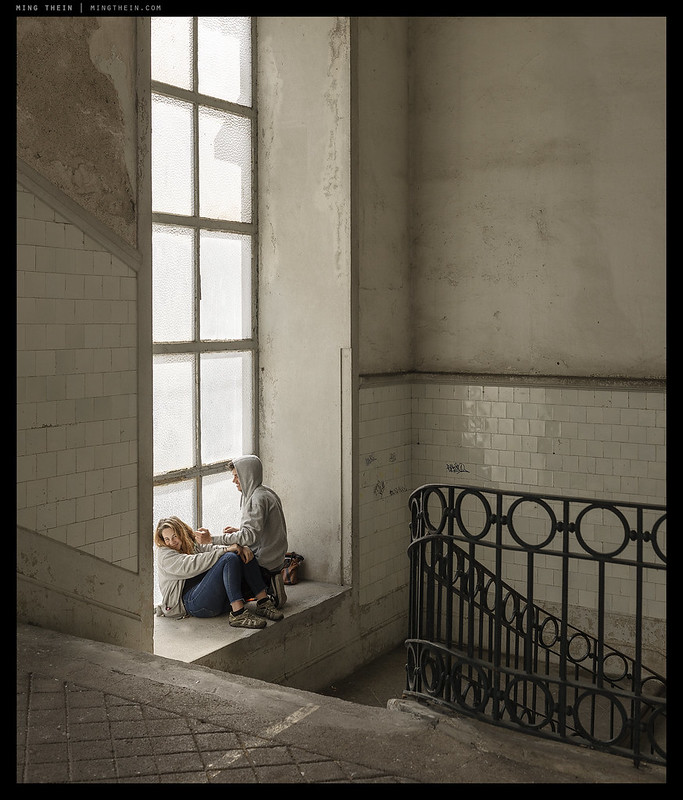
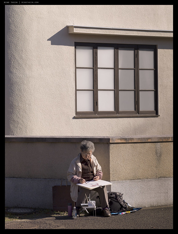
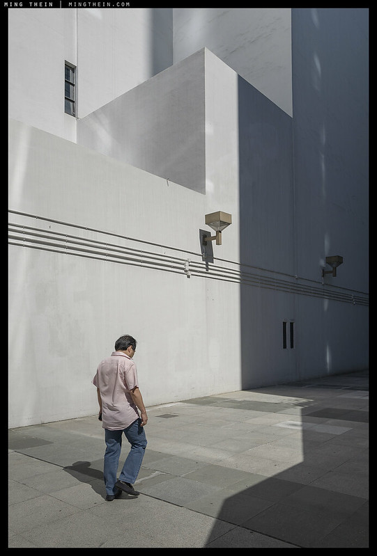
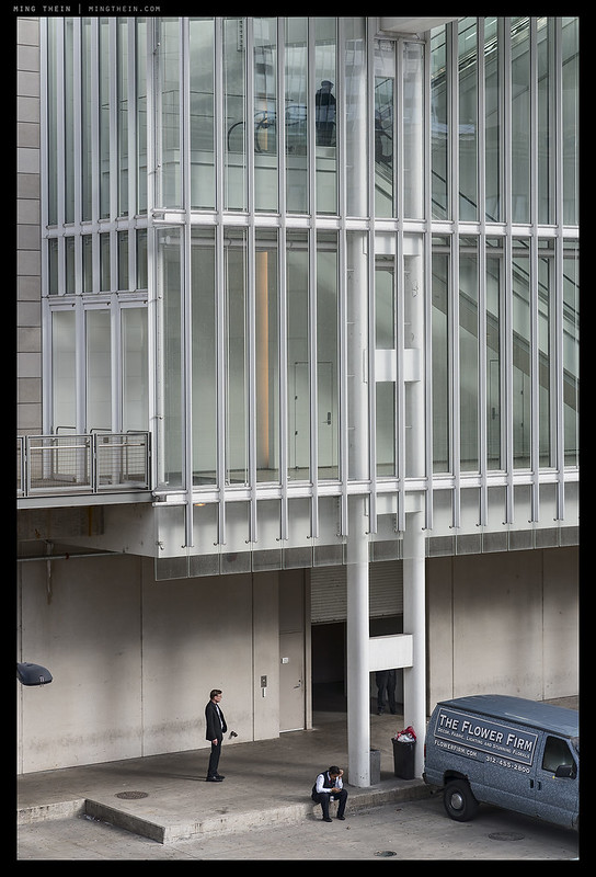
I don’t know whether it’s the skill at capture or the processing, but the first four of these as seen on an iPad are some of the most impressive color photos I’ve seen in a long time. I can’t put it into words without babbling on like someone talking about wine tasting — and my descriptors would sail far from the mark. But the impression of fidelity to what to seen is striking. And the subtle use of small islands of contrasting color, all with great restraint, works extremely well.
Thanks. My trick is to use a calibrated wide gamut monitor for the gross tonal manipulations, but proof on something that has a far more limited gamut – if it looks good on that (with no strange clipping or posterisation at the edges of gamut) then you’re safe. It’s important to remember that most of the time the output will never be viewed under ideal conditions, so we should also check it under the worst case scenario. Learned the hard way in the early days when clients said colour was off or there were weird stripes…but they were viewing on a projector or conference room TV. 😦 Fortunately, the transparent/ natural look I go for these days tends to stay well within gamut limits; it’s the highlights that are harder to manage because most devices start to shift, clip or lose fidelity at this end causing tonal breaks.
Hello Ming, Do you feel the color palette of the highly saturated films like Velvia is a bit “too much” when you see old slides from the perspective of a 2018 digital camera photographer?
Depends very much on the subject. Those films had a different tonal response to digital – they hit high saturation quickly, but didn’t hit 100% saturation for a very long time (i.e. there was a very long shoulder), meaning you still had tonal differentiation even at high saturation. This is quite different to the linearity of digital capture. There are still subjects/ scenes today where I think very high saturation is good for overall impact…
It’s important to get consistency in colour, if only to satisfy ones own sense of getting it right. I do think though that when we shot film, and I’m referring to transparencies, what the film rendered was part of the way photography recorded a particular scene. I wonder if Alex Webb’s pictures shot digitally would have the same aesthetic impact. What i’m trying to suggest is that often the perfect colour reproduction is simply just recording what we see with our eyes. Sure, we can bend the colour out of shape as much as we want in our software, but the choices are so massive you go crazy trying to decide. It was somehow much easier for the film emulsion to decide.
Not really a constructive comment to this post but I guess a nostalgic nod to film.
More than that, the ability to replicate whatever you had in mind in the first place. This requires some sort of consistency in both display/output (for judging what the right adjustments should be) and capture. It gets harder with multiple cameras as the adjustments required are different, and if at the edge of the luminosity range, then clipping might occur. There’s no question that the impact of an image is dependent on presentation; you won’t lose everything if the tonality and colour are off, but you can gain a lot of they’re on point. I have no doubt that Alex Webb could probably do the same thing (or better with the right adaptation), but a lot of what we recognise as ‘his style’ is dependent on the tonality and colour of that particular film. Plus side: we can now make our own ’emulsions’, and consistently so – as opposed to having to use the same thing as everybody else in the past. Minus side: infinitely variable choice does not at all simplify things…
Yes, you’re right, we can make our own emulsions, and that has to be a good thing. My issue is that which you mention as a “minus” I find it hard to stick to one “emulsion”, that’s because I shoot different things, from TV studio stills to magazine covers. That’s my fault for not being able to have commitment and confidence in a particular look……… ah, the pain of choice!
PS… is your A3 Photoshop workflow still good for the current LR/PS?
Yes, though some of the button markings/ positions may be different. The principle remains the same, and the profiles are still valid.
Good and bad, I suppose – personal palette and consistency is good for recognisability, less good for client flexibility/ commercial versatility. Also, not so easy to visualise. I guess it boils down to whether you want to be able to serve a wide range of clients or pursue artistic integrity…
If only one could pursue artistic integrity and let the clients buy it. In all honesty, these days, I find most of my clients unable to distinguish between Ritts and Rembrandt.
There are still some, but I agree, for the most part it’s price and shock or hipster value. Or worse, catalog safeness.
Thanks for your feedback on an interesting subject. So I guess in a way each camera manufacturer likes to put their individual stamp on colour response like the films of old. And if they wanted to be more neutral or the same as the next like Hasselblad they could be at a cost but then who’s to say what’s neutral. I must investigate HSLs and spyders but at the same time not get too bogged down. Thanks again.
Pretty much. In the Hasselblad situation I do know the individual sensors are calibrated to a quantitatively neutral standard (ie flat/equal transmission across the whole spectrum) though, against a reference colour chart. I suspect the others are either batch calibrated (sensors do vary because of the colour filter array, or the silicon itself – there is no ‘perfect’ device here) and that calibration may not be perfect for all sensors – or they’re calibrated to a ‘house ideal’ that’s as you say – deliberately different from perfect neutral to give it a particular bias. People often talk about ‘Nikon greens’ or ‘Canon reds’ – it’s no more than this calibration, and goes out of the window with the correct raw treatment…
Please correct my if I’m wrong. If you were to take the same subject with several different brand cameras and (expertly) processed the RAWs through photoshop you could get the same colour results. At the same time if you did the same but just corrected white balance the results would be quite different depending on the camera manufacturer. If that’s correct I find it difficult to understand how doing global adjustments doesn’t effect all the colours unless of course you don’t do global adjustments. It’s a pity that it’s nearly impossible to get consistently great results straight out of the camera but I guess that’s the nature of the beast.
Don’t get depressed: it only takes a Spyder toolkit to correct the colours from any camera to a reasonable degree. And it only costs a fraction of a Hasselblad.
Also, I’m not convinced that big efforts spent on digital calibration are much more helpful than trial-and-error when it comes to printing (unless you’re a pro doing it regularly). The visual impression is so different anyway. And if you’re publishing online, most of the audience won’t have calibrated monitors and the effort is lost. Again, a quick run with a Spyder does the job well enough.
Use a spyder on your printer, too – print a test chart, spyder measures and makes a correction profile, and then you should be consistent and as close to neutral as the printer can get with that inkset.
“If you were to take the same subject with several different brand cameras and (expertly) processed the RAWs through photoshop you could get the same colour results.”
Correct – the operative term being COULD. You would have to adjust the HSL sliders and/or channel curves differently for each camera.
“At the same time if you did the same but just corrected white balance the results would be quite different depending on the camera manufacturer.”
Correct again, assuming you didn’t touch the HSL sliders (i.e. all values at zero) or channel curves
“If that’s correct I find it difficult to understand how doing global adjustments doesn’t effect all the colours unless of course you don’t do global adjustments.”
I have a HSL and curve profile for each camera I use that brings the initial output back to a consistent neutral across all cameras. Global adjustments then do the same thing.
“It’s a pity that it’s nearly impossible to get consistently great results straight out of the camera but I guess that’s the nature of the beast.”
It’s impossible because every photographic situation is different, so one size fits all simply cannot be done.