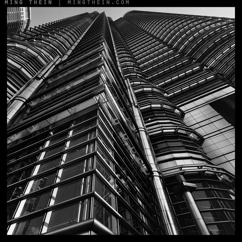
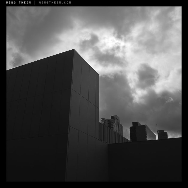
I: Kuala Lumpur
‘Project’-type photography – images shot to a theme as an exercise or assignment or with a view to an eventual exhibition – is generally a good way to motivate you to shoot if you’re stuck for inspiration. It narrows down the entire universe of possible subjects to just a few, or one. Or a single style. That restriction prevents the mental anguish of overload: either too many things to shoot, or nothing that really stands out in a visual barrage. If you’ve extensively shot the place you live in, it’s probably the former; the result is that you don’t land up photographing unless you take a trip or there’s an event – i.e. something out of the ordinary. The latter is what happens during that trip: perhaps there’s no inspiration, or there are just too many possible subjects, which result in a photographer losing focus and making a weak portfolio. Focus of effort is therefore generally a good idea. Believe it or not, this is actually the first intensely focused project of its sort I’ve attempted.
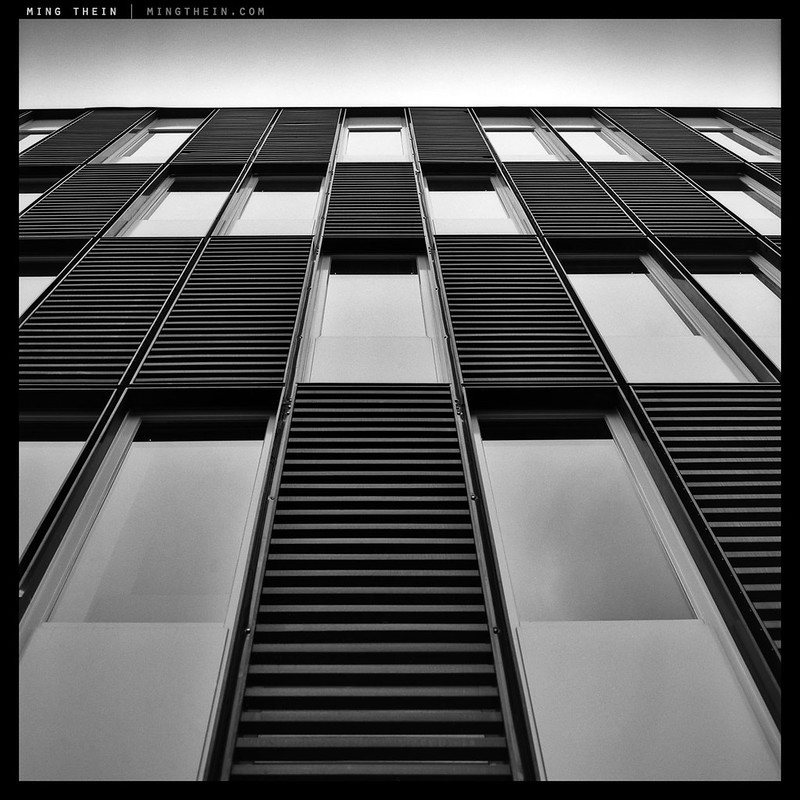
II, Amsterdam
Personally, I usually suffer from the latter: if anything, there’s too much visual material once the ‘photographer mode’ switch is thrown. I moderate this with a very rigorous curation process; there’s a lot left on the cutting floor because I’d rather have the image, or an attempt at the image, than not have tried it and regret it later. My biggest fear when shooting is that I might miss something – anything – which might later turn out to be a decisive moment. As such, I tend to shoot so much that I don’t require inspiration so much as focus.

III, Amsterdam
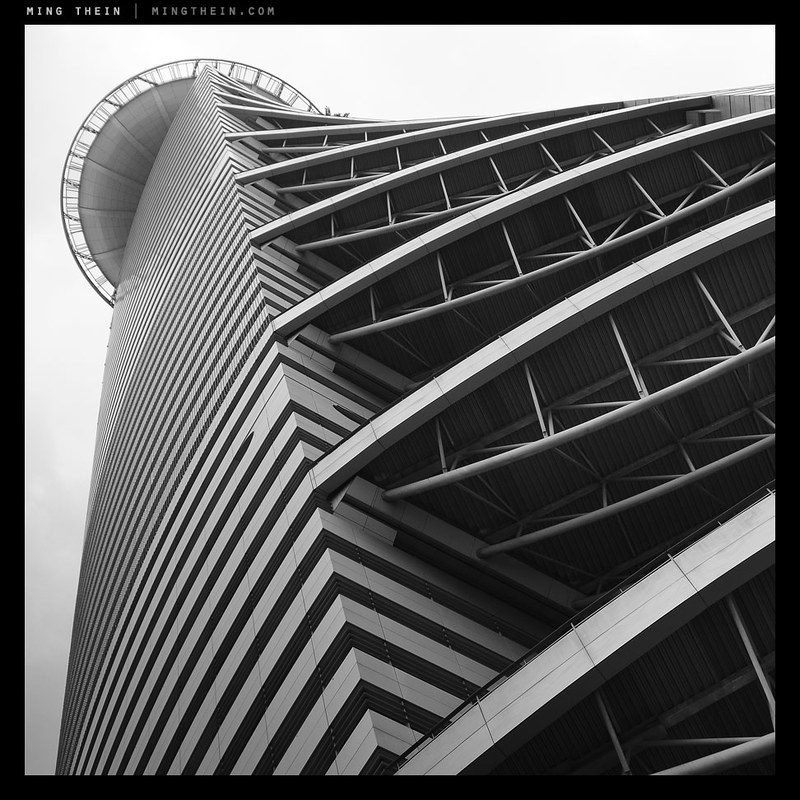
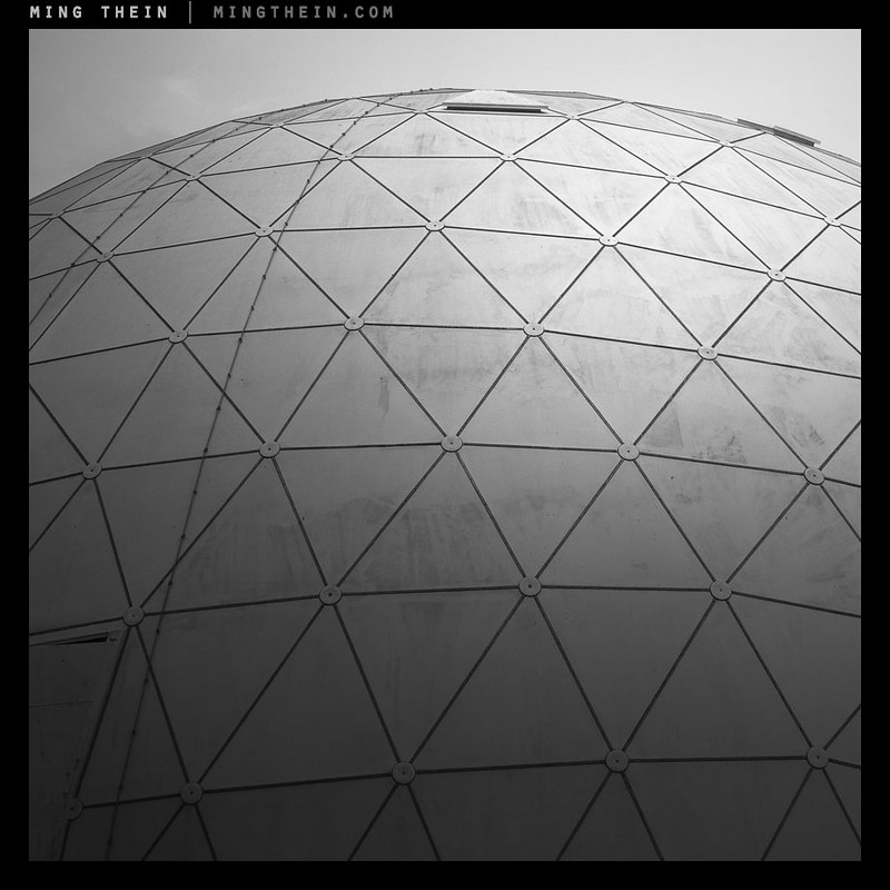
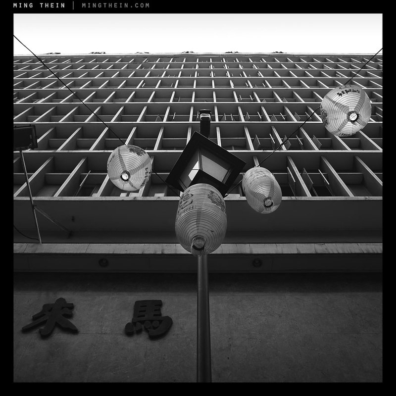
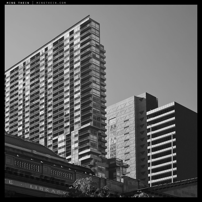
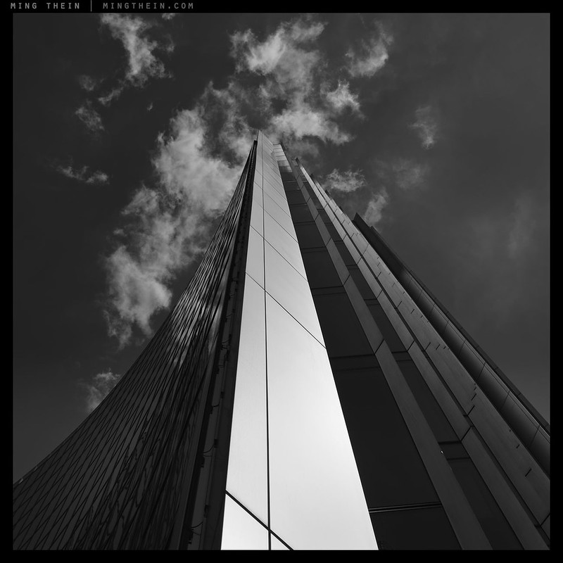
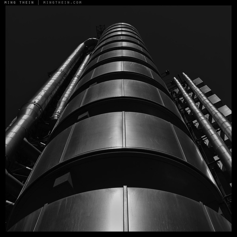
The Verticality project is something that I’ve been working on intermittently for the past year or so. I never intended it to be thematic; I made an image or two that I particularly liked, and then having identified the key traits of these images, subsequently looked out for such opportunities in the course of my other photography:
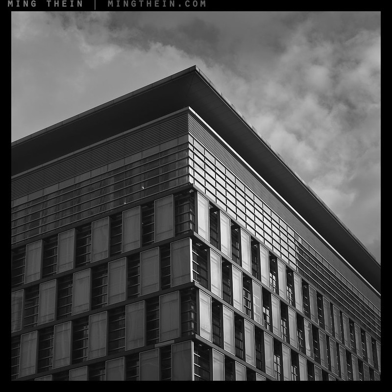
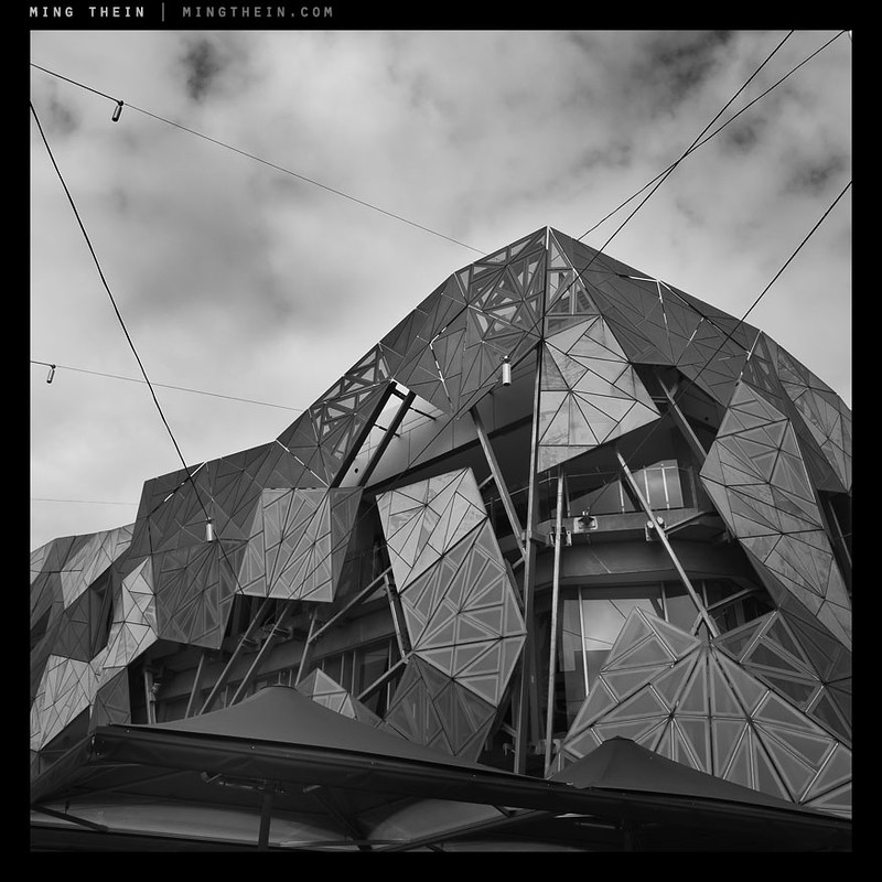
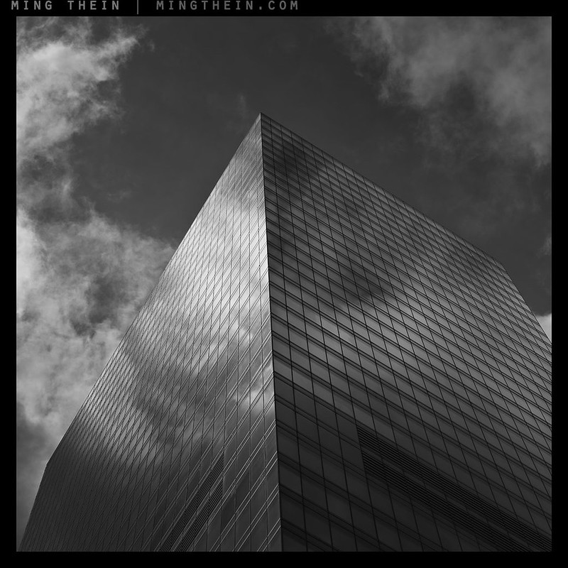
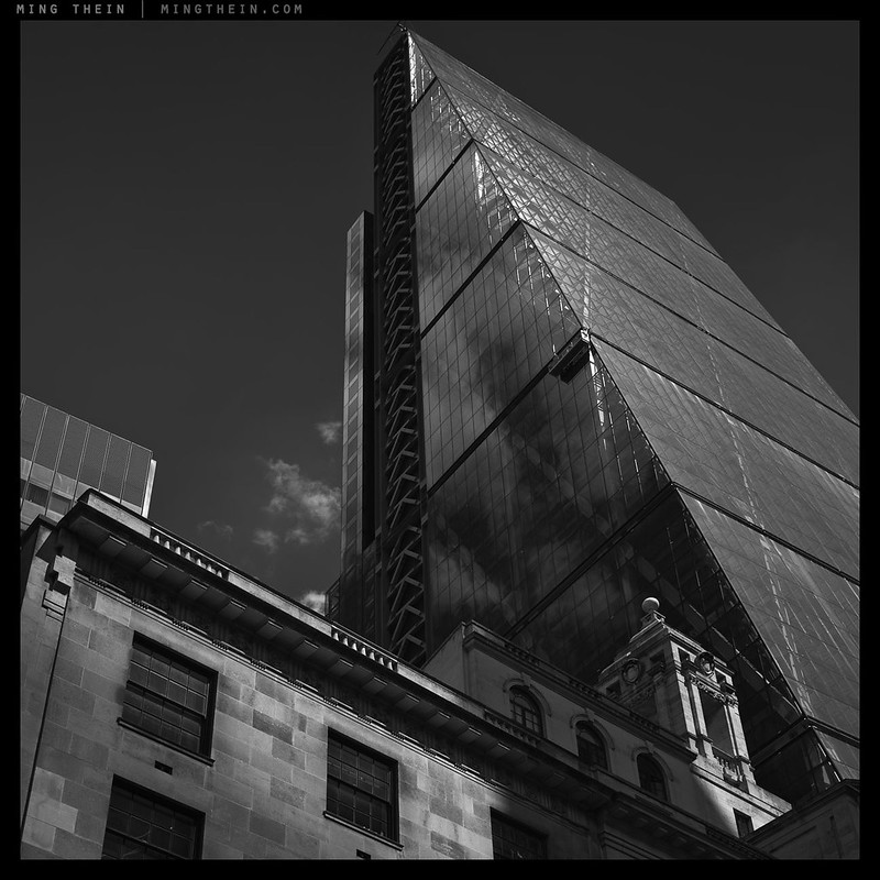
- An entirely man-made architectural subject, with heavy emphasis on geometry and form;
- An abstraction of scale through the removal of general visual cues such as people or natural objects (other than clouds);
- A perspective from ground level looking up;
- Flat but directional light to give the images a draughtsman’s quality;
- A tonally balanced black and white style to remove the emotional cues of color and introduce a cold, rationalistic monolithic-ness;
- A sense of ‘balanced imbalance’ – a strong lateral balance in the structure in the image, with a dynamic sense of vertical progression brought on by both geometric convergence of perspective and decreasing frequency structure of detail;
- A square presentation – originally an artefact of shooting the first few images with a Hasselblad, but now a conscious compositional choice because I feel that the square helps with balance;
- High technical image quality and pan-focal depth of field, suitable for Ultraprinting or large format display.
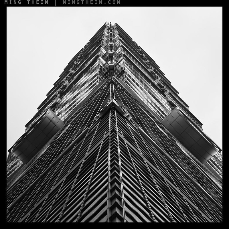
IV, Taipei
The results have now grown to the point that I feel they merit a post on their own; this will of course be an ongoing project. I haven’t decided what the final conclusion will be – if there is one – but if there’s enough interest, I’ll offer this as a limited series of Ultraprints at some point in the future. One of the things I like about this series is that it’s very equipment independent – the images leave no visual cues about the cameras used: they are entirely about conveying my idea, and I intend to leave it that way. Interestingly, I tried curating my back catalog to find images that fit; there were almost none. This isn’t surprising given the very specific set of visual objectives I had. One thing I do need to do is keep better track of the sequence names…you’ll find that the captions may not necessarily match the working file names.
Personally, I’m quite pleased with the results; enough so that I’ve started another project called <em>Portal</em> – I’ll probably be showing the fruits of this one in another six months. Enjoy! MT
V, Taipei
VI, Petaling Jaya

VII, Tokyo

VIII, Kuala Lumpur
IX, Penang
X, Kuala Lumpur
XII, Melbourne* (yes, I seem to be missing XI.)
XIII, Melbourne
XIV, Melbourne

XV, Melbourne
XVI, Singapore

XVII, London

XVIII, London

XIX, London

XX, London
XXI, London

XXII, London
XXIII, London
XXIV, London
__________________
A few places left for Making Outstanding Images Chicago (September 2014), Masterclass San Francisco (September 2014). Masterclass Venice (November 2014) now open for booking – click here to book or for more info
____________
Visit the Teaching Store to up your photographic game – including workshop and Photoshop Workflow videos and the customized Email School of Photography; or go mobile with the Photography Compendium for iPad. You can also get your gear from B&H and Amazon. Prices are the same as normal, however a small portion of your purchase value is referred back to me. Thanks!
Don’t forget to like us on Facebook and join the reader Flickr group!

Images and content copyright Ming Thein | mingthein.com 2012 onwards. All rights reserved


Reblogged this on An Opportunity for Reflection and commented:
Beautiful images. Really talented photographer with interesting angles ❤
Have not commented for long time but always enjoy your work.Like 4 & 19 the most.Can not explain why but 4 seems like a macro of an insect. Ciao Rod
That one I cannot explain…
This set is stunning, I don’t live anywhere near big structures like this but when I travel to ‘a big city’ I always look up and end up amazed like a little kid.
Is the workflow for these similar to the B&W workflow tutorial video ?
We need more of those post production tutorials, I know this is probably something you would like to keep for yourself as it is what I would call your signature, but damn I wish I could achieve such results in my B&W work !
Have you thought about maybe instead of a book maybe doing a 15 pages photoessay magazine ? That is something I’m personnaly looking into, there are some easy solutions out there and the selling price is not outrageous and that is something I would gladly buy just to get the whole serie in my hands.
Thanks. Yes, the workflow is the same as the B&W masterclass video (which hasn’t been released yet; we’re still in final postproduction).
Thank you Ming for the amazing photos.
A pleasure!
Exquisite!
But annoying because you have “pre-copied an idea” (*) I have been having ( for too damn long without doing anything about it ) for a shoot around my locale
(*) noo phrase, copyright 2014, :o)
Regards,
Plevyadophy
Hah! Paul, you actually need to go out and shoot it…besides, I’ve been doing this around the world for two years now…
Gorgeous. So often I forget to look up.
Thank you.
Yeah, me too; I forget to look up. In fact in my case it’s not forgetting it’s simply that I don’t bother to. And this flaw was brought home to me very strongly by what I saw when out shooting with Ming last month ( at one point he was describing a monument in my home town that I have been past hundreds, if not thousands of times, and I couldn’t work out what it was he was talking about ……….. and then the penny dropped!; he was looking up whilst I tend to keep my head down and there was a vast difference in our view and appreciation of the surrounding area as a result ). A great learning experience
You do realise that a couple of these were shot when I was with you in London, right?
Yes, I noticed. :o)
Superbe série, j’adore la IV 🙂
Merci!
I think if you leave out 3,5,9,10,12,13,and 14 — then print these very very large (12’x12′ minimum) and hang them in a gallery with 20-30 foot ceilings, you would have a powerful artistic statement about man reaching for the infinite and failing. The perspective would be dizzying, and, I imagine, quite emotional. Lovely stuff.
Hmm, that sounds very interesting. Gigantic prints of those would be overwhelming, and could really exploit the technical perfection of them.
Oops. One more thing: any tlit/shift here?
Yes, on the straightened ones.
1,4,19,21! Something about the square (or almost square) format(s) – a slightly uncanny sense of perspective and ambiguity as to scale. Well done.
Thanks – the conflict between perspective and ambiguity of scale is deliberate. On one hand, they’re sufficiently abstract that you can’t figure out how large an object you’re looking at, but there’s always a sense of looking up at something massive…
great set ming . as you said by changing to black and white you removed distracting elements , it has served to bring homogeneity for series and we are drawn only to essential minimised elements of images that separate each architecture . I would have placed 3rd and 14th together somehow they contrast each other well and still have a few common elements . by the way was leaving 11 a conscious decision ? Again a superb set , thanks for posting .
Thanks. The sequence follows the order in which they were shot, not any particular curation – it would probably be different if they were to be shown at a gallery; either alternating contrasts or a slow progression from start to finish with slight changes between them.
I messed up the numbering with 11 😛
Ming, knowing that these were made using various formats, how did sensor size and hence depth of focus play into the mix (if it did at all)? The subjects seem to require a wide DOF if shift/tilt is not an option. Were some of the formats you used intrinsically better suited than others? Oh, and I very much enjoyed these images, aesthetically. Thank you.
Actually, the subjects were far away enough that it was possible to get everything in focus all the time. No big deal. Larger formats were of course better for enlargements etc…
I’ve seen a few of these striking images before… to my book they could all be wall hangers in my home. Would work perfect as a set if I may except the Dutch, Penang and Melbourne ‘non’-keystone images. They belong perhaps to another set of similar architecture? Never mind.
Stunning work Ming.
How is it with B&W regarding super printing? Is that another ballroom of techniques?
Thanks Gerner. Yes, B&W Ultraprinting is slightly different because of the other tools you have to control tonality. There’s also the option to use the ‘wrong ink’ to metallize them; depending on the subject it can be quite nice, too.
These are really quite striking. My own reaction to them as a set is that they reinforce the illusion of strength and permanence in our structures. Everything included shows both purpose and a virtually unblemished quality. That illusion is reinforced of course by the viewer’s perspective, and the strong deep greys. In the examples that include clouds, the clouds seem to offer a strong feeling of freedom in contrast to the dominant structures below – reminiscent to the ‘Only the Clouds are Truly Free’ photograph that I think defines this impression.
Thanks Linden!
I think this makes a strong set for an Ultraprints portfolio. Do they meet your criteria for that?
Yes, they do. That was part of the objective. 🙂
Unbelievably beautiful set. they somehow reminds me Stravinsky’s music when looking at them out of nowhere 🙂
Thanks – interesting comment; is it the starkness/ bleakness/ blackness?
It’s probably modern feel and the quality of the black and white images with clearly defined lines, angles… just remind me of Stravinsky’s strong angular rhythmic and tempo. Maybe you can have his music playing in the background when they are shown at an exhibition in the future :). Again, they are beautiful MIng.
That’s not a bad idea – thanks!
Inspiring and thought provoking. A visual delight. Thank you!
Thank you.
Yeah, damn the torpedoes … 🙂
What I mean is: Yes some of these photographs are really good. Keep doing your thing. Trust your vision. You’re onto something good.
Having come to this post after doing an edit on one of my own ongoing projects to submit for an open exhibition, I’m in ‘edit mode’ and I’d like say that image III doesn’t seem to hang with the others.
I agree. Inspirational images but III seems out of place here.
Love them, Ming. I’ve always been a fan of your architecture work since I started reading your blog… a little more than 2 years ago.
Thanks!
Thank you.
Incredible dynamic range and tonality, Ming. Mind-blowing.
Thanks Roger!
I find it much more interesting to view a series of photos, with a conceptual link, than individual photos. There is something about the way one plays off of the others in a series which adds to all of the photos. A picture in isolation can sometimes be boring (maybe bland is a better word?). That same photo, together with its “peers” can be a totally different, and better experience.
I think it sad that we often have the feeling that a photo MUST stand on its own. We tend to miss out on the subtleties while in search for the BIG STATEMENT.
Thanks Ming. I’ve got a half dozen thematic project ideas in my head (and written on various scrap pieces of paper on my desk!). I think it’s time to work on one of those now!
I take it that these work for you, then?
You take that correctly, sir. I like them very much, as a group.
“Mix of everything – Hasselblad film and digital, large format, GR, D800E, P645Z…”
An amazingly consistent technique and vision considering !
Thanks, has to be. Can’t use the same camera for everything (different requirements for each job) or tell my clients ‘sorry, it’s different because of the camera’…
I’ve always had mixed feelings about architectural photography, whether straight or artistic shots.
Because it seems the real art and imagination originated in the architect. The rhythms, the crescendos, the surprising fillips- those were the design and intent and creativity of the architect.
Sure, a camera can take a picture of the music that was in the head of the actual architect. And it can do so in many different ways. But that is after the fact, and just a recording of what has already been wrought. A building is not something that just appeared spontaneously in nature.
A world famous architect was creating a book re one of his new buildings. The architect hired a traditional architectural photographer who came down after it was nearly finished with his tilt-shift lenses and his tripod and his photographer’s assistant. He made a lot of traditional shots that were used in the book. They represented the overall look of the building in good light, with perspective corrected, etc.
My wife spent a lot of time at that building during construction and took a lot of very unconventional shots – architectural details juxtaposed against the sky or the green spring grass, the reflections of people in the glass, etc. She sent a sample of those to the architect who went gaga over how she had shown him aspects of the building he hadn’t really seen or anticipated. He also paid her good money to license her photos to include in the book.
The point is, I disagree with ronin – I don’t see people saying God is the architect of nature, so I have mixed feelings about macros or landscapes cause God is really the artist.
I saw this after I replied, but yes – same thoughts here…
The architectural design is the brainchild of the architect, but understood you tend to disagree . Let’s look at it another way.
If I were to take a photograph of your photograph and publish my photograph, perhaps enhancing it with additional contrast or color or whatever, so that people can see it in a new way, would it be acceptable because I used a camera and my own vision? If you went gaga over it, would you pay me money for it?
Too extreme an example because it is similar technology? OK, say I render a painting of your photograph but think it could use another element… a mass of form… right… here. So I paint in a tree. Since you are not God, and I saw something more in your image than you did, can I just stick my painting in a gallery?
I think not, and the reason I have mixed feelings wrt architectural shots is that I can recognize the additional value of the photographer, but it seems like only added value on top of the base creation which was the rendering of the architect’s vision.
In other words, I don’t mind feeling a sense of artistic satisfaction if I take a nice photo of God’s work- the chance juxtaposition of an entire string of events I’m not aware of or could not comprehend- but that artistic satisfaction is diminished if the subject was already 95% there as the direct result of another man’s creativity.
But I’ve been talking about artistic shots. Commercial shots are a whole different category. Your wife got paid for commercial work to promote an architect, buildings being relatively non-portable. I’ve no qualms there, of course not.
It’s not the same thing, period. You don’t even have the same number of dimensions. The architect doesn’t create light. And if an idiot makes a bad photo of a building, does that also make it the architect’s fault?
You could say that about a photograph of anything that wasn’t created by the photographer…it is impossible for the creator to have envisioned every possible presentation method, vantage point and direction of light. Therefore there is still something that rests with the photographer.
The very best architectural photographers are undoubtedly bringing more to the table than just pretty pictures of what is set out in front of them.
Take a look into the role of the greatest of 20th century architectural photographers – the late Julius Shulman – as a taste-maker (supporting and promoting young architects) and interpreter of Modern Architecture. His images created a lifestyle around the buildings which is influential even now…
There are also cases where architect and photographer form a deep relationship because of the individual’s particular skills in interpreting the designs; See Le Corbusier and Lucien Herve or for a contemporary example See Helen Binet and Zaha Hadid.
Agreed. The documentary Visual Acoustics is a great look at Shulman’s work, and well worth anyone’s time.
i like your style of presenting architecture. are they all shot in 6×6 format.
i’m curious why you have adjusted the perspective of some images, and leave other out.
No, they’re shot with various cameras/ formats, but composed as square. I adjust perspective (or use shift lenses) if the convergence is minor; if it’s major, it becomes part of the composition. Depends on the building and the individual image.
Hey Ming, fantastic photographs as always, they certainly convey a sense of timelessness, so reduced to their essentials.
What I was wondering, as you mentioned that it became a conscious choice to represent the images as squares, yet you shot with cameras of different aspect ratios: do you actually sometimes crop in camera for ones with a non-square aspect ratio, or do you just pre-visualize them as squares, or just crop in post and decide on the final composition then?
The reason I am asking is because I have been really drawn to the square format, and am unsure how to deal with this, as I shoot with an OM-D and a GR. Even more because the OM-D allows you to shoot in squares but retain the full file from the RAW, in contrast to the GR where you lose that extra information without means to get it back.
Looking forward to your thoughts on that matter!
Thanks. They were consciously composed and previsualized as squares. I do the ‘mental cropping’ at the time of composing. Given the option, I shoot full-aspect and make a mental note of the crop; better still try to make an image that works as both native aspect and cropped for maximum flexibility.
Quite a disconcerting series – therefore, they work. Would there be an undercurrent of loatging of your previous career in here at all? Or am I reading too much into it? Or indeed projecting? XVIII really grabbed me, it gives off an intense feeling of detachment.
A bit of everything, I think – even feelings of my own I can’t identify at a subconscious level, so quite possibly, yes. We are after all a product of all of our experiences…
Reblogged this on 울산오피 하실장.
Lots of heavy PP artifacts in the darkened skies of the London pics…
It’s a flickr resizing/compression artefact. They’re not there in the full size image.
Fantastic pictures! Really! I actually thought I was the only one who liked these kinds of photos; the simple, graphic, almost surreal and eerie character of the photos combined with fantastic black-and-white tones. I’m now re-inspired to continue trying to make photos like this.
Thanks!
Very, very nice! Almost all of the images work by themselves but as a series they are doubly as effective. For someone like me who does not understand much about architecture or architectural photography the recurring theme adds a lot (and perhaps teaches something as well, which is a sign of a great essay). Long-term projects definitely make the site more interesting for long-time readers. I think a link to a dedicated page (or under your portfolio page) is in order.
Thank you – knowing what you think about my work lacking emotion, I’m quite surprised (and humbled) by the reaction. I think perhaps this is a good direction to go in…
I have another project/page in the works that will be along these lines; there are also other long term projects I’m working on, but have not yet reached maturity or completion. Actually, I don’t think any of these ever really reach completion; you never know when you might see something that just fits.
I just had to come back to comment on this. I think most readers, me included, evaluate your work against the best out there – Nick Brandt, Saul Leiter, or whoever else they last purchased a book from. The main distinction between those artists’ work and yours is clearly not technical skill or photographic talent (i.e. the skill of making good images). It is rather the material presented to audience and the process behind it. The constant stream of images is a key attraction of your website (I would assume those who only read reviews don’t purchase anything), but long term projects are definitely a good direction to take, especially to attract more art audience and keep long-term readers interested. Based on your own comments I wonder if impatience will be a hurdle, but I guess it is a matter of mixing long and short term work.
One last thought: it seems to me that the strongest books and projects have something beyond a unified theme and visual aspects. They have a purpose, or a mission, whether it is to promote wildlife preservation or just tell the readers an entertaining story. It binds the images together in a whole different way than just having similar “photographic qualities”. Obviously this is very subjective and a bunch of great photographs is always likely to make a great book when bound together.
I’m flattered by the comparison, and at the same time not. Those ‘greats’ actually produce or show very little work compared to me – I average 10-15 images a day, every day. If I shot the same thing, I’d be bored, you’d be bored, everybody would be bored. These are curated sets, but not the kind that have enough time to ‘sink in’. I suppose that’s as much a limitation of the demands of web media as anything else…
That was kind of the point, meant to be an encouragement – there is an obvious difference due to the output medium and your current publishing rate, but adding long-term projects should bridge large part of the gap, given the level of ability… and bring something of much interest to us readers, perhaps also new ways for you to monetise the hard work.
Formally perfect, technically flawless.
Fear of missing the moment? Hardly, except perhaps for the light.
Clearly, you are most at ease with objects rather than people.
Thank you. The part about people is not entirely true. I shot a lot of documentary in my earlier work and was told back then my people images were better than my objects. I just choose not to now.
Did you try these in your gallery scouting?
just happened to read Michael Kenna over at TOP, he’s a master and does not shoot people… 🙂
Yes, I did.
My reply to this one had a typo in the email address. @mac, not @nac — sorry
Fixed.
Oops. My last comment was suppose to be in response to Bryan!
Great shots, congrats – how about adding some small stuff?
I did consider it, but I both haven’t found the right subjects yet, and I think if the scale was too different it’d feel off…
I was going to say that this set is some of your best work, but I think what I really mean is that this set is one I have personally enjoyed the most.
I really like strong graphic elements in photos just like you have here. I have tried similar shots with pedestrian results but I always like to see how I compare to someone who is shooting similar things but at a higher level and trying to find out what makes the difference. In this instance one element is the use of negative space.
As for shooting project work, I am often directionless when shooting at home (I got a camera to travel). I’m bored with the same places. But noticing a similarity between my shots and other photographers motivates me to expand on a theme already in my catalog. Once I have a solid idea what what I’m trying to achieve shooting becomes more project like and is far more enjoyable and feels far more productive.
Last week it was David H Wells that had me out and about. This week it might just be Ming Thein.
Thank you.
After reading your response to Louis de la Torre, and wanting to spare myself a similar fate, I’d like to clarify that I was speaking from a completely personal perspective. The photography and the details and the composition are excellent. I just meant that, for whatever reason, I am not emotionally engaged with most of these images. Of course, pictures like the black and white Cuban cigar maker taken on an iPhone make me feel like getting out of photography altogether!
It’s entirely personal, and I think polarisation is a good thing: because emotional responses can be positive or negative. Indifference is perhaps the worst reaction.
Getting out of photography why?
Perhaps he means that your iPhone shots are excellent. Which they are… Which is good and bad. Good because they are excellent and bad because it is very obvious that the camera does not matter…
Ah, possibly…
Thanks for sharing the result of your project. Love the juxtoposition of angles and shapes and then the reflections of the clouds signifying nature and context, really beautiful, especially the London shots. Wondering about the effect of the images in colour, any thoughts on that?
Thanks. Oddly, they work individually in colour but not as a series: the differing shades of blue in the sky are distracting, and they’re either not similar enough or too similar. Strange, no?
I really loved these.
Thank you.
Sensational work, did you capture these images using your Haasleblad?
Thanks,
Jeffrey
>
Mix of everything – Hasselblad film and digital, large format, GR, D800E, P645Z…
Ricoh in this list speaks volumes for that camera…
I went Fuji, X100S, but clearly it was a tossup…
Awesome Project! I really like the details. I have been thinking about projects and series a lot. I like the idea of working on a project over an extended period of time. I noticed you often do a series of 5-10 images each day on flickr, photo essays, exhibits, ultraprints and Master Class 10 image sets.
Is it good to do both series taken in a day/week and also over time?
Thanks. 5-10 is manageable in the time available for the masterclasses; personally I find it’s the right number to have each image be memorable, but at the same time be able to show a variety.
I wouldn’t time limit yourself unless that’s part of the idea.
I usually love all your images, but I have to say that, except for one or two (such as the London juxtaposition of the old and the new), I wasn’t really moved by any if these pictures. They were certainly well executed (that goes without saying, of course) but lacked your usual spark of creative energy.
Thanks for your opinion. I guess that at least makes them polarising, which puts me a step closer to art!
They are neither aesthetic nor conceptual.
Think of the millions of people in close proximity to these structures who don’t give a second thought to the view that presents itself as they bustle about. It’s really about crystallizing the moment. I think the clouds really set the pictures off, reminding (or not) the ‘drones’ of their vulnerability and essential weakness in the face of nature and it’s forces. So I say reconsider your brush-off.
None of them stop to look up, either – yet everybody aspires to climb in life to the same things (for most)…surely the destination, or implied destination, matters too?
Thanks for your opinion. I guess that at least makes them polarising, which puts me a step closer to art!
Wow! Absolutely stunning pictures…so so beautiful!
http://www.sid-thewanderer.com
Thanks.