
The most challenging types of watch to design is where there are already rigid expectations set by the genre – pilot, diver etc. – to go outside this requires either not meeting functional requirements, or producing something that takes some acclimatisation by the market. You want to avoid being different simply or the age of being different as this inevitably leads to issues of design longevity/maturity as well as functional compromises. Our interpretation of a dive watch has had the longest and most painful gestation to date – with conceptual explorations starting in late 2017, not long after the 17.01 was launched. It’s taken us nearly two years to make something we were happy with, and in the end – we have also decided not to go to series production because it came too late in the brand’s overall design cycle. Even if we committed now, we wouldn’t see product until the end of next year at the earliest, by which time other launches with our second generation design language would have taken place and leaving the Abyss feeling a bit out of place.
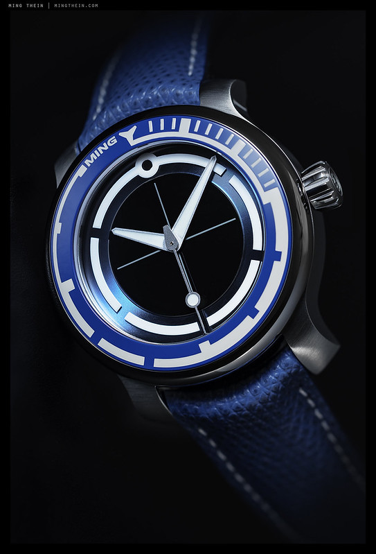
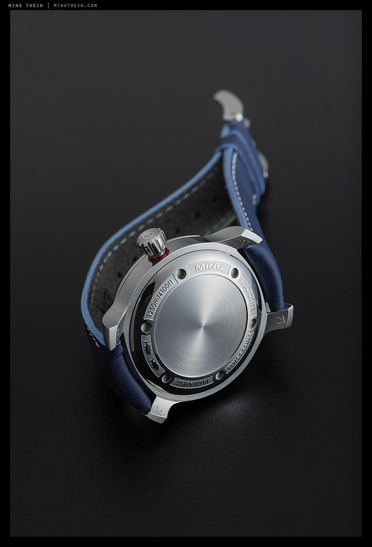
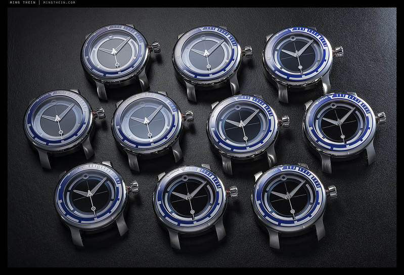
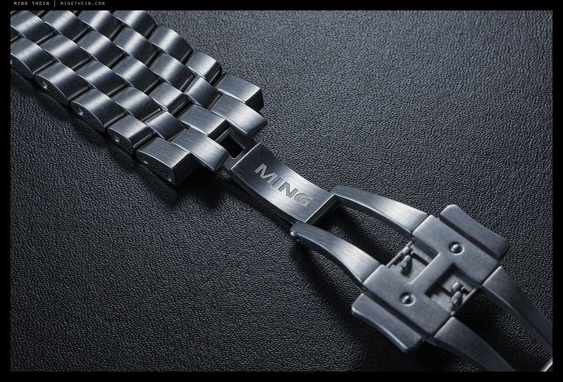
However, having put that time, effort and R&D spend into creating their watch, we decided to use all of the prototype cases to make a very small edition of 10 watches that we could launch now: the 18.01 Abyss Concept. I am personally very attached to this design as it takes our first generation language to the limits of interpretation and is still clearly one of ‘our’ watches – there’s clear lineage of 17.03, 19.01, and some all-new elements for functionality we didn’t previously need. It’s legible and functional without resorting to existing diver paradigms. We figured out how to make a functional rotating bezel without the visually disruptive serrations normally used for traction. The cases have been individually validated to extreme depth ratings (at least 1,250m; we don’t know how much more as that’s the limit of our test chamber) and are strong enough not to require helium release valves, but yet remain very wearable in proportion – 40mm in diameter, under 14mm thick, and visually a proportionate 10-11mm on the wrist*.
*There are techniques used in watch design to mask thickness: setbacks, vertical breaks, and domes – I kept the main case uniform without breaks to give a sense of solidity, but the front sapphire crystal and bezel are not just domed but also polished to help it blend; the caseback is a second dome that tends to disappear into the wrist. In both cases, there’s also the advantage of added strength from the dome, allowing us to reduce thickness a bit further.
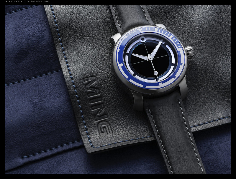
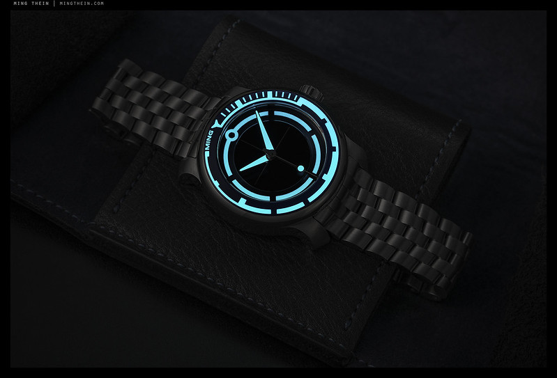
As with everything else, I went obsessively overboard and designed a new bracelet, travel pouch and curated strap selection to go with it. There’s also a ridiculous amount of luminous material, because – why not? It’s also an interesting challenge to create graphics that work both in positive (daylight) and negative (night, luminous material only); basically, everything that’s white on the watch glows with Super-LumiNova X1. We even fused it into the ceramic bezel. Whilst it makes me a bit sad that it doesn’t make strategic sense for us to produce them, I’m still glad some of these will see the light of day.
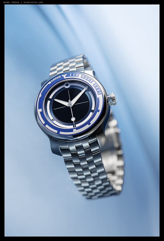
I think you can see from the images that this is one of our more dynamic dials – which is saying something given that all of our dials play with light quite strongly. We have both a color gradient from the outside in (silver bezel, mid blue insert, dark blue chapter ring, black centre) to focus maximum contrast into the middle of the dial and prioritise hand reading; there’s also a variety of textures from polished to brushed and matte along the same radial axis. The group shot of all watches is perhaps the most telling – you can see just how much the dial changes with a few degrees change in the reflection of primary light source, yet the hands and markers always remain legible.
From a photographic point of view, the real challenge here is the first image: any guesses as to how it was shot? And no, it isn’t a composite; one frame, WYSIWYG. MT
MING Watches are available exclusively and direct from us at www.ming.watch. The Abyss Concept unfortunately (or fortunately) sold out 10 minutes after launch.


__________________
Visit the Teaching Store to up your photographic game – including workshop videos, and the individual Email School of Photography. You can also support the site by purchasing from B&H and Amazon – thanks!
We are also on Facebook and there is a curated reader Flickr pool.
Images and content copyright Ming Thein | mingthein.com 2012 onwards unless otherwise stated. All rights reserved


bubble soap solution on watch, laid on arcrylic with water sprinkles.
Nope, it was submerged…
Do you plan a pilot’s watch as part of the new series in the second generation?
We don’t generally make watches according to a formula; a diver is an exception because it’s function specific. The rest – use whatever works 🙂
That Super-LumiNova X1 pattern is to die for. Very nice piece!
Thanks – it’s applied in about three different ways (ceramicised into the bezel; the usual paste fill with binder on the hands, and in adhesive chunks on the sapphire disc…)
My guess is the watch is submerged in a clear gelatin mix and then cooled (or gelatin poured over it). Then shot with a gelled flash from below.
Think simpler – but good idea (except gelatin isn’t that optical clear).
Is the watch boiling the liquid?
Nooo! Nothing so destructive…
To me it looks like the watch, which looks amazingly aesthetic and fine, has been submerged into a shallow glass container
filled with sparkling water, then perhaps put in a freezer since the bubbles looks…well frozen 😉
although 1/200sec ( flickr data) might just be enough!
Then the photo is made through the bottom after its frozen and illuminated with led/reflectors and an angled
blue light from the side…hmm 🙂
Another sensible answer (though freezing never produces clear ice except when blast frozen, which you can’t do at home) – and 1/200s is the sync limit of the Z7. Actual flash duration is of course much shorter…
Doubt that the liquid is water …. cohesive bubble pattern suggests slow dissipation and higher liquid density.
It’s not just water…
I like to think this is not so complicated after all … clear glass “dish” filled with carbonized water (Perrier?) with blue background underneath and carefully controlled light sources. Voila?
Now this is a sensible answer 🙂
For image 1 – some sort of bath with vibration?
Onto the watch – you know my view, absolute fabulous display of over-engineering. A shame not as a series, but also interesting to wait and see how the next phase in your design language looks 🙂
Nope! 🙂
The next one…should be better, else I should find another job.
Haha! If only that was applicable to other industry designers and experts 😉
I guess you put the watch into liquid nitrogen for the first image.
I should have specified all methods were non-destructive…
Here is my guess about the first image. The “bubbles” are actually beads of water. Coat the watch with polish or some such substance and spray with fine nozzle some water on it. It will bead up. Put it on a back-lit glassy surface and spray some water on the glass too. Of course, you need to add a lot of Ming expertise to this concoction!
Nope – I’d never be able to clean the polish off for every other image, and I’d also destroy the watch (or at least render it unsellable) in the process…plus there are also bubbles in the back- and fore-ground. 🙂