It is possible to make a calibration profile for every camera that takes you back to neutral color and tonal response; I do precisely this in PS Workflow III because I need to use a variety of tools for the range of work I do. It allows me to have a consistent color palette/ tonal signature across all of my images, regardless of hardware: this is important because some projects last for years and I may change hardware several times across the duration; but I cannot change the way the images look too much, else you sacrifice visual consistency. I also do this to get control over the output palette: subtle biases can influence viewer emotional response; this is one of the many tools in a storytelling photographer’s arsenal. Note: whilst some cameras allow for a wide range of adjustability of the in-camera processing, none of them allow full HSL adjustments (which would be required to get a totally neutral profile). Currently, the Olympus Pen F comes closest – but you still can’t fully escape the slightly warm default tuning, nor can you compensate on the fly for scenes of wildly different contrast levels (which our eyes do automatically).
Why the vast majority of manufacturers choose to go down this route of color interpretation given current technological capabilities at the point of recording (sensor) and processing (increasingly high processing power and speeds, ability to handle much more calibration data in real time) is not so much a mystery as a decision that can be blamed squarely on the marketing department. ‘Our color’ is for the most part a fallacy to get you to think you have no choice but to buy that particular manufacturer’s hardware if you like the tonal palette. Ironically, Hasselblad has had to market neutral/natural color as something unique to them to get the market to understand the differentiation – even though this should probably be the norm. In an ideal world, there is really no excuse for the manufacturers not to give you a switchable choice – either our ‘house’ baked in settings, or a neutral profile to season to taste later. There are still enough differences in system capabilities, UI and UX that may well sway somebody to buy one camera over another.
What makes even less sense is that despite all the stills-video convergence that has been happening, color handling is the one area where workflows remain almost completely separate. For stills, almost no manufacturer publishes lookup tables or chooses to output flat files for later grading; the assumption for the most part is the user of the file will take what they’re given and work in a WYSIWYG fashion. For video, the opposite is true: effectively no serious videographer works WYSIWYG and everything is graded in post. Having a neutral (log gamma) output is a must, and seen as a feature – in fact, many cameras will offer several flavours of log depending on the intended output color space, with the intention of maximising usable tonal and dynamic range from the captured file. This is a must given video has higher compression than stills, and as a result some latitude is lost if the output has color and tone adjustments already ‘baked in’ – mainstream 14 bit raw files are here, and we are slowly moving to 16 bit, but 10 bit video is still very much state of the art – let alone 12 or even 14/16. This represents a significant decrease in available tonal levels (since bit depth offers additional gradations to the power of 2), but is offset somewhat by the way our brains interpret moving images and the lack of very close scrutiny as would be present in a still image. Still, this is ironic given that the very same cameras are also often stills cameras. At best we may get a ‘neutral’ or ‘flat’ picture setting that mirrors the adjustments applied to video (ahem, Nikon) which maximises the latitude from a video file, but doesn’t even come close to doing the same with stills for reasons described previously. Even to gauge just how much latitude is in the file, completely flattening adjustment parameters (lowest contrast, saturation etc.) for the preview JPEG off which the histogram is based still often leaves the photographer relying on experience to figure out how much headroom is left at the time of capture – it may be as much as 1-2 stops.
As accurate and consistent as you can make your input workflow, and output files – without considering the output medium, it’s very difficult to a) fully maximise and display the captured gamut; b) ensure a viewing experience that’s consistent with the artist’s expectations, and c) know whether any differences in interpretation are due to a mistranslation in idea to visuals, or simply a badly calibrated monitor. Physical viewing of something approved by the photographer is probably the gold standard, and a print more so since it isn’t dynamic like a monitor – but even then if you view the same print under different color temperature or spectra lights, you’ll get a different experience again. And these differences can be enough to erase subtle tonal transitions that give an image transparency, or even shift dominant color to something completely undesirable. When processing images for myself I only consider my own viewing media and proof accordingly; however, when working for clients I have no choice but to edit in the widest color space possible, but proof on the lowest common denominator – usually mobile or tablet screens these days. Fortunately, Apple (at least, perhaps others) do attempt to calibrate their mobile devices to a common P3 gamut, which isn’t that wide but makes my job somewhat easier. It also unfortunately means most of the time, the full subtlety of a 16 bit file is lost in display; the gains are really in processing latitude before the histogram starts to break up and posterisation appears.
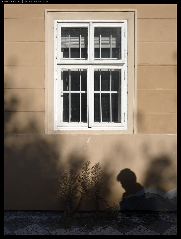
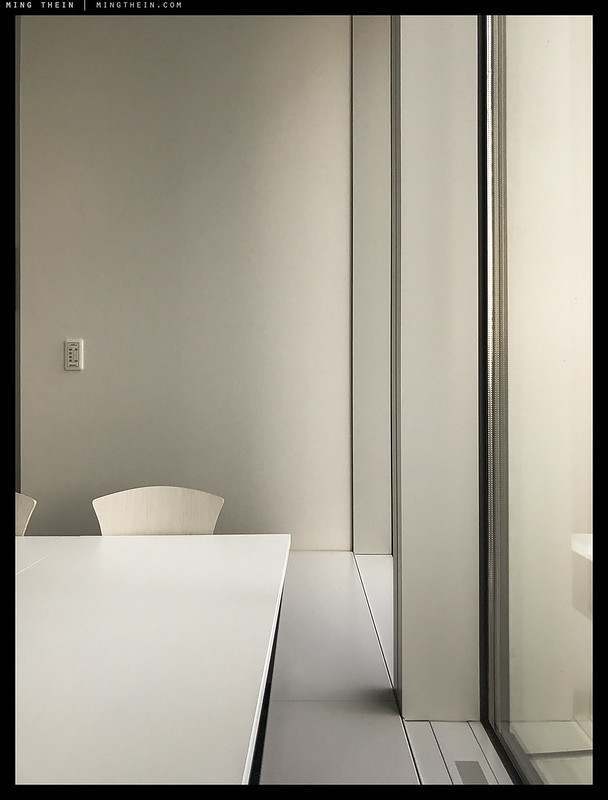
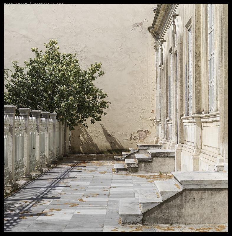
The images chosen to illustrate this post have a few things in common: a variety of hardware; the same workflow; similar subject matter, and a unifying and deliberately chosen color palette. You’ll notice that there isn’t a lot of difference visible to betray the differences in hardware (there’s nearly ten years in age, capture date, and post processing date and several sensor generations between them; even CMOS and CCD; let alone sizes from cameraphone to full frame digital 645). That’s not a surprise; it’s both a processing choice and a limitation of an 800px web jpeg, and outside of massive dynamic range challenges (which are somewhat evident here) – it’s difficult to tell that you wouldn’t necessarily be able to interchange hardware and photographic situations and get the same results. I certainly wouldn’t want to present a long term curation where the differences in method/technique distract from the idea/image. That’s also deliberate: I was working to the edges of my equipment and visualising within the limits of what I could capture at the time. That envelope of course grows as hardware capabilities grow, to the point that the restriction now is really your imagination – and even if the default manufacturer’s seasoning isn’t to your liking, that’s fine because there’s enough latitude to push and pull to reach your own personal house color. MT
__________________
Visit the Teaching Store to up your photographic game – including workshop videos, and the individual Email School of Photography. You can also support the site by purchasing from B&H and Amazon – thanks!
We are also on Facebook and there is a curated reader Flickr pool.
Images and content copyright Ming Thein | mingthein.com 2012 onwards unless otherwise stated. All rights reserved


So if youre a Nikon shooter but have always thought Canon had nicer skin tones is there a way of building a Nikon to Canon colour coverter as a LR preset and if so have you considered doing this and selling a bundle of different ones e.g Nikon to Fuji or Nikon to Pentax etc etc
It could be done, but why? I want my cameras to be consistent to my own color preferences, not what another manufacturer dictates. The presets in Workflow III are for neutral – you can then do whatever you wish afterwards, but at least it’s consistent between cameras…
Should you still want to make your own non-neutral profile, then use Workflow II and replace the absolute color checker chart with one shot by your camera of choice.
Hi Ming.
(I’m using Workflow 3 and its associated profiles.)
Am I right to guess that your Workflow 3 profiles are probably ‘closer’ to Hasselblad’s neutral colors?
Bingo!
Thanks for confirming :-).
Thanks for sharing your knowledge Ming.
I’ve used a ColorChecker Passport to generate profiles for my camera to use in Lightroom. It seems to help with the colour accuracy, especially with strong/saturated colours. On another hand, I’ve found the new Adobe Color/Portrait/Landscape profiles built into the more recent LR versions to give results I like as well, although I can’t really tell how neutral they are.
With my E-M5.2, I’ve noticed that the ColorChecker profiles that I get vary slightly with different lenses (colour shifts slightly between the profiles), with obvious differences between the Olympus and Panasonic glass, but the shifts between different Olympus lenses was less noticeable. So it seems like the colour response depends on the lens used as well.
Sorry, minor correction – I know the Adobe Color/Portrait/Landscape profiles probably aren’t neutral, since they differ from the ColorChecker output. ‘Neutral’ is a bit more challenging to know with only one camera, I think 🙂
From what I understand, those profiles were meant to match the camera’s own ‘portrait’/’landscape’ etc presets – I don’t think they are neutral…
So is their a way for the industrious user to build their own neutral profiles for their camera for use either in LR/ACR or possibly as a Photoshop lookup table? I tried ColorChecker passport with their LR plugin some years ago but was not overly impressed.
Yes, that’s covered in Workflow II…or if you don’t want to, I provide profiles in Workflow III.
About your videos, if I understand correctly: I’d purchase A3 if I want to use profiles you’ve developed or A2 if I want to develop my own profiles (or if I want the curation workflow that’s in A2 but not A3). I gather the profiles you’ve developed would afford neutrality and consistency across devices… so what would you say are the strongest motives that would favor building my own (A2) rather than running with the already-refined profiles of A3?
Bingo. Depends on how much work you want to put in, and if I’ve already made profiles for your camera already or not…
Got it and thanks! The number and range of profiles you’ve built must be extensive to say the least; is there a list posted somewhere or recommend that I just purchase A3 “asap” and discover?
Never mind that…. found the list 🙂
You found it before I had a chance to reply 🙂
Hmm. Where is the list? I haven’t found it yet …
Sorry – right here, in the original post: https://blog.mingthein.com/2016/08/03/new-workflow-iii-for-photoshop-and-lightroom/
I see D800/810 on the list. Have you developed a D850 profile that has a chance of being included in an update to A3?
Yes, but it’s not included in that pack (I can email it over though).
Hi Ming, can I take you up on that email offer of the profile? A family member made the A2/A3 purchase for me as a gift.
It’s a bit more complex than that: Oly and Panasonic ‘bake in’ corrections and adjustments to their lenses on their bodies that don’t exist on the unmatched combination (Oly on Pana and vice versa): this may have something to do with it…
Reinforcing what you said in the article, here is how I do it, keeping separate control over color & tone:
First, expose to the right (ETTR). I have the JPEG preview setup for the lowest contrast image and monochrome. Typically for ETTR on my Nikon cameras I am using exposure compensation of +1 stop but sometimes more. As you mentioned, I am able to judge acceptable/excessive blinkies by experience. I take care of the exposure decompensation in post.
In Lightroom/ACR I correct for white balance and then apply a set of standard adjustments the purpose of which is to yield a nice flat and color neutral image (per Workflow III). I also use the matching camera profile “Camera Flat” which does a good job of mimicking the Nikon flat profile available in Capture NX-D. I may need to tweak exposure somewhat depending on the image, but typically a standard exposure adjustment of -0.5 to -1.0 covers it for me. I also apply a standard raw sharpening setting that custom by camera.
I may play around a bit with virtual copies in Lightroom to get a feel for what’s possible but I don’t do the adjustments there. The reason is that there are no blend modes, therefore regardless of what the slider label says, every adjustment is both a color adjustment and a tone adjustment. I prefer to have control over color & tone separately.
I now export to Photoshop (or first do stitching in PTGUI if necessary). The first step in Photoshop is to create a hue & saturation layer and then desaturate (color blend mode) to create a B&W version for guidance. I work under the B&W layer to do local tonal balance adjustments in Luminosity Blend Mode using curves, levels, etc. using masks as necessary. I am not able to judge tonal balance in color so working in gray scale helps me a lot at this stage.
Next I deactivate the B&W layer to see the color and perform all my color balance & color grading adjustments in Color Blend Mode (using masks if necessary for local adjustments).
The only problem with Adobe camera flat is that it isn’t color neutral, and if you do any tonal adjustments afterwards you land up with these shifts being exacerbated – which often looks bad to the point of being distracting. I personally try to avoid layers because it’s too slow when you’ve got hundreds or thousands of images to chunk through – not everything can be keyboard shortcutted, and five or ten seconds an image starts to add up very quickly…
What is P3? Guess I have to google it.
Does ot not matter a lot at what level I set my brightness on the iphone? What do you reccomend?
P3 is a particular color space, mainly for video/film. Not so good for stills.
Iphone: I have no idea how gamut varies with brightness, but generally all measurements are made with maximum or near maximum brightness.
“Fortunately, Apple (at least, perhaps others) do attempt to calibrate their mobile devices to a common P3 gamut…”
I believe iMacs ship with a default P3-flavored monitor profile as well, but I have found it too high in contrast and too blue (D65?) for photography and graphic arts work. Fortunately, I have an spectrophotometer at my disposal… how do you contend with this issue?
The same way, actually – that, and I use an Eizo to do all of my editing and design work…
I’ve obviously been out of touch… I thought you were still using Apple’s Thunderbolt. I’ve given thought several times to using an Eizo for my editing…
I would be, but my TBD died about a year and a bit back (maybe more, time flies) and they never really made a replacement.