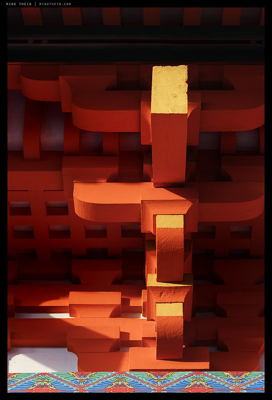
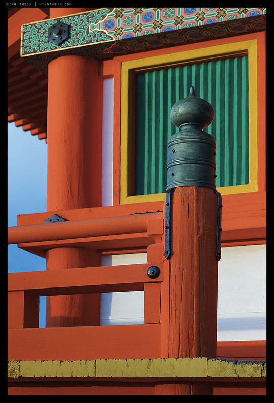
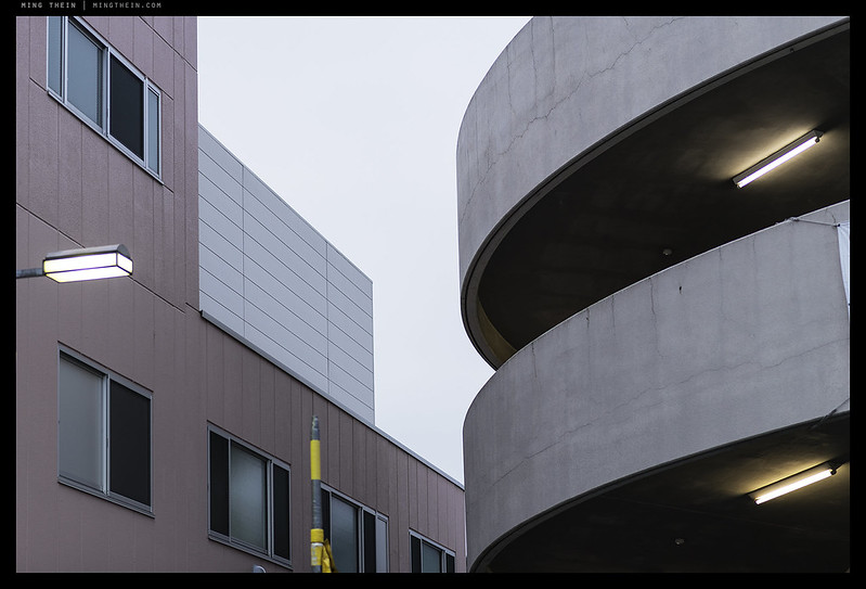
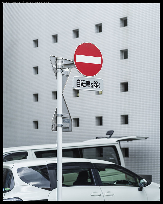
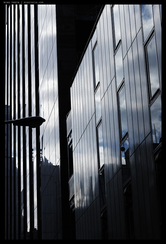
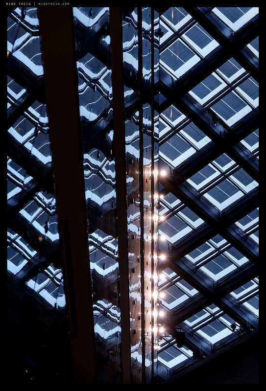
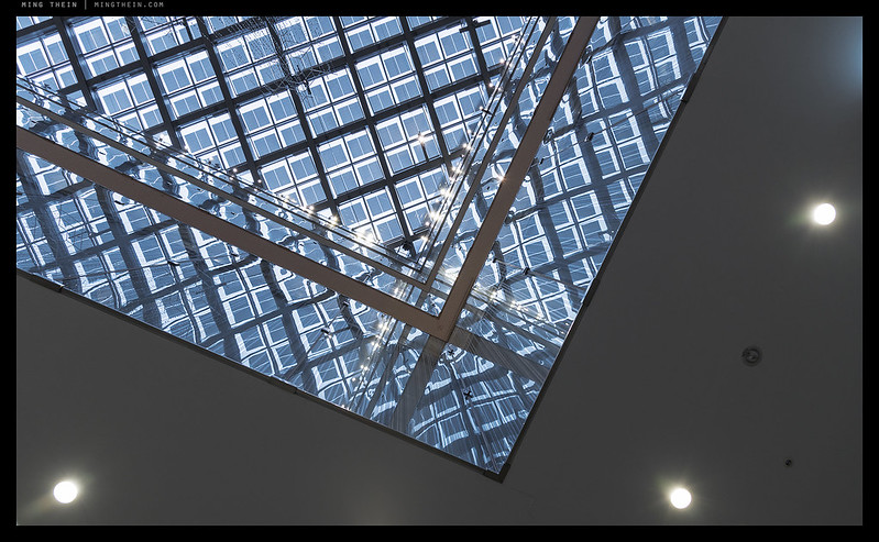
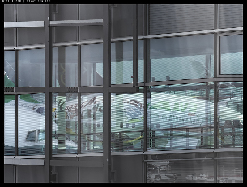
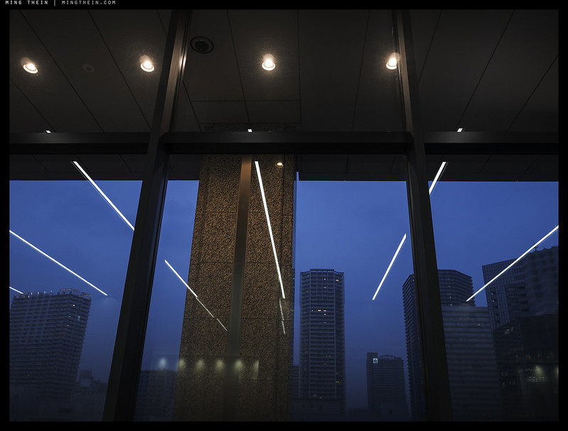
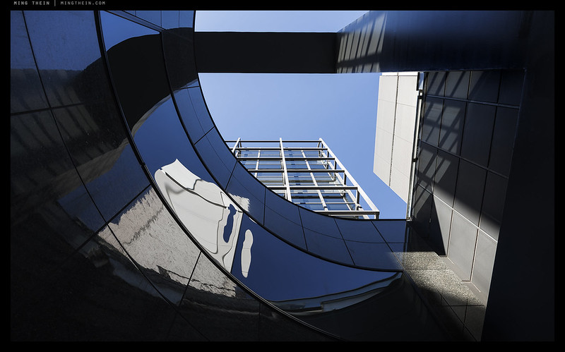
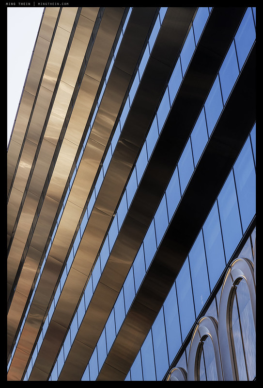
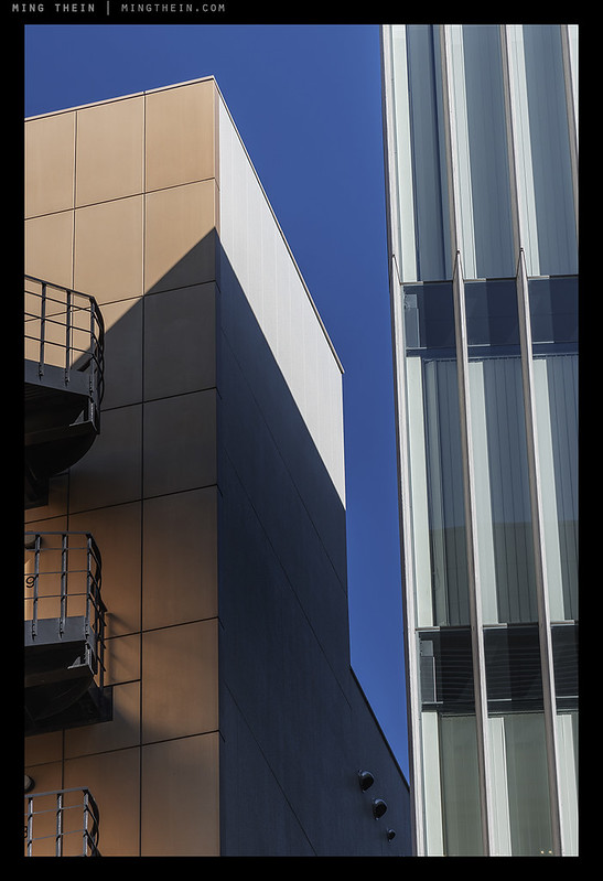
In a city with a very high visual density – any sort of design has to shout quite loudly in order do differentiate itself and stand out. There are two ways of doing this: be more retina-searing than the next object, or be so plain as to create a sort of hole in space. I’ve always been fascinated with the dichotomy of Japanese design in general, and the translation to life and various classes of objects; there are examples where a design stands out but ages poorly (cars), it doesn’t stand out but is functional and occasionally clearly designed by an engineer, not a user (consumer electronics), and other times where design is so minimalist but elevated to the level of art (any traditional objects such as lacquerware, fabrics, etc.). In the case of this photoessay – we see it in the detailing and the block forms and colors used to accentuate what might otherwise be quite plain. I suppose these examples actually tend more towards the minimalist than the ornate, simply because they can all be reduced to fairly simple elements cleverly interlinked – given the large number of these kinds of photos in the archive, it would probably be safe to say this is what resonates with me as a designer and photographer…
This series was shot with a mix of equipment including a GX85, X1D and D850 and post processed with Photoshop Workflow III. Travel vicariously to Tokyo in How To See Ep.2: Tokyo.
__________________
Ultraprints from this series are available on request here
__________________
Visit the Teaching Store to up your photographic game – including workshop videos, and the individual Email School of Photography. You can also support the site by purchasing from B&H and Amazon – thanks!
We are also on Facebook and there is a curated reader Flickr pool.
Images and content copyright Ming Thein | mingthein.com 2012 onwards unless otherwise stated. All rights reserved


There’s a gorgeous vibrancy to these images. I love the attention to detail too – so often large cities are photographed as huge cityscapes; it’s great to see the smaller, more intimate detailing here. 🙂
Thanks! I find it’s really the details that give a city its identity: it’s what we see at human scale…
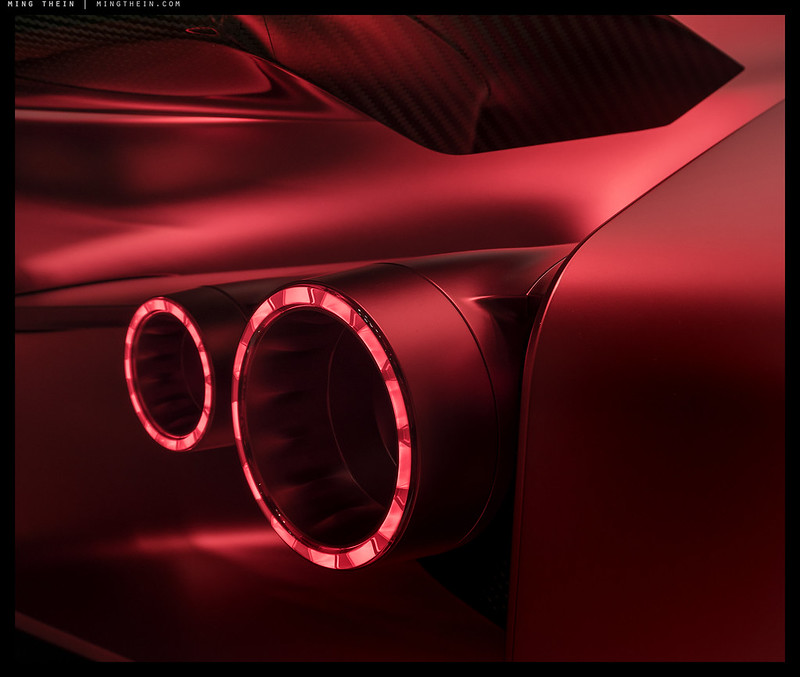
The red car (Ferrari?) has an amazing ‘3D look’ on my monitor….what workflow?
A Nissan concept. Partially due to lighting, partially due to some rather spectacular paint. All went through my usual workflow III.
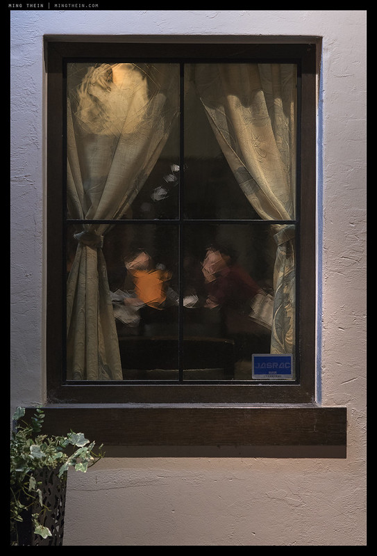
Another excellent set Ming! Especially the window shot with two people, I look at it as if it were a painting 🙂
Thanks – all care of the glass…
Very pleasing set to my eyes, and several remind me of some favorites you’ve posted here over the years.
Thanks!
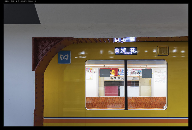
The through-the-window shot — is that a series of exposures adding up to the desired brightness outside and an in-camera, overlapping multiple exposure of the figures inside? Or weird window glass? Or what? It’s a theme to which you’ve returned many times, but I haven’t seen this effect before. Very striking. Beautiful.
The through-the-window shot was the only one I returned to for a closer look. A matter of personal taste to be sure, but I would convert this one to bw.
You’d lose the subtle color gradation in B&W, which contributes much to the feel of the scene…
Not sure which window you’re specifically referring to as here are several, but if it’s the one that looks a bit pastel or segmented – it was some really weird glass…
Yes, I see it now. At first I thought the design on the drapes was being seen through clear window glass. Thus the question, as the people within looked like patchwork rather than out of focus or motion-blurred. Later it became obvious that the drapes were being seen through the same patterned glass. The pattern can be seen in the upper left corner where the light is brighter and bounces back. Note to self: look at the larger image on Flickr.
I’m just glad I wasn’t accused of using some art filter 😛
Ha. I’ve encountered historic glass with ripples, as well as art glass, so many times that for me it was immediately recognizable (and found it very pleasant.)
There’s ripples and then there’s the 1970s… 😂
A beautiful and interesting set of compositions.
Thanks!
Great images as usual, Ming. “Retina-searing” – what a wonderful little phrase!
The kind of sensation one has after looking at a test flash at full power…
Personally, I’d have used a flash meter and not try and gauge exposure by looking at it. :D)
Ahh, so that’s what I’m doing wrong! :p
Gorgeous set Ming. Will we see a D850 review here? 😉
No, sorry…didn’t you ask before? 😉
I’m sure I did as I do miss your reviews 😉 and hoping that you had somehow cleverly mitigated the obvious conflict with your employer.
Never hurts to ask 🙂
I’m using one, which I bought with my own money. That should tell you enough, I think. Perhaps that can be he new kind of espresso-review: for those who know how picky I am, and the very wide variety of things I shoot – me admitting to buying one is probably about the best endorsement you can get. 😉
Beautiful images and a very interesting categorization of design – Stands out: Y/N, Endures: Y/N. I was looking through some images of India immediately before I read your post and am now trying to apply this segmentation to the images of the exquisitely intricate thousand year old temples. I would love to see the images you would make in India!
Thanks – I have been to India a couple of times, actually – though not really to urban areas.
avec ses lignes et sa lumière, éblouissant !!!
Merci!