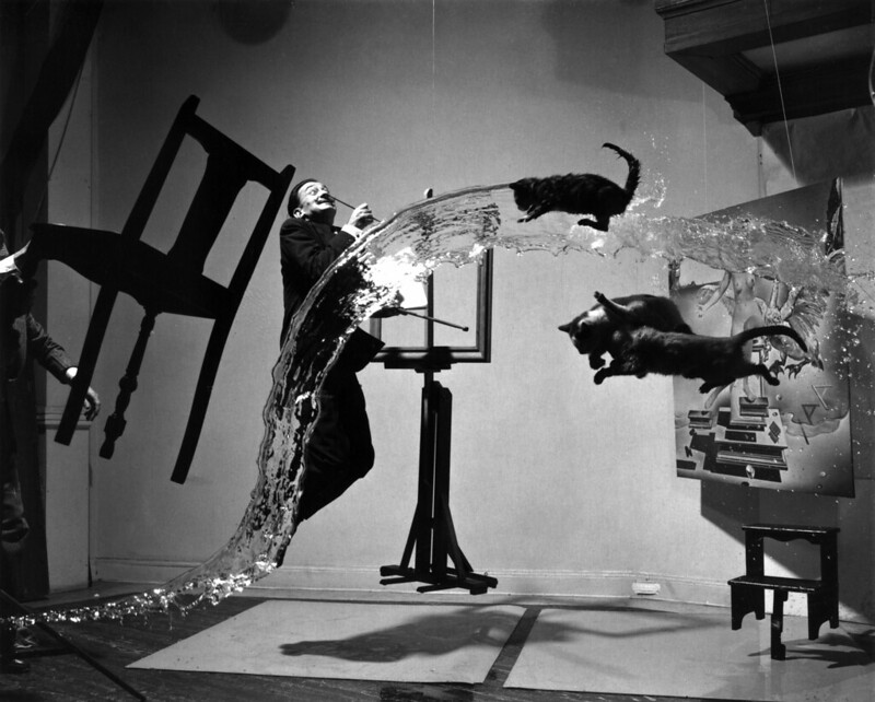
Dali ‘Atomicus’, unretouched. Source: Wikipedia, used under the terms of the Creative Commons
One of the less commonly cited photographic greats, Philippe Halsman is perhaps best known for his Atomicus portrait of Salvador Dali, above. He also photographed a number of other personalities of the time for Life and other magazines; I personally get the feeling his work is about as close as you can get to a constructed biography in a single frame. I had a discussion with one of my students recently about his six rules for the creation of photographic ideas – and the execution of that portrait. There was no Photoshop in 1948, and retouching was limited to painting over things – in this case, the removal of some of the supports for the various elements in the frame. The final image was take number twenty eight: by that point, the cats had probably had enough. The salient points of Halsman’s life and career are better summed up by Wikipedia, here. Today’s article is a few thoughts on that portrait and his principles in general.
- “the rule of the direct approach,”
- “the rule of the unusual technique,”
- “the rule of the added unusual feature,”
- “the rule of the missing feature,”
- “the rule of compounded features,”
- “the rule of the literal or ideographic method.”
All of these – and sometimes in concert – define a break from the ‘normal’, and cause the viewer to look just that bit longer; look a bit longer and you land up thinking. When you land up thinking, the image is memorable – and surely that’s the intention of every serious photograph. Atomicus in finished form does two things: firstly, conveys the essence of Dali’s personality and work in a way that’s immediately apparent to even those who might not be very familiar with the painter – and leaves those who are identifying key thematic elements. It is a surreal portrait of a surreal person, with a little uncontrolled chaos that has the net effect of both obfuscation and adding a layer of ambiguity/mystery to the underlying narrative. Since surrealism is as much interpretative on the part of the audience as it is the artist, this is of course rather appropriate.

Brokeback chair
Atomicus obviously uses all of the six principles except #4: you’ve got to hunt for that one, which makes sense. (In finished form, the missing feature are the supports.) It’s certainly direct: what you see is what you get. Those are real physical elements in mid-air and frozen by a short flash duration. Freeze-frame photography was certainly an unusual technique in that time period, when ‘fast’ films were ISO 400; a little motion blur in documentary was normal, unless you were using a flash. I’d say flying elements are certainly unusual, and lots of them – all recurring themes in Dali’s own work – did the compounding. I’m not so sure about the final one, though: photography is always interpreted as literal since it can be taken as a facsimile of the real world*.
*Perhaps the other surrealist Rene Magritte best summed it up with ‘The treachery of images’.
We assume that what we see in a photograph is real, and photographs in and of themselves have enough little flaws that they are not simulated or rendered elements – though modern graphics are pushing that boundary further and further every year. I suppose a better interpretation of #6 is one of stylistic presentation: the elements are depicted with as much visual clarity and unambiguity as possible – i.e. a chair is clearly a chair, rather than a motion-blurred out-of-focus smear, or covered by something else, or depicted only in closeup abstract.
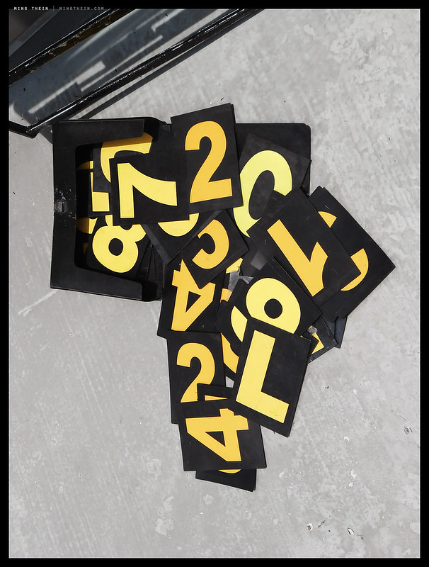
Africa in numbers
All in all, complete application of the six rules results in both an image that is not ordinary, but is still clearly and recognisably a photograph: and that that makes it ‘believable’ or feasible. On one side of the photographic continuum, you have the transparently literal and hyper-realistic – whether that’s depicting physically possible scenarios or not – and the other, the images that are abstracted and rely on the physical limitations of the photographic medium that cannot be replicated with direct human vision (e.g. perspective changes, two dimensional projection, monochrome, long exposure, exaggerated luminance, etc.) Personally, I think we have to aim for one of the two extremes to make a photograph that stands out today – simply because anything stuck in the middle doesn’t stand out enough from both reality and all of the other images to have any lasting impact.
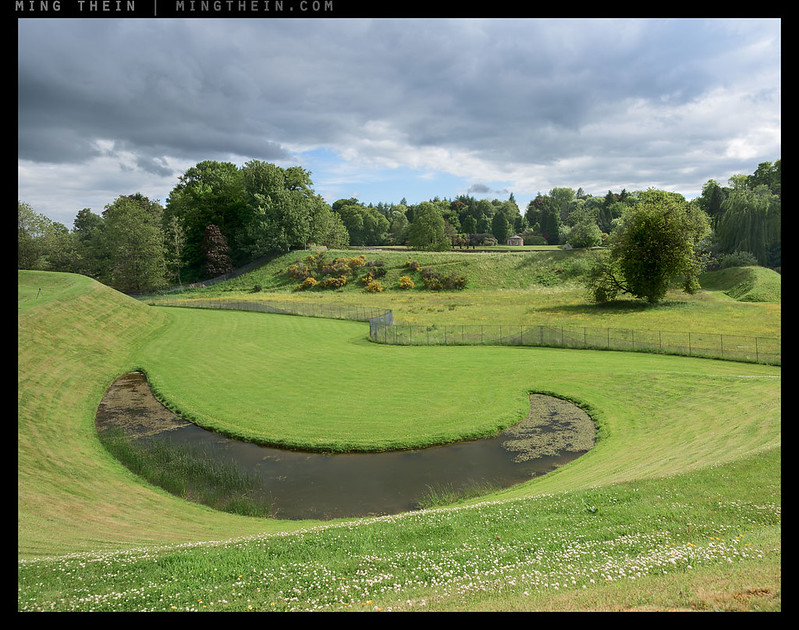
Happy landscape
Note that these extremes are independent of subject matter and presentation style: you could have a life-size print of a chair lit naturally, presented in such a way and rendered in sufficient detail that you could actually be looking at the real object (back to Magritte again) – or you could have a close up abstract of a chair that’s recognisably a chair, but say shot with a super wide and sitting in the middle of a moving river – in black and white. Both images ‘work’ and are memorable but for very different reasons. Halsman’s principles don’t conflict with either: they’re about how to create the difference.

Reconstituted tree
In practical terms, there are really only two things to take away: finding ‘the surprise’, or ‘the unexpected’, and making sure that it’s unambiguously presented and clear on immediate viewing. Subtle surprises can be layered in, but they might not be noticed if the image isn’t initially attention-grabbing enough – especially when we live in a world of effectively disposable images that either register and stick within the first seconds of viewing, or not at all. Perhaps the best way to put this into practice – short of constructing your own sets and engaging the services of a professional cat-herder – is to ask ‘where is the unusual element?’ when curating. I believe it can be both literal (e.g. flying cat) or a consequence of the geometry or light (e.g. evocative silhouettes). Not easy, but definitely beyond literal… MT
__________________
Masterclass Prague (September 2016) is open for booking.
__________________
Visit the Teaching Store to up your photographic game – including workshop and Photoshop Workflow videos and the customized Email School of Photography. You can also support the site by purchasing from B&H and Amazon – thanks!
We are also on Facebook and there is a curated reader Flickr pool.
Images and content copyright Ming Thein | mingthein.com 2012 onwards. All rights reserved


Thanks for this Ming, very interesting to read your thoughts on this choice of the photographer between the banal and the hyper-real. I happen to be writing a masters thesis on this very topic at present. I love your reconstituted tree by the way.
Best,
Tom
Thanks – hopefully the thoughts were of use.
Yeah, very interesting. I was wondering when you’d have a few words to say about Dali and Halsman – I think I commented on one of your photos on Flickr a while ago that your work and style etc puts me in mind of Salvador! (That’s a compliment, by the way, I’m a long standing Dali fan! 😉 ) Perhaps there’s also another lesson here in that sometimes there’s a danger of being too clever and of occasionally deploying great technical virtuosity for its own sake – a trap I think Dali himself fell into later in his long career, and indeed a problem of sorts for a good many artists in numerous genres who are very technically gifted. But we photographers have to do something to combat the literal (and thus the merely representational and hence banal), and the challenge is partly a technical one. Sadly, scrolling through Flickr of a morning, all too many people seem to try to do this by simply ramping up the saturation…
Anyway, food for thought as always. I like Brokeback chair, by the way, another of those photos only you could’ve made! 😉
I agree on the the technical trap – I’ve been trying photographing with my non-dominant (left) eye of late, and it seems to be yielding interesting results. I think it’s because we view the world more as a mass of shapes and colors rather than individual objects…material for a future post 🙂
Aah,
I’ll have to try that!
Thanks for the idea!
Thanks. Took me back to the golden age of Life magazine. I remember seeing a lot of his images on its covers. I think many of his rules would apply to getting those covers to stand out on a crowded newsstand. Of course, working for the Luce empire gave him ready access to the highest levels of politics, entertainment, and the arts, where, of course, everybody knew how to present themselves to the camera.
The only person I can think of today who comes close is Anne Lebowitz, who continues a lot of the traditions – for example, expensive and elaborate setups., equally expensive art direction and make-up.
Sadly those kinds of budgets no longer exist in editorial…
Dan Winters does a lot of these kinds of conceptual celebrity portraits too, and on C41 large format film, no less!
I also have to thank Ming for this article and its complete change of pace from the usual posts, even the philosophical ones. It’s definitely very interesting food for thought. More than usual, this is a pretty open-ended article, so we have to think about it a bit more.
Thanks Andre. We try, but I think it’s for a really small audience. Good thing I’m writing for me 🙂
haven’t read the article yet, but the chair photo is a photo of a nice sexy chick sitting on a guy’s lap.
Haha, good one!
Thanks for the morning jump start as always, I really appreciate you bringing this to the table. Definitely gives me the juice I need for some shooting this weekend.
Enjoy!
The shot that made the greatest impression on me was your “Happy landscape”, Ming. A “better” photograph of a “conventional”scene, perhaps. I can’t recall the line that’s stuck in the back of my head, but something along the lines that anyone can take a good shot of a complex scene – but it takes a special person to create a better shot of a simple subject.
The art of distillation, I guess?