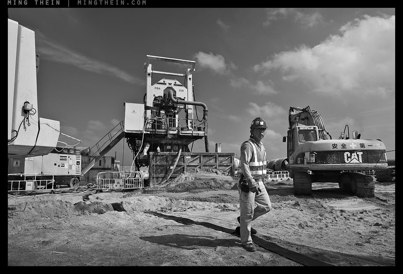
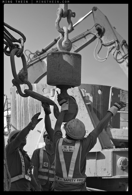
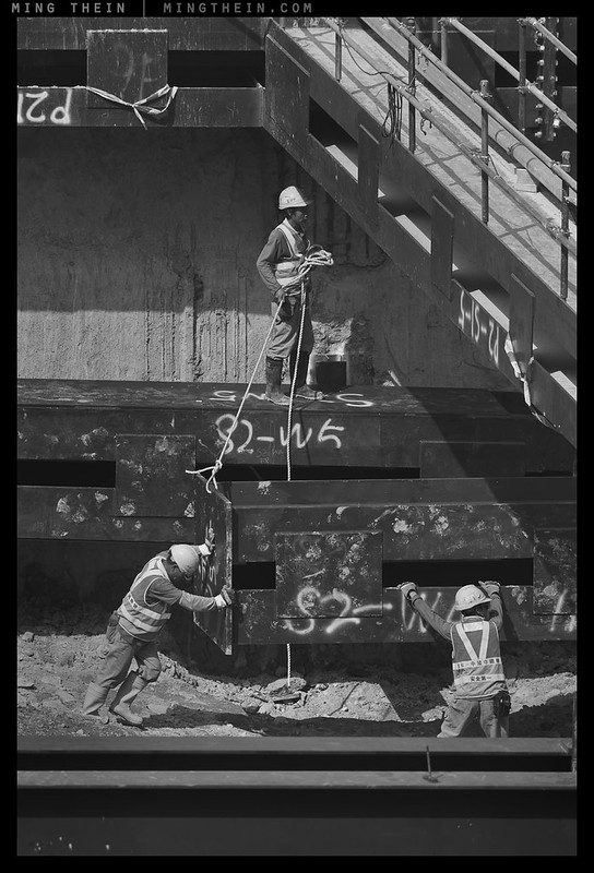
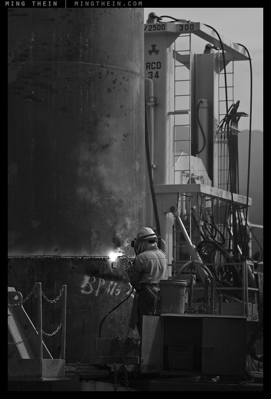
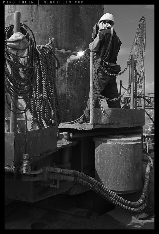
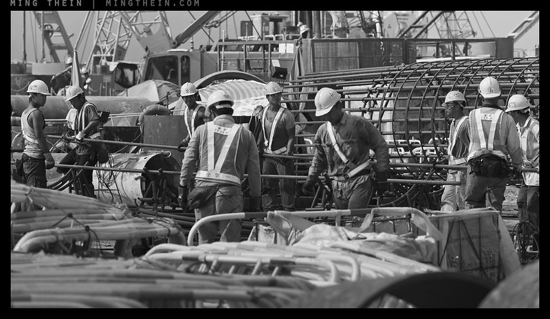
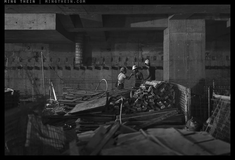
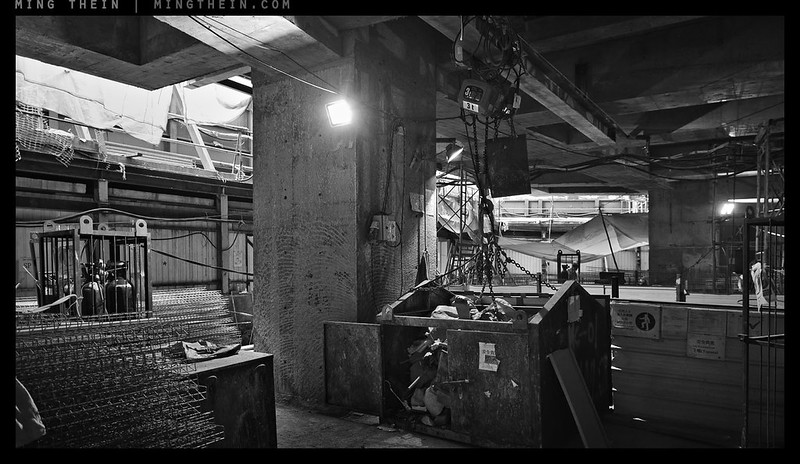
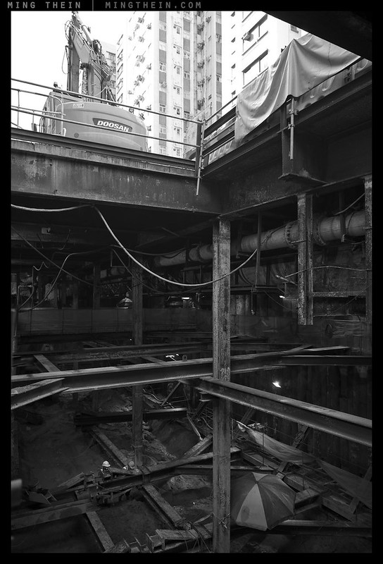
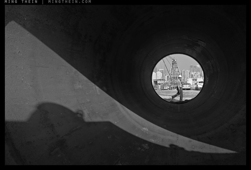
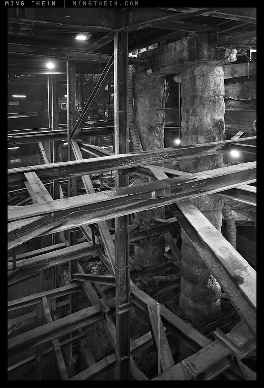
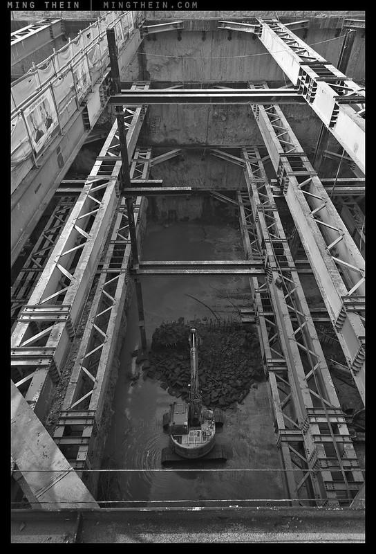
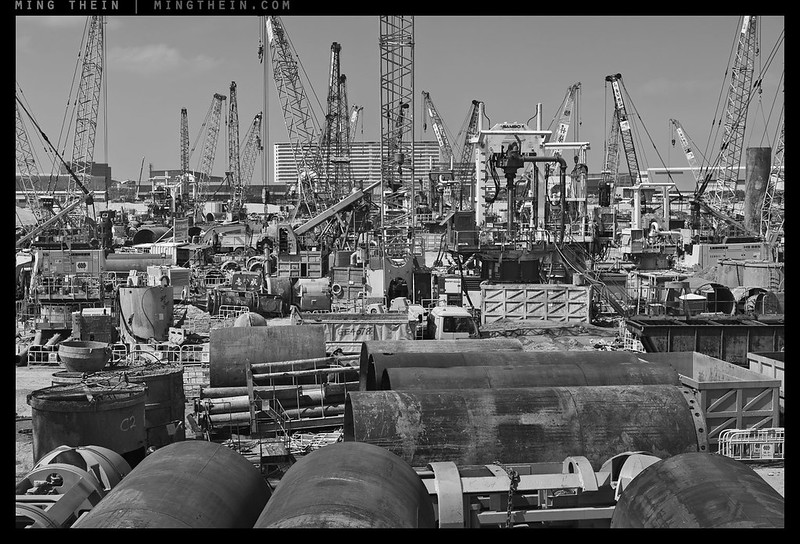
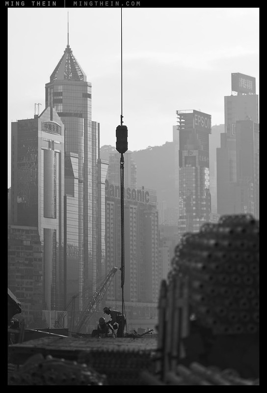
I’m presenting the second part of the Construction photoessay today – here, the individuals slowly recede into the context of the greater project and become important contributing parts of the whole. The ‘context’ is so large it often overwhelms everything else – I personally find the coordination part of the work amazing because once you’re on site, it’s very easy to get lost in the details. Large prints would of course work best to show the scale of many of these developments, but there are still limitations to the internet 🙂 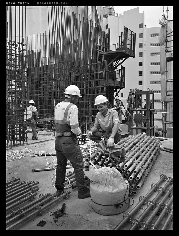
This series of images comes from my body of work from the last year-plus for client Chun Wo in Hong Kong; they are the largest local construction company and are mainly involved in large infrastructure projects, including the airport and Central-Wanchai bypass that spans most of the prime waterfront. As many of you will have seen from previous photoessays and posts, my brief with them is an ongoing on that covers several aspects: 1) documenting work in progress in the greater context of Hong Kong, as a historical record; 2) documenting and celebrating the workers who make it all possible; 3) recording the finished projects. Earlier in the year, we held a successful charity exhibition at the Hong Kong Arts Center which showcased a limited selection of the work – something like ~100 out of about 1,500 images delivered. I’ve been asked many times if we could share some of those images online for those who weren’t able to make it in person. Note that the sequencing and curation is not exactly the same because the presentation format is different, and there are some extra images I wanted to include (but we did not have gallery space for). Enjoy! MT
This series was shot with a Nikon D810, D800E, 24-120/4 VR, 80-400/4.5-5.6 VR, Zeiss 2.8/21 Distagon, Zeiss 1.4/55 Otus, Zeiss 1.4/85 Otus, and Ricoh GR. Postprocessing was completed using the Monochrome Masterclass workflow.
__________________
Be inspired to take your photography further: Masterclass Tokyo (9-14 Nov) is open for booking!
__________________
Visit the Teaching Store to up your photographic game – including workshop and Photoshop Workflow videos and the customized Email School of Photography; or go mobile with the Photography Compendium for iPad. You can also get your gear from B&H and Amazon. Prices are the same as normal, however a small portion of your purchase value is referred back to me. Thanks!
Don’t forget to like us on Facebook and join the reader Flickr group!

Images and content copyright Ming Thein | mingthein.com 2012 onwards. All rights reserved


Great set, reflects the amount of hard work and time that must have taken to complete. Each image of both sets is amazing
Thanks!
This is indeed a great set. I absolutely adore the rich tonality of the images and I agree with Sohail, it is very reminiscent of Salgado … simply beautiful ! Time to revisit my copy of the “Connection” exhibition book 🙂
Thanks!
What was the role of GR in this company of Nikons 800 and Otii?
The backup, the stealth camera, and the always-ready wide when the others had telephotos on.
As a back up camera in tight environment would you rather prefer a digital GR21 ( converter is a bit clumsy and not pockeable ) or 28mm is fine?
p.s. I ask this question because I`d love Ricoh to make a digital pendant to their famous analog GR21 and if there`s a chance Ricoh would listen to anybody, it would be certainly to your expert opinion.
28mm is fine in most of these situations as I have quite a lot of space to work with; 21 is too wide to maintain the right balance between foreground and background context.
Ricoh doesn’t listen to me either, they just steal my product images.
Right on, brother.
Was monochrome a (forced) choice in as much as needing to avoid an array of (superfluous) colours from hi-vis clothing to branded plant and equipment? I’ve always photographed in colour but am working on one project which seems fraught with problems if done in colour and so I’m thinking through my reasons for why perhaps monochrome may be a better choice. Not sure if you’ve done an essay on such a topic? Superb images by the way!
Yes and no – some were processed also in color for the usual PR output; monochrome was as you say, to remove the distractions and create a longer lasting and less visually ‘aggressive’ image; to some degree eras in time are also associated with a certain color palette…
Superb images, truly a sterling set. I admire your photography.
Thank you.
Salgado-esque!
He was certainly an inspiration 🙂
Hi Ming, I am assuming you had to wear PPE. How did you find that interfered with your equipment? Tim
I did – short answer, the helmet was a colossal PITA especially when attempting to shoot verticals…
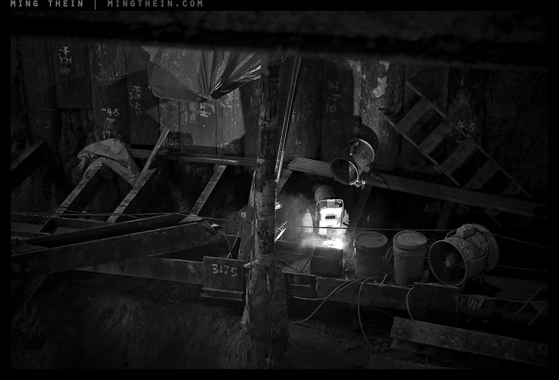
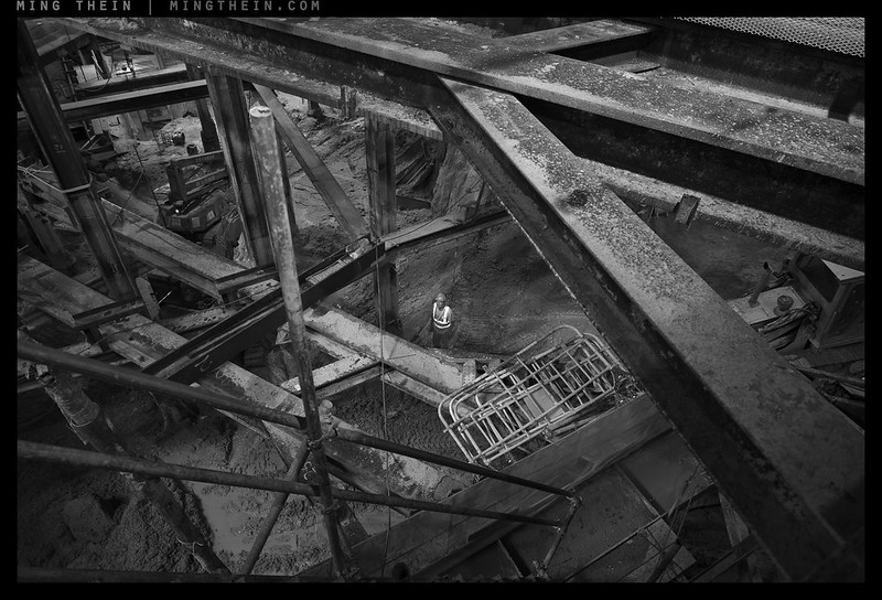
Congratulations, both sets are absolutely superb. For me the odd one out is _8B02044 (Welder in Dante’s pit) and I am curious to know if it made it to the exhibition. It is a superb pictorial shot, the best I have seen recently but with obvious operational safety issues in evidence (fan balanced on dodgy conduit tray over worker etc)
Thanks for showing these
Bill Spencer
Thanks – no, Dante’s pit didn’t make it in; as large as the exhibition was, we couldn’t hang everything 🙂
The fan isn’t on a conduit tray, it’s on an massive I-beam.
Again, these are great shots, as I said about Part 1. Few of us have the opportunity to photograph this kind of subject matter, and you have not only documented the construction process but also made fine photographic images. I do have a question: there are few pure whites in the images (apart form the flame and sparks of the welding torches), and few pure blacks. Would you be so kind as to explain your aesthetic choice to compress the dynamic range of the images, such that the greys predominate? Thanks!
Thanks Gary. The images are optimised for print on a) media with a slightly more limited dynamic range (large canvas, annual report paper etc.), so I have to take care of the midtones. In addition, it’s as much a stylistic choice as anything – I find that so long as you have something to anchor the eye at absolute black/white, the brain does the rest. You just need to provide a bit of information to ‘calibrate’. 🙂
I find it visually disturbing that many scenes have been taken under very bright sunlight and that is not reflected in your reproduction of the photo. It is a somewhat Kafkaesque but I can’t argue with one’s stylistic choice.
It was ‘squintingly bright’, which I could have reproduced – and held separation without clipping – but that would not have fitted the client’s purposes or my brief…
looks like hard work.thanks for sharing
It was – many sessions over the course of a year, heat/humidity and lots of gear to carry…
Terrific sense of scale imparted, even allowing for the limitations of the internet. Thanks for sharing these.
Thanks Grant – a lot of these made it into the exhibition earlier in the year, at much larger (at least 36″) sizes 🙂
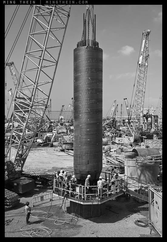
A lovely and solid set Ming. I like them a lot. But the last image really blows the roof off, what a fantastic image 🙂
Thanks!