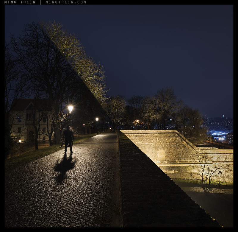
Drawing down on ghosts. Vysehrad fort, Prague
Most of the regular readers here will be familiar with the concept of ‘the four things’ – this is to say that there are a few elements that are independent of content that every image must have in order for it to leave some sort of impression on its audience. The framework is both a useful checklist and teaching tool to get a photographer to a certain level of proficiency; however, it can be restrictive in the sense that it is still somewhat formulaic. And that’s half the challenge here: if you can fulfil a list of objectives to make an outstanding image, then what is the function of the photographer? Surely these things could be programmed into an algorithm and left to its own devices to make the next hundred great photographs of the century? Wrong. There’s still one last element which will never foreseeably be automated or predicted or planned.
Let’s recap the four things first:
1. Good quality of light – i.e. appropriate for the subject
2. A defined subject; what is the photograph about?
3. A balanced and dynamic composition – something that both attracts the eye to the subject and is aesthetically pleasing
4. A clear idea.
Note carefully that none of these are technical qualities and all are independent of the camera used.
The final item is both first and last: without knowing what you’re trying to communicate, it’s impossible to define what the subject(s) should be or how they should be composed so the image is ‘read’ in a certain order. But without the other intervening three things, there’s no way you can communicate any idea at all. It is of course possible to interpret these things in a very simplistic way – take a product photograph, for instance:
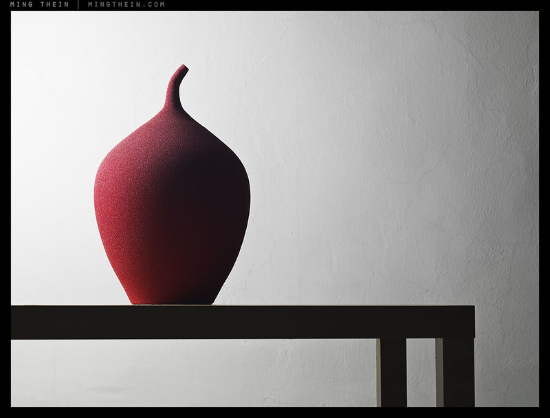
1. The quality of light is directional to both show the curvature and texture of the vase, and to render the background and base into a slightly abstracted two dimensional form that supports but does not distract from the vase – which is exactly what they should be doing in reality, too;
2. Our subject separates from a plain background by contrast, color, texture (spatial frequency of detail), and depth of field. Short of adding motion, that’s as good as it gets.
3. The most prominent part of the composition – the brighter left patch – is filled with our subject. The less important part to the right is slightly lower contrast and thus stands out less. The legs of the table and table itself pull you to the subject and form a visual base. Both bottom left and top right (note: opposite diagonals) are left ‘open’ to suggest some abstraction of form and spatial position.
4. It’s a vase. It looks nice, modern (read: minimalist), clean and aesthetically pleasing. Attention is drawn to the subtle but complex form by eliminating other distractions and using elements of the background itself as a reference for straightness/ rigidity/ order etc.
This is clearly not a very complicated photograph in concept, though of course there is some subtlety in the execution – how exactly do we set up the light? At what color temperature? Do we need a reflector to suggest the continuation of curvature on the rear surface, or does showing only one curve actually work better since it continues to suggest the 2D/3D abstraction? Is the photograph left- or right- facing? (Hint: left, because most Western audiences read and interpret information left to right; an Asian audience would have meant setting up the reverse because we read right to left. I bet many of you might have missed that one – nothing should be an accident in the studio!) It has all of the four things, so by my scoring system it would justify a ‘4’, and be a solid image by any standards* – but it is not exceptional, and here we get to the beginning of defining what that fifth element might be.
*For reference, an average photograph is usually a 1 or 2 at best. Most of my workshop/masterclass students come in at the ~2 level; i.e. they’re often missing compositional balance and a clear idea. They go out at 3-4, which means just a little further refinement is required to translate their vision clearly. I don’t assign these scores; they’re voted by the group in the collective portfolio review.
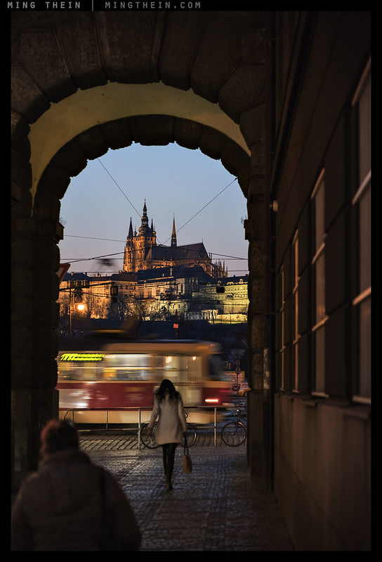
A Czech romance, Prague. Note how everything comes together at the right moment: the visual cues of Prague (church, castle, arches, tram, attractive lady) with a couple of extras (the moving tram, extra vague sinister figure in foreground) and the lines on the right pulling you in to the contents of the arch for a bit of dynamism. I knew I needed a person in the frame, but having two in the right position and the tram were the bonus. I had to move quickly to shift the composition so that the window lines on the right would balance off the figure in the bottom left, however. All figures were moving and candid, of course.
It is very possible to make a boring image that rates a score of ‘4’; I do realise we are getting dangerously close to the realm of personal biases here, but there are also some images that are almost universally accepted as being really outstanding – the 5s. Perhaps it is a question of historical impact and standing the test of time (to be the subject of a future article) – or perhaps it is something else.
My hypothesis is that the fifth element is really the unexpected: definitely from the perspective of the audience, and often partially from that of the photographer. It is the surprise that makes the difference between craftsmanship and art; or entertainment and boredom, much like how we got Milla Jovovich’s character instead of another rock in the Luc Besson movie of the same name**. The surprise is both the hook that draws us in, as well as the one that keeps us asking questions. And asking questions means that the image has stuck in our minds and certainly has a higher chance of being remembered than one that was simply passed over and ‘consumed’ in an instant. It is a almost a question of subconscious obsession rather than fleeting interest.
**One of my favourite films of all time, incidentally – the somewhat dysfunctional but kooky interpretation of the future – much like Futurama, too – is probably far closer to the truth than either the Utopia of Star Trek or the dystopia of The Matrix.

Look closer.
Although ‘the surprise’ can be planned, I would say that 99% of the time it is reactive – an element that the curve ball of fate throws at you. The question then becomes whether one is ready/ prepared to use it as a photographer, and more importantly, how that element is used. Can you change the idea in your own mind quickly enough to incorporate it? Or in the case of the dog/boy above, can you reset your camera and compose fast enough to catch the moment if you were shooting architecture on the other side of the street a few moments before but happened to turn and notice something a little odd? My personal suspicion is that half of what makes ‘the surprise’ work is our own unexpected reaction to it – we often do not have time to think (or think much, at any rate) without running the risk of losing the moment. We therefore react on an instinctive basis, making the image one that is a result of feel and subconscious intuition rather than planning.
A planned image is possible, but difficult: that surprise is gone, and it may be too finely engineered for the intuitiveness and universal impact of the whole situation to come through. There is an exception, however: the first image in this post was planned. The scene was one that was chanced – specifically the light shining upwards and cutting hard through the trees – but the gunslinger and camera composition were both carefully coordinated; it’s actually a stitch of two images with a PC lens because there was no other way to execute it. Here, the unexpected was a repeatable element we could use but something we hadn’t seen before (or easily repeat without a castle, trees, and enormous quartz-halogen spotlights).
5s are far and few between. But once you recognise ‘the unexpected’, and have made a few, then anything less feels like a compromise. But personally, I don’t mind making fewer but better images; as ever, it’s time to level up. MT
__________________
Turn the mood and style up to 11: the Hanoi Cinematic Masterclass in association with Zeiss (21-26 July and 28 July-2 August inclusive) is now open for registration – click here to book and for more information.
__________________
Ultraprints from this series are available on request here
__________________
Visit the Teaching Store to up your photographic game – including workshop and Photoshop Workflow videos and the customized Email School of Photography; or go mobile with the Photography Compendium for iPad. You can also get your gear from B&H and Amazon. Prices are the same as normal, however a small portion of your purchase value is referred back to me. Thanks!
Don’t forget to like us on Facebook and join the reader Flickr group!

Images and content copyright Ming Thein | mingthein.com 2012 onwards. All rights reserved


I may be a little late to the party but still would like to do a comment as composition is what I find most interesting and important in photography.
As I understand this article the fifth element is simply no.5 in the list of what makes a good photo.
However I do actually think we can say what no.5 is. Even if it is something unexpected it is nothing mysterious.
From a compositional point what makes a good photo (like that of the vase) even more interesting is a second point of interest (like the man and shadow in the first picture and the glass of beer in the last picture) or even more points of interest (like the two pedestrians and the tram in the third photo).
Take away one ore more additional points of interest and the photos would still be nice but not as good.
And if the purpose not was to show the vase without distracting elements that photo could be made more interesting with something additional. For exemple a cat looking at the vase or maybe even something as tiny as a fly on the wall.
Instead of talking about which level a photographic image reaches one could also make another analogy about how much skill the photograper needs to make a photograph by comparing it to juggling balls.
Practically everybody can juggle with only one ball. That’s like taking a snapshot. Make it two balls and it starts get much more difficult, but many can still do it. With three balls the majority already fails unless they practise a lot. Four and more balls are for real experts.
To reach those higher levels of skill the photographer must have both a deeper understanding for what makes a good photo and know how to make the best of it. Decisions that sometimes have to be made in milliseconds to capture the perfect moment.
While cameras today made it much easier taking well exposed and sharp photos enough that even a monkey could take a great photo by accident choosing horizontal or vertical format, right angle and moment of the shot and decide about flash or not is where many fail and missing what could have been a great shot.
So while there may be some luck involved when the photographer is not in full control of the scene (like in street shooting) a good photographer is better equipped to make most of the luck and make photos that stand out from others.
This 5th element (which is very nicely defined here by the way), seems very similar to the punctum that Barthes wrote about in Camera Lucida.
I’m going to have to look that one up… 🙂
You should! It’s a wonderful book on photography and the crossover with what you write about here is uncanny.
leeloo-dallas-multipass! (sorry, couldn’t resist!)
A very interesting and helpful post, thanks! Lots of things for me to think about and incorporate into future projects. I feel the need to get out there and get some practice right away!
That was one of my favourite movies, seriously. Anybody else want to negotiate? 😉
It’s one of my favourites also!
The shadow from the wall in the first picture, “Drawing down on ghosts”, is incredible.
Thanks!
This (elusive) fifth element is, as Ming notes, not for you to search; it is searching for you.
If you are aware enough, it may find you.
( And then you usually have a lot of work before you. It wants, or needs, a framework, which you must build – using as tools the 4 things, a sonnet or whatever is in your toolbox (and you may even have to make new tools).
And you can’t help building on, or against, your culture. And the audience will see it in reference to its (or, possibly, your) culture.)
Scorching sun
over the desert,
short is
every shadow.
Woe to him
who finds his way
only by
his own shadow.
( If the audience has a problem: )
Axel Petersson (aka Döderhultarn) is famous in Sweden for his wood carvings.
( Google: “Doderhultarn” for images.)
His audience thought he couldn’t really carve, so he made some very naturalistic horses to prove his skill – in later years his fame spread.
( If you have a problem: )
The satirist Olaf Gulbransson – if I remember rightly – once made an artistic and technically perfect naturalistic drawing of a (his?) hand holding a pencil and resting on a very empty sheet of paper…
Thanks for this article – lots to think about! “Look Closer” is terrific. 🙂
Thanks!
(Firstly, I’d just like to lower the tone by saying all this talk of the “5th element” just brings to mind that science fiction movie with Bruce Willis…)
Anyway, that aside:
To me, the fifth element is all about meaning in the mind of the viewer, something that is entirely subjective. Your third image says “Prague!” to me, a city of which I have fond memories, so I’d rate it a 5 (obviously you managed to include the other four things!), but if I’d never been to Prague it wouldn’t mean anything and I’d rate it a 4, regardless of anyone else’s opinion. Your second image says nothing much to me, so it will never be more than a 4, but if for some reason I had an emotional attachment to red vases, or it called to mind my mother’s house, for example, it might be a 5 to me. I’m not sure it’s about the unexpected, because what is unexpected to the photographer might not necessarily be so to the viewer. The Prague photograph doesn’t strike me as particularly “unexpected”. Very skilfully timed, but not unexpected.
I think you can try to achieve consistent fives by including opportunities for the audience to see meaning, but to me the important point is that the photographer is dead – your intentions cease to be important once the viewer sees the image.
Incidentally, I think it works the other way around too, it’s less common, but the photographer can take photos he/she doesn’t particularly care about, but they can be “fives” to the audience. Since joining your flickr group I did a little experiment to test the response I would get to photos I thought were adequate in terms of the “four things”, but with which I felt no emotional connection or sense of meaning. You accepted a couple of them, and one at least seems to be more popular with the group audience than it is with me 🙂 This feedback was just as interesting as the positive (or negative) responses I get to my photographs with which I do feel a sense of meaning…
Hey, nothing wrong with that movie!
The second vase image was never meant to be anything more than a 4 – that was the whole point. There is no emotional connection or surprise there.
The reverse logic of making images that might mean something to a random audience doesn’t work so well for consistency because that’s like looking for a problem to fit a solution rather than the other way around – given there are 7 billion people on this planet, it’s bound to work for somebody (!).
Love the first one Ming. Took me a while to figure out. btw the flickr link is broken
Thanks. I think flickr is having one of its little tantrums again – works for me…
There are no doubt numerous philosophies around what “makes” it “that” image….The one we live for. I’m not sure really that all 4 plus a 5th need to be there. I think it could be one or two elements that could push it over the line and it is then perceived to have all and hence the 5th element. But it just may be that strong that’s it could be a moment and a powerful one.
I agree with the reproduction theory and that unique initial (important word) image of the world if arranged. There are some great portraits….and then people want to copy or deviate slightly from this. However “it’s been done…sorry” will come into play. It was unique and given it came first it led the way. I’m pretty sure HCB’s great images have been watered down quite a bit over the years. Ansel Adams put himself firmly in the history books in landscape….a lot harder to do now!
I don’t disagree with your philosophy Ming, just not entirely sure all those things all need to be there. It’s a little to explain but we’d all probably know it if we saw it.
i think the order is both causal and not at the same time. I know what you mean: that element can make everything else ‘work’ regardless of whether it obeys ‘conventional’ logic or not. But at the same time, it might break it…
Just out curiosity, do you use a particular method to control shutter speed in your candid people shoots? I relie on aperture priority and auto ISO, with my minimum shutter speed set at or around 1/500. I’ve started to notice that slower shutter speeds, or perhaps a shutter that is just right, can produce a kind of contrast in images were objects are moving at different speeds.
I’m also in aperture priority and auto ISO, but my threshold is much lower. In some cases I might go back to full manual to get the amount of motion desired to render the people just indistinct enough…
To continue, when the idea of surprise as the Fifth Thing is extended to become Mystery this raises the possibility of a conflict between “A Clear Idea or a Well Defined Subject” and “Mystery”. An image that can be both clear and mysterious is accomplishing a sort of magic trick that adds to it’s power.
Very good article! I use exactly the same considerations in designing and making sculpture. I have long thought of the “Fifth Thing” as an element of mystery, ambiguity or open-endedness that I associate with poetry. This quality makes multiple ways of interpreting or interacting with the artwork possible, and keeps the interaction between artwork and viewer alive over time, demanding some creative input from the viewer and thus making the viewer complicit in the creative act.
That’s a great way of looking at it.
Excellent article! These are very useful ideas.
Thanks.
Hi Ming,
I think the 5th element is more around how difficult we perceive it is to reproduce the same image. So historic moments in time cannot be reproduced and can nail a 5/5. Other shots where the timing or location is critical to pull in the other 4 elements is very difficult to reproduce – but not impossible could merit 5/5. Finally static studio shots that are perceived easily reproducible (by pros such as yourself) don’t feel memorable and get 4/5. Cheers, Richard.
We can still add something to a ‘controllable’ shot to hit that five – sometimes the arrangement of objects or objects themselves come together in a way we didn’t (or couldn’t) necessarily envision; happy accidents do happen in experimentation 🙂
I personally think Richard honing in on the idea of reproducibility is one of the most insightful comments I have read on this site for a while (at least within the realm of comments that represent a philosophical proposition). I also do not think you and Richard are at odds at all. After all, a non-envisioned happy accident is (a) unlikely to be easily reproducible [hold that thought – might not be true] and (b) would never occur in a studio setting that was totally under control. Now, if photographer x’s happy accident (or very original idea) is reproducible and the photographer becomes known for it then it will begin to flood the Instagram and Flickr accounts of those inclined to reproduce it within a few weeks or months. After those weeks and months pass, photographer x’s original photograph will drop from a 5/5 to a 4/5 in the mind’s of all people who do not know photographer x’s photograph was first. E.g., I saw this a year or so ago, but it doesn’t excite me as much as it did then because I have seen so many reproductions since . https://www.flickr.com/photos/laurawilliams_x/9732914426/
Richard points out the non-repeatability of history makes the application of certain techniques at times in the past special. This (a) partially explains why every homage to Bresson’s jump annoys me and (b) suggests that these non-repeatable moments will occur less and less in the internet age because authorship will fail to be established prior to the proliferation of copies.
That’s what I think anyway. Thanks Richard. And thank you Ming.
I think I can see where you’re going with this: reproducibility vs deliberation. HCB’s jump is reproducible. But it wasn’t deliberate. Perhaps this is the difference?
Ming, Luke, thanks for your thoughtful feedback. Your additional insights lead me to better understand the element of surprise you are referring to (let me know if I am off the mark). For example, in studio portraiture, this may be the photographer (unintentionally) capturing a look or an expression that make just makes the work significantly more memorable (tying to my original idea – the 4 out of 5 elements of the portrait could be reproduced by any pro, but the 5th element – maybe not so and this makes the image special). Or in still life, as you said, there is just something that makes this image stand out among similar images. I am reminded of my mother’s painting of strawberries. Although she is an amateur, she just managed to nail the image – so much so that your mouth waters as you gaze upon the fruit. Many that have seen the painting, have pointed this out and still mention it to me years later.
In the end, I believe we are all saying that the 5th element is something that make the image so unique that it makes it forever memorable.
Cheers,
Richard.
This is an excellent thread because it is so important to think about quality and to cultivate our individual curatorial eyes. I too have given a lot of thought to the concept of the “memorability” of a particular artwork and I believe this may be touching upon the key to the ultimate quality in all of the arts.
Another way to think about the same thing is to think of any great artist and to imagine removing a handful of their most memorable (usually “their best”) works from their oeuvre. When I’ve tried this exercise in my mind, I realize that the whole status of many an artist would drop significantly in my estimation. That to me, in a sense, their whole lofty status often hinges on just a handful of masterworks that have that special, memorable “something”.
I would have to, without hesitation, agree with Ming about his preference to make “fewer but better images”. Trouble is, as I tell my painting buddies, “you can’t just paint the good ones”!
That exercise of yours – removing the few iconic images – suggests to me that perhaps the whole concept of mastery isn’t quite as controllable as we might think, and there’s still an element of randomness/luck to it…
That is an excellent point.
Beautiful girls hiding behind mirrors in nature is really nothing new. The twist in your linked photo is that the mirror doesn’t show the reflection but what is behind it without the girl. A surprise trick made much easier with digital post processing and easy reproducable. I would rate it much lower than you as it really is just two snapshots merged with some PP.
I do not agree about HBC’s jump photo being easily reproducable as it would be very difficult/impossible finding a scene with similar elements in the real world today. I certainly haven’t seen any jump photo that is even comparable in content. Remember it is not just a jump.
If it is such easily reproducable wouldn’t many copies have been made made by now since HCB took that photo in 1932? Can you please link me to such copies?
I think it is wrong to compare one of HCB’s most famous photos with simple snapshots as if both are equally easy to copy. But maybe you think Picasso or Miró and childrens drawings are on the same level as well?
Well, I can tell you that it isn’t post processed and was a single shot. By your logic it’s also easy to add a jumping man over any puddle or change backgrounds.
Be very careful before you start implying that people are faking images. I and others do not take that lightly and defamation is going to be met with legal action.
Imitations of the jump exist. I don’t note I remember them for precisely that reason: they’re obvious imitations. And that is pretty much the fate of any image in that vein. The real question is if you took a little known photo by one of the masters today, stripped the attribution and circulated it – would it be anywhere near as popular? I suspect not. They were of an age, representing something new for the time and that age has passed. New tools exist and whilst some may compromise integrity it doesn’t mean we should not use them if it is appropriate. The camera itself was a new tool at one point
Me thinking Picasso and Miri being scribbles? Isn’t it good manners to at least ask for somebody’s opinion on something before being that publicly derisive?
Ming, did you have your coffee break before replying to my post?
I ask because you are way off mark on so many points its not even funny but tragic to see those words written by you.
First I must ask if we are talking about the same photo, this one?:

Beacuse what you say about it and what I can see with my eyes and know doesn’t match what you claim.
From where do you have the information it is not post processed?
Because I can instantly prove YOU ARE WRONG from the only source that matters, the photographer herself:
http://laurawilliamsphotography.tumblr.com/post/61391251439/i-love-the-shot-with-the-girl-holding-the-mirror
Question: Did you photoshop the image in the mirror to match the background?
Laura: yes, yes I did!
Can it be much clearer than that?
Here is by the way a short interview with Laura:
http://petapixel.com/2014/02/24/invisible-laura-williams-talks-viral-surreal-self-portrait/
And look at here site where her self portraits are a display of photoshopping techniques:
http://www.laurawilliamsart.co.uk/home
She is obviously a very talented young lady that can have a bright career in for exemple advertising if she decides to pursue such a career after finishing her art school.
You could also look at this page shortly explaining how to do such photos and why it is practically impossible to do in real nature with trees and bushes:
https://studiojoslizen.wordpress.com/2013/09/20/mirrored-reflections/
In practise only if both foreground and background are plain and the same, like sand in a desert, asphalt on a road or just grass does it work using the reflection in the mirror without photoshopping. But such images are not as intriguing as those with more details in the background.
Now to your next accusation:
I clearly in several sentences wrote how difficult it is to reproduce HCB’s puddle jump photo and why.
But you completely ignores that claiming my logic would make it easy photoshopping a HCB jump clone as it is easy photoshopping the mirror trick.
Just because one thing is easy to do doesn’t make something else easy to do.
If you think all photoshopping demands the same effort then YOU should take credit for that logic yourself. DON’T claim it is my logic.
Secondly it is in my mind absurd bundling staged and photoshopped photos with candid, real life photos that only recive minor adjustements in post processing. For me, while there certainly are som grey areas, they are worlds apart. Or simply an apples vs. oranges comparision.
Clearly it is generally much easier to copy an idea that is staged. Especially if it is easy.
Copy a candid photo is much more difficult as the only correct and honest way to do it is making a similar candid photo. To copy a candid with a staged photo is obviously faking it.
While it is certainly possible to make staged copies of simple candids SIMPLE is the keyword here. The things that get copied are mostly simple things. Complex things demands much more effort and therefore are much more safe from being copied.
If there is some kind of profit to make and there are recourses for doing so practically every photo could be copied. With a five figure USD budget even the HCB jump could be copied. After all we have something called Hollywood where film companies even restaged actual war incidents like the Pearl Harbour attack. The question is just why somebody would spend such a budget on recreating a photo, even if it is one of the most ikonic photos that stand by itself and not because it illustrates a historical event. And doing something comparable from scratch in photoshop that is on same level as the original would propably take weeks rather than an hour for the mirror trick photo.
There are jumps and there are jumps. Actually there are propably millions of puddle jumps being made. Most are simple snapshots. A few are a bit better or even good. But are they all copies of HCB beacause of people jumping over or into puddles? Of course not! The only part people, if they at all all think of the HCB photo, copy is the jumping man and possibly his shadow.
But the HCB jumping man photo is so much more than the jumping man. To copy the idea of the photo it is not enough to copy the jumping man alone. Sadly most people see only the jump of the man and can’t take in and analyse the whole photo with all its elements mirroring and interacting with each other, and despite the complexity, in a very harmonic way. It’s one of those photos where everything fell into the perfect place in a split second, only once in the times of the whole universe. Thankfully HCB was there and pushed the trigger with divine timing.
But as ignorance is bliss people dismiss that photo as they don’t understand it and think they themselves took much better, sharper and more colourful photos last weekend!
I think actually someone submitted this actual photo to a contest some years ago without getting a prize for it! As for lesser known photos by well known photographers they may be well framed, but that doesn’t make them a masterpiece like the HCB jump.
Fact is that people simply like photos that appeal to their taste. So for a catlover hating dogs even the best photos of dogs made would be dismissed. Not because of their quality, which most people only have a vague understanding of anyway, but because of wrong content. Same things could be said about music. Someone who loves hip-hop may dislike Mozart and all kinds of classical music.
About my drawing comment you would be surprised (or not) how many actually think their own childrens drawings are as good or even better than some modern art!
HCB is dead and can’t defend himself. Somebody trampling on one of his best images I think deserves a virtual kick in the butt!
Now that leaves us with your advice. Clearly YOU are the one who are in most need following them. Using your words you are the one who have defamed me and what I wrote.
The threat of legal action for false claims on internet how a photo have been made is just laughable. Why not simply explain how the photo was made, putting the accuser in bad light?
While I know people are suing each other like crazy in USA (Is it equally bad in Malaysia?), somebody doing it for such a minor thing must have a seriously touchy ego.
Thankfully I don’t live in country where people are such crazy!
So what actions do you think is appropiate for me to take against you for jumping on me for all the wrong reasons?
I’m not such butthurt I would sue you. But an apology would be nice. And if you want me to forgive you and make a settlement you could always send me one of your photos of my choice! ;o)
As I am very modest I neither wouldn’t ask for an ultraprint (as the content of the image is more interesting for me than the technical quality) or a big print, just a decently sized, good standard print signed by you. I promise I’ll frame it and put it on a wall in my home!
Lastly. I apologise if some of what I write may seem a bit rude and the use of some large letter words. But I think I have a case for it. If a critique directed at me missfire it comes back like boomerang right in the face of the accuser. Just like the saying: What goes around comes around.
Finally I really think you are a fine photographer with a very good eye for composition. I’m really impressed how you can make really good photos of ordianary subjects. And with such high technical quality (admittedly my own achilles heel). So it is easy to see you are very able to deliver very good and professional work to your clients.
While I have no problem admitting you are head and shoulders above me in most areas of photography I am less sure you are superior to me when it comes to analysing and understanding photos as this is learned by looking at and studying various kinds of not only photography but art as well. People who want to improve the content of their photos should really consider reading some books explaining the content of older masterpiece paintings. There are a lot to learn about the meaning of all the details in paintings, like symbolic things and hidden messages that make the painting much more interesting.
Also I like HCB (without saying my photos are comparable) have that divine shutterfinger that seem to be controlled by higher forces pressing the release at exactly the right millisecond. Now, If only I could improve holding the camera straight! 😀
Finally THE END!
Well, at this point I’m apologising – mea culpa, and very, very sorry – because we’ve talking about two completely different images. This is a case of miscommunication and I assumed you were referring to my image with the woman (which is definitely NOT merged) hence my initial reaction.
Though it does not excuse my mistake, the way I see comments in WordPress, it appears you are replying one or two levels up to the master post, and I certainly did not link that image by Williams (nor was I even aware of it). When there are hundreds of comments to sift through and reply and you’re jet lagged and running on little sleep, mistakes happen.
I do agree that specific girl/mirror image looks quite obviously PP’d and isn’t at all a 5. So, we are on the same page. 🙂 Again, my mistake!
As for HCB’s jump and PS – let’s just say I’ve also had my fair share of clients ask for similar composites, and I’ve had to produce them so I do know how easy (or not) certain manipulations are.
I accept your explanation. We all do mistakes.
And I agree it is difficult following some long threads in the comments. Some system where every reply have the inclusion of what post it is a reply to would be preferable.
I am sure you know much better what your costs for different commercial work are. I really have no idea as wages and tax systems are such different in different parts of the world.
I do however have a sense for the costs here in an expensive West European country.
Also it depends what one want to do and on what ambition level.
I was thinking about a more serious level like some big commercial campaigns or some art photographer who can stage a scene, even a big one outside, from the ground, that demands a crew of assistants.
One exemple is Gregory Crewdson who is more of an artist than a photographer and confessed the only camera he personally own is the one in his smartphone. Because photography is just the media he uses to create his art, it is not his interest. Therefore he is more lika a director at a film letting others do all the work including tripping the shutter and doing the post processing.
As you propably know HCB and many other great photographers didn’t do any darkroom work themselves and just decided what would be printed looking at the contact sheet.
To do a modern copy of HCB’s jump in the puddle first a location would need to be scouted and all the the things missing would need to be added, including the water, that may need the building of a big, shallow pool to stay in place, etcetera. I think you get the idea of what I have in mind.
But if one not try to do a modern copy of the jumping man but rather use a similar idea, which in HCB’s photo not so much is about a jump but how the jump and other objects are duplicated and related to each other then it is of course possible to do a in a similar vein although the subject is completely different.
The best recent exemple I seen is this one:

that was part of a project on two twin sisters in Paris.
Note that the photo just like the HCB photo have a man in the background as the point above i. But unlike the man in the HCB photo viewing the scene with interest this younger guy as is the norm today take no notice as he is completely absorbed with his mobile phone conversation.
This article was a good recap to the same discussion we’ve been having about the 5’s. Photography being art and art being subjective, would a 5 be an image that appeals to a surprisingly large audience? An image that can perhaps transcend personal bias to some extent?
Ideally, yes. Practically, I think that’s incredibly difficult to achieve because we’d need some sort of emotional connection for a 5, and everybody is very different…
Ming, you seem to be a film aficionado.
Allow me to mention a couple of my all time favourites that also have IT:
Carl Dreyer: The Passion of Joan of Arc
Kon Ichikawa: The Burmese Harp
( The first is about a very personal conflict – and *very* expressively filmed. (A silent film, shut off the music – it distracts too much.)
The second is about human conflict – the only really good film about war I’ve seen.)
Can’t say I’m an aficionado – just not enough hours in the day for that – but I do try to watch a few, and sometimes find some inspiration from them – like 2046, for instance. I’ve seen the second one and agree it’s deeply moving. Will have to check out the first one – watching it silent might be a little odd though…
Oh no, not odd at all.
It is simply too intense, there is no room for music in the mind of the audience.
Aha, finally the article on the elusive number 5 and dammit it certainly is elusive!
Articulating the idea of the 5 is not easy. The way I think of a 5 is something that burns into my memory and leaves a distinct imprint. As ever with art this will vary person to person!
That’s a good way of putting it – and because of that subjectivity, the job got harder…
And you just raised the standards by how we judge your work Ming 😉
No doubts you’re up to the task!
Doesn’t count if you’d already raised them yourself 😛
It’s Sunday morning, can’t wait to get out in the yard and shoot. (Rare free time) Hoping to get lucky and maybe capture a 2 or a 3. The clouds roll in the rain and wind. Oh well, I come inside and am gifted with Theinism. Thanks for the inspiration Ming.
Peace
Greg
Haha – try a long exposure with some NDs, there might be some magic in there…
I think this is a brave article, as human language is insufficient to reallly grasp this 5:th element.
( Which, I believe, is one of the (lesser) reasons that humans make art, including poetry and, of course, photography.)
But I agree, you have said it better than most others.
Except, that I have _also_ seen examples of this 5:th element _not_ being the unexpected – except in the sense that that quality then usually comes as a surprise to the viewer because it is rather rare.
( And I have seen this in some of your images – but, as you say, it is also the matter of the perspective of the audience.)
It is difficult to give examples.
Much of Mozart’s music has that quality (even though it may have been unexpected in his time).
Some films by the Taviani brothers have it, e.g. Ceasar Must Die.
It is even harder to give examples of paintings, as there are many similarities with photography but the differences in the way this “unexpected” 5:th element can appear in these two arts are huge.
I think that’s both the joy and the frustration of art: we have the latitude to appreciate and add that fifth element, but not the control to consistently create and present it. Constructions of language can in themselves have the fifth element too – but those are equally elusive. It’s not an easy article to write, but perhaps a necessary one: being at least somewhat aware helps in the recognition and creation, even if the hit rate isn’t always 100%…of course it is brave since most of my audience probably expected a 5DSR review 🙂
🙂
( “..language…fifth..” , certainly, that’s what I meant by “including poetry”. 🙂 )
( And you do know that wasn’t the reason I called it brave! 😉 )
🙂
I really enjoyed reading this article. It is the written word about what we have been talking about over the last past months. It is all about the 5’s and in between the process. I think those of us who define ourselves a hobbyist and an enthusiastic photog may have that luxury to try to curate towards the 5’s. I know I would have extremely little to show, anyways it is my goal regarding what I choose to show.
It is, as you write Ming, certainly also a personal bias what is a 5 or less, but that is perhaps another story.
‘Look closer’ is one of those images that rocks my boat. It is really surprising and the story just so strong.
🙂 I certainly try to make 5s on assignment, but boy it’s a lot harder…
apologies: his or her model..
Ah Ming, maybe you have opened a can of worms here.. is it possible to have few or none of the first four elements but still have a great image.. ? An out of focus, over exposed, Kodak Brownie kind of shot, that just captured a moment, takes you back, hits that nostalgic or memory from long gone.. ? [There seems to be a current trend in adverts. to have the shaky, chrome under saturated feel that taps into this ..] On the other hand I suppose it is possible to have all five elements ticked off but still have an image that fails to shine or hit the right spot with the viewer? Take for example a studio photographer who shoots fifty shots of his model and only picks one or two, So somewhere/sometimes there is an element, which is almost impossible to define, that turns the knob up to 5+ or
even 6. Thanks as always for making us think … Regards Drew
Yes, because if you read carefully, you’ll notice that none of the four elements are technical. None of them rely on resolution or sharpness or the kind of camera you used.
this is amazing stuff.
Thanks.
Allow me to suggest what that “5th element” is: it’s when the other four elements work together in harmony to make a memorable photograph. It’s that ineffable quality where they all come together to form a cohesive, compelling whole.
That said, I will argue that for many types of photography — photojournalism being one — content is king. The image may have “technical” deficiencies, but if the subject matter is compelling enough, it will carry the image by itself. We’ve all seen examples of this.
No, I think it has to be more than that. And a compelling subject alone isn’t enough to make something beyond disposable. The other elements still have to be ‘good enough’ – and note that none of them are actually technical (subject isolation or quality of light, for instance).
Well, I would argue that Nick Ut’s “Napalm Girl” suffers from myriad deficiencies (subject isolation and quality of light) … yet the image is compelling, and, as history as demonstrated, far from disposable.
Again, for many types of photography, content is king.
I should add that the arrangement and priority of these elements will almost certainly change contingent upon the subject, e.g. landscape works has different content and balance priorities than photojournalism, which, in turn, is different from fashion photography, etc.
I’m not sure I’d agree with you on the deficiencies here. Diffuse light was necessary for that mood, and subject isolation isn’t solely by DOF. My eyes still go straight to the subject, so I’d say both are ‘good enough’ or better – again, neither are technical qualities but subjective and adaptable to the image/message.
She doesn’t seem like an isolated subject to me. She seems like a subject surrounded by context (which, again, is also fine). As to diffuse light, that part was out of his control; he merely had to work with what he had in the moment … vantage point being paramount.
But perhaps were discussing semantics here. Sometimes it’s hard to articulate why a photography is compelling, particularly if it evokes an emotional response. For the work I’m doing professionally, it’s about trying to tell a story, or capture a mood, in a single frame. Others’ requirements are doubtless going to be quite different.
“Napalm Girl” is a great example of the importance of being able to “reset your camera and compose fast enough to catch the moment”. I believe Nick Ut was not initially focusing on the girl when the situation arose. She caught his eye and he had to readjust.
I agree with Ming. I would not argue the photo suffers from any deficiencies. Quite the opposite. It is an extremely strong photo. Here is my synopsis (for what it is worth). Not only was diffuse light necessary for that mood – it could not have been any other way. Sadly it was a consequence of a napalm induced inferno blotting out the sun. You absorb this immediately. The strong lines of the road direct our eyes from a scene of terror and suffering in the foreground to devastation on the horizon – conveying causality. You have defenceless children in brilliant white contrasted against shadowy armed personnel. The children are running. The military personnel are walking. If the image wasn’t strong enough already, the scene is punctuated tragically by a single, naked and very vulnerable child fleeing in agony and terror.
I seriously doubt that Ut dwelled on such considerations. He would have had a matter of seconds to take the photo. Whether one would attribute the strength of the photo to skill or just plain circumstance; as you recognise, the photo is both moving and strongly historical.
I think the truth lies somewhere in-between, the instincts and skill of a photographer allow them to extract the most from any circumstance. In this case, Ut was there, the situation was changing rapidly yet he was able to leverage his considerable skill to capture a powerful and historic image.
This is where I would tie my commentary in with the ‘quinta essentia’. My view on extraordinary photography is similar to surprise or the unexpected. I always thought of it as serendipity. Catching something transient. Something dynamic. Something raw or emotional. Some mystery. Something unreproducible. This makes me respond with surprise. Serendipity is not to be confused with luck. I think it is luck plus skill. On top of that, I think the more skilled you are as a photographer, the better you will be at creating your own ‘luck’ (observational skills, anticipation, patience)!
Good analysis – and that image is a great example of preparedness meeting opportunity; seconds isn’t usually enough to consciously re-set up for a shot.
I agree with all of that. Serendipity, spontaneity, and the content of drama are why the photo works as it does. The arrangement of the light, and quite likely the photographer’s composition, were dictated by the need to capture the moment, and somewhat beyond his control. My point was that on a purely aesthetic level — for example if the unclad child were subtracted from the frame — the photo wouldn’t work as an exercise in light and line.
“We therefore react on an instinctive basis, making the image one that is a result of feel and subconscious intuition rather than planning.”
I think this is the important point. I study foreign languages as a hobby, and I’ve found that the best way to make progress is to ingest vast amounts of data, but not to consciously try and remember it all (as I remember reading, neuroscience thinks that we can only hold a fairly small number of concepts in the conscious mind at a given point in time). Instead, you let it sink into your mind and then wait until you really need it. That’s when you find out how well you’ve internalised it.
Similarly with photography: I never stop trying to find out new ideas (from books, videos – yours included – and whatever else inspires me). Then I go out and shoot, but I rarely if ever do a mental checklist before shooting. Instead, a situation will present itself and I’ll think (extremely fast) “oh, that’s nice light”, or “hey, I can create quadrants out of that”, etc. This happens faster than we can analyze it, hence my idea of letting the things you learn permeate into your mind and then bubble up when they are needed.
I imagine that the “fives”, as you describe them, happen when you apply something you’ve learned on a compelling subject which presents itself to you. Most of my favourite photos (of my own) have come about at least partly by accident – isn’t there that saying about preparation meeting opportunity?
Possibly…I think it’s luck being preparation meeting opportunity though. 🙂