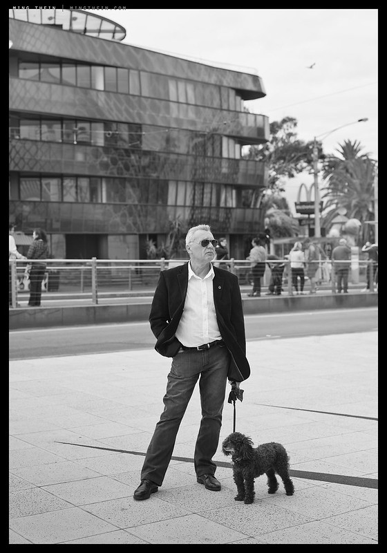
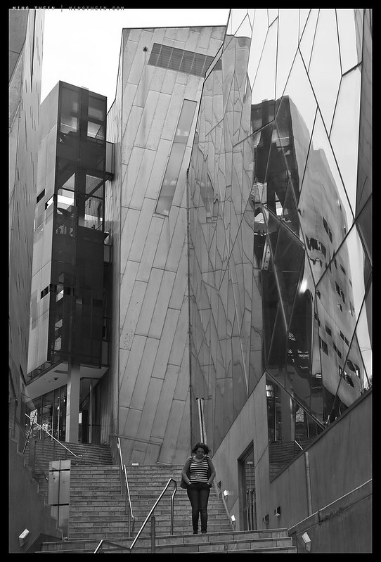
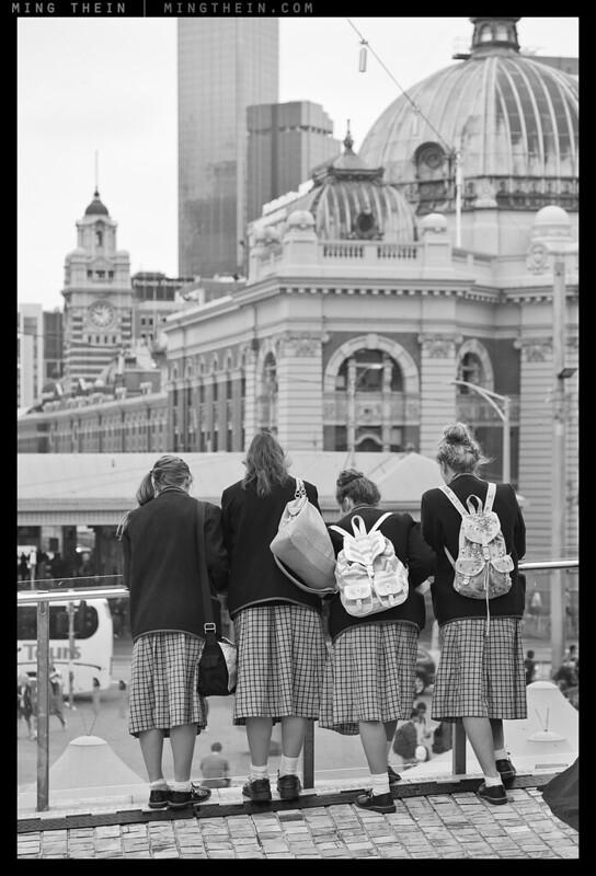
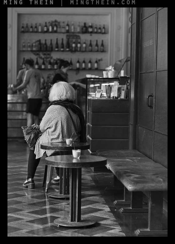
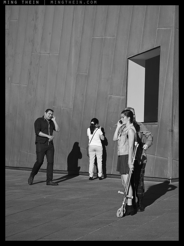
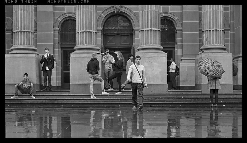
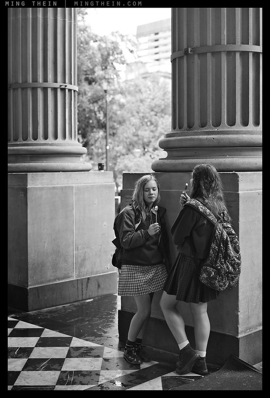
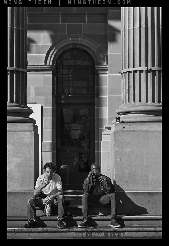
This photoessay is the first part of my monochrome work from the Melbourne workshop in March; some of my students may recognise the images. I’ve been criticised in the past for not getting ‘close enough’ for my images to qualify as street photography, so I’m not going to claim it as such even though there’s no strict definition of the genre to begin with. Rather, it continues a theme I’ve been exploring for the past couple of years: the exploration of people in their environment, and the idea of modern man in context as a species as opposed to an individual. Perhaps I should take up social anthropology in my spare time…
What I’ve always found is that as a visitor to a place – even if you’ve been there before, a long time ago, or lived there, or it basically isn’t your first visit – there’s a sense of detached surreality about everything, partially induced by time differences and partially induced by the fact that you’re not quite sure what passes as normal or socially acceptable because you’re out of your familiar comfort zone. There’s the feeling of trying to observe and drink everything in but not choke on the fire hose of information. I always feel that my jobs is to distill those observations into a coherent set of images that perhaps either single out what’s unusual for you as a foreigner, or single out what you might interpret as the ‘essence of the place’ through its people – not individuals, but people as collective types. The challenge is to keep the context – enough that you can place the locality – whilst simultaneously not losing that intimacy. I do feel that these would probably would better as either larger images or Ultraprints, rather than web-size – there’s far more detail and nuance than an 800 pixel JPEG can convey, and they were shot with Ultraprinting in mind.
This series was shot with a Nikon D800E, Nikon D4, Zeiss 1.4/55 Otus and Voigtlander 90/3.5 APO-Lanthar. Enjoy! MT

__________________
H2 2014 workshops now open for booking – Making Outstanding Images San Francisco, Chicago and Venice; Masterclass San Francisco and Venice – click here to book or for more info
____________
Visit the Teaching Store to up your photographic game – including workshop and Photoshop Workflow videos and the customized Email School of Photography; or go mobile with the Photography Compendium for iPad. You can also get your gear from B&H and Amazon. Prices are the same as normal, however a small portion of your purchase value is referred back to me. Thanks!
Don’t forget to like us on Facebook and join the reader Flickr group!

Images and content copyright Ming Thein | mingthein.com 2012 onwards. All rights reserved


Melbourne is an interesting city for photographers as it has a nice character and lots of interesting nooks and crannies. Some samples from my Flickr Melbourne album here: https://www.flickr.com/photos/life_in_shadows/albums/72157624630391659
would have been photographed with a 50mm lens. Right?
Mostly, 55mm.
Normally I’m a huge fan of your street photography (or whatever it is you wish to call it), but to be honest I’ve struggled to get into the sets that you’ve posted from Melbourne. Perhaps it’s because I’m more familiar with the landscape and culture – the people and their environment – but with the exception of a few gems I haven’t found the last few sets as captivating as usual…
Super wonderfull picts, you are the master. Cunny fox too, being of you,because of using MONOCHROME tag you enter the Leica domain.
Definitely no Leica here. Monochrome = devoid of color. Leica had to be different and drop the E.
“social anthropology in your spare time..” – lol, what spare time? And much of your street photography could be defined as “social anthropology” or maybe social ethnography, don’t you think?
“There’s the feeling of trying to observe and drink everything in but not choke on the fire hose of information.” I hope that phrase is not copyright MT, because I want to use it, heh. Well put, indeed.
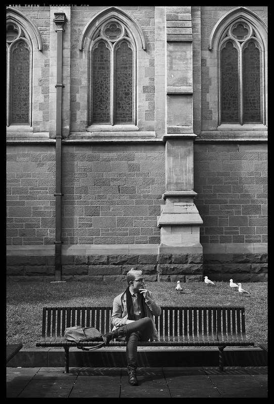
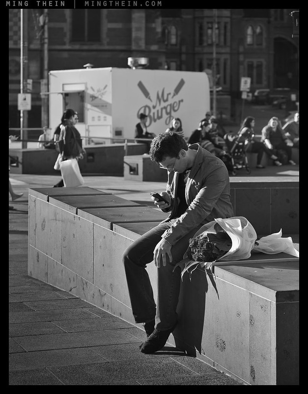
The picture of the man smoking on the bench, with his suspiciously LV looking bag near by….I immediately thought you’d spotted Thorsten Overgaard, lol. 😉
Very nice set of images. 🙂
Haha. No spare time! Go ahead and use the phrase. Words are words…
As for thorsten – he does have a habit of making his travels overlap mine…
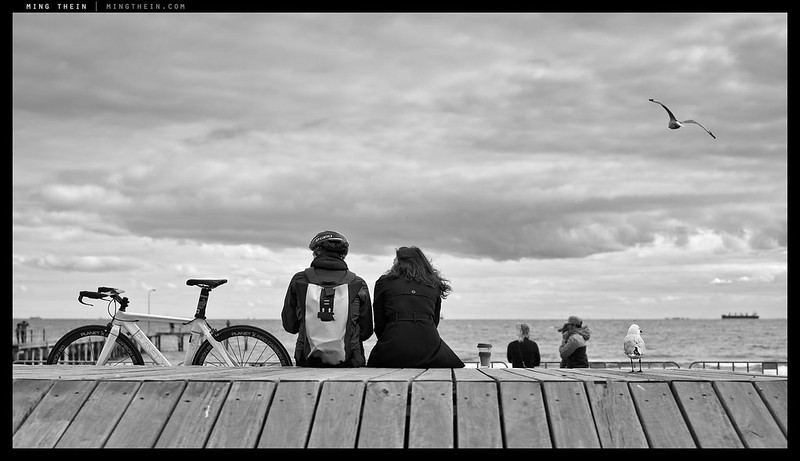
Loving that you got a lovely (typical) spread of Melbourne weather. I was keen to see your take on my favourite city (and home) and this is great. Looks like Bourke St Mall and Fed Square as always made some great photo opportunities for you! The St Kilda boardwalk is perhaps my favourite – the seagull, the bike resting, the somewhat serious clouds and of course the symmetry. Lovely. Can’t wait to see more.
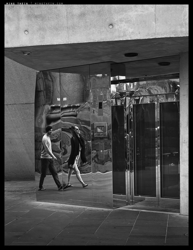
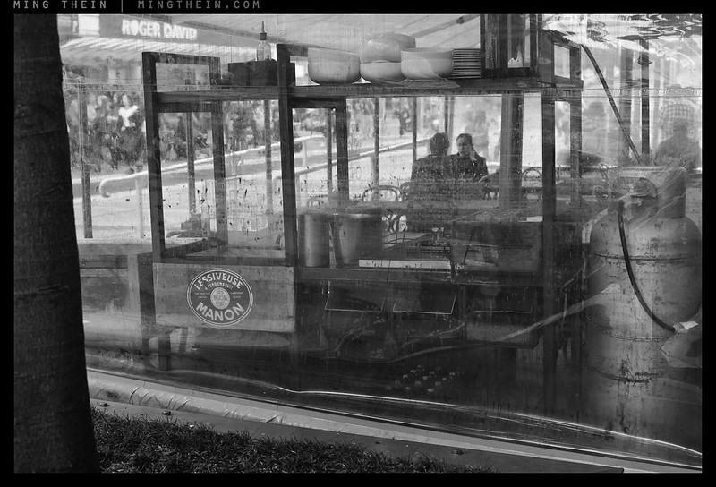
I tend to feel that colour would detract from most of these a lot, apart from the second, third and fifth images which are the right kind of abstract for me to go along with – I wonder if this relates to my imagined (but ‘real’ from experience of being there) of what the colours at these locations should be like.
Did you make it to Carlton Gardens? The Royal Exhibition Building and Museum would surely catch your interest.
Unfortunately not on this trip – not a lot of spare time. Next time!
Really nice series …love all the juxtapositions of people lovely!!
Thank you.
Very nice work Ming! I like how you combine your sense of geometry and abstract form with humans. Because of the way the camera projects 3D space onto a 2D surface, this kind of geometric abstraction is uniquely idiomatic for photography. Put more simply, the camera smooshes space onto a 2D picture like no other media. 🙂
Thank you – you don’t think they’re snapshots hidden by good processing? 😉
Ha! Well, at least he got 1 out of 2 right. 🙂
But this does bring up a question I’ve been thinking about: do you think that as photographers get better and their eye more discerning that they can start making pictures that are boring to people who either haven’t tried to do the same thing or aren’t as sensitive to particular subtleties in the photo? This could explain why HDR, Hipstagram, and other similar in-your-face photos are so popular because they’re really accessible and take no time to appreciate, nor do you have to look at them every day. This could be amplified by the really poor display media most people view photos in, too.
And before anyone accuses me of being a snob, this has happened lots of times to me: there have been photos I didn’t get immediately, but then when I came back to them months later, I suddenly appreciated them. And there are photos I used to love (some of which are widely acclaimed), and now I think they’re a bit over the top.
You could well be right. I think part of it may well also be because people either don’t spend enough time to actually look at an image properly (or it’s our fault for not catering to audiences with mayfly attention spans) or more likely – they’re great at criticising but can’t shoot their way out of a paper bag.
Great work!
But why do you not chose the 28 1.8 & 85 1.8 combo? For me this combo is much more flexible and versatile than only one 50 or 55! Sadly and regrettably, I “only” have the new Sigma 50 1.4 Art, not the OTUS but it is nevertheless a stellar performer on the d800e slightly worse than OTUS….I hope:)
So the OTUS has to be used because it is the best optically on the 800e and you spent the money (emptied your bank account for it!)….I guess…;)
But I was quite surprised that you didnt use the 28 1.8 at least…..the whole world knows that you are a 28mm shooter and being addicted to this focal lenght and FOV!!!;)
Three things annoyed me a little bit…all with regard to compo…. First and second picture (men both not so fixed in the middle/centre, for me it would have been better (composed) if they were standing /sitting more slightly on the right side of the picture –> two thirds rule!!!). And finally the sixth image the girl on the leftside of the bench –> her toe-cap is missing…..not captured or it was unconsciously cropped in post processing?
But these critic points are marginal….dont want to do any lèse-majesty……;)
Excited on part II……the wider….but not 28 😉
Anything new on the ” horroble Pentax/Ricoh front”???
Because I like the transparency with which the 55 Otus renders, and sadly the 28 and 85 Otuses aren’t available yet?
I love the boardwalk shot. Perfect.
Thanks.
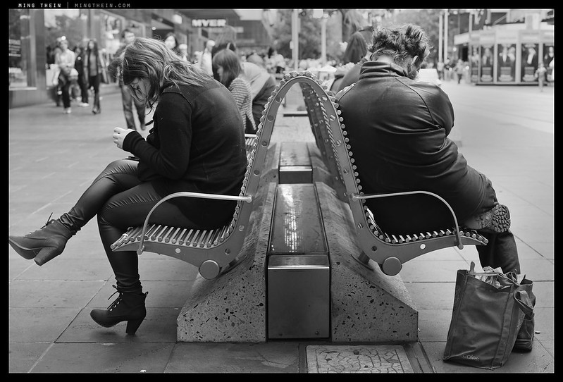
I really enjoy the second shot! It seems your signature is doing weird things. Probably something to do with fluctuating image sizes causing problems with your actions (assuming you use actions to place them).
Lovely series!
Thanks. Yes, I haven’t been able to figure out why yet – the action has a bug in it but it doesn’t seem consistent.
I recently revised all my actions and found that this one was the one that gave me the most trouble. I based mine on this guide (https://www.youtube.com/watch?v=2NRtn-BFMP0). I found that the issue comes when you used inconsistent image sizes. Also, if your border action is based on a pixel amount, then that pixel amount will be too much or too little depending on whether the image is bigger or smaller than the image you used to create the action – I notice that your border widths are often inconsistent. I get round this by having a standard pixel width that I use for all web processing, and I base all my border and signature actions on that width. My workflow goes like this: ACR – Import – Edit – Sharpen – Save (Hi-res) – Flatten – Resize 1400px wide for portrait or 2200px wide for landscape – sharpen for web – border (canvas size +82px black) – signature – save for web. Keeping one of your dimension values consistent means that you can always predict the behavior of your signature and border actions. Some tweaking may be required for non-standard, extra-wide, aspect ratios, but, for the most part, this keep things consistent!
Hope this helps!
Yes it does – the offending images are the ones that were slightly trimmed…
Matthew, those are great tips, especially using one side of the picture as a constant value. If one is OCD, I tend to use some percentage of only 1 dimension (2.5% of height in my case) to determine the border width. Why is this OCD? On Flickr, where all the pictures in the same row are resized to the same height, the borders will all be identical, no matter how big or small each picture started out, or what aspect ratios are put next to each other.
I used to do my borders in PS, but since I also use Lightroom, I’ve switched over to LR/Mogrify, which is donationware, and is very flexible. Other LR users may want to check it out, since LR doesn’t really have a good way to add borders.
The new flickr display mechanism is a disaster. It means you have zero control whatsoever over visual prominence – unless the images are all the same size. If you post one vertical after a series of panos, it’s going to turn up as a tiny little strip…
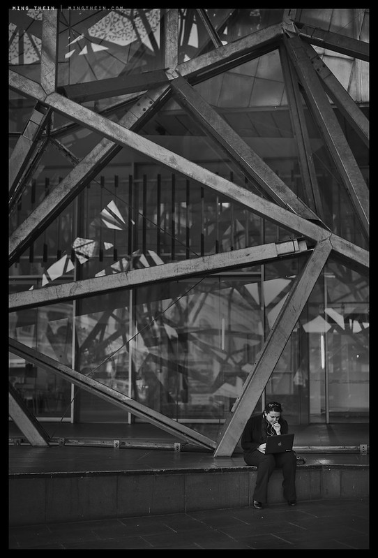
Most of these look like well-processed snapshots. Specially the one with the guy sitting there with his cell phone. Nobody would look at the photo twice if it were in color. The way it is now the processing hides the fact that it’s a bad picture.
Interesting point of view, and completely opposite to everybody else. Care to explain why, with actual reasons? Better yet, since it’s easier to understand by seeing, show me some examples of your own work that you’d consider to be outstanding street photography?
I don’t do any street photography myself. At all. I also don’t think you have to be a master at something in order to be a critic.
My problem with some (not all) of these photos is that they’re capturing dull scenes with nothing of interest and I feel that the very professional black/white processing is hiding that fact reasonably well. It’s like somebody went: “Oh, this photo of a guy sitting there with his cell phone is really dull but if I turn it into a black&white image it’ll look artsy.”
I do like about half of the pics in this set, don’t get me wrong. And obviously it’s just my personal opinion. But I’ve seen way better, more inspiring, and most of all more original pictures from you.
Look at the photo with the woman and a man sitting on a bench with their backs to each other. Well executed, no doubt. But it’s like we’ve seen the shot a thousand times before. Not original, not interesting.
Again: Some of the others I like. But this series seemed very hit&miss to me.
Got it. I post images I’m happy with, and ‘artsiness’ certainly isn’t a consideration. But hey, each to his own. Thanks for explaining.
I tend to agree with Marc but as you said – each to his own. i do not have a feeling about being Melbourne in particular. Could be any beach-side anglo-saxo sunny city … The visual cues are not that predominant in my humble opinion. Let see the other sets before making a call 😉 Now – some of them would happily hang on any of my wall …
That is in essence because that’s what Melbourne is: a mixture of other cities. It doesn’t have the history or distinctiveness in geography to set it aside…
Wonderful! I’ll be returning to these images when I have time to story write. Beautiful, fascinating work, as always.
Thank you.
The first street photography set of yours that I have liked; I am not really a fan of this genre of photography.
Thanks
Probably because it’s less ‘aggressive’ than most…
Great series, some of your best photography so far, in my opinion. But, hey, I like monochrome and images of people in natural settings that beg for the rest of the story. I gave up on “what is street photography?” a long time ago.” It supposedly has to have a street in in somewhere, but apparently beaches are okay too or doorways and windows from the street! But don’t travel too much or you’re likely to veer off into travel photography. Clearly, from what you’ve presented here, you are on the right track personally as a photographer. All you need to do is keep following your own instincts and passions and you will be rewarded for it. If the so-called critics you refer to only get you to do more “street” photography, then may they keep on criticizing. These are very enviable photographs for someone who likes this kind of photography.
Now, for the teaching part . . . from you, not me. When the closer issue came up, I just assumed I’d be seeing images from your 28mm Ricoh GR, and more importantly from a 28mm lens rather than a 55mm lens or greater. That goes to the essence of the closeness issue. I just saw a presentation on photography that showed two paintings of people in boats, one by Renoir and the other by one of his peers. Same place, same day. The friends showed a couple, man and woman in a boat approaching the dock. Renoir’s showed a beautiful woman (why not, you can paint whatever your want) at the end of a boat near the dock from the perspective of (let’s say) the man who was painting her sitting at the other end of the same boat. In other words, “in the boat.” For the first time I realized what all this means. Both paintings are beautiful, so not the issue. But the first one is a picture “of” a couple in a boat, and would have been photographed with a 50mm lens. Right? In the second one, Renoir was himself “in” the boat and he absolutely would have had to use a 28mm lens or 24mm to photograph the same scene properly. The photographer making the presentation was discussing perspective, but he didn’t realize that he was also — could have been talking about — why lens help determine one’s perspective. The key here was Renoir could not have taken the photograph of the girl “while in the boat” himself with a 50mm lens. He needed a 28 mm lens. Kind of a revelation to me, and a reason to study painting in you’re a photographer. “Ah, I see now. Keep using your 50mm and greater to take pictures of or about things you see, but when you switch to the 28mm lens, get into the scene yourself. Become a part of it.” I once read that the most frequently used lens for landscape was the 50mm lens. What, not wide angle as everyone always says. No, only wide if you want to literally lay in the flowers in the foreground and show how they lead to the mountains behind or the trees over there. Then use the wide angle lens. Otherwise, use the 50 or 90 and stitch them together into a panorama; easy to do these days. I’d really like your comments on this issue and some idea why you didn’t use your 28mm lens or GR for some of these photos. Or are they coming in Part 2? Either way, keep these things coming. I learn a lot from your photographs.
Thanks Larry. Short answer: the wider perspectives are in part 2. But I do select my desired feel/ mood first before the lens.
My CV 90/3.5 APO-Lanthar shows a considerable amount of CA, despite its APO design. Do you have similar experiences with your sample? I’m just curious.
Nope, no CA – just a sort of haziness wide open, which I think is caused by internal veiling flare.
Interesting. Mine must be a dog, then. I sent it to Japan for correction, but they just sent it back to me with no comments. I’m surprised by that great a sample variation and by that way of treating a costumer. Cant’t get a better copy now, because the lens is discontinued.
That’s odd. Longitudinal or lateral CA?
I guess it’s LoCA, the kind you see on trees with the sky as backgruond. I could show pictures if you like, but I’m on my iphone at the moment.
It’s still a sharp lens, though.
Mine shows some LoCA/ spherochromatism wide open, but not much.
Street photography intention is to show you the people in a given place with their surround … And you did it very well !!!
Thanks!
Great series, but I really don’t get the “not close enough” thing. On the contrary, I’ve always thought “how did you get so close?” 🙂
When images featuring people’s comfort zone invaded by cameras being shoved into their face are touted as art, then I start questioning my own sanity.
Distracted people. And you know I’m Mr. Stealthy…
This is street photography. I’d take on any argument that states otherwise. Great set.
Haha, thanks!
Well, some of them are street photoghraphy, some of them sidewalk photography and some of them might be square photography 🙂
Don’t forget park bench photography?
My favorites of the Melbourne shots so far!
Thanks! There will be a part two coming in a couple of days.
lovely series.
Thanks.