 What you are seeing is not a capture or printing error. The irregular inner concave surface of the moon is due to variations in depth from craters; the moon itself is in the very extremes of Zone X in the actual image, yet there is still tonal separation present in the print.
Following on from my earlier article on pushing print limits, I’d like to show you the fruits our labour: the Ultraprint. I think the above image pretty much says it all: that is a photograph of the actual print, with a ruler for comparison. Scale markings are in millimetres, as shown.
The concept for the Ultraprint originated from two sources: firstly, traditional wet contact printing, and secondly, the fact that I live in a small apartment with limited wall space means that not only do I not have space to hang a lot of large prints, I don’t even really have adequate space to store them. However, as anybody who’s seen one of my prints will tell you, there’s a world of difference between seeing an 800px web JPEG and a large print. Unfortunately, most people don’t have room to store or hang large prints, much like myself, and this limits the number of people who can enjoy them.
Recall that our impression of acuity/ ‘sharpness’ is a function of both spatial resolution and contrast; the better the microcontrast, the more recorded/ presented separation between nearly adjacent tones, and the higher our perception of acuity. It also increases the reproduction medium’s ability to replicate high-frequency detail. However, the required threshold for ‘sufficient sharpness’ drops off quite quickly as the viewing distance increases: i.e. as we make larger and larger prints, we’re always going to have to move further back to see the entire image at once. This is good, because it means we don’t actually need more resolution to make a larger print so long as the viewing angle remains constant – our eyes limit this anyway – but not so good because when we do choose to examine a small portion of the details of the print at close distance, we are often disappointed because we can see the limits of resolution – be it pixels, print dots, or simply smudging.
The Ultraprint resolves at the equivalent level of 720 PPI; that’s beyond the naked human eye’s ability to distinguish. What this means is that we can look at the prints as near as our eyes will focus, and there will still be the impression of more detail – you really need a 3-5x magnifying loupe to fully appreciate how much detail is in one of these prints. Think of it as the condensed essence of the image…
Production of an Ultraprint starts with the right file: a perfect, sharp-at-100%-actual-pixels 36-39MP (D800E, CFV-39) capture will yield a clean 10×15″ image. Any larger, and you can see that the process is capable of resolving more detail. Our tests have found that ~720 PPI is the maximum the print process can resolve; you can clearly see the difference between a 16MP and 36MP capture at 10×15″, but not at 8×12″. The file stays in 16 bit TIFF.
The paper is also carefully selected: it must have a very fine fibre structure so that the substrate does not limit resolution, but also so the density is high enough to be able to take a large quantity of ink – this allows us to have greater tonal separation, which is especially important for images that have areas that might run out of gamut – rich greens, strong reds and some blues are typical culprits. We are using Canson Infinity Platine Fibre Rag; this paper can trace its roots back to the Arches Platine paper manufactured by one of the oldest paper mills in Europe (and subsequently acquired by Canson) – but more importantly, the favourite paper of Picasso, Van Gogh and Chagall, amongst others. It has been in production for over four hundred years, which makes me think they probably know a thing or two about making paper.
Color calibration is the next step: we started with a calibrated profile for that paper and ink set, but further refine the boundaries of the profile – especially the out-of-gamut transitions – manually, with many test prints until I’m happy that the final result both matches the artistic intention as well as the initial image as closely as possible under a typical range of lighting conditions – it’s of course possible to calibrate perfectly for bright daylight only, but realistically, a lot of prints will be viewed under anything from tungsten (~2500K) to daylight mix (5000K). We try to achieve a realistic balance across that range of colour temperatures.
The file is then prepared for printing – we size the output to match the maximum resolution of the printer, then apply a recursive sharpening process to optimise edge acuity. There are also other settings that need to be altered for each file as they affect detail and tonality in various ways – including print head speed (drying time between passes, and thus ink absorption time), print head distance (resolution vs speed vs ink density and tonality) and various edge smoothing parameters.
Now only is the final print made, and individually hand-checked by me both for color consistency and flaws under a loupe. Needless to say, the entire process is extremely labor intensive, and very demanding of both raw capture quality and workflow. I’ve found that a lot of my earlier favourites will not hold the level of detail shown here to beyond 8×10″ or thereabouts – this is probably the first accessible print process that really makes the full use of all of the resolution our current generation of cameras can provide. Who’d have thought you actually need a D800E’s 36MP for a sub-A3 print?

Above: Original image, resized digital. D800E and Zeiss 1.4/55 Otus

Above: Print, grey balanced and photographed under neutral light – the reflective ‘sparkles’ at the bottom are due to the irregular surface of the paper. NO colour correction was applied post-capture other than eyedropper WB.
The end results I think speak for themselves: these two images I’ve selected to show as test examples are very challenging for different reasons. The moon image has a lot of nearly out-of-gamut blues and magentas in the clouds; lose those and you lose definition. In fact, the print has slightly better tonal separation than the web JPEG of the original! In addition to that, the moon itself is not overexposed in the actual file – but it does lie in Zone X, with both very subtle colour and luminance variation defining the craters:

Above: 100% crop from original file
Above: Matched crop from closeup image of 10×15″ print, ruler for scale
I’m also pleased to report that the print process is also faithful for monochrome images: the following image was printed at 10×15″ – it is a uncropped file from a D800E, Zeiss 2/135 APO at f5.6 and on a tripod – i.e. under optimal conditions:


And the lower image is of course a closeup of the print, from a portion towards the upper left of the image. There are what appears to be some surface imperfections/ dust/ noise; these ‘flecks’ are actually portions of the paper’s surface that is at a slightly different angle to the rest – barytas are irregular, rough papers – and happen to have caught the incident light. I think you’ll agree this level of resolution and tonal detail is quite impressive.
The final example is another very challenging image to print: we’ve got nearly-out-of-gamut red-oranges in the tree, very slight depth of field separation between the red tree and the background, and a lot of foreground deep shadow detail in Zones 1-3:
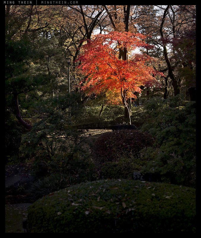
Above: Original image, resized digital. Hasselblad 501CM, CFV-39 digital back, CF 2.8/80

Above: Print – once again, grey balanced and photographed under neutral light. No colour correction applied post-capture other than eyedropper WB.

Above: To give you a sense of scale: the image printed here is about 10×13″ due to the original aspect ratio.

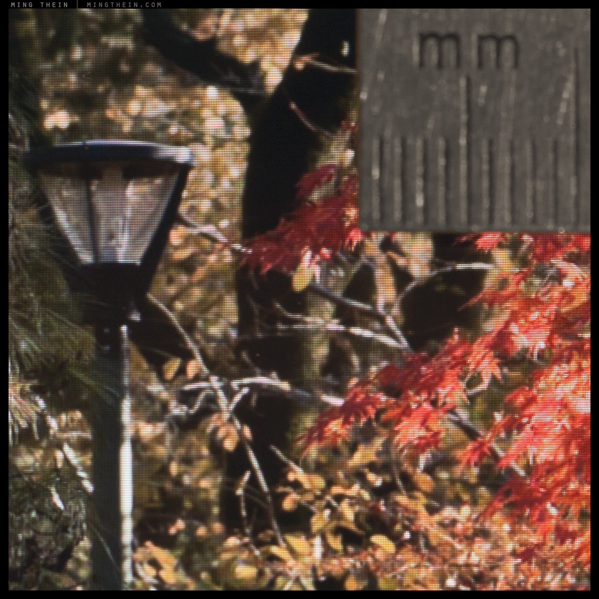
Above: 100% crop from the digital file; note slightly out of focus background – this helps give the actual image a very strong sense of three-dimensionality by enforcing separation between the foreground and background…

Above: 100% crop from 10×13″ print
…And note how this is also replicated faithfully in the actual image. Beyond that, notice also how close the challenging intense orange-red colours are to the original file; more importantly, the tonal separation between leaves is maintained. You’ll notice microcontrast seems a bit higher in the printed image; that was an intentional adjustment to avoid the image looking too flat and subdued at normal viewing distances. Note also the level of resolution: there is a stick under the 28mm marking that’s approximately 50um wide. This level of detail is both repeatable and consistent.
Let’s look at this a different way: against what is arguably one of the best displays today for pixel density: an iPad Mini Retina, which has 326DPI. Please ignore colour; photographing an LCD panel never yields good results. Look only at resolution.

Above: Here’s how the same area looks on the iPad Mini, scaled to match the size of the print and then photographed to provide an approximate relative comparison between the three when viewed with the naked eye – file, print and screen. I think in some areas, the print is reproducing visibly more detail than the screen – look at the pine needles and separation between red leaves, for instance. (Ignore colour accuracy.)

Above: And here you can start to see the pixel grid making itself known – good displays have both small pixels and small gaps between them. Click here for a larger version.
Again, for those of you who’ve seen one of these displays, you’ll know that it’s a really quite impressive way of reproducing images; all I can say is imagine what the prints look like. What the Ultraprint does is bring the detail/ resolution impact of a large print to a smaller, more accessible (and easily displayed/ stored) format.
In the next couple of days, I will launch the first edition of these prints for you to enjoy in person, preferably with a loupe or high power magnifying glass. We strongly believe that this has significantly raised the bar for fine art printing to a whole new level – but more importantly, I hope the new size also makes it more accessible to a wider audience. MT
____________
Places left for 2014 Making Outstanding Images Workshops: Havana and London – click here for more information and to book!
____________
Visit the Teaching Store to up your photographic game – including workshop and Photoshop Workflow videos and the customized Email School of Photography; or go mobile with the Photography Compendium for iPad. You can also get your gear from B&H and Amazon. Prices are the same as normal, however a small portion of your purchase value is referred back to me. Thanks!
Don’t forget to like us on Facebook and join the reader Flickr group!

Images and content copyright Ming Thein | mingthein.com 2012 onwards. All rights reserved


Now I know the exact tactics. I will definitely choose the paper with fine fiber so that substrate does not limit the resolution and the density would be high enough to be able to take large quantity of sublimation ink.
Retina looks quite poor compared to Ultraprint. I am surprised.
How the new 4K era relates to this? A 32inch 4K TV/display has 8MP effective resolution. Now stack 4 of these in a matrix and you have 32MP TV screen wall. That’s mind blowing and will challenge even the Ultraprint, I think.
With the Soccer World cup comming, they are (4K TVs) selling as warm cookies here in Germany.
Your 4K wall would give you 36MP over about 4x6ft – that’s easily achieved with a normal print and a D800E. Visual impact at distance will be there, but pixels per degree of observer FOV on the output is still very much in favour of the Ultraprint.
Hello Ming,
First of all, I”d like to state clearly that the detail of those prints is IMO flat out jaw dropping. Second that my own printing experience mainly is with magazines. So that’s really another matter. Of course things like absorption values of the paper and pixel enlargement play an important role, but the levels are quite different. Still, I’d like to do more “personal” printing in the future, hence my interest in those articles. (Grrreat work, BTW.) Now my questons.
Two questions about sharpening, Ming.
When preparing a file for printing, you apply a recursive sharpening process.
1) Can you go a bit more into detail? What I do is not a standardized method, but I’ll mainly use unsharp mask in different steps, with typically the highest percentage at a radius of 1 pixel. Of course this is in relation to the necessary final resolution and the values are decided while monitoring. I wonder if your method differs a lot.
2) How do you keep the process recursive. I’d say: save different files: one mother file and the another one for every specific printing process.
And also some question about micro contrast, in the last, “Red leaves” picture.
3) You write “You’ll notice microcontrast seems a bit higher in the printed image”. How did you perform the enhancing of the microcontrast?
4) There is an issue here, I think. You know, I also experienced the wonderfull 3D seperation that Otus renders, even at narrow apertures, when focusing closer, getting an in focus “medium-far” distance, and slightly softer “far-far” areas. This is clearly seen in a magical way in your 100% crop from the digital file, but it is a bit lost (IMO) in the crop from print. I’d guess this is due to the enhanced microcontrast, but I’m really not sure. It may well be possible that the “reflective” factor of the paper plays the most important role here. Or it was because of the choice you needed to make: more crispness when looking from normal distance or more 3D when looking into the details. Of course, if that’s the choice, one needs to go for the first. I’m really curios for your standpoint here, because personally I find myself moving somewhat back and forward in that domain (going for more crispness vs. smoother transitions). I guess there simply isn’t one single truth. But since I’m completely self educated, I sometimes wonder if there are any “generally accepted standards”, regarding sharpening, crispness, transitions, etc…
Don’t know what happened. In question 1, the second sentence needed to be:
What I do is not a standardized method, but I’ll mainly use unsharp mask in different steps, with typically the highest percentage at thresholds under 1pixel and much less at above 1 pixel.
Thank you.
1. Actually, there’s very little sharpening involved IF you’re dealing with files that are from a camera with no AA filter and are already sharp at the pixel level – there’s no more sharpening that can be done. I never go over 0.5 pixel radius.
2. We print from the master. There’s a calibration to bring the printed profile as close to the master profile as possible. No recursive files.
3. A consequence of controlling/ varying ink density.
4. Very much a matter of taste. Of course the crop of the print really doesn’t do the actual print justice…so the transition is a lot better than you see in the scan.
Thanks for your fast answer, Ming.
1) Pleasant surprise. With Otus files, I find myself sliding the sharpening back to zero most of the time (it’s set to 25% by default in the RAW converter) and use nothing else. Earlier, with other lenses, I mostly applied some unsharp mask at a 0,8 radius, but was also tending towards 0,5. For press printing, I was used to apply more, but since I work more and more with pictures just for myself, I use less and less. Feels good that I was coming pretty close to what you do (in this domain, that is).
2) Makes sence. We use a (probably) comparable calibration for the press. The only thing I wonder now is, how much processing you do to create your master file. I know that’s hard to describe – maybe in “average minutes of work”, just to give me an idea?
3) Interesting. So there’s no processing done in the file itself.
4) OK, got it. I’d love to see a real print though… 🙂
Thanks again. It may seem odd, but simple things like those can often confirm what I already suspected, but wasn’t absolutely sure about, because so many people “exaggerate” and then call it normal. I did too sometimes, and so I may not be reluctant towards working in a more subtle way.
1. Anything >0.5px tends to trigger haloes in finer/ higher frequency detail.
2. Depends – if there’s commercial retouching involved, it could be a day. If it’s an urban scene, it could be under a minute. If I have to do that much processing then I got something wrong at the time of capture, and I toss it because it’s a compromised image.
3) No.
4) There are a couple of Ultraprints left from the first limited run…
I love this web site. A novice can drink from the surface and be refreshed and the professional can dive in deeply and never hit bottom. I’m always refreshed and inspired by what you do with your art and profession and especially your humble passion for truth and beauty with excellence.
Thank you!
Very impressive.
Thanks!
The process you’re developing is fascinating. I will continue to follow closely.
On a different note I’m surprised by your enthusiasm for the Retina iPad mini display. My understanding was it has a much narrower gamut than the iPad Air despite the higher density display (or perhaps because of). A quick search reruns numerous test results that show it’s actually narrower than standard sRGB. Is that not a factor in your use of this device?
Jerry
That might well be the case. However, I’m still happy with the way my images look on it, so perhaps that’s all that matters? In any case I’m not using it for proofing or processing…
Wonderful stuff Ming. Can’t wait to to order and see one in the ‘flesh’. I look forward to seeing what’s on offer soon.
🙂 Soon!
Remembering your praise for the photo print quality in Nick Brandt’s books, if you still have access to them, a comparison with your and Mr. Wong’s Ultraprint could be interesting.
( I understand, of course, that it could only be approximate, as there is no common original.)
I’m certainly looking forward to the completion of your article series on your and Mr. Wong’s journey towards the inkjet limits; I’ve found a great deal of food for thought.
Gravure printing (which was used for Nick Brandt’s books) is limited to resolving structures 50-100um wide; the 720dpi Ultraprints theoretically stop at 35um, though that of course depends on many other factors such as the droplet size, colour (pure colours will be ‘tighter’ because they do not require multiple drops of ink to achieve the final colour, eliminating resolution issues) etc.
Again, it’s very difficult to say one is categorically better than the other as we don’t have a common source image, but I’d say the Ultraprints are certainly on par, and perhaps slightly better so long as the original file is of sufficient resolution – much as the numbers suggest.
Yes, I guessed something like that from your book reviews.
Thank you for clarifying and quantifying the issue!
And as you don’t mention dynamic range, I guess that is also comparable(?). I wonder if colour (book) printing has been able to reach this level.
Certainly food for thought. Brings back memories of when I worked with 8×10 and made contact prints.. Funny that Wongs favourite paper is what I’m currently using. I wonder if resolution would seem even higher on the smooth surface of the Harman.
On the whole I find your results very persuasive as far as the coulor prints are concerned, but I’m less sure regarding the B&W. On my monitor I see only white featureless leafs and black featureless shadows in the crop. Where are all the gray tones, the whole midrange seems to be missing. I have seen your great concern with gradation of greys in your film shots so perhaps the crop shown is not representative for the whole image or indeed for the result of the B&W printing.
It might well be, but personally I don’t like the lack of texture, and we also have supply issues in this country – Wesley has a small cache of old stock for his personal use, but nowhere near enough to offer a print run or mount an exhibition.
B&W greys: you’re not seeing them in this crop because of the limited tonal range of the subject itself at that frequency. The higher the frequency of a subject, the less tonal transitions you see simply because there is no ‘space’ for them to take place. As you point out, I am extremely particular about my tonal gradations, so there’s no way I’d show an image/ print I didn’t think met the standard. This one does, but you really have to see the full/ original print, which is faithful to the original (digital) image. It’s very difficult to replicate that feel without seeing the actual print.
What a great topic!
Over the years I have learned about myself that I gravitate towards modesty. In my other disciplines – music and glassblowing – I strongly prefer to keep things small and intimate and frankly abhor most things to do with larger, more ostentatious productions. As I contemplate putting together my first photo print exhibition, there is a temptation to go big, but like you, I live and work in a small space and those logistics would be a real headache.
And then there’s the target audience. Who would buy my spectacular 4×6′ prints? If all went well, people with lots of money and vast amounts of interior space. Trouble is, I don’t generally relate to those kinds of people. I don’t like pandering to them, I don’t like dealing with them. I like making stuff for laid-back, down-to-earth folks who have soul and taste and not necessarily great financial means. It makes for a lame business model but it also keeps the blood pressure down.
Don’t get me wrong – I try not to be a class warrior and I do sometimes appreciate big things that kick ass. But for me, the thought of doing my first show at a nice manageable scale somehow warms my cockles on many levels. (If 8×10″ contact prints were good enough for Edward Weston…)
Your articles are help light the way and for that, once again I thank you.
No problem.
It just seems odd to me that my prints would be so large I as the artist don’t even have space to store/ display them; and frankly, I’d rather sell many smaller ones than one large one – too much financial risk if one print is make or break, and I certainly don’t know anybody who’d buy them, either.
That said, smaller is not necessarily cheaper. These require significantly more work and proofing to produce than the larger prints simply because of the level of optimisation that goes into each individual image; there’s simply no one-size-fits-all setting because each image is different, and there are a lot of combinations of parameters…
Thanks for that amazing series. It is a marvel!
My initial question about good quality photo books looks more like a joke now….
Well done. 10×15 is a wonderful size for viewing in-hand and matted and framed. As you point out, the correct viewing distance and wall space determines the necessary print quality.
A gentlemen above commented on prints made in a lab.
You assumed he meant dye sublimation, mini-lab prints. The big professional labs do not use dye sub, which uses color ribbons of CMYK to print. Their output devices are laser and print onto papers like Fuji Crystal Archive. They are generally thought of as continious tone, true photographic quality.
It wasn’t clear what he was referring to; the Lambda machines you mention are not exactly common – and they certainly don’t produce ‘soft’ results so long as they’re supplied with the correct input file. I don’t believe Fuji Crystal Archive is a baryta paper though, I seem to remember it being one of the usual resin-coated glossy papers.
Fuji Crystal Archive is not a baryta paper.
LightJet is slightly more common in the US that Lambda machines, though the results are similar. Fuji make several choices in paper finishes, though the whiteness and brightness are similar. Finishes are more commonly just surface texture differences. Often these machines are set for faster output, especially at smaller print sizes, the output resolution is limited by the operator. Some labs do a very good job on larger Lambda and LightJet prints.
Old Baryta B/W papers, like some packs of Oriental Paper that I still have here, contain barium sulphate. The main result is a better reflectance off the paper surface, though whiteness often appears to be better. Calcium carbonate is another common substance used in the production of commercial coated papers. As mentioned above, inkjet papers are coated with a receiving layer, though the reason is that without it the paper would warp. I don’t want to get too technical on this, since there are many more aspects of paper production, plus a ton of notes here, and over a hundred pounds of samples.
I think it’s hilarious that you think you’re the first person to print at this resolution. You’re only scratching the surface.
Not optically. But in a wide gamut, consistent way from a digital file and a digital print method, on this type of paper, show me another one…
Besides, how can it be ‘scratching the surface’ if we’re already nearly at the resolving limits of the fibre structure of the paper? Even if the print process can resolve more, the output material cannot represent it. Your comment simply does not make sense.
What are the requirements for printers for this kind of work? Would, say, an Epson R3000 be capable?
We’re using the 9900. There’s a noticeable difference in resolution, but a bigger one in tonality as the larger printer has a couple of extra cartridges which means the tonal gradients are smoother and more linear. This enables lower contrast detail to be faithfully reproduced.
Well done! You’ve apparently reached the current limit of paper printing on paper. And without seeing your actual print I expect that you’ve also surpassed the quality of a contact print. However, even with the excellent print examples you’ve shown, I still prefer the look of the ‘original’ as I ‘perceive’ a wider color gamut and enhanced detail (moon crops) when viewing on my iPad Mini Retina. Printing uses as few as 4 colors while displays use millions which technically should give the advantage to the display. But isn’t is amazing how we’ve tricked the brain into perceiving so many colors with so few. What are your thoughts on the next promising medium for the achieving the ‘ultra’ result — higher resolution displays? electronic paper? digital coatings for paper? BTW, speaking of focusing, did you ever install those promising new focus screens on your D800e? Thanks again for sharing your experience.
Actually, we’re using 11 inks. They combine to make 11! (factorial) different colors, which is a lot more than 4 million – more like 40 million, and that doesn’t even count dithering/ density variations.
The reason ‘original’ images on screen will always have more pop is because you’re looking at a transmissive medium and not a reflective one – there’s nothing we can do about that.
More pixels – 720dpi – could retain it make for an even more detailed image with smoother tonal variations, but I think at some point we may also see irregular sized pixels, wider dynamic range (think OLED) and multiple colors…
I know nothing about the technical stuff, but this immediately brings back fond memories of looking at velvia 50 slides on a light box 🙂 but with the added benefit of not needing a loupe and being able to use both eyes …. very cool and kudos to you guys on the innovation !
Thank you, that was the intention – I wanted to have the look and feel of a (very) large format transparency…
I am guessing that a similar practice couldn’t be applied to the modern day wet/lab process onto Fuji paper? I don’t know why though. If the Fuji C. Arc. paper is essentially the same as traditional papers of old then the limiting factor must be in how the information is transferred to the paper (an area I know nothing about). I had a look at some of my Fuji crystal digital prints and pro ink jets under a loupe 8x and the detail was blotchy compared to a large format film print where the detail was totally all there. And like you say even without a loupe the difference in apparent, so I’m not sure where the masses with their D800’s/5D’s wanting better smallish prints go!
I’m guessing the prints you saw came out of a minilab machine, which use dye sublimation for the actual printing process. The source file is the main culprit – it’s either heavily downsized by the machine, or a low res scan, or most people’s input files are not up to snuff to begin with. Not every image can be Ultraprinted – I was surprised by how many of my own files wouldn’t hold up, and I’m very particular about pixel quality and shot discipline…
Can you predict the failing files on your apple screen or do you have to test print? Would an upmarket NEC or Eizo screen show the failings any better? I’m guessing not unless it was a colour issue.
Generally I can, but that’s more of an experience thing. It is theoretically possible to map the gamut of your printer/ paper combination and soft proof for clipping with that, but it’s a pretty laborious process.
I believe the we will up the ante with the new 50MP CMOS medium format or Sigma dp Quattro cameras. Ming and I have been pushing limits of papers, one in particular is his favourite i.e. Canson Infinity Platine Fiber Rag, while mine’s the Harman Fiber Gloss Al.
Remains to be seen, when there are actually cameras to test…
Let’s see …. 44″ Ultraprints …. (reaching for calculator) …. how many MP will I need? …. 🙂
24×36″ would require about 450MP…
Hi Ming,
I think here starts an interesting discussion. Let’s not talk about a 24″ ultraprint but a print that holds up to nose level. I was able to get those from my 4×5 slides when everything came together (not too contrasty scene for the film, no wind to shake the view camera, perfect aperture and exposure etc.) I would call these prints “supernatural”. They are obviously nice to view from the standard distance but allow you to go closer and examine details that the naked eye was not able to resolve at the location.
Now with the conventional process gone, and the sensors not yet at > 100 MP, will it be better to print the 24″ image at 200 dpi or to uprezze them in photoshop to 720 dpi before having them printed. Moreover, the 4×5 slides scanned with 6000 dpi on a drum scanner really do not hold up to the pixel level. Still, downsized to 360 dpi and printed, the images look gorgeous with micro-contrast not matched by the D800e (with PC-E 45 lens). May it be that the oversampling of the analogue media is still better than the uprezzing in photoshop or any RAW processor?
Thanks for this very interesting tests. It saves us a lot of ink, paper, and frustrations.
Well, given the ‘nose level’ requirement, we’re still looking at 720dpi or thereabouts.
A 24″ image at 200dpi will look soft. Uprezing it to 720 won’t produce any additional detail; it will still look soft, and may take on artefacts instead.
Film tops out around 3000dpi of real information to hold up at the pixel level in my experience, even on the very best slides – which means approximately a 5:1 enlargement. Even if you do not oversample, you’re starting with a lot more information in the 4×5 – about 180MP – which means a much sharper print at the same size.
I have not tried the Canson, but I agree with Wesley that Harmon FB AL is my favorite paper and I got a good deal last year on a 24″ roll.
Wondering if Wesley has tried Moab Slick Rock paper? Got some the other day to try out.
Thanks for your latest set of good articles on printing, a often neglected topic.
This looks awesome! Very cool about the paper being the favorite paper of Picasso, Van Gogh and Chagall.
Thanks. Apparently Michelangelo used an earlier form of it, too…
Ming, you rock!
And maybe Apple can ditch the retina display and design an ultra display 🙂
Sure – double the pixel density, quadruple the graphics card requirements, and uh oh…the cost! The cost! 😛
I would just be curious how these compare to already existing (to avoid suggesting you go out and do this), enlarger produced photos from 6×6/7/9 or 4×5 printed to the same modest sizes; 10×13 or so and perhaps actual contact prints from 8x10s. Is it down to the resolving power of light on paper vs. the resolving power of ink droplets on paper? It sounded like from your interviews with the print master that the paper is pretty much the same aside from a coating for the inkjet version.
Do contact prints from large format hold a reputation of density and resolution? I ask, because I have never seen them.
The problem is we’d have to print the same file/ negative to make a meaningful comparison, so either we’d have to scan an original neg that’s been contact printed, or make a fresh contact print of a fresh neg. Not having easy access to optical enlarging/ printing equipment, this isn’t exactly a straightforward comparison.
As far as I can see – we are pretty much at the limits of the paper; even if the negative has more information – 2000-3000DPI vs 700-800DPI – I don’t honestly know how much more the paper can resolve. And yes, they’re the same kind of paper except the inkjet version has a barium sulphate coating.
I was thinking you might have access to some original contact prints or enlargements by others that you could post images of close up detail to compare to the moon shot you have. Would scanning a negative and printing it eliminate the enlarged/contact printed comparison because of the digital step? I am not shooting for either side here, just curious if your final images are meeting the earlier stated (or my interpolation of it) desire to reach the contact print density/ resolution. Finally, It would be interesting to see a variety of final prints made from divergent processes and comparing the 700+ ppi medium sized digitally made ultraprints. Your print master mentioned a few types and you seem to be developing your own evaluation metric, so why not float out a comparison or two of some super sharp images even if they aren’t the same image, same camera, same lenses, etc?
I do have access, but it’s a meaningless comparison because we are not using the same source image – the limits of resolution could be because of printing technique, lens defocus, motion blur, camera shake etc. These cannot be eliminated to objectively compare print quality only. There are simply too many variables. Ideally we’d have to use the same source – a scanned 4×5 printed through the Ultraprint process, and then the same negative printed to the same size enlargement entirely optically.
If you have such a negative, without wishing to impose, I would like to see that. Seeing the comparison of screen to ultraprint makes me want to see the contact print/small enlargment as a comparison. After reading the preview to the ultraprint post I was hopeing to see all three compared. Thanks for the discussion on the topic, either way.
I don’t – but a full blown scientific comparison is on the to do list as soon as I find the time…
The simple answer has to do with dot gain, and spreading of ink, more than precision of placement. I’ve seen offset presses and frequency modulation plates produce amazing results, but these are not practical for low volume prints. Years ago I learned a technique from Dan Burkholder for making digital contact negatives at the final print size. That technique is used by many doing platinum prints, and a few people using true B/W paper, but generally rarely used. The ultimate is four colour Carbro printing, though that technique is even more rare. I’ve seen great examples of Carbro prints, though honestly the effort involved is why high quality inket is now more common.
May I have a B&W “forest,” please? Incredible!
It’s not in the forthcoming print run, but it can certainly be arranged – please send me an email (mingthein@gmail.com) and we’ll work out the details.
Check out the London Photography Gallery print I brought to the Centre yesterday.
Took a few reads to digest all the info, but what I find most interesting is that you’ve found a way to make use of all the megapixels in a manageable manner (albeit with a fair amount of labour).
Question is would you ever want to frame an ultraprint?
Sure, why wouldn’t you want to frame it?
That said, part of the reason why I wanted to see if this kind of printing was doable was simply because there’s very limited space to hang prints, or store rolled tubes – but the 10×15″ Ultraprints fit nicely inside an artist’s portfolio for storage – and that’s also how I’m going to be shipping the first folio set of Ultraprints…
Yes, I had the same idea that an artist portfolio would be more appropriate because you are possibly able to appreciate the detail better.
I’m sure people will think me a bit strange with a magnifying glass pressed up close on a hung photo 😀
It would depend how large the photo is 🙂
These past few posts have been immensely inspirational to me. I am feeling the same spark that I felt when I first started doing photography. I think this means that I will have many days ahead of me full of absorbing information and trying to learn a new skill. I can not thank you enough.
Ming, I want/need/beg to see this in person. Please.
Wait, Wesley hasn’t showed you yet? I’ll bring some around to CFAP in the next few days, once my car comes back from getting a new windscreen…
The prints were so sharp they blew out your windscreen? Wow.
Err, no. How is this relevant?
It’s not, just my juvenile sense of humor asserting itself.
I thought I was missing something…
Well, in place of laughter, I’ll take a vague sense of confusion.